
*This post contains affiliate links. I receive small commissions for purchases made through these links at no extra cost to you. These commissions help me keep this site up and running, in order for me to keep providing helpful and inspiring art content. :)
Struggling with an art block or creative rut? Looking for ideas to get the most out of Inktober this year? Eager to take your art further, whether in terms of skill development or expanding your audience? Participating in online art challenges can be an amazing way to get back into creating art consistently after a break, as well as to improve your drawing/painting skills in a short period of time. Not to mention, because so many people will be participating and sharing consistently, it's also a great way to get your art out there and start growing your name as an artist. I've personally participated in Inktober a few times in the past and have gotten a lot from pushing myself to complete them. You can check out video timelapses I've shared of past sketching processes, things I learned from the challenge and more in past posts. I also recently shared a video over at my YouTube channel in which I explain the main reasons why participating in daily art challenges like Inktober can be so powerful for artists, as well as my main tips to help you reach the finish line while enjoying every step of the way. You can check it out here. To add to the Inktober/Fall art challenge goodness and helpful tips, I'd love to share an article today which was kindly contributed by Debbie Woodliffe. Debbie's not only been working in the creative industry for nine years, but has always had a deep love for art and it's been her hobby her entire life. As a creative, Debbie knows what it's like to struggle with blocks. Inktober and similar challenges have helped her move past them and get back into the flow of consistent art creation. Below, she'll be sharing her top tips that'll help reignite your creativity and take your art to a new level with Inktober 2021. Without further ado, let's get into her article!
|

I hope this post was helpful and inspiring!
Thanks so much to Debbie Woodliffe for so generously sharing all of this useful information with us. It has certainly gotten me excited for Inktober and all the amazing work I'm sure I'll get to see next month.
Thank you for reading and I wish you tons of progress and enjoyment in your art journey.
For a list of my favorite art supplies, go here.


8 Comments
Would you love to paint animals using watercolor, but find it a bit intimidating? Have you tried painting animals in the past, just to end up disappointed and frustrated with your results? Would you like to be able to create animal paintings that are impactful and full of life?
For animal-loving artists like myself, it can be incredibly rewarding to paint one successfully, in a way that communicates its beauty.
One of the pieces of advice I most frequently give to my students and art community members over on Patreon, is to make time to break up complex compositions (or subjects) into elements, techniques and/or layers that can be practiced in isolation.
This way, when we sit down to work on the complete piece, we're not only much more likely to be successful, but we'll also enjoy the process a lot more due to the understanding and confidence we've built through this previous practice and prep work.
And this is exactly what I did in the video below in order to push my ability to paint animals using watercolor.
I found three (quality) reference images of very different sets of animal eyes so that I could challenge myself and dove right into these studies.
You can check out the three painting processes below.
If you enjoyed this video and found it helpful, make sure to subscribe to my YouTube channel. I share a brand new video every week with art tips, drawing and painting tutorials and mindset/productivity tips for artists. *Subscribe HERE*
This goes without saying, but eyes are one of, if not the, most important parts of any portrait, whether we're drawing/painting a person or an animal.
Why?
Eyes are able to transmit the person's or animal's essence and personality and, if drawn or painted well, they can make the entire piece come to life.
Which means, they can also break the piece, if drawn or painted poorly.
Oftentimes, artists decide to make eyes the focal point and draw more attention to them by making use of techniques such as:
- Bringing in higher levels of detail in the eye area
- Creating higher tonal contrast in this area
Find a list of my favorite watercolor painting supplies here.
Tips for Painting Beautiful Animal Eyes with Watercolor
1. Make time for isolated studies
It's super smart to practice different elements and techniques in isolation or via smaller studies, as opposed to jumping right into complete paintings without having done any previous practice or preparation.
When I was first getting started on my own painting journey, I used to go right into a brand new drawing or painting expecting a masterpiece, only to end up frustrated with my results.
I used to have very high expectations of myself, even when I was getting started with a brand new medium or a subject I had never drawn or painted before.
Then I had an awakening.
Every-single-type of subject, whether it's a portrait, a landscape, a still life arrangement, etc., can be broken down into things that can be practiced separately. Taking time to practice things that we feel might be challenging for us before jumping in can make all the difference in the world.
As mentioned before, this kind of prep work makes it much more likely that we'll not only end up with a final piece we love, but that we'll actually enjoy the process much more.
For example, if you love drawing or painting portraits, learning about the anatomy of different facial features and and practicing each in isolation without the overwhelm of drawing/painting an entire face, is going to inform your final piece immensely.
If you love drawing or painting landscapes, creating studies of different types of skies, trees and things like water or flowers, will make it much more likely that you'll succeed at that final piece.
When it comes to painting animal eyes, understanding their structure, as well as their different parts is incredibly powerful. If we don't take time to study them, it can be easy to leave out little elements that are important in order for them to look believable.
2. Use high-quality reference photos
When we're trying to achieve higher levels of realism, it's essential to work with references, at least in the beginning. In fact, I'd recommend both using photos, as well as drawing/painting from direct observation (otherwise known as drawing/painting from life).
Why?
Because without references and material to inform your work, you'll most likely be making up information and drawing/painting subjects the way you think they look like, and not what they actually look like. Unless you have a photographic memory or are a genius of some kind, of course.
Plus, realism is all about those subtleties and details, which are super easy to forget if we don't have the subject in front of us in one way or another.
Even if your goal is to later be able to draw things from imagination, using references is going to help you develop your observational skills and understand about Art Fundamentals such as light behavior, form and perspective, all of which are key and impossible to understand if you don't study what things look like in real life.
Having said all this, learning to select the right reference photos for drawing or painting is essential, as we can make the process way harder for ourselves if we're trying to create a drawing or painting using a low quality image.
Here are a few things to make sure your reference photo shows if you'll be using it as a reference for your artwork:
- High resolution
- Not blurry/pixelated
- Not over or underexposed
- No flash!
- Not cropped in awkward ways (no essential body parts cut out)
- Good lighting (you can see lights, midtones and darks)
- When drawing/painting animals, make sure you can see the eyes as clearly as possible or make sure you collect other references of that same animal that do let you see its eyes
- When drawing/painting animals, we want to look for a pose that enhances the beauty and particularities of the animal and isn't awkward
3. Choose your paintbrush sizes and switch between them mindfully along the way
Before getting started with your painting, choose the specific paintbrushes you'll be using for both outside of the eyes, as well as for the detail inside of the eyeballs.
The fur around the eyes can be described in a much more abstract/looser way and, at least for those first layers, medium sized paintbrushes work best (I like using round brushes in sizes 14-16).
For the detail inside the eyes, we usually want much more control. Inside those eyeballs, we have very small (yet super important) elements to add in, such as the tear duct, the pupil, tear lines, etc., many of which we want sharp and defined.
We also have to be able to work around those little highlights in the eyeballs, as these are essential in making the eyes look lifelike.
For complete animal paintings or things like eyelashes, etc., it's also important to choose a very thin detailing paintbrush. I'd recommend practicing drawing thin lines with whatever paintbrush you choose before adding them in.
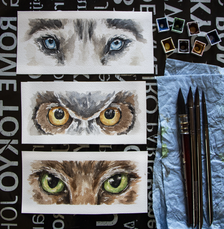
Watercolor animal eyes by Erika Lancaster (Husky, owl, cat)
4. Plan when/where you're going to be using wet-on-wet techniques vs. wet-on-dry techniques
*Wet-on-wet: Applying/dropping in paint onto paper that has been pre-wetted with clean water or has a layer of paint that's still wet- Great for organic color gradients, soft transitions from more saturated color to more translucent color and blurred edges.
*Wet-on-dry: Applying paint on paper that is completely dry - Great for sharp, defined edges.
Before starting with any watercolor painting, it's advisable to think of a strategy that'll help you arrive at the effects/outcome that you're looking for.
As opposed to opaque painting mediums such as acrylics or oils, we're not able to cover up our mistakes with a layer of paint. Not to mention, saving our highlights is essential and, once paint touches paper, there's no going back to the whiteness the paper once had.
And, yes, you can decide to add in your highlights at the end with white gouache or another medium, but it's important to understand that when we're working with watercolor, we're playing with the medium's translucency and the whiteness of the paper underneath to create a variety of different values.
Usually, we want the whiteness of our paper to stand in place for our highlights and no white paint is actually necessary when working with watercolor, if we save those whites.
I'd highly recommend not getting started until you have at least a general idea of how many layers of paint you're thinking of going in with, as well as which areas you want to use wet-on-wet techniques in, which areas you want to use wet-on-dry in, and which will require a layering of both.
Also, along the painting process, continue asking yourself whether it's important to allow a layer of paint to dry before going in with the next.
For example, when painting many of the details inside of the eyeball (highlights, pupil, etc.), you're probably going to want to go in wet-on-dry in order to achieve sharp outlines, but for the fur and elements around the eyes, wet-on-wet can come it very handy.
Transitions between colors within the pupil can oftentimes also be created wet-in-wet.
Five minutes of planning before getting started can go a long way in having a smoother painting process, and arriving at way more successful results!
5. Remember the spherical nature of the eyeball
If you've never tried painting a sphere using watercolor before, it's extremely helpful, as eyeballs have a spherical form. *There are animals such as owls that don't have spherical eyes.
Aside from the eyeball being a sphere, we need to remember that eyeballs are set deep within the skull and are covered/wrapped by an upper and lower eyelid with creates outwards/convex volume in the head shape.
The sphere in itself is going to have different values throughout it, and the eyelids create shadows on the sphere, too!
When we're drawing or painting human eyes, we're able to see much more of the sclera (the whites of the eyes), and it's easier to tell different values throughout it. Just like when drawing or painting teeth, even though the sclera is essentially white/off-white they are never one flat white value.
If we leave them with only one flat value, and don't try to understand their 3D form, we risk our outcome looking quite cartoony and it will retract from the level of realism in the piece, even if the rest of the piece is realistically rendered.
6. Plan your highlights and keep them protected throughout the painting process
Notice the highlights and lighter values in the reference photo both inside of the eyes as well as around them, and think of the strategy you'll be using to keep them protected throughout the painting process.
Are you going to be using masking fluid to keep lightest lights protected, or will you be painting around them carefully?
Whatever you decide to do, make sure that you plan for them, as once you cover up that paper with paint, there's no going back to the whiteness the paper once had.
Those highlights are incredibly important to make those eyes come alive and look moist and realistic.
Also, the more we can do to understand the structure of the animals head (brow ridge, snout size, rounded areas around the eyes, etc.) the more 3D and realistic our painting will tend to look.
This is why doing skull studies is so valuable!
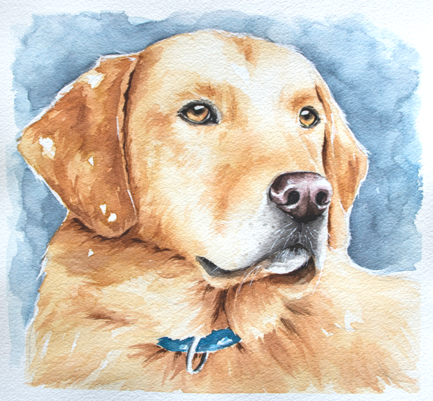
Watercolor Labrador by Erika Lancaster. Whiskers were added in at the end with white gouache and a fine detailing brush.
7. Start with a bright yellow layer in the eyeball when appropriate
Whenever it makes sense, I like starting with a semi-translucent layer of bright yellow in the iris/pupil (avoiding the highlights), as this provides a glow to the eyes.
Usually I like doing this with a color such as Gamboge or Permanent Yellow Medium.
This works very well when the animal's eyes are amber colored and even green.
However, I didn't use this strategy for the husky eyes I share above, because these eyes are blue and I would risk turning them green (yellow + blue= green).
8. Mindfully use soft/blurred transitions vs. defined edges
When painting eyes, we're usually going to need a combo of shapes with soft/blurred out edges and hard/defined edges.
Notice where these blurred out effects happen and where sharper edges are located in your reference.
Usually, we have lots of soft transitions within the pupil, where one color turns gradually into another color. But when it comes to painting elements like little shapes along the tear lines, eyelashes, and pupils in some cases, we want the edges of our shapes to be defined.
By giving thought to these things, you'll have a better idea of whether you should be painting on paper that's still wet, or whether you should allow the previous layer to dry completely before adding more detail.
It's essential to stay patient!
Aside from all this, if we're looking for higher levels of realism, it's important to stay away from the look of obvious/stark outlines around different elements.
A lot of animals, such as cats, tend to have a darker (eyeliner type look) around their eyes. This may instinctively make us want to go in and create a hard outline around the entire eye and this will ultimately retract from the level of realism of the piece.
In realism, there are no outlines and it's important to notice the subtle changes in values even in these areas that we may initially perceive as dark lines.
Usually there's a line weight variation within the elements we initially perceive as lines, such as the tear lines, and even whiskers. Meaning, certain segments of those "lines" are thicker while others are thinner, some are darker while others are lighter. Capturing this leads to a more natural look.
Notice moisture and any highlights along the tear lines, too!

9. Pay attention to the length and direction of hair growth around the eyes
Whenever we're painting animals that have fur or feathers, it's important to acknowledge their length and the direction they're growing out towards. Not only this, but how this length and growth direction changes throughout its head and body (it's not the same all throughout!).
If we mindlessly start laying down marks and lines without paying attention to our reference, we're most likely going to end up with an outcome that doesn't look very realistic, which is why it's so important to keep observing our reference photo.
Whether you decide to paint the areas around the eyeballs before or after the eyeballs themselves, switch on over to the paintbrushes that you've selected for this and stay focused when laying down those brushstrokes that are meant to describe fur or feathers.
The way you use your paintbrush should reflect the direction and length of that growth.
This doesn't meant that you have to paint every-single-hair that you see in the photo (in fact I would never recommend trying to paint each individual hair), but noticing these characteristics and taking them into account as you're laying down those abstract shapes representing those groupings of hair or feathers, is essential.
10. Leave eyelashes and whiskers until the end (or keep them protected with masking fluid)
Make sure you don't get ahead of yourself and leave eyelashes and/or whiskers until after the areas beneath and around them have been finalized.
Sometimes, though, I do mask out the animal's whiskers using liquid frisket before getting started with the painting process. Generally speaking though, details like whiskers and eyelashes are created with lines or marks that are overlapping the other elements, which is why the layers underneath have to be finished.
You don't want to have to go in a fix layers underneath after the whiskers or eyelashes have been added!
Be patient and always keep thinking critically in terms of what should come first and what should come later.
Also, make sure you're using very small paintbrushes that come to a thin tip for these final details and, if needed, always practice painting thin lines on a scrap piece of paper before going into your painting. This is something I almost always do myself, to the day.
In the eye studies I share in this video, I approach the animal's eyelashes in a very abstracted way, using irregular shapes as opposed to trying to draw in every single eyelash in. Whiskers I do either mask out since the beginning or add until the end using white gouache. *Refer to Yellow Labrador watercolor painting above.
Find a list of my favorite watercolor painting supplies here.
*This post contains affiliate links. I receive small commissions for purchases made through these links at no extra cost to you. These commissions help me keep this site up and running, in order for me to keep providing helpful and inspiring art content. :)
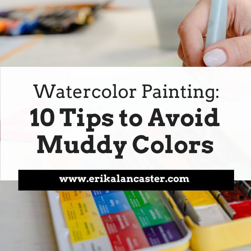
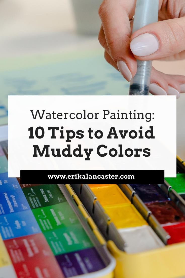
What, exactly does the term muddy color refer to when painting with watercolor? What are the common culprits for muddy colors and which actions should we take in order to avoid them?
Watercolor!
So vibrant, so fresh, so... tricky!
Muddy colors are one of the most common struggles for people starting out with this painting medium and in today's blog post (and YouTube video!), I'm covering what they are exactly, so that you know what to keep an eye out for. I'll also be providing my best tips that'll help you keep your colors fresh and vibrant.
There's no doubt that watercolor is an amazing painting medium that can be a lot more practical to use when compared to mediums like acrylics or oils, which require a larger space to set up, a well-ventilated area, much more clean up and, most often than not, a larger investment in supplies.
This said, it doesn't take much time using watercolors to realize that they are truly a challenge.
Not only are there so many variables involved when it comes to painting with watercolor that affect both the painting experience, as well as the final outcome (such as the humidity and temperature of the room we're in, the quality of our paint, each specific pigment's characteristics, the type of paper that we're using, etc.), but there's also no way to simply cover up our mistakes or swipe them off like we can when we're painting with opaque mediums.
Learn more about different types of paint, paintbrushes and watercolor paper and what you truly need as a beginner just getting started in my blog post titled Watercolor Supplies for Beginners and Things You Must Know.
Not to mention, we're working on a substrate that's inherently fragile. Even when we're working with paper that's intended for water-soluble mediums, it can only take so much scrubbing, lifting and layering. It's paper!
It's essential to stay patient, work mindfully, practice our water control and allow the paper to dry/regain its strength whenever needed throughout the process.
As loose, expressive and even quick, more experienced artists make painting with watercolor seem, as I'll be talking about in the video, creating a successful piece requires not only mastering water control, but also knowledge of color, and going in with some sort of strategy.
We need to visualize the overall effects we're going for so that we know what techniques (wet-on-wet, wet-on-dry, etc.) to use where and also, when.
It's also essential to have some sort of general plan when it comes to the colors we'll be using.
Then we can allow ourselves to let go and embrace the beautiful, organic effects that only watercolors allow.
So... what are muddy colors, exactly?
The term 'muddy color' refers to a color mixture or a section of our painting has turned dull, flat, matte and, overall, lifeless.
Muddy colors lack the vibrancy (and most of the time also the translucency) that watercolor allows and don't look like they belong within the context of the piece, when one takes into consideration the rest of the colors used around that area.
Watercolor allows for a light, interesting, vibrant use of color that's unique to this medium and flat, lifeless colors are often proof that something has gone wrong.
This said, it's important to note that a muddy color is very different from a desaturated or muted-out color.
Desaturated colors are grays, browns or neutralized colors and these are often used intentionally by artists who are looking to tone down highly-saturated colors straight out of the pan or tube to make them look more realistic/natural or simply to make use of a color scheme that suits their style best.
You'll notice that lots of colors (except for browns and neutrals) are very saturated and vibrant right out of the pan or tube, and these kinds of colors don't happen very much in real life when you look at the settings or living things around you.
Other watercolor artists simply like the look of more muted out colors and create they own color mixtures, adding a second or even third color to desaturate them or create the color they need.
This doesn't make these colors mud, as long as the artist knows what he/she is mixing together, has at least somewhat of a plan, is staying in control, is playing to the medium's translucent nature and interesting use of color, and the colors fit within the context of the piece.
Take this still life watercolor of mine below as an example. I've created my own gray and brown color mixtures using Ultramarine Blue and Raw Umber and there's still a vibrancy/life to them.
There's a variety in values, translucencies and even color temperature throughout these areas, and these more desaturated color mixtures harmonize and look like they've been planned. They allow the bright, vivid colors in the apples to shine.
*Learn more about Art Fundamentals and what it takes to plan for successful, harmonious and balanced compositions with my classes over on Patreon.
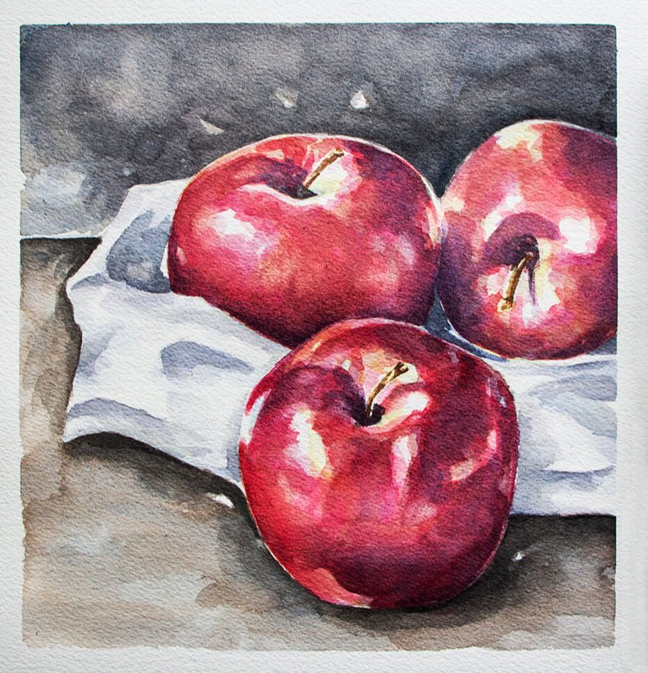
Watercolor Apples Still Life by Erika Lancaster
Desaturated, muted out colors and even grays and browns can, indeed, have a life and vibrancy to them, as long as we plan for them intentionally and make sure not to overwork our paintings.
What's essential, in my opinion, is making use of this medium's translucency and dynamic nature to create light looking paintings with a vibrant use of color so that, whether the colors we're using are pure/highly-saturated or toned-down, our paintings still seem to glow from within.
Matte and opaque are opposite to translucent and vibrant.
And flatness/heaviness is basically where the problem is.
Not darkness, not level of saturation.
When we're just getting started with this medium and are still lacking water control, it's incredibly easy to overwork our paintings.
Add to this the fact that most beginnersdon't invest enough time to learn about the Color Wheel/Color Theory and this is a recipe for lots of frustration and disappointment.
If you enjoyed this video and found it helpful, make sure to subscribe to my YouTube channel. I share a brand new video every week with art tips, drawing and painting tutorials and mindset/productivity tips for artists. *Subscribe HERE*
Why do muddy colors happen?
Usually, they happen because of one (or a combination) of the following:
a) Because we lose control of our different colors on our paint mixing palette or on our paper (colors can intermix in both areas).
b) We don't know much about the Color Wheel/Color Theory and don't pre-select our colors before starting a new piece (testing out color mixtures is very important).
c) We don't clean out our paintbrush bristles well in-between colors and/or we're not changing our water throughout the painting process.
d) We're not staying patient and are getting anxious to finish, going over the same spot again and again, while our paper is still wet, in attempts to fix mistakes but damaging our paper in the process.
Find a list of my favorite watercolor supplies here.
10 Tips to Avoid Muddy Colors When Painting with Watercolor
1. Learn about the Color Wheel and color temperature
The Color Wheel is an invaluable tool that helps us understand color relationships.
Not only does it allow us to create color mixtures effectively while working, but it also enables us to plan color schemes prior to starting with the painting process that work beautifully and help us communicate the message we're looking to communicate.
Experiment with creating your own color mixtures. See what happens first-hand when you combine cool colors, warm colors and a warm plus a cool. Learn about color and work on color mixing exercises outside of a painting process via color studies and explorations.
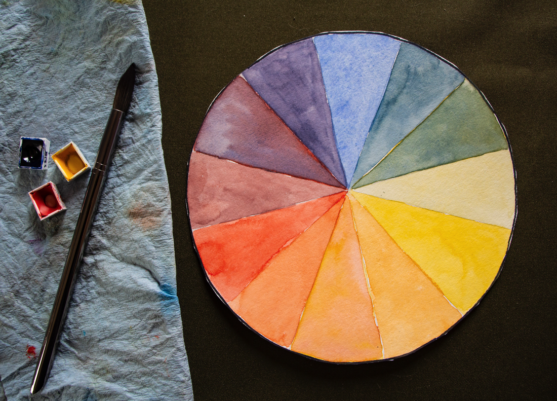
12- Part Color Wheel in Watercolor including Primary, Secondary and Tertiary colors.
2. Pre-select the colors you'll be using for the painting on hand before getting started
Randomly picking colors throughout the painting process is a surefire way of arriving at muddy colors.
Keeping things limited to only a certain amount of necessary colors, especially in the beginning, is a great idea. This not only allows the beginner to keep colors more organized throughout the process, but will mostly likely lead to an outcome that is much more harmonious and cohesive.
In this video, I share my entire process for painting a still life with watercolor using only 4 colors and why I love working with a limited color palette.
Before getting started with a new piece, give thought to how you're going to be creating the different colors you'll be needing, how you're going to be creating shadows and darker values of different colors, etc.
Most often than not, working with a limited amount of colors is going to help you get comfortable with color mixing a lot faster!
3. Change your water throughout the painting process (or use 2 or 3 containers)
As soon as you notice your water becoming murky, change it! You can also consider using 2 or even 3 containers as you're painting.
This way, you're able to use one of them to rinse out your bristles and another to take clean water from as needed throughout the process whenever you need to pre-wet areas of your paper, add more water to paint mixtures, soften out edges, etc.
4. Make sure you're cleaning out your paintbrush bristles thoroughly in-between colors
If you just finished using one color and you're planning on going into a color that's very different from it, make extra sure that your bristles are well rinsed, especially if you're not looking to desaturate your colors.
As a rule of thumb, if I'm not going into an Analogous color (a color that is next to to the one I was just using the Color Wheel), or just finished using a brown/neutral color, or even a color that might be more opaque than the one I want to use next (watercolors can be opaque, semi-opaque, translucent and semi-translucent), I make extra sure that all of the previous color has been washed out.
Unless I actually want to desaturate or mute-out a color.
If you're using grays, browns or neutrals, or Complementary Colors (opposites in the Color Wheel) in your painting, make sure to stay mindful throughout the process, as it's very easy for colors to mix together on your paper (especially if you're using lots of wet-on-wet), in your paint-mixing palette, and even in the bristles of your paintbrush!
5. Be careful when using Complementary Colors
Complementary Colors are opposites in the Color Wheel and, when mixed together, they neutralize or mute each other out. You can use this to your advantage if this is what you want to do, but if your aim is to keep your colors super saturated, then you need to approach these color combos with some sort of strategy.
Ask yourself: Depending on the effects that I'm going for, what area should I paint first, next and last? What techniques should I be using (wet-on-wet, wet-on-dry, etc.)? What areas should I stay extra mindful to allow to dry before adding more color on top or around it? Should I be placing these two colors next to each other at this point in the process?
Remember that watercolor is always going to expand and bleed into paper that is wet. So if you don't want colors to intermix, you must allow them to dry completely.
If it makes sense for the subject on hand and the style you're going for, consider darkening colors with an Analogous Color, if you want colors to remain very vivid. Remember, Analogous Colors are next to each other in the Color Wheel.
6. Avoid using ready-made blacks
Though color ingredients vary from brand to brand, most ready-made blacks such as Lamp Black, Ivory Black, Mars Black, etc., tend to be very flat and usually dull-out colors. This is one of the reasons why so many traditionally trained watercolor artists don't use them and, instead, create their own dark color mixtures that have liveliness and a color temperature to them.
It's also important to have in mind that blacks can really lead to stark, heavy looking marks or shapes that can be very distracting, and that there's actually very little pure black in nature. Even shadows have color and a temperature to them.
There are tons of ways to create your own darks when using watercolor.
I share many different dark color mixtures in this video over at my YouTube channel.
If you do use a ready-made black, consider adding another color into it.
You can also use Neutral Tint, Payne's Gray or Analogous Cours to darken a certain color.
7. Hold yourself back from overworking your paintings
This is a tough one and something I'm working on as I continue on my journey with watercolor. Especially because I started painting with oils and acrylics, which usually require layering and going over the same area many times.
When it comes to working with watercolor, I've realized that the less moving around of paint we do after its been placed and even the less amount of layers we have to develop, the better and the fresher the outcome tends to be.
I've realized that visualizing the outcome we're after and approaching a new watercolor painting process with at least some sort of general plan is essential. This helps us lay down our washes and brush strokes more confidently and leave things be.
Because, if we don't know what we're after or what we're doing, we're going to be hesitating and making lots of mistakes that we'll want to go in and fix.
Mistakes and accidents always happen, but they're usually a lot smaller and can be made less noticeable more easily if we go in with a strategy and are staying mindful/patient.
If you feel you need to practice a specific technique or do isolated studies of something before getting started with a more complete piece, do it! It'll help you attack a new painting a lot more confidently and with much more success.
If you make a mistake, don't fret. Simply absorb excess water and paint with your absorbent towel or semi-dry paintbrush bristles and allow it to dry. Come back after the paper has regained its strength to see how you can make it less noticeable.
*A small amount of moving around of our paint is okay, but avoid going over the same spot again, and again, and again!*
8. Allow your layers of paint to dry completely before applying another wash on top
Like I said before, watercolor is always going to expand into paper that is wet. If the paper is very wet, the paint you place on top is going to expand more rapidly. If the paper is starting to dry, it'll expand more slowly.
But it'll always feather out at least a bit depending on the level of moisture.
There are varying degrees of wetness a paper can have when we're working with watercolor and, as we continue practicing, it'll become easier to tell when we should be dropping in our paint in order to achieve a certain level of gradating or blurring out.
If we want our marks or the edges of our shapes to be clean and sharp, or if we don't want the previous colors we've placed to intermix with the ones we want to place on top, it's important to be patient and allow our painting (or at least that specific area) to dry completely.
Always remember that, wet paper is fragile paper and we must allow it to regain its strength before attempting to add further detail or darken certain areas.
9. Avoid using opaque colors
Watercolor paint can be opaque, semi-opaque, transparent and semi-transparent. Each individual color's characteristics vary, even within the same paint set, and this is one of the reasons why swatching out a new paint set is important.
It's important to know that opaque colors tend to create color mixtures that get thicker and thicker, and murkier and murkier, which can lead to mud much more easily than using transparent colors.
This doesn't mean that we can't use them (I use them all the time!), but it does mean that we have to use them carefully or, in many cases, on their own.
Colors such as Cadmium Yellow, Cadmium Red, Cerulean Blue, Raw Umber and Yellow Ochre tend to have opaque qualities to them.
You can never go wrong with testing out the different color mixtures you're planning on using on a scrap piece of watercolor paper before actually using them in your painting.
10. Make sure that you're cleaning out your paint mixing palette thoroughly and keep colors organized throughout the process
This one's related to keeping your water and paintbrushes clean, and I just thought I'd add it in because it can be especially helpful for beginners.
When we're watching videos in which expert watercolor artists are using a huge watercolor palette with a bunch of different colors that seem to be intermixing and they are freely taking their colors as they're painting, it's important to realize that they:
a) Know the Color Wheel like the back of their hand
b) Have mastered water control and know what to do to fix mistakes
and
c) Most likely than not, they've pre-selected and organized the specific colors they know and love using to create their very own color palette
When we're just getting started it can seem like we should be approaching our painting process in that same way, with a large amount of colors and with a palette that *seems to be* out of control.
It can be very frustrating when a beginner sees that, tries to replicate that, continues ending up with paintings that don't seem right, and has no idea what he/she is doing wrong.
My advice?
Learn about Color Theory, keep things practical and limited, and stay as organized as possible in the beginning so that you can continue practicing mindfully and, I promise, you'll get to that point a lot sooner!
*Bonus Tip:
Higher quality watercolor paint is going to lead to better results (better color payoff/more vibrancy/easier mixing of colors/etc.) and generally offers more information about each color such as its level of translucency, granulation, etc. Cheaper watercolors tend to be chalky and opaque, which lead to muddy colors.
Find a list of my favorite watercolor supplies here.
*This post contains affiliate links. I receive small commissions for purchases made through these links at no extra cost to you. These commissions help me keep this site up and running, in order for me to keep providing helpful and inspiring art content. :)
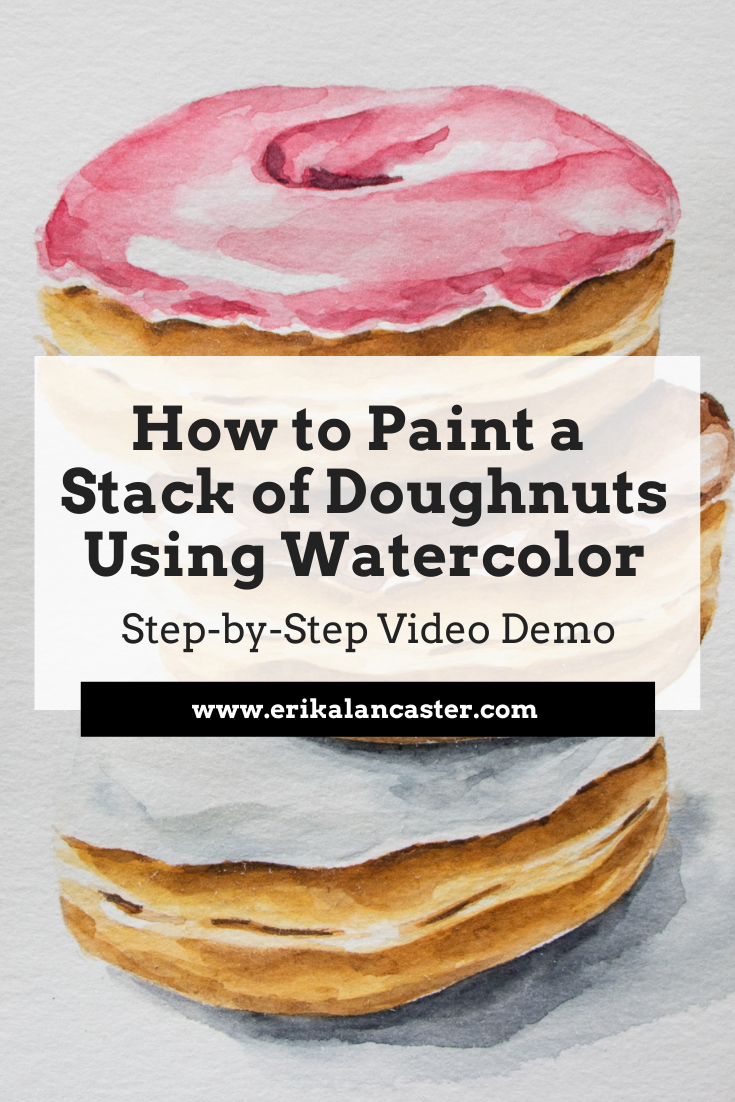
Interested in watercolor food illustration, but don't know where do start? How can higher levels of realism be developed using watercolor? Why is layering so important and how does it work when using this tricky painting medium?
In today's blog post/YouTube video, I'm taking you through my full watercolor painting process for a stack of doughnuts. Throughout the video included in this post, I share everything about my technique, no holds barred, as well as provide tons of tips on water control and much more.
I absolutely love painting food!
Food illustration is one of the first kinds of work I started doing when my journey with watercolor began a few years ago, and this is still my go-to subject when I feel blocked or frustrated creatively.
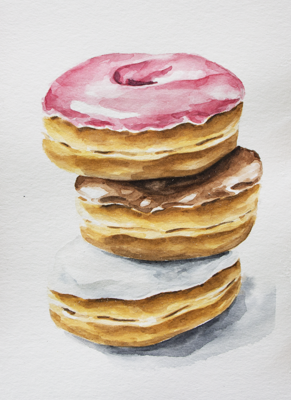
For the painting process I'll be sharing in this post, I used a photo that I took in my own home studio. Here's the photo and the final painting.

|
|
Check out my blog post titled How to Take Your Own Art Reference Photos Quickly and Easily to find essential tips on taking pictures to work from for future pieces. Forming your own art reference photo library is so powerful!
Or, if you're short on time and are looking to find great art reference photos online that you can use without getting into trouble, check out this blog post.
Below the video, I'll be providing the key takeaways for you.
If you enjoyed this video and found it helpful, make sure to subscribe to my YouTube channel. I share a brand new video every week with art tips, drawing and painting tutorials and mindset/productivity tips for artists. *Subscribe HERE*
For a list of my favorite watercolor painting supplies, go here.
For a list of my favorite watercolor painting supplies, go here.
Key Takeaways from Today's Watercolor Tutorial
1. Use a high-quality reference photo
When we're looking to develop higher levels of realism, getting information from references is essential. Whether we're using photographs or something we actually have in front of us that we can reach out and touch, we need information on what things actually look like in real life.
When you're looking for a great art reference photo to work from, there are a few things to have in mind. These include: image resolution, lighting, cropping, etc.
You want to work from a photo that'll make the process easier for you and not harder!
In my blog post titled 6 Tips for Realistic Drawing, I provide the key things to have in mind when looking for a great art reference photo for realism in drawing/painting.
If we work purely from our imagination, chances are we're going to be guessing on important details such as different values (highlights, midtones, darks) found throughout the three-dimensional structure of the subject, shadow placement, and small nuances that can really make or break the realism in our painting.
Training ourselves to observe the things around us is essential, especially as representational artists.
When we're going for realism, it's important to remember that we have to draw or paint the subject the way it actually looks like in real life and not what we think it looks like. These are two very different things.
And unless we've been studying a specific subject for a long time, in all sorts of different perspectives and lighting situations, most likely than not, having a reference is going to be necessary.
2. Pinpoint highlights and keep them protected throughout the painting process
Before getting started with my painting process, I always make time to pinpoint highlights, midtones and darks in my reference photo or the subject I have in front of me.
By doing this, you can map them out in your preliminary outline sketch (lightly!) and keep them protected throughout the painting process.
Remember that, when working with watercolor, the whiteness of your paper is going to stand for your highlights. If we cover them up, we're getting rid of that lightest value and there's no way to go back to the whiteness the paper once had.
Not to mention, when we're going for higher levels of realism, we need to develop a wide range of values starting from highlights, lightest lights, a wide range of midtones, and darkest darks.
With watercolor, we're using the medium's translucency, in combination with the lightness of the paper underneath it, to develop these different values.
If we're afraid of going in with darker/more saturated color and leave our painting very light all throughout, OR if we go in super dark and saturated right away and leave out lighter values, our painting will probably look very flat and/or heavy.
This is great if we're going for a more illustrative style, but not optimal if we want to create a sensation of three-dimensional form or depth in our painting.
3. Use layering
When using watercolor, I like working from lights to darks, as this provides me greater control and helps me stay away from accidents that are hard to correct.
Also, I love using wet-on-wet for my beginning layers in order to create soft gradations and edges, and later move on to wet-on-dry techniques for my darker values and other details. In other words, I tend to use less and less water as the painting process moves forward.
Layering is awesome, but there are a few things to have in mind.
When painting with watercolor, it's important to remember that we're working on paper. Even though this paper is intended for water-soluble mediums, wet paper is fragile paper, and we need to stay mindful of when it's time to take a step back and allow it to regain its strength.
Especially when we're just getting started and haven't gotten our water control down, it's very easy to overwork/damage our paper.
It's okay to move the paint around a bit or even do some lifting with an absorbent towel while it's still wet if you do so gently, but going over the same spot again and again with your paintbrush is usually not the best.
Move the paint around minimally (if needed) and to allow that layer of paint to dry before going back in to darken certain areas or add further detail.
Also, it's important to have some sort of plan for your layers. Visualize and ask yourself how many layers you're going to need to create your painting and what techniques you're going to use for each layer to get the results you're after.
Ask yourself: Am I looking for the paint to blur out and create softer edges? Am I going for sharp, defined edges or marks?
If you want edges to be blurred out, go in while the paper is still wet (the level of wetness will determine how much your paint blurs out). If you want defined edges, make sure you've allowed your painting to dry completely.
Finally, remember to be patient! Achieving higher levels of realism is almost always going to take quite a bit longer than more expressive, loose pieces do.
But it'll totally be worth it!
4. Stay away from stark looking shapes or marks, as well as obvious outlines
In realism there are no outlines.
The way we're able to tell one plane from the next or one element from another element, is because there is a difference in values amongst them, not because there is an outline in between them.
And oftentimes, this difference in values is very subtle!
This can be a difficult thing to grasp when we're just getting started, especially because a lot of us get started with art by copying our favorite cartoon characters (which often have black or dark outlines all throughout) and/or because we get started coloring pages with our crayons that contain images composed of line drawings.
The more you practice drawing and painting, and continue developing your observational skills, the easier it gets to pinpoint subtle differences in values.
In this same vein, we want to stay away from marks that are way too stark looking as they also detract from the realism of the piece. Marks that are too obvious, or heavy/flat shapes are distracting and, if we need to incorporate marks, it's important to have line weight variation in mind, as well as gradations in values around them.
Also, it's important to keep things irregular, imperfect and organic, especially if we're drawing or painting something that isn't machine made. This leads to more natural results.
I like visualizing the different values throughout my subjects as abstract shapes that fit together as a type of puzzle.
5. Add your shadow to place your subject in space
Shadows are so, incredibly important in realism! They establish the subject in space and situate it on the surface it's on. Without it/them, it'll look as if the subject is floating.
This is okay, in situations in which we're looking to create a completely background-free illustration, such as the type of work that we'll be editing digitally to place on products or to send to a client for some sort of editorial purpose. Like the ones I'm working on in my blog post/YouTube video titled How to Remove Backgrounds from Scanned Art (Photoshop for Beginners).
I love creating my largest area of cast shadow using wet-on-wet and then placing my area of occlusion shadow (darker area closest to the subject), on top of the first layer of lighter paint while it's still wet. This way the second, darker color dissipates and gradates into the lighter color.
Usually, there are different values even throughout areas of shadow. Sometimes there's a sharp edge between them, and other times they gradate softly into each other. It depends on the light situation present.
And remember, shadows should always be consistent throughout a piece. Otherwise, something is going to look off at the end and this will detract from the realism in the drawing or painting.
Before getting started with a new piece, locate the light source. Where is the light hitting the subject from? Is it in the top left? Top right? Right in front of the subject? Somewhere below it?
Wherever it is, keep in in mind throughout the painting process and make sure all the shadows you add in make sense.
*BONUS TIP: Careful when painting white subjects with watercolor!
Painting white objects or animals can be tricky with this medium.
We need to leave enough paper shining through to make the object (or part of the object) appear white, yet add enough color/values to give it a three-dimensional look.
If we don't develop enough values in these areas, the object will likely appear flat and will not be consistent with the other elements in your painting that you have developed a three-dimensional look in.
It's similar to how we never want to leave the whites of the eyes (the Sclera), or the teeth completely white when painting a portrait. White or off-white objects are never completely white in realism.
There are shadows falling over them that have to do with their structure and the elements around them, as well as colors in the environment they are in that affect the way we see them.
The material the subject is made of (bone, glass, ceramic, silk, etc.) also has a huge effect on its reflective qualities and how sharp those highlights are, as well as if we're able to see reflected colors on its surface.
On the other hand, if we go overboard with adding way too much paint and aren't careful to leave enough white paper unpainted, it won't look white anymore!
It's a very subtle balance, for sure.
I would recommend taking a step back from your work every few minutes, observing your piece from further back and comparing it to your reference. Ask yourself if more paint or detail is really necessary to create that illusion of three-dimensional form.
If it's not really necessary, leave it as is.
For a list of my favorite watercolor painting supplies, go here.


What does it really take to develop one's own artistic style and voice? How do professional artists get to a point at which their artwork is unique and seems to be an extension of themselves? Is there anything that artists just getting started can do to get there sooner?
In today's blog post/YouTube video I'll be sharing a fundamental aspect behind finding one's own artistic style and voice that's rarely, if ever, discussed. I'll also be sharing some key tips that have helped me make a ton of progress with this in my own journey.
So, let's just cut to the chase.
The fact is that becoming an artist that creates unique, quality artwork is just as much about doing the internal work as it is about continuing to develop our cold drawing/painting skills.
Why?
Because it's through the introspection, self-analysis and even self-discovery that takes place as you continue honing your art skills that you'll be able to start peeling back the layers and learn who you are as a human being, as well as how this relates to your very own creative process.
You must find out who you are, the message you want to share with the world and how you want to share it.
Without comparing yourself to anybody else.
If we don't practice listening to ourselves throughout the creative process and we constantly depend on external inspiration in the form of other artists' work to get started, we risk never finding out enough.
We risk not connecting the necessary dots so that we're able to create something from scratch that's truly ours.
Think about it.
If there's one thing that all kinds of artists who manage to constantly create unique, meaningful work have in common...one thing that makes a person stand out from the crowd, it's the fact that they know who they are.
They know what's important to them and are unapologetically themselves.
Don't get me wrong.
Developing our cold artistic skills and knowledge on Art Fundamentals is essential when we're just getting started.
In my blog post titled 5 Tips for the (Serious) Self-Taught Artist, I get into the importance of learning about Art Fundamentals, as well as why its vital for serious artists to adopt a learning mentality and to embrace exploration.
It's through knowledge about Art Fundamentals that you'll be able to make use of Elements and Principles of Art effectively, in a way that's visually impactful, harmonious, balanced and that transmits your message.
This knowledge also provides you the confidence you need to trust in yourself artistically, which is so important.
And yes, we're always going to be inspired and influenced by other people's work (visual artists and otherwise) that has impacted us directly or indirectly throughout our lives.
Our art is an extension of ourselves after all.
But there are effective ways to do it and others which aren't so helpful if we're already at a certain skill level.
In this blog post, I explain how to get inspired by other artists' work in a way that isn't copying and that will actually get you closer to discovering your own art style.
Even though there's nothing "new" under the sun, no one else in the world has that exact combination of influences and experiences you have.
And you better believe that you have the ability to create an original mishmash of all those things.
Here are the objective/tangible aspects that we often consider when looking at our own or someone else's artwork:
What makes an art style?
But, what about the more subjective aspects? What about those things that cannot be readily described, but felt and understood at a deeper level?
What about the artwork's overall mood, message or story?
Artists who've developed a unique style and voice, find their own way of making use of their medium(s) and the aforementioned objective/tangible aspects in order to transmit a particular feeling or message that connects to who they are.
And while this message doesn't have to be anything complex or grandiose, it does have to come from you.
If you enjoyed this video and found it helpful, make sure to subscribe to my YouTube channel. I share a brand new video every week with art tips, drawing and painting tutorials and mindset/productivity tips for artists. *Subscribe HERE*
Creating quality original artwork comes down to two things:
a) Having an original vision and a message that's meaningful to you
b) Having the skills and tools necessary to see it come to life
As you continue honing your skills and mastering your medium, start reflecting on your creative process, what you're enjoying and not enjoying, the commonalities that you're finding in the pieces you've created, your personal strengths and weaknesses, what strengths you'd like to enhance and what weaknesses you want to work on, etc.
Also ask yourself what's most important to you, what life/world issues deeply affect you, what change you'd like to see in the world, what life lessons have marked you or made you different from others, etc.
Remember that, even though a lot of us are total introverts and work in isolation, we create art to ultimately share it with others.
We create art to communicate important issues, bring light and/or build bridges.
What is it that you want to communicate with yours?
Then, work intentionally, based on your findings and the goals you set for yourself.
Here are a few specific tips that'll help.
Tips to Find Your Own Art Style and Voice
1. Prioritize and stay consistent
Consistency is number one whenever we're trying to achieve anything big in our lives. Even if you're only taking baby steps, if you continue, a year from now you'll be absolutely amazed with the progress you've made.
It's important to embrace the fact that art is a large part of who you are, and to truly commit to improving your work and finding yourself artistically.
Make it a priority and don't be afraid to set those goals!
In this blog post, I share my method for setting goals and breaking them down into tasks you can do monthly, weekly and daily, so that you can make sure that you're moving forward consistently.
Move past those limiting beliefs because quite often, we're holding our own selves back from making significant progress.
2. Inspiration can come from anywhere
When we're looking to get inspired to start a new piece or project, a lot of us immediately turn to other visual artists' work for inspiration.
However, as an artist, you have stronger sensibilities than non-artists. If you want to, you can get inspired with practically anything.
By breaking away from Instagram and Pinterest, and practicing with finding beauty or interest in day-to-day objects, thoughts, feelings or circumstances, you'll be opening the floodgates to new, original ideas.
Also, it's important to realize that we're not always going to be inspired.
If we're serious about reaching artistic success, we need to find motivation in achieving our long-term goals (they're different for all of us and you need to find what these are for you).
Oftentimes, inspiration will come to you as your working or will come to you as you continue busting through those milestones!
3. Create an inspiration board
Create a collection of things that inspire and appeal to you.
Yes, other artists' work can be part of this collection but, add bits and pieces of all kinds of things/subject-matter including colors, textures, words, music bands, random elements and whatever comes to mind.
What's absolutely amazing, is looking back at these collections you've created and discovering patterns or threads in the items you've picked (often subconsciously).
It allows you to discover specific things that appeal to you in a visual and tangible form.
Analyze the collections you come up with and internalize the threads you find. Ask yourself questions like: How do these visual patterns connect with who I am and my personal tastes? Can I find a message here?
I love doing these digitally, as the Internet makes it very easy to find all sorts of images and we can even create collections via Pinterest boards or in any sort of photo-editing software.
4. Put yourself through periods of "incubation"
As visual people, it can be very hard not to get influenced by art and design that we have right in front of us.
And this can be very hard because with the Internet and social media, we're constantly bombarded with all kinds of visual stimuli.
The fact of the matter is, that the influences that have already impacted you and make you who you are, are already inside of you.
You don't need to take anything new in, in order to create.
*This doesn't include using reference photos or subjects you have in front of you in real life, if this is the way you work. But try creating your own references based on your original ideas/concepts.
I put myself through periods of what I like to call incubation, in which I limit the new influences I'm taking in and make time to sift through what's already inside of me.
It's important to turn off unnecessary external influences from time to time, trust that we have what we need already within us and listen.
This tip goes hand-in-hand with another suggestion I've provided in other YouTube videos and blog posts:
"Limit consumption and increase creation."
Do your best to create your own concepts and see those visions through from start to finish. Take your own art reference photos, draw that preliminary sketch from the imagination, whatever it may be for you.
And there's no need to be a master at your medium to allow yourself to do this!
And the more you put yourself through this process independently, the easier it will get.
5. Get writing!
I cannot even begin to describe how much writing has helped me, not only in getting to know myself, but also in becoming a happier and more productive artist.
Writing things down or doing what I like to refer to as "brain-dumps", is so helpful in getting rid of unnecessary mind-clutter that's making you slower or may even be blocking you.
I talk about it in my blog post: 5 Essential Self-Care Tips for Artists and Creatives.
It doesn't matter if you don't consider yourself a good enough writer, because it's not about getting perfect grammar and spelling. What matters is getting out what's in your mind and heart at the present moment.
Similarly to tip #3, you're going to start seeing threads in your journal entries in terms of personal thoughts and even expression styles which continue popping up. These can give you clues on ideas that are important to you and that perhaps you can integrate into your artistic message in some way, shape or form.
For me, my writing takes form of morning pages, but getting out that journal and doing free-form, unstructured writing is something you can do whenever you have time during the day.
That's it for today's blog post!
I really wanted to share these ideas with you today because I know how frustrating it can be as a beginner artist who wants to desperately move past the awkward phase and get to creating original and meaningful artwork, to come across advice such as:
"Keep doing the work and it will come to you eventually."
or
"Don't try to rush it or pressure yourself, just keep on creating and it will come naturally, at the right time."
While these suggestions are all well and good, they are too vague and often leave beginners spinning their wheels, continuing to do exactly what they were doing before and making the self-discovery process a lot longer than it needs to be.
So, after you reach a certain skill level with your medium, you need to start trusting that you have everything you need to create original work from scratch already within you.


www.erikalancaster.com
is a participant in the Amazon Services LLC Associates Program, an affiliate advertising program designed to provide a means for sites
to earn advertising fees by advertising and linking to amazon.com.
www.erikalancaster.com
is a participant in the Shareasale.com Affiliate Program, an affiliate advertising program designed to provide a means for sites to earn advertising fees by advertising and linking to Shareasale.com partner companies.
 RSS Feed
