Erika Lancaster- Artist + Online Art Teacher
  • HOME
  • BLOG + FREEBIES
  • MEMBERSHIP
  • CLASSES
  • GALLERY
  • MY ART TOOLS

Realistic Watercolor Food Painting Tutorial

6/9/2020

0 Comments

 
Watercolor How to Paint Doughnuts Realistically
Follow

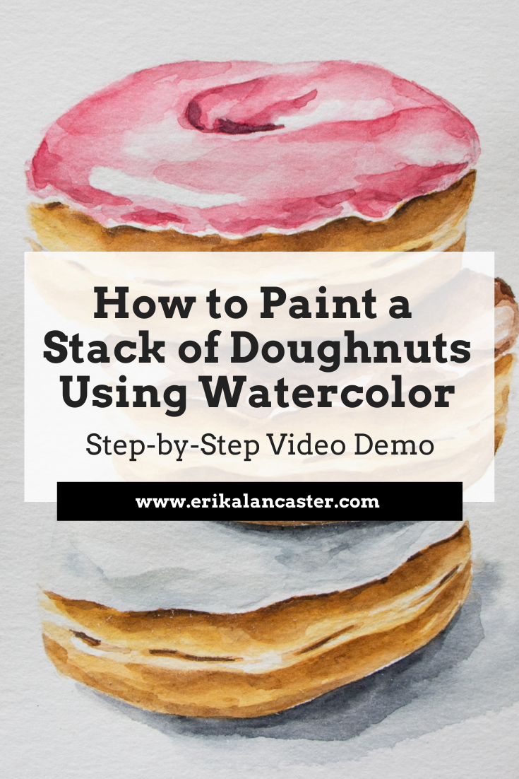
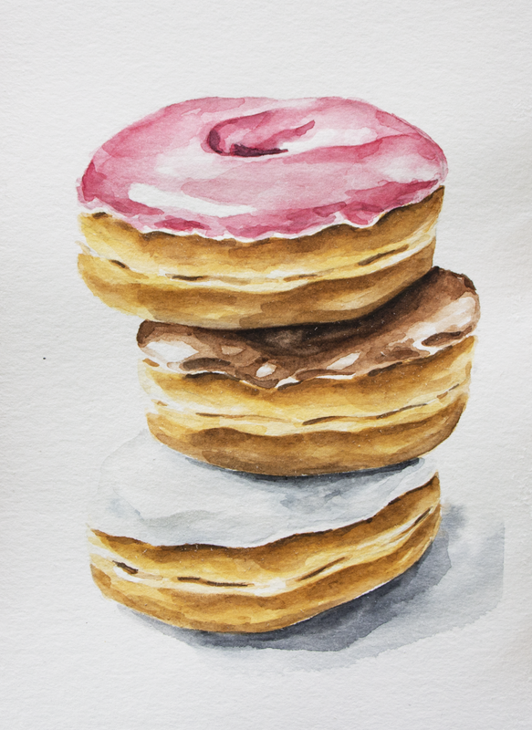
*This post contains affiliate links. I receive small commissions for purchases made through these links at no extra cost to you. These commissions help me keep this site up and running, in order for me to keep providing helpful and inspiring art content. :)


Interested in watercolor food illustration, but don't know where do start? How can higher levels of realism be developed using watercolor? Why is layering so important and how does it work when using this tricky painting medium?


In today's blog post/YouTube video, I'm taking you through my full watercolor painting process for a stack of doughnuts. Throughout the video included in this post, I share everything about my technique, no holds barred, as well as provide tons of tips on water control and much more.

I absolutely love painting food!

Food illustration is one of the first kinds of work I started doing when my journey with watercolor began a few years ago, and this is still my go-to 
subject when I feel blocked or frustrated creatively. 

For the painting process I'll be sharing in this post, I used a photo that I took in my own home studio. Here's the photo and the final painting.
​
Picture
Picture

​*To get immediate access to a vault of my original art reference photos that gets added to every month and that you can use with no attribution, join us on Patreon!


​
Check out my blog post titled How to Take Your Own Art Reference Photos Quickly and Easily to find essential tips on taking pictures to work from for future pieces. Forming your own art reference photo library is so powerful!

Or, if you're short on time and are looking to find great art reference photos online that you can use without getting into trouble, check out this blog post. 

Below the video, I'll be providing the key takeaways for you. 


​
If you enjoyed this video and found it helpful, make sure to subscribe to my YouTube channel. I share a brand new video every week with art tips, drawing and painting tutorials and mindset/productivity tips for artists. *Subscribe HERE*
​


​

Key Takeaways from Today's Watercolor Tutorial

​
​

1. Use a high-quality reference photo
​

When we're looking to develop higher levels of realism, getting information from references is essential. Whether we're using photographs or something we actually have in front of us that we can reach out and touch, we need information on what things actually look like in real life. 

When you're looking for a great art reference photo to work from, there are a few things to have in mind. These include: image resolution, lighting, cropping, etc.

You want to work from a photo that'll make the process easier for you and not harder! 


In my blog post titled 6 Tips for Realistic Drawing, I provide the key things to have in mind when looking for a great art reference photo for realism in drawing/painting. 

If we work purely from our imagination, chances are we're going to be guessing on important details such as different values (highlights, midtones, darks) found throughout the three-dimensional structure of the subject, shadow placement, and small nuances that can really make or break the realism in our painting.

Training ourselves to observe the things around us is essential, especially as representational artists. 

When we're going for realism, it's important to remember that we have to draw or paint the subject the way it actually looks like in real life and not what we think it looks like. These are two very different things.

And unless we've been studying a specific subject for a long time, in all sorts of different perspectives and lighting situations, most likely than not, having a reference is going to be necessary. 


​


2.  Pinpoint highlights and keep them protected throughout the painting process
​

Before getting started with my painting process, I always make time to pinpoint highlights, midtones and darks in my reference photo or the subject I have in front of me.  

By doing this, you can map them out in your preliminary outline sketch (lightly!) and keep them protected throughout the painting process. 

Remember that, when working with watercolor, the whiteness of your paper is going to stand for your highlights. If we cover them up, we're getting rid of that lightest value and there's no way to go back to the whiteness the paper once had. 

Not to mention, when we're going for higher levels of realism, we need to develop a wide range of values starting from highlights, lightest lights, a wide range of midtones, and darkest darks. 

With watercolor, we're using the medium's translucency, in combination with the lightness of the paper underneath it, to develop these different values.

If we're afraid of going in with darker/more saturated color and leave our painting very light all throughout, OR if we go in super dark and saturated right away and leave out lighter values, our painting will probably look very flat and/or heavy.


This is cool, if we're going for a more illustrative style, but not optimal if we want to create a sensation of three-dimensional form or depth in our painting. ​


​
Step-by-Step watercolor and drawing tutorials for beginners


​

Check out my FREE Patreon-exclusive tutorial and class samples here!


​

3. Use layering
​

When using watercolor, I like working from lights to darks, as this provides me greater control and helps me stay away from accidents that are hard to correct.

Also, I love using wet-on-wet for my beginning layers in order to create soft gradations and edges, and later move on to wet-on-dry techniques for my darker values and other details. In other words, I tend to use less and less water as the painting process moves forward. 


Layering is awesome, but there are a few things to have in mind.

When painting with watercolor, it's important to remember that we're working on paper. Even though this paper is intended for water-soluble mediums, wet paper is fragile paper, and we need to stay mindful of when it's time to take a step back and allow it to regain its strength. 

Especially when we're just getting started and haven't gotten our water control down, it's very easy to overwork/damage our paper.

It's okay to move the paint around a bit or even do some lifting with an absorbent towel while it's still wet if you do so gently, but going over the same spot again and again with your paintbrush is usually not the best.

Move the paint around minimally (if needed) and to allow that layer of paint to dry before going back in to darken certain areas or add further detail. 


Also, it's important to have some sort of plan for your layers. Visualize and ask yourself how many layers you're going to need to create your painting and what techniques you're going to use for each layer to get the results you're after.

Ask yourself: Am I looking for the paint to blur out and create softer edges? Am I going for sharp, defined edges or marks?

​If you want edges to be blurred out, go in while the paper is still wet (the level of wetness will determine how much your paint blurs out). If you want defined edges, make sure you've allowed your painting to dry completely. 

Finally, remember to be patient! Achieving higher levels of realism is almost always going to take quite a bit longer than more expressive, loose pieces do.

But it'll totally be worth it!


​

4. Stay away from stark looking shapes or marks, as well as obvious outlines
​

Not sure if you've heard this before but, in realism there are no outlines.

The way we're able to tell one plane from the next or one element from another element, is because there is a difference in values amongst them, not because there is an outline in between them.


And oftentimes, this difference in values is very subtle!

This can be a difficult thing to grasp when we're just getting started, especially because a lot of us get started with art by copying our favorite cartoon characters (which often have black or dark outlines all throughout) and/or because we get started coloring pages with our crayons that contain images composed of line drawings.

The more you practice drawing and painting, and continue developing your observational skills, the easier it gets to pinpoint subtle differences in values.

In this same vein, we want to stay away from marks that are way too stark looking as they also detract from the realism of the piece. Marks that are too obvious, or heavy/flat shapes are distracting and, if we need to incorporate marks, it's important to have line weight variation in mind, as well as gradations in values around them. 

Also, it's important to keep things irregular, imperfect and organic, especially if we're drawing or painting something that isn't machine made. This leads to more natural results. 

I like visualizing the different values throughout my subjects as abstract shapes that fit together as a type of puzzle. 

​

​

5. Add your shadow to place your subject in space
​

Shadows are so, incredibly important in realism! They establish the subject in space and situate it on the surface it's on. Without it/them, it'll look as if the subject is floating.

This is okay, in situations in which we're looking to create a completely background-free illustration, such as the type of work that we'll be editing digitally to place on products or to send to a client for some sort of editorial purpose. Like the ones I'm working on in my blog post/YouTube video titled How to Remove Backgrounds from Scanned Art (Photoshop for Beginners). 

I love creating my largest area of cast shadow using wet-on-wet and then placing my area of occlusion shadow (darker area closest to the subject), on top of the first layer of lighter paint while it's still wet. This way the second, darker color dissipates and gradates into the lighter color. 

Usually, there are different values even throughout areas of shadow. Sometimes there's a sharp edge between them, and other times they gradate softly into each other. It depends on the light situation present. 

And remember, shadows should always be consistent throughout a piece. Otherwise, something is going to look off at the end and this will detract from the realism in the drawing or painting. 

Before getting started with a new piece, locate the light source. Where is the light hitting the subject from? Is it in the top left? Top right? Right in front of the subject? Somewhere below it?


Wherever it is, keep in in mind throughout the painting process and make sure all the shadows you add in make sense. 


​

*BONUS TIP: Careful when painting white subjects with watercolor!
​

Painting white objects or animals can be tricky with this medium! We need to leave enough paper shining through to make the object (or part of the object) appear white, yet add enough color/values to give it a three-dimensional look. 

If we don't develop enough values in these areas, the object will likely appear flat and will not be consistent with the other elements in your painting that you have developed a three-dimensional look in. 

It's similar to how we never want to leave the whites of the eyes (the Sclera), or the teeth completely white when painting a portrait. White or off-white objects are never completely white in realism.

There are shadows falling over them that have to do with their structure and the elements around them, as well as colors in the environment they are in that affect the way we see them.

The material the subject is made of (bone, glass, ceramic, silk, etc.) also has a huge effect on its reflective qualities and how sharp those highlights are, as well as if we're able to see reflected colors on its surface.

On the other hand, if we go overboard with adding way too much paint and aren't careful to leave enough white paper unpainted, it won't look white anymore!

It's a very subtle balance, for sure. 

I would recommend taking a step back from your work every few minutes, observing your piece from further back and comparing it to your reference. Ask yourself if more paint or detail is really necessary to create that illusion of three-dimensional form. 

If it's not really necessary, leave it as is!


​
​

Watercolor supplies used in video:
​

Picture
Picture
Royal & Langnickel Zen Watercolor Brushes $2.99 - $5.99


​


​

10 Things I Wish I Knew About Watercolor as a Beginner
Watercolor Wet on Wet Technique for Beginners Blooms Splatters and Runs
Watercolor Still Life Choosing Colors for a New Painting
0 Comments


Leave a Reply.

    Picture
    ​
    Learn Drawing and Watercolor Step by Step Tutorials

    ​
    Best Art Blog Helpful Resources for Artists

    ​

    Picture

    ​
    Become a Patron!

    ​

    www.dickblick.com

    ​

    ​
    www.erikalancaster.com
    is a participant in the Amazon Services LLC Associates Program, an affiliate advertising program designed to provide a means for sites
    ​to earn advertising fees by advertising and linking to amazon.com.


    www.erikalancaster.com
    is a participant in the 
    Shareasale.com Affiliate Program, an affiliate advertising program designed to provide a means for sites to earn advertising fees by advertising and linking to Shareasale.com partner companies.
    ​

    RSS Feed

Picture
Picture
       
​  
Website Disclaimer              Privacy Policy              ​Terms and Conditions
©  2022  Erika Lancaster.  All rights reserved.
  • HOME
  • BLOG + FREEBIES
  • MEMBERSHIP
  • CLASSES
  • GALLERY
  • MY ART TOOLS