*This post contains affiliate links. I receive small commissions for purchases made through these links at no extra cost to you. These commissions help me keep this site up and running, in order for me to keep providing helpful and inspiring art content. :)
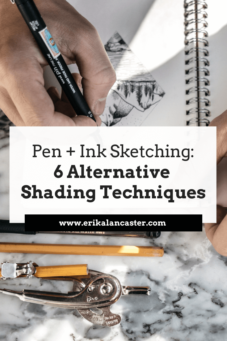
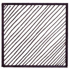
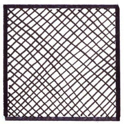
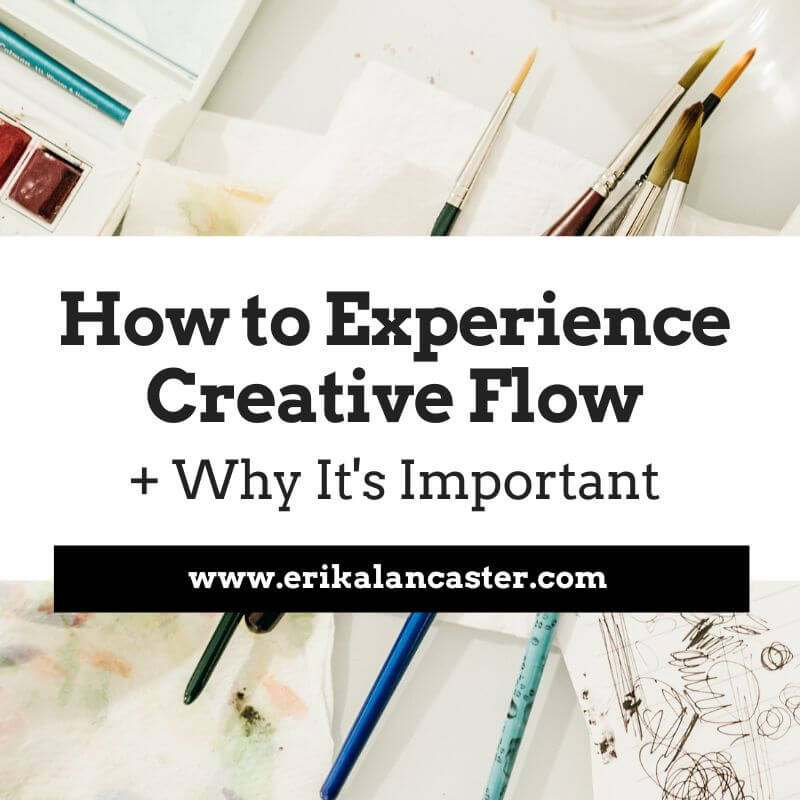
Are you confident with your skill level creating outline sketches and feel ready to start giving them a sense of three-dimensionality and form? Do you find all of the information out there about different shading techniques a bit overwhelming and, perhaps, are unsure about which one(s) you should be using in your work? Is it even necessary to know about all of them? I find sketching with pen and ink incredibly refreshing in between larger projects. A couple of the things I love about this artistic medium are that it challenges me to think about the intention behind each line or mark I create, and that I have to work around mistakes in order to complete each piece. You see, as opposed to sketching or drawing with pencil, ink cannot be erased! In today's blog post, I'm going to share my favorite six of ways of shading and adding three-dimensionality to pen and ink sketches. I'll explain how to go about using each technique, as well as some points I consider positives and negatives about each. This way, you'll have more of an idea of when you could be using them in your own work and you'll avoid creating effects that you weren't intending to create. It's important to understand that, when using these techniques, we are creating marks and lines. By repeating marks and lines we not only create value, but also a certain visual texture. If we're not mindful about how we draw these marks, we can create effects in a piece that are too distracting and that don't really help describe our subject effectively. In this post we're focusing a bit more on value because this is what is going to help us give our sketches a sense of believable form. Though the techniques I will describe below are different, these two principles apply to all of them: a) The more marks created= The more ink is covering the surface (paper)= The darker the value b) The less marks created= The less ink is covering the surface (paper)= The lighter the value I highly recommend checking out this past blog post of mine: Guide to Shading Techniques: Hatching, Crosshatching, Scribbling and Others In it, I go over why being able to discern between lights, mid-tones and darks in a reference image is essential and also provide specific examples of hatching, crosshatching and scribbling in old masters' work. This post also includes a few free downloadable pdfs with useful exercises for you to practice with! It's important for you to know that it's ultimately going to be up to you to explore these mark-making techniques and decide which ones you prefer. How you use them (and combine them) is going to depend on your own preferences, as well as the style you're going for.
If you enjoyed this video and found it helpful, make sure to subscribe to my YouTube channel. I share a brand new video every week with art tips, drawing and painting tutorials and mindset/productivity tips for artists. *Subscribe HERE*
Exploring Mark-Making and Shading Techniques
|
||||||||||||||||||

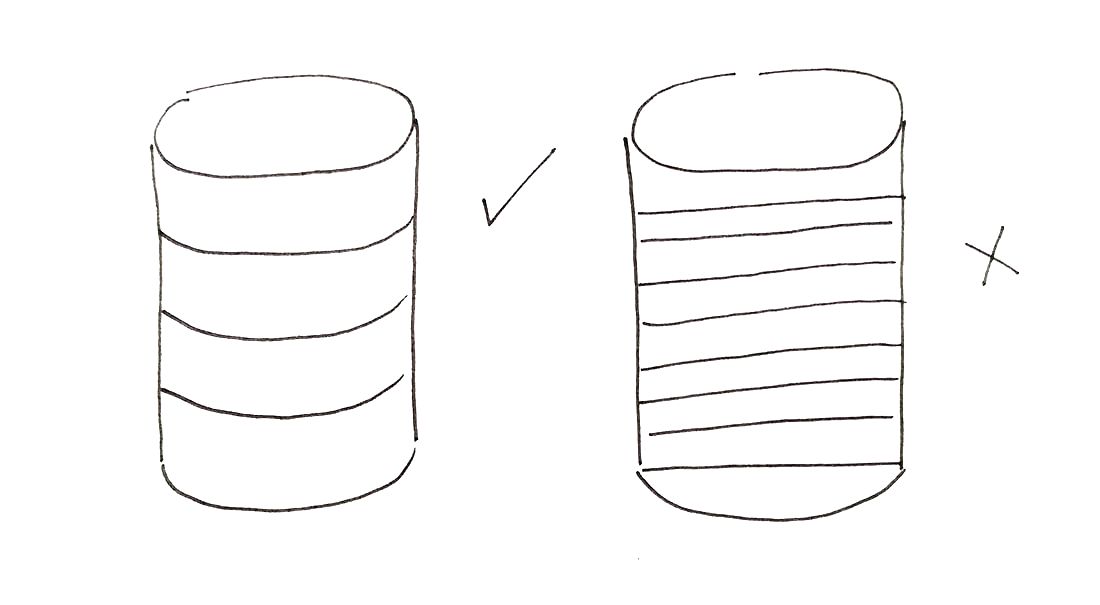
Cylinder sketch showing contour lines
|
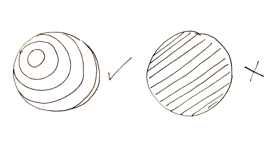
Sphere sketch showing contour lines
|
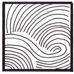
To create contour lines, it's essential to think about the subject's form and volume before laying down any lines. Contour lines accentuate the curves in subjects that are rounded or more organically shaped.
Notice how, in the sketches above, the versions with curved lines help translate a cylinder and a sphere's form much better than the ones with the straight lines.
As opposed to hatching and cross-hatching lines, we're not replicating the same line over and over again, but seamlessly transforming our curved lines to better emphasize the rounded and convex/concave areas of our subjects.
Contour lines transform throughout a drawing following the natural curves of our subject, and the perspective/angle we're viewing the object at will affect what these lines look like.
Positives:
-With some practice and efficient visualization, it's a very fast way of giving a sketch of organically shaped subjects (think of the human figure or a piece of fruit) a sense of realistic form.
Negatives:
-It requires a certain amount of visualization.
-If you stop paying attention to what you're doing for even a short amount of time, your drawing is not going to be very successful.
4. Weaving
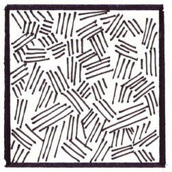
To create a weaving pattern, draw shorter sets of intersecting/interlocking lines. These sets of lines can have a specific organized pattern to them, or they can be placed in a more random manner.
Simply start by laying down your first set of lines anywhere you'd like, and then start adding more sets around that line in a varied enough angle that they look like they're intersecting with each other.
Positives:
-This mark-making technique creates a very appealing visual texture which is very easy to achieve.
Negatives:
-It requires a certain amount of concentration just to create a "weaving" effect, which may take away from our focus when trying to achieve adequate value placement.
-The high level of texture created may be too distracting when drawing certain subjects.
5. Stippling
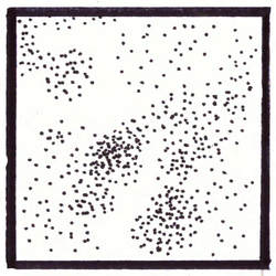
Positives:
-This technique can create amazingly realistic drawings of pretty much any kind of subject.
-We have a lot of control because the marks are so small and the technique it itself forces us to take our time with it.
Negatives:
-It can be EXTREMELY time consuming and tiring.
-Creating so many dots may lead to damaging the tip of our drawing pen.
6. Scribbling
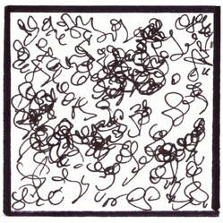
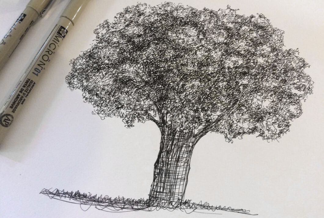
To do effective scribbling, relax your hand and allow it to move naturally and organically. Don't focus on creating any specific kinds of shapes or lines, but more on loops and variety.
Practice changing the pressure you're exerting on your paper as you want to deepen values and let your hand go.
Positives:
-Once you're comfortable with this technique, it is a very easy way of achieving a visual effect of small, overlapping natural elements, that require more irregularity in them (think of leaves, plants and curly hair).
Negatives:
-It can be easy to go overboard since we are letting our hand have a mind of its own. I recommend taking breaks and stepping back every now and then.
*Find free downloadable PDFs to practice your mark-making and value transitions at the end of this post!
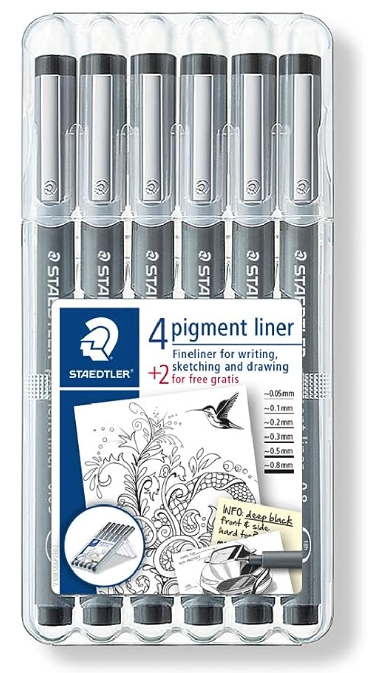
Staedtler Pigment Liners Assorted Sizes
Strathmore Bristol Paper Vellum Surface
|
Pigma Micron Pens Assorted Sizes
|
LePen Pens Assorted Sizes
|
Shading Simple Geometric Shapes
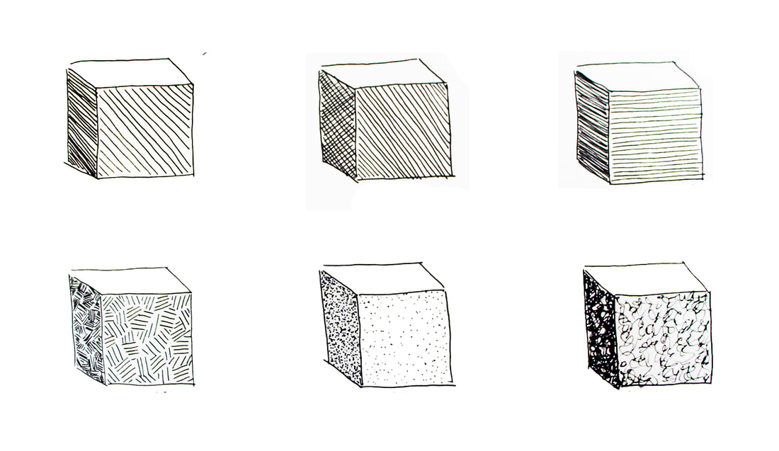
The absolute best way to get started with actual shading is to begin with simple geometric shapes that are formed by flat planes (cubes, rectangular prisms, triangular prisms).
It's important to decide where your light source is going to be located before you begin so that you can then decide where your lightest, medium and darkest planes are going to be.
Take a moment to observe the cubes above. Can you tell which side is the lightest, which is the darkest and which is the in-between value? Judging by the placement of these values, where would you say the light source is located?
Need help drawing three-dimensional geometric shapes? No problem! Go to my blog post titled Perspective for Beginners: How to Use 1 and 2 Point Perspectives to find free downloadable pdfs with step-by-step instructions.
If you'd like to practice specifically shading cubes and don't feel like drawing them, download the free pdf at the end of this post!
Once you're successful with shading flat-sided geometric shapes, move on to geometric shapes that contain curves in them (spheres, cylinders, cones, etc.).
Only after you have practiced these enough, should you move on to more complex subjects.
Stay tuned for the next post, because we'll be discussing how to use each of these techniques to describe the form of a piece of fruit!
*Free downloadables!
| value_transitions_shading.pdf |
| drawing_marks_lines.pdf |
| shading_3d_shapes.pdf |
I like this because it gives me insight as a newbie and makes me want to go buy the products! I also am sharing with my talented niece and daughter. My friends in Oregon too.
Hi Lynn,
I'm so happy to hear that you enjoyed this post and that it inspired you to do some sketching! Thank you so much for taking time to comment and for sharing with you family/friends! It means the world to me. :)
What a beautiful, thorough post! So helpful
Hi Patricia,
I'm happy to hear you found this post useful! Will be writing more blog posts and creating more YouTube videos about sketching with pen and ink!
Thanks so much for taking time to comment! :)
I really like this post, this is very helpful to me
Hi, Maddie!
Thanks so much for reading and taking time to leave a comment. :)
Glad to hear it was helpful.
It's interesting to learn that sketching with a pen can be refreshing in between projects. My wife is wanting to improve her art skills and she was wondering how she could sketch her drawings better. I'll be sure to tell her to sketch with a pen in between projects to feel refreshed.
Hi, Carl!
Thanks so much for checking out this post. :)
Pen and ink sketching can be incredibly fun and rewarding. It definitely challenges us in different ways than using regular graphite pencils.
There's also so much room for exploration with alternative shading and mark-making techniques, which can bring a lot of our personality and unique(ness) to the piece.
I've grown a lot from this medium and hope your wife enjoys it, too.
Have a great day and thanks for reading!
thanx so much for sharing..hope i will see videos with Acrylic inks combined with pen maybe ? i love to see combined media its interesting..
Hi, Gili!
Thanks so much for reading and leaving a comment. :)
I haven't used acrylic inks, but I do use ink in combination with watercolor.
I'll definitely consider creating mixed-media blog posts and videos! Thanks for your suggestion.
Take care,
Erika
thanx for your reply..
It makes sense that more marks equal a darker line. My sister is getting into drawing with pens. I want to get her a custom pen for her birthday.
Hi, Trevor!
More marks= a darker value (not necessarily a darker line as it can also be a shape)
A darker line can be created by a thicker pen tip or by applying more pressure on our paper.
Darker and lighter values or line weights are also relative to the values around them! :)
Thanks so much for reading and leaving a comment. Glad to hear your sister is working on her art!
Stay safe,
Erika
thank you so much ! i'm teaching my daughter and this is definitely the perfect start.
Hi, Mahwish!
Glad to hear this one was helpful. :)
Thanks so much for checking it out and enjoy your teaching! Always happy to hear about people working on art with their families.
Stay safe,
Erika
Thanks for pointing out that there is a technique that we can decide which direction it will go according to our preference. I would like to try these different techniques to start a new hobby, drawing. With that in mind, I hope I can buy custom masonic gift pens that I can have for myself to gift myself on my birthday this month.
Hi, Mia!
Glad you found this one helpful. :)
I wish you tons of enjoyment and progress in your art journey.
Thanks for reading and taking time to leave a comment.
Thank you ❤️ for your work ,I am a new bie to learn shading I was just wandering around to find some knowledge and I saw your website ,I am thankful for all the knowledge you have shared with us ,I hope to become a better artist like you ❤️
Hey, Yash!
Glad to hear you found this one helpful. :)
Thanks so much for checking out this post and taking time to comment.
I wish you tons of progress and enjoyment as you move forward in your art journey!
Bruh, this is all ripped off from Alphonso Dunn. Peeps be stealing his techniques without giving the master credit!
Hey, there!
Alphonso Dunn is fabulous!
Buuuut, alternative shading techniques have existed since way before he was born. :)
Hatching, crosshatching, etc. have been used in etchings dating back to the Renaissance.
Thanks for reading!
I love the enlightment it was really helpful thanks but I need more
Hi, there!
Thanks for checking this one out.
You'll be able to find lots more helpful content on pen and ink drawing over at my YouTube channel.
Here's a pen and ink playlist: https://youtube.com/playlist?list=PLUhSVLFDaUTJyDLPxJBWupwQ3Sze9cGtr
Enjoy!
Leave a Reply.


is a participant in the Amazon Services LLC Associates Program, an affiliate advertising program designed to provide a means for sites
to earn advertising fees by advertising and linking to amazon.com.
www.erikalancaster.com
is a participant in the Shareasale.com Affiliate Program, an affiliate advertising program designed to provide a means for sites to earn advertising fees by advertising and linking to Shareasale.com partner companies.
 RSS Feed
