Erika Lancaster- Artist + Online Art Teacher
  • HOME
  • BLOG + FREEBIES
  • MEMBERSHIP
  • CLASSES
  • GALLERY
  • MY ART TOOLS

How to Swatch Watercolors + Why It's Important

12/2/2018

4 Comments

 
Watercolor Vocabulary for Beginners and How to Swatch Paint
Follow

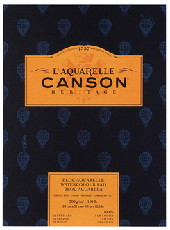
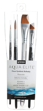
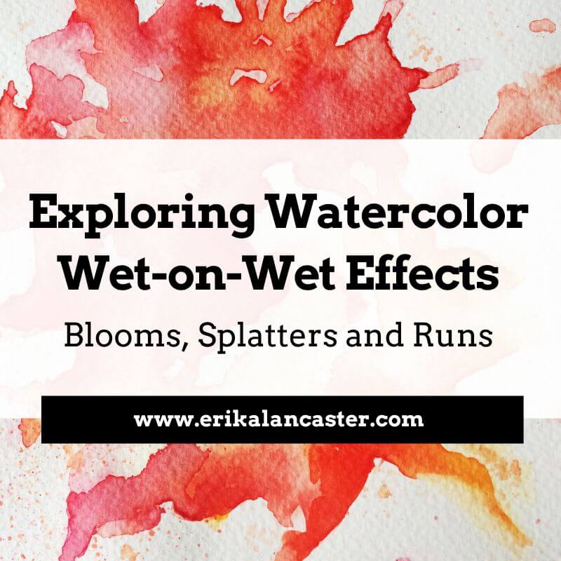
*This post contains affiliate links. I receive small commissions for purchases made through these links at no extra cost to you. These commissions help me keep this site up and running, in order for me to keep providing helpful and inspiring art content. :)

​

What's the actual reason behind swatching watercolor paint (aside from the satisfaction of laying pretty colors down on paper)? What specific things should we be looking for when testing out a new watercolor paint set, besides differences in color? What are the different variables that may affect watercolors' behavior and their final appearance? 


In this blog post, I'm going to explain the most important characteristics that you should start taking note of when it comes to watercolor paint.

By understanding these different aspects and how they vary from pigment to pigment, you'll be able to make more informed choices when it comes to picking your color palettes/schemes for your paintings, which will make everything go a lot smoother. 

I'll also walk you through my own personal method for swatching out a new paint set and share why I like testing my paints on two different types of paper.


It's very useful to explore a new paint set before actually attempting to create a painting with it. This is especially the case when it comes to watercolors, as this painting medium's inherent characteristics make it tricky to use.

For one, watercolors are translucent, which means we can't simply cover up our mistakes like we can when working with acrylics or oils. Secondly, due to their water-soluble properties, they tend to have a mind of their own.

​Finally (and something that was very hard for me to wrap my head around in the beginning), behaviors and effects can vary greatly from pigment to pigment, even within a set manufactured by the same company.

There are also many external factors that can affect our watercolor painting process and the final outcome of a piece, such as how clean our water is, what kind of paper is used, and even the temperature of the room we're working in!


Always remember that, as artists, we have to learn to embrace the exploration process. It may seem like a waste of time and resources when we're just starting out, but these smaller studies give us confidence and allow us to find ourselves as artists, so that we're then able to create more effective finalized works. 


If you're a beginner just starting out with watercolors, I highly recommend checking out my blog post titled 10 Things I Wish I Knew Before Starting With Watercolors. 

By understanding these ten ideas and applying them in your painting, you'll be able to progress your watercolor skills much quicker and waste less supplies in the process.


Let's get to the swatching!
​
​
If you enjoyed this video and found it helpful, make sure to subscribe to my YouTube channel. I share a brand new video every week with art tips, drawing and painting tutorials and mindset/productivity tips for artists. *Subscribe HERE*
​​

​

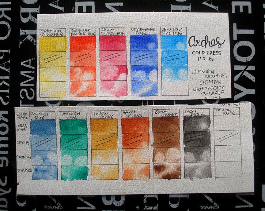
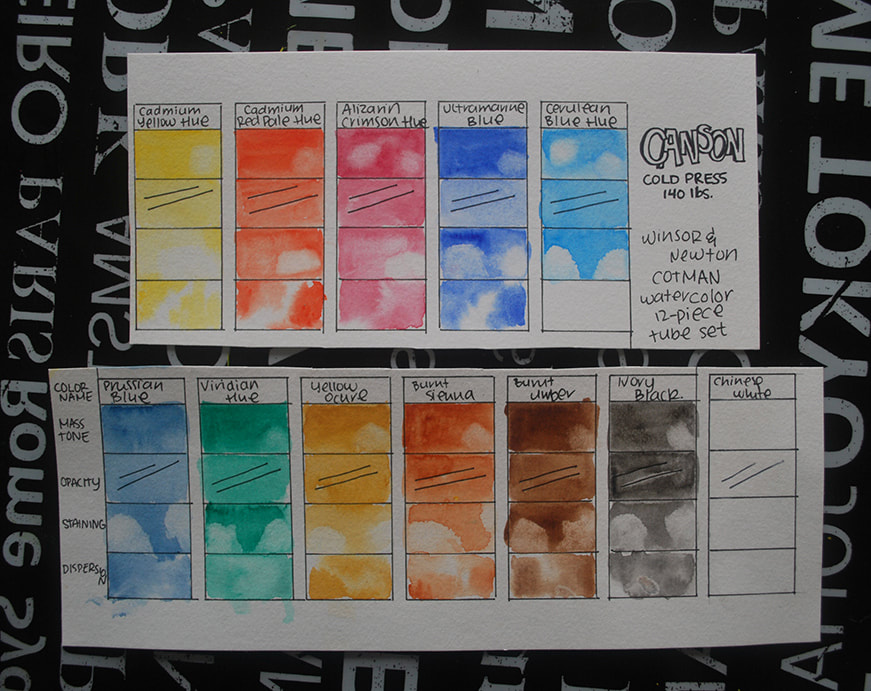
There is no right or wrong way to test out a new watercolor paint set. The whole point of swatching and testing out colors is for you, the artist, to have a better understanding of different color behaviors.

This way, you'll be able to select the colors you like best depending on the particular subject you paint, your personal techniques and the overall effects you're going for. 


If you're just starting out and haven't found your style, no problem! As your artistic journey progresses, you'll discover your own way of working and the specific paint qualities that are important for you.

​Later on, you'll be able to modify your swatching process to whatever fits you best and perhaps leave out aspects that aren't as important.

​
​
​
Drawing and Watercolor Tutorials for Beginners

Check out my FREE Patreon-exclusive tutorial and class samples here.


Watercolor Paint Characteristics and Must-Know Vocabulary


a) Mass tones
A color's mass tone tells us what it looks like when it's straight out of the tube and at its fullest saturation. Basically, it's the color at its purest and undiluted self.

-This is usually the first rectangle I fill in below the hue's name and I make sure to use the least amount of water possible.


b) Staining qualities
A color's staining quality refers to how difficult it is to remove from the paper when lifting, scrubbing or attempting to reactivate it once it's dry. 

-To test this out, I like lifting paint from a small section of my Masstone square/rectangle when it's still wet with either a rag or a paintbrush. I also like coming back to my color swatch once it's dried completely to see if any color can be lifted or reactivated because I personally use this technique a lot in my work. There are some pigments that are known for being extremely staining, such as Prussian Blue, and others that lift up quite easily. 


c) Opacity
A color's opacity tells us how opaque or transparent it is. Usually, you're looking for transparency when it comes to watercolors, as this is the quality that gives paintings created with this medium their distinctive glow.

​-For faster swatches, I like drawing a couple of ink lines in this square/rectangle (allow them to dry completely) and painting over them with each color to see if there is any chalky residue left behind.
-Another option is painting a couple of lines or shapes with a different color (a different color from the one you're testing) and seeing how much the subsequent layer of color allows the bottom to shine through. 


d) Level of dispersion
A color's level of dispersion refers to how easily it expands and/or intermixes with other colors when dropping on damp paper.  A high level of dispersion means a paint color expands quickly and intermixes a lot with colors around it. A low level of dispersion means it mostly stays in place.


-For quicker swatches, I like simply wetting this square/rectangle with clean water and dropping the color in in several different places to see how fast it expands. 
-Another option is dropping a different color in first and then placing the specific hue you're testing out to see how much it expands/intermixes. I do recommend preparing a larger square/rectangle for swatching if you want to test this out. Because I don't do a ton of wet-on-wet work myself, this isn't I take too much time doing. However, if you do a lot of landscapes or even abstracts, it may be very useful for you to spend time testing out this particular one for your different colors!


e) Granulation
A color's granulation level can be identified by laying down a flat wash, allowing it to dry completely, and observing how even and uniform it looks after. Pigments that have a high level of granulation separate from their binder when mixed with water and tend to settle into the texture of the paper it is placed on. This leads to white dots and a patchy look in some areas. *A high level of granulation isn't inherently bad, as it can be used to create great effects in areas that require them. Many artists use highly granulating paints to their advantage!

-I don't usually create a separate square/rectangle to test out granulation, but come back to observe this later on after my paint has fully dried and settled into the paper in all my sections. 


f) Permanence
A color's permanence refers to how resistant it is when exposed to light. In other words, how quickly does it start to fade out? Usually, manufacturers include this information somewhere within the packaging of the product with the following codes: AA (Extremely Permanent), A  (Permanent), B (Moderately Durable) or C (Fugitive). 
-I don't usually create a separate square/rectangle to test out permanence, but come back to observe how much the color has faded out a few months later. 


g) How do colors react on different types of paper?
I usually like seeing how different pigments react on at least a couple of different types of watercolor paper because I know how much of a difference the right paper can make!
-For the swatching of this particular Winsor and Newton set, I used both higher quality Arches watercolor paper, as well as cheaper Canson paper. Both of these were 140 lb. Cold Press papers, but the Arches had much more of a texture to it. Another option could be testing your paint out on both Cold Press and Hot Press papers.


Check out my blog post/YouTube video Watercolor Supplies for Beginners + Things You Should Know. In it, I explain everything you have to know about watercolor paper and demystify a lot of common thoughts beginners have in relation to watercolor supplies. 


​

Painting Swatching Outcome + My Conclusions

Watercolor swatches on Arches paper
Swatching out Winsor and Newton paint set on Arches 140 lb. Cold-Press watercolor paper. This photo has not been manipulated in any way.

​
Watercolor swatches on Canson paper
Swatching out Winsor and Newton paint set on Canson 140 lb. Cold-Press watercolor paper. This photo has not been manipulated in any way.

​
The colors included in this Winsor and Newton 12-piece tube set are:
Cadmium Yellow Hue
Cadmium Red Pale Hue
Alizarin Crimson
Ultramarine Blue
Cerulean Blue
Prussian Blue
Viridian Green
Yellow Ochre
Burnt Sienna
Burnt Umber
Ivory Black
Chinese White

I enjoyed testing out this Winsor and Newton watercolor tube set and look forward to painting a piece with it.

​Even though this brand's Cotman line is described as being their affordable/student grade option, this particular tube set offers an excellent color payoff, contains a good amount of paint and is quite comfortable to work with.

​The paint's texture is just thick enough when squeezed out of the tube and onto the paint-mixing palette. Each tube contains 8 ml of paint and the manufacturer has included relevant information on its packaging such as each color's level of Permanence and Pigment Code. 


A few things I noticed in regards to the differences between the swatches created on the two different watercolor papers:

a) Overall, the colors painted on the Arches paper are more vibrant than how they appear on the Canson paper. 

b) The degree of this varies from pigment to pigment, but I was able to lift up more paint from the Canson paper, especially once the paint had dried. This probably has to do with the fact that the 100% cotton Arches paper absorbs the pigment a lot more effectively.

c) Wet-on-wet effects were much more beautiful on the Arches paper, which allowed them to disperse a lot more fluidly and gradually. On the Canson paper, the paint pooled in certain areas and left a patchy effect. 

d) All colors, except for the Chinese white are completely transparent (which is a good thing). Transparent watercolors allow bottom layers to shine through and give paintings a unique glow. If you zoom into the ink lines below the Chinese white swatch, they appear to have a bit of a chalkiness over them. 


​

Watercolor Supplies:

*I buy most of my art supplies online through Blick or Amazon. Both of them are excellent options for finding great supplies at accessible prices. Click on images below to learn more about each product. 

Picture
Royal & Langnickel Zen Line Watercolor Brushes $2.83 - $5.99

I hope you enjoyed this post and learned something new, or got inspired to go and create something for yourself. I wish you tons of progress and enjoyment in your artistic journey!  :)

​Thanks so much for popping by today!
​

​

Gift Ideas for Artists Who Paint
10 Things I Wish I Knew Before Starting with Watercolors
How to Paint a Watercolor Landscape
4 Comments
Dyaln Peterson link
11/27/2019 10:59:39 am

I like what you said about using swatches to find how easily a watercolor paint will expand when dropped on paper. My sister has been telling me about how she wants to do more art in the coming months. I'll share this information with her so that she can look into her options for swatches that can help her with this.

Reply
Erika Lancaster link
5/18/2020 09:52:29 am

Hi, Dyaln!
Thanks so much for checking out this blog post and also for sharing with your sister!
I wish her tons of progress and enjoyment in her journey with watercolors.
Have a lovely day,
Erika

Reply
Kristofer Van Wagner link
4/15/2021 03:56:15 pm

I am thankful that this post pointed out that it is important for us to learn swatches when we do watercoloring. It makes sense as it will impact the outcome of the painting. Assuming that I need to learn how to watercolour, I will look for online courses.

Reply
Erika Lancaster link
4/18/2021 02:40:05 pm

Hi, Kristofer!
I'm glad you found this post helpful.
I wish you tons of enjoyment as you move forward in your journey with watercolor.
Take good care and thanks for reading!

Reply


Leave a Reply.

    Picture
    ​
    Learn Drawing and Watercolor Step by Step Tutorials

    ​
    Best Art Blog Helpful Resources for Artists

    ​

    Picture

    ​
    Become a Patron!

    ​

    www.dickblick.com

    ​

    ​
    www.erikalancaster.com
    is a participant in the Amazon Services LLC Associates Program, an affiliate advertising program designed to provide a means for sites
    ​to earn advertising fees by advertising and linking to amazon.com.


    www.erikalancaster.com
    is a participant in the 
    Shareasale.com Affiliate Program, an affiliate advertising program designed to provide a means for sites to earn advertising fees by advertising and linking to Shareasale.com partner companies.
    ​

    RSS Feed

Picture
Picture
       
​  
Website Disclaimer              Privacy Policy              ​Terms and Conditions
©  2022  Erika Lancaster.  All rights reserved.
  • HOME
  • BLOG + FREEBIES
  • MEMBERSHIP
  • CLASSES
  • GALLERY
  • MY ART TOOLS