|
*This post contains affiliate links. I receive small commissions for purchases made through these links at no extra cost to you. These commissions help me keep this site up and running, in order for me to keep providing helpful and inspiring art content. :) How do artists choose the colors they'll be using for a new watercolor painting? What can I do to keep my color mixtures better organized on my mixing palette throughout the painting process and steer clear of accidentally creating mud? Why is it important to invest time in planning the colors we'll be using before starting a new painting? In this blog post, I'll be sharing three reasons why I love using a limited amount of colors (usually 3-7) to create my watercolor paintings and how this practice has helped me make deeper, faster progress as a painter. Color is an Element of Art that plays a huge role in making a visual composition look harmonious and cohesive. As with all other Art Fundamentals, use of color is something that most skilled artists continue learning about and improving upon throughout their journeys. It's absolutely essential for the beginner starting with any kind of painting medium, to learn about Color Theory and the Color Wheel, as this knowledge enables us to not only create successful color mixtures throughout the painting process, but also to plan great color schemes that work for the piece on hand. Because skilled artists know how important color and value are, they take time to prepare for a new piece via the creation of thumbnails, swatching colors, and thinking of how they'll be creating the color mixtures needed for a new painting prior to actually starting. Either this, or they've already prepared a custom color palette to work from that has all of the colors they love and know they're going to need. They know exactly what's going to happen when two or three of those colors get mixed together. Artists know that making time to think about color before starting to paint will enable them to move forward more smoothly and will lead to an outcome that is impactful, harmonious, and also communicates their message more clearly. And how each artist goes about selecting his/her colors is completely dependent on the artist's personal creative process. Artists who are looking for very high-levels of realism often go by specific colors they see in their reference pictures or in the subjects they have in front of them when working from direct observation. They make time to observe and put in the work to ensure their colors/color mixtures match what they actually see. Others work from references loosely and manipulate color to bring a certain level of expression, contrast, etc. into the picture. Sometimes they change specific colors altogether or alter some of them to bring their style in. And others, such as abstract artists, at times start their paintings based on a specific color scheme they found inspiring, designing an entire visual composition around it. Or they create their own color schemes that are meant to transmit a specific message or emotion (putting Color Psychology to use). Of course, there are tried-and-true color schemes that have been used by artists throughout history that will always lead to very visually pleasing results. In lots of Van Gogh's work, you'll see use of Complementary Colors, in Monet's you'll see use of Analogous Colors, etc. Some artists take hours preparing the colors they'll be using for a new painting and others take minutes, but they always bring in their knowledge of the Color Wheel and Color Theory. It doesn't really matter how you do it. The more you paint, the more your own personal style and creative process will become clearer. The point here is to make it a habit to start thinking about color before starting to paint. Color is a huge, complex topic and I believe it's important for beginners to build upon a solid base of knowledge and take their learning a step-at-a-time, as this helps avoid overwhelm and keeps their art journey enjoyable. This will help them stay consistent, which is key in making significant artistic progress.
If you enjoyed this video and found it helpful, make sure to subscribe to my YouTube channel. I share a brand new video every week with art tips, drawing and painting tutorials and mindset/productivity tips for artists. *Subscribe HERE*
You'll find a list of my favorite watercolor supplies here. 3 Reasons Why Limited Color Schemes Are AwesomeEven as a more experienced painter, I absolutely love using limited color schemes because of the points I'm going to be sharing next. This said, keeping things simple can do wonders for beginners and can help them make much faster progress than being drowned and overwhelmed with a wide array of different colors, and even paper and paintbrushes. *We're not getting into paper and paintbrushes today, but I highly recommend checking out my blog post titled Watercolor Supplies for Beginners and Things You Must Know if you'd like more in-depth information on watercolor painting supplies. 1. They help us get comfortable with color mixing By taking time to plan and prepare a limited amount of colors, we'll be putting our knowledge of color to the test, as this forces us to give thought to how we'll be creating our different color mixtures with the least amount of colors possible. A couple of quick examples of how to work with a less amount of colors: -If you've already selected a yellow and a red for a new painting, and all of the sudden realize you're going to need an orange color, why not use a mixture of your yellow and red instead of reaching for an orange? -If you've already selected your Ultramarine Blue and your Burnt Umber for certain areas of your painting, why not use a mixture of these two to create your dark gray, instead of reaching for another gray? In my many years teaching art, I've found lots of beginners are afraid to mix their own colors and are looking for instructors to provide very specific "recipes" and even color-to-color ratios for their mixtures. Also, lots of beginners feel they need the specific color that the artist in the tutorial they are following is using. By learning about the Color Wheel, Color Temperature, etc., and making time to play with color (intentionally of course), they'd be able to create any needed color without much guidance at all. Make time to learn the basics. Don't skip over them because they'll improve everything you choose to do in the future. Make time to explore and get comfortable with your medium, before attempting to create a polished masterpiece. As beginners, it's important to keep things simple. Most often than not, keeping things intentionally limited will help us make faster progress than jumping between a bunch of different things and overwhelming ourselves with lots of supplies. 2. They lead to harmonious paintings When we're just getting started, most of us are anxious to begin with the painting process. We tend to skip over any sort of preparation and move forward randomly picking colors. I did this when I was first getting started in my painting journey and was so confused as to why my paintings always ended up looking amateurish and incohesive. Unless we have a very colorful art style or are going for this look intentionally, randomly picking colors throughout the painting process is a surefire way of ending up with a painting that is very overwhelming to look at or that is "all-over-the-place" in terms of the message it's transmitting to the viewer. By limiting our colors and repeating colors as we're creating our different paint mixtures, we'll end up with much more harmonious results. Our color mixtures look like they belong together and are working in unison to transmit one same message. It's similar to the "Mother Color" method that some artists working with oils and acrylics use to unify and provide color harmony in their paintings. What they do is choose one color to be the "Mother", which is going to be added (in a small degree) to every color mixture. This makes the different colors look like they belong together. All part of one same "whole". And this is what we want when we're designing a visual composition. We want the different parts to work together as one "whole". The "Mother Color" method doesn't quite apply the same way when we're working with watercolor, as the color mixing process when using this medium is a lot more organic and free-flowing. We're constantly shifting color ratios, paint to water ratios, etc. as we move along, but the principle of re-using the same colors in our different color mixtures in order to unify the overall outcome still applies. Give thought to how you can use this idea in your own work to both make your paintings more cohesive and also to transmit your message/emotion/idea in a more powerful way. 3. They help us stay organized throughout the painting process When working with watercolor, it can be very easy for our colors to start mixing together due to the amount of water we're using throughout the process, which can certainly be frustrating! *This paint mixing palette has certainly helped me in this department. Loosing control of our color mixtures on our paint mixing palettes can lead to creating mud (brownish/grayish/desaturated colors that we weren't actually going for). By having made the time to actually test out our color mixtures on scrap pieces of watercolor paper prior to starting with the painting process, we'll be avoiding undesired colors. Also, by limiting the amount of colors we're using and knowing exactly which colors we're using throughout our painting (at least in loose terms), we'll be making things a lot easier for ourselves along the way. It takes out all of the guesswork as we'll know exactly which color to reach for whenever we need to create more of any specific mixture. I don't know about you, but it's very easy for me to start accidentally dipping my paintbrush into a paint pan I wasn't intending to use during the painting process (especially when I'm using a larger paint set that includes several different blues, reds, browns, etc.). To make things easier for myself, I often love removing the paint pans I have selected from my watercolor set and only have those with me as I'm working. Over on Patreon, I share step-by-step watercolor painting tutorials in which I explain everything, starting from how I select my paint colors and create my color mixtures, to how I develop my color, values and details in layers.
I hope you found this post helpful, and wish you tons of progress and enjoyment in your artistic journey!
10 Comments
6/15/2020 01:05:39 pm
It doesn't really matter how you do it. The more you paint, the more your own personal style and creative process will become clearer.
Reply
6/22/2020 07:23:50 pm
So true, Kyle!
Reply
6/22/2020 09:20:16 am
I like what you said about testing your color mixtures for better watercolor painting. My sister wants to get better at painting in the coming years. I'll share this information with her so that she can look into her options for professionals who can help her with this.
Reply
6/22/2020 06:43:38 pm
Hi, Patrick!
Reply
Joyce West
2/17/2021 01:24:02 pm
I am always looking for new and better ways of improving my art.
Reply
2/22/2021 10:25:06 am
Hi, Joyce!
Reply
3/23/2023 09:13:22 am
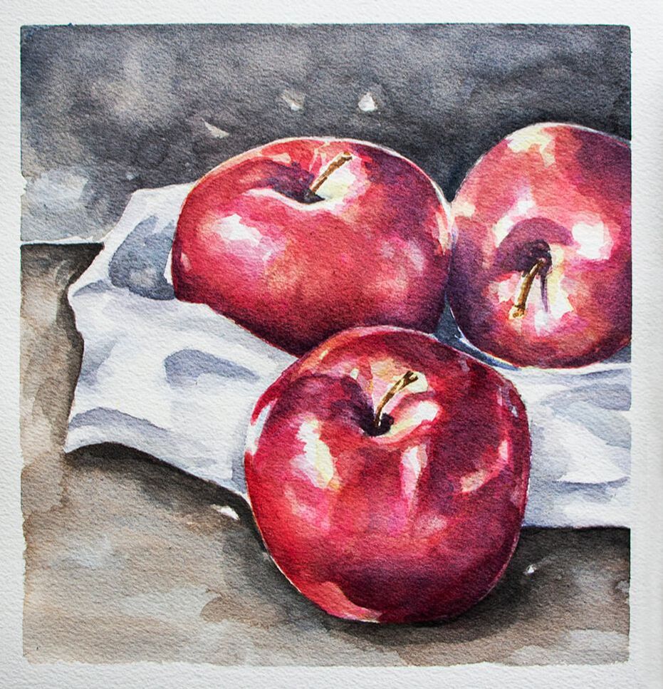
Thank you for the watercolor still life tutorial Erika! Apples are an easy and intimidating subject matter for beginners.
Reply
3/29/2023 01:50:49 pm
Hi, Jasmine!
Reply
5/22/2023 10:11:27 am
Hey, there!
Reply
Leave a Reply. |
www.erikalancaster.com
is a participant in the Amazon Services LLC Associates Program, an affiliate advertising program designed to provide a means for sites to earn advertising fees by advertising and linking to amazon.com. www.erikalancaster.com is a participant in the Shareasale.com Affiliate Program, an affiliate advertising program designed to provide a means for sites to earn advertising fees by advertising and linking to Shareasale.com partner companies. |







 RSS Feed

