*This post contains affiliate links. I receive small commissions for purchases made through these links at no extra cost to you. These commissions help me keep this site up and running, in order for me to keep providing helpful and inspiring art content. :)
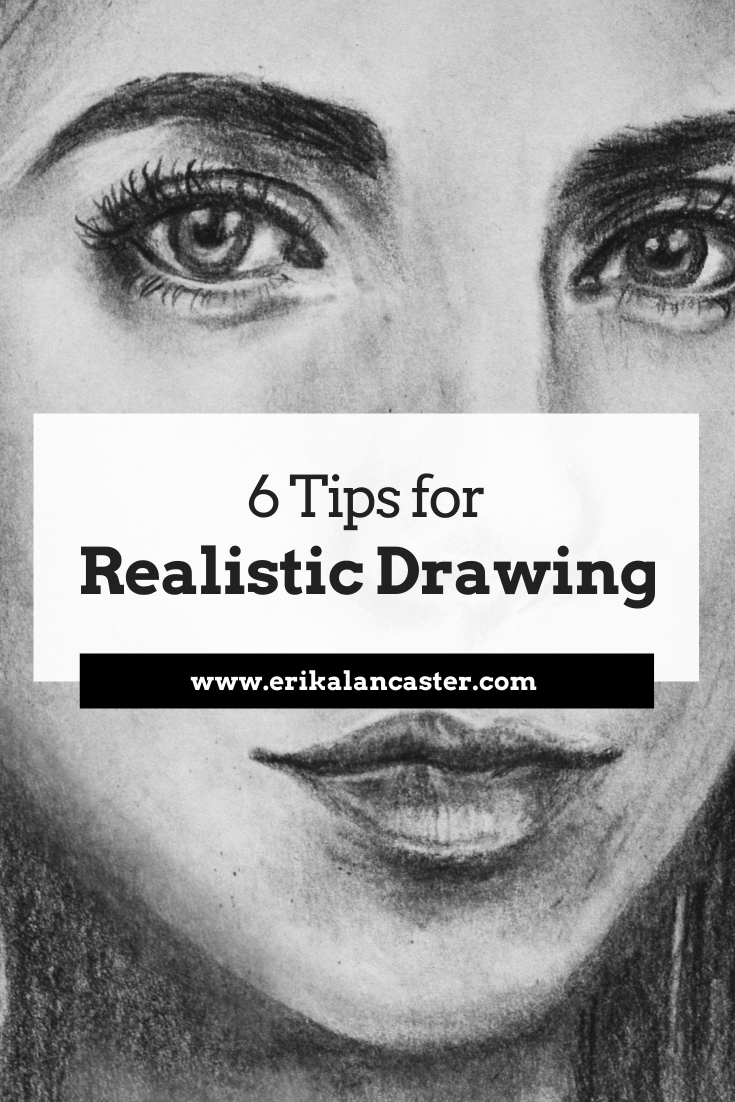
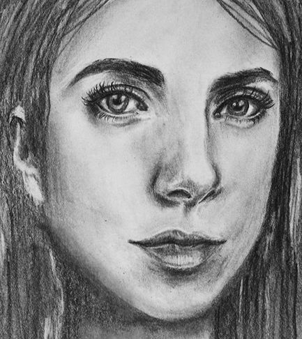
Are you impressed by artists who are able to achieve high levels of realism in their work and wish you could also get to that point, someday? Interested in bringing realistic form and three-dimensionality to your drawings so that they can really pop out? Have you gained some confidence creating line sketches, and are ready to start adding realistic light and shading effects? Even though I consider myself much more of a sketcher and a painter than a realistic drawer per se, I think it's essential to make time for these kinds of studies. I also think that it's important for aspiring artists to devote time to achieving believable drawings/paintings because this is what's going to lead them to develop great observational skills and grasp fundamental art topics such as proportion, value, perspective, form, etc. In today's blog post, I'll be sharing a video time-lapse of a portrait I drew using regular pencils, as well my top six tips to apply when attempting to create a realistic drawing of any type of subject (whether it be a face, animal, arrangement of objects, etc.). By understanding and practicing the six key points I'll be sharing below, beginner artists will start making much faster progress and will soon be creating impressive, more professional-looking drawings. I want to make something clear. To achieve realism, we need references. These references are going to allow us to observe what subjects actually look like in real life. If we don't use references, we are going to be working from what we think subjects look like. References provide us details and remind us of tiny intricacies that we would have otherwise not thought about. And when attempting to achieve realism, it's ALL about observing the subtleties and being able to recreate them accordingly. References can take the form of photographs or compositions we have arranged to draw from life (otherwise called working from direct observation). Drawing from direct observation is essential for artists that have gained a certain level of skill using photographic references, as it provides a more challenging opportunity to further our artistic development. As I've mentioned in other blog posts and YouTube videos, drawing is the basis for everything else in art. I believe all artists, no matter how skilled they've already become or what particular medium they've chosen to gain mastery in, should continue making time to sharpen their drawing/observational skills throughout their journeys. Personally, I make sure to schedule in time for it on a weekly basis, even though what I sell are my paintings!
If you enjoyed this video and found it helpful, make sure to subscribe to my YouTube channel. I share a brand new video every week with art tips, drawing and painting tutorials and mindset/productivity tips for artists. *Subscribe HERE*
Tips to Improve Your Realistic Drawing
|
Prismacolor Turquoise Drawing Pencil Set
Mr. Pen Kneaded Erasers
|
Canson Drawing Sketchbook 11x14"
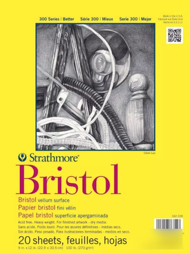
Strathmore Bristol Paper Vellum Surface 9x12"
|
|
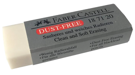
Faber-Castel Dust Free Soft Eraser
|
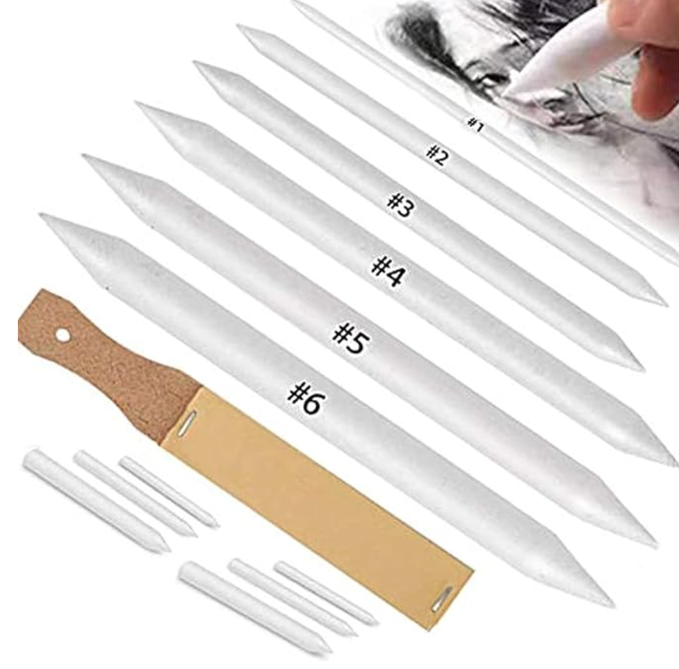
Blending Stump Set
|
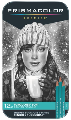
-A few different pencil grades (2H or HB for the initial sketch, a couple of mid-grade a 2B or 4B to start creating darker values gradually, and a softer grade like an 8B for darkest areas)
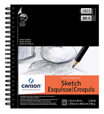
-Drawing or sketching paper (smooth paper is going to ensure smooth blending)
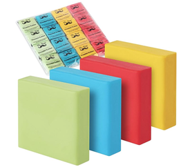
-A kneaded eraser or eraser intended for smaller areas
-A regular soft rubber eraser for larger areas
-A blending stump or tortillon to blend smaller areas
-A tissue paper to blend larger areas
-A quality sharpener
-A scrap piece of regular paper or tracing paper to rest my hand on as I'm working

3. Always start with a light initial sketch, focusing on largest shapes first
The proportion and location of these different elements in regards to each other has to be spot on, before even thinking about moving on to things like shading and texture.
It's the absolute worst to spend hours developing details and even creating beautiful, smooth shading just to step away from our drawings and realize that the proportions/locations of different elements are off.
Also, whether you're creating your initial sketch by tracing over a photograph or freehand, make sure those initial lines are created lightly so that they can be invisible at the end (we want no visible lines when creating realism).

4. Keep in mind that in realism, there are no visible lines
It's essential to stay away from creating any sort of stark-looking lines, whether it's around our different shapes/planes or in an area we're intending to create a smooth gradient in.
This said, we are required to draw lines when we are working on creating some kinds of texture (hair, eyebrows, eyelashes, etc.). However, even in these cases, the "lines" we are leaving behind are not uniform from one edge to the other, but have a variety even within them in terms of thickness or value.
They most likely go from thick to thin or from dark to light, etc., which leads to much less stark looking lines.
5. Create gradual, smooth transitions between your different values
There should be no stark changes between one to the next and there shouldn't be any visible lines throughout these transitions either.
The exercises I share in this video will help you develop better pressure control.
6. Make sure you are creating a very wide variety of values throughout your drawing
There have to be very light areas (which will appear almost white at the end), there have to be very dark areas (which will appear almost black at the end) and there have to be a ton of mid-values in between.
Practice creating a beautiful balance between lights and darks.
A lot of beginners make the mistake of not going dark enough where needed. Don't be afraid to go dark (as long as the values are really there in the reference). This said, make sure you're never pressing down too hard on your paper because this can damage it and cause visible scratches that will not be able to be fixed!
For the most part, I like working my way towards the darks gradually. Also, as you're working, you'll probably find that you're darkening some areas that you were intending to leave light.
This is where small, detailing erasers come in super handy because they allow you to go back in and lighten these areas. They also allow you to pull out highlights wherever needed, which is crucial for realistic looking hair.
*Bonus Tip: Make sure that you're looking at your reference, at least, 50% of the time you spend working!
Hey,
I just read ur blog & it helped me a lot but I just wanna ask u a question that is it possible to do all kinds of shading through using only one pencil ?
Cuz I have tried to do so & also plz check out my insta account and give me light tips on improving my art : @theartist_619
Hi, Piyush!
Thanks so much for reading and taking time to comment. It means the world.
You can definitely create a full drawing using only one pencil. I did this when I was first getting started myself. Having a few different pencil grades does make it easier, though.
I just followed you on Instagram and you're doing a great job progressing towards more realistic shading!
You're doing an awesome job creating a very wide range of values, from lightest lights, to darkest darks. This creates a lot of contrast and helps your drawing pop out.
Three things off the top of my head in terms of suggestions for even higher levels of realism are:
-Be careful with not leaving visible outlines or stark marks throughout your drawing (remember in realism different planes or areas are separated by subtle changes in values or textures, not lines- for example- I see lots of little lines created throughout the sleeve of the man's shirt in your last piece on Insta)
-Make sure the transitions between different values are more gradual, unless dramatic lighting is taking place.
-Lay down your graphite as smoothly as possible- explore blending stumps if you haven't already.
An exercise I would really recommend to practice, is drawing fabric. Place a shirt, a bed sheet or a towel on a table or desk in front of you and try to draw shadows and lights from direct observation. Focus on gradual transitions from one value to the other.
If you'd like more individualized feedback and suggestions on exercises, I recommend joining my community over on Patreon, as I always prioritize paying students and community members. :)
https://www.patreon.com/erika_lancaster_artist
I wish you tons of progress and enjoyment in your artistic journey!
Erika
Thank you,
Miss Erika
I'll consider joining your community on patreon in a few weeks or so
As I really like your way of observation of the environment & I'd like to learn more from you
Can you please tell how to realistic with pencil colours
It would be an honor to have you, Piyush! :)
All the best to you,
Erika
Thanks a lot Erica Lancaster
Thanks for reading and taking time to leave a comment, Fred!
Have a lovely week ahead. :)
Thanks so much for checking this one out. :)
Hope you're having a great day!
Hey even I used to draw with a pencil. A ordinary pencil but a lil bit costly one ofc.
But here erasers are important cause for hair part in portrait we need small corrections and in face too. Many times we must need smaller erasers so, it’s better to use a kneaded eraser for better outcomes. But pencils are not that imp for me.
Hey, there!
Thanks so much for reading and leaving your valuable comment.
You're SO right! Erasers are very important for realism.
I really enjoy the Mono Zero eraser for cleaning up small and/or narrow areas and also for highlights in texture such as hair. It's awesome!
A kneaded eraser is also something I always have on hand when drawing or sketching. It's very helpful.
I want realistic girl sketch 🤞🤞
Hello, my name is Shivani. I just read your blog and it's very helpful. I'm trying sketch realism. I use most of the techniques you mentioned here. But it doesn't exactly look like the reference. Any tips for improvement?
My Instagram account is meraki_31. Can you please check this out and review it?
Thankyou 😊
Hi, Shivani!
Thanks so much for checking out this blog post. I'm happy to hear you found some helpful nuggets. :)
Sorry to say that I don't have time to look into all of the artwork that I'm sent by people every day, as I have to prioritize my own work, as well as paying students and customers.
If you'd like individualized feedback from me, please consider joining us over on Patreon: https://www.patreon.com/erika_lancaster_artist
Thanks and have a great one!
Really cool tips, gracias
Hi, Dara!
Thanks so much for checking this one out. :)
Happy to hear you found it helpful.
Wish you tons of progress and enjoyment in your art journey!
hello maam ,
i read ur blog and really it helped me . will u pls suggest me something rto make face sketches more easily?
thank you.
Hi, Garima!
Thanks so much for reading and taking time to leave your comment/question.
Here's a basic, face drawing tutorial for beginners just starting with learning about facial proportions: https://www.erikalancaster.com/art-blog/how-to-draw-a-face-for-beginners
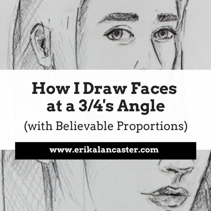
If you're more advanced and are ready to draw faces at different angles, here is another step-by-step tutorial that includes a video on using the Loomis method for drawing the face and head: https://www.erikalancaster.com/art-blog/how-to-draw-faces-at-angles-loomis-method
Hope you find these helpful!
Wish you tons of progress and enjoyment in your journey.
teach me on eyes pls ,i like ur art
Hi, Annie!
Hope you're doing well and thank you for checking out this blog post.
Here's a blog post/YouTube video tutorial that I created on my process for drawing eyes: https://www.erikalancaster.com/art-blog/how-to-draw-realistic-eyes-my-process-and-essential-tips
Hope you enjoy it and find it helpful!
can you give ome sketchs for me to draw or some website where I can find diffrent types of sketchs for sketching.
And as well as I am glad tat I have found out this website
just wanted to have some refrence sketchs for me to draw
THANK YOU
Hi, there!
Thanks so much for checking out this post and taking time to leave a comment. :)
I'm not quite sure what it is you're looking for. Are you looking for pieces of artwork (drawings/paintings) that you can copy as references for practice? If so, I'd recommend Pinterest or Instagram... Just don't share them online if you're doing it for practice, as you can get into trouble if you're not careful about attributing the piece to the original artist.
If you're looking for actual tutorials, there's great instruction on sites like https://www.arttutor.com/ and https://thevirtualinstructor.com/
Hope this helps!
Cheers,
Erika
These tips really helped me a lot. Thank you so much..i wanted to ask you a question regarding coloured sketches. i'm unable to find perfect skin tones. any suggestion?
Hi, there!
Glad you found this post helpful.
What are you using as a coloring medium? Colored pencils?
I primarily sketch with graphite and drawing pen, and paint using watercolor and acrylics. I create my own skin colors by mixing different colors together.
But there are lots of colored pencil tutorials online on skin colors that I feel will be helpful for you if this is the kind of medium you use!
You should look for tutorials from Kirsty Partridge and others on YouTube. :)
Have a great day and thanks so much for reading!
Thank you for posting this blog article! As an art instructor for all grade levels (K-12th grade) I have always found it difficult to translate what I learned to do intuitively as an artist when it comes to drawing into practical, applicable tips that my students can apply to their own work. Teaching a student to draw realistically has always been daunting. Your article is well written and concise and provides me with just the right amount of information to share with the budding artists in my classroom. Thanks a lot!
Hi, Christina!
Thanks so much for checking out this post on tips on realistic drawing. I'm so glad to hear that it was helpful.
I worked as art teacher in a school environment for many years and I get you!
Thanks for popping by and leaving your comment.
Wish you tons of enjoyment with your teaching.
Erika
Thank you for giving me tips! I love to draw and this is going to help me ALOT! Thanks so much!
Thank you. I found the video and tips very helpful
Hi, Mary Alice!
Glad you found some helpful nuggets in this one.
Thanks so much for reading and taking time to leave a comment.
Have a great day and take good care. :)
Well, hello Erica.
I am glad I found your blog. I love art. I had taken art classes, but mostly in sculpture. It was so much fun. I would like to practice and became good at painting. I will try to join your class. I'm appreciative of your generosity by helping those who want to be as good as you. I am hoping to join you as well in the near future. Now I am looking for work.
Best wishes,
Loma
Hi, Loma!
Thanks so much for checking out this post and taking time to leave a comment. :)
I'm glad you're enjoying what I'm sharing and you can count on me to continue producing free helpful articles and videos.
Sending you lots of luck on your job-hunting and tons of enjoyment in your art endeavors!
Hi!
I love your blog, but whenever I try to draw, the drawings always end up wrong in some perspective. To make things worse, I can't shade properly and when I do get it right I end up frustrated and annoyed.
Is there anything I can do?
James
Hi, James!
Hope you're having a great day.
Thanks so much for reading and taking time to comment.
I'd recommend investing in a course or a book that's specifically on Perspective (depending on how you learn better).
Perspective (which is directly related to 3D form) is an essential Art Fundamental to wrap our heads around when we're getting started and are looking to develop our skills with higher levels of realism.
Practice and really train yourself to observe what things look like in real life, and visualize things around you as simple forms or combinations of simple forms (rectangular prisms, cylinders, etc.) and always work from general and make your way towards specifics. This will help you with both perspective and proportion.
And make sure you're spending enough time on your preliminary sketches before getting started with shading. Don't start adding detail or shading until your outline sketch shows effective proportion, perspective, shapes, etc., as no amount of detail and shading with fix a faulty foundation. This would be like adding frosting to a cake that isn't well done.
Soooo, if you're interested in improving your freehand sketching and being able to draw things without tracing, I'd highly recommend spending time learning about perspective and 3D form.
Hope this helps! Have a good one!
Hello Erika. I love your blog and your art. I hope I find this helpful going back to my drawing board. Do you advise that I practice realism drawing with objects before I move to faces?
Hi, Simi!
Great question.
I 100% absolutely DO advise all of my students to practice rendering objects realistically before moving on to faces. If they're not able to understand 3D form, light behaviour, and have enough control over their drawing medium to shade simple objects properly, then faces will usually be too difficult. Either this or they usually turn our relatively flat because they haven't taken time to understand 3D form and the structure of the human head. :)
So, yes, 100%
Hope this helps and thanks for reading!
Hey, I just wanted to thank you for the wonderful tips on drawing portraits. I am newish to drawing realistically. I started I think in April or May this year.
There is something I think might help other new realistic graphite artists that I learned from someone else.
If you take a fresh sheet of paper and put it up to the grayscale reference, you can really see the different values.
I hope it helps, and again, thank you!
Hey, there!
Thanks so much for checking out this blog post and for leaving your valuable tip! It's very helpful for other people coming by looking to improve. :)
Wish you a great day and take good care!
Honestly this helped me a great deal, I'm a beginner Yes, and I'm trying to understand the basics of realistic drawing and this article is just the perfect tutorial I ever came across.. thanks so much ♥️
Hey, there!
Thanks so much for checking out this post and taking time to comment.
I'm so glad it was helpful, and wish you tons of enjoyment and improvement in your art journey. :)
Can you use charcoal to help with realism?
Hi, Mia!
You certainly can use different charcoal techniques to create higher levels of realism in drawing.
What's cool about charcoal, is that it helps you create very deep, true blacks, as opposed to graphite (pencils), which you can really only get really dark gray with. Also, charcoal tends to have a more matt finish, whereas graphite leads to a "shinier" outcome, especially when you start pressing down harder.
It's just about learning about different techniques with whichever medium you'd like to develop realism in your drawings with. :)
Thanks so much for reading and take good care!
Hi Mia I appreciate the content these tips are essential for an aspiring artist like myself.
Hey, there!
Thanks so much for checking this one out.
Glad to hear it was helpful. My name's Erika. :)
Have a great day and take good care.
Thank you
Hey, there!
Thank you for checking this one out. :)
Have a beautiful day and take good care!
Whenever i try to make sth dark I always have to press on the paper, how can I avoid this erika
Hi, Daniel!
How many different pencil grades are you using when drawing? Are you using softer pencil grades when you're developing your darkest values, such as 6B, 8B, etc.?
If you're using softer pencil grades, you'll notice right off the bat that you don't have to exert very much pressure at all and it'll look darker.
I'd recommend checking out my Drawing for the Total Beginner Mini-Course if you haven't already. I explain all about different drawing pencil grades and how they can come in handy throughout the drawing process in the first class.
You can get immediate access to it for free by clicking on the button on the banner at the top of this blog section. :)
Cheers!
Hi Erika, thanks for the steps highlighted, am a beginner and this is really insightful. Please which Graphite pencil brand can u recommend for me? Would be delighted to get rresponse from you.
Thanks so much, I bought a 3b 6b and 10b pencil, but I'm having problem knowing where to use each tone if I'm drawing from a photograph of someone, unlike drawing someone else's drawing who has already shown you the intensity of the tones for each part.
Hi, Daniel!
Every artist goes about their drawing process in a different way. But what I can tell you is, I work from the hardest pencil grade I've chosen from the piece on hand, towards the softest pencil grade I've chosen.
I only use the softest pencil grades (which are darker and smudgier), in darkest value areas, in order not to muddy up my drawing.
If you're having trouble discerning between different value areas in a picture, I'd recommend turning it into a black and white/grayscale picture in a photo-editing software like Photoshop or Gimp, as all of the different colors will be turned into one same, monochromatic value "scale".
This is something I often get my beginner students to do, as it helps them become better at pinpointing different values in order to make them happen in their drawings. They're then able to do it a lot more successfully with full color photos.
But it is going to come down to understanding about 3D form and light behavior, and developing your observational skills, too. It's this, in combination with mastery over your drawing (or painting) medium, that will allow you to achieve more realistic results.
Hope this helped!
Have a great day and thanks for popping by!
Thank you for sharing. I would like to see your next amazing contents.
Hey, there!
Thanks so much for checking this one out.
Glad you enjoyed it!
Have a great day and take good care. :)
Hai Erika,
Would you mind being our teacher in our community of interest in drawing?
Best regards,
Novianti
Hi, Novianti!
If you have any inquiries on my teaching services, please reach out via email ([email protected]).
Thanks and have a great day! :)
Hey, there!
Thanks so much for checking this one out. :)
Glad you enjoyed it.
Have a lovely day and take good care.
Hi, Lou!
Thanks so much for checking this one out.
Glad it was helpful. :)
Wish you a great day!
I believe all artists, no matter how skilled they've already become or what particular medium they've chosen to gain mastery in, I’m so thankful for your helpful post!
Hello,
Thanks so much for checking out this post.
Wish you a great day!
Thanks so much! This really helped me and now my drawings look a little more realistic 🤗
Glad it helped, Leonardo!
Thanks so much for reading.
Enjoy your art practice.
The way you break down complex concepts into practical advice is incredibly helpful. The tip about varying line weights for depth is a game-changer, and your illustrations really drive home the impact of these techniques. It's like a virtual art class packed with inspiration!
I'm so glad to hear it was helpful.
Thanks so much for reading and taking the time to leave a comment.
Enjoy your art practice!
CAN YOU PLEASE TELL ME A WEBSITE TO FIND A QUALITY ART SUPPLIES
Sure. I get most of my supplies from blick.com and amazon.com.
On this page, you'll find all of my favorite current drawing and painting supplies and these are all links that take you straight to those websites: https://www.erikalancaster.com/favorite_art_supplies.html
Leave a Reply.


is a participant in the Amazon Services LLC Associates Program, an affiliate advertising program designed to provide a means for sites
to earn advertising fees by advertising and linking to amazon.com.
www.erikalancaster.com
is a participant in the Shareasale.com Affiliate Program, an affiliate advertising program designed to provide a means for sites to earn advertising fees by advertising and linking to Shareasale.com partner companies.
 RSS Feed
