Shading Objects Using Hatching, Crosshatching, Scribbling, and Other Drawing Pen Techniques7/11/2018 
*This post contains affiliate links. I receive small commissions for purchases made through these links at no extra cost to you. These commissions help me keep this site up and running, in order for me to keep providing helpful and inspiring art content. :)
Do you love the look of pen and ink drawings that demonstrate hatching, crosshatching, and other mark-making techniques, and need a bit of guidance to start putting them to use in your own work? How does one go about using the visual information taken in from a reference photograph and translate it into a pen and ink sketch that demonstrates three-dimensionality? In order to start adding a sense of believable form to a sketch, it's essential to understand how to create a variety in values using the art medium at hand. It's also very important that we practice taking in the visual information presented to us through either photographs or real-life subjects, so that we're able to describe form effectively through drawing. Using pen and ink can be intimidating at first due to the fact that it's permanent and we need to use mark-making techniques to create different values. There is a large variety of mark-making methods and they all lead to very different results. In today's post, I will be sharing the process that I go through when creating pen and ink sketches of objects using photographic references. I will be walking you through each step, from the selection of a great photograph, to preparing an initial pencil sketch, to actually filling that sketch in with ink marks. I will be exploring six different mark-making techniques so that you're able to see how the outcomes compare to each other. In my previous blog post titled Pen and Ink Sketching: 6 Shading Techniques, I gave a thorough explanation of each of the six techniques I'll be using here today. I focused on how to go about creating marks successfully using each, and provided essential exercises for beginners to start off with, including how to actually use them to start adding shading and form to an outline drawing of a cube. If you're a beginner just starting out with pen and ink, I highly recommend checking my previous post out. Both that post and this one include free downloadable pdfs that you can print out at home and practice with. *Find these free downloadables at the end!
If you enjoyed this video and found it helpful, make sure to subscribe to my YouTube channel. I share a brand new video every week with art tips, drawing and painting tutorials and mindset/productivity tips for artists. *Subscribe HERE*

My Process When Creating Pen and Ink Studies Using Photographic References
|
|||||||||||||||||||||||||||||||||||||||||||||||||||||||||||||||||
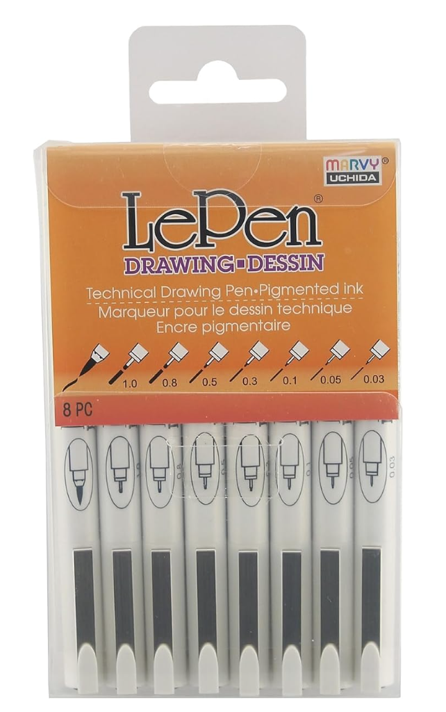
LePen Drawing Pens 8 Piece Set
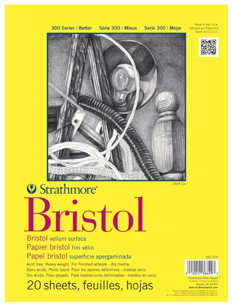
Strathmore Bristol Paper Vellum Surface
|
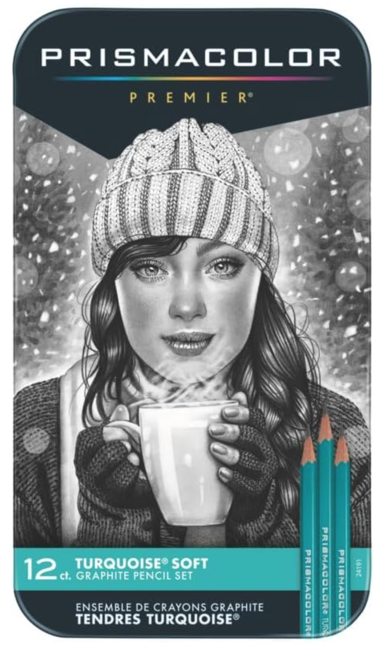
Prismacolor Premier Turquoise Drawing Pencils
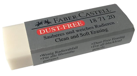
Faber-Castell Dust Free Soft Graphite Erasers
|
2. Warming up
I enjoy warming up my hand by practicing the marks I will be using in my studies on a scrap piece of paper. If you're a beginner just starting with pen and ink and you're setting out to sketch an object in a way that actually transmits form, I suggest practicing value strips as well (there is a pdf at the end of the post that you can use to practice with).
It's absolutely essential that you understand how to create a variety in values using marks when it comes to sketching with a drawing pen, especially if you're looking to add believable structure and form to a drawing.

Practicing different types of marks to shade a simple geometric shape.
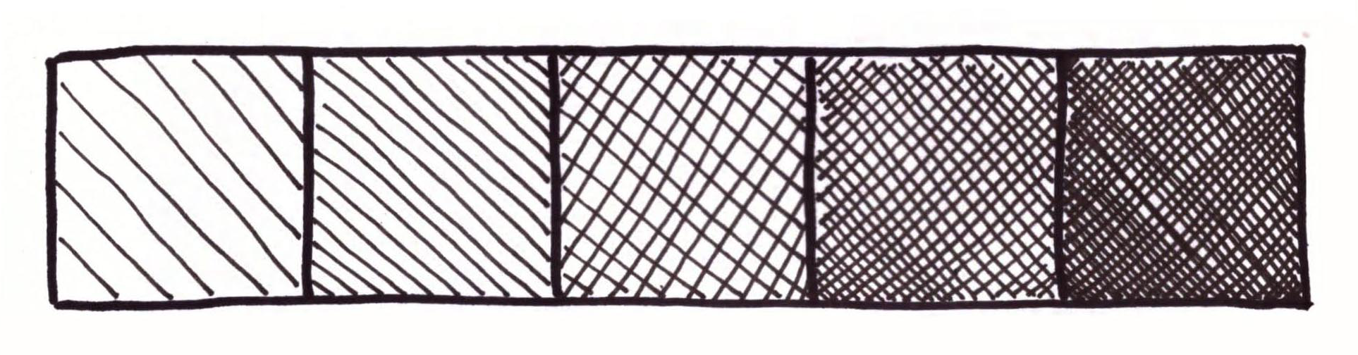
Value strip showing hatching and crosshatching.
3. Choosing a great reference photo
When searching for a photograph to use as reference for any kind of art study, there are a few things you have to keep in mind. First, make sure that its contents are suited for your current skill level, especially when you are exploring a new medium.
This way, you'll be able to focus more on the new medium or technique. Aside from this, you must select a photograph that is high quality.
When I am choosing a photograph to work from, I make sure that it has a great resolution that will allow me to zoom in to view details as needed.
Photographs should also have great lighting, which means that they are not over or underexposed, and that there is a good range of values/balance between lights and darks.
If you have trouble discerning between light, mid-tone and dark areas, I highly recommend looking for photographs with a single light source and possibly opening up your image in an image-editing software like Photoshop to desaturate it.
Keep practicing this, because it's imperative that you gain practice doing this so that you're able to render values and place them accordingly when you're trying to make your drawings more believable.
To find more free, quality photographs to practice with, visit my post titled My Favorite Free Image Sites and Two Examples of References with Finished Illustrations!
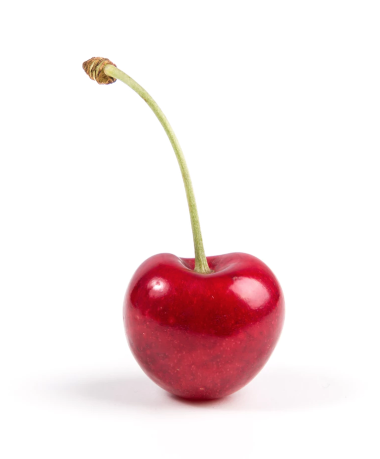
Photo by Thomas Quaritsch from unsplash.com. Click on link to visit site and download for your studies.
|
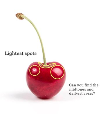
Photo showing lightest areas.
|
4. Creating an initial outline sketch (and lightest values map)
Once I have taken a moment to observe my reference picture and have pinpointed lightest and darkest areas, as well as mid-tones, it's time to create my initial pencil sketch!
This will entail creating a simple outline drawing of my object, paying attention to proportion and location of separate elements in regards to each other.
Also, at this point I also create a "map" for myself that will remind me where my lightest areas are located, so that I can protect them and leave them untouched by any marks. You can make this "map" as detailed as you'd like if you feel that creating more shapes with your pencil will help you throughout the mark-making process.
If you'd like to skip the outline drawing phase of this study and jump straight onto the ink mark-making, you can download either the large single cherry outline pdf or the six cherry outline pdf so you can practice all of the mentioned techniques!
Both of these free downloadable worksheets can be found at the end of this blog post.

5. Laying down initial layer of marks
First, I outline my initial pencil sketch (minus the smaller "map" shapes) using my drawing pen. Then, similarly to my watercolor painting process, I leave the lightest lights completely untouched by any ink and start adding in my first layer of ink.
What I like to do with these faster studies, is fill in all my mid-tone to darkest areas simultaneously using light pressure on my pen, making sure to work around my lightest areas.
In other words, by the end of this step, my entire mid-tone and darkest areas already are covered with that first "light" layer of marks.
6. Adding darker values
This is the part of the process that is the most time-consuming, as I work back and forth between mid-tone to darkest areas doing my best to create gradual shifts in value until the desired form is achieved.
Throughout this process, I constantly look at my reference picture.
It's essential to not go overboard by adding too many marks in mid-tone areas, but also to not be scared of going dark where needed (which is usually only in small areas).
Remember that there has there has to be a good range of values within your sketch or you risk "flattening" it out!
At the end, you can outline your sketch using your drawing pen once more if you wish! :)
Comparing Different Mark-Making/Shading Techniques
Hatching
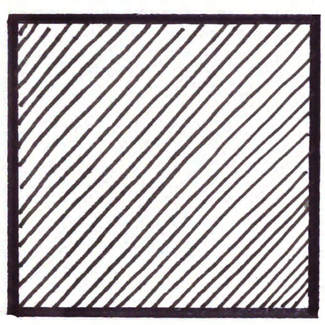
Hatching- Mark-making/ Shading technique
|
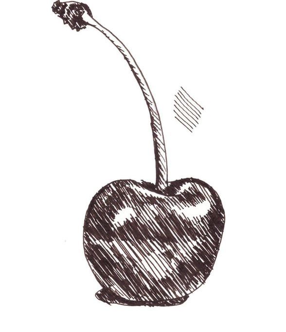
Cherry sketch showing hatching.
|
Crosshatching
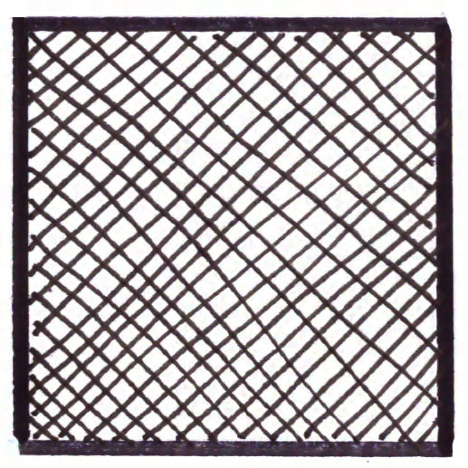
Crosshatching- Mark-making/ Shading technique
|
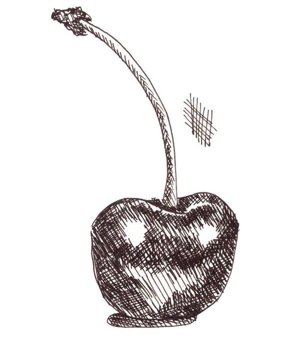
Cherry sketch showing crosshatching.
|
Contour Lines
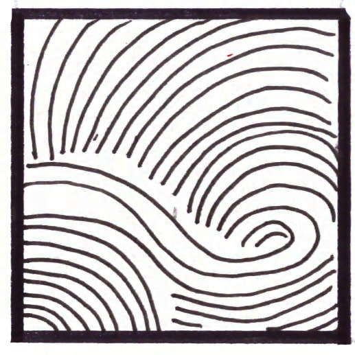
Contour Lines- Mark-making/ Shading technique
|
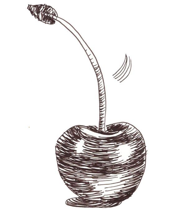
Cherry sketch showing contour lines.
|
Weaving
Weaving- Mark-making/ Shading technique
|
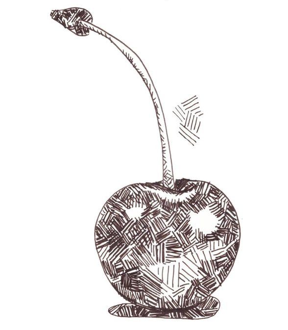
Cherry sketch showing weaving.
|
Stippling
Stippling- Mark-making/ Shading technique
|
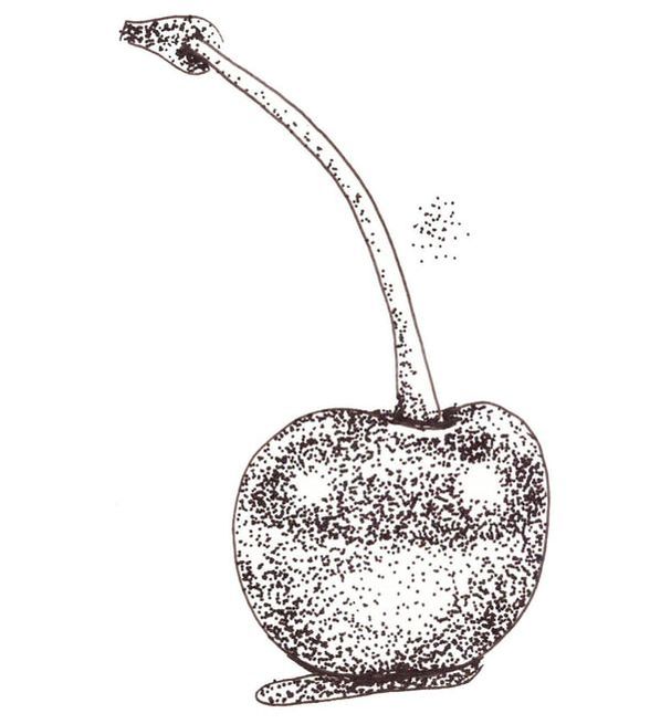
Cherry sketch showing stippling.
|
Scribbling
Scribbling- Mark-making/ Shading technique
|
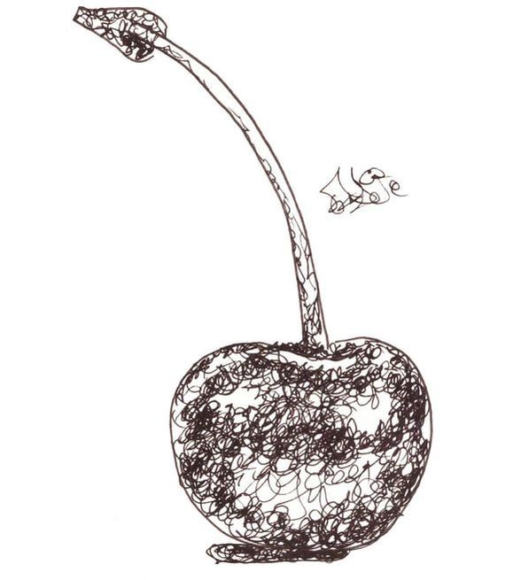
Cherry sketch showing scribbling.
|
I would recommend practicing at least a few different pen and ink mark-making/shading techniques because it's the only way you'll be able to know which ones come more naturally to you, as well as which can best create the effects you're going for.
My personal favorites are hatching/crosshatching and contour lines. I'd love to know which you like best below!
*Free downloadables!
| drawing_marks_lines.pdf |
| value_transitions_shading.pdf |
| cherry_outline_drawing.pdf |
| 6_cherry_outline_drawings.pdf |

10 Comments
*This post contains affiliate links. I receive small commissions for purchases made through these links at no extra cost to you. These commissions help me keep this site up and running, in order for me to keep providing helpful and inspiring art content. :)
Are you confident with your skill level creating outline sketches and feel ready to start giving them a sense of three-dimensionality and form? Do you find all of the information out there about different shading techniques a bit overwhelming and, perhaps, are unsure about which one(s) you should be using in your work? Is it even necessary to know about all of them?
I find sketching with pen and ink incredibly refreshing in between larger projects. A couple of the things I love about this artistic medium are that it challenges me to think about the intention behind each line or mark I create, and that I have to work around mistakes in order to complete each piece.
You see, as opposed to sketching or drawing with pencil, ink cannot be erased!
In today's blog post, I'm going to share my favorite six of ways of shading and adding three-dimensionality to pen and ink sketches. I'll explain how to go about using each technique, as well as some points I consider positives and negatives about each.
This way, you'll have more of an idea of when you could be using them in your own work and you'll avoid creating effects that you weren't intending to create.
It's important to understand that, when using these techniques, we are creating marks and lines. By repeating marks and lines we not only create value, but also a certain visual texture.
If we're not mindful about how we draw these marks, we can create effects in a piece that are too distracting and that don't really help describe our subject effectively.
In this post we're focusing a bit more on value because this is what is going to help us give our sketches a sense of believable form.
Though the techniques I will describe below are different, these two principles apply to all of them:
a) The more marks created= The more ink is covering the surface (paper)= The darker the value
b) The less marks created= The less ink is covering the surface (paper)= The lighter the value
I highly recommend checking out this past blog post of mine:
Guide to Shading Techniques: Hatching, Crosshatching, Scribbling and Others
In it, I go over why being able to discern between lights, mid-tones and darks in a reference image is essential and also provide specific examples of hatching, crosshatching and scribbling in old masters' work. This post also includes a few free downloadable pdfs with useful exercises for you to practice with!
It's important for you to know that it's ultimately going to be up to you to explore these mark-making techniques and decide which ones you prefer. How you use them (and combine them) is going to depend on your own preferences, as well as the style you're going for.
If you enjoyed this video and found it helpful, make sure to subscribe to my YouTube channel. I share a brand new video every week with art tips, drawing and painting tutorials and mindset/productivity tips for artists. *Subscribe HERE*

Exploring Mark-Making and Shading Techniques
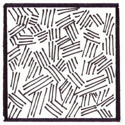
1. Hatching
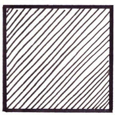
Hatching- Shading technique
This technique entails creating sets of straight parallel lines. The direction of these lines doesn't really matter. You can decide whether you want to draw them horizontally, vertically or diagonally (at any angle).
However, you do have to make sure that there is a consistency between each of your sets, especially in terms of the distance that you're leaving between your lines and their overall direction.
This doesn't mean they have to be absolutely perfect, but you do need to stay mindful of what your doing!
Positives:
-It is a very fast way of giving a subject a sense of form, especially geometric shapes and subjects composed primarily of geometric shapes (think houses, buildings and furniture).
Negatives:
-You do have to be somewhat confident drawing straight lines.
-Because we are drawing straight lines, this could lead to a certain "flatness" in areas that aren't really meant to be flat, which means we have to be extra careful when using this technique when drawing organically shapes objects with curves in them (think human form, a piece of fruit, etc.).
*Look for examples of hatching/crosshatching in portraits and still lifes online to see how it can be successfully done.
2. Cross-Hatching
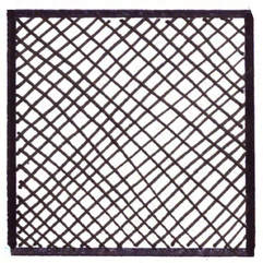
Cross-hatching- Shading technique
This technique is very similar to hatching, but it entails creating a second set of straight parallel lines on top of the first. This second set of lines can be drawn in any angle or direction you'd like, as long as you pick an angle and keep it consistent throughout.
Remember to focus on the distance that you leave between your lines and their overall direction.
Positives:
-You can very naturally combine hatching with cross-hatching, as the addition of your second sets of lines can create your darker values.
-It is a very fast way of giving a subject a sense of form, especially geometric shapes and subjects composed primarily of geometric shapes (think houses, buildings and furniture).
Negatives:
-You do have to be somewhat confident drawing straight lines.
-Because we are drawing straight lines, this could lead to a certain "flatness" in areas that aren't really meant to be flat, which means we have to be extra careful when using this technique when drawing organically shapes objects with curves in them (think human form, a piece of fruit, etc.).
*Look for examples of hatching/crosshatching in portraits and still lifes online to see how it can be successfully done.

3. Contour Lines
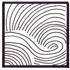
Contour Lines- Shading technique
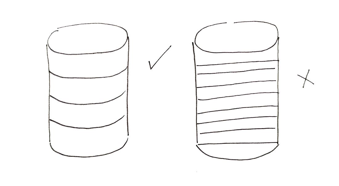
Cylinder sketch showing contour lines
|
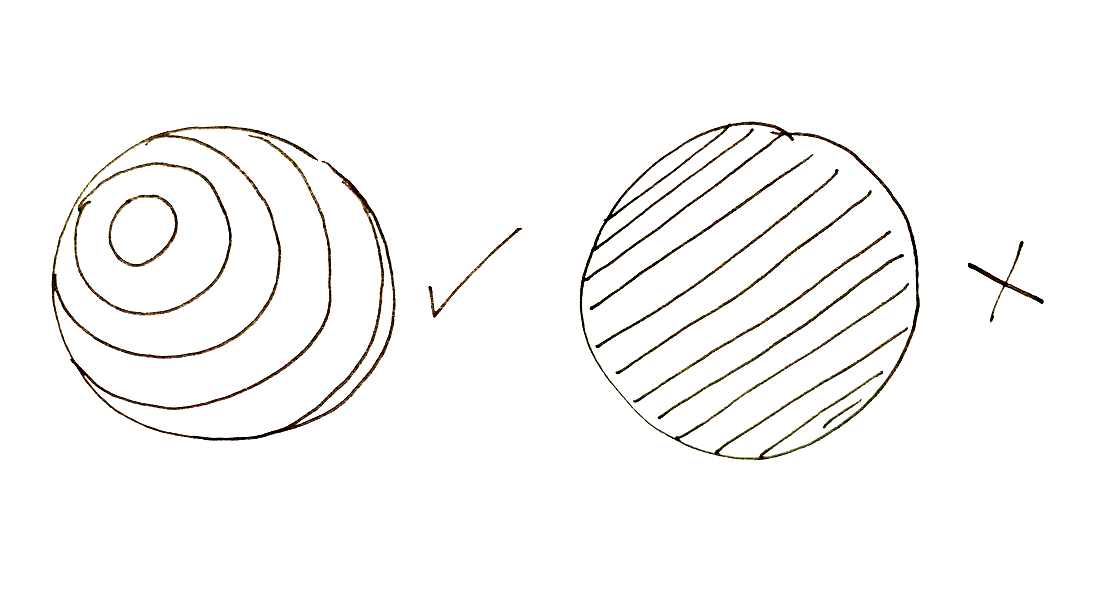
Sphere sketch showing contour lines
|
To create contour lines, it's essential to think about the subject's form and volume before laying down any lines. Contour lines accentuate the curves in subjects that are rounded or more organically shaped.
Notice how, in the sketches above, the versions with curved lines help translate a cylinder and a sphere's form much better than the ones with the straight lines.
As opposed to hatching and cross-hatching lines, we're not replicating the same line over and over again, but seamlessly transforming our curved lines to better emphasize the rounded and convex/concave areas of our subjects.
Contour lines transform throughout a drawing following the natural curves of our subject, and the perspective/angle we're viewing the object at will affect what these lines look like.
Positives:
-With some practice and efficient visualization, it's a very fast way of giving a sketch of organically shaped subjects (think of the human figure or a piece of fruit) a sense of realistic form.
Negatives:
-It requires a certain amount of visualization.
-If you stop paying attention to what you're doing for even a short amount of time, your drawing is not going to be very successful.
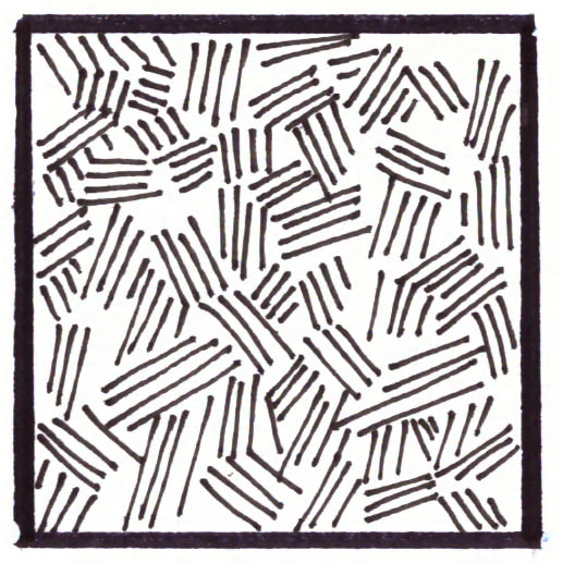
4. Weaving
Weaving- Shading technique
To create a weaving pattern, draw shorter sets of intersecting/interlocking lines. These sets of lines can have a specific organized pattern to them, or they can be placed in a more random manner.
Simply start by laying down your first set of lines anywhere you'd like, and then start adding more sets around that line in a varied enough angle that they look like they're intersecting with each other.
Positives:
-This mark-making technique creates a very appealing visual texture which is very easy to achieve.
Negatives:
-It requires a certain amount of concentration just to create a "weaving" effect, which may take away from our focus when trying to achieve adequate value placement.
-The high level of texture created may be too distracting when drawing certain subjects.
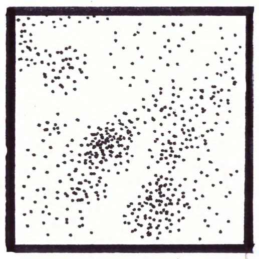
5. Stippling
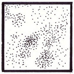
Stippling- Shading technique
Stippling requires us to lay down a huge amount of dots. We have to be mindful and do this calmly, as trying to rush generally leads to creating ticks (small lines) instead of dots, which leads to inconsistency in our marks.
Positives:
-This technique can create amazingly realistic drawings of pretty much any kind of subject.
-We have a lot of control because the marks are so small and the technique it itself forces us to take our time with it.
Negatives:
-It can be EXTREMELY time consuming and tiring.
-Creating so many dots may lead to damaging the tip of our drawing pen.
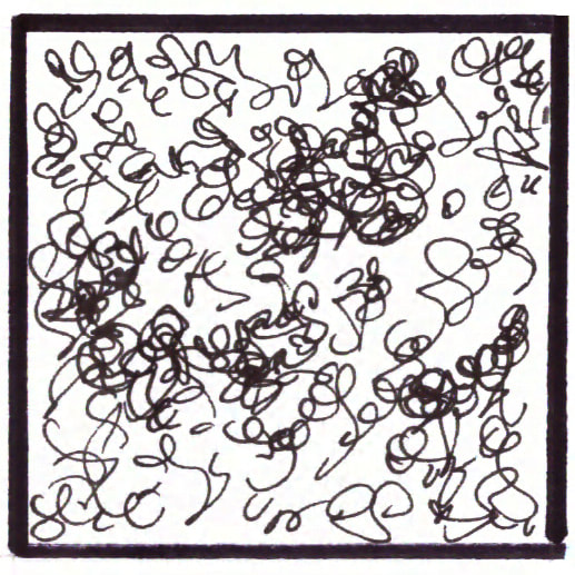
6. Scribbling
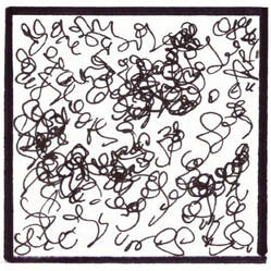
Scribbling- Shading technique
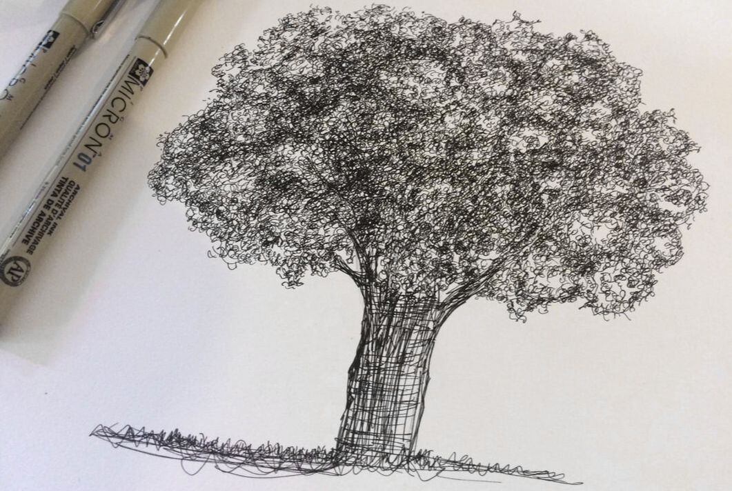
Pen and ink tree study by Erika Lancaster
To do effective scribbling, relax your hand and allow it to move naturally and organically. Don't focus on creating any specific kinds of shapes or lines, but more on loops and variety.
Practice changing the pressure you're exerting on your paper as you want to deepen values and let your hand go.
Positives:
-Once you're comfortable with this technique, it is a very easy way of achieving a visual effect of small, overlapping natural elements, that require more irregularity in them (think of leaves, plants and curly hair).
Negatives:
-It can be easy to go overboard since we are letting our hand have a mind of its own. I recommend taking breaks and stepping back every now and then.
*Find free downloadable PDFs to practice your mark-making and value transitions at the end of this post!
|
|
|
|
|
Shading Simple Geometric Shapes
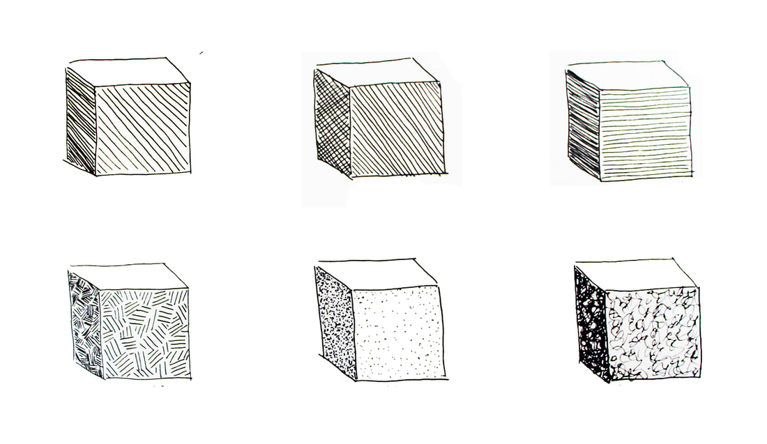
Shading a cube using different pen and ink techniques.
The absolute best way to get started with actual shading is to begin with simple geometric shapes that are formed by flat planes (cubes, rectangular prisms, triangular prisms).
It's important to decide where your light source is going to be located before you begin so that you can then decide where your lightest, medium and darkest planes are going to be.
Take a moment to observe the cubes above. Can you tell which side is the lightest, which is the darkest and which is the in-between value? Judging by the placement of these values, where would you say the light source is located?
Need help drawing three-dimensional geometric shapes? No problem! Go to my blog post titled Perspective for Beginners: How to Use 1 and 2 Point Perspectives to find free downloadable pdfs with step-by-step instructions.
If you'd like to practice specifically shading cubes and don't feel like drawing them, download the free pdf at the end of this post!
Once you're successful with shading flat-sided geometric shapes, move on to geometric shapes that contain curves in them (spheres, cylinders, cones, etc.).
Only after you have practiced these enough, should you move on to more complex subjects.
Stay tuned for the next post, because we'll be discussing how to use each of these techniques to describe the form of a piece of fruit!
*Free downloadables!
| value_transitions_shading.pdf |
| drawing_marks_lines.pdf |
| shading_3d_shapes.pdf |


*This post contains affiliate links. I receive small commissions for purchases made through these links at no extra cost to you. These commissions help me keep this site up and running, in order for me to keep providing helpful and inspiring art content. :)
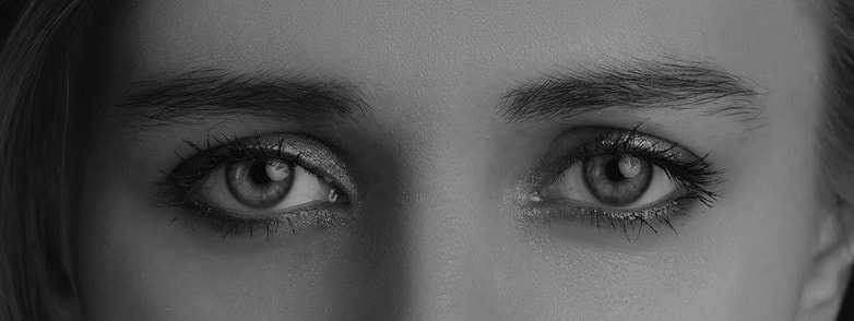
Do you find your eye drawings look slightly "off" and have trouble pinpointing areas of improvement? Have you wondered what you can do to make your drawings of facial elements look a bit more realistic? Would you like to take your portrait drawings a step further and give them more expression and life?
A lot of artists love drawing eyes (myself included) and this makes total sense! I really believe eyes are the windows to the soul. They play a huge role in portraiture because they have the ability of expressing emotion and the story behind the subject on hand.
In this blog post, I'll be sharing the method I go through when drawing realistic eyes, as well as the key components of eyes that should always be included in order to make them look believable. To finish up, I will also be sharing a few essential tips to have in mind whenever attempting to draw anything realistically.
Drawing portraits, or any individual facial element, is difficult and requires practice. We are used to seeing faces day-in-and-day-out, which makes us highly susceptive to noticing mistakes in a portrait drawing or painting.
Even if a non-artist wasn't able to decipher where the error is located specifically, he/she will most likely know that something doesn't look quite right.
This makes it essential for us, as artists, to study facial features in isolation and understand their structures and proportions, as well as their appropriate location within the head area.
This knowledge, together with an effective rendering of values, is what will make a portrait (or facial elements) look believable.
I highly recommend checking out this past blog post in which I explain why studying facial features individually will help you improve your portraits and what I personally do to study them:
Improve Your Portrait Artwork By Doing This One Thing
Also, learn about how and when it's okay to use other people's photographs as art references in this blog post:
When and How to Use Other People's Photographs to Create Art
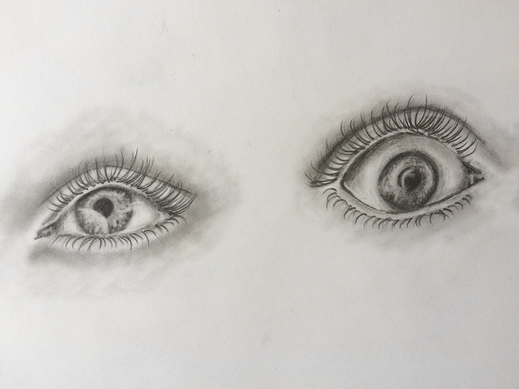
Realistic eye drawings by Erika Lancaster. Sketchbook studies.
If you enjoyed this video and found it helpful, make sure to subscribe to my YouTube channel. I share a brand new video every week with art tips, drawing and painting tutorials and mindset/productivity tips for artists. *Subscribe HERE*

How to Draw Realistic Eyes
You will need:
-Pencils (HB, 2B, 6-8B)
-Eraser stick or kneaded eraser
-Regular rubber lead eraser
-Sharpener
-Blending stump
-Drawing paper (sketchbook or Bristol board)
*Optional: Ruler
|
|
|
|
|
|
|
|
Drawing Process:
1. Start with a great, high-quality photo reference
When attempting to draw anything realistically, it's extremely important to use a great photographic reference (unless you're drawing from life but we will not be getting into this at the moment as this is more of a beginner-oriented tutorial).
Why? Working with a reference allows us to develop our observational skills, which is absolutely key. As artists looking to improve the sense of realism in our work, me must learn to see.
Not to mention, a reference informs us about what the subject actually looks like and reminds us of details that we can easily forget if we didn't have it. These details can make or break our drawings/paintings!
It's important to draw our subject how it actually looks like in real life and not how we think it looks like.
What makes a high-quality photograph?
For the most part, you want to look for pictures that demonstrate good lighting and have a high resolution that allows you to zoom in to clearly see details as needed.
Find a list of my favorite free, quality image sites in my blog post titled:
My Favorite Free Image Sites and Two Examples of References With Finished Illustrations

Reference picture from Pixabay.com. Click on picture to go to original source.
Reference picture cut at close-up of eyes and desaturated for studying purposes.
2. Create your preliminary outline sketch
You want to start out any drawing by creating a light sketch that integrates all necessary elements and demonstrates effective proportion and placement of each of these elements in regards to each other.
For this initial sketch, use your harder-lead pencil (H-HB).
Because achieving adequate proportion and location of individual facial elements is very important when drawing faces, I like creating guidelines for myself in the form of small ticks before actually starting my drawing.
I use a ruler or another tool to measure out sizes and distances as needed, as well as vertical and horizontal lines to keep things in alignment.
After having studied facial proportions, I know that there should be a certain symmetry to eyes and that the width of one eye should be able to fit between the two.
Learn about facial proportions and adequate locations of facial elements in this blog post:
How to Draw a Face (for Beginners)
Though there are many different eye shapes out there, there are certain key parts of eyes that are always at least partially visible and, therefore, you should make sure to integrate them into your drawing.
Though there isn't a set sequence that you must to draw these individual elements in, do make sure to leave your eyelashes until the end!
Always include the following:
a) The shape that represents the visible part of the eyeball
b) The pupil (darkest/blackest part in of the eye)
c) The iris (the part of the eye that contains color) *This part is almost NEVER visible in its entirety, unless you want your subject to look very surprised! It usually has darker edges and flecks of lighter color within it.
d) At least some reflection within the pupil and iris *These reflections give life to the eye and create the effect of eyes being moist.
e) The tear-duct in the inner corner of the eye
f) The tear-line along the bottom eyelid
g) The crease above the upper eyelid
h) The eyebrow
i) The eyelashes (which I highly recommend drawing until the very end)
*Notice how each of these are present in your selected picture before actually drawing them out.
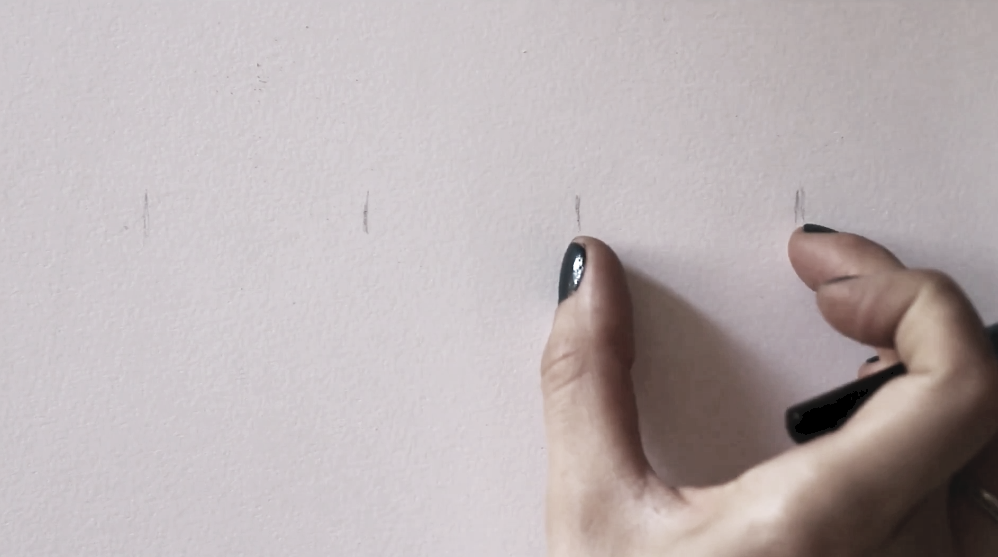
Establishing a few initial guidelines will help us ensure that our eyes will have effective proportion and location.
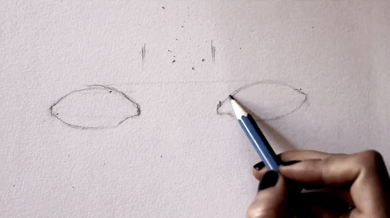
Drawing initial eye sketch (a).
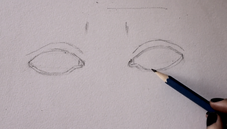
Drawing initial eye sketch (b).
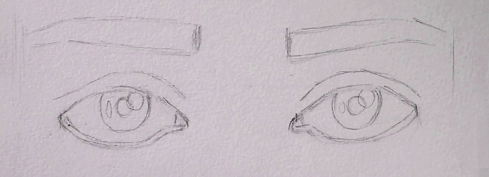
Drawing initial eye sketch (c).
|
|
|
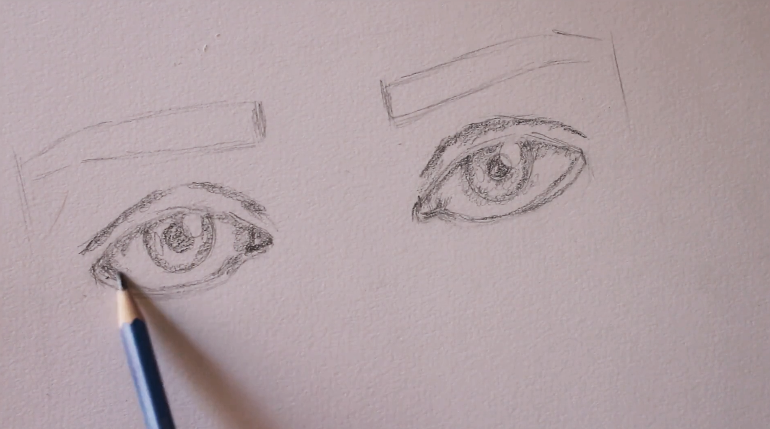
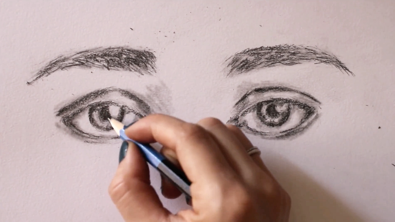
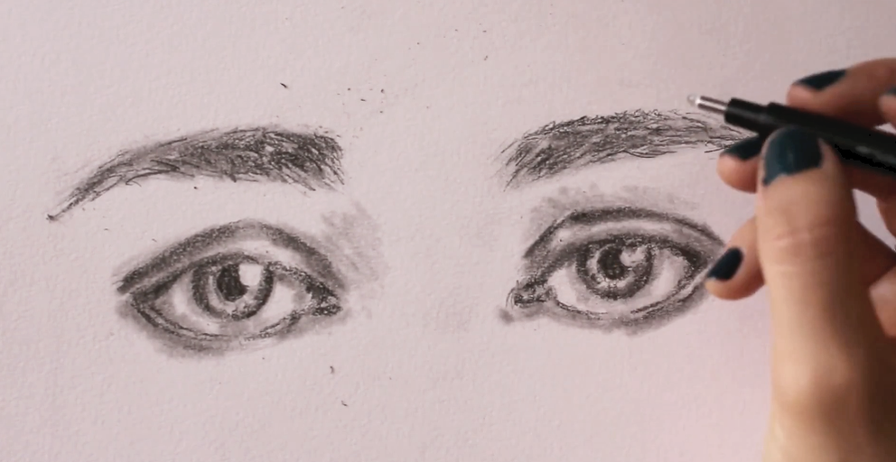
3. Start developing values and textures gradually
This is the part of the process that is probably going to take the longest, but take your time and observe your reference picture constantly.
Remember it's different values (highlights, midtones and darks) that give a drawing a sense of three-dimensional form. Therefore, you should observe where these different values are located within your subject so that you're able to recreate them.
Seriously! Around 50% of your time should be spent observing!
If you're having trouble with this, I recommend two things:
a) Choose a better picture with clearer lights/shadows, or
b) Desaturate your picture in Photoshop or another photo-editing software so you can see it in grayscale as opposed to full- color.*You can also do this in Gimp, which is a free photo-editing software you can download for free.
Using your softer-grade pencils (starting with 2B and progressing to 6B-8B as needed), take your time developing a wide range of values in layers, working from lights to darks as you go.
If you need help understanding different pencil grades, I highly recommend checking out my Drawing for the Total Beginner Mini-Course, which you can access for free after joining my art email insider list. I explain all about pencil grades in the first class of this course!
When it comes to shading, I always like starting in the darkest areas than I'm able to perceive in my reference picture, but I lay down my graphite lightly. I know that darkest darks are going to get developed incrementally, in layers.
Lay down your layers of graphite by exerting only a small amount of pressure on your paper and use your blending stump to create smooth transitions between your different values, as well as to get rid of any visible pencil lines.
Do your best not to cover up areas of highlights (lightest lights) with graphite. If you do cover them, no worries. You can pick up those highlights again later using a kneaded eraser or a Mono Zero eraser.
|
|
|
You should end up with parts that look almost entirely white, parts that look very dark, and an ample range of mid-tones in between.
Make sure that you create gradual transitions between your values and stay away from leaving visible outlines and harsh marks!
Remember, there are no visible outlines in realism!
Many beginners tend to believe that the sclera (the white part of the eyeball) should be left completely white, but it's not! There is shadow within the sclera created by the top eyelid and, usually, at the corners (which helps create the spherical shape of the eyeball).
Once again, don't guess. Observe your reference picture and make sure to develop your values as you see them.
When drawing the hair texture of the eyebrows, create a variety in values and draw them incrementally, starting from lights and making your way towards darks as you go.
Work back and forth as much as you need to, until you arrive at a good sense of three-dimensional form.
Resist the urge to add in your eyelashes until the end!
Developing values (a).
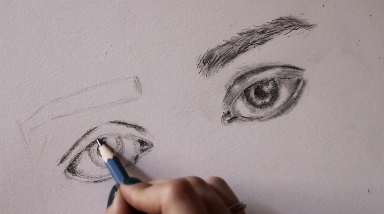
Developing values (b).
Developing values (c).
Developing values (d).
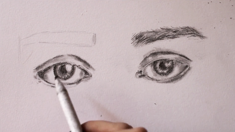
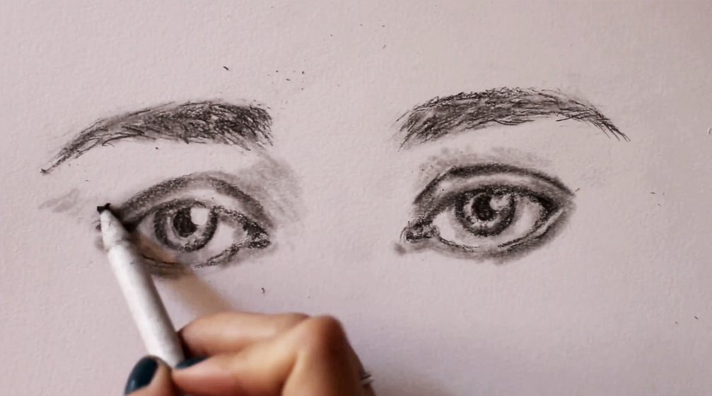
4. Establish a bit of form around the eyes to bring them together
Our eyes are spherical forms that are set in deep sockets in our skulls. They also have a large protruding form in between them (the nose) and a brow bone above them.
All of these things create nooks and crannies, and interesting shadows around our eyes. Take your drawing a bit further and bring your eyes together by adding in the shadows you see around them.
I like using my blending stump for this, gliding it gently in the areas where I need to create shadows. By this point in the drawing process it usually has plenty of graphite collected in its tip, but if yours doesn't, simply lay down more graphite where you see fit, making sure to start lightly.
Creating form around the eyes (a).
Creating form around the eyes (b).
Creating form around the eyes (c).
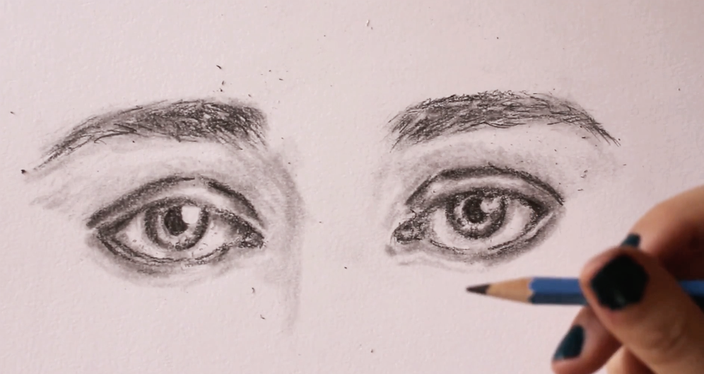
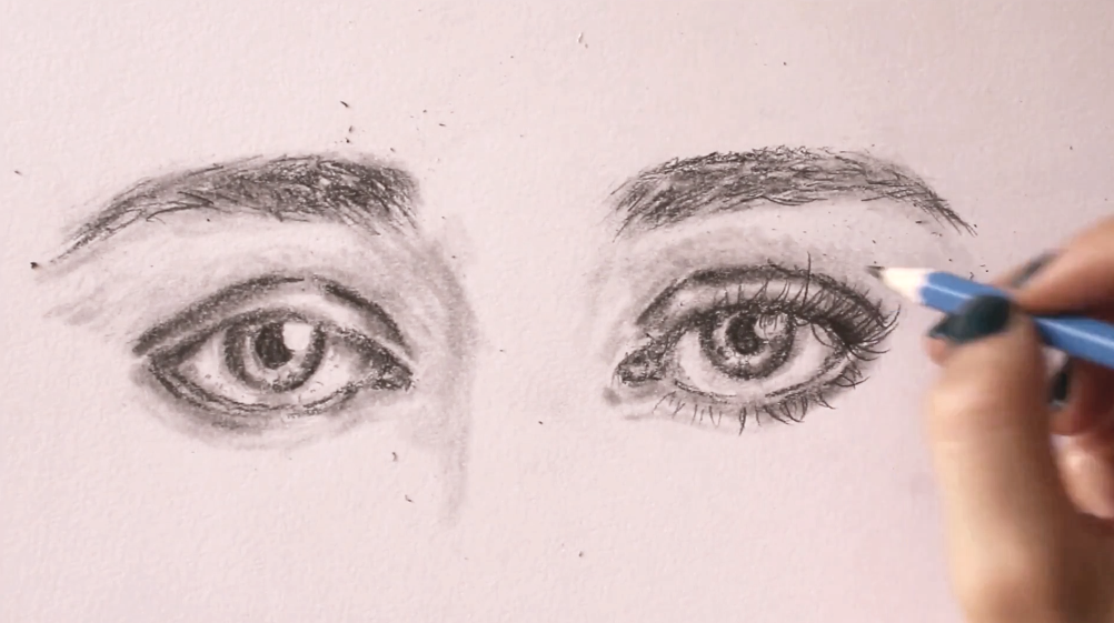
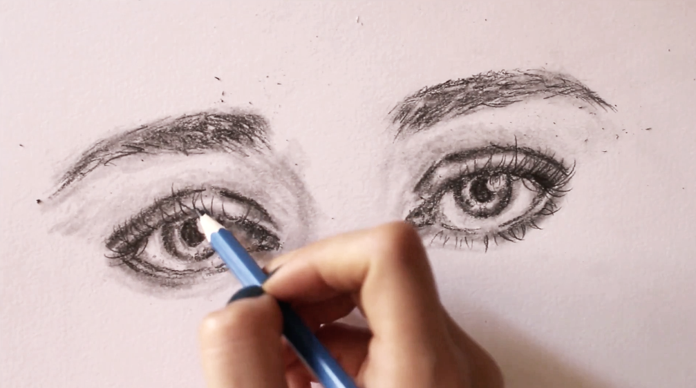
5. Draw the eyelashes
When you're done with the development of your values, it's time to draw in the eyelashes! For this part of the process, I like using my HB pencil, and I need to make sure that it's nice and sharp.
Natural eyelashes aren't perfect. Some of them are shorter than others, they are set at irregular distances from each other, and they go off in different directions depending on the angle and the direction the eye is looking towards. Also, many of them overlap!
Because the eyeball has a sphere-like structure, eyelashes located the inner-corner of the eye (close to the tear duct) tend to curl toward the nose, those in the middle section of the eyelid curl straight forward, and those in the outer corner of the eye curl away from the face.
Of course, the curl is generally emphasized more when drawing females than males and there are eyelashes that are completely straight.
Once again, draw what you see in the picture.
Another thing to note is that, usually, eyelashes located in the inner-corner of the eye and those along the lower eyelid are a lot shorter.
Be very careful not to oversaturate your eyelashes and create a variety amongst them in terms of value and thickness. This is easier said than done!
When drawing males, I've found that the less lashes I can get away with, the better!
Keep the aforementioned characteristics in mind and remember that natural things are imperfect.
Drawing eyelashes (a).
Drawing eyelashes (b).
And we're done!
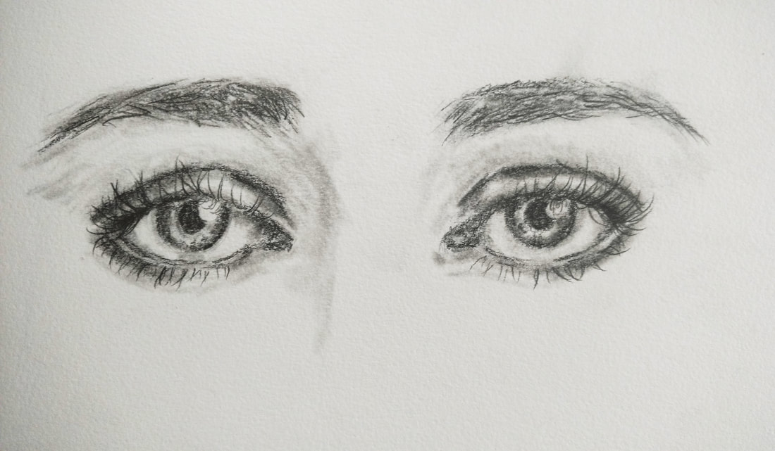
Realistic eye pencil drawing by Erika Lancaster.
Key tips to have in mind for realistic drawings:
1. Take your time choosing (or producing) a great reference picture.
2. Realize that value is more important than color and train yourself to discern highlights, mid-tones and shadows in your reference images.
3. Get used to observing your references constantly throughout the drawing process.
4. Draw what you see and not what you think things look like.
5. Steer clear of outlines and stark shapes (embrace subtleties).
6. Develop a wide variety in values and create gradual transitions between them.
I hope you found this post helpful! Which facial feature do you find most difficult to draw? Is it the eyes, nose, lips, ears....? Let me know in the comments section below! :)


*This post contains affiliate links. I receive small commissions for purchases made through these links at no extra cost to you. These commissions help me keep this site up and running, in order for me to keep providing helpful and inspiring art content. :)
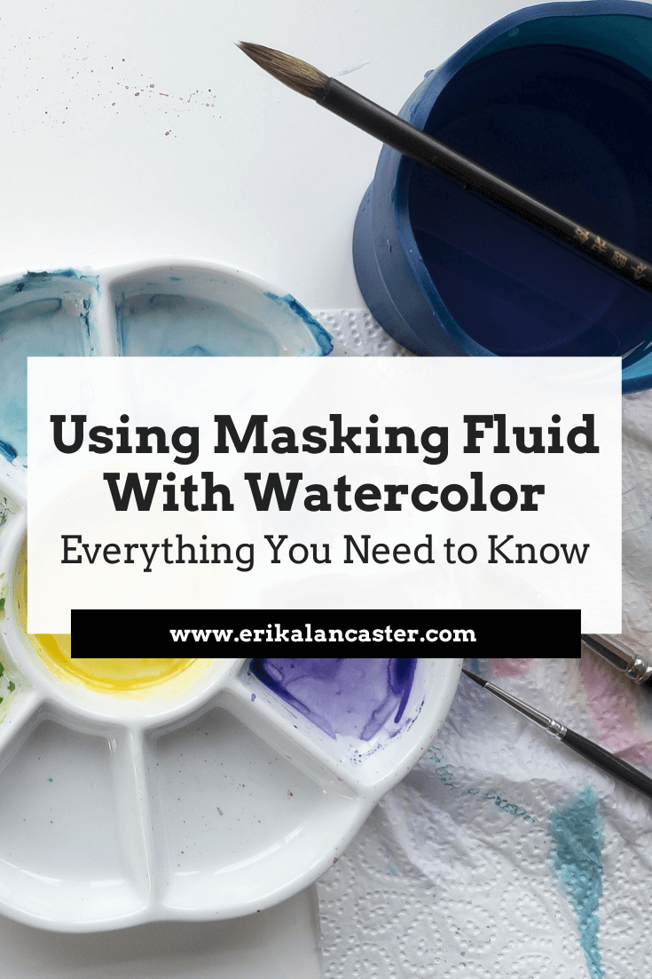
Are you struggling with saving your whites when painting with watercolors? Have you been considering the use of masking fluid but are unsure about how to use it effectively and whether it's really necessary at all? Have you avoided using masking fluid in your work because it makes the process longer and more tedious?
One of the most difficult things to get used to when starting with watercolors, is planning where the lightest areas of our paintings will be and keeping them protected throughout the painting process.
Watercolors are quite different from other painting mediums due to the fact that they are translucent and require us to work from lightest to darkest values. As opposed to acrylics, oils or gouache, this painting medium doesn't allow us to simply cover up mistakes.
By doing a bit of planning beforehand and knowing what tools/techniques to use for each project individually, we can ensure that we're using watercolors to their full potential.
When used effectively, this artistic medium is able to create very striking paintings that have a lighter feel to them than those created with acrylics or oils, and also seem to glow from within.
Protecting our lightest areas is essential in order to achieve such qualities.
In this blog post, I am sharing the steps I personally go through when using masking fluid in a watercolor painting. I will also provide some essential tips that will help you avoid accidents.
To illustrate each step, I have included a beginner-friendly masking fluid exercise. It's very important to do a few explorations with new tools before actually trying them out in a painting!
Even though many watercolor sets contain white paint, traditional watercolor artists avoid using it. There's no need because the watercolor paper itself IS the white and the areas left free of pigment will stand as the highlights of the painting.
Whether the artist decides to use masking fluid or not, he/she makes sure to protect those whites because, once pigment touches paper and is absorbed, there's no way to get that white back.
Traditional watercolor artists also avoid using black, but that is a story for a different day.
To learn about the ten most important things you should make sure to apply when painting with watercolors, read my blog post titled 10 Things I Wish I Knew Before Starting with Watercolors.
Now-a-days, there are tons of amazing artists who use watercolors in combination with other types of mediums, creating beautiful mixed-media artworks. There are those who complete a watercolor painting without paying much mind to highlights until the end, when they add them in using white gouache, acrylic paint, paint pens, and/or other drawing mediums.
I'm all about exploring mediums and creating one's own artistic style!
However, I've found it invaluable to study each medium individually and challenge oneself to create desired effects using that medium alone. I noticed the biggest improvement in my painting quality when I pushed myself to complete a project using only one medium.
So, I recommend making time to explore each medium on its own once you're at a certain skill level, especially if you find that you're continuously reaching out for a second/third medium as a crutch because you were unable to create the effects you were intending to.
Once you've learned the characteristics of each medium and the general do's and don'ts, then go ahead and combine them, if you wish to.
But let it be because it's your stylistic choice, and not because you needed another medium as extra support. It's hard! But I promise you you, that it will help you improve a whole ton.
Masking fluid is absolutely not necessary in order to create a great watercolor painting, but it sure is a great tool to know about, especially when painting certain kinds of subjects that have shiny, reflective surfaces and/or tiny areas you want to block out.
If you don't have masking fluid or wish not to use it, you have the option of carefully working around your planned white highlights, but because watercolors are so fluid, it may be a challenge.
Here is an example of a painting I created by very carefully working around the areas I wanted completely white at the end (no masking fluid). See all those tiny white spaces? I consciously made an effort not to get any pigment in them!
If I had accidentally covered up those spaces, my painting would look flat and wouldn't have that "glow" to it.
Watercolor sandwich by Erika Lancaster
If you enjoyed this video and found it helpful, make sure to subscribe to my YouTube channel. I share a brand new video every week with art tips, drawing and painting tutorials and mindset/productivity tips for artists. *Subscribe HERE*
So, what is masking fluid, exactly?
Masking fluid (also referred to as liquid frisket) is liquid latex that dries to a rubbery/waterproof film, allowing us to block out areas in our paintings that we want free of pigment. It contains ammonia, which makes the liquid very smelly and makes it necessary to work in a well-ventilated room.
Usually, we're presented with masking fluid options at art supply stores that look white while in the bottle and dry to a transparent/yellowish film. However, pigmented varieties are available, in case the artist requires a greater visibility throughout the placement process.
Though the use of masking fluid entails adding in a couple of extra steps and makes the painting process longer, it does make protecting the whites a lot easier and is a great tool to have when painting complex, detailed subjects!
How to Use Masking Fluid
You will need:
-Watercolor paper
-Masking fluid
-Watercolor paint
-Paintbrushes
-Pencil
-Eraser
-Paint-mixing palette
-Cup of water
-Old rag or paper towel
-Bar of soap or dishwashing liquid
-A tool for placing your masking fluid (old paintbrush, wooden skewer, paper clip, cotton swab, etc.)
*Optional:
-Masking tape
-Rubber cement pick up or soft eraser
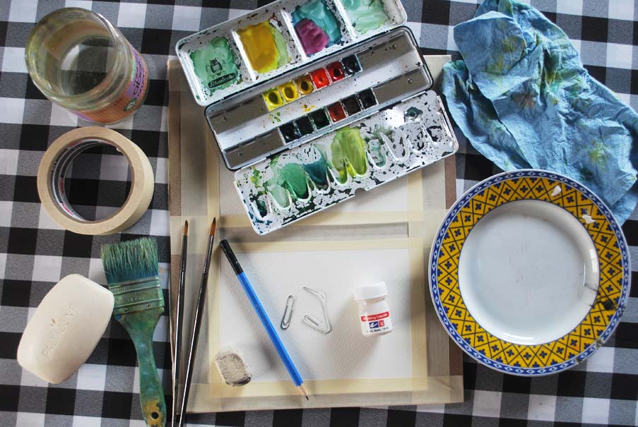
Watercolor painting supplies
|
|
|
|
Instructions:
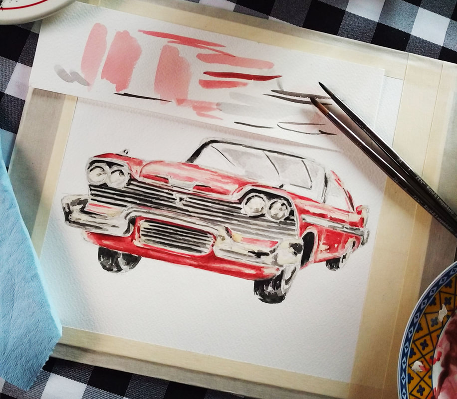
1. Create your initial sketch
As always, start with a good, light pencil drawing. Once you're done, map out where you want your highlights to be. Usually, this will entail having a good look at your reference picture and pinpointing lightest areas. Then, we would lightly outline these small shapes.
*Illustrative exercise (recommended for beginners):
For the purpose of this little abstract exercise, we will be blocking out lines. Create a simple design using straight or curved lines and keep them as light as possible (so you can erase them later)!
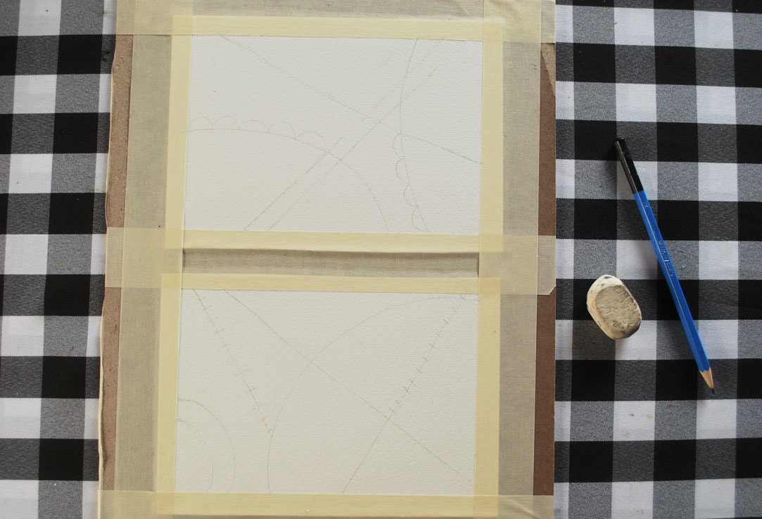
Initial pencil sketch
2. Select a tool to place your masking fluid with
Depending on the effect you're going for in your painting, this tool can range from a paintbrush, to a wooden skewer, to a cotton swab, or even a toothbrush (for splattering). If you do decide to use a paintbrush, make sure you use an older one that you don't mind damaging because it doesn't take much for masking fluid to kill those bristles!
Personally, I've already ruined at least a couple of paintbrushes and have gotten used to applying masking fluid with paper clips!
*For this exercise, you'll need a pointier tool so you're able to trace your pencil lines.
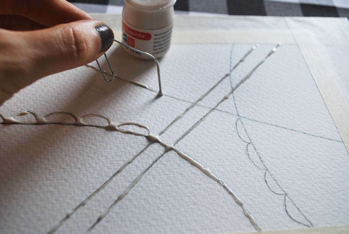
Placing masking fluid with a paper clip
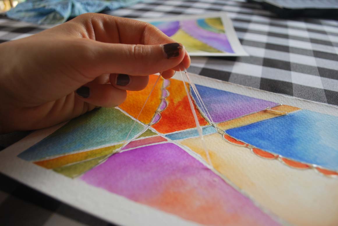
3. Take your time placing your masking fluid on desired areas
Do this carefully and take your time! Make sure your not scraping or otherwise damaging your paper, especially if you're using a sharp, pointy tool to place your masking fluid with.
If you're creating a finalized painting using a reference picture, try to look at it constantly so you make sure to block out all areas you want protected.
*Carefully trace your pencil lines. It's totally normal to have to re-dunk your paper clip into your masking fluid every few seconds! When you're done, allow it to dry completely (this can take up to 30 minutes depending on the thickness it was placed in. Make sure it's completely dry to the touch before continuing with the next step.
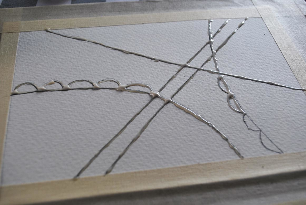
Placing masking fluid
Nearly dry, yellowed masking fluid
Check out my FREE Patreon-exclusive tutorial and class samples here.
4. Paint as per usual
Move on to the painting process, starting from lightest and most translucent values to darker values, allowing each layer to dry before applying the next. Don't be afraid of painting over the masking fluid. That's what it's there for!
If you're creating a finalized painting, take your time developing those values and get your painting as close to being done as possible before removing the masking fluid.
What I personally do, is to make sure I've arrived at a point at which I feel I can't advance any further until my masking fluid is out of the way. Once you're done, allow your painting to dry naturally and completely.
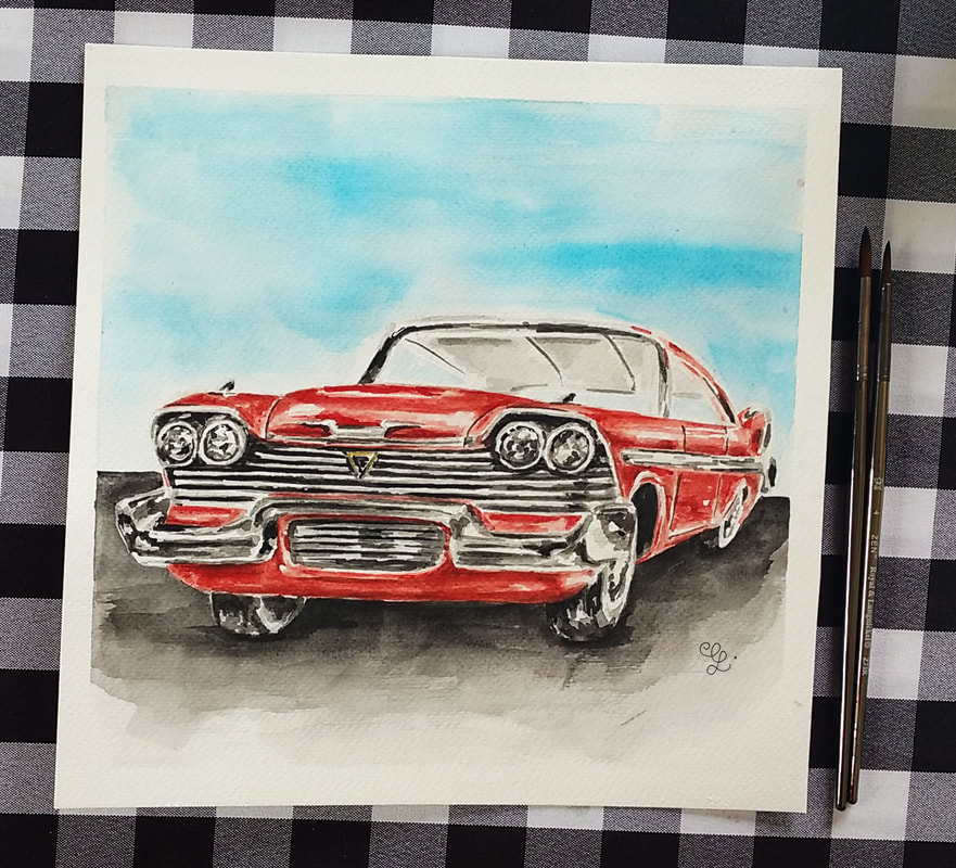
To see how I create striking paintings working in layers, visit my blog post Realistic Watercolor Sandwich Process
*For this beginner-friendly exercise, explore different colors and effects until you arrive at something you like.
4. Paint as per usual
Move on to the painting process, starting from lightest and most translucent values to darker values, allowing each layer to dry before applying the next. Don't be afraid of painting over the masking fluid. That's what it's there for!
If you're creating a finalized painting, take your time developing those values and get your painting as close to being done as possible before removing the masking fluid.
What I personally do, is to make sure I've arrived at a point at which I feel I can't advance any further until my masking fluid is out of the way. Once you're done, allow your painting to dry naturally and completely.
To see how I create striking paintings working in layers, visit my blog post Realistic Watercolor Sandwich Process
*For this beginner-friendly exercise, explore different colors and effects until you arrive at something you like.
Watercolor painting process
Watercolor painting process
5. Remove that masking fluid!
This is the time we've all been waiting for!
Once your painting is completely dry, carefully and gently remove that masking fluid with a rubber cement pick up, a soft eraser or using your fingers (I wouldn't recommend using your fingers if your hands are usually sweaty or greasy though!).
Rub gently until part of it lifts and then gently pull the rest off. Make sure you remove it completely and lightly dust your painting off so no pieces are left behind.
Removing masking fluid
6. Soften hard edges and finish any last details
Once your masking fluid has been removed, you'll notice that you're left with very stark-looking, sharp white shapes. If you're creating a painting that's more on the realistic side (like in the car painting time lapse video I've included in this post), you'll probably want to soften at least some of these.
To do this, simply wet your paintbrush in clean water and do some gentle scrubbing on those sharp lines, moving the pigment around on your paper. However, be very careful not to cover up all of your white!
Now is also the time at which you can further deepen values in your painting if you need to, or carefully create any washes you feel would improve your painting.
Allow to dry completely before removing any masking tape.
*For the purpose of this abstract exercise, I left my white lines as they were after having removed my masking fluid because I liked the look of it. If you'd like to explore softening some of them or even adding in extra washes of color, go for it!
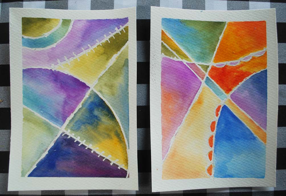
Erase those pencil lines!
Masking Fluid Pro Tips!
1. If you want to use a paintbrush for masking fluid placement, soak its bristles in dishwashing soap (or rub them gently on a bar of soap) before dipping it into the masking fluid. This will make it easier to remove the masking fluid when you're done.
2. Never shake your masking fluid bottle before starting with its application. This creates air bubbles and may lead to coagulation, which may make it harder to place on desired areas and may affect the outcome of your work.
3. Only apply masking fluid on bone-dry paper and only remove it from bone-dry paper.
4. When using masking fluid, resist the urge to speed up drying times using a hairdryer or any sort of heat tool. Warm air can cause the already-hardened masking fluid to stick to your paper even more, which can later lead to rips and tears as you try to remove it!
5. Never allow hardened masking fluid to be on your paper for extended periods of time (over two days). Whether this is a problem or not will depend on a number of variables such as masking fluid and paper brands/types, environmental temperature, etc. However, be wary of leaving masking fluid on your paper for long periods of time because it can get to a point at which it may be impossible to remove!
6. Explore different ways you can apply and use masking fluid! There are so many ways to do it, from placing it carefully the way we did in today's exercise, to splattering, smearing, etc. Experimenting with different tools and techniques can definitely open up your horizons about what's possible with watercolors and will also allow you to have different tricks up your sleeve whenever you're painting complex subjects!
What method do you personally use to create highlights in your watercolor paintings? Do you have any negative experiences with masking fluid? I'd love to know in the comments section below!
*This post contains affiliate links. I receive small commissions for purchases made through these links at no extra cost to you. These commissions help me keep this site up and running, in order for me to keep providing helpful and inspiring art content. :)
Does the word 'perspective' scare you off from creating more complex artworks? Do you feel like being too precise and using grids takes away from the fun of creating art? Would you love to be able to create drawings or paintings that effectively transmit a sense of depth and space, but don't know where to start?
The term 'perspective' basically refers to our point of view when we're in a specific, fixed location. Depending on where you're sitting or standing right now, you're going to have a different perspective of your surroundings when compared to a person sitting on the opposite side of the room, or even from someone sitting/standing next to you at a different height or slightly different angle!
To create believable three-dimensionality and depth on flat surfaces like paper or canvas, artists make use of grids and/or lines that assist them in creating optical illusions.
Though perspective may be more evident in artworks featuring indoor or outdoor scenery, it's actually present in all types of art, whether it's a portrait, a still-life, or anything in between. Make no mistake, perspective is a fundamental topic to understand in order to achieve believable and compositionally-sound drawings or paintings.
In today's post (and YouTube video!), we're focusing on 1-Point Perspective, which is the perfect place to start for the beginner artist. I'll be walking you through an initial exercise using simple three-dimensional geometric shapes that will allow you a proper warm-up, and then we'll be applying our knowledge to draw the inside of a room!
*A quick caveat before moving on: If you feel you don't have enough practice drawing simple, three-dimensional geometric shapes, you may want to practice drawing these a few times before continuing with the first drawing exercise.
Feel free to grab and print these two PDF's with steps for drawing cubes, rectangular prisms, etc.
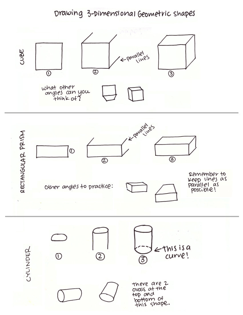
3D-Geometric shapes A. Click to download printable PDF.
|
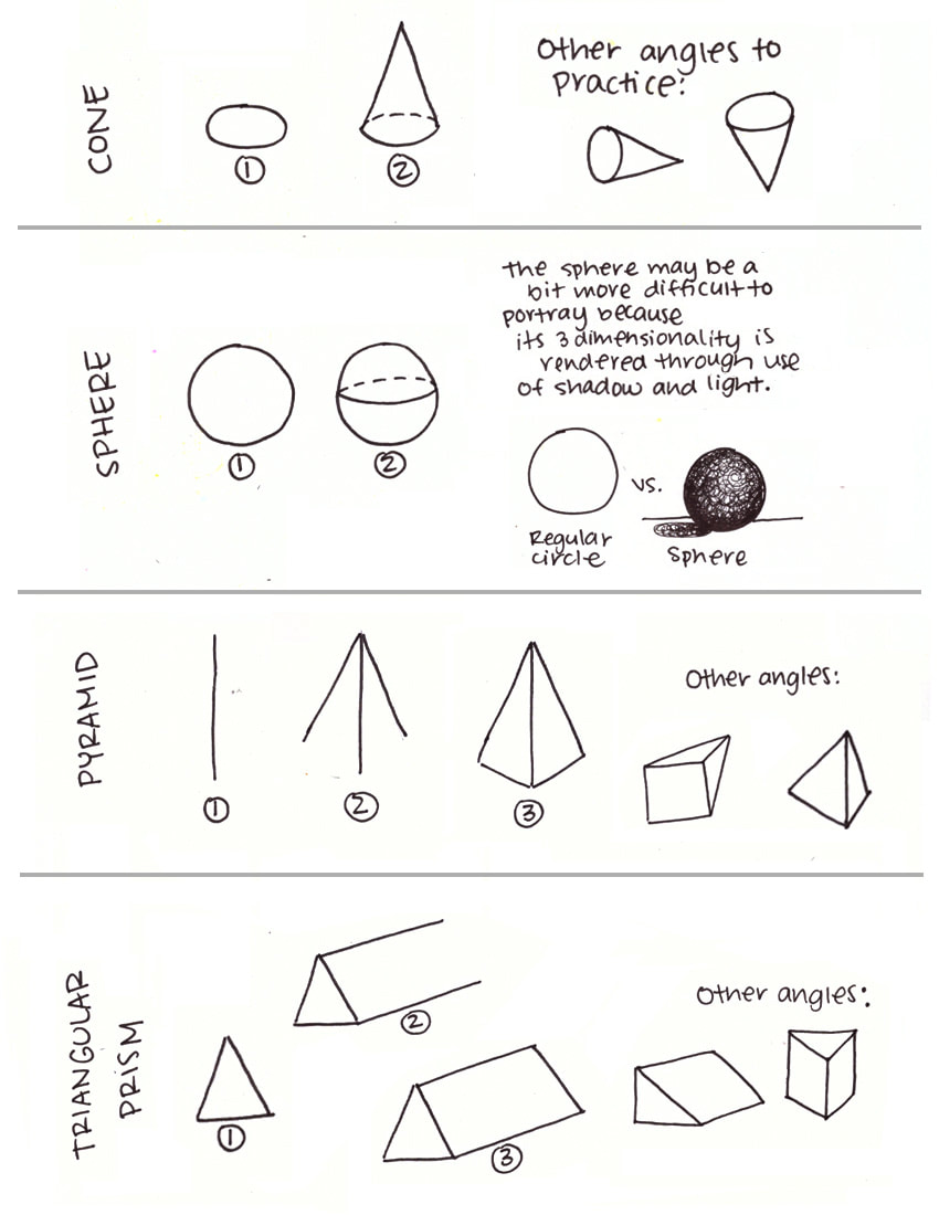
3D-Geometric shapes B. Click to download printable PDF.
|
A while back I wrote a very thorough guide to both One-Point and Two-Point Perspectives, which includes several more free downloadable worksheets/templates. In that post, I explain a lot of key terms related to perspective that you should definitely know about and also provide numerous examples of perspective in both famous artworks and modern photography.
Check it out here:
Perspective for Beginners: How to Use 1 and 2 Point Perspectives to Create Great Artwork
The 1-Point Perspective Grid
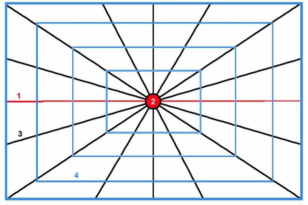
The 1-Point Perspective grid
One, Two and Three-Point Perspectives are all categorized as ¨Linear Perspectives¨. This means that they rely on the use of straight lines to depict three-dimensional space and the forms within it. In other words, to apply these techniques we will need to prepare for our drawings by creating grids which will be erased later on.
What these grids do, is allow us to create the illusion that objects get smaller and smaller as they get further away from us, while objects closer to us will appear larger.
These grids also allow us to establish our vanishing point(s), which represents the furthest point from us in the distance. The 1-Point Perspective grid contains one vanishing point, while the 2-Point Perspective grid contains two, and so on.
The 1-Point Perspective grid, is very useful when we're trying to draw a subject front-on. Surfaces of objects facing the viewer are drawn in their flat, undistorted shapes.
However, sides of shapes that are not facing the viewer are created by diagonal lines that converge at our single vanishing point in the distance.
The following are included in a One-Point Perspective grid:
1. Horizon Line
This is the line that separates sky from land (in landscapes) or sky from water (in seascapes). It is also referred to as the "eye-level" of the viewer. The Horizon Line doesn't necessarily have to be right in the middle of your picture. In fact, it is a lot better, compositionally speaking, if it is somewhere below or even above the halfway point of your drawing area. Objects above the horizon line are drawn as if you're looking up at them, while objects below it are drawn as if you're looking down at them.
2. Vanishing Point
The Vanishing Point is placed somewhere on the Horizon Line and it represents the farthest point in your picture. When creating a grid, this point is were the Orthogonal Lines all meet.
3. Orthogonal Lines
Orthogonal Lines (also known as Convergence or Vanishing Lines) are key when drawing perspective. They are diagonal and recede back into the vanishing point. A perspective grid can have many Orthogonal Lines or very few of them, depending on the complexity of the picture. The more elements in the picture, the more lines you will probably have to include in your grid.
4. Transversal Lines
These are completely horizontal or vertical lines that are either parallel or perpendicular to the horizon line. They form rectangles or right angles along the grid and are especially useful when drawing interiors (which we'll be doing today!).
5. Vantage Point
The Vantage Point refers to the specific place from which a scene is viewed. This point can actually be very high (referred to as bird's-eye) or very low (referred to as worm's-eye). It is crucial to decide where the Vantage Point is going to be in the very beginning because this will affect the placement and size of all elements within the composition.
If you enjoyed this video and found it helpful, make sure to subscribe to my YouTube channel. I share a brand new video every week with art tips, drawing and painting tutorials and mindset/productivity tips for artists. *Subscribe HERE*

Let's get started!
Supplies You'll Need:
-1 pencil with harder lead (4H, 2H or H)
-1 pencil with softer lead (B, 2B or 4B)
-Ruler
-Sharpener
-Soft eraser
-A few sheets of regular printing paper
*Optional: Black drawing pen
-1 pencil with harder lead (4H, 2H or H)
-1 pencil with softer lead (B, 2B or 4B)
-Ruler
-Sharpener
-Soft eraser
-A few sheets of regular printing paper
*Optional: Black drawing pen
|
|
|
Drawing Exercise #1: 3D Shapes Using the 1-Point Perspective Grid
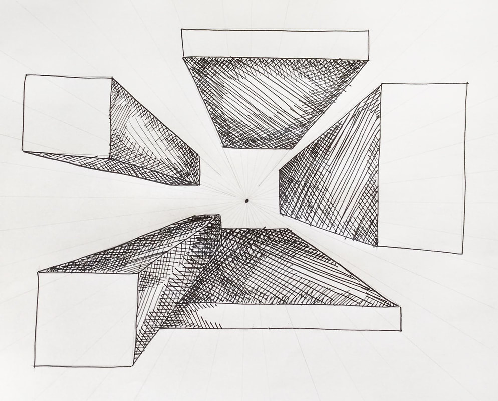
3-Dimensional shapes drawn on a 1-Point Perspective grid.
Check out my FREE Patreon-exclusive tutorial and class samples here.
Steps:
1. Using a ruler and your hard-lead pencil, draw a simple 1-Point Perspective grid. Pick a point within your drawing space (it doesn't necessarily have to be right smack in the center of it). With your ruler, draw lines intersecting at this point. Draw enough lines to fill the majority of your drawing space, but keep them as light as possible!
2. Using a softer-lead pencil, start drawing flat, two dimensional squares or rectangles anywhere within your grid. Do your best to keep your lines as straight as possible and help yourself with your ruler if needed. These flat shapes will be the 'planes' or sides of objects facing you.
3. Pin-point the innermost corners of your shapes (the ones closest to the vanishing point) and, using a ruler, draw lines from these corners to your vanishing point. Make sure your ruler is perfectly aligned with the corners of your shapes and your vanishing point. *Notice that some shapes are going to have two planes (or sides) showing and others will have three, depending on their location within your grid.
4. Close these shapes anywhere you'd like using horizontal or vertical lines. Make sure to protect those right angles and keep your lines as parallel as possible!
5. Extra step: Shade some of your shape's sides, just make sure to keep it consistent throughout (if you start shading the innermost planes of your shapes, keep the front planes unshaded).
Read my blog post titled Guide to Shading Techniques: Hatching, Cross-Hatching, Scribbling and Others to learn some fast shading methods!
Drawing Exercise #2: Drawing a Room Using the 1-Point Perspective Grid
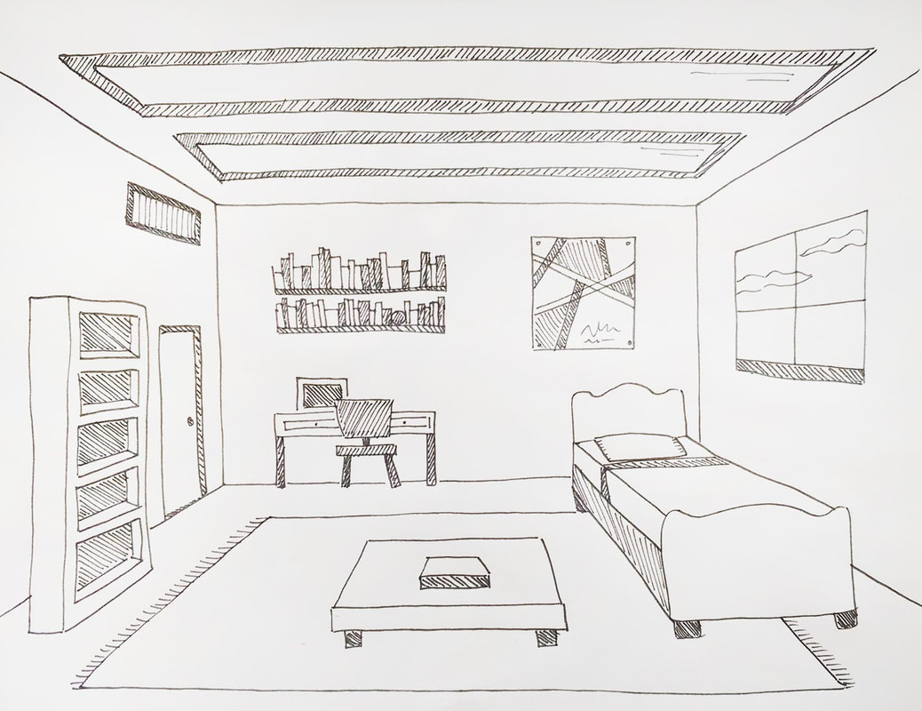
Room interior drawing showing One-Point Perspective.
Process:
1. Using a ruler and your hard-lead pencil, draw a flat rectangle in good size somewhere near the center of your drawing space (this will represent the back wall of your room).
This rectangle doesn't necessarily have to be perfectly centered by any means, but make sure that you're leaving enough space around it so you have enough area to add things into your room!
*Don't make this rectangle to small or narrow, as it will make your room look more like a long hallway. And don't make your rectangle to big, as this will make it seem like your standing too close to your back wall!
2. Create a very light cross in the center of your rectangle/back wall by aligning your ruler to opposite corners of your rectangle (top-left to bottom-right and top-right to bottom-left).
Make a dot right where these diagonal lines intersect. This will represent your vanishing point.
3. Next, you're drawing the four corners of your room! To do this, align your ruler with your vanishing point and each of the corners of your back wall to draw four lines outward.
Fill up the rest of the area on your floor, ceiling and walls with light lines like we did in the first exercise. Avoid filling in your back wall with lines, as you won't be needing them there.
4. Switch to your softer-lead pencil and re-trace the corners of your room to make them a bit darker. This will allow you to better visualize your floor, walls and ceiling.
5. Start adding in windows, doors, rugs or whatever you'd like to include in your room using your diagonal grid lines. Start by adding in flat decorative items (posters, doors, windows) and once you've got that down, begin experimenting with using 3-dimensional shapes as foundations for more complex pieces of furniture!
Remember, rectangular prisms and cubes can basically be used to start off drawings of tables, shelves, beds and even sofas!
*Check out the embedded video and pause as many times as you need to to see how I do it, step-by-step.
Vincent Van Gogh's famous Bedroom in Arles is an excellent example of a famous artwork showing the interior of a room. Where would you say the Vanishing Point in this work is located?
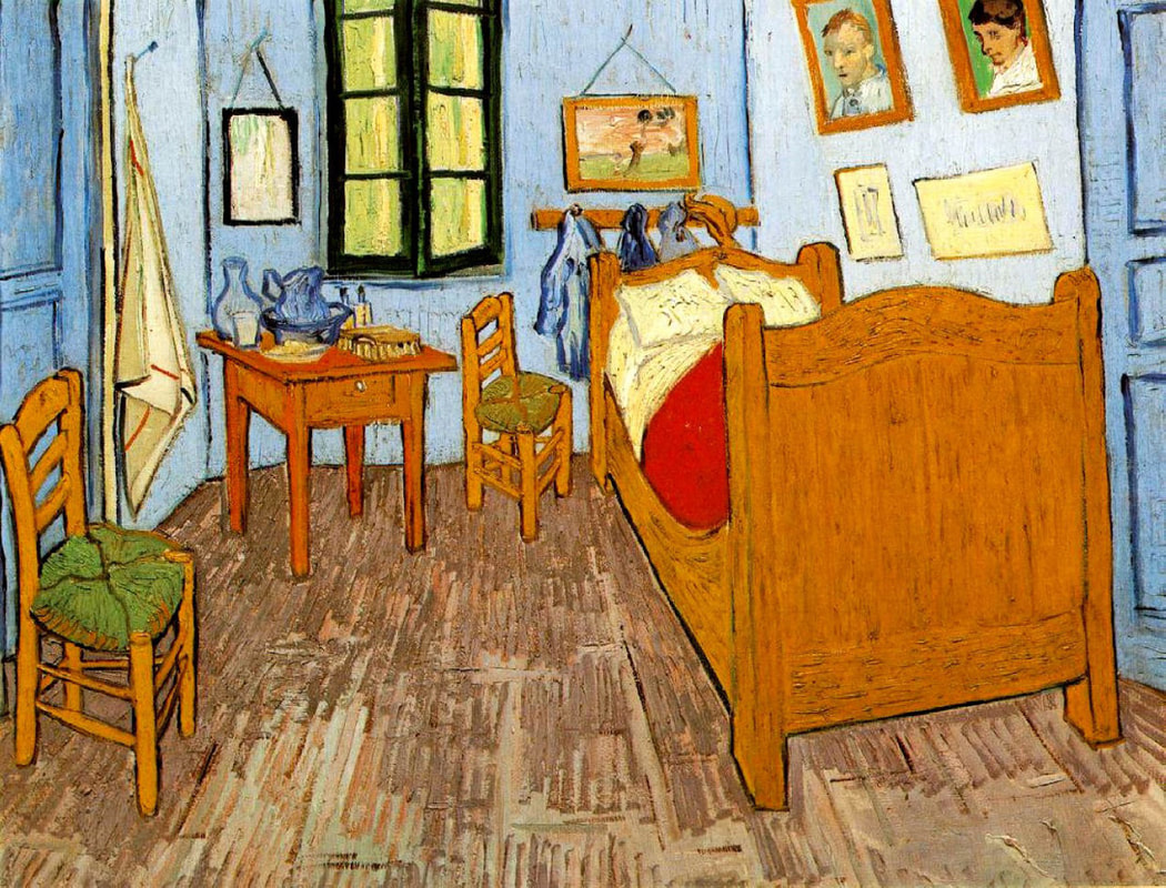
Bedroom in Arles painting by Vincent Van Gogh (1888) showing 1-Point Perspective.
Notice how the Vanishing Point in this room is off-center! In many cases, placing this point off-center actually makes a work more interesting!
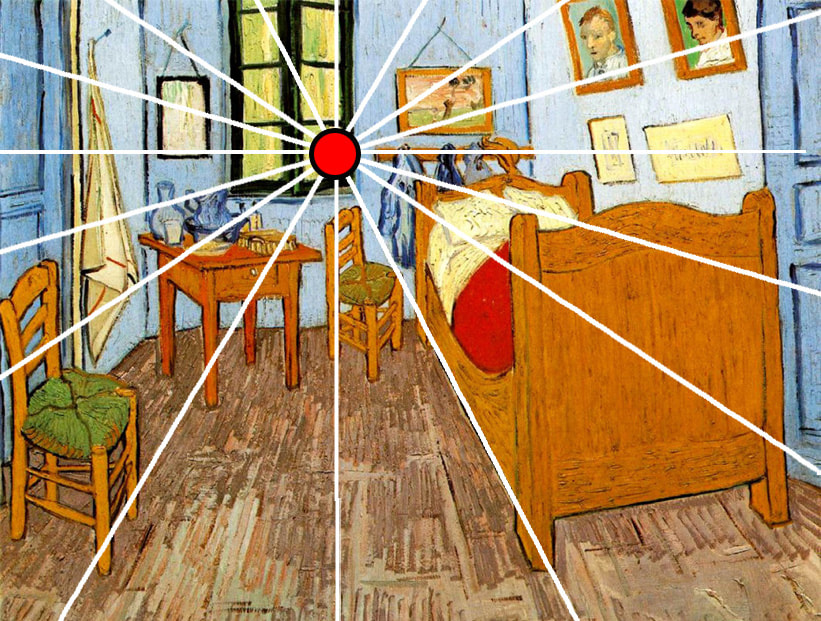
Bedroom in Arles painting by Vincent Van Gogh (1888) with 1-Point Perspective grid.
Even though creating perspective may sound complicated and like an intricate process when we're just starting out, I promise you that it's not as hard as it seems and it will come naturally to you after some practice!
Not to mention, these types of drawings usually lead to very satisfying results and provide us with much needed visualization practice that will improve our artistic skills tremendously!
Take your time with this, have fun, and move on to creating 2-Point Perspective drawings once you've grasped the concept! :)
What's your favorite masterpiece or famous artwork that demonstrates 1-Point Perspective? I'd LOVE to know in the comments section below!
| geometric_shapes1.pdf |
| geometric_shapes2.pdf |
| 1_point_grid.pdf |


www.erikalancaster.com
is a participant in the Amazon Services LLC Associates Program, an affiliate advertising program designed to provide a means for sites
to earn advertising fees by advertising and linking to amazon.com.
www.erikalancaster.com
is a participant in the Shareasale.com Affiliate Program, an affiliate advertising program designed to provide a means for sites to earn advertising fees by advertising and linking to Shareasale.com partner companies.
 RSS Feed
