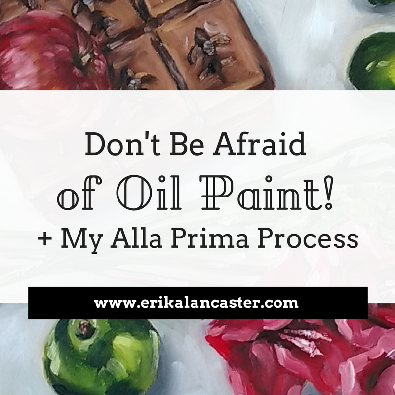
Have you reached a point in your art journey at which you feel relatively confident about your skills but are anxious to find your own style and voice? Are you stuck with your art and feel that your own perfectionism and/or fear of failure is keeping you from moving forward? "Create your own visual style... let it be unique for yourself and yet identifiable for others." -Orson Welles There is a point in every artist's journey at which a substantial amount of time and effort has been dedicated to developing artistic skills, but the artist has yet to decide what ideas he/she wants to share with the world and what mediums, techniques and style will set him/her apart from others. It takes an immense amount of work, exploration and introspection to push through this point, but it's important to keep on until the breakthrough happens. In my opinion, it's exactly this desire to push through the initial phase that differentiates a hobbyist from a pro. It's a point at which perfect rendering and technique becomes just as important as (or may even take back seat to) having an artwork transmit the ideas or feelings we are striving to transmit. In this blog post, I will be sharing five very useful tips that will help you loosen up and express more of yourself through your art. It's this exploration that will help you discover yourself as an artist. If you're at this point, it's time to experiment fearlessly and push your limits! I wrote a blog post several months ago in which I share an excellent method that you can apply to start discovering your own art style using other artists' work as inspiration. This strategy will be very useful for you in this stage, so make sure to check it out after this post. How to Effectively Use Other Artists' Work as Inspiration and a Great Method to Start Developing Your Own Artistic Style. Currently, I'm doing a lot of exploratory work with oils on canvas. If you've been following my work for any amount of time, you probably already know that I love working on smaller-scale watercolor illustrations. However, I've had the pleasure of creating larger decorative fine art for local clients and have really enjoyed it! I'm making time for oil painting as much as I can and am planning on selling my artwork internationally in the near future. I'm working on a series of five large landscape oil paintings. I will be sharing these with you throughout the upcoming weeks so stay tuned! 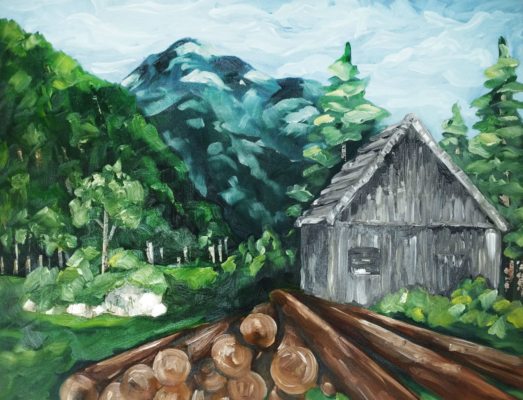
Landscape oil painting by Erika Lancaster (90 x 70 cms.).
If you enjoyed this video and found it helpful, make sure to subscribe to my YouTube channel. I share a brand new video every week with art tips, drawing and painting tutorials and mindset/productivity tips for artists. *Subscribe HERE*
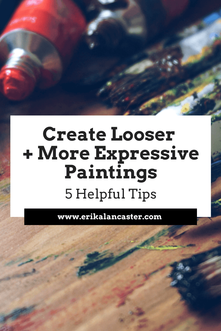
5 Tips That Will Help You Become More Loose and Expressive When Creating Art "Regularity, order, desire for perfection destroy art. Irregularity is the basis of all art." -Pierre-Auguste Renoir 1. Gain confidence in your skills by learning and practicing Art Fundamentals In order to draw or paint freely, you need to have a certain level of confidence in your skills and artistic knowledge. And the only way to truly gain confidence in anything, is by practicing first-handedly and delving deep into the fundamentals. Knowing Art Fundamentals inside and out is going to help you immensely, and is the basis for everything else. Topics like composition, harmony, proportion, color, perspective, texture, value, etc., have to be engrained in your head so that you can apply this knowledge naturally and organically as you are creating your artwork. Over at my Patreon site, I have a library of classes that cover all the basic Art Fundamentals I learned about in school, in sequential order! All of my most helpful, exclusive content such as real-time drawing and watercolor painting tutorials with downloadables, weekly sketchbook prompts, feedback from me on your work, and much more can be accessed immediately upon joining. Check out my Patreon site here! Aside from knowing Art Fundamentals, it's also imperative for you to have some experience working with whatever medium and supplies you're thinking of using. How are you going to paint or draw freely if you feel like you're constantly fighting with the medium, or have no idea how the substrate/medium/etc. is going to react throughout the process? The saying "Learn the rules before you can break them" applies here! In my blog post titled Why Sketchbooks Are Essential Tools for Artists and A Few Usage Tips I share how I personally use my sketchbooks on a daily basis to make sure I'm progressing continuously. 2. Prepare yourself mentally before you begin It's absolutely essential to start a challenging piece in the right headspace. Once you have arrived at the idea of what you'll be creating, start with positivity and confidence. I've mentioned this before, but our minds are extremely powerful. Remember, if you think you're going to fail, you most likely will. Now is the time to embrace experimentation and throw perfectionism out the window. Allow the magic to happen as you work with your medium and tools. Do your best to give up some of your control and allow your medium to do some of the speaking for itself. 3. Paint with larger brushes and, if possible, on a larger substrate Painting/drawing at a larger scale will not only encourage more arm movement (which in turn leads to more dynamic work), but allows you to focus on larger shapes. Using a larger brush, or drawing tools like chalk or charcoal, also make it more difficult to obsess over tiny little details. This, in turn, challenges you to think about what is actually needed in your composition and what can be left out. Not to mention, larger pieces are also (usually) meant to be viewed from farther away. At the moment of drawing or painting, step back and continuously remind yourself that the piece is meant to be appreciated from a distance. If you're creating a painting, remember that your paintbrush is not meant to be held as a writing pencil or pen! Try holding it with your thumb and index finger, and keep the rest of your hand relaxed. Beginners have a tendency to hold brushes very close to the bristles to feel more in control. Try holding your brush farther up the handle, anywhere from halfway up to the tip. Explore the different types of brush strokes your brushes are able to create, and the shapes and textures their bristles naturally leave behind. Load your paintbrushes with a good amount of paint so that there's more of a chance for interesting "natural" occurrences to happen. 
Check out my FREE Patreon-exclusive tutorial and class samples here.
4. Use music Music can have such a deep impact on our mood and inspiration levels! I love creating a good, long playlist for myself prior to starting with a painting. Music helps keep my creativity flowing and my energy high for hours. Our taste in music will vary from person to person, of course. Perhaps an artist looking to create an extremely dynamic abstract painting would be inspired by music with a faster/upbeat tempo. Whereas, another artist might find more relaxing, classical music more helpful. Regardless of your taste in music, create a playlist that will help you stay positive, inspired and motivated to continue. 5. Practice leaving your brushstrokes alone Do your best to place your brushstrokes (or lines if your drawing) with intention and then leave them alone! Allow the organic occurrences to happen and think of how you can use these effects to your advantage instead of trying to correct them or blend them out. Stop yourself from pushing forward with actions that are really not really necessary. Try to do more with less and don't obsess over every tiny little accident or irregularity. Let go of the need to control everything! I hope that you found this post helpful and that it encouraged you to keep exploring and moving forward with your art. I wish you all the best and remember to enjoy the process!
12 Comments
*This post contains affiliate links. I receive small commissions for purchases made through these links at no extra cost to you. These commissions help me keep this site up and running, in order for me to keep providing helpful and inspiring art content. :)
Do you frequently experience phases of low creativity? Are you currently unmotivated to continue pushing your artistic skills forward? Does a lack of inspiration stop you from creating and progressing as an artist? "Inspiration and work ethic, they ride right next to each other." - Jack White
All artists are bound to go through some kind of creative block from time to time, no matter how talented or experienced they may be. This makes it absolutely essential (especially for us working artists) to have some sort of effective system set in place to keep us productive and moving forward consistently. Though we may consciously decide to take breaks from our art from time to time, being an artist is synonymous with constant creation. Keeping creativity levels high day-in-and-day-out can certainly be exhausting, and it's impossible to be in the perfect headspace for creation all of the time. However, taking long breaks from our art will most definitely affect our progress. In today's blog post, I will share the method I personally use to re-engage with my art in difficult times. This strategy will help you whenever you're feeling uninspired, unmotivated, frustrated, or even just bored with your current art routine. The goal is to ensure that you're moving forward, even when you're not at your best. You can make the exercise as easy or difficult as you'd like at any given point in time. I'll explain in a bit. But first, there's something we have to talk about. I find there are two main reasons that we can hit creative blocks as artists: 1. We may not feel like creating because we feel insecure or simply bored with our current art routines. In these situations, we have to learn to suck it up and get to work. Sometimes we have to be okay with just showing up and doing what we can. 2. We can be mentally and physically drained by everything we have going on in life, and will very likely hit a wall even if we do show up. Each one of us is in a different situation, but it's imperative to make time for self-care. It should be our priority above all else. If you're in the first camp, I encourage you to power through. The more you push yourself to create in these times of low inspiration, the easier it will become. If you're in the second, I really recommend you take a few days to plan out how you'll be prioritizing your mental and physical well-being from here on out. I truly, 100% believe that if you're not taking care of yourself, everything else will suffer, including your artistic progress. Read my blog post titled How I Find Inspiration as an Artist and Some Ideas to Keep You Going. Over there, I share the mental attitudes I have adopted that helps me stay inspired and keep creative blocks at bay. 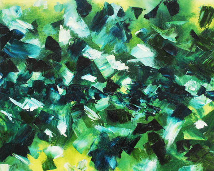
Abstract painting by Erika Lancaster
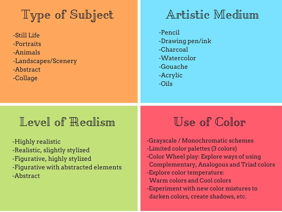
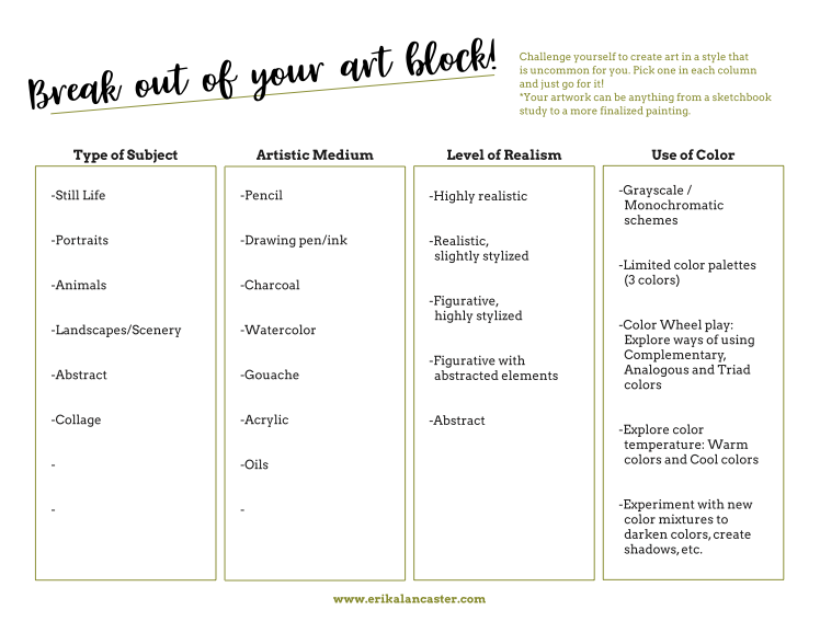
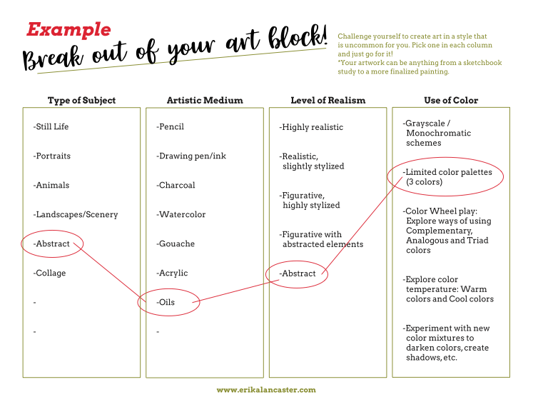
Practical Life Tips to Get You Back Into the Flow of CreationBefore we actually get into the creative exercise, I'm going to give you a few general tips that you should try. I find when I apply these in my daily or weekly routines, I'm less likely to get into an art block to begin with. 1. Clean and organize your working area I don't consider myself a neat-freak by any means. However, I have to admit that when things start to get messy around me, it starts affecting me mentally (and thus my productivity suffers). By staying organized, there's much more of a chance you'll feel like getting to work. 2. Get moving Guys, I cannot stress the importance of physical exercise enough. Some of my best ideas come up when I'm moving. Not to mention, as artists/illustrators, we sit and/or hunch a lot of the time and it's absolutely imperative to stay healthy and work on our posture! Exercise has brought me a level of mental clarity and energy that I didn't have in my younger (and most sedentary) years. At the very least, make sure you're taking stretching breaks throughout the day. 3. Go be social or get out of your usual environment As artists, it can be easy to stay holed up in our studios all day long. Although we primarily work by ourselves, it's important to remember that our inspiration comes through actually living experiences first-handedly. Sometimes, just going out for coffee with a friend or taking a walk around the block will do! Keep in mind you never want to get to a point at which you forget how to talk to other human beings! 4. Set aside some Me Time I don't know about you, but I feel like life gets so busy sometimes that if breathing wasn't absolutely automatic and necessary to continue living, I think I would forget to do it. Understandably, there will be periods of high stress in our lives, but these should be the exception and not the rule. Make sure you're setting aside time to do what you want to do in life and enjoy it! Make time for proper rest and to be alone as much as you feel you need to. 5. Start taking notes I carry a small sketchbook or notebook everywhere I go. I got in the habit of doing this a while back because ideas randomly pop up in my head throughout the day and I don't want to end up forgetting something that could lead to a good artwork or creative project in general. It's awesome to have a little bank of ideas in the background because, even if you don't use them immediately, you can come back to them when you can't find anything to work on. Check out my blog post titledWhy Sketchbooks are Essential Tools for Artists and a Few Usage Tips. 6. Get inspired by the other art genres Don't limit yourself to only getting inspired by the visual arts! Reading good literature, watching movies/documentaries, listening to music, and even cooking can lead to amazing ideas for new art pieces! Finding ways of mixing and matching things we love all across the board can lead to the most personal and unique art pieces! 7. Create a Pinterest Inspiration board (or a folder on your desktop) Collect artwork that appeals to you and use it as inspiration. However, never ever compare yourself to other artists! Try to target and make notes of specific characteristics you like (maybe it's the colors the artist used, the line work, how effectively emotions are transmitted, etc.) and try to implement it in your own way. Check out my Pinterest inspiration board here. Read my post titled How to Effectively Use Other Artists' Work as Inspiration and a Great Method to Start Developing Your Own Artistic Style to learn about my personal approach of getting inspiration from artists I admire, while making sure I'm creating something truly original. 8. Ditch the perfectionist attitude Many times, we keep ourselves from even starting because we're afraid of wasting supplies and/or producing something that won't measure up to our expectations (or the expectations of others). I honestly believe that being a perfectionist is one of the worst mistakes an artist can make. It wasn't until I understood that creating art is more about the process than the end product that I started to really improve my skills and make progress towards finding my style. Not everything is supposed to be a masterpiece! My Secret Tool for Staying Creatively Inspired (and Challenged)
If you enjoyed this video and found it helpful, make sure to subscribe to my YouTube channel. I share a brand new video every week with art tips, drawing and painting tutorials and mindset/productivity tips for artists. *Subscribe HERE*
As artists, we should embrace exploration and challenge. It is through exploring different techniques, supplies and/or subjects that we not only expand our abilities, but are able to learn about our personal likes, dislikes and areas of improvement. I like taking moments of low inspiration or motivation to step out of my comfort zone and do something that will challenge me in a way that I haven't been in a while, whether it's a shorter pencil sketch or a painting using mediums or styles I haven't explored. See, even if you've already discovered your artistic medium of choice and are set on your subject or technique, stretching your boundaries is a great way to stimulate your creativity, reinvigorate yourself and reignite your passion for art. Through explorations uncommon to you, you're able to arrive at ideas you wouldn't have thought of, ideas that can later be applied in your larger pieces. When I'm truly in a tough mental state, I don't pressure myself to generate an amazing product at all, but focus much more on the exploration and journey. I disconnect from my inner critique and focus on enjoying the feel of my supplies, each individual color, line and shape. I allow things to happen naturally. This is what I decided to do on the day I filmed the video included here. What's important, is to keep moving forward at least in a small way, and not give up altogether.
|


|
|
|
|
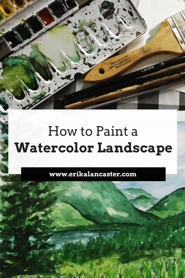
Painting Process
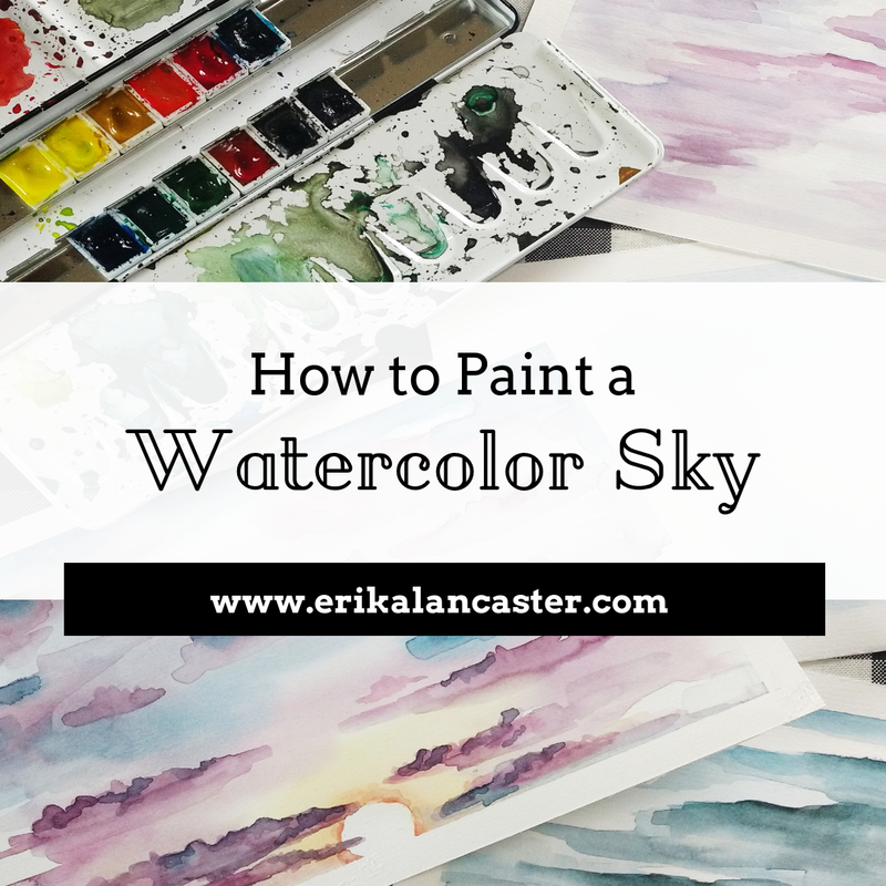
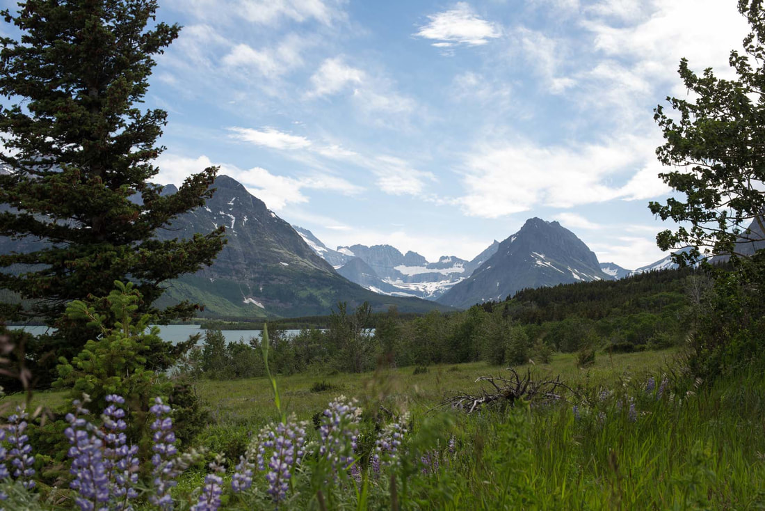
Watercolor Mountain Landscape
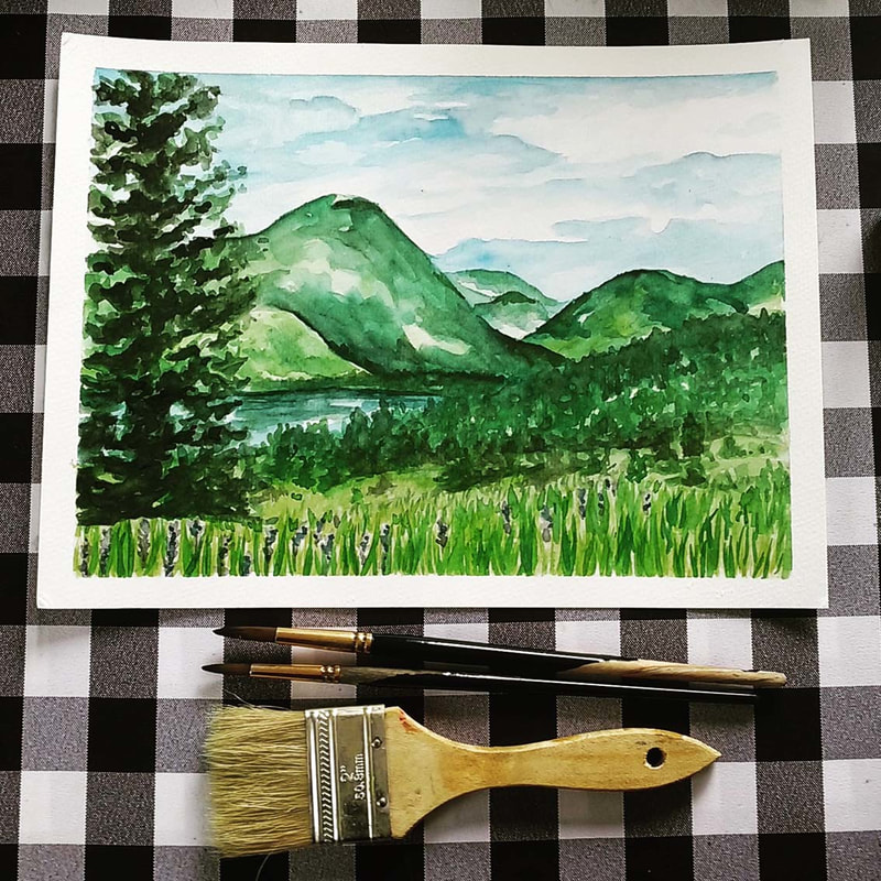
All of the "base" layers of paint were created using the wet-on-wet technique. I used less and less water in my paint mixtures as I moved on with subsequent layers, which allowed me to create deeper values, textures and details.
1. I created my initial pencil sketch lightly using my reference photograph as inspiration, but not stressing out about making it exactly the same.
Personally, I don't like my pencil lines to show through my paint, so I do my best to draw as lightly as possible using an HB pencil and even go back to erase what I can before starting to add my color in.
2. I painted the first layer of my sky using the wet-on-wet technique.
Using my two inch paintbrush, I wet my entire sky area using clean water and started adding in my first layer of blues, making sure to create a variety in values since the very beginning (I used my rag to do lifting wherever I wanted to create the illusion of clouds).
I then decided to allow my first layer of paint to dry, jumping to the opposite side of my painting. *Refer to the How to Paint a Watercolor Sky blog post/video.
3. I wet the entire grass section of my sketch using clean water. I then dropped in and played around with a few yellows/light greens until I had to allow that section to dry.
4. I wet the entire mountain area and started dropping in and playing around with greens in this section, making sure to observe my reference picture in order to have a general idea of where darker values would be created later on (this is very important especially when there are overlapping elements present).
5. At this point, I went back to finish my sky area by adding darker blues and a bit more definition in specific areas of my clouds.
I was very careful not to go overboard! Add some definition here and there, and leave other areas blurrier.
6. I decided to jump to the lake area of my picture because the sections around it were already dry.
Again, I wet this area with clean water and started dropping in my blue paint mixtures, making sure to create a tonal variety since the beginning. I allowed this area to dry.
7. Jumping back to the dry mountain area, I started adding in deeper, darker values.
I made sure to observe my reference picture constantly for this, but wasn't attempting to make everything exactly the same. It's important to be very careful when placing darker values of color because you risk flattening out your painting!
8. I jumped back to the middleground/foreground area, adding in deeper, darker greens where I saw them in the picture, allowing the lighter greens already there to show through.
9. I created a purple paint mixture and quickly practiced my lavender flowers before adding them into my painting. I added a few here and there, but made sure not to go overboard.
I also made sure to place them in irregular patterns and to make some smaller than others.
Remember, when painting anything natural, go for asymmetrical and irregular patterns and shapes! *Refer to the Watercolor Flowers and Rocks blog post/video.
10. At this point, I wanted to start adding in trees/plants and started with the ones located in the middleground.
I used gentle scribbling motions in irregular triangular shapes to give the impression of pine trees in the distance, and made sure to keep them quite small, as they are quite far away from the viewer.
It's very important to give thought to the size of each element you'll be adding in, as this helps give off the impression of depth and perspective. *Refer to the Watercolor Tree Tutorial blog post/video.
11. I could tell that my mountains (which had already dried) required a bit more contrast and darker values in certain areas, so I went back to work on them.
12. Jumping back to the foreground, I used a darker green to add in the effect of short shrubs/plants in some areas. I used a scribbling motion to create these textures.
Remember, you're creating the illusion of plants, and not trying to paint every single detail! I recommend keeping it loose and expressive!
13. At this point, it was time to add the large tree in the foreground!
I created my lightest and most translucent green and started adding in the illusion of the layered leaves I could see in the picture using light scribbling motions. Once I was done laying down the general shape of the tree, I started adding in deeper greens in certain areas, making sure to not go overboard.
14. I created a light and translucent green paint mixture and started adding in individual blades of grass using upwards strokes with my smaller round brush.
I knew I was going to go back in later with a variety of greens to make this area look more believable.
Remember that the blades of grass that are farther away (closer to the horizon line) have to be a lot smaller than the ones closest to the viewer. Once my initial layers of green grass had dried, I start adding in my mid-to-darker values.
15. Finally, I stepped away from my painting and compared it to the reference image in order to pinpoint where darker values have to be added in.
Because watercolor paint dries lighter than it looks when wet, usually deeper contrast has to be created later on.
Don't be afraid to add darker values! Just make sure to add them deliberately and carefully (only where necessary and never covering up large areas of your previous layers entirely).
Colors I used for this landscape study:
Sky area
Ultramarine Blue
Prussian Blue
Grass area
Permanent Green Olive
Lemon Yellow
Mountain area
Permanent Green Olive
Lemon Yellow
Ultramarine Blue
Water area
Ultramarine Blue
Prussian Blue
Permanent Green Olive
Plants and Trees
Ultramarine Blue
Permanent Green Olive
Sepia Brown
Lavender Flowers
Permanent Carmine
Ultramarine Blue
Ultramarine Blue
Prussian Blue
Grass area
Permanent Green Olive
Lemon Yellow
Mountain area
Permanent Green Olive
Lemon Yellow
Ultramarine Blue
Water area
Ultramarine Blue
Prussian Blue
Permanent Green Olive
Plants and Trees
Ultramarine Blue
Permanent Green Olive
Sepia Brown
Lavender Flowers
Permanent Carmine
Ultramarine Blue

What areas do you find most difficult when painting landscapes? Are there any elements that you avoid adding in because they've been too difficult to render in the past? I'd love to hear from you in the comments section below!


*This post contains affiliate links. I receive small commissions for purchases made through these links at no extra cost to you. These commissions help me keep this site up and running, in order for me to keep providing helpful and inspiring art content. :)
Do you want to start adding specific details into your watercolor landscapes but are a bit confused about how to go about it? Have you, perhaps, found an awesome reference image you'd love to turn into a painting, but are unsure about what the process would be to make it happen? Are you happy with the way you start a painting but grow frustrated as you start adding details in?
Do you want to start adding specific details into your watercolor landscapes but are a bit confused about how to go about it? Have you, perhaps, found an awesome reference image you'd love to turn into a painting, but are unsure about what the process would be to make it happen? Are you happy with the way you start a painting but grow frustrated as you start adding details in?
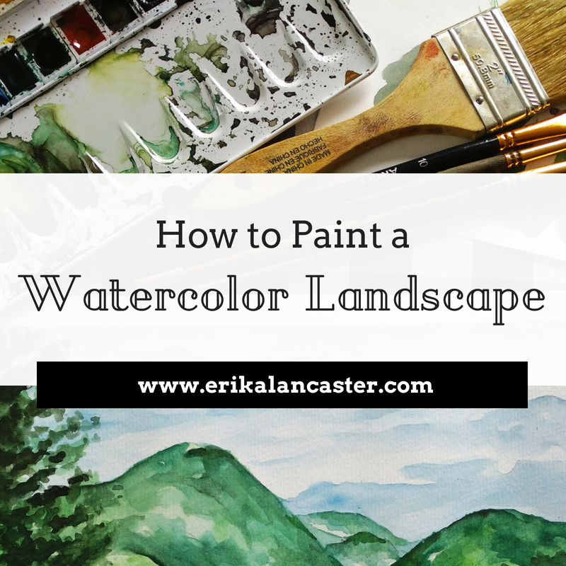
Welcome to the third part of the Watercolor Landscapes for Beginners Series!
Flowers, rocks and grass may seem like small parts when one thinks of a landscape painting, but these natural elements have the ability of adding color and areas of interest to this type of composition. The way we decide to include and render these details can, pretty much, make or break our paintings.
When I was first starting to paint landscapes using watercolors, I was full of questions:
Am I supposed to paint smaller details directly on my white paper or on top of my first, second or third layer(s) of paint?
How much time am I supposed to spend on each little detail in order to make a great painting?
Is it best to finish one area entirely and then move on to the next or can I work on everything simultaneously?
How dark do I have to get in order to achieve good form and contrast?
What is the best way to create my darker color values?
Where, exactly, am I supposed to use the wet-on-wet technique and where can I use wet-on-dry?
How can I create a believable texture for that particular object?
The questions were endless!
Throughout the time I've been using this medium, I have found that there are many ways to go about creating a great-looking painting, provided the artist has a good understanding of Art Fundamentals and is aware of the particular characteristics of watercolors.
Also, check out my 10 Things I Wish I Knew About Watercolors When I Was Getting Started video over on YouTube! It's an awesome introduction to the medium and is chock-full of information that will make you make faster progress in your watercolor journey.
In this post and the video included here, I will be sharing my personal tips and tricks, as well as the process I go through to create believable and aesthetically pleasing landscapes.
By understanding these principles and working on your own studies, you'll be able to create great work in no time.
Check out the other parts of the series below!


I recommend checking these blog posts/YouTube videos out and trying these studies before jumping into today's tutorial.
Let's get started with the tutorial
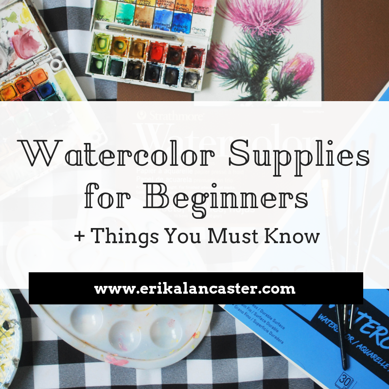
Supplies you will need:
-Watercolor paper or sketchbook (140 lbs. or thicker)
-Watercolors (basic colors will do)
-Paintbrushes (8-10 point round brush and a thicker flat brush)
-Rag or paper towel
-Cup of water
-Pencil (I'd recommend an HB)
-Gum eraser
-Masking tape
-A piece of thick cardboard or something to tape your watercolor paper on
-Watercolors (basic colors will do)
-Paintbrushes (8-10 point round brush and a thicker flat brush)
-Rag or paper towel
-Cup of water
-Pencil (I'd recommend an HB)
-Gum eraser
-Masking tape
-A piece of thick cardboard or something to tape your watercolor paper on
If you enjoyed this video and found it helpful, make sure to subscribe to my YouTube channel. I share a brand new video every week with art tips, drawing and painting tutorials and mindset/productivity tips for artists. *Subscribe HERE*
|
|
|
|
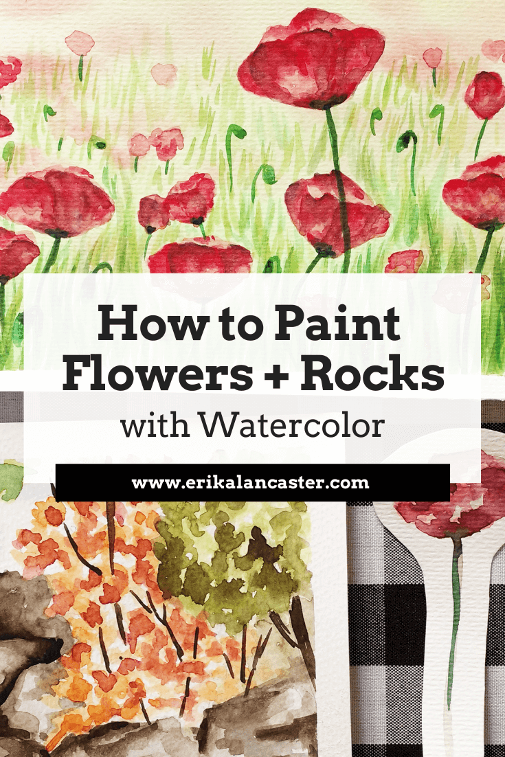
Reference Images Used
For these studies, I found a couple of high quality photographs online that included the specific elements I wanted to study (flowers, grass and rocks). As always, I went for my trusted online free image sources Pixabay and Pexels.
I highly recommend these websites if you're looking for beautiful reference pictures to work from!
*Note: I used these pictures loosely and wasn't trying to copy them exactly.
You can find my other favorite free image sources in my blog post titled My Favorite Free Image Sites & Two Examples of References with Finished Illustrations.
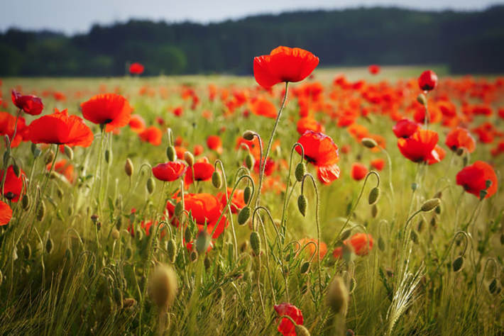
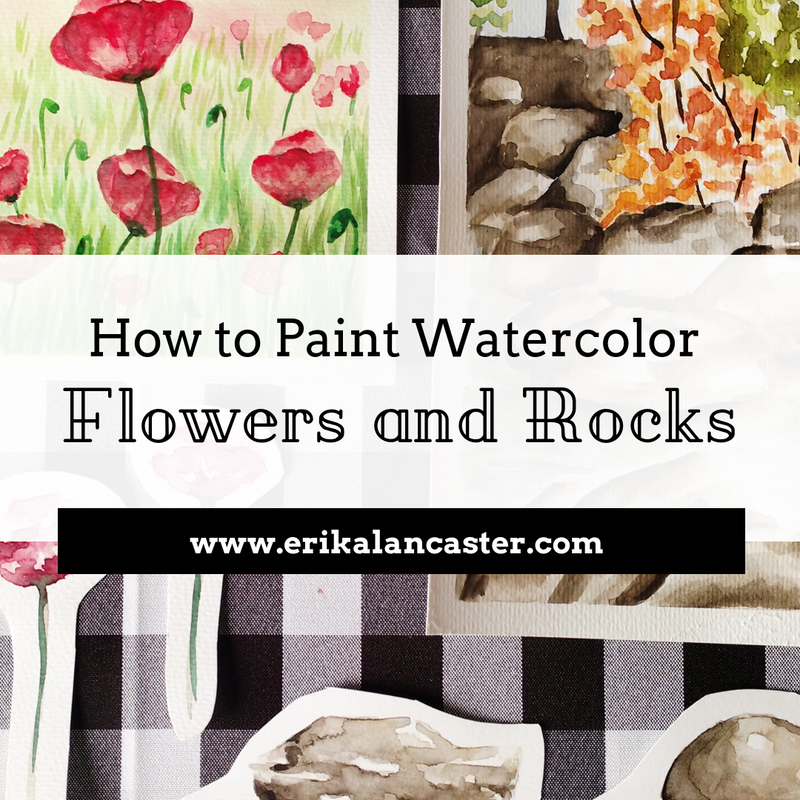
Field of Poppy flowers. Click on image to go to its original source at Pixabay.
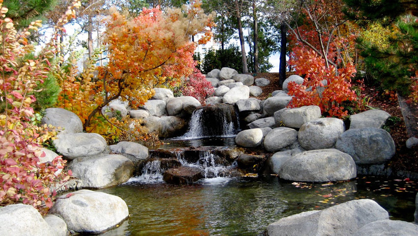
Rocky creek. Click on image to go to its original source at Pexels.
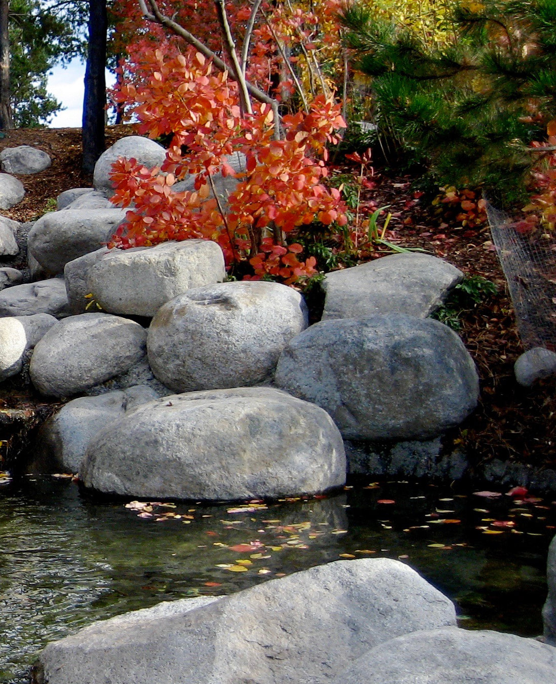
Focusing on only this area of the picture.
|
Because I'm mainly using this image to practice rocks, I decided to open it in Photoshop and crop out a section that I thought would make for a nice little painting. This allowed me to focus on the subjects I wanted to practice. |
Painting Process
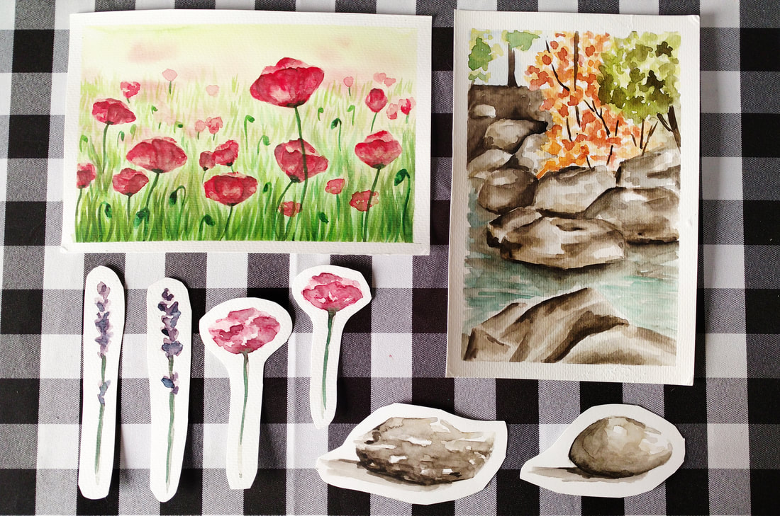
Quick watercolor flower and rock studies and paintings.
Watercolor Poppy Field
1. Before actually starting with my complete painting, I created individual studies of two of my favorite landscape flowers.
2. After deciding I wanted to create a field of Poppies, I looked for a high quality picture online that included a good amount of them in it. It's important to develop an eye for what images could possibly lead to nice looking paintings.
3. I taped my watercolor paper onto a thick piece of cardboard and, using the wet-on-wet technique described in the first video of this series, I created a blurry background effect using yellow and light green.
While wet, I dropped in a few dots of my red Poppy flower mixture because I wanted my furthest flowers to appear blurred out. I allowed my first layer to dry completely.
4. I started adding in very loose and irregular red shapes that would later be turned into the tops (or petals) of the Poppy flowers. At this point, I started using deeper red color mixtures with a less amount of water in them, but I still didn't go too dark, taking it one step at a time.
I made sure to add just enough shapes for it to look like a field of Poppies, but not too many that it would look too crowded. It's SO important to know when to stop!
5. I jumped around from flower to flower, adding in deeper red values carefully. I created the illusion of separate petals by placing few curved lines here and there. The darkest hue used within the petal area was created by adding in blue to my red mixture.
As always, my darkest values were placed very deliberately and only where needed (see reference image at all times).
6. I started adding in individual blades of grass using a medium green paint mixture and clean upward motions (using my thin round brush). I created the effect of realistic depth by making the blades of grass smaller as they got closer to the horizon line (further from the viewer).
7. Once I had added the first layer of grass, I allowed it to dry and went back to work on my Poppies. To soften some of the noticeable darker shapes left within the petal areas, I wet my brush with clean water and did gentle scrubbing. I did this only here and there.
8. I created a deeper green value and painted the flower stems, more grass, as well as flower buds scattered throughout. To create a sense of depth, I made sure to leave the most crisp-looking and vibrant green blades of grass closest to the viewer and the most translucent ones closest to the horizon line.
I also made sure to add at least a bit of a darker green to my flower buds in order to transmit a more believable sense of form.
Specific colors I used for this study:
- Lemon Yellow
- Permanent Green Olive
- Cadmium Red Light
- Permanent Carmine
- Ultramarine Blue
Watercolor Rocky Creek
1. I opened my reference photograph in a photo-editing software and cropped an area that would allow me to focus on painting rocks. Using a pencil, I created a very light sketch on my watercolor paper, getting inspired by the image but not fussing to much about drawing it exactly the same.
2. I wet the entire rock area and started laying down my first and most translucent paint mixture, making sure to leave small areas free of pigment. Saving small white areas is very important when creating believable stones and rocks.
3. I jumped from one rock to the other deepening values and then allowed them to dry while I continued with the other areas of my painting. *Please refer to the first two blog posts/videos of this series if you'd like to know more about how I paint skies, water and trees.
4. I went back to my rocks, deepening values and creating a sense of shadow behind and between the rocks. At this point I also softened some of the transitions between my values by doing my scrubbing technique with a clean brush.
Specific colors I used for this study:
- Sepia Brown
- Ivory Black
- Yellow Ochre
- Cadmium Yellow Light
- Permanent Green Olive
- Cadmium Red Light
- Permanent Carmine
- Ultramarine Blue


*This post contains affiliate links. I receive small commissions for purchases made through these links at no extra cost to you. These commissions help me keep this site up and running, in order for me to keep providing helpful and inspiring art content. :)
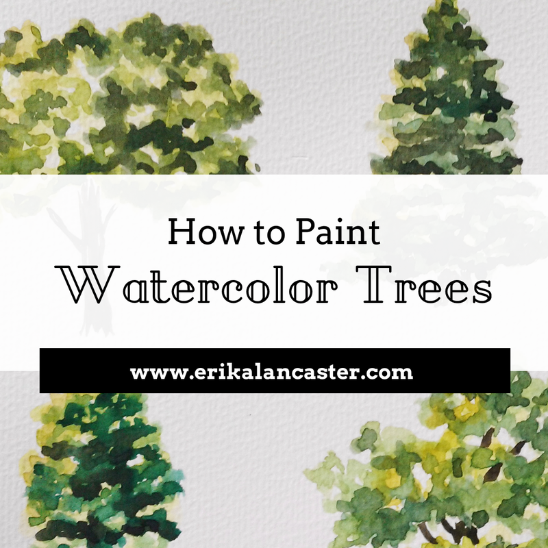
Have you ever started painting a watercolor landscape and hit a wall when adding in trees and/or plants? Do you find you start your trees well but frequently end up overworking them, producing lifeless and flat green blobs? Are you getting tired of always painting the same kind of tree?
Have you ever started painting a watercolor landscape and hit a wall when adding in trees and/or plants? Do you find you start your trees well but frequently end up overworking them, producing lifeless and flat green blobs? Are you getting tired of always painting the same kind of tree?
Welcome to the second part of the Watercolor Landscapes for Beginners Series!
Trees and plants are, arguably, the most important parts of any landscape (at least this is the case when there are no other living subjects included). For this reason, it's a great idea to make time to study them before actually attempting to paint a composition of this kind.
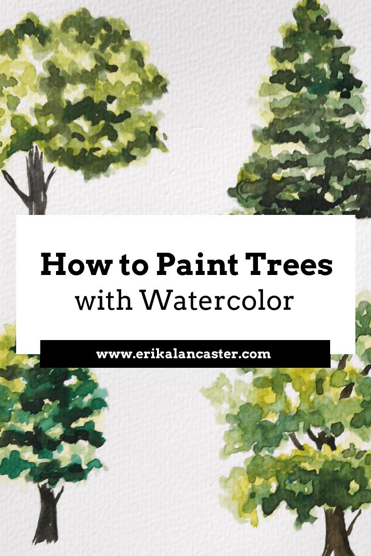
This blog post includes a video in which I walk you through six different tree studies. Throughout these time-lapses, I share the steps I go through when painting trees using watercolors, as well as all of my personal tips and tricks.
Check out my Tips for Water Control video over on YouTube! Water control is definitely one of the first skills the beginner getting started with watercolors must master.
With practice, you'll be painting believable trees that have life to them and add areas of interest in your paintings.
Before you begin drawing or painting trees, or anything else for that matter, there's nothing better than going out and observing what the subject actually looks like in real life.
Go for a walk and take some photos at your nearest park. At the very least, look for high quality photographs online and create a little collection.
Take a moment to observe their shape, the variety of hues and textures they can have, the shadows created by them and within them, etc.
Take notes.
Take the plunge and try painting plein air someday!
Check out other parts of the Watercolor Landscape series below:


Let's get started with the tutorial!
Supplies you will need:
-Watercolor paper or sketchbook (I'd recommend paper that's at least 140 lbs in thickness)
-Watercolors (basic colors will do)
-Paintbrushes (at least two round brushes in different sizes)
-Rag or paper towel
-Cup of water
-Pencil (I'd recommend an HB drawing pencil)
-Gum eraser
-Watercolors (basic colors will do)
-Paintbrushes (at least two round brushes in different sizes)
-Rag or paper towel
-Cup of water
-Pencil (I'd recommend an HB drawing pencil)
-Gum eraser
If you enjoyed this video and found it helpful, make sure to subscribe to my YouTube channel. I share a brand new video every week with art tips, drawing and painting tutorials and mindset/productivity tips for artists. *Subscribe HERE*
|
|
|
|
Painting Process
1. Loosen up your hand by practicing the "scribbling" technique using your paintbrush and a piece of scrap watercolor paper.
2. Create your initial pencil sketch lightly, focusing on the largest shapes of the tree.
3. Create your lightest and most translucent hues using a mixture of yellows and greens.
4. Begin placing your lightest layers of paint by using light scribbling motions and making sure to leave white areas between your clumps of leaves. Remember, you are NOT painting each individual leaf, but creating the illusion of leaves!
5. Once you have placed your initial lightest values of yellow and/or green, "drop" darker hues onto certain areas. Allow wet-on-wet effects to happen. Don't go overboard! Set aside and allow to dry. At this point only lightest to mid-green values should be placed.
6. Create your second set of paint hues (mid-tones to darker values) using the previous colors, but adding in dark blue and brown. Abstain from using black.
7. Start placing your mid-tones to darkest values deliberately. Remember the point is not to cover up previous layers of paint, but only to add darker values where needed. *Use your pictures to conclude how much of your darkest values should be added and where (remember these are mostly where cast shadows would be between your clumps of leaves-no more!).
While you should never be afraid of adding dark values to a watercolor painting, you should add them carefully and only where needed.
8. Paint your tree trunk and branches, using your rag or paper towel to lift some paint in certain areas to create texture and a sense of form.
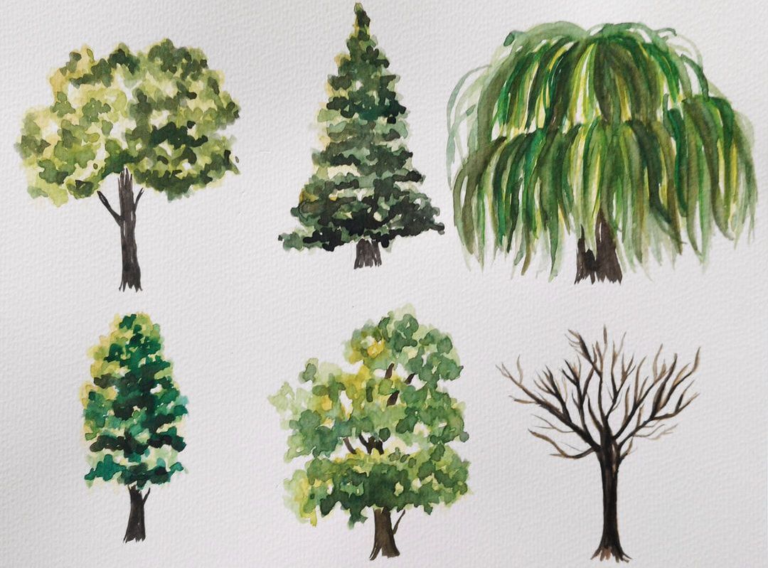
Watercolor tree studies by Erika Lancaster.
Specific colors I used to paint these trees:
- Yellow Ochre
- Cadmium Yellow Light
- Permanent Green Olive
- Ultramarine Blue
- Sepia Brown
Before I end this post, I would like to remind you to have fun creating these studies. Re-do them as many times as you need to.
Enjoy your explorations and embrace imperfection.
Enjoy your explorations and embrace imperfection.


www.erikalancaster.com
is a participant in the Amazon Services LLC Associates Program, an affiliate advertising program designed to provide a means for sites
to earn advertising fees by advertising and linking to amazon.com.
www.erikalancaster.com
is a participant in the Shareasale.com Affiliate Program, an affiliate advertising program designed to provide a means for sites to earn advertising fees by advertising and linking to Shareasale.com partner companies.
 RSS Feed
