*This post contains affiliate links. I receive small commissions for purchases made through these links at no extra cost to you. These commissions help me keep this site up and running, in order for me to keep providing helpful and inspiring art content. :)
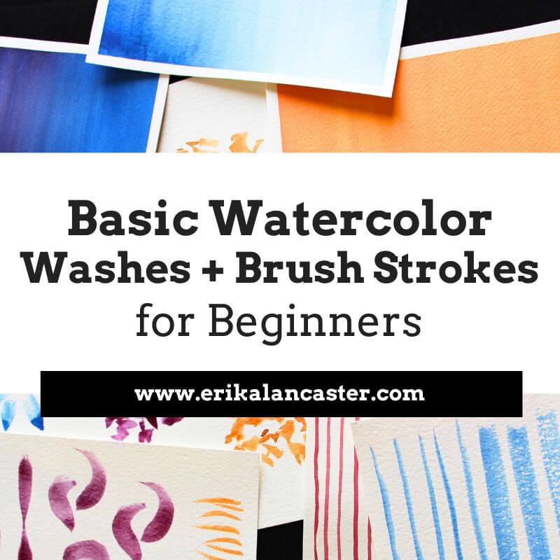
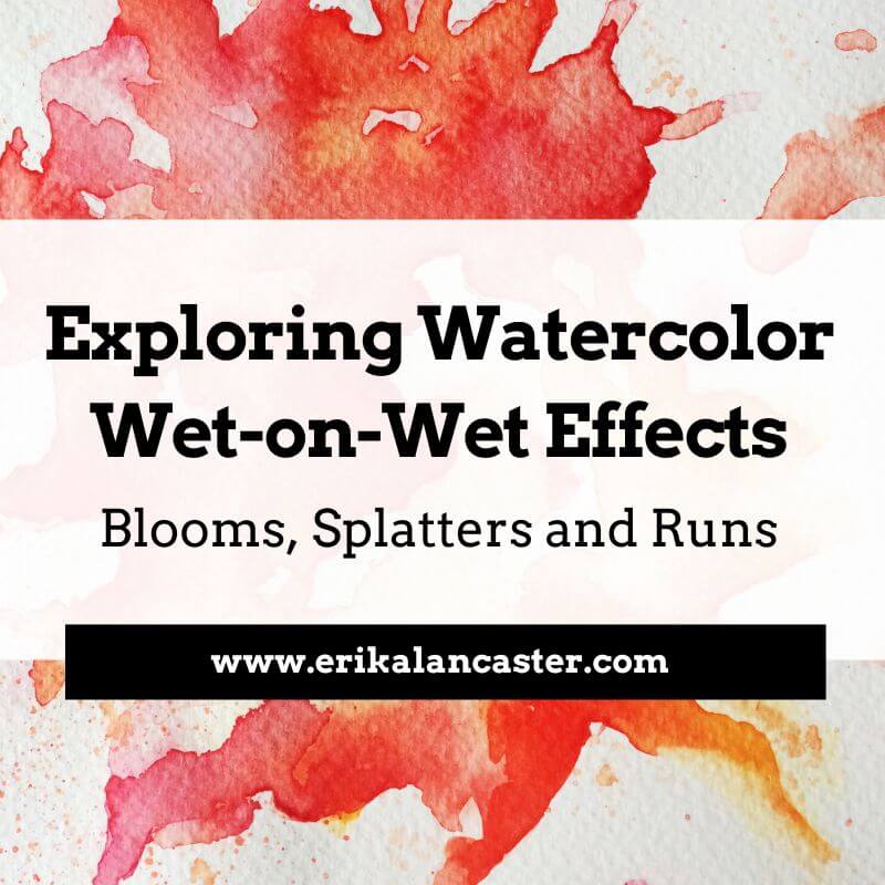
What, exactly, does the term wet-on-wet refer to and how can we use these techniques to create beautiful paintings with watercolor? Do you love watching artists create those awesome washy watercolor effects, but find that things don't end up as expected when you're trying them yourself? In today's blog post I'll explain what wet-on-wet effects are, how they can be combined with wet-on-dry effects to create awesome paintings, and a few essential tips to apply when using these techniques. I'll also explain how to do different effects like blooms, splatters and runs. Make sure to check out the video included in this post to see me in action! Wet-on-wet refers to the act of applying fresh paint onto a wet surface or on paint that is still wet rather than onto a dry surface or a layer of paint that has already dried. When using these kinds of techniques, we get colors that blend or intermix with each other. It's important to understand that this painting technique isn't exclusive to watercolors, but can be used with all traditional painting mediums (watercolor, gouache, acrylic, oils) and it can be used in a variety of ways. First and foremost, when working with watercolors, it's essential to understand that when a paint mixture is placed on paper that is wet (either because it has been pre-wetted with clean water or because a previous layer of paint hasn't dried), the paint mixture will expand, creating a blurred out/fuzzy effect. Opposite to this, when we place a paint mixture on paper that is dry (either because it's a fresh sheet of watercolor paper or because the previous layer has completely dried), the newly placed paint will not expand, leading to sharp looking lines and defined shapes. This principle is essential to grasp and it's important for beginners starting out with watercolors to know that wet-on-wet and wet-on-dry effects complement each other to create beautiful paintings. By combining them, we're able to create a visually pleasing contrast, bring attention to focal points by adding sharper detail to certain elements, add depth to a piece, and many other things. It's important for beginners to practice both kinds of techniques, and start giving thought to how they can be used in a particular piece before actually starting the painting process. 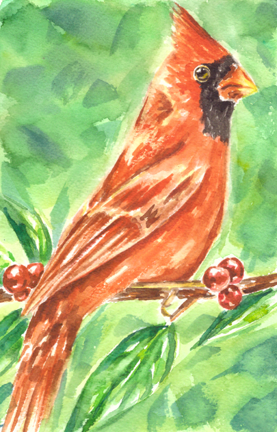
Watercolor Cardinal painting by Erika Lancaster. Wet-on-wet techniques in combination with wet-on-dry techniques.
How and when you use wet-on-wet and wet-on-dry techniques in your painting process will depend on what subject you're painting and what effects you're personally going for. Generally speaking though, the first layers of paint should be translucent and paint mixtures should contain more water than pigment. As the painting process moves forward and subsequent layers start being placed, paint mixtures contain less water and more pigment. 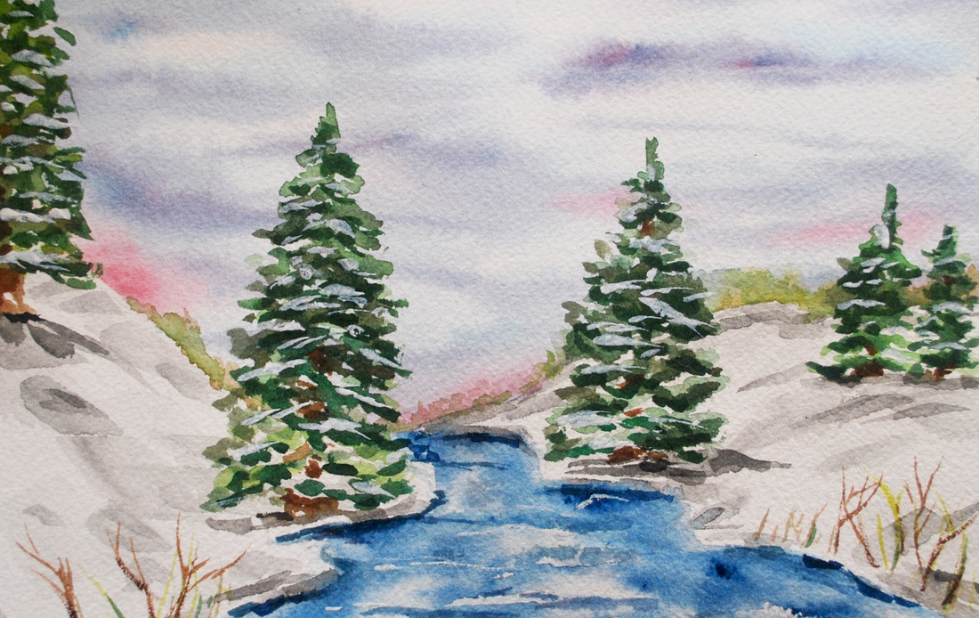
Watercolor Winter Landscape painting by Erika Lancaster. Wet-on-wet techniques in combination with wet-on-dry techniques.
If you enjoyed this video and found it helpful, make sure to subscribe to my YouTube channel. I share a brand new video every week with art tips, drawing and painting tutorials and mindset/productivity tips for artists. *Subscribe HERE*
5 Essential Tips to Have in Mind When Using Wet-on-Wet Techniques1. Use medium to heavier-weight paper with enough tooth/absorbency Paper makes a huge difference when painting with watercolor and can often be the reason why our wet-on-wet effects don't turn out as expected. No matter what kind of painting medium we're using, it's absolutely essential to give thought to what paper or support we'll be painting on before starting a piece as this will directly affect both our painting process, as well as its overall outcome. When painting with a water-soluble medium like watercolor, we should use a paper that is intended for this purpose. This said, when we're planning on using lots of wet-on-wet effects like the ones described in this post, it's best to use a medium (140 lb.) to heavier weight (300 lb.) watercolor paper, as anything thinner will warp and possibly even shred throughout the process. You also want it to have some degree of tooth or texture to it, as this will help ensure that water/paint mixtures will be absorbed when placed upon it. Watercolor paper can certainly be difficult to grasp, as there are so many different types and formats available. In my blog post/YouTube video Watercolor Supplies for Beginners and Things You Must Know, I go much more in depth into watercolor paper and explain a few other important aspects in regards to watercolor painting supplies. 2. Give thought to the colors you'll be using Because colors will be intermixing a ton when using wet-on-wet techniques, it's essential to do a bit of planning to ensure that we won't create unwanted hues accidentally. Though one of the beauties of watercolor is the fact that it has a mind of its own, skilled artists are able to have at least some level of control over the 'chaos'. They have practiced water control and have a good idea of what's going to happen when a certain paint mixture is placed in a specific area, using effects to their advantage. Skilled watercolor artists have not only become masters at managing the combination of paint and water, but they also know the importance of planning color. This Element of Art is an important aspect behind making a painting look harmonious and balanced. We're also able to create very striking visual effects when planning our color palettes and giving thought to how we'll actually be using it throughout the painting process. Color shouldn't be an afterthought or something that happens accidentally. In the video included in this post, you'll see how I create my warm and cool color studies separately. The reason I do this is because I know that when Complimentary Colors mix together, they create grayed out/dull tones. Complementary Colors mute each other out and, in these studies, I wanted my colors vibrant and saturated. 3. Keep your water clean Using murky water when painting with watercolor is a huge no-no, no matter what kinds of techniques you're using. Dirty water will affect your paint colors and may even make your piece appear dirty. When working wet-on-wet we're not only using a lot of water, but we're also usually working at a faster pace because we're using the freshness/dampness of an area to create beautiful effects. It's important to ensure that we're not accidentally dipping our paintbrush into dirty water and placing this water on our paper! I've known of artists that use two or even three cups of water as they are painting. One idea could be to use one glass of water to rinse color off your brush and a second one to dampen it with clean water. Whatever it is you decide to do, make sure you're constantly checking on your water throughout the painting process. 
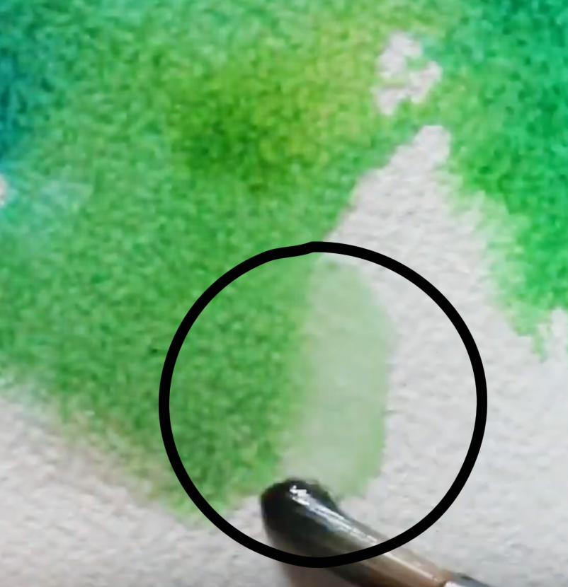
For a list of my favorite art supplies and books, go here. 4. Constantly give thought to how much water is already on your paper and how much water is in your brush The outcome of our wet-on-wet techniques will greatly depend on how wet/damp the specific area of paper is, as well as how thick or watery the paint mixture that we're placing upon it is. I would recommend beginners to practice creating a wide range of paint mixtures, from watery/translucent to thicker/heavily pigmented mixtures, and see what happens when they are placed on slightly dampened paper vs. puddles of water. In the video included in this blog post, you can see me play around with large puddles of water/paint mixtures. While puddles allow for a lot of exciting movement, they are certainly difficult to control and can lead to unwanted effects like backruns and splotchiness if we're not careful! Generally speaking, if your paper is already very wet, it would be best to stay away from laying down a very watery paint mixture on it. In principle, for backruns not to happen, you have to make sure that there is less water in your brush than there is on your paper. Another option to avoid backruns and undesired splotchiness would be to allow your paint layer to dry completely before going back in with another color. If you've wetted your paper too much accidentally, you can always absorb some excess water with a paper towel or with a clean (dry or slightly dampened) brush. 5. Know when to stop When I was first starting out with watercolor, I didn't understand that watercolor paper can only take a certain amount of 'beating' before it has to be left alone to regain its strength. Even if paper is specially intended for use with water, it's essential to understand that wet paper is fragile paper. With watercolors, we must stay mindful of when we should stop, as continuing to work over and over on one same area will definitely lead to overworking our paper (even when using the heavier weight variety). Beginners starting out with this medium tend to lay down paint mixture over paint mixture and try to fix mistakes or make changes in one same area, damaging the paper. When we've made a mistake, it's best to do a bit of gentle lifting when the paint is still wet and then allow it to dry completely. What I like doing, is ignoring my accident for a bit and working on other areas of my painting while that one dries. Other times, I work on two pieces at once and jump back and forth from one to the other, allowing paint layers to dry. Often, we can make mistakes less noticeable by doing a bit of work in the area once the initial layer has dried. We can add more washes of color, lift some more, or even to a bit of gentle scrubbing at this point. Check out my blog post titled 5 Common Watercolor Painting Mistakes and How to Fix them for ideas on fixing accidents and avoiding them altogether.
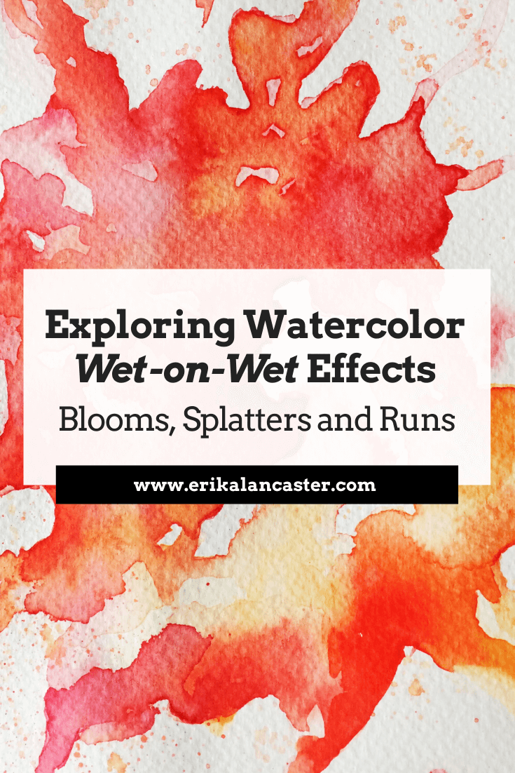
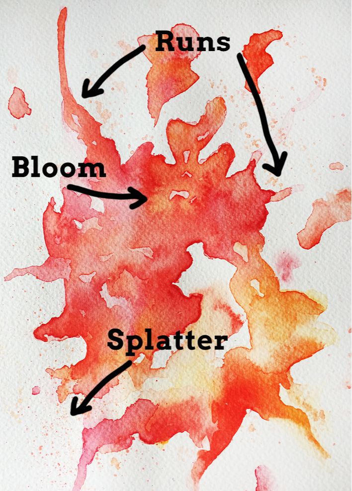
Watercolor Wet-on-Wet Techniques
|
|||||||||||||||||||||||||||||||||||||||
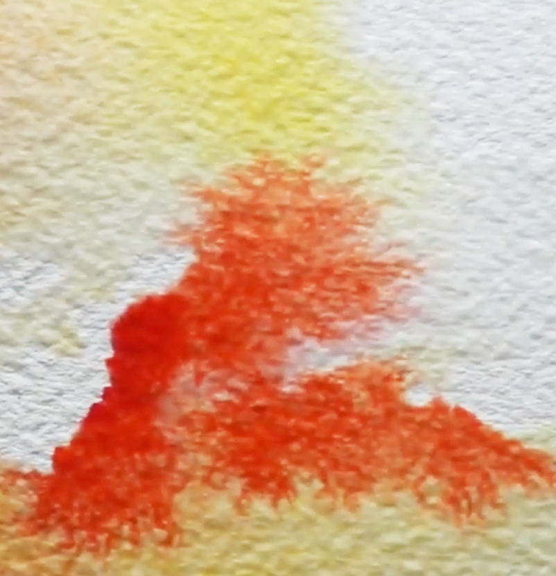
Watercolor orange and yellow bloom
|
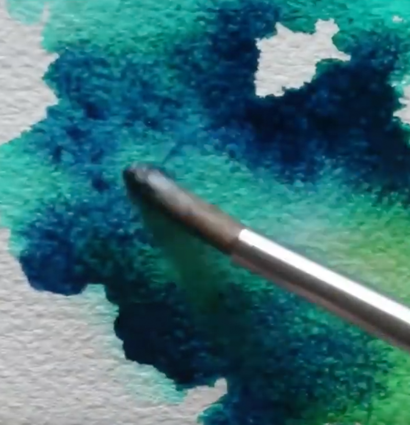
Watercolor blue and green bloom
|
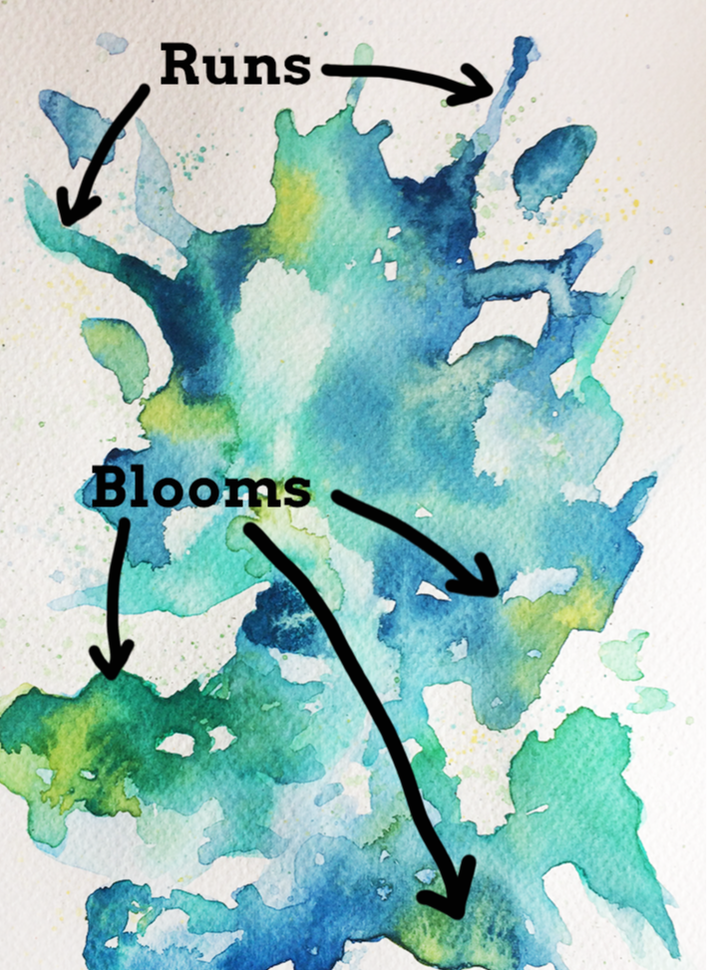
2. Runs (Controlled + Organic)
Runs are interesting effects that can be used when we're creating an abstract painting, or even when adding abstract elements to figurative painting. They are, quite simply, a stream of paint running off the main area or subject in our piece.
We can create runs completely organically by shifting our paper to a slanted or sideways position while it has a large amount of water on it. Sooner or later, gravity will make the water naturally travel down your paper.
If it doesn't happen, consider placing a bit more water in the puddle using your paintbrush, and/or gently tap the paper on your desk in this vertical position.
We can also create controlled runs quite easily by drawing a line of clean water in a specific shape/direction, placing a watery paint mixture at the start of it (the place where our main shape ends and our clean line of water starts), and shifting our paper sideways until the paint mixture starts moving down on its own.
Remember, when using watercolor paper, the paint mixture will naturally expand or move towards the wetness and stay away from dry areas. This is why the paint will naturally travel down the path we've created for it!
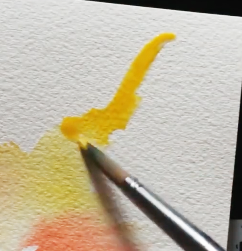
Watercolor run in yellow
|
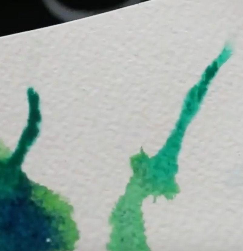
Watercolor run in blue/green
|
3. Splatters
Splatters can have very striking results and can be used in a variety of ways. If heavily-pigmented paint drops fall on areas of paper that are wet, you can create mini-blooms! On the other hand, if splatters fall on dry paper, these drops will retain their sharp, circular shape.
It's easy to go overboard with it, though, mostly because it's quite fun to do! So work incrementally and stay mindful throughout the process.
To do this technique, create a watery but pigmented paint mixture, wet your paintbrush (I use a round in size 8 in the video) and gently tap it on another paintbrush in a cross position.
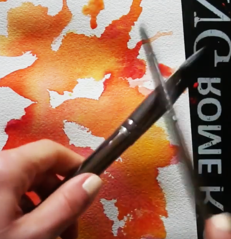
Watercolor splattering technique in warm color exploration
|
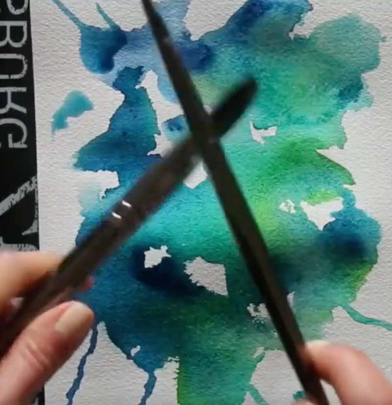
Watercolor splattering technique in cool color exploration
|
4. Bleeds
Many beginners starting out with watercolors aren't aware of this, but it's easy to soften out stark- looking lines and shapes both while our paint is still wet and after our paint has already dried.
One of the techniques we can use to soften lines or create feathering effects is bleeding, which can be easily done whilst our paint is still wet or is in the drying process.
To do bleeding, simply rinse your paintbrush thoroughly and draw a line of clean water right along the outer edge of the shape or line you want to soften out. Because paint will expand in wet areas, the color will feather out into the recently wetted line of clean water you've drawn, creating a softened effect.
This said, one of watercolors characteristics is the fact that they can be reactivated once they've dried! This means that we'll always have the option to go back into an area to soften it out by doing some gentle scrubbing using a clean, damp paintbrush.
Of course, certain pigments will be easier to lift and move around than others and it will be almost impossible to go back to the whiteness of our paper, but we'll be able to do at least some level of softening.
It's very useful to swatch out our colors when buying a new watercolor paint set, as this allows us to test out paint characteristics before actually using them in a painting.
In my blog post/YouTube video titled How to Swatch Watercolors and Why it's Important, I describe important characteristics and terminology related to this painting medium and take you through my own swatching process.
Watercolor bleeding/feathering effect in red
|
Watercolor bleeding/feathering in green
|
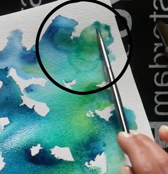
*Bonus Effect: The Backrun
When we're just starting out with using wet-on-wet effects, are working too fast and/or are not staying mindful of what's going on, backruns happen. We can avoid backruns by practicing water control, staying mindful of how wet our paper is and how much water our paintbrush has in its bristles.
In essence, backruns can be avoided by making sure the amount of water in our bristles is less that the amount of water that is already on our paper. They can also be avoided by allowing the previous layer to dry completely before going back in with another wash of color.
This said, backruns are one of those things that some artists consider to be absolutely wrong, while others actually create them intentionally to give the impression of specific things in their paintings like foliage in a landscape, etc.
What do you think?
Watercolor back run
Watercolor supplies used in the video:
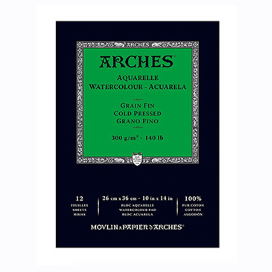 Arches Watercolor Paper Pad: 10 X 14 inches Arches Watercolor Paper Pad: 10 X 14 inches
|
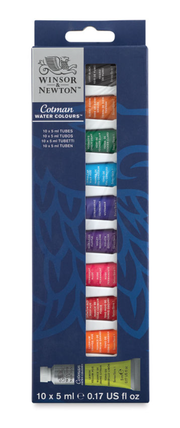
Winsor & Newton Cotman Watercolor Set of 10 Tubes
|

Royal & Langnickel Zen Line Watercolor Brushes
|
I hope you enjoyed this post and learned something new, or got inspired to go and create for yourself.
I wish you tons of progress and enjoyment in your artistic journey! :)
12 Comments
*This post contains affiliate links. I receive small commissions for purchases made through these links at no extra cost to you. These commissions help me keep this site up and running, in order for me to keep providing helpful and inspiring art content. :)
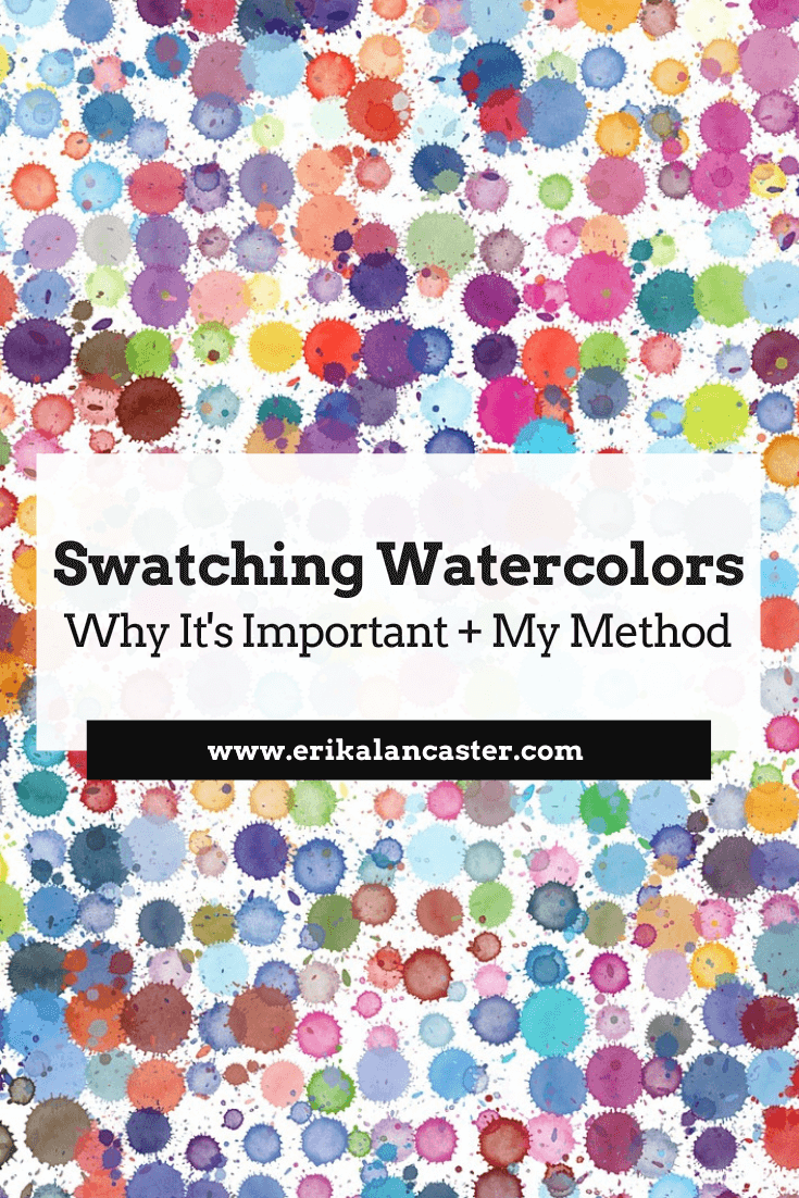
What's the actual reason behind swatching watercolor paint (aside from the satisfaction of laying pretty colors down on paper)? What specific things should we be looking for when testing out a new watercolor paint set, besides differences in color? What are the different variables that may affect watercolors' behavior and their final appearance?
In this blog post, I'm going to explain the most important characteristics that you should start taking note of when it comes to watercolor paint.
By understanding these different aspects and how they vary from pigment to pigment, you'll be able to make more informed choices when it comes to picking your color palettes/schemes for your paintings, which will make everything go a lot smoother.
I'll also walk you through my own personal method for swatching out a new paint set and share why I like testing my paints on two different types of paper.
It's very useful to explore a new paint set before actually attempting to create a painting with it. This is especially the case when it comes to watercolors, as this painting medium's inherent characteristics make it tricky to use.
For one, watercolors are translucent, which means we can't simply cover up our mistakes like we can when working with acrylics or oils. Secondly, due to their water-soluble properties, they tend to have a mind of their own.
Finally (and something that was very hard for me to wrap my head around in the beginning), behaviors and effects can vary greatly from pigment to pigment, even within a set manufactured by the same company.
There are also many external factors that can affect our watercolor painting process and the final outcome of a piece, such as how clean our water is, what kind of paper is used, and even the temperature of the room we're working in!
Always remember that, as artists, we have to learn to embrace the exploration process. It may seem like a waste of time and resources when we're just starting out, but these smaller studies give us confidence and allow us to find ourselves as artists, so that we're then able to create more effective finalized works.
If you're a beginner just starting out with watercolors, I highly recommend checking out my two-parter series on YouTube titled 10 Common Watercolor Mistakes.
You'll find part 1 here and part 2 here.
By avoiding these common beginner mistakes, you'll be able to make faster progress.
Let's get to the swatching!
If you enjoyed this video and found it helpful, make sure to subscribe to my YouTube channel. I share a brand new video every week with art tips, drawing and painting tutorials and mindset/productivity tips for artists. *Subscribe HERE*
There is no right or wrong way to test out a new watercolor paint set. The whole point of swatching and testing out colors is for you, the artist, to have a better understanding of different color behaviors.
This way, you'll be able to select the colors you like best depending on the particular subject you paint, your personal techniques and the overall effects you're going for.
If you're just starting out and haven't found your style, no problem! As your artistic journey progresses, you'll discover your own way of working and the specific paint qualities that are important for you.
Later on, you'll be able to modify your swatching process to whatever fits you best and perhaps leave out aspects that aren't as important.
Find a list of my favorite art supplies and books here.
Watercolor Paint Characteristics and Must-Know Vocabulary
a) Mass tones
A color's mass tone tells us what it looks like when it's straight out of the tube and at its fullest saturation. Basically, it's the color at its purest and undiluted self.
-This is usually the first rectangle I fill in below the hue's name and I make sure to use the least amount of water possible.
b) Staining qualities
A color's staining quality refers to how difficult it is to remove from the paper when lifting, scrubbing or attempting to reactivate it once it's dry.
-To test this out, I like lifting paint from a small section of my Masstone square/rectangle when it's still wet with either a rag or a paintbrush. I also like coming back to my color swatch once it's dried completely to see if any color can be lifted or reactivated because I personally use this technique a lot in my work. There are some pigments that are known for being extremely staining, such as Prussian Blue, and others that lift up quite easily.
c) Opacity
A color's opacity tells us how opaque or transparent it is. Usually, you're looking for transparency when it comes to watercolors, as this is the quality that gives paintings created with this medium their distinctive glow.
-For faster swatches, I like drawing a couple of ink lines in this square/rectangle (allow them to dry completely) and painting over them with each color to see if there is any chalky residue left behind.
-Another option is painting a couple of lines or shapes with a different color (a different color from the one you're testing) and seeing how much the subsequent layer of color allows the bottom to shine through.
d) Level of dispersion
A color's level of dispersion refers to how easily it expands and/or intermixes with other colors when dropping on damp paper. A high level of dispersion means a paint color expands quickly and intermixes a lot with colors around it. A low level of dispersion means it mostly stays in place.
-For quicker swatches, I like simply wetting this square/rectangle with clean water and dropping the color in in several different places to see how fast it expands.
-Another option is dropping a different color in first and then placing the specific hue you're testing out to see how much it expands/intermixes. I do recommend preparing a larger square/rectangle for swatching if you want to test this out. Because I don't do a ton of wet-on-wet work myself, this isn't I take too much time doing. However, if you do a lot of landscapes or even abstracts, it may be very useful for you to spend time testing out this particular one for your different colors!
e) Granulation
A color's granulation level can be identified by laying down a flat wash, allowing it to dry completely, and observing how even and uniform it looks after. Pigments that have a high level of granulation separate from their binder when mixed with water and tend to settle into the texture of the paper it is placed on. This leads to white dots and a patchy look in some areas. *A high level of granulation isn't inherently bad, as it can be used to create great effects in areas that require them. Many artists use highly granulating paints to their advantage!
-I don't usually create a separate square/rectangle to test out granulation, but come back to observe this later on after my paint has fully dried and settled into the paper in all my sections.
f) Permanence
A color's permanence refers to how resistant it is when exposed to light. In other words, how quickly does it start to fade out? Usually, manufacturers include this information somewhere within the packaging of the product with the following codes: AA (Extremely Permanent), A (Permanent), B (Moderately Durable) or C (Fugitive).
-I don't usually create a separate square/rectangle to test out permanence, but come back to observe how much the color has faded out a few months later.
g) How do colors react on different types of paper?
I usually like seeing how different pigments react on at least a couple of different types of watercolor paper because I know how much of a difference the right paper can make!
-For the swatching of this particular Winsor and Newton set, I used both higher quality Arches watercolor paper, as well as cheaper Canson paper. Both of these were 140 lb. Cold Press papers, but the Arches had much more of a texture to it. Another option could be testing your paint out on both Cold Press and Hot Press papers.
Access my Watercolor Supplies 101 crash course here.
In it, I explain everything you should know about watercolor paper, paint and brushes.
Painting Swatching Outcome + My Conclusions
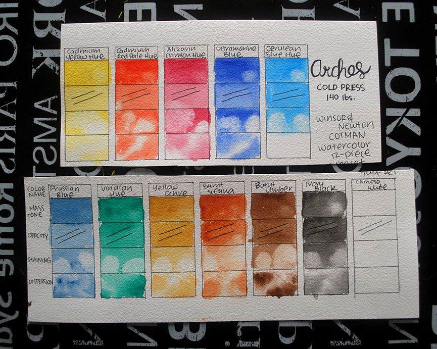
Swatching out Winsor and Newton paint set on Arches 140 lb. Cold-Press watercolor paper. This photo has not been manipulated in any way.
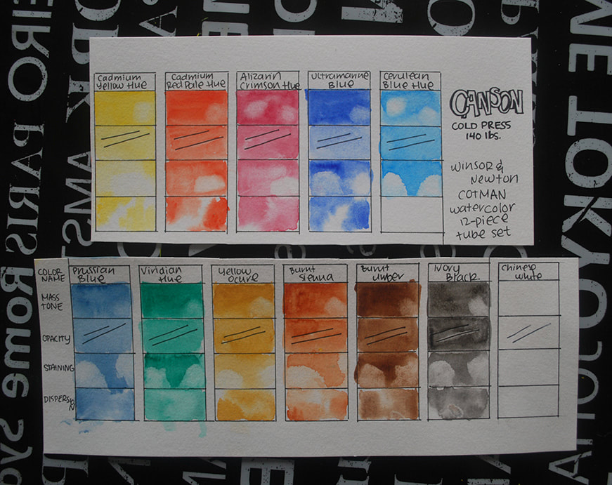
Swatching out Winsor and Newton paint set on Canson 140 lb. Cold-Press watercolor paper. This photo has not been manipulated in any way.
The colors included in this Winsor and Newton 12-piece tube set are:
Cadmium Yellow Hue
Cadmium Red Pale Hue
Alizarin Crimson
Ultramarine Blue
Cerulean Blue
Prussian Blue
Viridian Green
Yellow Ochre
Burnt Sienna
Burnt Umber
Ivory Black
Chinese White
I enjoyed testing out this Winsor and Newton watercolor tube set and look forward to painting a piece with it.
Even though this brand's Cotman line is described as being their affordable/student grade option, this particular tube set offers an excellent color payoff, contains a good amount of paint and is quite comfortable to work with.
The paint's texture is just thick enough when squeezed out of the tube and onto the paint-mixing palette. Each tube contains 8 ml of paint and the manufacturer has included relevant information on its packaging such as each color's level of Permanence and Pigment Code.
A few things I noticed in regards to the differences between the swatches created on the two different watercolor papers:
a) Overall, the colors painted on the Arches paper are more vibrant than how they appear on the Canson paper.
b) The degree of this varies from pigment to pigment, but I was able to lift up more paint from the Canson paper, especially once the paint had dried. This probably has to do with the fact that the 100% cotton Arches paper absorbs the pigment a lot more effectively.
c) Wet-on-wet effects were much more beautiful on the Arches paper, which allowed them to disperse a lot more fluidly and gradually. On the Canson paper, the paint pooled in certain areas and left a patchy effect.
d) All colors, except for the Chinese white are completely transparent (which is a good thing). Transparent watercolors allow bottom layers to shine through and give paintings a unique glow. If you zoom into the ink lines below the Chinese white swatch, they appear to have a bit of a chalkiness over them.
Watercolor Supplies:
*I buy most of my art supplies online through Blick or Amazon. Both of them are excellent options for finding great supplies at accessible prices. Click on images below to learn more about each product.
|
Find a list of my favorite art supplies and books here.
I hope you enjoyed this post and learned something new, or got inspired to go and create something for yourself.
I wish you tons of progress and enjoyment in your artistic journey!
Find a list of my favorite art supplies and books here.
I hope you enjoyed this post and learned something new, or got inspired to go and create something for yourself.
I wish you tons of progress and enjoyment in your artistic journey!


*This post contains affiliate links. I receive small commissions for purchases made through these links at no extra cost to you. These commissions help me keep this site up and running, in order for me to keep providing helpful and inspiring art content. :)
Are you eager to start selling your artwork online but perhaps feel overwhelmed with all the options out there? Wondering if print-on-demand platforms like Society6 and Redbubble are right for you? Do the technical aspects involved in creating on online shop and uploading your artwork effectively keep you from moving forward?
In today's blog post I'll be sharing my entire process for creating products to sell on Society6, as well as essential information you should definitely know if you're thinking of opening a shop of your own on this platform.
I'll also be providing a list of pros and cons about Society6 to help you make an informed decision on whether opening this type of shop is right or you.
Society6 is an online marketplace that allows artists and designers to easily create their own shops and sell their work not only on prints, posters, canvases, and other kinds of wall art, but on a large variety of accessories like phone cases, tote bags, apparel and even furniture!
One of the reasons why I decided on Society6 over other platforms is because, in my research phase, I heard great things about the quality of their products from other artists.
About a year and a half ago, when I first started learning about different options for selling my work online, I was taken aback by the amount of platforms available and the differences between each.
Some of them require artists to go through application processes, others ask for fee payments for each artwork uploaded, others keep a huge percentage of the artist's earnings, etc.
Of course, there are marketplaces like Etsy through which the artist assumes all responsibility for customer service, packaging and shipping orders, which you can go for right-off-the bat if you want more control and direct contact with your customers.
I decided to create shops on both Society6 and Redbubble, as they are fast to open, easy to use and require no monetary investment. However, since before starting with my online art business journey, I knew that my end goal was to eventually sell my original artwork through Etsy.
The way I saw it, these smaller shops would be a great way to start developing a habit for creating new pieces and uploading them on a semi-regular basis.
They would also enable me to test out what people liked most and to start marketing my different products through social media.
I saw these shops as a stepping stone, as I knew I still had a ton to learn about before opening my shop on Etsy. Also, I'm all for creating a variety of income streams and plan to keep these smaller shops running even after my Etsy shop has gained some traction.
Setting up multiple income streams is a total must for artists of all kinds, in my opinion.


There are three things that you should do before deciding whether a platform/marketplace is right for you or not:
a) Research, research, research (but don't get stuck there)
This entails visiting the site yourself and reading the information the company provides. You must know what their terms are, the support they provide, how/when you're getting paid, the quality level of their products, etc. I also recommend listening to reviews from at least three different artists or designers that have been on the platform for a decent amount of time.
Also, think about whether the company's overall vibe (the mood and attitudes they transmit through their site, social media channels, advertisements, etc.) meshes with yours.
b) Give thought to what goals you have for your artwork
There are so many paths that an artist could go down.
Is your dream to sell paintings for large amounts of money and getting into galleries? Are you primarily a commercial illustrator working with clients? Would you like to venture into surface pattern designing? Would you like to have your own larger shop on Etsy (or on your own website) through which you'll take care of all production and shipping to your customers in the future?
You have to know what it is you want to do before investing too much time and energy into something that may or may not be right for you.
What does your gut tell you?
Listen to your intuition and what feels right for you. Then take serious action and stay consistent. As you continue learning, don't be afraid to veer off the path you initially chose if you discover its not right for you. This is normal!
Check out my free masterclass on Goal-Setting and Time Management for Artists here.
c) Actually do it and give it a decent amount of time
Once you've come to a decision (be careful not to spend such a long time in the research phase that you never actually get to anything), it's essential to put in consistent effort and be patient. You might be doing everything right and still see nothing happening for months.
Remember it takes time to see results on any platform and it's essential to stay consistent for a while before arriving at any conclusions. Always continue learning what aspects you can improve about your shop and how you can get your work out there effectively.
If you enjoyed this video and found it helpful, make sure to subscribe to my YouTube channel. I share a brand new video every week with art tips, drawing and painting tutorials and mindset/productivity tips for artists. *Subscribe HERE*
How to Scan, Edit and Upload Artwork Onto Society6
1. Creating Your Artwork
You can upload any kind of artwork onto Society6 and choose any (or all) of the items available to place it on if you so desire. However, it's important to take into account that not all kinds of artwork will look good on all types of products.
And, of course, the less amount of items you make available, the less options you will offer to your visitors, which translates into less sales.
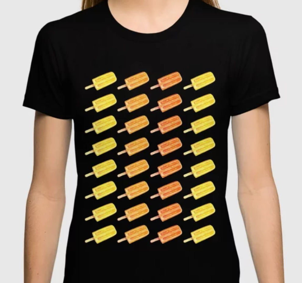
With my limited amount of time, I decided to create patterns using the watercolor illustrations I was already creating for the calendars I send out to my art email insiders every month! With one same pattern, I would be covering most of the items offered by Society6 at once and they would look awesome.
I know creating patterns might not fit your own artwork but, if you wish to create patterns with your illustrations as I do, I highly recommend creating your artwork with little to no background so that it's easy to "clip out" in Photoshop (or the photo editing software of your choosing).
As you upload your first drawings or paintings and start placing them on products, you'll find what types of items suit your work best. As much as it's great to have more products to offer, don't feel obligated to create products that don't make your artwork shine.
And, of course, the less amount of items you make available, the less options you will offer to your visitors, which translates into less sales.
With my limited amount of time, I decided to create patterns using the watercolor illustrations I was already creating for the calendars I send out to my art email insiders every month! With one same pattern, I would be covering most of the items offered by Society6 at once and they would look awesome.
I know creating patterns might not fit your own artwork but, if you wish to create patterns with your illustrations as I do, I highly recommend creating your artwork with little to no background so that it's easy to "clip out" in Photoshop (or the photo editing software of your choosing).
As you upload your first drawings or paintings and start placing them on products, you'll find what types of items suit your work best. As much as it's great to have more products to offer, don't feel obligated to create products that don't make your artwork shine.
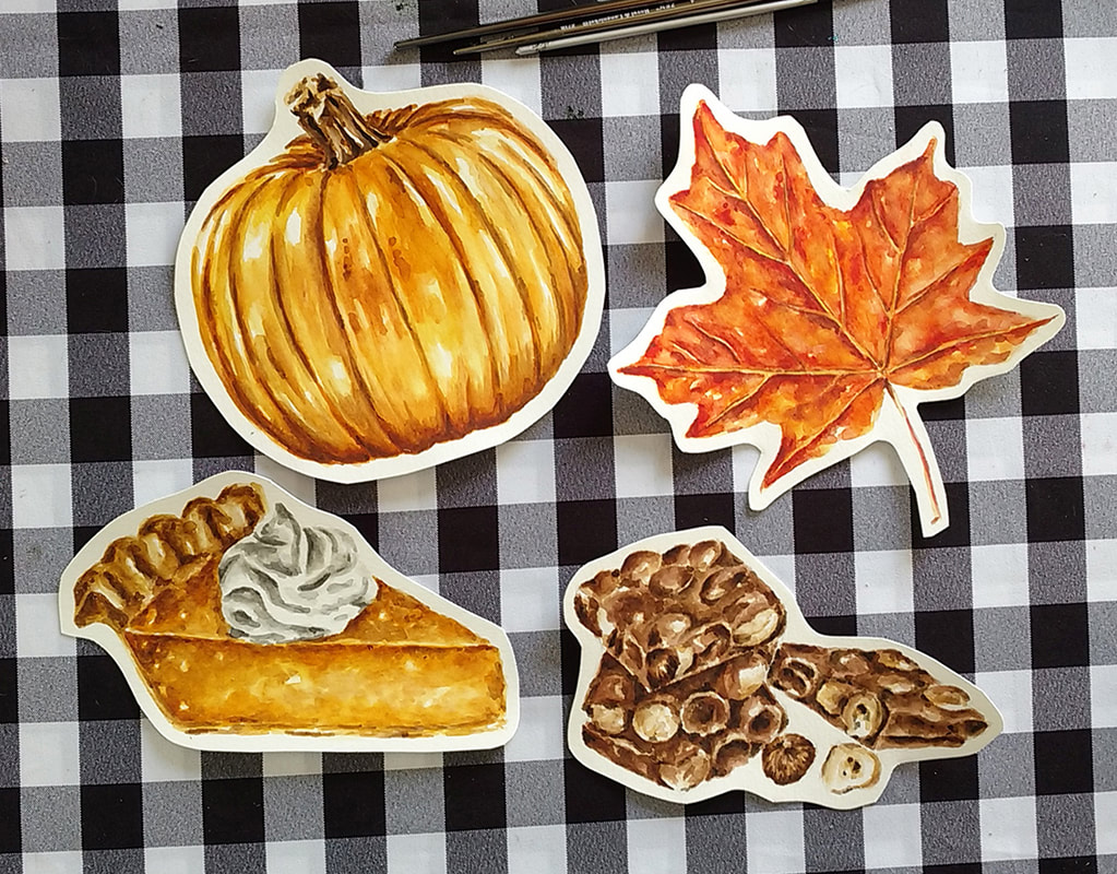
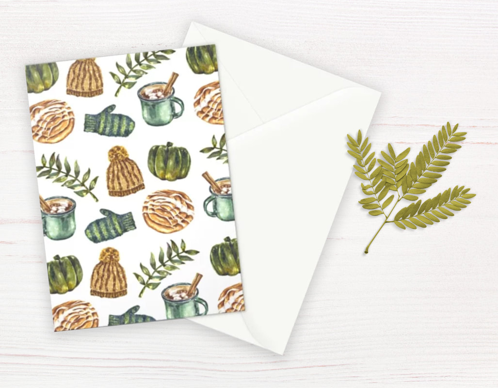
Watercolor food and botanical illustrations by Erika Lancaster. Winsor and Newton watercolors on Canson 140 lb. watercolor paper.
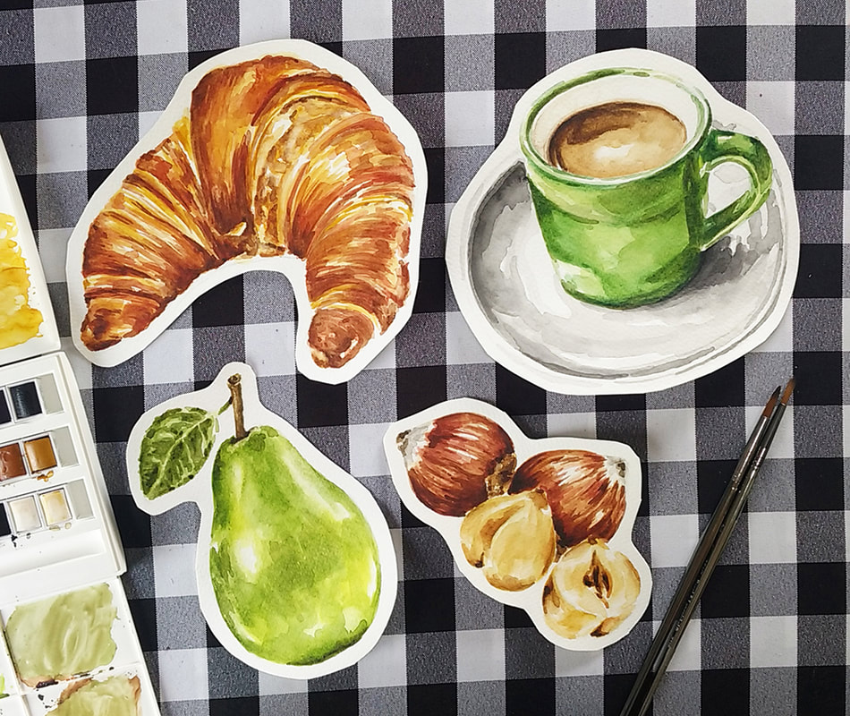
Watercolor food and botanical illustrations by Erika Lancaster. Winsor and Newton watercolors on Canson 140 lb. watercolor paper.

2. Scanning Your Artwork
In terms of the scanning process, there are a couple of things that you should have in mind. Firstly, the products you're intending to place your design on will be printed, which means that the resolution and quality of your scanned artwork matters a lot. Thus, you should make sure your scanner's settings are at at least 300 dpi (dots per inch).
There are artists that scan their work at higher resolutions, but this is the minimum. If you decide to scan at an even higher resolution, your scanning process will most likely take longer and your files are going to take up much more space on your computer.
Below are a couple of scanners that have been recommended by other artists who've bought these specifically with the intention of scanning their work and creating their own prints. After having read so many great reviews, I'm definitely going to be investing in one of these in the near future as I expand my business.
Great scanners for artists:

Canon CanoScan CS9000F Mark II, 6218B009
|
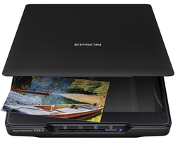
Epson Perfection V39 II Color Photo and Document Flatbed Scanner with 4800 dpi
|
3. Editing Your Artwork & Creating Your Designs

Epson DS-50000 Large-Format Document Scanner: 11.7” x 17” Flatbed
|
|
Once I have a high quality scan of my illustration on my computer, it's time to open Photoshop and move onto the cleaning/editing process, as well as creating any sort of pattern I'd like with it. If you don't currently have Photoshop, and don't want to pay for the software, don't worry!
You can download Gimp for free, which is a very popular photo-editing software you can get online for both Mac and PC. This popular alternative is even used by professional illustrators and contains pretty much all the tools that could come in handy for you as an artist.
In Photoshop, I mainly remove the background from my illustration, do any cleaning necessary (to remove hairs, etc.) and perhaps increase the contrast a tiny bit at times. To "clip" the illustration from the background I like using the Pen Tool, which provides me much more control than the Magic Wand selector.
You want to be careful when cutting your illustrations out, because any white spots you leave outside of your illustrations will get printed on the products! I always make sure to re-check my work when I'm done.
Every now and then, I also use Photoshop to manipulate colors so that I'm able to create colorful patterns using only one "base" illustration.
Once I've successfully separated my illustration from its background, it's time to create an appealing pattern with it! I visit Society6's Pixel Dimension Requirement page to make sure I'm creating my file in the right size before working on my pattern.
In this page, Society6 lists out the document sizes (in pixels) needed for each of their products. But don't worry, you don't need to create a separate file for each!
What I do is create a new document in Photoshop with their minimum recommended size of 6500 x 6500 pixels and create my pattern there. This size is covers most of the products on the list and the platform will automatically place it on all the products that require this size or smaller, which saves a lot of time.
There are currently only 2-3 products that require a larger size than this and you can create separate files for those if you wish. There are also a couple of products like stickers and t-shirts which you'll probably find need a separate design or layout.

Pixel Dimension Requirements for Society6 Products. Click on image to visit site.
Once I'm happy with my pattern, I deactivate the background layer in Photoshop and save the document as a .png, which allows the background to remain transparent. This is the file you'll upload onto Society6.
Because I know I'm most likely going to have to come back to Photoshop to create separate .pngs for stickers and t-shirts, I leave it open.

Click to visit Gimp's website and download the software.
3. Uploading onto Society6
Opening your shop on Society6 is very fast and easy. All you need is a PayPal account. I recommend giving thought to your Username/URL because you won't be able to change it later and filling out your Artist Bio as soon as your able. Upload a banner and an avatar image to make your shop your own.
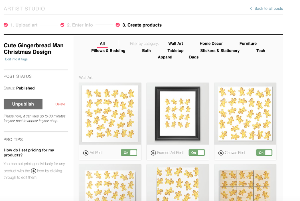
Once that's done, all you have to do is click on the button at the top that says "Sell" and you're going to be taken through a very straightforward 3-step process. The platform take a minute to process your artwork when you upload, as it's placing it on all available products that it fits on.
Next, you'll have to fill in a title for your work, as well as tags and a description. A tip here is to put yourself in the buyer's shoes. Instead of typing in a subjective title for your artwork, think about what words visitors actually type into Society6's search bar when looking for products. Be descriptive, create a five word title, use up all the available tags, and create a good little paragraph.
Finally, the fun part! You'll be taken to the last section, in which you'll see your design on all sorts of awesome items. You get to decide which to deactivate if you wish. I highly recommend taking time to look over every single product to ensure that your design is at an optimum size in each.
All you have to do is click on each item and shift your design's size/location.
As you scroll down the Create Products page, you will see what products require a separate .png file. I usually need to create a separate file for stickers, as a sticker page has to have fewer elements and they have to have a good distance between them (stickers have a white outline around them that shouldn't overlap).
also create separate patterns for t-shirts that are usually more vertical and contain less elements than my initial pattern.
Create whatever .png files you need and upload them separately onto individual products by clicking on those items.
Finally, hit Publish and, in around 15 minutes, your products will be up on your shop!
Back-end of Society6 store. Placing artwork on products.
*Next step! Market your artwork!
No matter how amazing your artwork is, if nobody knows about it, you're going to have a hard time making sales. Don't be afraid of putting your work out there!
While Society6 does a great job attracting shoppers to their site, their marketplace is saturated with incredible artists that have been on the platform a very long time and have formed a history/reputation for themselves. All of us need to go through that and have to accept and learn to enjoy the phase we're in.
If you're serious about selling your work online, I suggest optimizing your social media accounts so that you give your audience a clear idea of what you do and offer. Pick one or two and keep them professional.
Refrain from sharing personal things and stick to uploading pictures of your creative process, your favorite tools, what you find inspiring, links to useful articles that your target audience would find helpful, and share your new products!
Visit Society6's blog to find great tips for getting your work out there.

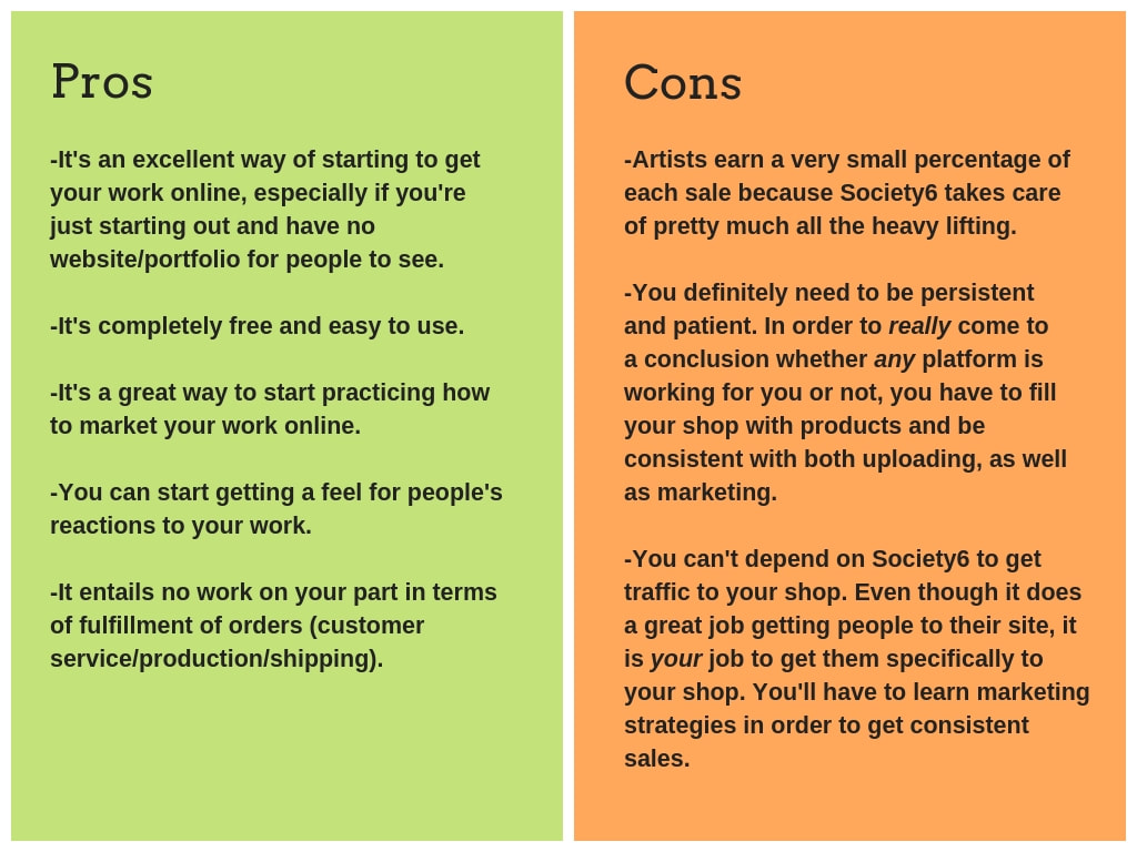
Pros and Cons of Society6 (and other similar online shops)
I hope you enjoyed this post and learned something new, or got inspired to go and create something for yourself.
I wish you tons of progress in your art journey and tons of luck with your sales!


*This post contains affiliate links. I receive small commissions for purchases made through these links at no extra cost to you. These commissions help me keep this site up and running, in order for me to keep providing helpful and inspiring art content. :)
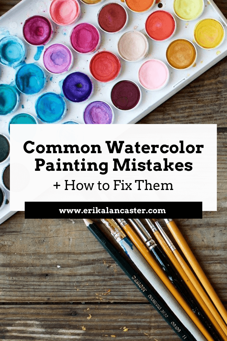
Do you feel like you're constantly fighting against your supplies when painting with watercolors? Feel like a failure after every single little mistake you make throughout your painting process? Do you frequently end up frustrated with yourself and throw away more paintings than you actually keep?
In today's post, I'll be sharing five common watercolor painting mistakes and what I personally do to fix them or avoid them altogether. By making use of these tips and tricks, you'll end up with a painting that is going to have way more positives than negatives.
When using watercolors, we cannot just simply cover up our mistakes with a new layer of paint. This artistic medium requires us to be much more mindful and delicate, even, right from the start of the painting process.
I use several different kinds of paint for my own work and when I make the switch to watercolors, it helps me to remember that I'm using this medium's transparency, in combination with the whiteness of my paper, to produce a wide range of values.
I am not covering up my substrate and layering paint, as I would with oils or acrylics, but using my paper in itself as my lightest value. This is what's going to help create watercolors' distinctive "glowing" effect.
There's way more of a chance that you'll produce a great watercolor painting if you do, at least, a bit of planning before starting, and are able to remain patient throughout the process.
It's also essential that you are aware of this medium's characteristics and have practiced basic exercises before jumping into a more complex subject.
I highly recommend reading my blog post titled 10 Things I Wish I Knew Before Starting With Watercolors if you're just getting started.
All this said, it's important to know that you don't have to get frustrated with yourself and throw away a painting every-single-time you've made a mistake.
If you're mistake is small (which it should be if you're staying focused throughout the process), there most likely will be a way to make it less noticeable. There are also specific things you can do to avoid these mistakes in the first place!
For the time-lapse video included in this post, I painted a subject that I knew would be extra challenging for me and would allow me to demonstrate how I approach my mistakes on a real project.
Though I knew that my painting wasn't going to be "perfect" when that first mistake happened, I was determined to push through, and I'm happy I did. I learned a lot from it and will apply this knowledge in future paintings.

Watercolor Cougar by Erika Lancaster. Schmincke watercolors on Fabriano 140 lb. watercolor paper.
Art supplies used for this watercolor painting:
|
|
|
|
Five Ways to Avoid or Fix Watercolor Mistakes
It's important to understand that no mistake will be completely erased with any of these techniques. What you're trying to do is make them less noticeable, so that they don't distract from the great areas of your painting.
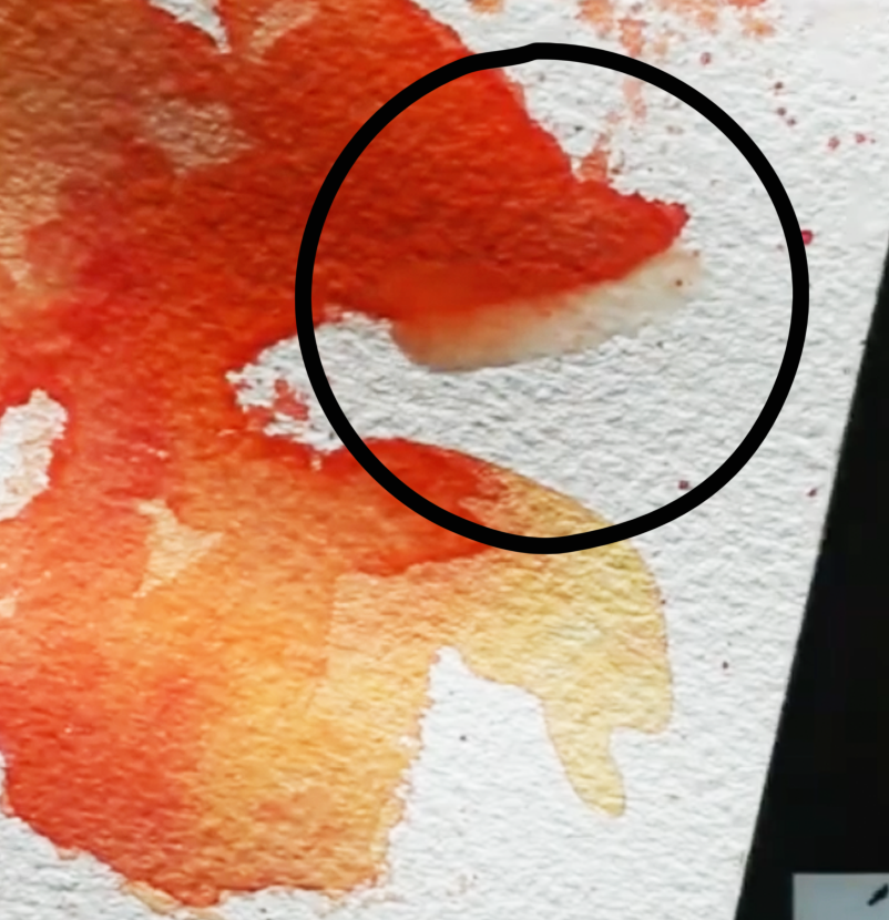
Mistake #1: Accidentally covering up your lightest areas (highlights)
How to avoid this:
Make sure that you take time to plan and decide how you'll be protecting your lightest areas before starting with the painting process. You can do this by either creating a "map" for yourself (drawing small shapes around these areas using a pencil) and very carefully working around them as you're painting.
If you're painting a very complex subject with very small areas you want to protect, I recommend using masking fluid, as I did to protect the whiskers of this cougar.
To learn everything you need to know about using masking fluid with watercolors, visit my blog post titled Using Masking Fluid with Watercolors: Everything You Need to Know.
How to fix it:
Use the lifting technique to remove some of the pigment from your paper. If your paint is still wet, simply take your rag or paper towel and gently blot your paper with up and down motions (not sideways as this will damage the paper).
If your paint is already dry, no problem! As long as you're using decent quality watercolor paint, they can be reactivated by re-wetting them. All you have to do is rinse your brush well, remove excess water from its bristles and do gentle circular scrubbing motions in the area.
Don't go back in with too much water, though, and stay mindful about not damaging your paper.
Remember that the more wet your paper is, the more fragile it is. So once you've removed all you can, just let it go and allow the area to dry.
*It's important to know that different colors are going to have different staining qualities on your paper, and that the quality/type of paper you're using will affect the outcome of this technique.
*Also, the thicker the paper you're working on, the more scrubbing and lifting it will allow without you damaging it. These techniques won't work well if you're using lightweight paper. I love working on paper that's 140 lbs. and thicker.

Mistake #2: Laying down too much dark paint in the beginning stages or creating flat/stark looking shapes or lines
How to avoid this:
Remember that a good watercolor piece requires patience. Take your painting one-step-at-a-time and always start with light, translucent values and work your way towards darker darks incrementally.
Look at your reference and add your darkest values only where you actually see them (usually even these areas have somewhat of a variation in color and translucency in them in order to avoid flatness).
Generally speaking, you want to keep very dark/saturated colors only in the areas that really require them and make use of the medium's translucent qualities.
How to fix it:
Went a bit crazy laying down way too heavily pigmented paint mixture in a larger area (or sooner) than intended? Don't fret! Use the lifting technique described in the previous point using your rag to gently blot the area while it's still wet or use your clean, damp brush to do some scrubbing.
Be gentle while you remove as much pigment as possible and allow to dry before attempting to do anything else in that area.
You can also use the pulling/spreading technique in order to dissipate the concentrated pigment into a larger area. Of course, you don't want to spread that pigment into areas that are meant to be white or affect other colors you've already placed, so be careful.
I've found, dissipating that stark line or edge into a gradient really helps remove that flatness that we've mistakenly created. Do what you can and leave it. Move on to work on other areas of your painting.
Later on, when the area is completely dry, you can go back in and make any overworked areas less noticeable by adding more paint carefully and playing around with values/washes.
Mistake #3: Bleeding colors (when you didn't plan for them)
How to avoid this:
It's really essential for you to know the different effects that watercolors allow and when to use different techniques. I wouldn't recommend moving onto a complex piece if you haven't practiced simple exercises that will allow you to know your medium's characteristics.
Essentially, when you place a paint mixture on a previously wetted paper, it will expand/bleed/intermix. This is referred to as the wet-on-wet technique and will lead to a blurred-out effect that you, most likely, do not want in some areas of your painting.
Before starting with your painting process, give thought to what areas you want blurred out, and which you want more definition in. The more defined you want an area, the more important it is for you to wait for the previous layer of paint to dry before applying more paint on top.
How to fix this:
Gently blot your paper with your paper towel immediately when this intermixing starts happening in order to prevent it from expanding more. Allow it to dry completely.
If the mistake is small and the color left behind is faint, chances are you will be able to add more definition to the area with subsequent layers once it's dry.
Photo courtesy of Unsplash.com. Click on image to visit original site.
Mistake #4: Creating muddy colors
Check out this blog post that I specifically created to help avoid this issue!
How to avoid this:
The very best thing you can do in order to avoid muddy colors to begin with, is to take time to test and experiment how the pigments you're planning to use mix together. Before starting to paint, give thought to the color palette needed for your composition. Plan the exact colors you'll be using, and keep your palette limited (5-6 colors usually works for me).
I cannot paint without my scrap piece of watercolor paper beside me that allows me to constantly test out color mixtures and transparencies throughout the process.
Know and understand the Color Wheel and the relationships between colors. Explore Analogous and Complementary colors, and decide how you want to approach deepening color values and creating shadow effects.
Take time to do exercises before even attempting to paint a complex subject or else you'll end up frustrating yourself more than you need to.
In the third class of my free Watercolor for the Total Beginner Mini-Course, I walk you through several color mixing exercises, which you'll find extremely useful!
*Don't mix more than 3 different colors together, unless you know what you're doing.
How to fix this:
If you've mistakenly laid down a muddy color on your paper, try to absorb what you can while it's still wet and allow the area to dry. There are some cases in which adding a light wash of a brighter color on top, will make the mistake less noticeable.
Mistake #5: Overworking or damaging your watercolor paper
How to avoid this:
If you're anything like me and you enjoy using techniques like scrubbing, lifting and layering, buy decent quality paper that's at least medium weight or thicker (140 lbs. and heavier). I personally cannot work on thin, flimsy paper.
However, even when using thick, quality paper, it's essential to learn when to stop and allow your paper to dry. The more experience you gain, the faster you'll be able to recognize when your paper needs time to recoup!
In the video included here, you'll notice I jump around a lot. If I do something I don't like, I absorb/lift what I can, and leave it. I work somewhere else and come back to that area to fix it later. I do not obsess over imperfections and move on with the process.
How to fix this:
Damaged paper simply cannot be fixed (unless you want to cut that part off). Of all the mistakes mentioned in this post, this is probably the deadliest, so stay mindful throughout the process so it never gets to this point.
Try not to get to obsessive over your mistakes, take a learning experience for what it is, and move on with the work you can do.
To finish up this post, I want to encourage you to not get frustrated over small mistakes. There is a certain beauty behind imperfection, and what you should be striving for with each piece is progress.
Trying to chase perfection with every single drawing or painting you create is probably going to end up hindering you and not allowing you to move forward as fast as you could.
Thanks so much for reading!

*This post contains affiliate links. I receive small commissions for purchases made through these links at no extra cost to you. These commissions help me keep this site up and running, in order for me to keep providing helpful and inspiring art content. :)
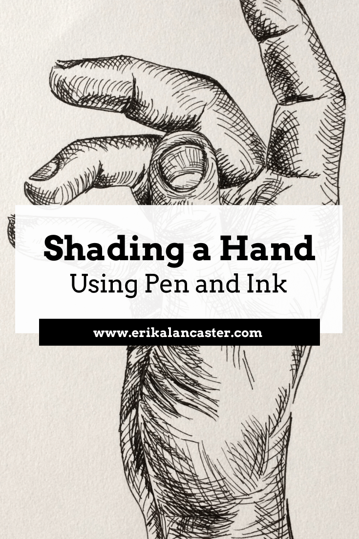
Have you gained confidence with your pen and ink mark-making, but need a bit of guidance when it comes to actually shading more complex subjects? Are you excited to step-up your pen and ink game so that you're able to create drawings that transmit more believable form and three-dimensionality?
When using pen and ink to create drawings that are more on the realistic side, it's essential to remember that we are both creating marks AND using said marks to render a wide range of values.
I've found that believable form is achieved with this art medium by staying mindful throughout the drawing process and placing marks as deliberately as possible.
Ink can be a bit intimidating due to the fact that it's permanent, but if you have enough practice with different mark-making techniques and you understand how to locate darkest areas, mid-tones and highlights in a reference image so that you can then create such values with marks, you'll be just fine!
For this blog post/YouTube video, I picked a subject I consider challenging (a hand) to explain my step-by-step process when adding form and three-dimensionality using the contour line/hatching technique.
This will help break the process up into more understandable chunks so that you can approach this kind of drawing more intentionally.
With practice, you'll gain confidence and you'll be able to enjoy creating more complex pen and ink drawings in no time!
This time, I wanted to jump right into the pen and ink explanation, and focus more on the creation of ink marks to render value/form than anything else. You'll see I start out with a previously created outline drawing of a hand.
To create this outline drawing, I did something I generally don't do, and traced a photo reference.
If you've been following me for a while, you're probably well-aware that I don't like tracing. However, I really wanted to jump right into the pen and ink techniques. Plus, I also wanted to provide both the exact photographic reference I used, as well as the initial outline drawing so we could start at the exact same point.
You can download both pdf's at the end of this post and follow along!
If you'd like to see how I would draw a hand in my usual freehand method, I highly recommend visiting my blog post titled 5 Essential Sketching Tips for Beginner Artists. I'm usually a huge believer in drawing subjects entirely freehand and not tracing.
If you're a beginner just starting out with pen and ink, I highly recommend checking out the blog posts/YouTube videos I released before this one. In those posts, I go much more in depth into different shading techniques and provide great exercises to start off with!
*Find them here:
Pen and Ink Sketching: 6 Shading Techniques
Shading Objects Using Hatching, Crosshatching, Scribbling, and Other Drawing Pen Techniques
If you enjoyed this video and found it helpful, make sure to subscribe to my YouTube channel. I share a brand new video every week with art tips, drawing and painting tutorials and mindset/productivity tips for artists. *Subscribe HERE*
My method for adding believable form to complex subjects using pen and ink techniques
1. Study your reference/subject
I find it extremely useful to take time to study my subject, especially when it comes to drawing or painting something more complex, like a hand. If possible, I make time to learn about its underlying structure (which in this case is a combination of many small bones-muscles-tendons-etc.).
Having at least some knowledge about our subject's underlying structure will greatly improve our ability to render effective form and three-dimensionality!
Since we are drawing a hand, we can take a few minutes to study our own from different angles. Though our hands may look different from the next persons', their underlying structure is the same.
Take note of its convex vs. concave spots, the fleshy and bony areas, how the different elements within it compare with each other, its overall imperfections and the range of movement the different joints allow, etc.
All this said, it's essential to select an excellent photographic reference to work from (if you're not drawing from life).
I talk about the things I take into account when selecting this type of reference in my blog post titled Shading Objects Using Hatching, Crosshatching, Scribbling and Other Drawing Pen Techniques). Observe your photograph thoroughly.
I've included a letter-sized pdf of this hand photograph at the end of the post, in case you'd like to download and print it for practicing purposes.
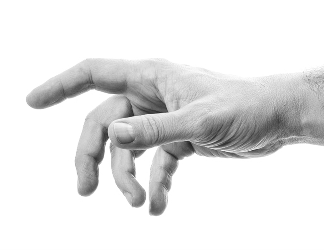
Reference hand photo after desaturating. Click on image to download original photograph from www.pixabay.com.
Once you've gained enough practice with reference photographs, I highly recommend incorporating at least some amount of drawing/sketching from direct observation (otherwise known as drawing/sketching from life) into your practice, as this will bring you much faster progress.
In my blog post titled Why Drawing from Direct Observation is Essential and 10 Tips to Improve, I explain why this method is so important for an artist's growth and provide a bunch of tips to make the process less daunting.
2. Start with a pencil outline drawing
Depending on your skill level and the objectives you have set for this study, you can decide whether you want to create your initial pencil sketch completely freehand, or if you'd like to focus on getting right into the pen and ink shading like I did for this tutorial.
I like using an HB or B pencil to create this preliminary drawing and keep it as light as possible because I want to be able to erase it completely later on.
If you'd like to download the free pdf that I've used to create this hand, you'll be able to find it at the end of this post.
I like using an HB or B pencil to create this preliminary drawing and keep it as light as possible because I want to be able to erase it completely later on.
If you'd like to download the free pdf that I've used to create this hand, you'll be able to find it at the end of this post.
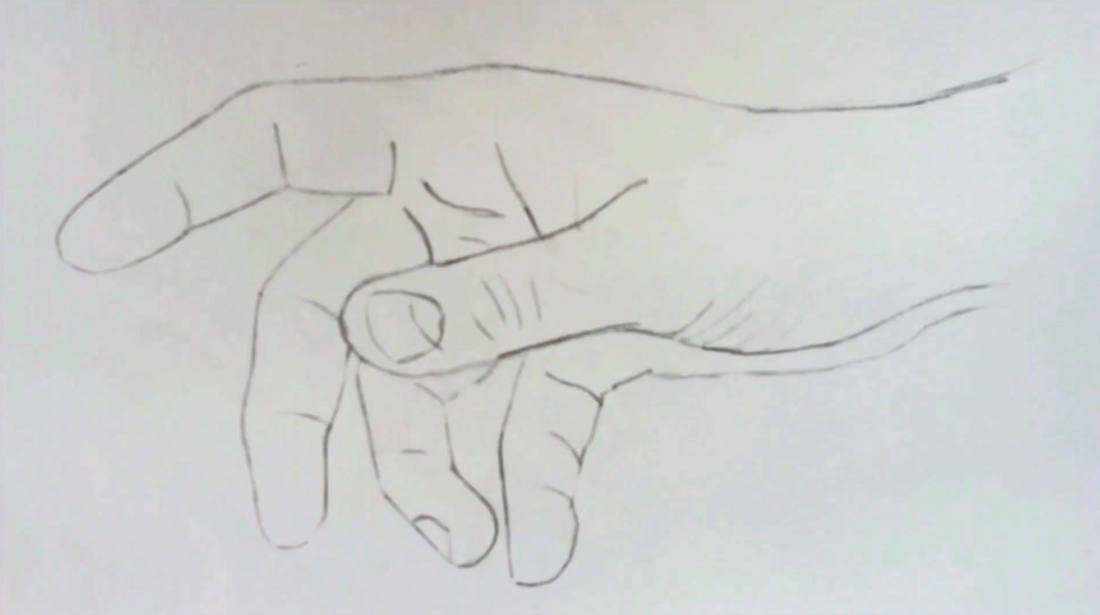
Hand outline pencil drawing
|
|
|
|
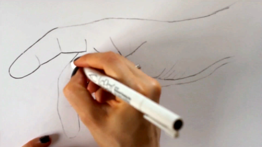
3. Outline your pencil drawing using ink
I used my LePen .5 point drawing pen to go over my pencil sketch carefully. Once the ink was set and dry, I erased all initial pencil lines.
At this point, you may also find it useful to create what I call a "value map" for yourself. You do not want to start adding marks without having a good idea of where your light source is located within the picture, as well as where darkest, mid-tones, and lightest areas are.
Draw shapes around these areas so that they can remind you throughout your drawing process where greatest value changes are located. You want to be especially mindful of where the lightest areas are within your reference image, so that those areas can be left untouched by ink.
Tracing outline pencil drawing using a drawing pen

4. Start adding in initial layers of marks
Before starting this hand study, I decided that I would be using mostly contour lines/contour hatching for my shading. If used effectively, this mark-making technique allows us to very efficiently create three-dimensional form to more complex subjects that contain curves all throughout.
I usually like starting my pen and ink shading process with the very darkest areas, so I took a good look at where the deepest values of my picture were located and got ready to start laying down my initial sets of marks.
I switched to my .3 point LePen drawing pen and let the curves of my outline drawing to guide me, as well as my knowledge of the hand structure.
As I mentioned in the past pen and ink tutorials, it's very important to keep a sense of consistency within each group of marks you create.
These initial sets of lines are very important because they will be the foundation for everything else, so make sure to pay attention to what you're doing! Notice how curves start shifting in certain areas to best describe folds, fleshy bits, etc?
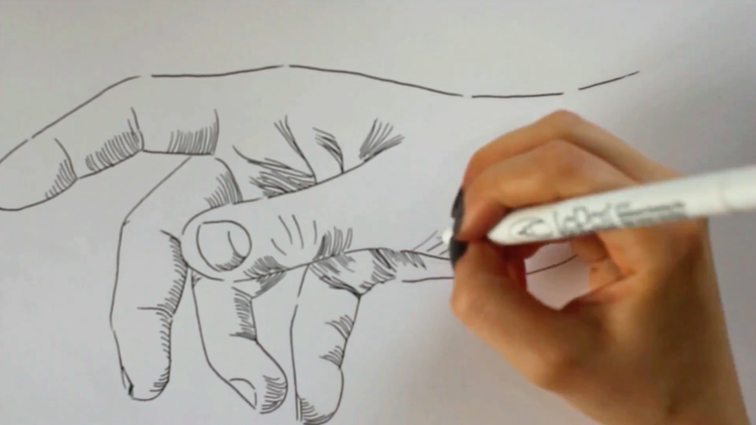
Adding in first groups of marks in the darkest areas within my reference photograph
5. Work on mid-tone range and deepen darkest values
By this point, all of your darkest areas and perhaps even a bit of the mid-tone areas, should be covered with your first layer of marks. It's time to start developing more mid-tones!
Once you start laying down your mid-tones, you're probably going to want to go back to your darkest areas and deepen them because they're not going to seem dark enough anymore.
To do this with the contour line technique, all you have to do is add another set of curved lines on top of the first, similar to when you're doing crosshatching.
There is no set angle at which you have to draw this second group of curved lines, as long as they are intersecting with the first. Remember there has to be consistency within each group of lines you create.
Throughout the drawing process, keep in mind that, developing a wide range of values is essential when you're attempting to create a three-dimensional effect.
There have to be very light areas in your drawing (which will be represented by those areas of paper that are completely free of ink), a wide range of mid-tones, and extremely dark areas (those small areas almost entirely covered with ink).
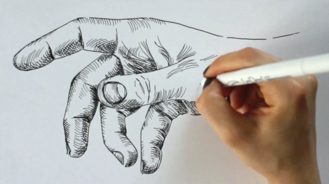
Working on mid-tones and deepening darkest areas with cross-contour lines
6. Fine tuning
Still using my .3 LePen drawing pen, I smoothed out values that needed to transition a bit more gradually. Once I was happy with my drawing, I switched back to my .5 LePen drawing pen and traced my initial outline drawing only in certain areas.
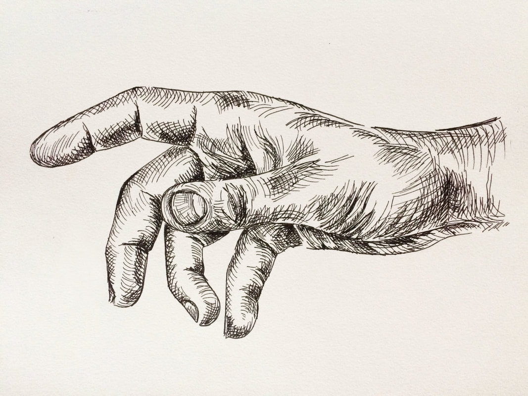
Final pen and ink hand drawing
*Free downloadables!
| hand_outline_drawing.pdf |
| grayscale_hand_reference.pdf |


www.erikalancaster.com
is a participant in the Amazon Services LLC Associates Program, an affiliate advertising program designed to provide a means for sites
to earn advertising fees by advertising and linking to amazon.com.
www.erikalancaster.com
is a participant in the Shareasale.com Affiliate Program, an affiliate advertising program designed to provide a means for sites to earn advertising fees by advertising and linking to Shareasale.com partner companies.
 RSS Feed
