*This post contains affiliate links. I receive small commissions for purchases made through these links at no extra cost to you. These commissions help me keep this site up and running, in order for me to keep providing helpful and inspiring art content. :)
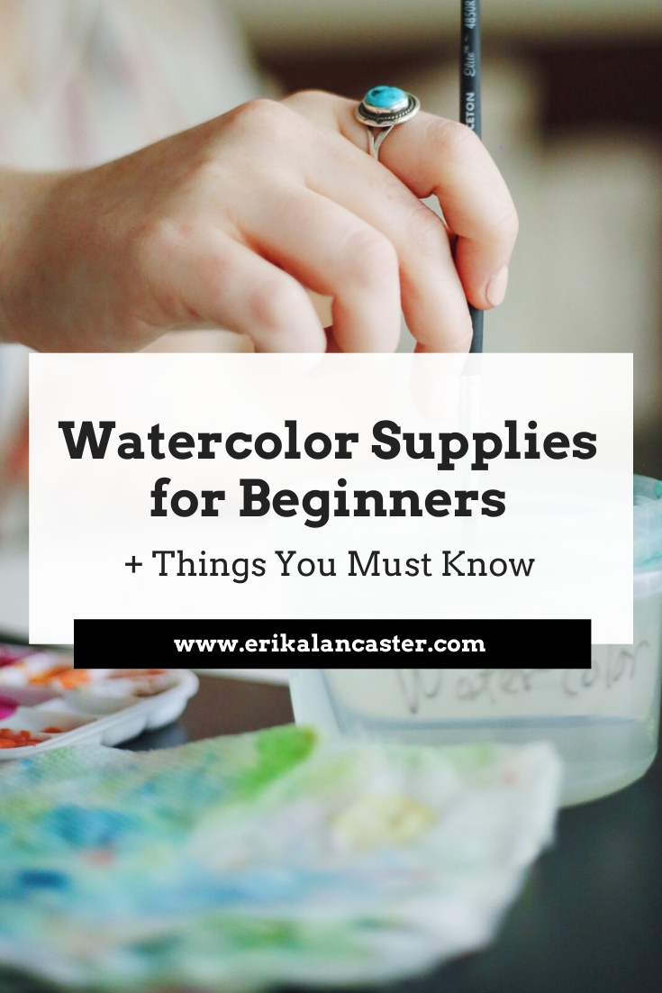
Interested in learning watercolor but unsure of what supplies are best suited for beginners on a budget? Does the thought of going to the art supply store and having to decide what specific items to choose in a sea of different types of paper, paint and paintbrushes make you not want to start at all? Do you find all the information out there about watercolor paint, paper, paintbrushes, etc. confusing and, perhaps even, overwhelming? I feel you! When I was first starting my own watercolor painting journey, I wasted a lot of money on supplies that ended up sitting on my shelf unused. I also bought materials (especially paper) that made the whole learning process much more frustrating and longer than it could have been. Though I'm still working hard at improving my skills, I've learned a lot in the years I've been painting with this medium, and I have a solid idea of what particular supplies actually helped me improve, as well as which ones I shouldn't have spent my hard-earned cash on. In this blog post, I will share a list of items that all beginner watercolor artists should have on hand when starting on their journeys, as well as specific brands of products that I have personally used time-and-time again. I will also provide essential information throughout that I wish I knew when I first started with this amazing painting medium. This way, you'll not only be able to make more informed choices when you're deciding which supplies to buy, but you'll progress your watercolor painting skills a lot faster. 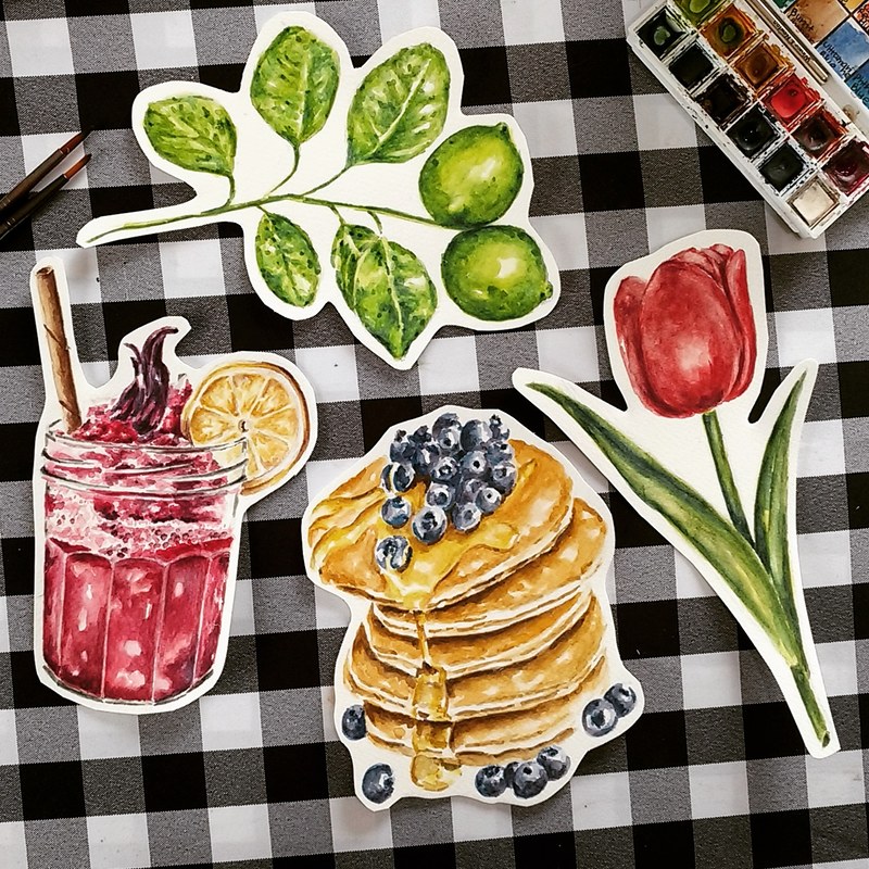
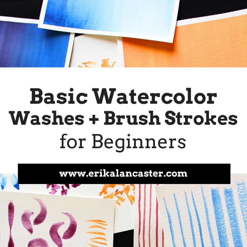
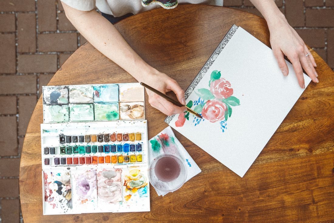
Watercolor illustrations by Erika Lancaster
Before I get into talking about specific supplies, I'd like to preface this by saying that I'm all for using basic, non-expensive supplies when creating any kind of artwork, especially when we're just getting started and/or when the piece is not meant to be sold. It's important to invest in superior quality supplies once you start selling your paintings, but there is absolutely no need for you to spend so much money in the beginning. If you have money to invest in it, then by all means go ahead and go for expensive supplies right away. But I know I didn't have the budget in the beginning. What's important for the beginner is to stay consistent with his/her practice and gain momentum. And it's very hard to stay consistent when we're worried about wasting our precious (and expensive) supplies. Also, in many ways, the more limited your supplies are, the faster you'll grow. There are several brands of art supplies that are on your side and create quality products for you to build up your skills without the need to spend a ton of money. So please, don't make this an excuse not to keep working on your art! Next, I'll be sharing a list of nine essential items to have on hand as you start your watercolor painting journey. Some of these you'll have to buy, but others you probably already have. :)
If you enjoyed this video and found it helpful, make sure to subscribe to my YouTube channel. I share a brand new video every week with art tips, drawing and painting tutorials and mindset/productivity tips for artists. *Subscribe HERE*
For a full list of my current favorite art supplies go here. Watercolor Supplies for Beginners on a Budget
|
||||||||||||||||||||||||||||||||||||||||||||||||||||||||||||||||||||||||||||
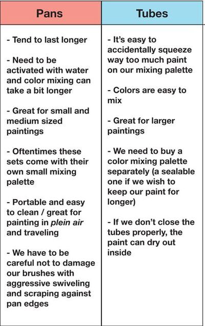
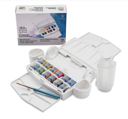
Winsor and Newton Cotman Half Pan Watercolor Set
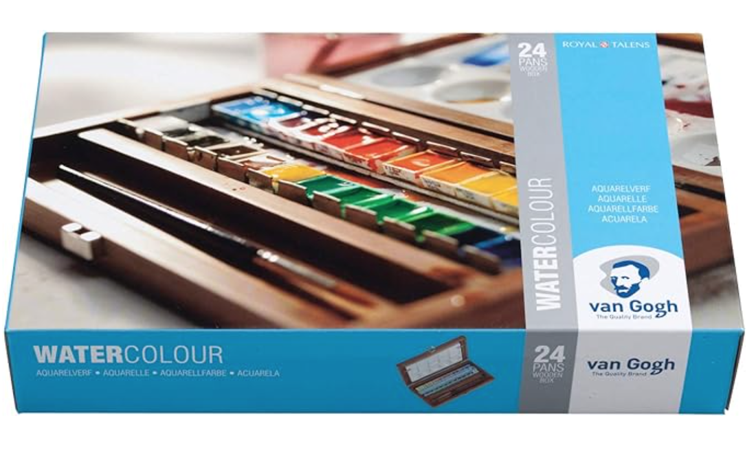
Van Gogh Half Pan Watercolor Set
|
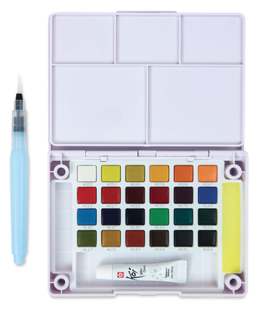
Sakura Koi Half Pan Watercolor Set
|
2. Paper
Out of all the watercolor painting supplies on this list, I think paper was the most difficult for me to wrap my head around when I was starting out because it comes in so many different types, weights and formats. Here's what you need to know:
There are three main things that will affect your painting experience, as well as the outcome of your work when it comes to paper, and this is its weight (how thick or thin it is), absorbency (directly related to paper 'sizing') and texture (how rough or smooth it is).
These are the main things you should start noticing about your paper as you move forward. When we're just starting out, it's best to go for a paper that falls within a mid-range of each of these three things.
Watercolor paper is categorized into three main types: Rough, Cold-Press and Hot-Press
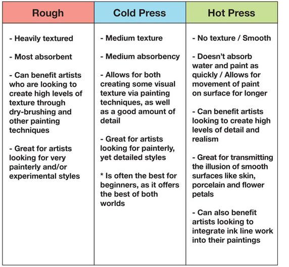
Because Cold-Press paper offers the best of both worlds, it's the paper of choice for many professional watercolor artists and it is the one I recommend beginners look for.
This said, it's important for you to know that characteristics will vary from brand to brand and you're going to have to do some exploration yourself in order to arrive at the specific brands/products that work to your benefit, enhancing your own art style.
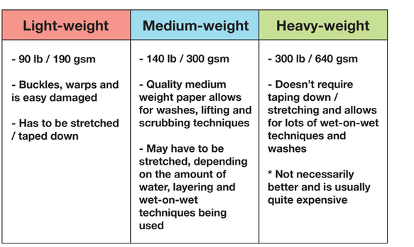
In terms of thickness, watercolor can be found in lightweight, medium-weight and heavy-weight.
I would strongly advise against spending money on any kind of light-weight paper, as it tends to buckle, warp and is much more delicate, which is something we don't want when we're just getting to know a new painting medium.
Here are three specific weights that you can usually find at art supply stores:
Here are two of my favorite accessible watercolor paper brands. I used both Canson and Strathmore papers a ton at the beginning and still enjoy using them for quicker studies and explorations.
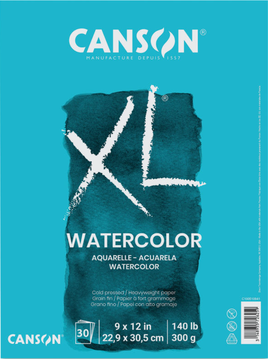
Canson XL Cold Press Watercolor Paper
|
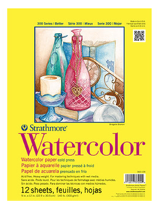
Strathmore Cold Press Watercolor Paper
|
There are watercolor artists out there that may shun lower quality watercolor paper advise beginners to start with the best 100% cotton watercolor paper right off the bat. I'm not one of them.
100% cotton watercolor paper may be awesome for professional artists already selling their work (especially if they're selling originals), but as beginners we are exploring and developing skills.
Superior paper brands like Arches are amazing, but they are much more expensive. I much prefer you paint a lot and not keep yourself from working because your materials are too precious!
The last thing you should know about in terms of paper, are the different formats that you can find it in. Watercolor paper can be acquired in pads with many sheets in them, in large sheets that you can buy in singles and then cut up in whatever size you'd like to work in, and in blocks.
Blocks are interesting because they have a film or adhesive all around their edges and require you to use some sort of knife to separate sheets one by one. They are useful, especially for those looking to paint landscapes and/or enjoy working in plein air because they eliminate the need to stretch your paper on a board beforehand.
I would recommend beginners start with paper pads. I enjoy buying medium sized pads and cutting them to whatever size I need, sometimes creating 2-4 separate illustrations with one same sheet.
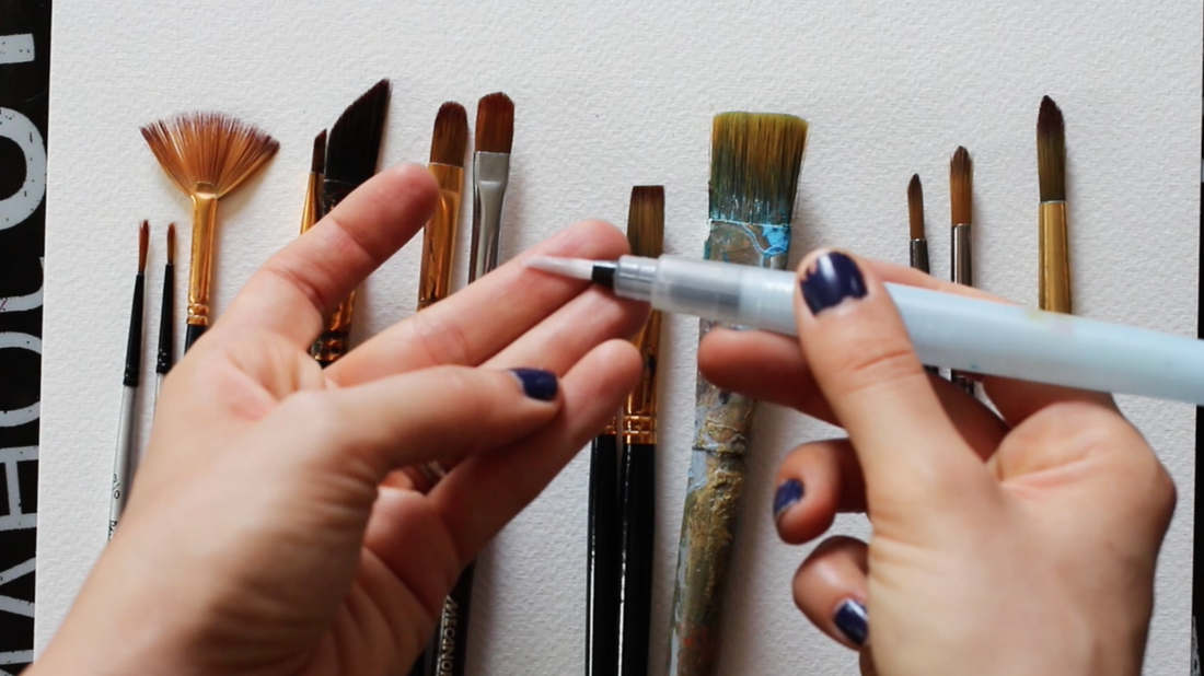
3. Paintbrushes
A good watercolor paintbrush should be able to hold a good amount of water in it, maintain a fine point/end and also distribute paint smoothly on your paper.
I'm going to be explaining a bit about the two things that you should know about at this point, which are different paintbrush shapes and hair.
First and foremost, I want to get something out of the way.
I feel there is the misconception amongst beginners starting out with watercolors that you should have tons of different types of paintbrushes in order to create a successful watercolor painting, and this couldn't be further from the truth.
When we're first starting out getting to know the medium, we might feel inclined to buy those huge sets of paintbrushes so that we can follow along with different watercolor technique tutorials and fun abstract exercises.
Though learning different techniques and exploring the beautiful effects that watercolor allows is very useful, when you really want to hone into your subject of choice (be it landscapes, still life, animals, portraits, etc.), and actually improve your skill, you're going to find that you only use a few (or even a couple) different types of brushes.
Once you have spent a bit of time practicing, you're going to arrive at your own favorite paintbrush type/size and, most likely, you'll be able to paint all sorts of things using only those two or three brushes!
So instead of buying one of those huge paintbrush sets with all the different types in it, invest in only 3-4 higher quality paintbrushes that you're actually going to use (and won't fall apart after a few paintings). I would recommend round brushes, as they are the most versatile.
Decide what sizes are right for you, depending on your subject of choice, as well as the level of detail you want to be able to achieve. I would recommend acquiring one larger (1-1.5 in) flat brush along with 2-3 sizes of rounds, just so you can have a way to cover larger areas at once.
But that's pretty much it!
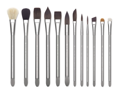
Here are the main kinds of paintbrush shapes that you'll be able to easily find at art supply stores:
I'm going to be explaining a bit about the two things that you should know about at this point, which are different paintbrush shapes and hair.
First and foremost, I want to get something out of the way.
I feel there is the misconception amongst beginners starting out with watercolors that you should have tons of different types of paintbrushes in order to create a successful watercolor painting, and this couldn't be further from the truth.
When we're first starting out getting to know the medium, we might feel inclined to buy those huge sets of paintbrushes so that we can follow along with different watercolor technique tutorials and fun abstract exercises.
Though learning different techniques and exploring the beautiful effects that watercolor allows is very useful, when you really want to hone into your subject of choice (be it landscapes, still life, animals, portraits, etc.), and actually improve your skill, you're going to find that you only use a few (or even a couple) different types of brushes.
Once you have spent a bit of time practicing, you're going to arrive at your own favorite paintbrush type/size and, most likely, you'll be able to paint all sorts of things using only those two or three brushes!
So instead of buying one of those huge paintbrush sets with all the different types in it, invest in only 3-4 higher quality paintbrushes that you're actually going to use (and won't fall apart after a few paintings). I would recommend round brushes, as they are the most versatile.
Decide what sizes are right for you, depending on your subject of choice, as well as the level of detail you want to be able to achieve. I would recommend acquiring one larger (1-1.5 in) flat brush along with 2-3 sizes of rounds, just so you can have a way to cover larger areas at once.
But that's pretty much it!
Here are the main kinds of paintbrush shapes that you'll be able to easily find at art supply stores:
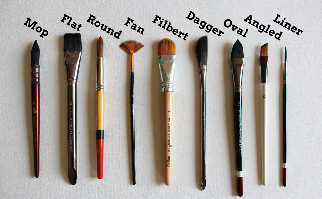
All of these can be found in all kinds of sizes. As your watercolor painting journey progresses, you'll likely hear about other types of more specialized paintbrushes like: the mop brush, dagger brush, rigger brush, etc., but don't worry about those for now!
An awesome type of paintbrush that you should know exists, especially if you enjoy painting outdoors or taking your art supplies along with you when you travel, is the water-fillable paintbrush. This one eliminates the need for a water jar as you paint.
Re-fillable watercolor paintbrush (included in Sakura Koi watercolor set)
Royal Langnickel Zen Watercolor Brushes ($2.69 - $5.39) at blick.com
|
And lastly, in regards to brushes, you are going to be able to find them with three different kinds of hair: natural, synthetic and a mixture of the two. Paintbrushes with natural hair are usually considered higher quality and are created with hair from different animals (squirrel, camel, ox, etc.).
However, there are excellent quality synthetic paintbrushes that mimic natural hair and I would recommend these for beginners as they are usually more affordable and durable in many ways.
I only work with synthetics.
4. Paint mixing palette
I really enjoy using ceramic paint-mixing palettes and finally invested in a proper one with 9 wells some time ago, after having spent years using an old dinner plate from my kitchen.
If you buy a watercolor set like Sakura Koi set mentioned in number one, you don't really need to buy a separate palette, but you can get a plastic one with reservoirs like the one below for a small amount of cash.
If you buy a watercolor set like Sakura Koi set mentioned in number one, you don't really need to buy a separate palette, but you can get a plastic one with reservoirs like the one below for a small amount of cash.
5. Thick backing board or mat
Some kinds of paintings will require you to tape your watercolor paper down onto a hard surface, and any kind of thick cardboard will do. This is especially necessary to have on hand if you enjoy painting landscapes, using lots of washes, or simply covering most of your paper with paint.
You can always tape your paper down onto your desk or table, but you won't be able to shift it and turn it throughout the painting process, which can be uncomfortable and annoying.
You can always tape your paper down onto your desk or table, but you won't be able to shift it and turn it throughout the painting process, which can be uncomfortable and annoying.
6. Artist's masking tape
You're going to need a good roll of masking tape to tape your paper down onto hard surfaces for the reason mentioned above. Unless you're using heavy-weight paper or a watercolor paper block, you'll have to stretch it if you're planning on creating a complete painting.
If you paint simple illustrations that have little to no backgrounds or don't use wet-on-wet techniques very much, you can get away with not stretching medium to heavy weight paper.
If you paint simple illustrations that have little to no backgrounds or don't use wet-on-wet techniques very much, you can get away with not stretching medium to heavy weight paper.
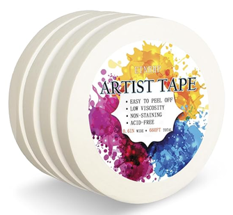
Artist Tape
7. Absorbent tag or paper towel
When we're painting with watercolor, it's essential to have some sort of rag or paper towel on hand in order to lift paint and/or create certain effects. I'm a huge fan of these reusable Scott Shop Towels and use them for both my watercolor and oil paintings, but you can also use a paper towel from your kitchen.
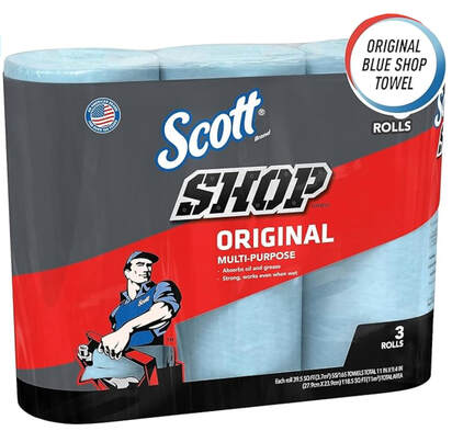
Blue Scott Shop Towels
8. Glass or plastic container (or two)
Some watercolor artists enjoy using two, or even three, watercolor cups/glass jars as they are working. This ensures that their water is going to be cleaner throughout the painting process, which is absolutely essential!
If you choose to do this, one jar can be used to rinse your brush, while the other can be used to add water to paint mixtures.
Whether you decide to use only one, two or three water containers, just make sure you're keeping an eye on your water and changing it as needed. Using dirty water will affect your colors!
9. Scrap pieces of watercolor paper
I simply cannot paint without a scrap piece of watercolor paper by my side. It's absolutely essential to test your paint mixtures before actually going into your painting with them, in order to ensure that the color and transparency are what you intend them to be.
I always cut up older paintings that didn't work out into smaller pieces for this purpose, so no paper is wasted.
Remember watercolor paintings require a bit more care and planning throughout the process, as they cannot be easily fixed.
I always cut up older paintings that didn't work out into smaller pieces for this purpose, so no paper is wasted.
Remember watercolor paintings require a bit more care and planning throughout the process, as they cannot be easily fixed.

10. Pencil and eraser
You're going to need a harder pencil grade (2H, HB) for your initial sketch in order to ensure that your lines are light enough that they won't show through your paint. A harder lead pencil is also going to ensure that no messy graphite is left on your watercolor paper that could be smudged throughout the painting process.
Also, make sure you have a nice, soft rubber eraser on hand. If you find your pencil work is too dark, make sure to lightly erase before starting to paint.
Also, make sure you have a nice, soft rubber eraser on hand. If you find your pencil work is too dark, make sure to lightly erase before starting to paint.
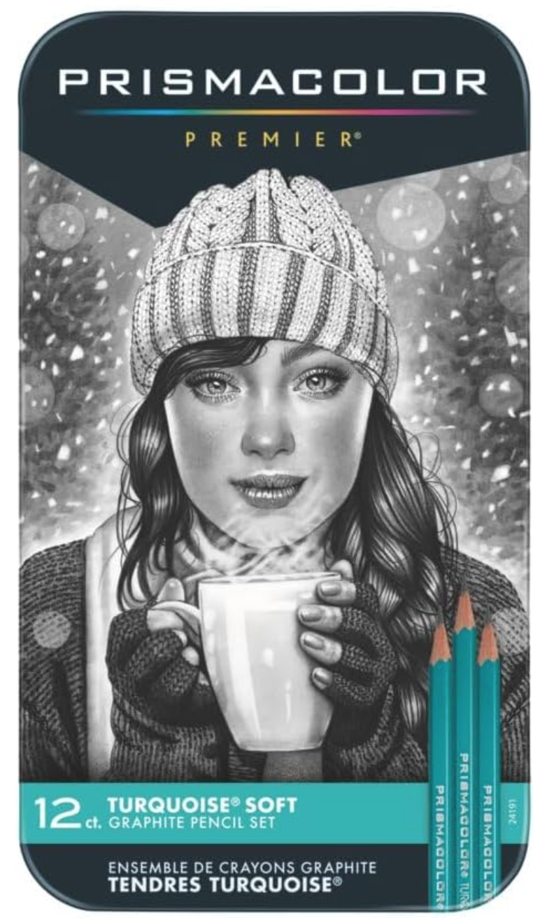
Prismacolor Turquoise Drawing Pencils
|
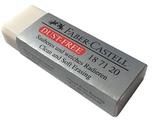
Faber Castell Dust Free Soft Erasers
|
|
|
That's it!
With these 10 supplies you'll be ready to get started on your watercolor painting journey.
With these 10 supplies you'll be ready to get started on your watercolor painting journey.
31 Comments
*This post contains affiliate links. I receive small commissions for purchases made through these links at no extra cost to you. These commissions help me keep this site up and running, in order for me to keep providing helpful and inspiring art content. :)
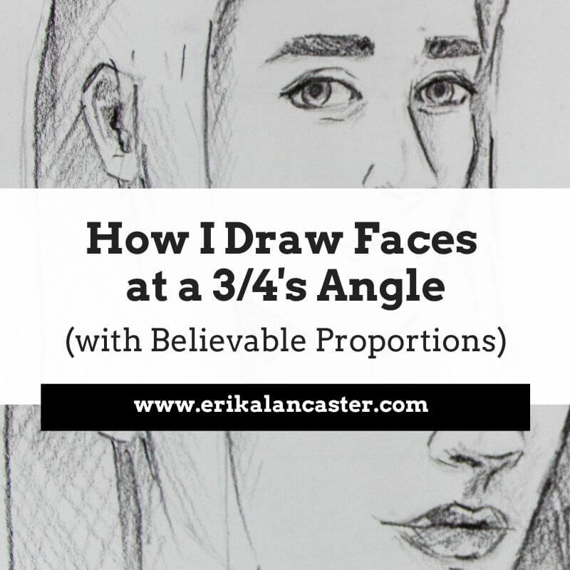
Are you impressed by artists who are able to achieve high levels of realism in their work and wish you could also get to that point, someday? Interested in bringing realistic form and three-dimensionality to your drawings so that they can really pop out? Have you gained some confidence creating line sketches, and are ready to start adding realistic light and shading effects?
Even though I consider myself much more of a sketcher and a painter than a realistic drawer per se, I think it's essential to make time for these kinds of studies. I also think that it's important for aspiring artists to devote time to achieving believable drawings/paintings because this is what's going to lead them to develop great observational skills and grasp fundamental art topics such as proportion, value, perspective, form, etc.
In today's blog post, I'll be sharing a video time-lapse of a portrait I drew using regular pencils, as well my top six tips to apply when attempting to create a realistic drawing of any type of subject (whether it be a face, animal, arrangement of objects, etc.).
By understanding and practicing the six key points I'll be sharing below, beginner artists will start making much faster progress and will soon be creating impressive, more professional-looking drawings.
I want to make something clear. To achieve realism, we need references. These references are going to allow us to observe what subjects actually look like in real life. If we don't use references, we are going to be working from what we think subjects look like.
References provide us details and remind us of tiny intricacies that we would have otherwise not thought about. And when attempting to achieve realism, it's ALL about observing the subtleties and being able to recreate them accordingly.
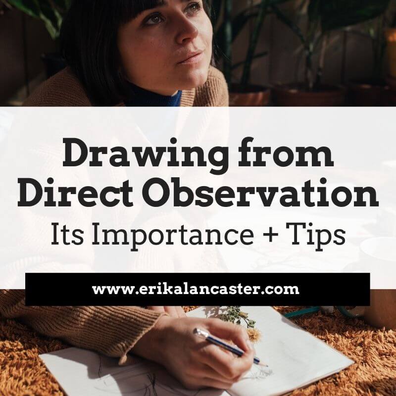
References can take the form of photographs or compositions we have arranged to draw from life (otherwise called working from direct observation).
Drawing from direct observation is essential for artists that have gained a certain level of skill using photographic references, as it provides a more challenging opportunity to further our artistic development.
As I've mentioned in other blog posts and YouTube videos, drawing is the basis for everything else in art. I believe all artists, no matter how skilled they've already become or what particular medium they've chosen to gain mastery in, should continue making time to sharpen their drawing/observational skills throughout their journeys.
Personally, I make sure to schedule in time for it on a weekly basis, even though what I sell are my paintings!
If you enjoyed this video and found it helpful, make sure to subscribe to my YouTube channel. I share a brand new video every week with art tips, drawing and painting tutorials and mindset/productivity tips for artists. *Subscribe HERE*
Tips to Improve Your Realistic Drawing
1. Make sure you're using a quality reference
Whether you're using a photograph or drawing from life, it's essential to put in time to search for a great picture or create a great composition.
If you're using a reference photograph, make sure it has a great resolution that is going to allow you to zoom in as needed, and that it shows a great play between lights and shadows. Do not use an overexposed or underexposed photograph as reference, as this will not lead to a good three-dimensional looking piece.
If you're a beginner just starting out, something that is going to be very helpful is opening up your photograph in a photo-editing software like Photoshop or Gimp and turning it into black and white/grayscale. This is going to allow you to pinpoint lights, darks and mid-tones a lot easier.
Being able to discern between different values in your reference is absolutely key to you being able to recreate them. Make to mistake, value is much more important than color when creating realism.
If you're a bit more experienced and are starting to draw from life, check out my blog post titled Why Drawing from Direct Observation is Essential and 10 Tips to Improve. In it, I explain why drawing from life is so important in order to progress our skills even further, and share a few tips to make the process less daunting.
2. Know and prepare your art supplies
When I first started drawing I used regular printing paper, my pencils from school, and had no idea about the different types of erasers that existed.
While this is perfectly fine when we're just starting out, and I actually am all for creating art with limited and basic tools, when you're ready to really improve your work, it's essential to invest in actual drawing supplies.
Using tools for the type of artwork you're intending to create is going to ensure that you're not making the process extra-difficult for yourself and you'll be able to progress much faster.
All of the following art supplies are products I myself use and would recommend for anyone getting started.

Prismacolor Turquoise Drawing Pencil Set
Mr. Pen Kneaded Erasers
|
Canson Drawing Sketchbook 11x14"
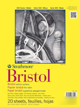
Strathmore Bristol Paper Vellum Surface 9x12"
|
|
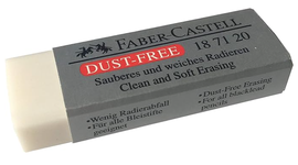
Faber-Castel Dust Free Soft Eraser
|
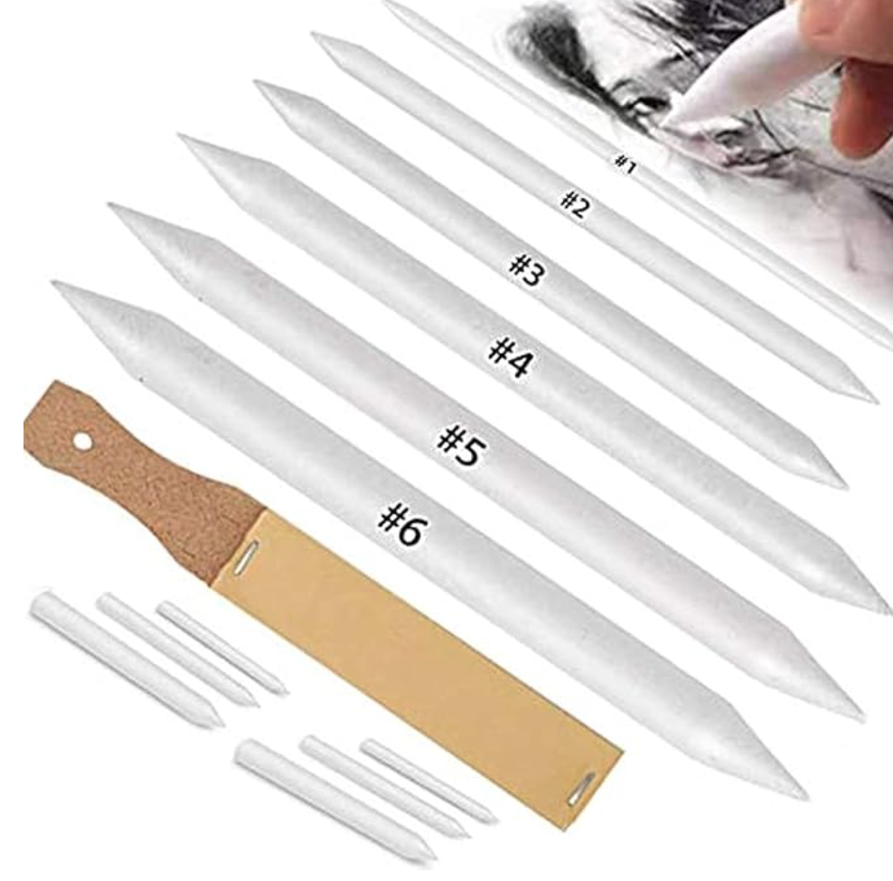
Blending Stump Set
|
When I set out to create a drawing that is more on the realistic side, I make sure to have the following supplies on hand:
-A few different pencil grades (2H or HB for the initial sketch, a couple of mid-grade a 2B or 4B to start creating darker values gradually, and a softer grade like an 8B for darkest areas)
-Drawing or sketching paper (smooth paper is going to ensure smooth blending)
-A kneaded eraser or eraser intended for smaller areas
-A regular soft rubber eraser for larger areas
-A blending stump or tortillon to blend smaller areas
-A tissue paper to blend larger areas
-A quality sharpener
-A scrap piece of regular paper or tracing paper to rest my hand on as I'm working

3. Always start with a light initial sketch, focusing on largest shapes first
When we're starting with any kind of drawing, it's absolutely essential to learn to visualize what we're looking at as a combination of simple shapes and to tune out details.
The proportion and location of these different elements in regards to each other has to be spot on, before even thinking about moving on to things like shading and texture.
It's the absolute worst to spend hours developing details and even creating beautiful, smooth shading just to step away from our drawings and realize that the proportions/locations of different elements are off.
Also, whether you're creating your initial sketch by tracing over a photograph or freehand, make sure those initial lines are created lightly so that they can be invisible at the end (we want no visible lines when creating realism).

4. Keep in mind that in realism, there are no visible lines
In real life, the shapes we see are created by subtle differences in values, which are influenced by light and shadow. These shapes are not outlined as they are in cartoons.
It's essential to stay away from creating any sort of stark-looking lines, whether it's around our different shapes/planes or in an area we're intending to create a smooth gradient in.
This said, we are required to draw lines when we are working on creating some kinds of texture (hair, eyebrows, eyelashes, etc.). However, even in these cases, the "lines" we are leaving behind are not uniform from one edge to the other, but have a variety even within them in terms of thickness or value.
They most likely go from thick to thin or from dark to light, etc., which leads to much less stark looking lines.
5. Create gradual, smooth transitions between your different values
Unless you're working with a photograph (or with a real-life composition) that shows very dramatic lighting, transitions between lights and darks must be gradual and smooth.
There should be no stark changes between one to the next and there shouldn't be any visible lines throughout these transitions either.
The exercises I share in this video will help you develop better pressure control.
There should be no stark changes between one to the next and there shouldn't be any visible lines throughout these transitions either.
The exercises I share in this video will help you develop better pressure control.
6. Make sure you are creating a very wide variety of values throughout your drawing
In order for your drawing to really pop out and transmit a sense of realistic three-dimensionality, you have to develop a huge range of values throughout your piece.
There have to be very light areas (which will appear almost white at the end), there have to be very dark areas (which will appear almost black at the end) and there have to be a ton of mid-values in between.
Practice creating a beautiful balance between lights and darks.
A lot of beginners make the mistake of not going dark enough where needed. Don't be afraid to go dark (as long as the values are really there in the reference). This said, make sure you're never pressing down too hard on your paper because this can damage it and cause visible scratches that will not be able to be fixed!
For the most part, I like working my way towards the darks gradually. Also, as you're working, you'll probably find that you're darkening some areas that you were intending to leave light.
This is where small, detailing erasers come in super handy because they allow you to go back in and lighten these areas. They also allow you to pull out highlights wherever needed, which is crucial for realistic looking hair.
*Bonus Tip: Make sure that you're looking at your reference, at least, 50% of the time you spend working!
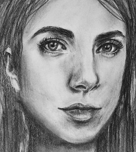
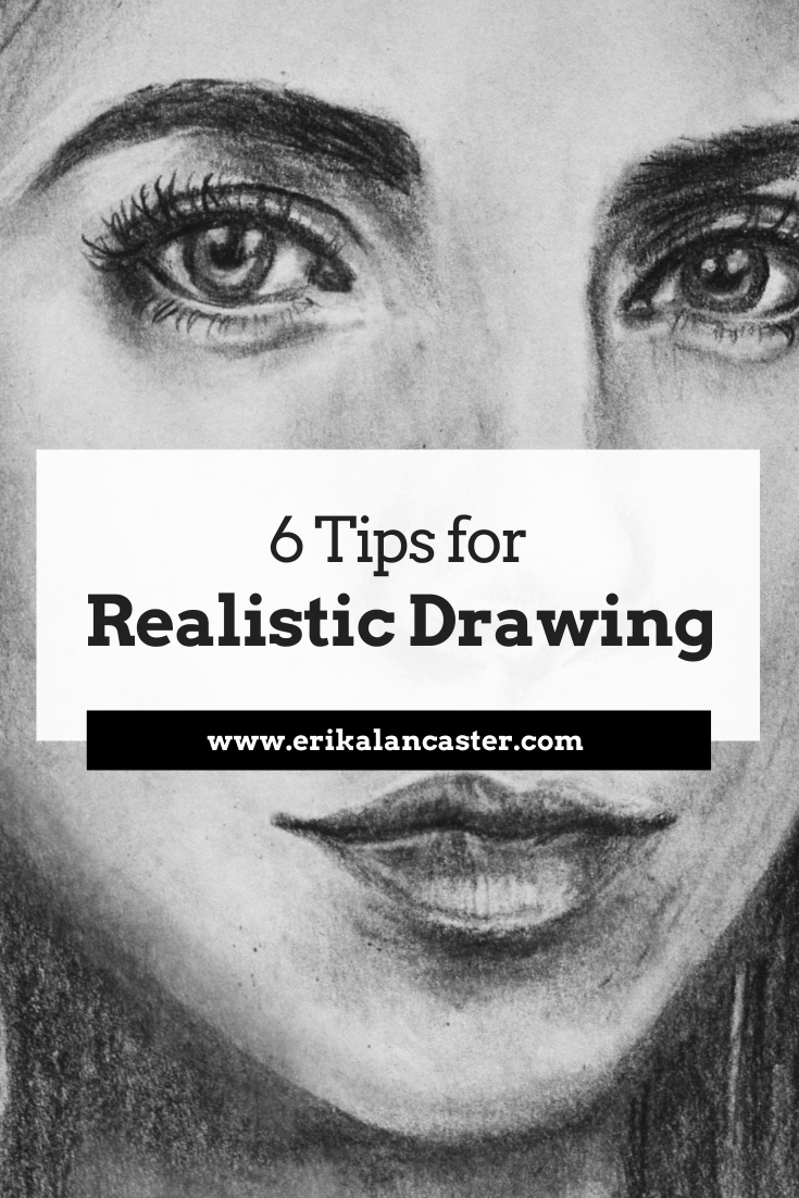
Portrait drawing by Erika Lancaster
*This post contains affiliate links. I receive small commissions for purchases made through these links at no extra cost to you. These commissions help me keep this site up and running, in order for me to keep providing helpful and inspiring art content. :)
Do you feel like you're constantly fighting against your supplies when painting with watercolors? Feel like a failure after every single little mistake you make throughout your painting process? Do you frequently end up frustrated with yourself and throw away more paintings than you actually keep?
In today's post, I'll be sharing five common watercolor painting mistakes and what I personally do to fix them or avoid them altogether. By making use of these tips and tricks, you'll end up with a painting that is going to have way more positives than negatives.
When using watercolors, we cannot just simply cover up our mistakes with a new layer of paint. This artistic medium requires us to be much more mindful and delicate, even, right from the start of the painting process.
As an artist who uses different painting mediums, it's helpful to remember that I'm using this medium's transparency in combination with the whiteness of my paper, to produce a wide range of values.
I am not covering up my substrate and layering paint, as I would with oils or acrylics, but using my paper in itself as my lightest value. This is what's going to help create watercolors' distinctive "glowing" effect.
There's way more of a chance that you'll produce a great watercolor painting if you do, at least, a bit of planning before starting, and are able to remain patient throughout the process.
It's also essential that you are aware of this medium's characteristics and have practiced basic exercises before jumping into a more complex subject.
I highly recommend reading my blog post titled 10 Things I Wish I Knew Before Starting With Watercolors if you're just getting started.
All this said, it's important to know that you don't have to get frustrated with yourself and throw away a painting every-single-time you've made a mistake.
If you're mistake is small (which it should be if you're staying focused throughout the process), there most likely will be a way to make it less noticeable.
There are also specific things you can do to avoid these mistakes in the first place.
Five Ways to Avoid or Fix Watercolor Mistakes
It's important to understand that no mistake will be completely erased with any of these techniques. What you're trying to do is make them less noticeable, so that they don't distract from the great areas of your painting.
Mistake #1: Accidentally covering up your lightest areas (highlights)
How to avoid this:
Make sure that you take time to plan and decide how you'll be protecting your lightest areas before starting with the painting process. You can do this by either creating a "map" for yourself (drawing small shapes around these areas using a pencil) and very carefully working around them as you're painting.
If you're painting a very complex subject with very small areas you want to protect, I recommend using masking fluid, as I did to protect the whiskers of this cougar.
To learn everything you need to know about using masking fluid with watercolors, visit my blog post titled Using Masking Fluid with Watercolors: Everything You Need to Know.
How to fix it:
Use the lifting technique to remove some of the pigment from your paper. If your paint is still wet, simply take your rag or paper towel and gently blot your paper with up and down motions (not sideways as this will damage the paper).
If your paint is already dry, no problem! As long as you're using decent quality watercolor paint, they can be reactivated by re-wetting them. All you have to do is rinse your brush well, remove excess water from its bristles and do gentle circular scrubbing motions in the area.
Don't go back in with too much water, though, and stay mindful about not damaging your paper.
Remember that the more wet your paper is, the more fragile it is. So once you've removed all you can, just let it go and allow the area to dry.
*It's important to know that different colors are going to have different staining qualities on your paper, and that the quality/type of paper you're using will affect the outcome of this technique.
*Also, the thicker the paper you're working on, the more scrubbing and lifting it will allow without you damaging it. These techniques won't work well if you're using lightweight paper. I love working on paper that's 140 lbs. and thicker.
On this page, you'll find a list of my favorite current art supplies.

Mistake #2: Laying down too much dark paint in the beginning stages or creating flat/stark looking shapes or lines
How to avoid this:
Remember that a good watercolor piece requires patience. Take your painting one-step-at-a-time and always start with light, translucent values and work your way towards darker darks incrementally.
Look at your reference and add your darkest values only where you actually see them (usually even these areas have somewhat of a variation in color and translucency in them in order to avoid flatness).
Generally speaking, you want to keep very dark/saturated colors only in the areas that really require them and make use of the medium's translucent qualities.
How to fix it:
Went a bit crazy laying down way too heavily pigmented paint mixture in a larger area (or sooner) than intended? Don't fret! Use the lifting technique described in the previous point using your rag to gently blot the area while it's still wet or use your clean, damp brush to do some scrubbing.
Be gentle while you remove as much pigment as possible and allow to dry before attempting to do anything else in that area.
You can also use the pulling/spreading technique in order to dissipate the concentrated pigment into a larger area. Of course, you don't want to spread that pigment into areas that are meant to be white or affect other colors you've already placed, so be careful.
I've found, dissipating that stark line or edge into a gradient really helps remove that flatness that we've mistakenly created. Do what you can and leave it. Move on to work on other areas of your painting.
Later on, when the area is completely dry, you can go back in and make any overworked areas less noticeable by adding more paint carefully and playing around with values/washes.

Mistake #3: Bleeding colors (when you didn't plan for them)
How to avoid this:
It's really essential for you to know the different effects that watercolors allow and when to use different techniques. I wouldn't recommend moving onto a complex piece if you haven't practiced simple exercises that will allow you to know your medium's characteristics.
Essentially, when you place a paint mixture on a previously wetted paper, it will expand/bleed/intermix. This is referred to as the wet-on-wet technique and will lead to a blurred-out effect that you, most likely, do not want in some areas of your painting.
Before starting with your painting process, give thought to what areas you want blurred out, and which you want more definition in. The more defined you want an area, the more important it is for you to wait for the previous layer of paint to dry before applying more paint on top.
How to fix this:
Gently blot your paper with your paper towel immediately when this intermixing starts happening in order to prevent it from expanding more. Allow it to dry completely.
If the mistake is small and the color left behind is faint, chances are you will be able to add more definition to the area with subsequent layers once it's dry.
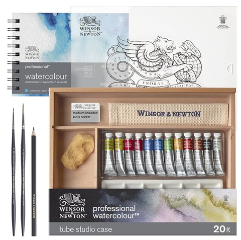
Winsor & Newton Professional Watercolour Travel Case Set -12 Colors
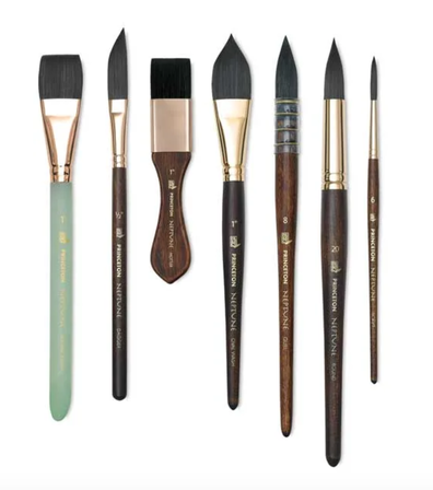
Princeton Neptune Watercolor Brushes
Mistake #4: Creating muddy colors
*In this video I explain how to avoid muddy colors when working with watercolor.
How to avoid this:
The very best thing you can do in order to avoid muddy colors to begin with, is to take time to test and experiment how the pigments you're planning to use mix together. Before starting to paint, give thought to the color palette needed for your composition. Plan the exact colors you'll be using, and keep your palette limited (5-6 colors usually works for me).
I cannot paint without my scrap piece of watercolor paper beside me that allows me to constantly test out color mixtures and transparencies throughout the process.
Know and understand the Color Wheel and the relationships between colors. Explore Analogous and Complementary colors, and decide how you want to approach deepening color values and creating shadow effects.
Take time to do exercises before even attempting to paint a complex subject or else you'll end up frustrating yourself more than you need to.
*Don't mix more than 3 different colors together, unless you know what you're doing.
How to fix this:
If you've mistakenly laid down a muddy color on your paper, try to absorb what you can while it's still wet and allow the area to dry. There are some cases in which adding a light wash of a brighter color on top, will make the mistake less noticeable.
Mistake #5: Overworking or damaging your watercolor paper
How to avoid this:
If you're anything like me and you enjoy using techniques like scrubbing, lifting and layering, buy decent quality paper that's at least medium weight or thicker (140 lbs. and heavier). I personally cannot work on thin, flimsy paper.
However, even when using thick, quality paper, it's essential to learn when to stop and allow your paper to dry. The more experience you gain, the faster you'll be able to recognize when your paper needs time to recoup!
In the video included here, you'll notice I jump around a lot. If I do something I don't like, I absorb/lift what I can, and leave it. I work somewhere else and come back to that area to fix it later. I do not obsess over imperfections and move on with the process.
How to fix this:
Damaged paper simply cannot be fixed (unless you want to cut that part off). Of all the mistakes mentioned in this post, this is probably the deadliest, so stay mindful throughout the process so it never gets to this point.
Try not to get to obsessive over your mistakes, take a learning experience for what it is, and move on with the work you can do.
To finish up this post, I want to encourage you to not get frustrated over small mistakes. There is a certain beauty behind imperfection, and what you should be striving for with each piece is progress.
Trying to chase perfection with every single drawing or painting you create is probably going to end up hindering you and not allowing you to move forward as fast as you could.
Thanks so much for reading!

*This post contains affiliate links. I receive small commissions for purchases made through these links at no extra cost to you. These commissions help me keep this site up and running, in order for me to keep providing helpful and inspiring art content. :)
Have you gained confidence with your pen and ink mark-making, but need a bit of guidance when it comes to actually shading more complex subjects? Are you excited to step-up your pen and ink game so that you're able to create drawings that transmit more believable form and three-dimensionality?
When using pen and ink to create drawings that are more on the realistic side, it's essential to remember that we are both creating marks AND using said marks to render a wide range of values.
I've found that believable form is achieved with this art medium by staying mindful throughout the drawing process and placing marks as deliberately as possible.
Ink can be a bit intimidating due to the fact that it's permanent, but if you have enough practice with different mark-making techniques and you understand how to locate darkest areas, mid-tones and highlights in a reference image so that you can then create such values with marks, you'll be just fine!
For this blog post/YouTube video, I picked a subject I consider challenging (a hand) to explain my step-by-step process when adding form and three-dimensionality using the contour line/hatching technique.
This will help break the process up into more understandable chunks so that you can approach this kind of drawing more intentionally.
With practice, you'll gain confidence and you'll be able to enjoy creating more complex pen and ink drawings in no time!
This time, I wanted to jump right into the pen and ink explanation, and focus more on the creation of ink marks to render value/form than anything else. You'll see I start out with a previously created outline drawing of a hand.
To create this outline drawing, I did something I generally don't do, and traced a photo reference.
If you've been following me for a while, you're probably well-aware that I don't like tracing. However, I really wanted to jump right into the pen and ink techniques. Plus, I also wanted to provide both the exact photographic reference I used, as well as the initial outline drawing so we could start at the exact same point.
You can download both pdf's at the end of this post and follow along!
If you'd like to see how I would draw a hand in my usual freehand method, I highly recommend visiting my blog post titled 5 Essential Sketching Tips for Beginner Artists. I'm usually a huge believer in drawing subjects entirely freehand and not tracing.
If you're a beginner just starting out with pen and ink, I highly recommend checking out the blog posts/YouTube videos I released before this one. In those posts, I go much more in depth into different shading techniques and provide great exercises to start off with!
*Find them here:
Pen and Ink Sketching: 6 Shading Techniques
Shading Objects Using Hatching, Crosshatching, Scribbling, and Other Drawing Pen Techniques
If you enjoyed this video and found it helpful, make sure to subscribe to my YouTube channel. I share a brand new video every week with art tips, drawing and painting tutorials and mindset/productivity tips for artists. *Subscribe HERE*
My method for adding believable form to complex subjects using pen and ink techniques
1. Study your reference/subject
I find it extremely useful to take time to study my subject, especially when it comes to drawing or painting something more complex, like a hand. If possible, I make time to learn about its underlying structure (which in this case is a combination of many small bones-muscles-tendons-etc.).
Having at least some knowledge about our subject's underlying structure will greatly improve our ability to render effective form and three-dimensionality!
Since we are drawing a hand, we can take a few minutes to study our own from different angles. Though our hands may look different from the next persons', their underlying structure is the same.
Take note of its convex vs. concave spots, the fleshy and bony areas, how the different elements within it compare with each other, its overall imperfections and the range of movement the different joints allow, etc.
All this said, it's essential to select an excellent photographic reference to work from (if you're not drawing from life).
I talk about the things I take into account when selecting this type of reference in my blog post titled Shading Objects Using Hatching, Crosshatching, Scribbling and Other Drawing Pen Techniques). Observe your photograph thoroughly.
I've included a letter-sized pdf of this hand photograph at the end of the post, in case you'd like to download and print it for practicing purposes.
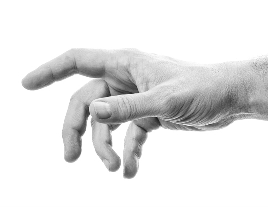
Reference hand photo after desaturating. Click on image to download original photograph from www.pixabay.com.
Once you've gained enough practice with reference photographs, I highly recommend incorporating at least some amount of drawing/sketching from direct observation (otherwise known as drawing/sketching from life) into your practice, as this will bring you much faster progress.
In my blog post titled Why Drawing from Direct Observation is Essential and 10 Tips to Improve, I explain why this method is so important for an artist's growth and provide a bunch of tips to make the process less daunting.
2. Start with a pencil outline drawing
Depending on your skill level and the objectives you have set for this study, you can decide whether you want to create your initial pencil sketch completely freehand, or if you'd like to focus on getting right into the pen and ink shading like I did for this tutorial.
I like using an HB or B pencil to create this preliminary drawing and keep it as light as possible because I want to be able to erase it completely later on.
If you'd like to download the free pdf that I've used to create this hand, you'll be able to find it at the end of this post.
I like using an HB or B pencil to create this preliminary drawing and keep it as light as possible because I want to be able to erase it completely later on.
If you'd like to download the free pdf that I've used to create this hand, you'll be able to find it at the end of this post.
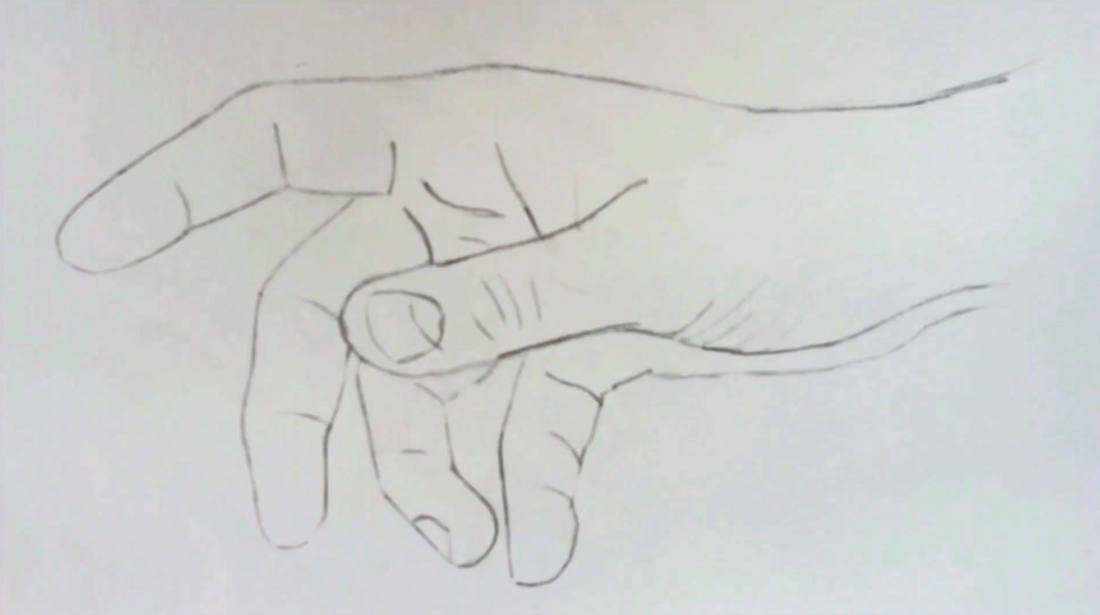
Hand outline pencil drawing
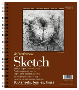
Strathmore 400 Series Sketch Pad, 11x14 inch, 50 Sheets

Marvy LePen Technical Drawing Pen Set, Multiple Sizes
|

Prismacolor Turquoise Drawing Pencils
|
3. Outline your pencil drawing using ink
I used my LePen .5 point drawing pen to go over my pencil sketch carefully. Once the ink was set and dry, I erased all initial pencil lines.
At this point, you may also find it useful to create what I call a "value map" for yourself. You do not want to start adding marks without having a good idea of where your light source is located within the picture, as well as where darkest, mid-tones, and lightest areas are.
Draw shapes around these areas so that they can remind you throughout your drawing process where greatest value changes are located. You want to be especially mindful of where the lightest areas are within your reference image, so that those areas can be left untouched by ink.
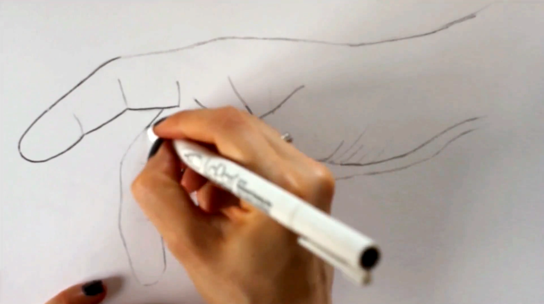
Tracing outline pencil drawing using a drawing pen

4. Start adding in initial layers of marks
Before starting this hand study, I decided that I would be using mostly contour lines/contour hatching for my shading. If used effectively, this mark-making technique allows us to very efficiently create three-dimensional form to more complex subjects that contain curves all throughout.
I usually like starting my pen and ink shading process with the very darkest areas, so I took a good look at where the deepest values of my picture were located and got ready to start laying down my initial sets of marks.
I switched to my .3 point LePen drawing pen and let the curves of my outline drawing to guide me, as well as my knowledge of the hand structure.
As I mentioned in the past pen and ink tutorials, it's very important to keep a sense of consistency within each group of marks you create.
These initial sets of lines are very important because they will be the foundation for everything else, so make sure to pay attention to what you're doing! Notice how curves start shifting in certain areas to best describe folds, fleshy bits, etc?
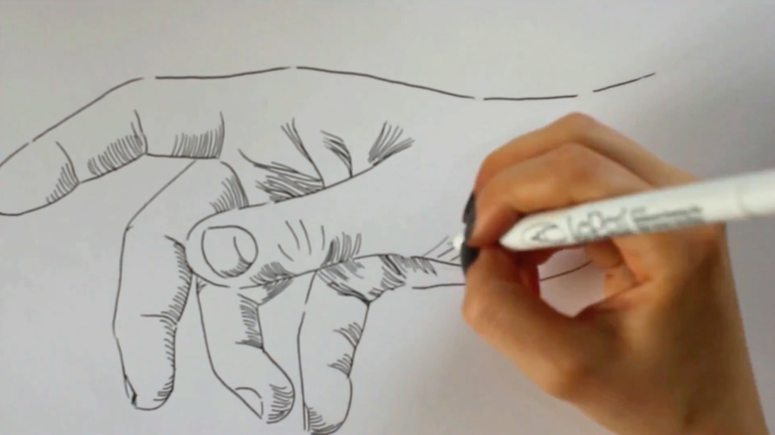
Adding in first groups of marks in the darkest areas within my reference photograph
5. Work on mid-tone range and deepen darkest values
By this point, all of your darkest areas and perhaps even a bit of the mid-tone areas, should be covered with your first layer of marks. It's time to start developing more mid-tones!
Once you start laying down your mid-tones, you're probably going to want to go back to your darkest areas and deepen them because they're not going to seem dark enough anymore.
To do this with the contour line technique, all you have to do is add another set of curved lines on top of the first, similar to when you're doing crosshatching.
There is no set angle at which you have to draw this second group of curved lines, as long as they are intersecting with the first. Remember there has to be consistency within each group of lines you create.
Throughout the drawing process, keep in mind that, developing a wide range of values is essential when you're attempting to create a three-dimensional effect.
There have to be very light areas in your drawing (which will be represented by those areas of paper that are completely free of ink), a wide range of mid-tones, and extremely dark areas (those small areas almost entirely covered with ink).
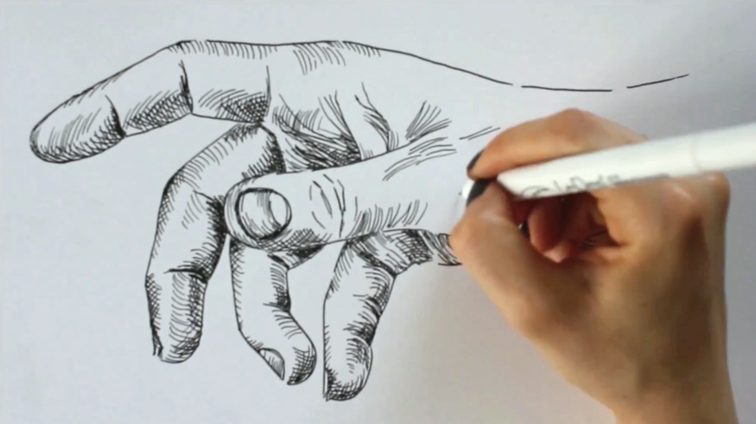
Working on mid-tones and deepening darkest areas with cross-contour lines
6. Fine tuning
Still using my .3 LePen drawing pen, I smoothed out values that needed to transition a bit more gradually. Once I was happy with my drawing, I switched back to my .5 LePen drawing pen and traced my initial outline drawing only in certain areas.
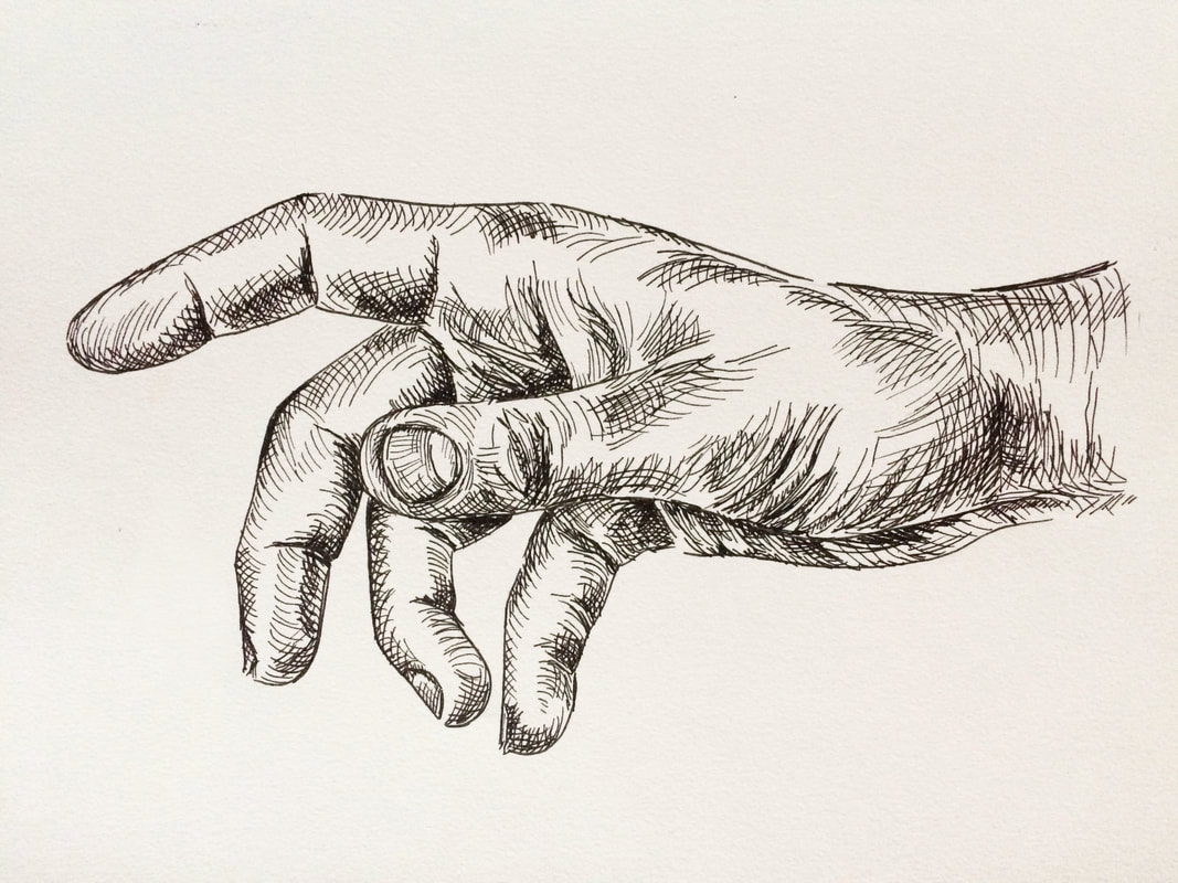
Final pen and ink hand drawing
*Free downloadables!
| hand_outline_drawing.pdf |
| grayscale_hand_reference.pdf |

Shading Objects Using Hatching, Crosshatching, Scribbling, and Other Drawing Pen Techniques
7/11/2018
*This post contains affiliate links. I receive small commissions for purchases made through these links at no extra cost to you. These commissions help me keep this site up and running, in order for me to keep providing helpful and inspiring art content. :)
Do you love the look of pen and ink drawings that demonstrate hatching, crosshatching, and other mark-making techniques, and need a bit of guidance to start putting them to use in your own work? How does one go about using the visual information taken in from a reference photograph and translate it into a pen and ink sketch that demonstrates three-dimensionality?
In order to start adding a sense of believable form to a sketch, it's essential to understand how to create a variety in values using the art medium at hand. It's also very important that we practice taking in the visual information presented to us through either photographs or real-life subjects, so that we're able to describe form effectively through drawing.
Using pen and ink can be intimidating at first due to the fact that it's permanent and we need to use mark-making techniques to create different values. There is a large variety of mark-making methods and they all lead to very different results.
In today's post, I will be sharing the process that I go through when creating pen and ink sketches of objects using photographic references. I will be walking you through each step, from the selection of a great photograph, to preparing an initial pencil sketch, to actually filling that sketch in with ink marks.
I will be exploring six different mark-making techniques so that you're able to see how the outcomes compare to each other.
In my previous blog post titled Pen and Ink Sketching: 6 Shading Techniques, I gave a thorough explanation of each of the six techniques I'll be using here today.
I focused on how to go about creating marks successfully using each, and provided essential exercises for beginners to start off with, including how to actually use them to start adding shading and form to an outline drawing of a cube.
If you're a beginner just starting out with pen and ink, I highly recommend checking my previous post out. Both that post and this one include free downloadable pdfs that you can print out at home and practice with.
*Find these free downloadables at the end!
If you enjoyed this video and found it helpful, make sure to subscribe to my YouTube channel. I share a brand new video every week with art tips, drawing and painting tutorials and mindset/productivity tips for artists. *Subscribe HERE*
My Process When Creating Pen and Ink Studies Using Photographic References
1. Preparing our supplies
To create the kind of pen and ink studies we're going to be exploring today, I usually like having the following supplies on hand:
-Pencil (preferably H or HB)
-Soft eraser
-Drawing/sketching paper or Bristol board
-Drawing pens (.3 and .5 points) *Two of my favorite brands are LePen and Micron!
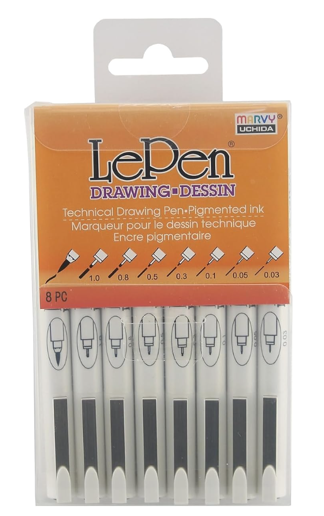
LePen Drawing Pens 8 Piece Set
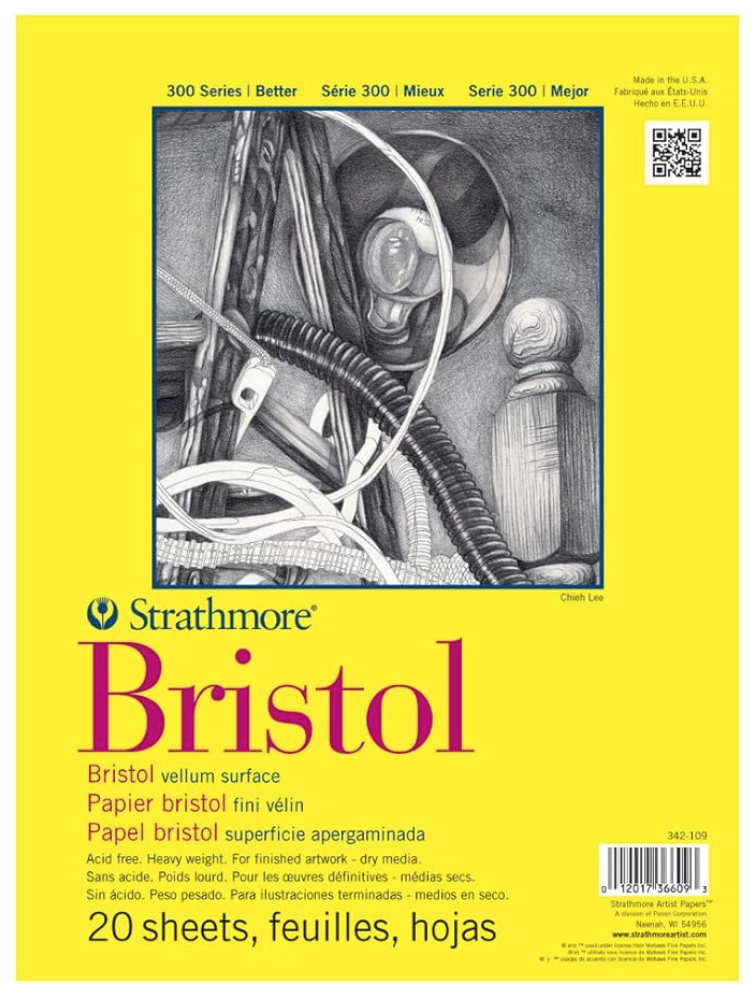
Strathmore Bristol Paper Vellum Surface
|
Prismacolor Premier Turquoise Drawing Pencils

Faber-Castell Dust Free Soft Graphite Erasers
|
2. Warming up
I enjoy warming up my hand by practicing the marks I will be using in my studies on a scrap piece of paper. If you're a beginner just starting with pen and ink and you're setting out to sketch an object in a way that actually transmits form, I suggest practicing value strips as well (there is a pdf at the end of the post that you can use to practice with).
It's absolutely essential that you understand how to create a variety in values using marks when it comes to sketching with a drawing pen, especially if you're looking to add believable structure and form to a drawing.
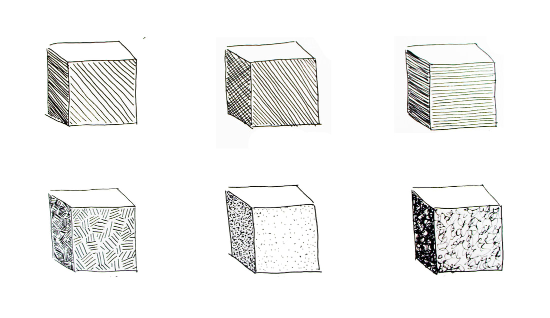
Practicing different types of marks to shade a simple geometric shape.
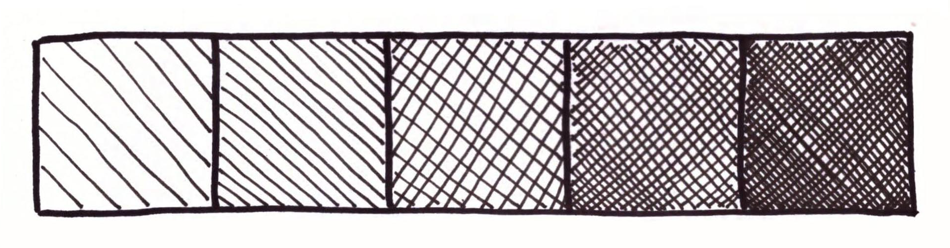
Value strip showing hatching and crosshatching.
3. Choosing a great reference photo
When searching for a photograph to use as reference for any kind of art study, there are a few things you have to keep in mind. First, make sure that its contents are suited for your current skill level, especially when you are exploring a new medium.
This way, you'll be able to focus more on the new medium or technique. Aside from this, you must select a photograph that is high quality.
When I am choosing a photograph to work from, I make sure that it has a great resolution that will allow me to zoom in to view details as needed.
Photographs should also have great lighting, which means that they are not over or underexposed, and that there is a good range of values/balance between lights and darks.
If you have trouble discerning between light, mid-tone and dark areas, I highly recommend looking for photographs with a single light source and possibly opening up your image in an image-editing software like Photoshop to desaturate it.
Keep practicing this, because it's imperative that you gain practice doing this so that you're able to render values and place them accordingly when you're trying to make your drawings more believable.
To find more free, quality photographs to practice with, visit my post titled My Favorite Free Image Sites and Two Examples of References with Finished Illustrations!
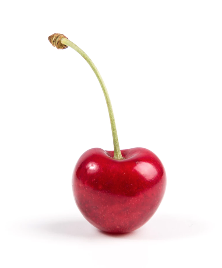
Photo by Thomas Quaritsch from unsplash.com. Click on link to visit site and download for your studies.
|
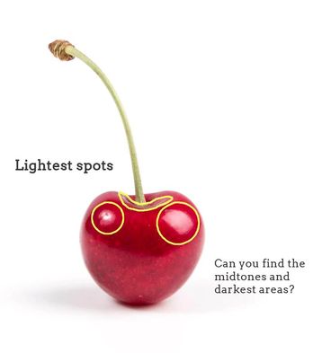
Photo showing lightest areas.
|
4. Creating an initial outline sketch (and lightest values map)
Once I have taken a moment to observe my reference picture and have pinpointed lightest and darkest areas, as well as mid-tones, it's time to create my initial pencil sketch!
This will entail creating a simple outline drawing of my object, paying attention to proportion and location of separate elements in regards to each other.
Also, at this point I also create a "map" for myself that will remind me where my lightest areas are located, so that I can protect them and leave them untouched by any marks. You can make this "map" as detailed as you'd like if you feel that creating more shapes with your pencil will help you throughout the mark-making process.
If you'd like to skip the outline drawing phase of this study and jump straight onto the ink mark-making, you can download either the large single cherry outline pdf or the six cherry outline pdf so you can practice all of the mentioned techniques!
Both of these free downloadable worksheets can be found at the end of this blog post.

5. Laying down initial layer of marks
First, I outline my initial pencil sketch (minus the smaller "map" shapes) using my drawing pen. Then, similarly to my watercolor painting process, I leave the lightest lights completely untouched by any ink and start adding in my first layer of ink.
What I like to do with these faster studies, is fill in all my mid-tone to darkest areas simultaneously using light pressure on my pen, making sure to work around my lightest areas.
In other words, by the end of this step, my entire mid-tone and darkest areas already are covered with that first "light" layer of marks.
6. Adding darker values
This is the part of the process that is the most time-consuming, as I work back and forth between mid-tone to darkest areas doing my best to create gradual shifts in value until the desired form is achieved.
Throughout this process, I constantly look at my reference picture.
It's essential to not go overboard by adding too many marks in mid-tone areas, but also to not be scared of going dark where needed (which is usually only in small areas).
Remember that there has there has to be a good range of values within your sketch or you risk "flattening" it out!
At the end, you can outline your sketch using your drawing pen once more if you wish! :)
Comparing Different Mark-Making/Shading Techniques
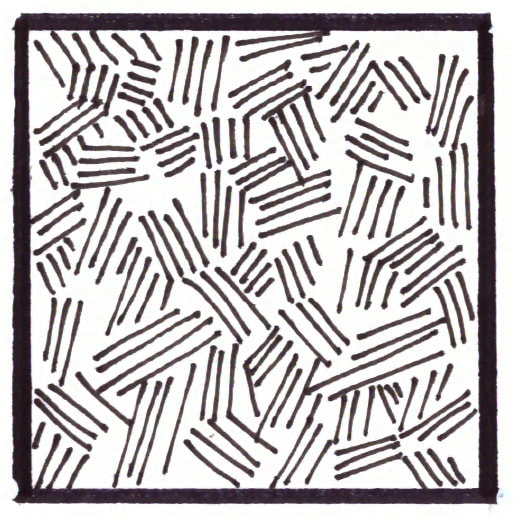
Hatching
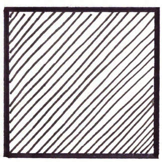
Hatching- Mark-making/ Shading technique
|
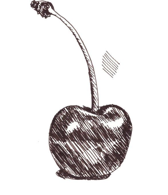
Cherry sketch showing hatching.
|
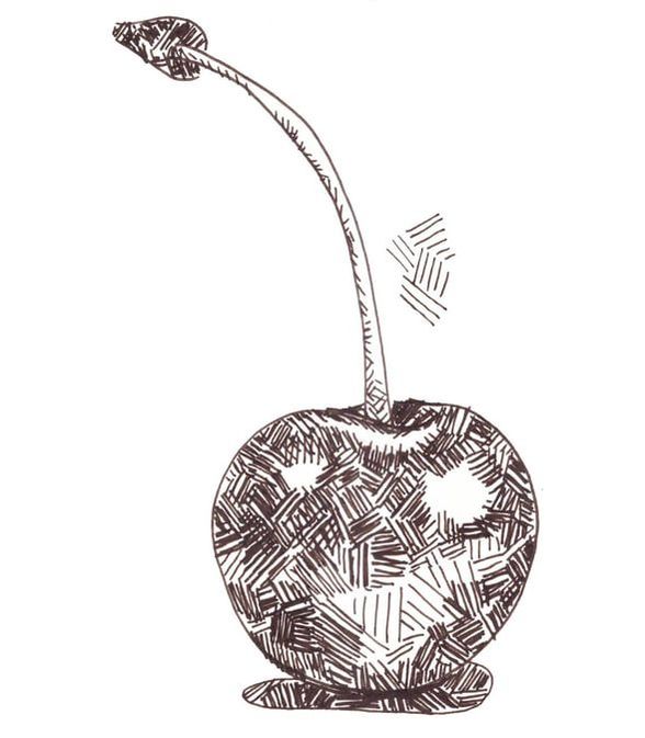
Crosshatching
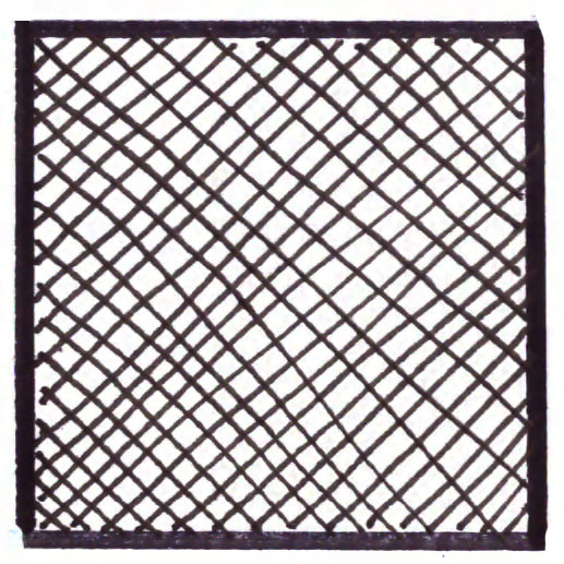
Crosshatching- Mark-making/ Shading technique
|
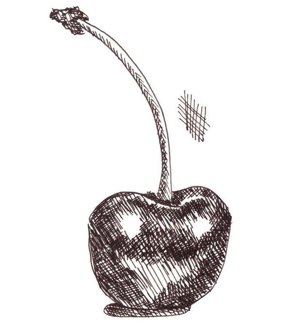
Cherry sketch showing crosshatching.
|
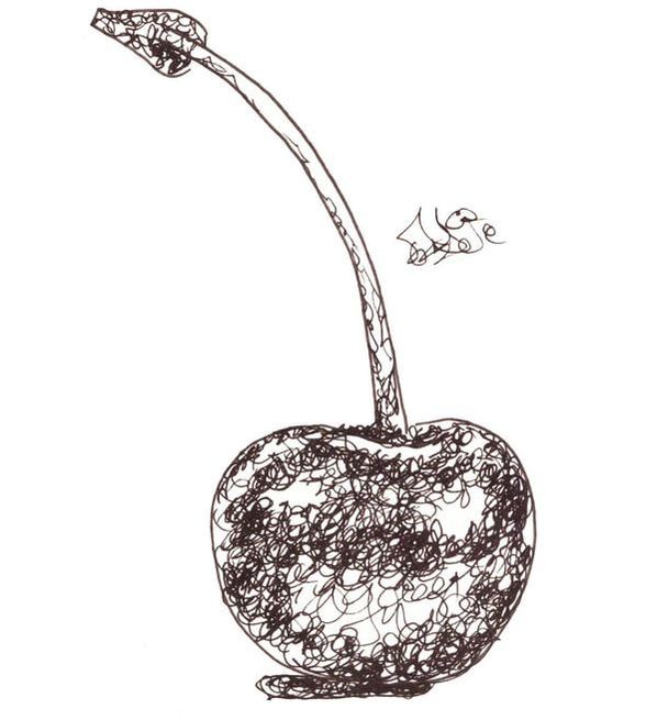
Contour Lines
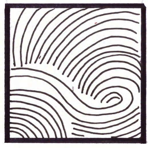
Contour Lines- Mark-making/ Shading technique
|
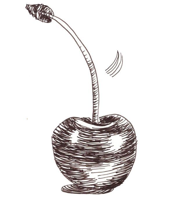
Cherry sketch showing contour lines.
|
Weaving
Weaving- Mark-making/ Shading technique
|
Cherry sketch showing weaving.
|
Stippling
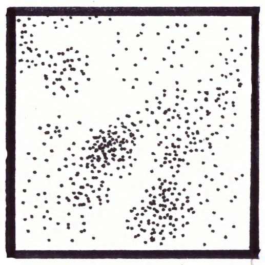
Stippling- Mark-making/ Shading technique
|
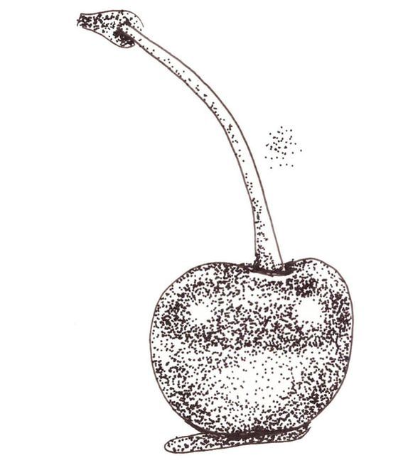
Cherry sketch showing stippling.
|
Scribbling
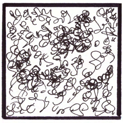
Scribbling- Mark-making/ Shading technique
|
Cherry sketch showing scribbling.
|
I would recommend practicing at least a few different pen and ink mark-making/shading techniques because it's the only way you'll be able to know which ones come more naturally to you, as well as which can best create the effects you're going for.
My personal favorites are hatching/crosshatching and contour lines. I'd love to know which you like best below!
*Free downloadables!
| drawing_marks_lines.pdf |
| value_transitions_shading.pdf |
| cherry_outline_drawing.pdf |
| 6_cherry_outline_drawings.pdf |


www.erikalancaster.com
is a participant in the Amazon Services LLC Associates Program, an affiliate advertising program designed to provide a means for sites
to earn advertising fees by advertising and linking to amazon.com.
www.erikalancaster.com
is a participant in the Shareasale.com Affiliate Program, an affiliate advertising program designed to provide a means for sites to earn advertising fees by advertising and linking to Shareasale.com partner companies.
 RSS Feed
