Confused as to why your watercolor landscapes are looking unrealistic and flat?Looking for best ways to create realistic greens for your watercolor botanical pieces? How can you make unnatural looking greens in your watercolor sets look more realistic? Lots of beginners getting started on their journey with watercolor struggle with creating lively, interesting greens. This is not surprising, as many greens included in commercial watercolor sets are very unnatural straight out of the pan/tube, and they usually haven't taken time to learn about the Color Wheel and color relationships, or how to mix colors in order to modify their saturation and value. Add to this the fact that, when working with watercolor, having good water control and understanding that we're working with a translucent medium is a must. Without this skill and understanding, you'll likely create heavy, flat-looking paintings even with great green mixtures! My advice? Start by understanding the characteristics that set watercolor apart from other painting mediums, such as: -Watercolor is transparent (not opaque like acrylics, oils or gouache). We're meant to use this translucency to develop depth, but also arrive at an end result that is light and seems to glow from within. -We paint on paper, which is inherently more delicate and easier to overwork than, say, canvas or wood. Because of this, it's essential to learn when we have to allow the paper to dry. -We're using thin layers of paint and are not looking to cover up our entire painting area with thick layers of paint as we would when working with opaque mediums. -We're planning/saving our highlights throughout the painting process, as it's the whiteness of the paper that'll stand in place for our lightest areas, as well as other light value sections in which we're looking to incorporate the brightness and beauty of the paper as part of the piece. -Because the white of the paper stands in place for our lightest value areas, and we're using translucent paint, no white paint is necessary. -We use plenty of water along the way and are constantly modifying the water- to-paint ratios in our mixtures depending on whether we want lighter/paler color or darker/more saturated color. After familiarizing yourself with the basics of the medium on hand, start learning about the Color Wheel, as this will help you to understand relationships between different colors, as well as essential Color Theory-related topics such as Color Temperature, Value and Saturation. By developing these basic skills and knowledge on these key topics, mixing believable and lively greens will be a breeze! In the thorough video below, I share my two main strategies for creating realistic green color mixtures, how to further desaturate/mute out greens by adding different colors, and also how I paint a tree that shows a variety of green values for depth.
If you enjoyed this video and found it helpful, make sure to subscribe to my YouTube channel. I share a brand new video every week with art tips, drawing and painting tutorials and mindset/productivity tips for artists. *Subscribe HERE*
For a list of my favorite art supplies, go here. Two Strategies for Creating Natural, Lively Greens with Watercolor Strategy #1: Using a Base/Ready-Made Green Choose a "base" green to work with, making sure to notice how warm (yellow-biased) or cool (blue-biased) it is. You can use any green, but depending on whether it's very warm or cool biased (or somewhere in-between), you're probably going to have to add more or less of your other colors. Choose a yellow and a blue to add into your "base" green. To create your lighter green, mix yellow into it. To create a dark green, mix blue into it. In the video above, you can see me explore adding two different yellows and two different blues into my base green so that you can see how the addition of different colors leads to different lighter and darker greens. For this strategy, you can see your "base" green as your "midtone" or "medium" green. Continue modifying the ratios of the colors in your color mixtures until you arrive at a lighter green, a medium green and a darker green. With these color mixtures created on your palette, you'll be ready to paint greenery that has depth and dimension to it. I'd highly recommend trying out the exercises shared in the video to start getting comfortable with color mixing and to get to know the colors you're able to create with the set you have. 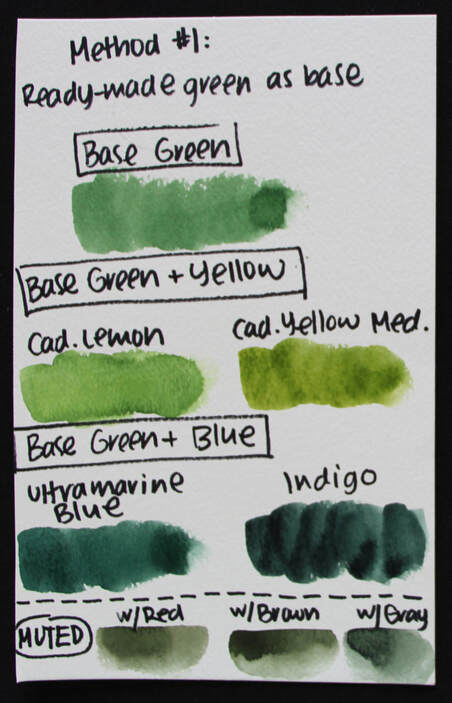
Swatches for Strategy#1: Using a Ready-Made "Base" Green
Strategy #2: Using Yellow and Blue to Create Green Choose a blue and a yellow, then mix them together to create your green. Blue and yellow are Primary Colors that create green (a Secondary color). Take your time modifying your color mixture, adding more blue or yellow, until you mixture looks green on your palette. I'd recommend exploring different blue and yellow combinations you have available, as the temperature of the blue and yellow you use, as well as how dark or light it is, will have a great impact on your end green result. These variables will also have an impact on how muted/desaturated your end result is. In the video above you can see me exploring both warm and cool yellow and blue color combos, and you can see the immense difference in those green results. Some greens look way more natural than others and there's no need to bring in a third color to desaturate it further. To create your lighter greens, simply add more yellow into your mixture. For your darker greens, simply add more blue into your mixture. And, once again, with your light, midtone/medium, and darker green color mixtures ready on your palette, you're set to start painting! 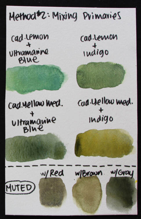
Swatches for Strategy#2: Using Yellow and Blue to Create Green
Want to mute out a green? Whether you're using a ready-made green or have created your own green mix using either of the aforementioned strategies, here are three ways to make them look a bit more natural: -Add in a bit of green's Complementary Color (opposite to green in the Color Wheel), which is red -Add in a brown/neutral color such as Burnt Sienna, Burnt Umber, Sepia or Van Dyke Brown -Add in Payne's Gray or Neutral Tint 
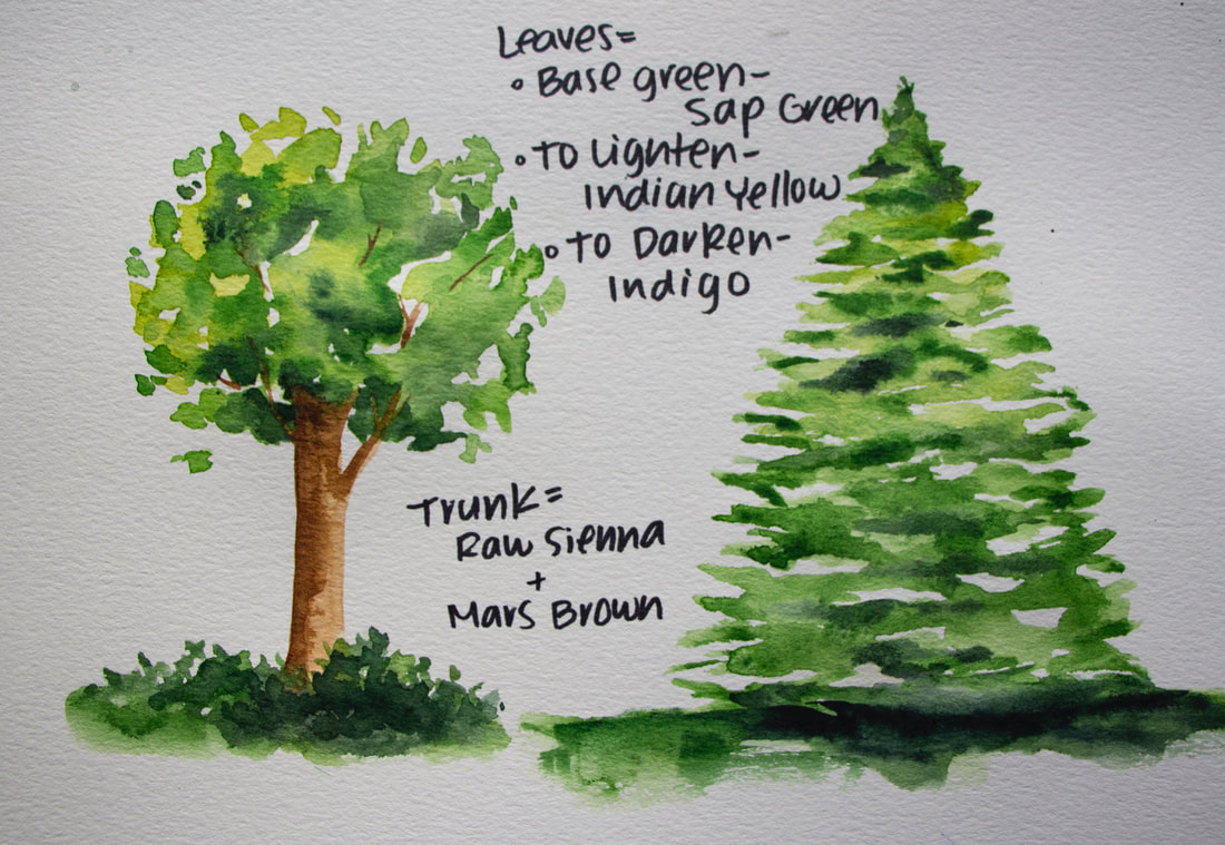
Tree studies created using the "base" green strategy. Sap Green was used as the "base" green. Indian Yellow was added to create lighter green. Indigo was used to create darker green.
4 Comments
12/30/2021 09:54:30 am
Hey, Frank! 9/12/2023 12:05:32 pm
Hi, Betsy! Leave a Reply. |


 www.erikalancaster.com
is a participant in the Amazon Services LLC Associates Program, an affiliate advertising program designed to provide a means for sites to earn advertising fees by advertising and linking to amazon.com. www.erikalancaster.com is a participant in the Shareasale.com Affiliate Program, an affiliate advertising program designed to provide a means for sites to earn advertising fees by advertising and linking to Shareasale.com partner companies. |


 RSS Feed
