*This post contains affiliate links. I receive small commissions for purchases made through these links at no extra cost to you. These commissions help me keep this site up and running, in order for me to keep providing helpful and inspiring art content. :)
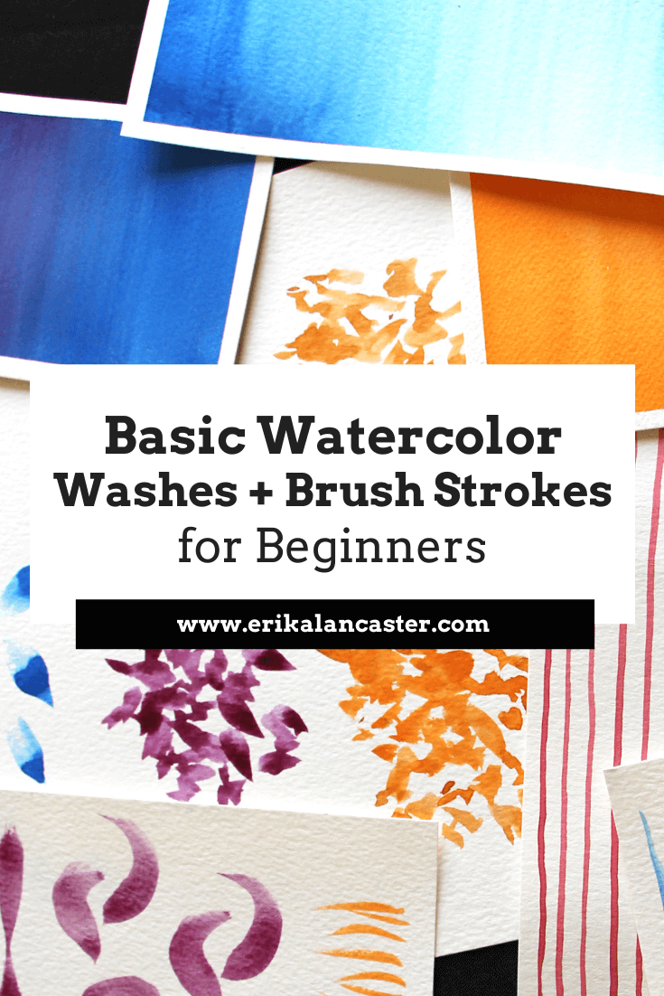
Eager to learn watercolor painting but confused as to where to start? Have you started on your journey with watercolor, but always experience frustration during your painting processes and/or end up disappointed with your results? Water and brush control are two basic skills that anyone looking to learn watercolor should focus on in the beginning. Why? Because without these two skills, it's going to be very difficult to succeed with pretty much any kind of painting you set out to work on, whether it's a completely abstract piece or something more realistic. My advice for beginners getting started with any new drawing or painting medium is to devote time to explore it without pressuring themselves to complete a full piece or to achieve perfection in any way. Get to know your medium. Do some research to understand what sets it apart from other drawing or painting mediums, and what the main things are that one should know about in order to create a piece that allows it to perform/"shine" to its full capabilities. In this video, I share the top things I wish I knew about watercolor when I was getting started, in which I share these main characteristics. Compare and contrast watercolor paintings with pieces created with opaque painting mediums such as acrylics or oils. Take notes. For example, when it comes to watercolor, we're meant to use the medium's translucency, in combination with the whiteness of the paper under the paint, to create depth and volume. *We don't even need white paint! Another thing that distinguishes watercolor from other painting mediums is the fact that we're working on paper as opposed to canvas, wood or other tougher substrates. And, while we're using paper that's intended for water-soluble mediums, it's still paper. Paper is much more fragile (especially in its wet state) and, thus, it's much more easily overworked/damaged. As opposed to the heaviness that opaque painting mediums can have, when we're working with watercolor, we're trying to achieve a lighter-looking outcome...a piece that seems to glow from within. When the medium's characteristics are taken into account as we're painting, and the basic "rules" are understood (which we can decide to break later), it's much more likely that we'll arrive at the results we're looking for. Aside from doing research and continuing to learn about these things, basic drills and exercises on brush strokes, as well as washes are essential in the beginning. This hands-on practice will help us tackle complete paintings with greater confidence and ease. This said, the following drills and exercises are very helpful, even for artists who're more advanced, as we have to get to know our brushes every time we invest in a new one. In the following watercolor tutorial video, I walk you step-by-step through the main brush strokes to practice as a beginner, as well as the three must-know washes. I'd recommend practicing these in a sketchbook that's intended for watercolor, or on accessibly priced (but quality) watercolor paper. Find a list of my favorite watercolor supplies here.
If you enjoyed this video and found it helpful, make sure to subscribe to my YouTube channel. I share a brand new video every week with art tips, drawing and painting tutorials and mindset/productivity tips for artists. *Subscribe HERE*
Basic Watercolor Brush Strokes*For these brush stroke exercises, I'd recommend using a medium-sized brush, whether it's a flat or a round (or both!). Something around a size 8-14 would do perfectly. Another suggestion that'll increase your practice is creating your strokes in different directions (horizontally, vertically, diagonally, etc.). 1. Thin Lines To create thin lines, touch just the tip of your paintbrush to your paper and drag from one edge of your paper to the other with one consistent, flowing brush stroke. Do your best to keep the thickness of your line as consistent as possible from start to finish. This means that only the tip of your paintbrush should be coming into contact with your paper from beginning to end. 2. Thick Lines To create thick lines, you'll have to press down the belly of your paintbrush to your paper. Just like with the thin lines, try to keep that pressure and the thickness of your lines consistent from start to finish. You'll likely notice dry brushing effects near the ends of your lines, as paint and water start running out from your bristles. Dry brushing is shown near the end (right) of my thick lines in the image below. You can see specks of white paper showing through, where my paint/water started running out and the color wasn't covering the paper as smoothly. 3. Thin-to-Thick Lines For thin-to-thick lines, the pressure you're exerting on your paintbrush changes as you move from one edge to the other. In other words, your arm is moving laterally, but you're simultaneously lifting and pressing, over and over. This creates variations in thickness throughout that line. The challenge is to always have at least a bit of contact with the paper from start to finish. 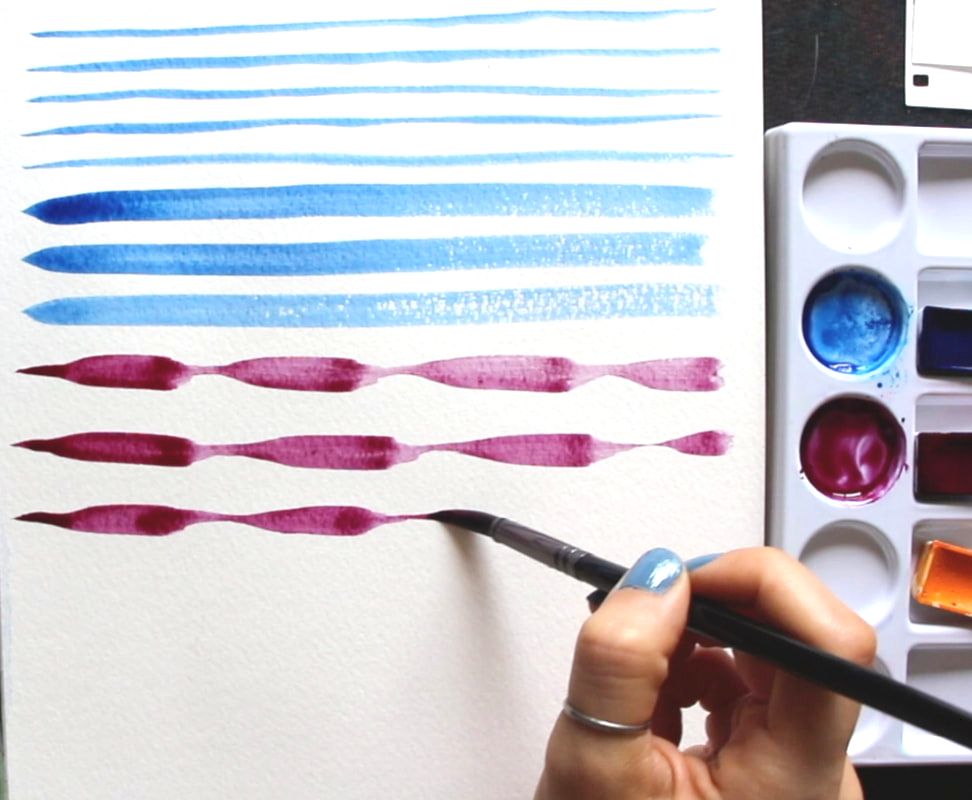
4. C-Strokes These are short, curved strokes that start out wider and taper at their tail ends. Essentially, you press down the belly of your brush at the top, and release that pressure as you move towards the end of that stroke, all the while drawing a curve or "c" shape. 5. Flicking For this one, you flick your wrist upwards (or in whichever direction you'd like) in one quick, short stroke. There's no need to press down your paintbrush bristles onto your paper very much at all, but at the end of the flicking motion, you do want to lift your bristles from your paper in order to have that tapered look at the end. You want the "base" or "root" of your stroke to have a slightly thicker look than the end. This brush stroke is very handy when adding grass to landscapes. 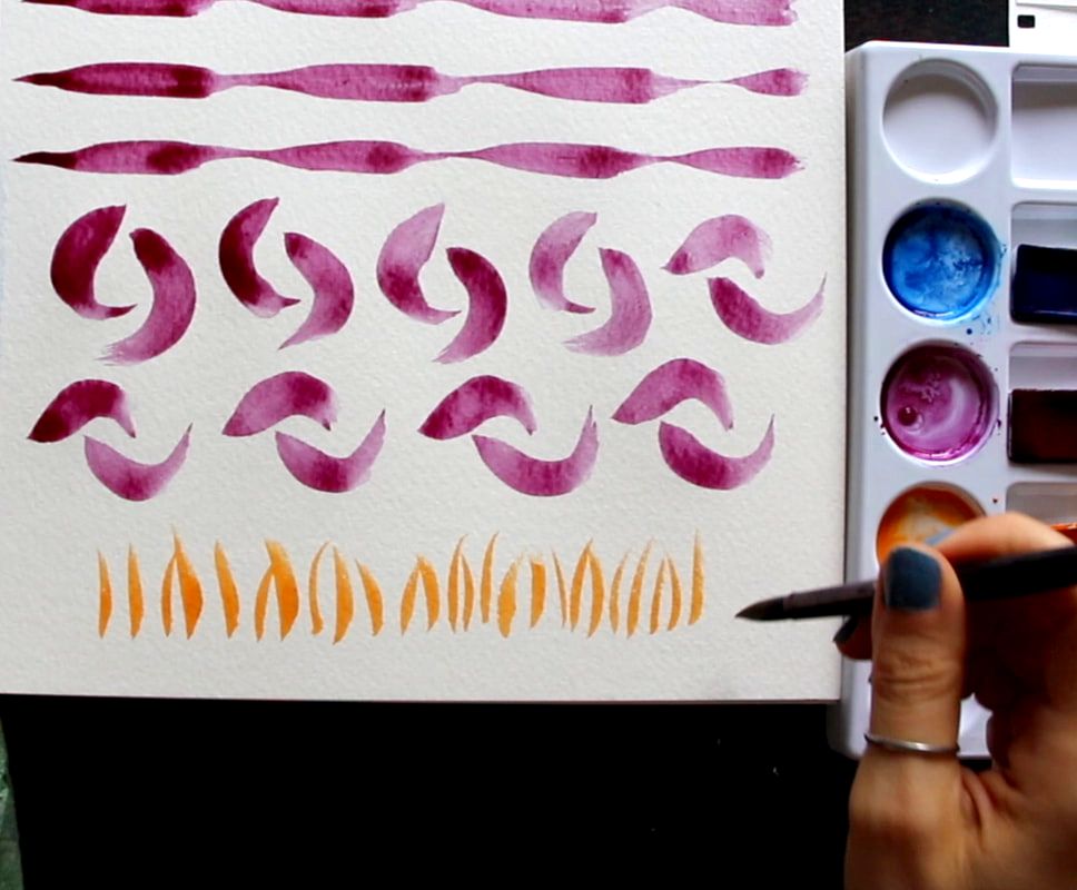
6. Bouncing I think of bouncing as a form of stamping. All you have to do after you've loaded up your paintbrush, is press down its bristles so that their entirety comes into contact with your paper, and lift. On and on. There is no dragging or lateral movement of any kind. Just press and lift, and press and lift. You can imagine how much of a difference it would make if I had used a flat brush instead of a round, as the "stamped" shapes would not look like water drops or leaves, but would be more boxy/angular. This one is great to create the illusion of leaves when painting nearby trees and plants. 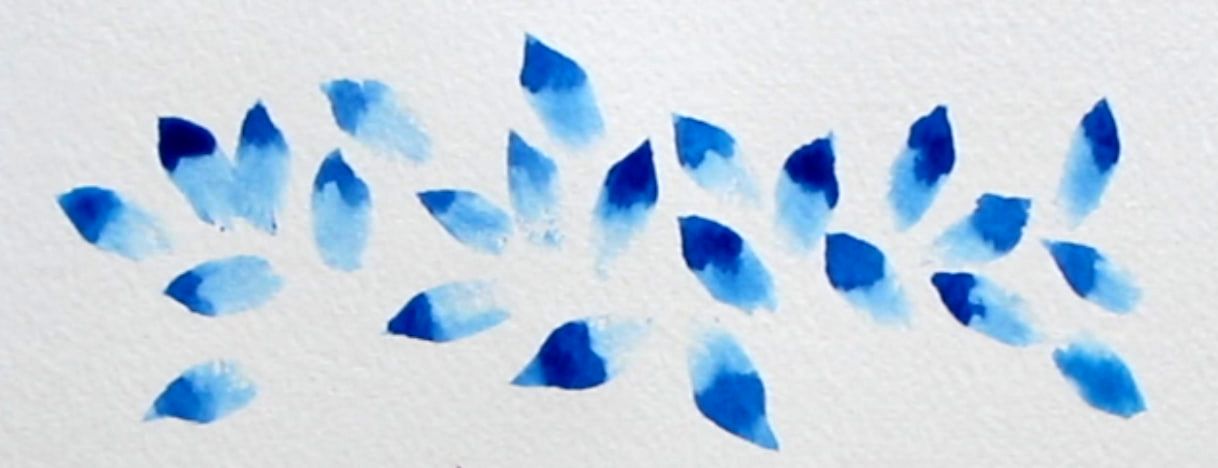
7. Scribbling To do scribbling (shown in orange in the image below), loosen up your wrist and really practice using your paintbrush in a variety of different ways. You're looking for irregularity all throughout (no organized patterns or perfect shapes) and this is created via shifting and changing the pressure you're exerting on your paintbrush, but also the angle you're using your paintbrush at (90°/45°/30° from your paper, etc.), and the direction you're painting towards. You're moving your paintbrush up and down, but also laterally in different ways. Curves and loops are also great. Just let your wrist go and embrace irregularity! 8. Scribbling + Bouncing This is a combination of both techniques which can be seen in the image below at the top (the magenta/purplish color). You'll notice some visible "stamped" leaf/drop shapes, while other shapes are more irregular in terms of their shape and size. This technique is also great for leaves of plants and trees. 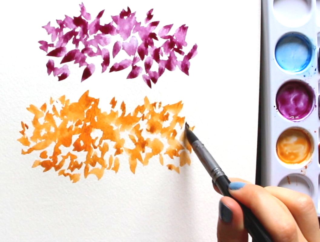
9. Dark-to-Light Lines With one same load of your paintbrush, you start at the top by painting a line using the color at its most saturated (darkest) state. In between each line, you dip your paintbrush in your container of water 1-2 times, remove the excess water, and paint the next line. Then you dip your paintbrush in your container of water again, remove the excess water, paint the next line, and so on and so forth until you reach the bottom. This is a great exercise for water control and understanding translucency, as well as the wide range of values you can create with only one color. 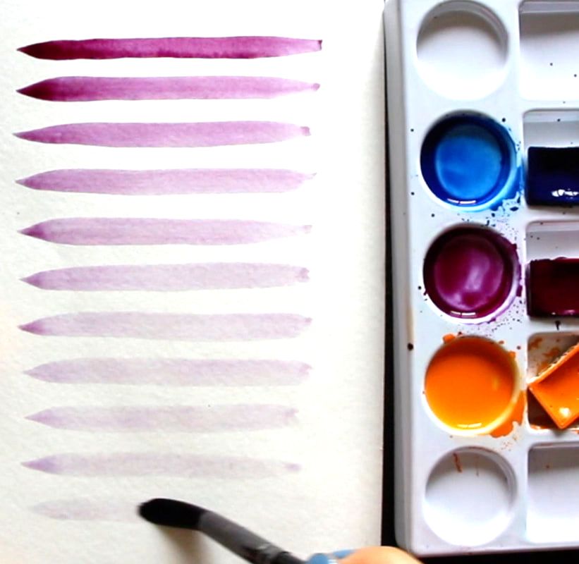
3 Must-Know Watercolor Washes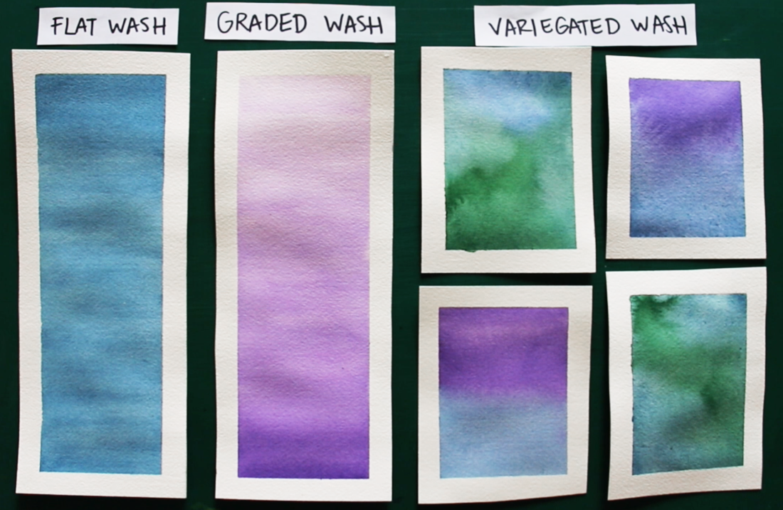
*For these watercolor wash exercises, I'd recommend larger sized brushes, whether a large round/mop or a flat brush. The larger the painting area, the larger the brush you'll want to use. These strips I prepared for myself were around 3 inches in width and 6 inches in height. I used a 3/4" flat brush. It's important to create enough juicy/saturated color mixtures for yourself on your color mixing palette and to work quickly as you're laying down that color. The less moving around of paint that you do after it's been placed on paper, the better. 1. Flat Wash 
The objective with the flat wash is to paint consistent/uniform color all throughout the shape. What's important to take into account with this one is that, as you're making your way down (or upwards or sideways), your color will start running out from your paintbrush bristles and it'll become lighter and lighter. How quickly this happens depends on the size of the space you're painting in, as well as the size of the paintbrush you're using. If the shape you're filling up with color is relatively small, and you're using a large brush, perhaps you'll make it through with just one load. On the other hand, if you're trying to fill a larger space, and are using a smaller brush, you're going to have to reload way more often. Keep your eye on the paper as you're filling that shape in and notice if/when the color is becoming weaker and, when it does, quickly load up your paintbrush with more paint and pick up where you left off before the paint that's on your paper starts to dry. 2. Graded Wash 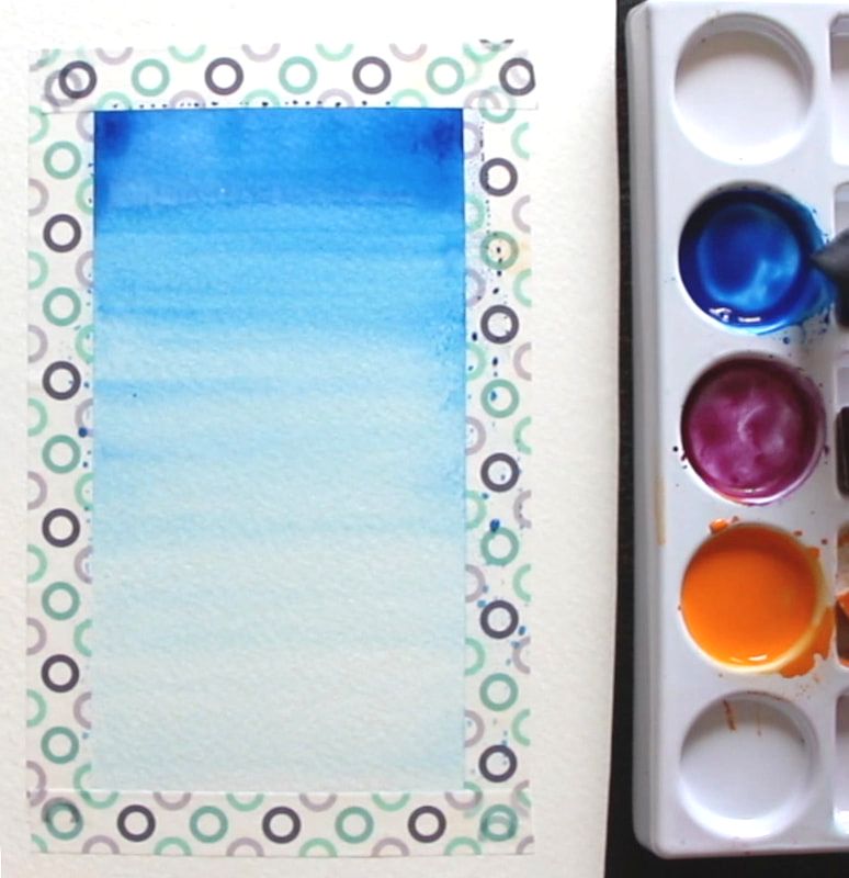
For the graded wash, you're looking for your color to become lighter (or darker) as you move up/down. You're looking for a gradual change in value/translucency of the color you're laying down. As opposed to the flat wash, you want your color to start running out from your paintbrush bristles so that it becomes weaker and weaker as you go. Keep your eye on your paper and, as your making your way down filling in that shape, make sure your color is becoming more translucent. If it's not, quickly dip your paintbrush in your container of water a couple of times, remove the excess water, and come back to pick up the edge of your shape where you left off. I usually have to dip my paintbrush in my container of water to weaken that color at least a couple of times throughout the process to ensure that, when I reach the end of that wash, my color will be at its most translucent. 3. Variegated Wash 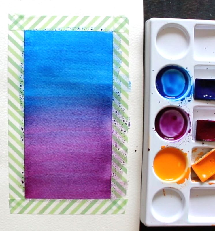
In a variegated wash, one color gradually turns into another color, which means we'll need at least a couple of different colors. I'd recommend getting started with colors that are Analogous (right next to each other) in the color wheel. By choosing Analogous colors, you'll ensure vibrant transition colors throughout the gradient you create. 
Complementary colors (opposites in the color wheel) mute each other out, and you can accidentally create muddiness or grays/browns in between, where your two colors merge together. To create a variegated wash, paint in a section of your shape with one of your colors and then remove all of that color from your paintbrush bristles, remove the excess water, load up your paintbrush with the next color and paint in the rest of the shape. In the video, I painted in the blue until I got around halfway down, I removed the blue from my paintbrush bristles, loaded up my paintbrush with purple and worked on the transitional gradient by overlapping this purple on top of the blue in the middle section. I then removed the blue-purple from my paintbrush bristles, reloaded with just purple, and finished that last third so that I would only have purple as I made my way towards the bottom. 
I hope this post was helpful and wish you lots of progress and enjoyment as you move forward in your journey with watercolor.
8 Comments
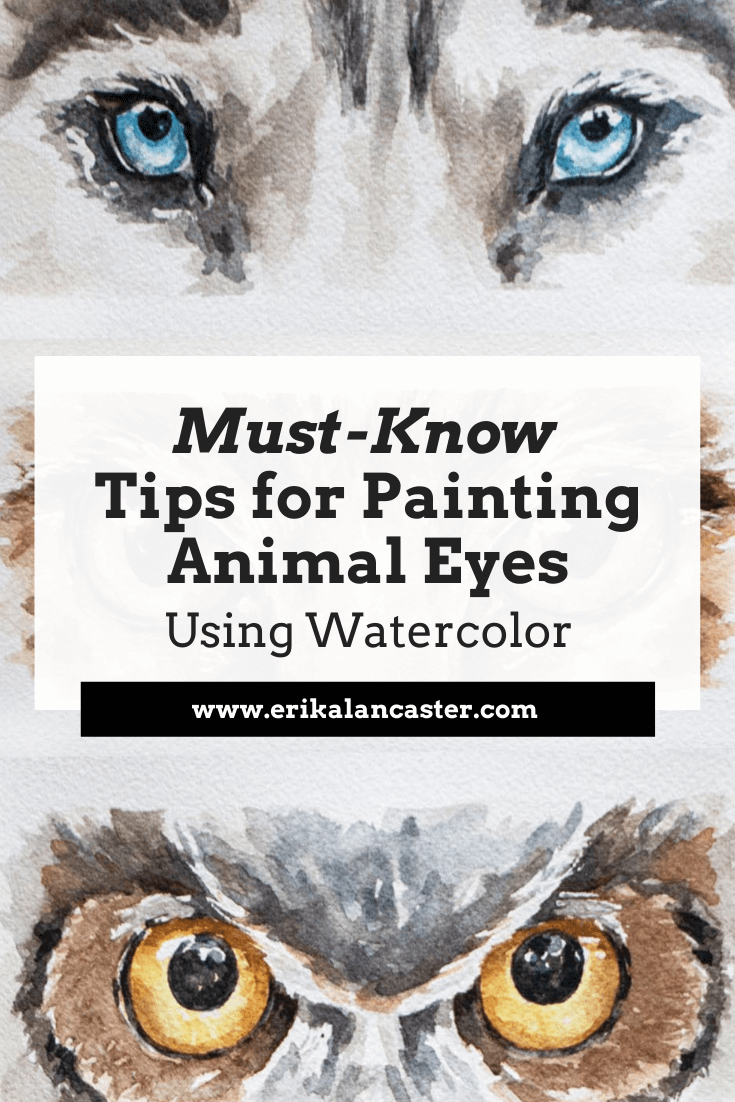
Would you love to paint animals using watercolor, but find it a bit intimidating? Have you tried painting animals in the past, just to end up disappointed and frustrated with your results? Would you like to be able to create animal paintings that are impactful and full of life? For animal-loving artists like myself, it can be incredibly rewarding to paint one successfully, in a way that communicates its beauty. One of the pieces of advice I most frequently give to my students and art community members over on Patreon, is to make time to break up complex compositions (or subjects) into elements, techniques and/or layers that can be practiced in isolation. This way, when we sit down to work on the complete piece, we're not only much more likely to be successful, but we'll also enjoy the process a lot more due to the understanding and confidence we've built through this previous practice and prep work. And this is exactly what I did in the video below in order to push my ability to paint animals using watercolor. I found three (quality) reference images of very different sets of animal eyes so that I could challenge myself and dove right into these studies. You can check out the three painting processes below.
If you enjoyed this video and found it helpful, make sure to subscribe to my YouTube channel. I share a brand new video every week with art tips, drawing and painting tutorials and mindset/productivity tips for artists. *Subscribe HERE*
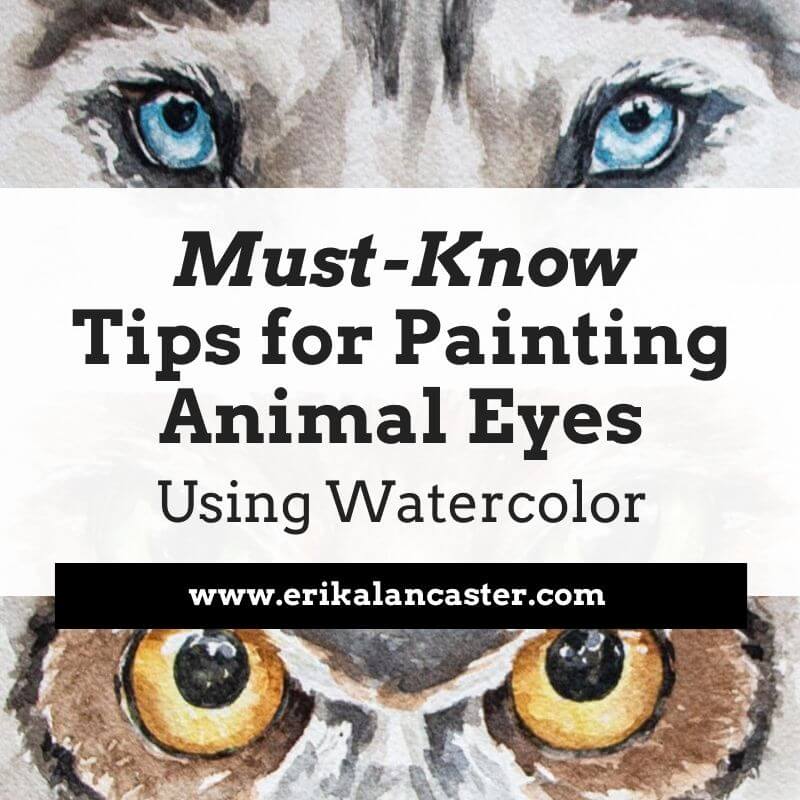
This goes without saying, but eyes are one of, if not the, most important parts of any portrait, whether we're drawing/painting a person or an animal. Why? Eyes are able to transmit the person's or animal's essence and personality and, if drawn or painted well, they can make the entire piece come to life. Which means, they can also break the piece, if drawn or painted poorly. Oftentimes, artists decide to make eyes the focal point and draw more attention to them by making use of techniques such as: - Bringing in higher levels of detail in the eye area - Creating higher tonal contrast in this area Find a list of my favorite watercolor painting supplies here. Tips for Painting Beautiful Animal Eyes with Watercolor 1. Make time for isolated studies It's super smart to practice different elements and techniques in isolation or via smaller studies, as opposed to jumping right into complete paintings without having done any previous practice or preparation. When I was first getting started on my own painting journey, I used to go right into a brand new drawing or painting expecting a masterpiece, only to end up frustrated with my results. I used to have very high expectations of myself, even when I was getting started with a brand new medium or a subject I had never drawn or painted before. Then I had an awakening. Every-single-type of subject, whether it's a portrait, a landscape, a still life arrangement, etc., can be broken down into things that can be practiced separately. Taking time to practice things that we feel might be challenging for us before jumping in can make all the difference in the world. As mentioned before, this kind of prep work makes it much more likely that we'll not only end up with a final piece we love, but that we'll actually enjoy the process much more. For example, if you love drawing or painting portraits, learning about the anatomy of different facial features and and practicing each in isolation without the overwhelm of drawing/painting an entire face, is going to inform your final piece immensely. If you love drawing or painting landscapes, creating studies of different types of skies, trees and things like water or flowers, will make it much more likely that you'll succeed at that final piece. When it comes to painting animal eyes, understanding their structure, as well as their different parts is incredibly powerful. If we don't take time to study them, it can be easy to leave out little elements that are important in order for them to look believable. 2. Use high-quality reference photos When we're trying to achieve higher levels of realism, it's essential to work with references, at least in the beginning. In fact, I'd recommend both using photos, as well as drawing/painting from direct observation (otherwise known as drawing/painting from life). Why? Because without references and material to inform your work, you'll most likely be making up information and drawing/painting subjects the way you think they look like, and not what they actually look like. Unless you have a photographic memory or are a genius of some kind, of course. Plus, realism is all about those subtleties and details, which are super easy to forget if we don't have the subject in front of us in one way or another. Even if your goal is to later be able to draw things from imagination, using references is going to help you develop your observational skills and understand about Art Fundamentals such as light behavior, form and perspective, all of which are key and impossible to understand if you don't study what things look like in real life. Having said all this, learning to select the right reference photos for drawing or painting is essential, as we can make the process way harder for ourselves if we're trying to create a drawing or painting using a low quality image. Here are a few things to make sure your reference photo shows if you'll be using it as a reference for your artwork:
3. Choose your paintbrush sizes and switch between them mindfully along the way Before getting started with your painting, choose the specific paintbrushes you'll be using for both outside of the eyes, as well as for the detail inside of the eyeballs. The fur around the eyes can be described in a much more abstract/looser way and, at least for those first layers, medium sized paintbrushes work best (I like using round brushes in sizes 14-16). For the detail inside the eyes, we usually want much more control. Inside those eyeballs, we have very small (yet super important) elements to add in, such as the tear duct, the pupil, tear lines, etc., many of which we want sharp and defined. We also have to be able to work around those little highlights in the eyeballs, as these are essential in making the eyes look lifelike. For complete animal paintings or things like eyelashes, etc., it's also important to choose a very thin detailing paintbrush. I'd recommend practicing drawing thin lines with whatever paintbrush you choose before adding them in. 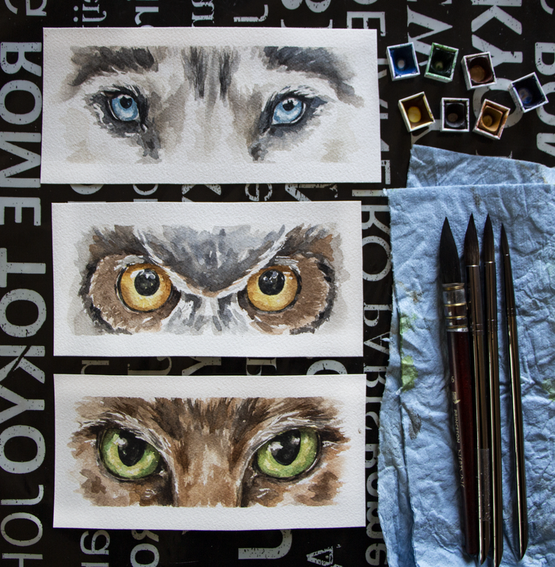
Watercolor animal eyes by Erika Lancaster (Husky, owl, cat)
4. Plan when/where you're going to be using wet-on-wet techniques vs. wet-on-dry techniques *Wet-on-wet: Applying/dropping in paint onto paper that has been pre-wetted with clean water or has a layer of paint that's still wet- Great for organic color gradients, soft transitions from more saturated color to more translucent color and blurred edges. *Wet-on-dry: Applying paint on paper that is completely dry - Great for sharp, defined edges. Before starting with any watercolor painting, it's advisable to think of a strategy that'll help you arrive at the effects/outcome that you're looking for. As opposed to opaque painting mediums such as acrylics or oils, we're not able to cover up our mistakes with a layer of paint. Not to mention, saving our highlights is essential and, once paint touches paper, there's no going back to the whiteness the paper once had. And, yes, you can decide to add in your highlights at the end with white gouache or another medium, but it's important to understand that when we're working with watercolor, we're playing with the medium's translucency and the whiteness of the paper underneath to create a variety of different values. Usually, we want the whiteness of our paper to stand in place for our highlights and no white paint is actually necessary when working with watercolor, if we save those whites. I'd highly recommend not getting started until you have at least a general idea of how many layers of paint you're thinking of going in with, as well as which areas you want to use wet-on-wet techniques in, which areas you want to use wet-on-dry in, and which will require a layering of both. Also, along the painting process, continue asking yourself whether it's important to allow a layer of paint to dry before going in with the next. For example, when painting many of the details inside of the eyeball (highlights, pupil, etc.), you're probably going to want to go in wet-on-dry in order to achieve sharp outlines, but for the fur and elements around the eyes, wet-on-wet can come it very handy. Transitions between colors within the pupil can oftentimes also be created wet-in-wet. Five minutes of planning before getting started can go a long way in having a smoother painting process, and arriving at way more successful results! 5. Remember the spherical nature of the eyeball If you've never tried painting a sphere using watercolor before, it's extremely helpful, as eyeballs have a spherical form. *There are animals such as owls that don't have spherical eyes. Aside from the eyeball being a sphere, we need to remember that eyeballs are set deep within the skull and are covered/wrapped by an upper and lower eyelid with creates outwards/convex volume in the head shape. The sphere in itself is going to have different values throughout it, and the eyelids create shadows on the sphere, too! When we're drawing or painting human eyes, we're able to see much more of the sclera (the whites of the eyes), and it's easier to tell different values throughout it. Just like when drawing or painting teeth, even though the sclera is essentially white/off-white they are never one flat white value. If we leave them with only one flat value, and don't try to understand their 3D form, we risk our outcome looking quite cartoony and it will retract from the level of realism in the piece, even if the rest of the piece is realistically rendered. 6. Plan your highlights and keep them protected throughout the painting process Notice the highlights and lighter values in the reference photo both inside of the eyes as well as around them, and think of the strategy you'll be using to keep them protected throughout the painting process. Are you going to be using masking fluid to keep lightest lights protected, or will you be painting around them carefully? Whatever you decide to do, make sure that you plan for them, as once you cover up that paper with paint, there's no going back to the whiteness the paper once had. Those highlights are incredibly important to make those eyes come alive and look moist and realistic. Also, the more we can do to understand the structure of the animals head (brow ridge, snout size, rounded areas around the eyes, etc.) the more 3D and realistic our painting will tend to look. This is why doing skull studies is so valuable! 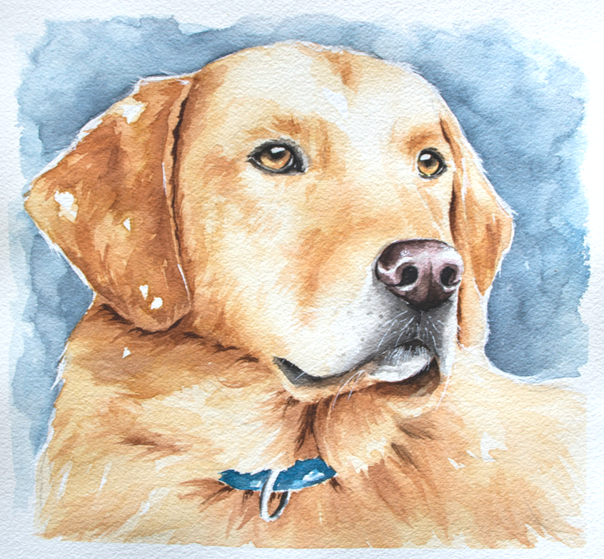
Watercolor Labrador by Erika Lancaster. Whiskers were added in at the end with white gouache and a fine detailing brush.
7. Start with a bright yellow layer in the eyeball when appropriate Whenever it makes sense, I like starting with a semi-translucent layer of bright yellow in the iris/pupil (avoiding the highlights), as this provides a glow to the eyes. Usually I like doing this with a color such as Gamboge or Permanent Yellow Medium. This works very well when the animal's eyes are amber colored and even green. However, I didn't use this strategy for the husky eyes I share above, because these eyes are blue and I would risk turning them green (yellow + blue= green). 8. Mindfully use soft/blurred transitions vs. defined edges When painting eyes, we're usually going to need a combo of shapes with soft/blurred out edges and hard/defined edges. Notice where these blurred out effects happen and where sharper edges are located in your reference. Usually, we have lots of soft transitions within the pupil, where one color turns gradually into another color. But when it comes to painting elements like little shapes along the tear lines, eyelashes, and pupils in some cases, we want the edges of our shapes to be defined. By giving thought to these things, you'll have a better idea of whether you should be painting on paper that's still wet, or whether you should allow the previous layer to dry completely before adding more detail. It's essential to stay patient! Aside from all this, if we're looking for higher levels of realism, it's important to stay away from the look of obvious/stark outlines around different elements. A lot of animals, such as cats, tend to have a darker (eyeliner type look) around their eyes. This may instinctively make us want to go in and create a hard outline around the entire eye and this will ultimately retract from the level of realism of the piece. In realism, there are no outlines and it's important to notice the subtle changes in values even in these areas that we may initially perceive as dark lines. Usually there's a line weight variation within the elements we initially perceive as lines, such as the tear lines, and even whiskers. Meaning, certain segments of those "lines" are thicker while others are thinner, some are darker while others are lighter. Capturing this leads to a more natural look. Notice moisture and any highlights along the tear lines, too!
9. Pay attention to the length and direction of hair growth around the eyes Whenever we're painting animals that have fur or feathers, it's important to acknowledge their length and the direction they're growing out towards. Not only this, but how this length and growth direction changes throughout its head and body (it's not the same all throughout!). If we mindlessly start laying down marks and lines without paying attention to our reference, we're most likely going to end up with an outcome that doesn't look very realistic, which is why it's so important to keep observing our reference photo. Whether you decide to paint the areas around the eyeballs before or after the eyeballs themselves, switch on over to the paintbrushes that you've selected for this and stay focused when laying down those brushstrokes that are meant to describe fur or feathers. The way you use your paintbrush should reflect the direction and length of that growth. This doesn't meant that you have to paint every-single-hair that you see in the photo (in fact I would never recommend trying to paint each individual hair), but noticing these characteristics and taking them into account as you're laying down those abstract shapes representing those groupings of hair or feathers, is essential. 10. Leave eyelashes and whiskers until the end (or keep them protected with masking fluid) Make sure you don't get ahead of yourself and leave eyelashes and/or whiskers until after the areas beneath and around them have been finalized. Sometimes, though, I do mask out the animal's whiskers using liquid frisket before getting started with the painting process. Generally speaking though, details like whiskers and eyelashes are created with lines or marks that are overlapping the other elements, which is why the layers underneath have to be finished. You don't want to have to go in a fix layers underneath after the whiskers or eyelashes have been added! Be patient and always keep thinking critically in terms of what should come first and what should come later. Also, make sure you're using very small paintbrushes that come to a thin tip for these final details and, if needed, always practice painting thin lines on a scrap piece of paper before going into your painting. This is something I almost always do myself, to the day. In the eye studies I share in this video, I approach the animal's eyelashes in a very abstracted way, using irregular shapes as opposed to trying to draw in every single eyelash in. Whiskers I do either mask out since the beginning or add until the end using white gouache. *Refer to Yellow Labrador watercolor painting above. Find a list of my favorite watercolor painting supplies here. 
*This post contains affiliate links. I receive small commissions for purchases made through these links at no extra cost to you. These commissions help me keep this site up and running, in order for me to keep providing helpful and inspiring art content. :)
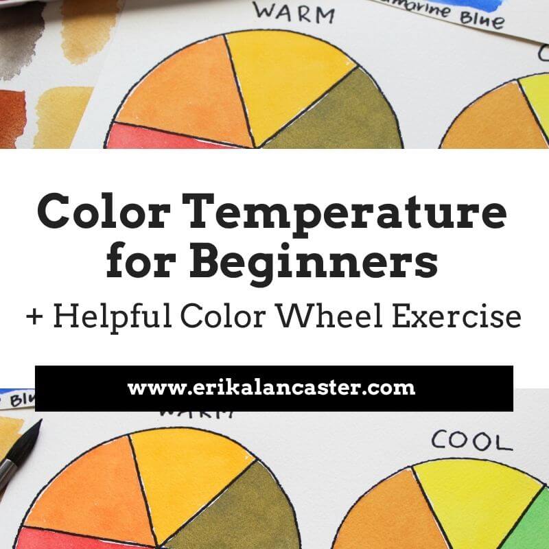
Why is it important to plan colors before starting a painting? How is a limited color palette useful? How will learning about the Color Wheel help us create more successful and professional-looking artwork? In the video included within this blog post, I'll be sharing how I go about selecting my colors prior to starting a new piece. I'll share my thinking process as I go through this method and will be offering lots of tips pertaining to color. In past blog posts and YouTube videos, I have mentioned how color is an essential Element of Art to learn about as a beginner artist. The reason? When we're looking to create a visual composition, we have to think about how different parts fit together into a whole. And color plays a huge role in making a visual composition look harmonious and cohesive. When it comes to a visual composition, all individual elements are connected. Each one has an effect over how we perceive the elements around it. And just like how you wouldn't throw on an outfit with a ton of different colors and textures that don't mesh well together, you have to think about how things will look like in a painting when appreciated as a whole. It's not about one element in the piece, but how the different elements included intermix to effectively transmit the idea or message we're trying to get across. It's incredibly important that any beginner artist who is serious about improving their painting makes time to learn about the Color Wheel. This is an incredibly important tool that allows us to understand relationships between colors so that we're not only able to create effective color mixtures during the painting process, but also prepare color schemes that work well. Here's a free class on Color Temperature in which I share a powerful exercise for beginners. Limiting the amount of colors that you use in a painting is also very useful because the more colors you use, the more disorganized your palette will be, the more likely color mixtures will lead to mud, and the more incoherent the end-results. Whatever you do, stay away from randomly selecting colors during the painting process and dedicate at least a bit of time to plan for your painting. I promise you, there's much more of a chance that you'll end up with great results.
If you enjoyed this video and found it helpful, make sure to subscribe to my YouTube channel. I share a brand new video every week with art tips, drawing and painting tutorials and mindset/productivity tips for artists. *Subscribe HERE*
You'll be able to find a list of my favorite watercolor supplies here.
*This post contains affiliate links. I receive small commissions for purchases made through these links at no extra cost to you. These commissions help me keep this site up and running, in order for me to keep providing helpful and inspiring art content. :)
Do you need fancy supplies to progress your drawing skills and create the artwork you'd like to share with the world? How does one go about drawing a believable face? Why is keeping a sketching habit important for artists of all kinds? In the time lapse video included within this blog post I share my entire face drawing process, starting with creating the head shape, moving onto laying down guidelines to help with the effective placement of facial features, sketching in individual elements and finishing up by adding quick shading using a combination of hatching and crosshatching. Drawing believable portraits (and any part of the human figure) is challenging, as it requires us to not only have decent drawing skills to be able to render form/three-dimensionality as well as different textures like hair and skin, but it also entails having a good amount of knowledge on proportion. You see, faces are probably what we see most as human beings. Due to this, even non-artists are usually able to tell when something looks off, even though they may not know exactly where the error is. In this YouTube video, I take you step-by-step, through drawing a simple, forwards-facing portrait and explain basic facial proportions. *This is, in my opinion, an essential place for beginners to start. In my blog post, How to Draw Faces at a 3/4's Angle-My 4 Step Process, I get into starting to understand the head shape as a three-dimensional form, why it's useful to understand the underlying structure of the face (the human skull), and take you through drawing a portrait at an angle. Though I primarily sell my paintings, I'm a huge sketching fan. I consider drawing to be the basis for all kinds of art and really believe in keeping a sketchbook habit. Even quicker sketches created consistently will help keep your observation sharp and continue progressing your artistic skills. Not to mention, sketching is also incredibly practical as we don't really need much besides drawing paper, a few different pencil grades and an eraser. There's no need to take out your painting supplies and go through your whole set-up if you're short on time.
If you enjoyed this video and found it helpful, make sure to subscribe to my YouTube channel. I share a brand new video every week with art tips, drawing and painting tutorials and mindset/productivity tips for artists. *Subscribe HERE*
If you're not new to my blog posts or videos, you're probably already aware that I'm a huge fan of keeping it simple when it comes to art supplies. I'm a big fan of artists who are able to create amazing work using basic, and even limited, tools. There's no need for anything fancy in order to make immense progress in your drawing skills. The supplies below are what I usually have on hand when I'm drawing or sketching. *I'm not a big fan of kneaded erasers and have replaced them entirely with my Mono Zero eraser that I acquire via Amazon. I use blending stumps only when I'm creating more realistic drawings such as the one in this video.
I hope you enjoyed this post and learned something new, or got inspired to go and create a sketch for yourself.
I wish you tons of progress and enjoyment in your artistic journey! :) 
*This post contains affiliate links. I receive small commissions for purchases made through these links at no extra cost to you. These commissions help me keep this site up and running, in order for me to keep providing helpful and inspiring art content. :)
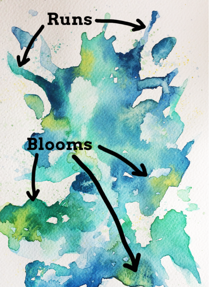
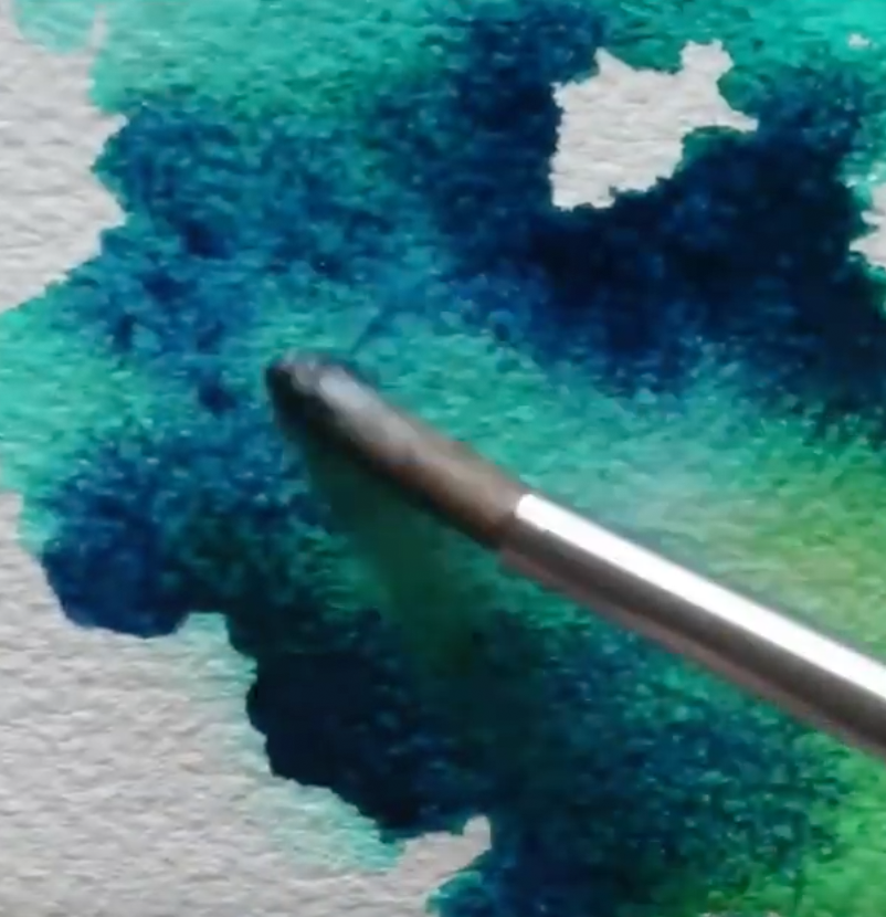
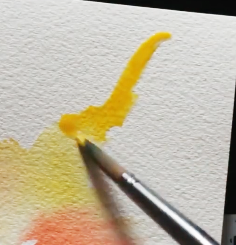
What, exactly, does the term wet-on-wet refer to and how can we use these techniques to create beautiful paintings with watercolor? Do you love watching artists create those awesome washy watercolor effects, but find that things don't end up as expected when you're trying them yourself? In today's blog post I'll explain what wet-on-wet effects are, how they can be combined with wet-on-dry effects to create awesome paintings, and a few essential tips to apply when using these techniques. I'll also explain how to do different effects like blooms, splatters and runs. Make sure to check out the video included in this post to see me in action! Wet-on-wet refers to the act of applying fresh paint onto a wet surface or on paint that is still wet rather than onto a dry surface or a layer of paint that has already dried. When using these kinds of techniques, we get colors that blend or intermix with each other. It's important to understand that this painting technique isn't exclusive to watercolors, but can be used with all traditional painting mediums (watercolor, gouache, acrylic, oils) and it can be used in a variety of ways. First and foremost, when working with watercolors, it's essential to understand that when a paint mixture is placed on paper that is wet (either because it has been pre-wetted with clean water or because a previous layer of paint hasn't dried), the paint mixture will expand, creating a blurred out/fuzzy effect. Opposite to this, when we place a paint mixture on paper that is dry (either because it's a fresh sheet of watercolor paper or because the previous layer has completely dried), the newly placed paint will not expand, leading to sharp looking lines and defined shapes. This principle is essential to grasp and it's important for beginners starting out with watercolors to know that wet-on-wet and wet-on-dry effects complement each other to create beautiful paintings. By combining them, we're able to create a visually pleasing contrast, bring attention to focal points by adding sharper detail to certain elements, add depth to a piece, and many other things. It's important for beginners to practice both kinds of techniques, and start giving thought to how they can be used in a particular piece before actually starting the painting process. 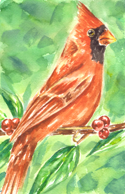
Watercolor Cardinal painting by Erika Lancaster. Wet-on-wet techniques in combination with wet-on-dry techniques.
How and when you use wet-on-wet and wet-on-dry techniques in your painting process will depend on what subject you're painting and what effects you're personally going for. Generally speaking though, the first layers of paint should be translucent and paint mixtures should contain more water than pigment. As the painting process moves forward and subsequent layers start being placed, paint mixtures contain less water and more pigment. 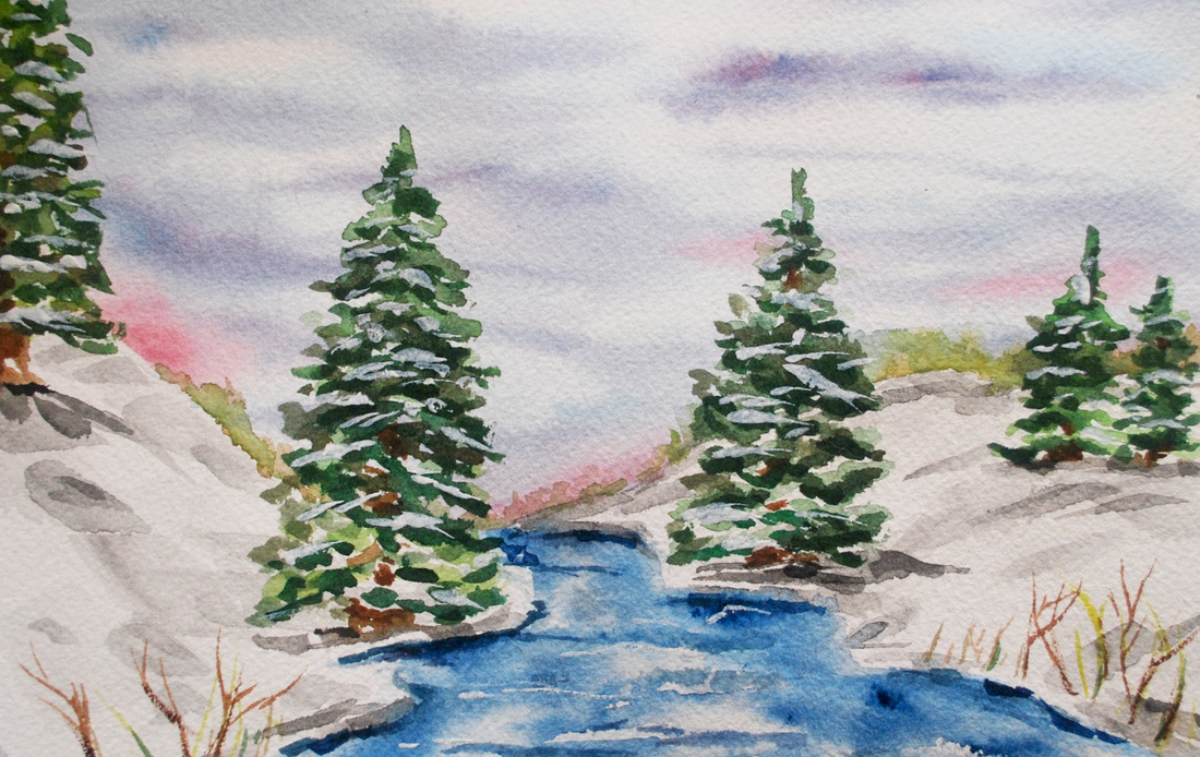
Watercolor Winter Landscape painting by Erika Lancaster. Wet-on-wet techniques in combination with wet-on-dry techniques.
If you enjoyed this video and found it helpful, make sure to subscribe to my YouTube channel. I share a brand new video every week with art tips, drawing and painting tutorials and mindset/productivity tips for artists. *Subscribe HERE*
5 Essential Tips to Have in Mind When Using Wet-on-Wet Techniques1. Use medium to heavier-weight paper with enough tooth/absorbency Paper makes a huge difference when painting with watercolor and can often be the reason why our wet-on-wet effects don't turn out as expected. No matter what kind of painting medium we're using, it's absolutely essential to give thought to what paper or support we'll be painting on before starting a piece as this will directly affect both our painting process, as well as its overall outcome. When painting with a water-soluble medium like watercolor, we should use a paper that is intended for this purpose. This said, when we're planning on using lots of wet-on-wet effects like the ones described in this post, it's best to use a medium (140 lb.) to heavier weight (300 lb.) watercolor paper, as anything thinner will warp and possibly even shred throughout the process. You also want it to have some degree of tooth or texture to it, as this will help ensure that water/paint mixtures will be absorbed when placed upon it. Watercolor paper can certainly be difficult to grasp, as there are so many different types and formats available. In my blog post/YouTube video Watercolor Supplies for Beginners and Things You Must Know, I go much more in depth into watercolor paper and explain a few other important aspects in regards to watercolor painting supplies. 2. Give thought to the colors you'll be using Because colors will be intermixing a ton when using wet-on-wet techniques, it's essential to do a bit of planning to ensure that we won't create unwanted hues accidentally. Though one of the beauties of watercolor is the fact that it has a mind of its own, skilled artists are able to have at least some level of control over the 'chaos'. They have practiced water control and have a good idea of what's going to happen when a certain paint mixture is placed in a specific area, using effects to their advantage. Skilled watercolor artists have not only become masters at managing the combination of paint and water, but they also know the importance of planning color. This Element of Art is an important aspect behind making a painting look harmonious and balanced. We're also able to create very striking visual effects when planning our color palettes and giving thought to how we'll actually be using it throughout the painting process. Color shouldn't be an afterthought or something that happens accidentally. In the video included in this post, you'll see how I create my warm and cool color studies separately. The reason I do this is because I know that when Complimentary Colors mix together, they create grayed out/dull tones. Complementary Colors mute each other out and, in these studies, I wanted my colors vibrant and saturated. 3. Keep your water clean Using murky water when painting with watercolor is a huge no-no, no matter what kinds of techniques you're using. Dirty water will affect your paint colors and may even make your piece appear dirty. When working wet-on-wet we're not only using a lot of water, but we're also usually working at a faster pace because we're using the freshness/dampness of an area to create beautiful effects. It's important to ensure that we're not accidentally dipping our paintbrush into dirty water and placing this water on our paper! I've known of artists that use two or even three cups of water as they are painting. One idea could be to use one glass of water to rinse color off your brush and a second one to dampen it with clean water. Whatever it is you decide to do, make sure you're constantly checking on your water throughout the painting process. 
For a list of my favorite art supplies and books, go here. 4. Constantly give thought to how much water is already on your paper and how much water is in your brush The outcome of our wet-on-wet techniques will greatly depend on how wet/damp the specific area of paper is, as well as how thick or watery the paint mixture that we're placing upon it is. I would recommend beginners to practice creating a wide range of paint mixtures, from watery/translucent to thicker/heavily pigmented mixtures, and see what happens when they are placed on slightly dampened paper vs. puddles of water. In the video included in this blog post, you can see me play around with large puddles of water/paint mixtures. While puddles allow for a lot of exciting movement, they are certainly difficult to control and can lead to unwanted effects like backruns and splotchiness if we're not careful! Generally speaking, if your paper is already very wet, it would be best to stay away from laying down a very watery paint mixture on it. In principle, for backruns not to happen, you have to make sure that there is less water in your brush than there is on your paper. Another option to avoid backruns and undesired splotchiness would be to allow your paint layer to dry completely before going back in with another color. If you've wetted your paper too much accidentally, you can always absorb some excess water with a paper towel or with a clean (dry or slightly dampened) brush. 5. Know when to stop When I was first starting out with watercolor, I didn't understand that watercolor paper can only take a certain amount of 'beating' before it has to be left alone to regain its strength. Even if paper is specially intended for use with water, it's essential to understand that wet paper is fragile paper. With watercolors, we must stay mindful of when we should stop, as continuing to work over and over on one same area will definitely lead to overworking our paper (even when using the heavier weight variety). Beginners starting out with this medium tend to lay down paint mixture over paint mixture and try to fix mistakes or make changes in one same area, damaging the paper. When we've made a mistake, it's best to do a bit of gentle lifting when the paint is still wet and then allow it to dry completely. What I like doing, is ignoring my accident for a bit and working on other areas of my painting while that one dries. Other times, I work on two pieces at once and jump back and forth from one to the other, allowing paint layers to dry. Often, we can make mistakes less noticeable by doing a bit of work in the area once the initial layer has dried. We can add more washes of color, lift some more, or even to a bit of gentle scrubbing at this point. Check out my blog post titled 5 Common Watercolor Painting Mistakes and How to Fix them for ideas on fixing accidents and avoiding them altogether.
Watercolor Wet-on-Wet Techniques
|


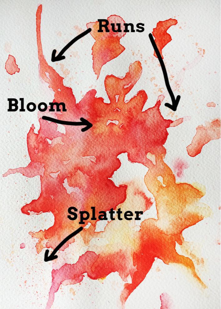
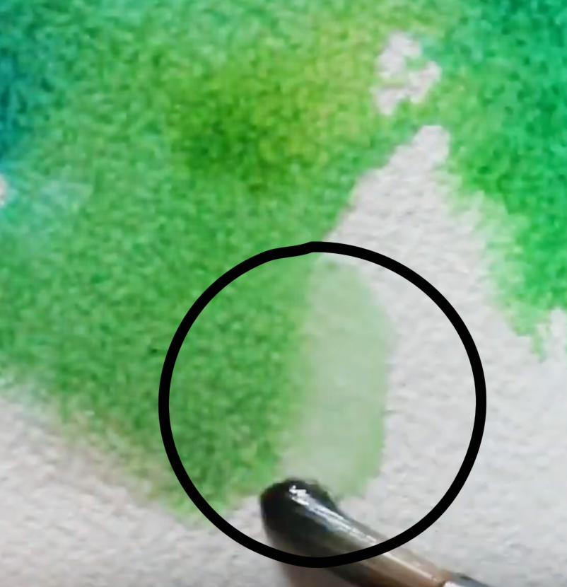
Watercolor orange and yellow bloom
|
Watercolor blue and green bloom
|
2. Runs (Controlled + Organic)
Runs are interesting effects that can be used when we're creating an abstract painting, or even when adding abstract elements to figurative painting. They are, quite simply, a stream of paint running off the main area or subject in our piece.
We can create runs completely organically by shifting our paper to a slanted or sideways position while it has a large amount of water on it. Sooner or later, gravity will make the water naturally travel down your paper.
If it doesn't happen, consider placing a bit more water in the puddle using your paintbrush, and/or gently tap the paper on your desk in this vertical position.
We can also create controlled runs quite easily by drawing a line of clean water in a specific shape/direction, placing a watery paint mixture at the start of it (the place where our main shape ends and our clean line of water starts), and shifting our paper sideways until the paint mixture starts moving down on its own.
Remember, when using watercolor paper, the paint mixture will naturally expand or move towards the wetness and stay away from dry areas. This is why the paint will naturally travel down the path we've created for it!
Watercolor run in yellow
|
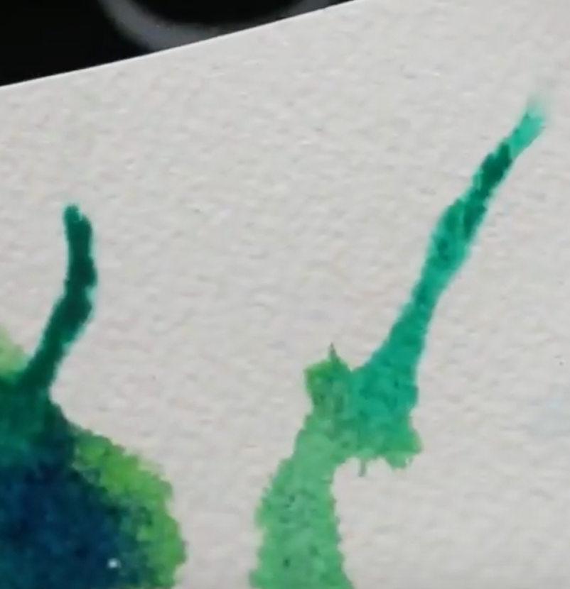
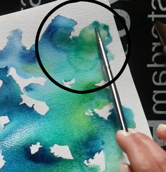
Watercolor run in blue/green
|
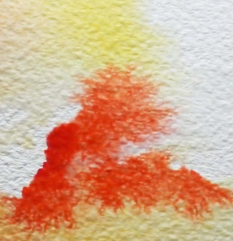
3. Splatters
Splatters can have very striking results and can be used in a variety of ways. If heavily-pigmented paint drops fall on areas of paper that are wet, you can create mini-blooms! On the other hand, if splatters fall on dry paper, these drops will retain their sharp, circular shape.
It's easy to go overboard with it, though, mostly because it's quite fun to do! So work incrementally and stay mindful throughout the process.
To do this technique, create a watery but pigmented paint mixture, wet your paintbrush (I use a round in size 8 in the video) and gently tap it on another paintbrush in a cross position.
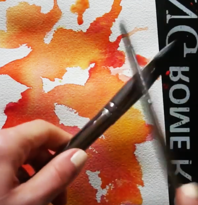
Watercolor splattering technique in warm color exploration
|
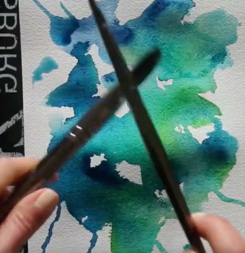
Watercolor splattering technique in cool color exploration
|
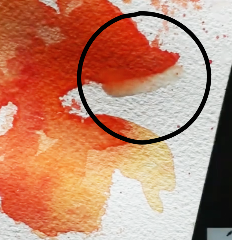
4. Bleeds
Many beginners starting out with watercolors aren't aware of this, but it's easy to soften out stark- looking lines and shapes both while our paint is still wet and after our paint has already dried.
One of the techniques we can use to soften lines or create feathering effects is bleeding, which can be easily done whilst our paint is still wet or is in the drying process.
To do bleeding, simply rinse your paintbrush thoroughly and draw a line of clean water right along the outer edge of the shape or line you want to soften out. Because paint will expand in wet areas, the color will feather out into the recently wetted line of clean water you've drawn, creating a softened effect.
This said, one of watercolors characteristics is the fact that they can be reactivated once they've dried! This means that we'll always have the option to go back into an area to soften it out by doing some gentle scrubbing using a clean, damp paintbrush.
Of course, certain pigments will be easier to lift and move around than others and it will be almost impossible to go back to the whiteness of our paper, but we'll be able to do at least some level of softening.
It's very useful to swatch out our colors when buying a new watercolor paint set, as this allows us to test out paint characteristics before actually using them in a painting.
In my blog post/YouTube video titled How to Swatch Watercolors and Why it's Important, I describe important characteristics and terminology related to this painting medium and take you through my own swatching process.
Watercolor bleeding/feathering effect in red
|
Watercolor bleeding/feathering in green
|
*Bonus Effect: The Backrun
When we're just starting out with using wet-on-wet effects, are working too fast and/or are not staying mindful of what's going on, backruns happen. We can avoid backruns by practicing water control, staying mindful of how wet our paper is and how much water our paintbrush has in its bristles.
In essence, backruns can be avoided by making sure the amount of water in our bristles is less that the amount of water that is already on our paper. They can also be avoided by allowing the previous layer to dry completely before going back in with another wash of color.
This said, backruns are one of those things that some artists consider to be absolutely wrong, while others actually create them intentionally to give the impression of specific things in their paintings like foliage in a landscape, etc.
What do you think?
Watercolor back run
Watercolor supplies used in the video:
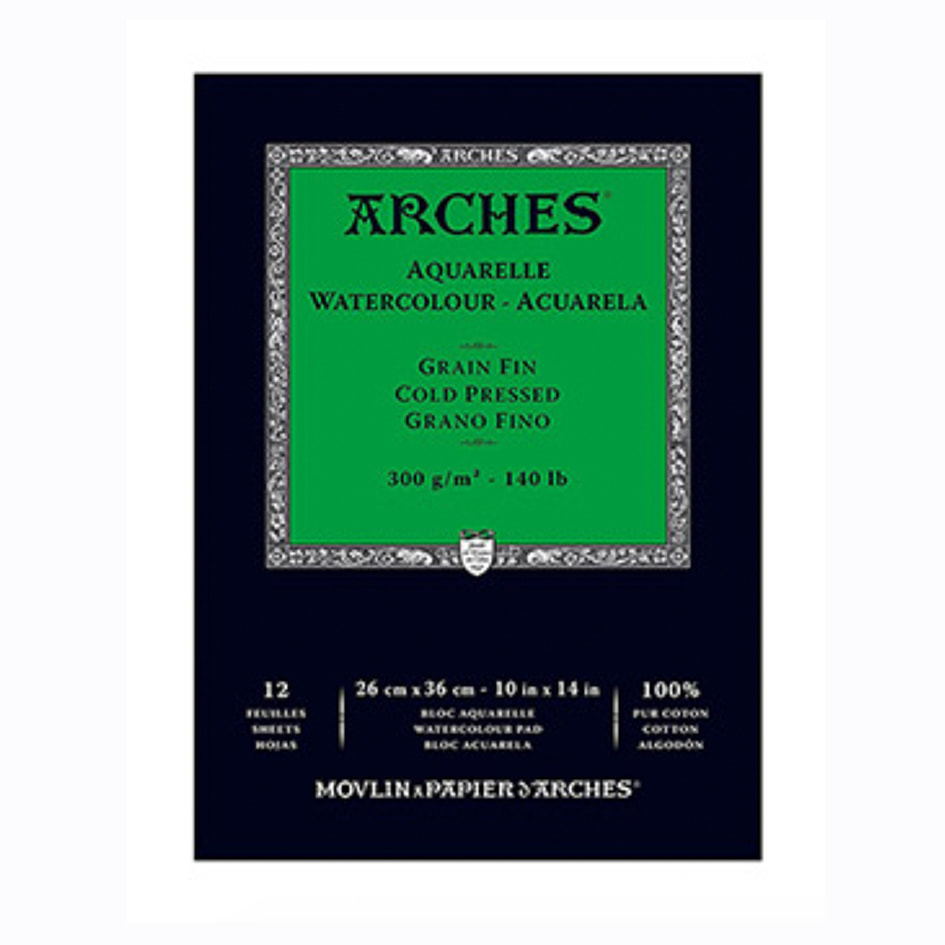 Arches Watercolor Paper Pad: 10 X 14 inches Arches Watercolor Paper Pad: 10 X 14 inches
|
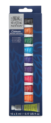
Winsor & Newton Cotman Watercolor Set of 10 Tubes
|
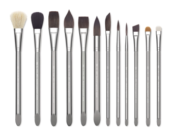
Royal & Langnickel Zen Line Watercolor Brushes
|
I hope you enjoyed this post and learned something new, or got inspired to go and create for yourself.
I wish you tons of progress and enjoyment in your artistic journey! :)


www.erikalancaster.com
is a participant in the Amazon Services LLC Associates Program, an affiliate advertising program designed to provide a means for sites
to earn advertising fees by advertising and linking to amazon.com.
www.erikalancaster.com
is a participant in the Shareasale.com Affiliate Program, an affiliate advertising program designed to provide a means for sites to earn advertising fees by advertising and linking to Shareasale.com partner companies.
 RSS Feed
