*This post contains affiliate links. I receive small commissions for purchases made through these links at no extra cost to you. These commissions help me keep this site up and running, in order for me to keep providing helpful and inspiring art content. :)
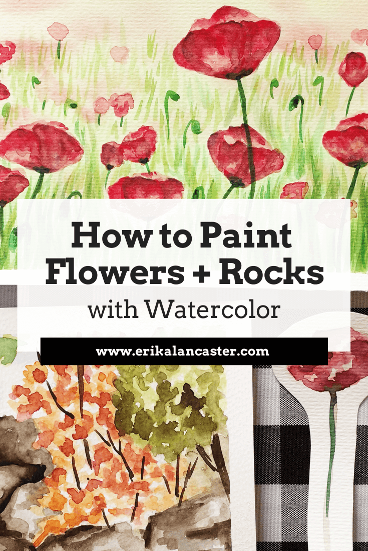
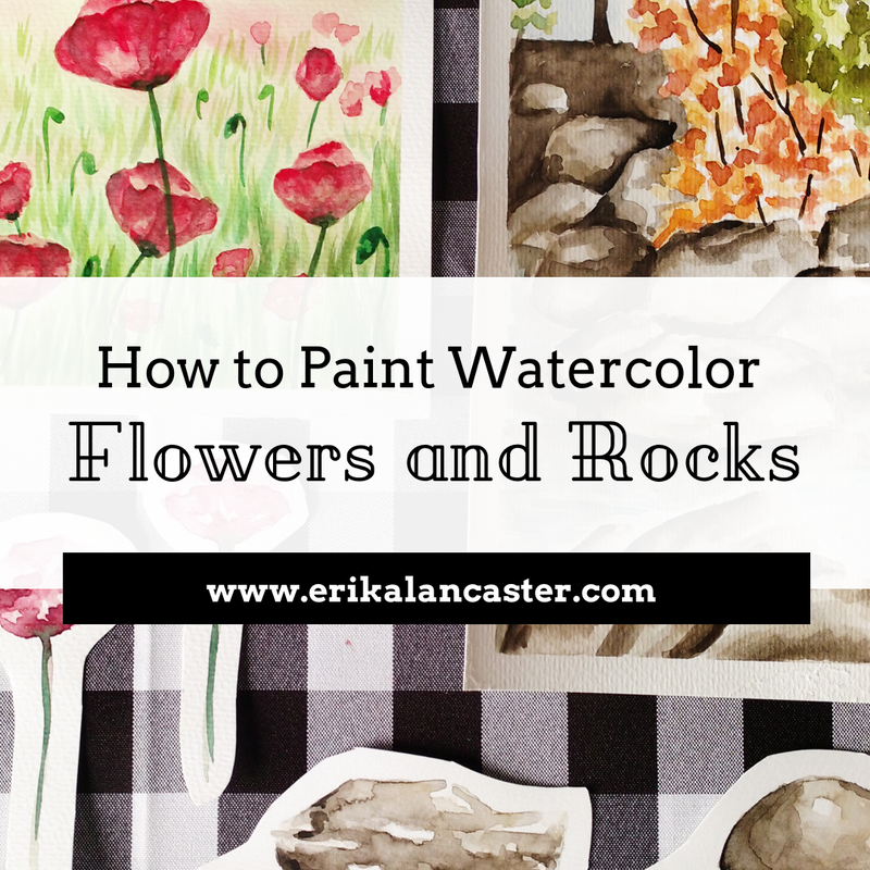
Do you want to start adding specific details into your watercolor landscapes but are a bit confused about how to go about it? Have you, perhaps, found an awesome reference image you'd love to turn into a painting, but are unsure about what the process would be to make it happen? Are you happy with the way you start a painting but grow frustrated as you start adding details in? Welcome to the third part of the Watercolor Landscapes for Beginners Series!Flowers, rocks and grass may seem like small parts when one thinks of a landscape painting, but these natural elements have the ability of adding color and areas of interest to this type of composition. The way we decide to include and render these details can, pretty much, make or break our paintings. When I was first starting to paint landscapes using watercolors, I was full of questions: Am I supposed to paint smaller details directly on my white paper or on top of my first, second or third layer(s) of paint? How much time am I supposed to spend on each little detail in order to make a great painting? Is it best to finish one area entirely and then move on to the next or can I work on everything simultaneously? How dark do I have to get in order to achieve good form and contrast? What is the best way to create my darker color values? Where, exactly, am I supposed to use the wet-on-wet technique and where can I use wet-on-dry? How can I create a believable texture for that particular object? The questions were endless! Throughout the time I've been using this medium, I have found that there are many ways to go about creating a great-looking painting, provided the artist has a good understanding of Art Fundamentals and is aware of the particular characteristics of watercolors. Also, check out my 10 Things I Wish I Knew About Watercolors When I Was Getting Started video over on YouTube! It's an awesome introduction to the medium and is chock-full of information that will make you make faster progress in your watercolor journey. In this post and the video included here, I will be sharing my personal tips and tricks, as well as the process I go through to create believable and aesthetically pleasing landscapes. By understanding these principles and working on your own studies, you'll be able to create great work in no time.
|
||||||||||||||||||||||||||||||

|
|
|
|
Reference Images Used
For these studies, I found a couple of high quality photographs online that included the specific elements I wanted to study (flowers, grass and rocks). As always, I went for my trusted online free image sources Pixabay and Pexels.
I highly recommend these websites if you're looking for beautiful reference pictures to work from!
*Note: I used these pictures loosely and wasn't trying to copy them exactly.
You can find my other favorite free image sources in my blog post titled My Favorite Free Image Sites & Two Examples of References with Finished Illustrations.
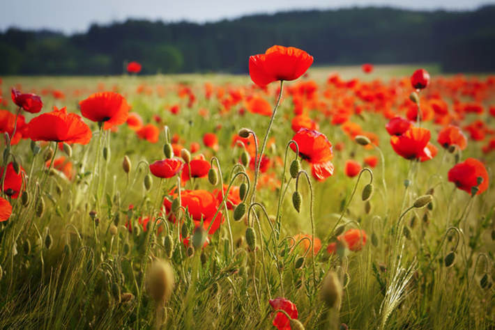
Field of Poppy flowers. Click on image to go to its original source at Pixabay.
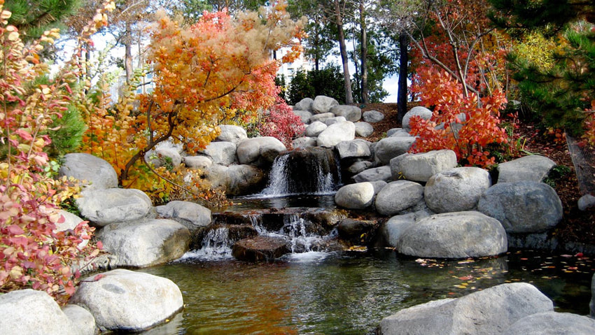
Rocky creek. Click on image to go to its original source at Pexels.
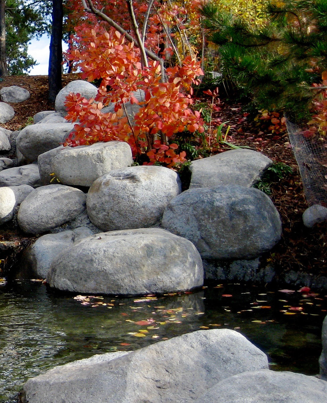
Focusing on only this area of the picture.
|
Because I'm mainly using this image to practice rocks, I decided to open it in Photoshop and crop out a section that I thought would make for a nice little painting. This allowed me to focus on the subjects I wanted to practice. |
Painting Process
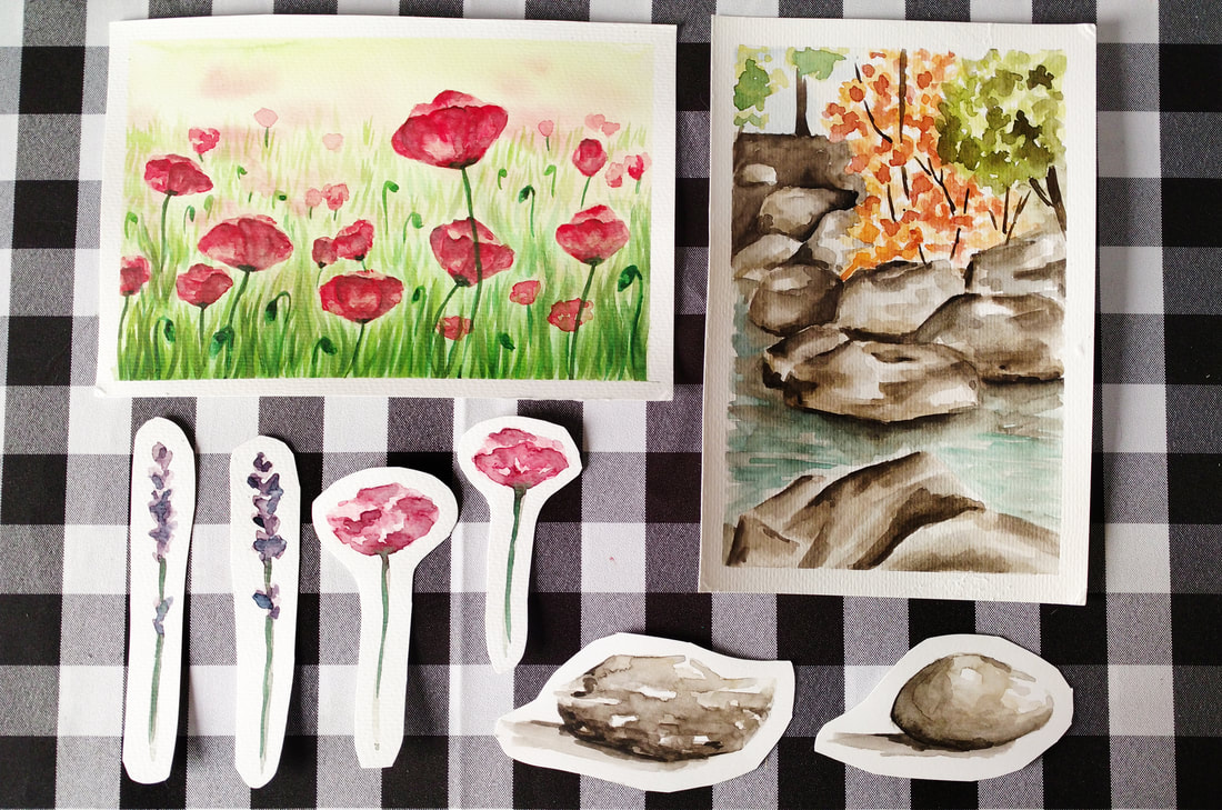
Quick watercolor flower and rock studies and paintings.
Watercolor Poppy Field
1. Before actually starting with my complete painting, I created individual studies of two of my favorite landscape flowers.
2. After deciding I wanted to create a field of Poppies, I looked for a high quality picture online that included a good amount of them in it. It's important to develop an eye for what images could possibly lead to nice looking paintings.
3. I taped my watercolor paper onto a thick piece of cardboard and, using the wet-on-wet technique described in the first video of this series, I created a blurry background effect using yellow and light green.
While wet, I dropped in a few dots of my red Poppy flower mixture because I wanted my furthest flowers to appear blurred out. I allowed my first layer to dry completely.
4. I started adding in very loose and irregular red shapes that would later be turned into the tops (or petals) of the Poppy flowers. At this point, I started using deeper red color mixtures with a less amount of water in them, but I still didn't go too dark, taking it one step at a time.
I made sure to add just enough shapes for it to look like a field of Poppies, but not too many that it would look too crowded. It's SO important to know when to stop!
5. I jumped around from flower to flower, adding in deeper red values carefully. I created the illusion of separate petals by placing few curved lines here and there. The darkest hue used within the petal area was created by adding in blue to my red mixture.
As always, my darkest values were placed very deliberately and only where needed (see reference image at all times).
6. I started adding in individual blades of grass using a medium green paint mixture and clean upward motions (using my thin round brush). I created the effect of realistic depth by making the blades of grass smaller as they got closer to the horizon line (further from the viewer).
7. Once I had added the first layer of grass, I allowed it to dry and went back to work on my Poppies. To soften some of the noticeable darker shapes left within the petal areas, I wet my brush with clean water and did gentle scrubbing. I did this only here and there.
8. I created a deeper green value and painted the flower stems, more grass, as well as flower buds scattered throughout. To create a sense of depth, I made sure to leave the most crisp-looking and vibrant green blades of grass closest to the viewer and the most translucent ones closest to the horizon line.
I also made sure to add at least a bit of a darker green to my flower buds in order to transmit a more believable sense of form.
Specific colors I used for this study:
- Lemon Yellow
- Permanent Green Olive
- Cadmium Red Light
- Permanent Carmine
- Ultramarine Blue

Watercolor Rocky Creek
1. I opened my reference photograph in a photo-editing software and cropped an area that would allow me to focus on painting rocks. Using a pencil, I created a very light sketch on my watercolor paper, getting inspired by the image but not fussing to much about drawing it exactly the same.
2. I wet the entire rock area and started laying down my first and most translucent paint mixture, making sure to leave small areas free of pigment. Saving small white areas is very important when creating believable stones and rocks.
3. I jumped from one rock to the other deepening values and then allowed them to dry while I continued with the other areas of my painting. *Please refer to the first two blog posts/videos of this series if you'd like to know more about how I paint skies, water and trees.
4. I went back to my rocks, deepening values and creating a sense of shadow behind and between the rocks. At this point I also softened some of the transitions between my values by doing my scrubbing technique with a clean brush.
Specific colors I used for this study:
- Sepia Brown
- Ivory Black
- Yellow Ochre
- Cadmium Yellow Light
- Permanent Green Olive
- Cadmium Red Light
- Permanent Carmine
- Ultramarine Blue


8 Comments
*This post contains affiliate links. I receive small commissions for purchases made through these links at no extra cost to you. These commissions help me keep this site up and running, in order for me to keep providing helpful and inspiring art content. :)
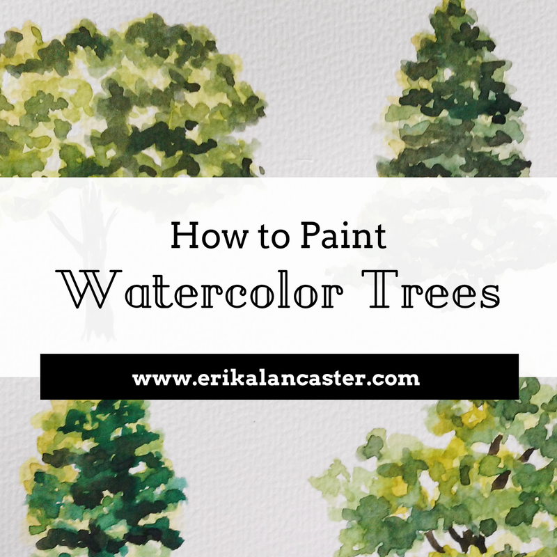
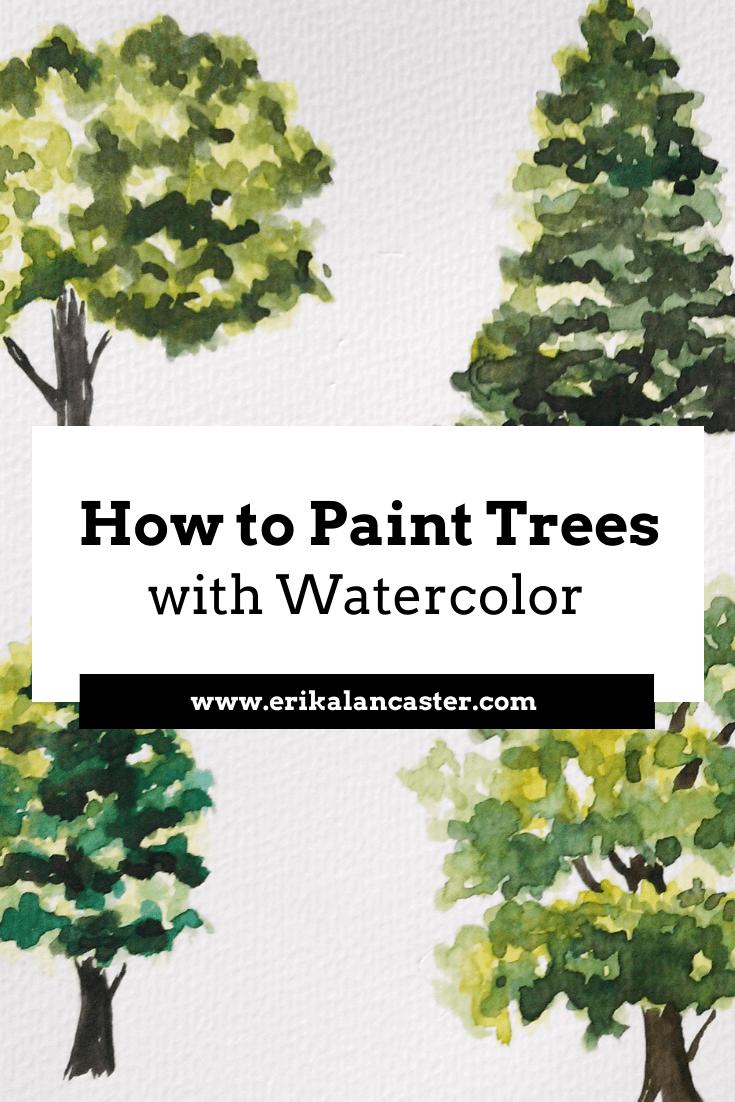
Have you ever started painting a watercolor landscape and hit a wall when adding in trees and/or plants? Do you find you start your trees well but frequently end up overworking them, producing lifeless and flat green blobs? Are you getting tired of always painting the same kind of tree?
Have you ever started painting a watercolor landscape and hit a wall when adding in trees and/or plants? Do you find you start your trees well but frequently end up overworking them, producing lifeless and flat green blobs? Are you getting tired of always painting the same kind of tree?
Welcome to the second part of the Watercolor Landscapes for Beginners Series!
Trees and plants are, arguably, the most important parts of any landscape (at least this is the case when there are no other living subjects included). For this reason, it's a great idea to make time to study them before actually attempting to paint a composition of this kind.
This blog post includes a video in which I walk you through six different tree studies. Throughout these time-lapses, I share the steps I go through when painting trees using watercolors, as well as all of my personal tips and tricks.
Check out my Tips for Water Control video over on YouTube! Water control is definitely one of the first skills the beginner getting started with watercolors must master.
With practice, you'll be painting believable trees that have life to them and add areas of interest in your paintings.
Before you begin drawing or painting trees, or anything else for that matter, there's nothing better than going out and observing what the subject actually looks like in real life.
Go for a walk and take some photos at your nearest park. At the very least, look for high quality photographs online and create a little collection.
Take a moment to observe their shape, the variety of hues and textures they can have, the shadows created by them and within them, etc.
Take notes.
Take the plunge and try painting plein air someday!
Check out other parts of the Watercolor Landscape series below:


Let's get started with the tutorial!
Supplies you will need:
-Watercolor paper or sketchbook (I'd recommend paper that's at least 140 lbs in thickness)
-Watercolors (basic colors will do)
-Paintbrushes (at least two round brushes in different sizes)
-Rag or paper towel
-Cup of water
-Pencil (I'd recommend an HB drawing pencil)
-Gum eraser
-Watercolors (basic colors will do)
-Paintbrushes (at least two round brushes in different sizes)
-Rag or paper towel
-Cup of water
-Pencil (I'd recommend an HB drawing pencil)
-Gum eraser
If you enjoyed this video and found it helpful, make sure to subscribe to my YouTube channel. I share a brand new video every week with art tips, drawing and painting tutorials and mindset/productivity tips for artists. *Subscribe HERE*
|
|
|
|
Painting Process
1. Loosen up your hand by practicing the "scribbling" technique using your paintbrush and a piece of scrap watercolor paper.
2. Create your initial pencil sketch lightly, focusing on the largest shapes of the tree.
3. Create your lightest and most translucent hues using a mixture of yellows and greens.
4. Begin placing your lightest layers of paint by using light scribbling motions and making sure to leave white areas between your clumps of leaves. Remember, you are NOT painting each individual leaf, but creating the illusion of leaves!
5. Once you have placed your initial lightest values of yellow and/or green, "drop" darker hues onto certain areas. Allow wet-on-wet effects to happen. Don't go overboard! Set aside and allow to dry. At this point only lightest to mid-green values should be placed.
6. Create your second set of paint hues (mid-tones to darker values) using the previous colors, but adding in dark blue and brown. Abstain from using black.
7. Start placing your mid-tones to darkest values deliberately. Remember the point is not to cover up previous layers of paint, but only to add darker values where needed. *Use your pictures to conclude how much of your darkest values should be added and where (remember these are mostly where cast shadows would be between your clumps of leaves-no more!).
While you should never be afraid of adding dark values to a watercolor painting, you should add them carefully and only where needed.
8. Paint your tree trunk and branches, using your rag or paper towel to lift some paint in certain areas to create texture and a sense of form.
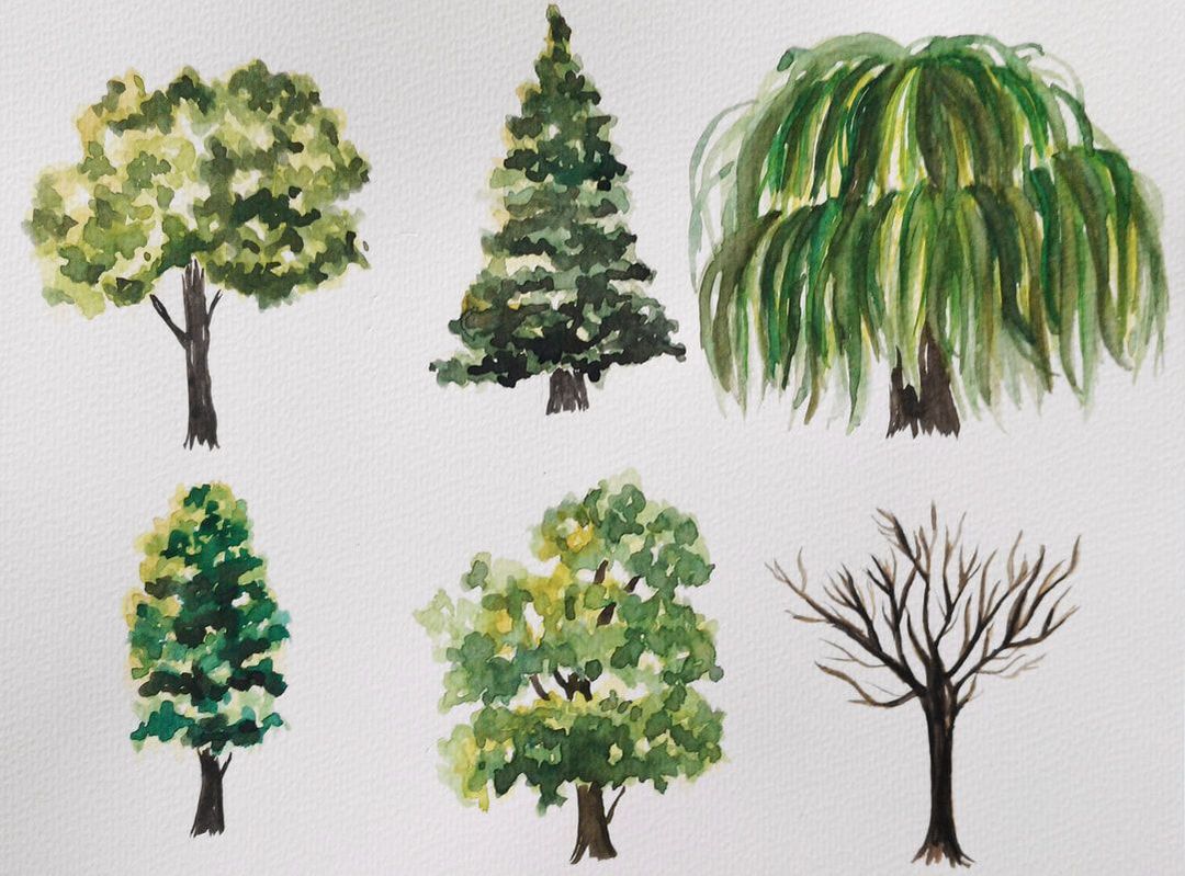
Watercolor tree studies by Erika Lancaster.
Specific colors I used to paint these trees:
- Yellow Ochre
- Cadmium Yellow Light
- Permanent Green Olive
- Ultramarine Blue
- Sepia Brown
Before I end this post, I would like to remind you to have fun creating these studies. Re-do them as many times as you need to.
Enjoy your explorations and embrace imperfection.
Enjoy your explorations and embrace imperfection.

*This post contains affiliate links. I receive small commissions for purchases made through these links at no extra cost to you. These commissions help me keep this site up and running, in order for me to keep providing helpful and inspiring art content. :)
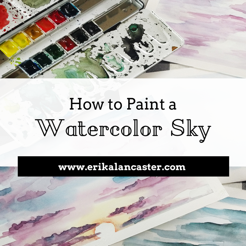
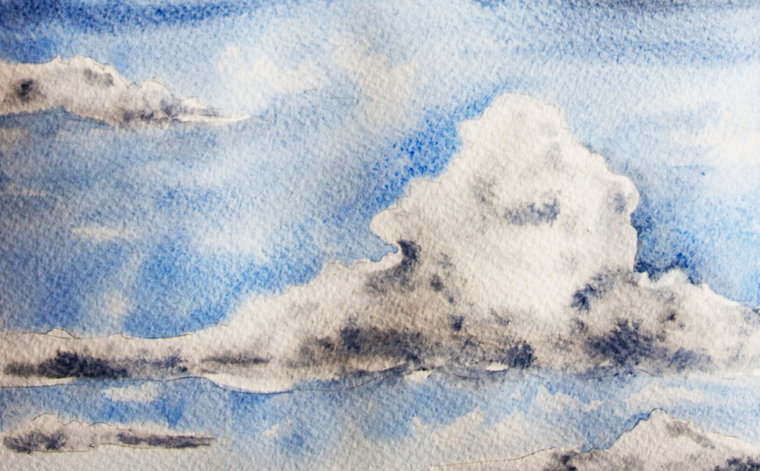
Interested in learning how to create beautiful looking skies that will enhance your watercolor landscapes? What are some different kinds of skies that we can create using this painting medium? Why is it useful to create different smaller studies of skies before actually attempting to paint a complete landscape?
Interested in learning how to create beautiful looking skies that will enhance your watercolor landscapes? What are some different kinds of skies that we can create using this painting medium? Why is it useful to create different smaller studies of skies before actually attempting to paint a complete landscape?
Welcome to the first part of the Watercolor Landscapes for Beginners Series!
Landscape compositions are complex because they are made up of a large variety of elements, layers and effects.
As beginners just starting out with watercolors, we usually still lack water control (check out my Tips on Water Control video over on YouTube) and are unaware of specific techniques that will lead to the effects we want to achieve, which can make painting a complete composition very frustrating and overwhelming!
Due to all of this, I don't recommend looking for full-landscape video tutorials right off the bat. By taking things one step at a time, you are able to build a solid foundation, ensure a natural and more enjoyable progress, and make it a lot more likely to end up with a finished product you're actually proud of.
This is why I've created this mini-series for you. :)
In this series, we're going to be breaking landscapes apart into different commonly used elements or "layers". We will be studying each element individually, or in isolation, before using our learned skills and techniques to create a complete landscape.
Today, we're starting with the furthest "layer" from the viewer in most landscapes, which is the sky. After this, we're moving into elements that are usually located within the foreground and/or middleground.
Check out other parts of the Watercolor Landscape series below!


Supplies you will need:
-Watercolor paper that's at least 140 lb/300 gsm in weight
-Watercolors (basic colors will do)
-Masking tape
-Paintbrushes (at least one larger flat brush and a smaller round brush)
-Rag or paper towel
-Cup of water
-Pencil (I'd recommend an HB drawing pencil)
-Gum eraser
-Watercolors (basic colors will do)
-Masking tape
-Paintbrushes (at least one larger flat brush and a smaller round brush)
-Rag or paper towel
-Cup of water
-Pencil (I'd recommend an HB drawing pencil)
-Gum eraser
|
|
|
|
Tips to Apply in Your Sky Studies
1. Start with your most saturated color at the top and make your color lighter/more translucent as you make your way down.
2. Save your white areas from the start. Do your best to protect these areas as you progress.
3. Allow layers to dry before applying subsequent ones.
4. As you start placing your darker values, make sure you are ONLY adding them were necessary. Stay away from painting large areas of uniform, solid color/value (this leads to flatness and heaviness).
*Your rag or paper towel will be your best friend throughout the process because it allows you to "lift" paint off from your paper if you've placed too much.
If you enjoyed this video and found it helpful, make sure to subscribe to my YouTube channel. I share a brand new video every week with art tips, drawing and painting tutorials and mindset/productivity tips for artists. *Subscribe HERE*
2 Sky Watercolor Studies
Starting time in video: 4:30
-Colors used in this study: Cobalt Blue
-Colors used in this study: Cobalt Blue
Starting time in video: 11:34
-Colors used in this study: Cobalt Blue, Ultramarine Blue, Burnt Umber
-Colors used in this study: Cobalt Blue, Ultramarine Blue, Burnt Umber
Check out my FREE Patreon-exclusive tutorial and class samples here.
Become an art email insider to get immediate access to my Watercolor for the Total Beginner Mini-Course, as well as many more helpful artsy goodies!
I highly recommend working on at least a few different sky studies before moving on to the second part of the series. Take your time, re-watch the video as many times as you'd like, and remember to enjoy yourself as you get to know this medium!
If you've been reading my blog posts for a while, you probably know by now how I am a huge believer in learning to enjoy the process. I think the journey is just as important, if not more important, than the final art piece.
I encourage you to not focus only on creating a beautiful perfect finalized painting, but on spending time studying and experimenting with techniques, subjects and supplies.


*This post contains affiliate links. I receive small commissions for purchases made through these links at no extra cost to you. These commissions help me keep this site up and running, in order for me to keep providing helpful and inspiring art content. :)
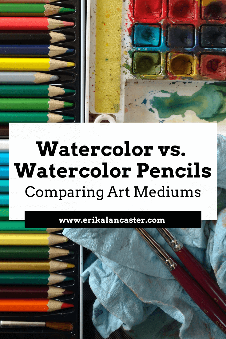
Confused about the differences between watercolors and watercolor pencils? Are you curious if the skills you have acquired with either of these mediums translates into the other? Or, perhaps, you already bought a set of either and don't know how to use them for optimum results?
This blog post will help clear up most of the doubts that revolve around these two water-soluble artistic mediums. I will be comparing the two in terms of preparation of supplies, painting process, and will finish up with a side-by-side comparison of the finished art studies.
While I find it totally awesome that there are constantly new kinds of art supplies being produced and that an artist's options continue to grow, such a diversity in products may be overwhelming at times.
All of these options can cause confusion, not to mention spending money on products that we may not end up using, which is always a bummer.
I'm a huge proponent for encouraging artists to try every type of medium they can. Experiencing supplies first-handedly is definitely the best way an artist can come to conclusions about personal likes, dislikes and overall needs.
Artists have to discover not only what artistic mediums suit their styles best, but also their preference in brands (what may be good for one of us may be terrible for the other).
However, art supplies can be very expensive and I certainly don't recommend investing in a new medium out of whim (unless you have the money to do so).
We don't want to waste our money on materials that we may not enjoy using, which can happen even if the medium at hand is often compared to another which we have experienced and liked.

So, in order to save you some of the hassle, I will share my process as I create a simple painting using both watercolor pencils and watercolor paints. Then, I will compare the final outcomes and explain my conclusions.
This way, you can decide for yourself if either of these is worth looking into. I'll also share some tips and tricks that may help you enjoy these mediums more and achieve more effective results.
To find a list of my favorite art supplies so far, read my blog post titled My Favorite Art Supplies (So Far).
To find a list of my favorite free online photo resources go to my post titled My Favorite Free Image Sites & Two Examples of References with Finished Illustrations.
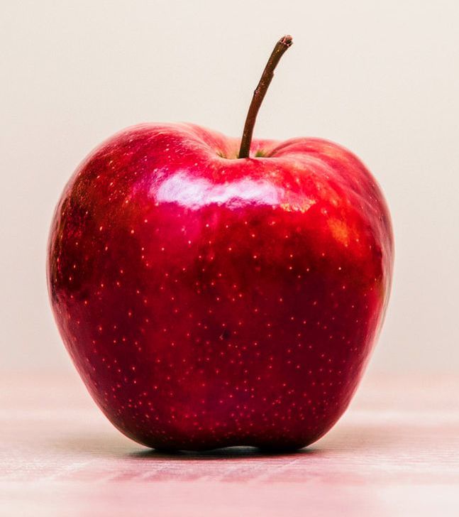
Click on the image to download reference picture.
|
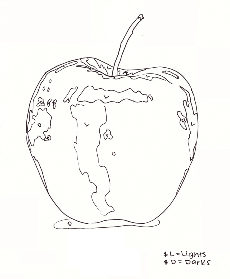
Outline drawing I created showing light and dark areas. Click on image to download pdf.
|
Painting Process Using Both Art Mediums
If you enjoyed this video and found it helpful, make sure to subscribe to my YouTube channel. I share a brand new video every week with art tips, drawing and painting tutorials and mindset/productivity tips for artists. *Subscribe HERE*
Check out this watercolor pencil rose painting video I shared over on YouTube, too!
Check out this watercolor pencil rose painting video I shared over on YouTube, too!
Watercolor Pencil Study
Supplies
-Pencil
-Eraser
-Watercolor paper
-Brush (stiffer bristles)
-Watercolor pencils
-Sharpener
-Water
-Rag (for lifting)
|
|
|
Process
a) Create your pencil sketch lightly and select the colors you'll be using (this will depend on the reference photo you're working with). Lay down your colors as needed, leaving the whitest areas free of color.
Imagine you're using regular colored pencils and start creating color mixtures as you see fit, being careful not to "burnish" or press on your paper too hard. Start off with a good amount of color right off the bat. You really don't have to think about it too much because the color will be moved around.
b) Once your initial layer of color has been added, use a paintbrush with a small amount of water to move the pigment around your paper. I like using a combination of straight/curved paintbrush strokes as well as scrubbing in small, circular motions.
Try to pay attention to where the colors/values are in your reference picture so that you don't drag a color too far from where it should be. Look at your reference continuously.
c) Allow initial paint layer to dry COMPLETELY and place more pigment on areas you'd like to make darker. However many layers of detail you decide to add is up to you, just make sure to allow them enough drying time in-between. Focus on creating needed values, as well as creating washes of color wherever needed.
*When placing your deeper values, it's useful to wet your brush and take the pigment straight off the pencil tip! You can also use a watercolor pencil directly on your wet paper wherever you need a very dark value to be, but make sure that you are careful when doing this because you don't want to damage your paper.
d) Finally, it's up to you if you'd like to use your watercolor pencils to create any final details, outlines or expressive line work that you feel could compliment your painting!
Watercolor Paint Study
Supplies
-Pencil
-Eraser
-Watercolor paper
-Watercolor paints
-Brushes
-Paint mixing palette
-Water
-Rag (for lifting)
|
|
|
Process
a) Create your pencil sketch lightly and prepare the colors you will be using (this will depend on the reference photo you have selected). Prepare your color palette by either taking some amount of pigment from your paint set and mixing it with water to create a few different values, or by creating color mixtures yourself.
b) Start laying down your first layer of paint, making sure to leave the lightest areas free of color. Start with your lightest and most transparent layers of paint.
c) Allow each layer to dry before moving on to the next. Remember, the point is not to cover your previous layer of paint, but to go on adding deeper values only where you can actually see them in your reference picture.
The amount of layers you create is up to you (depending on how detailed you want your painting to be). Remember to look at your reference image continuously.
Comparing Finished Studies
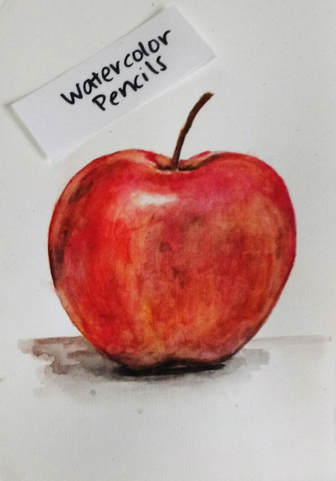
Apple watercolor pencil painting. Magicfly watercolor pencils on Cold Press 140 lb. Art-n-Fly watercolor paper.
|
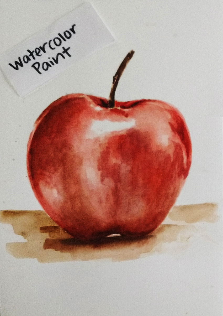
Apple watercolor painting. Sakura Koi watercolor set on Cold Press 140 lb. Art-n-Fly watercolor paper.
|
Differences
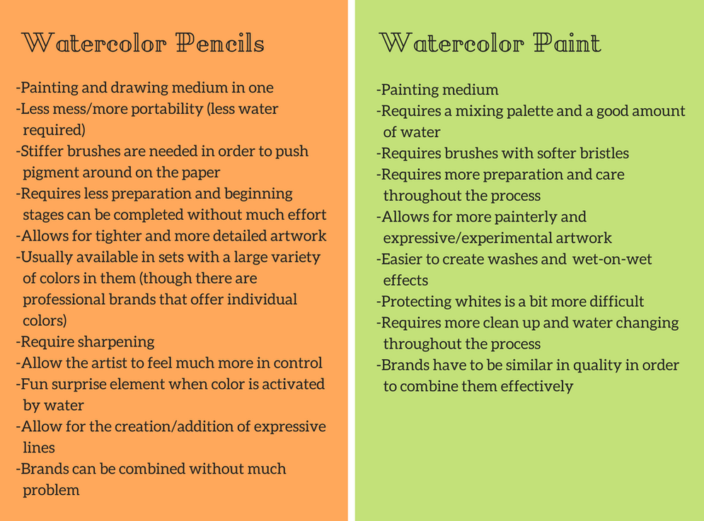
The main difference between these two art mediums is that watercolor pencils are a drawing and a painting medium in one, when watercolor paint is only a painting medium. Furthermore, supplies needed are a bit different in that watercolor pencils require paintbrushes with stiffer bristles so that pigment can be effectively moved around the paper.
No color mixing palette is needed with watercolor pencils, as the mixing happens right on the paper. However, we do need a sharpener.
In terms of process, the main difference noted is that the beginning stages of a watercolor pencil piece don't require as much thought and care as a watercolor painting piece does.
Though I really recommend pre-selecting and preparing colors before starting with either medium, a watercolor painting involves creating sets of values and mixtures on a palette.
Also, when laying down initial colors in a watercolor pencil project, the artist doesn't have to worry about being so precise because the color is going to move around a lot.
By comparing my finished studies side-by-side, we can conclude that watercolor pencils allow for a more controlled and tighter outcome when compared to the watercolor painting piece.
Most of the time, some amount of line work will remain visible at the end when using watercolor pencils (I did my best to soften most line work in mine because I wanted to go for a painted look).
The watercolor painting has more of a luminosity to it, which may be related to the fact that I have more experience with this medium than with watercolor pencils. Also, brush strokes are a lot more visible, which create a more painterly effect.
Watercolor pencils are generally less messy and offer a solution for artists who want to create watercolor effects without the hassle of clean up. They can also be more portable,and don't require setting up a painting station when creating artwork in plein air.
Differences between watercolor pencils and watercolor paint.
Similarities
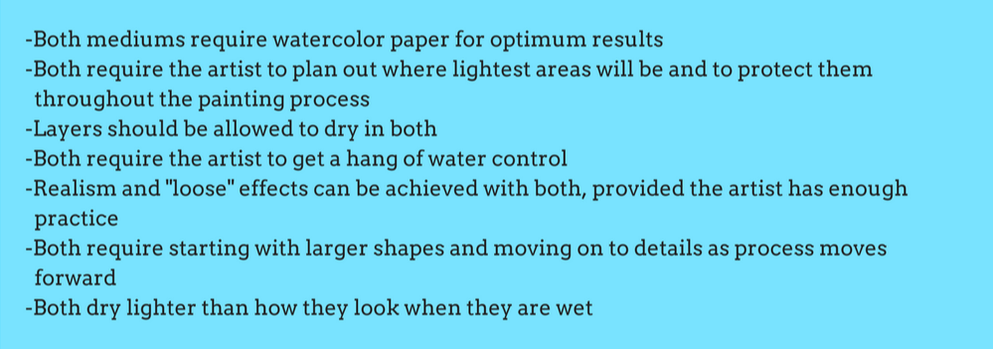
Because these mediums are water-soluble, both require watercolor paper for optimum results, as well as drying time in-between layers. It is also necessary for the artist to plan and protect the lightest areas before starting, in order to achieve effective luminosity and form.
However, generally speaking, watercolor pencils require less water throughout the painting process which gives the artist more control and makes it somewhat easier to protect the whites.
Both mediums have their learning curves in regards to water control, but once the artist has enough practice with them, realism and more expressive "loose" effects can be achieved with both.
Also, both mediums dry lighter than they look when they are wet, but color payoff will vary greatly depending on the quality of supplies used. Both allow lifting to a certain extent, which can be used to correct some mistakes.
Finally, both mediums require a certain amount of research in order to find quality products at affordable prices. Using lower quality products can lead to frustration and disappointment.
Similarities between watercolor pencils and watercolor paints.
Final Thoughts
Though watercolors and watercolor pencils are often compared due to their water-soluble properties, they are different in terms of how they are used and may lead to artworks with very different characteristics.
Depending on the artist's individual style and preferences, he/she may find one medium much more enjoyable than the other.
I personally wouldn't recommend watercolor pencils to artists that are specifically interested in painting techniques.
However, watercolor pencils present a versatility that may be very appealing to artists that enjoy sketching/drawing and line work, as well as those looking to combine different techniques into one same project.
| apple_outlines_watercolor.pdf |
| apple-unsplash-reference_1.jpg |


*This post contains affiliate links. I receive small commissions for purchases made through these links at no extra cost to you. These commissions help me keep this site up and running, in order for me to keep providing helpful and inspiring art content. :)
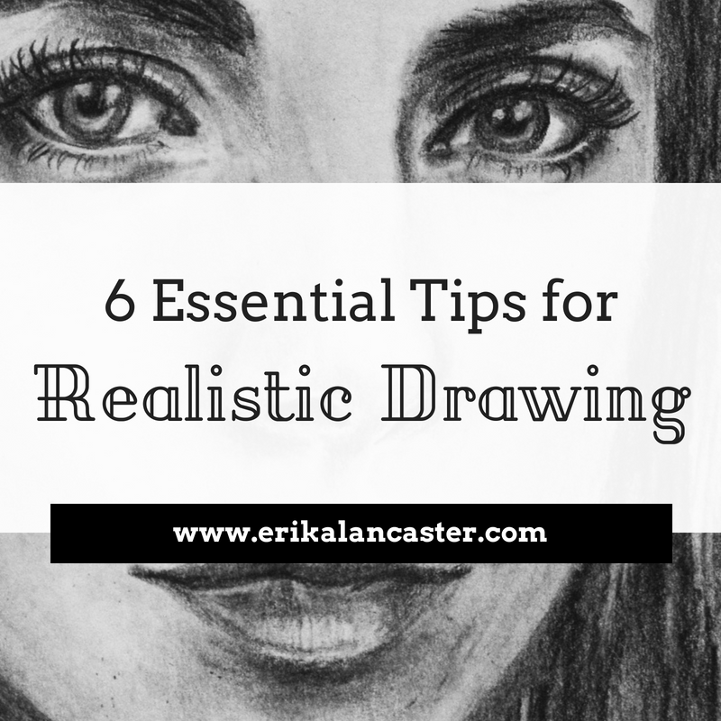
Do you feel your portrait drawings or paintings lack realism, even though you've thoroughly understood facial proportions and placement of elements within the head shape? Do you get stuck when trying to draw realistic eyes, noses, lips, or any other part of the face?
In this post, I'll be explaining why it's so important to study each facial feature in isolation when we're trying to improve our portrait drawing or painting skills. I will also be sharing how I personally like to create facial feature studies in my sketchbook.
Check out the video time-lapse included within this post to see me paint a few monochromatic/grayscale eye studies using black watercolor paint. In this YouTube video, I also share five essential things I make sure to keep in mind when creating realistic eyes.
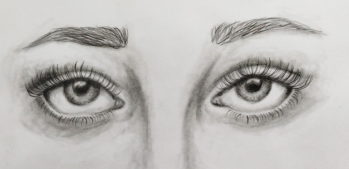
Realistic eyes drawing with pencil. Sketchbook study by Erika Lancaster.
Why Study Facial Elements in Isolation?
Drawing a face is a complex process because, like any other part of the human anatomy, it is made up of so many different parts!
The large variety of expressions a face could have, as well as the positions the human head can be in, create an insane amount of variables that can make drawing a portrait very difficult.
Not to mention, there is an endless combination of face shapes and shapes/sizes of individual facial features!
This is why it's so important to take time to dissect and learn about each feature individually. If you're studying eyes, for example, take time to understand their different parts and make notes of important characteristics.
Look up videos and collect pictures in order to better understand how they are located within the human head, how they move/work and what kinds of shapes they can have.
By making time to analyze and draw eyes, noses, lips, and ears individually, you are not only improving your drawing skills, but preparing yourself to create more effective portraits later on. Not to mention, the process will be much less intimidating for you and you'll be able to work a lot faster.
Have you already studied the basics of facial proportions and how to draw facial elements in their simplest form? If you haven't, I highly recommend you check out my How to Draw a Face for Beginners blog post. In it, I share basic information on drawing portraits that you should grasp and practice before moving on to higher levels of realism.
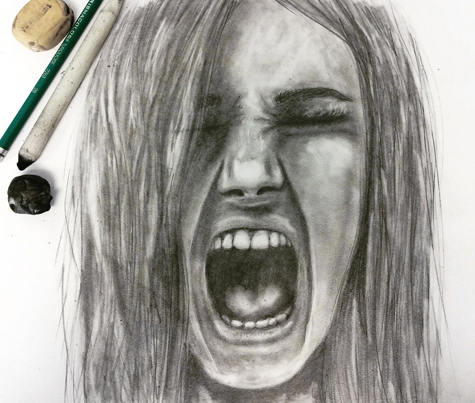
Girl screaming drawn with pencil by Erika Lancaster.
It's important to know that, even if you're not intending for your personal art style to be completely realistic, you should make time to study how things actually look like in real life. This knowledge and experience will give you a solid foundation to work off of and will enhance anything you decide to do later on.
I've written a couple of blog posts in the past that you should totally check out! If you're just starting to draw faces, I recommend my step-by-step tutorial titled How to Draw a Face (for Beginners).
If you've already understood basic facial proportions as well as location of facial features and are looking to start drawing faces in different angles, I totally recommend last week's blog post titled How to Effectively Draw Faces at a 3/4's Angle (My 4-Step Process and Practice Freebies).
If you enjoyed this video and found it helpful, make sure to subscribe to my YouTube channel. I share a brand new video every week with art tips, drawing and painting tutorials and mindset/productivity tips for artists. *Subscribe HERE*
My Method for Studying Facial Features
1. Collect high quality close-up photographs of the specific facial feature
I usually like creating anywhere from three to five studies in one sitting, but do whatever you can with the time you have. Collect good photographs to work from! A great tip is to pick images that include the facial feature at hand at different angles/perspectives, as well as in different types of lighting.
2. Prepare drawing or painting supplies
For my studies, I'm currently sticking with pencil and/or black watercolor. This allows me to focus on value placement, texture and form. I suggest bringing in color only after one has succeeded at achieving realism using grayscale or monochromatic schemes.
Practice using whatever drawing supplies you are already comfortable with, so that you can focus on studying the facial features, and not on practicing a specific technique. These are two different things!
I really believe that the most basic drawing supplies will get you far. You don't need anything fancy to create awesome-looking drawings. Here are a few of the drawing tools I use for my own drawings/sketches.
|
|
|
3. Take time to really observe each picture before starting
Pinpoint darkest and lightest areas, irregularities, as well as forms. Notice the shadows created by the different planes of the facial element. Take notes if this will help you remember these things as you're drawing or painting.
Check out my blog post titled My Favorite Free Image Sites to find beautiful, high quality reference images for your art!
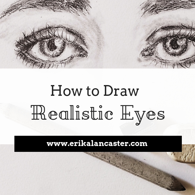
4. Draw main shapes and lines using light pencil strokes
Now is not the time to move into any details. Focus on recreating the largest shapes and lines you see. When drawing an eye, for example, I start with the shape created by the visible part of the eyeball, then I move on to the pupil, iris, tear duct, and the general shape of the eyebrow (no hairs yet!).
Check out this past blog post on my step-by-step process for drawing eyes.
Also create the tiny shapes of white reflection that are almost always visible on the pupil and iris to remind yourself that they should be left white. The only line I draw at this point is the one created by the crease of the eyelid.

5. Develop your values
Create your values patiently and in layers of graphite. Constantly observe your reference picture and recreate what you're actually seeing. Don't guess!
You really don't want to exert much pressure on your paper at all, as this will lead to visible scratch marks that you won't be able to fix. By using the right pencil grades throughout the process (which I explain all about in my free Drawing Mini Course for the Total Beginner), you'll be able to develop dark values without having to press down much at all.
If you do use burnishing techniques, make sure to leave them until the very end.
Practice discerning between lightest, darkest and midtone areas in your image. If you're studying eyes, for example, one of the darkest areas is going to be the pupil and perhaps areas along the crease of the eyelid.
Make sure that you protect your lightest areas as best as you can when working on your values. If you're using pencil, it's very useful to have a good eraser at hand (preferably a thin one) in order to go back in at the end and lighten any areas that were darkened by accident. To learn about the types of erasers I personally use, visit my blog post titled My Favorite Art Supplies (So Far).
*If you decide to do these studies with watercolor, it's important to allow your layers to dry before continuing to add more details or darken certain areas. I love working on several sketches simultaneously so that I'm able to jump around and keep working while allowing another study to dry.
6. Create any final details
Leave the final details until the very end, once values have been effectively developed. In the case of drawing or painting eyes, it's very important to leave the eyelashes until the end! *Watch the video included in this post to learn tips about drawing eyelashes, as well as five essential things to have in mind when drawing eyes.
Check out this blog post that I've shared on How to Draw Realistic Hair.
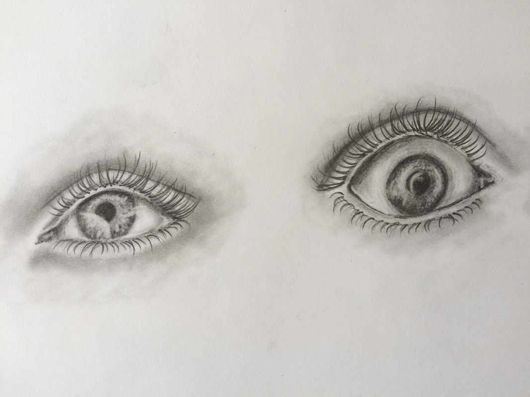
Pencil eye studies by Erika Lancaster.
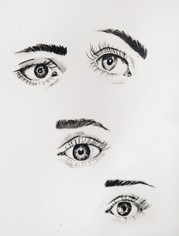
Watercolor eye studies by Erika Lancaster.
Which facial feature do you find most difficult to draw? For me it's noses! Let me know in the comments section below.


www.erikalancaster.com
is a participant in the Amazon Services LLC Associates Program, an affiliate advertising program designed to provide a means for sites
to earn advertising fees by advertising and linking to amazon.com.
www.erikalancaster.com
is a participant in the Shareasale.com Affiliate Program, an affiliate advertising program designed to provide a means for sites to earn advertising fees by advertising and linking to Shareasale.com partner companies.
 RSS Feed
