*This post contains affiliate links. I receive small commissions for purchases made through these links at no extra cost to you. These commissions help me keep this site up and running, in order for me to keep providing helpful and inspiring art content. :)
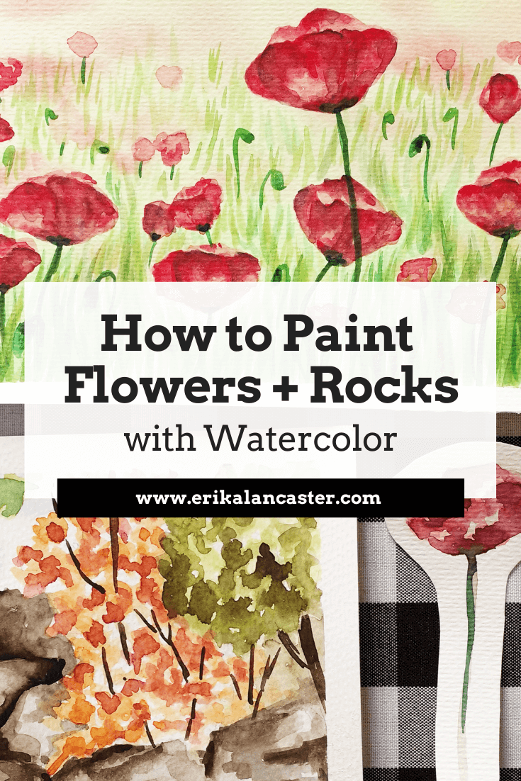
Would you like to start adding details to your watercolor landscapes but don't know how to go about it? Have you found a great reference photo you'd love to turn into a painting, but are unsure about the process? Are you happy with the way you start a painting but grow frustrated as you move along? Welcome to the third part of the Watercolor Landscapes for Beginners Series!Flowers, rocks and grass may seem like small parts when one thinks of a landscape painting, but these natural elements have the ability of adding color and areas of interest to this type of composition. The way we decide to include and render these details can, pretty much, make or break our paintings. When I was first starting to paint landscapes using watercolors, I was full of questions: Am I supposed to paint smaller details directly on my white paper or on top of my first, second or third layer(s) of paint? How much time am I supposed to spend on each little detail in order to make a great painting? Is it best to finish one area entirely and then move on to the next or can I work on everything simultaneously? How dark do I have to get in order to achieve good form and contrast? What is the best way to create my darker color values? Where, exactly, am I supposed to use the wet-on-wet technique and where can I use wet-on-dry? How can I create a believable texture for that particular object? The questions were endless! Throughout the time I've been using this medium, I have found that there are many ways to go about creating a great-looking painting, provided the artist has a good understanding of Art Fundamentals and is aware of the particular characteristics of watercolors. If you're just getting started, I would highly recommend checking out my Watercolor 101 course over on Gumroad. It includes everything you should know about this tricky medium, as well as essential exercises that will help you progress faster. In this post and the video included here, I will be sharing my personal tips and tricks, as well as the process I go through to create believable and aesthetically pleasing landscapes. By understanding these principles and working on your own studies, you'll be able to create great work in no time.
|
|

Princeton Neptune Watercolor Brushes

Scott Shop Absorbent Towel
|
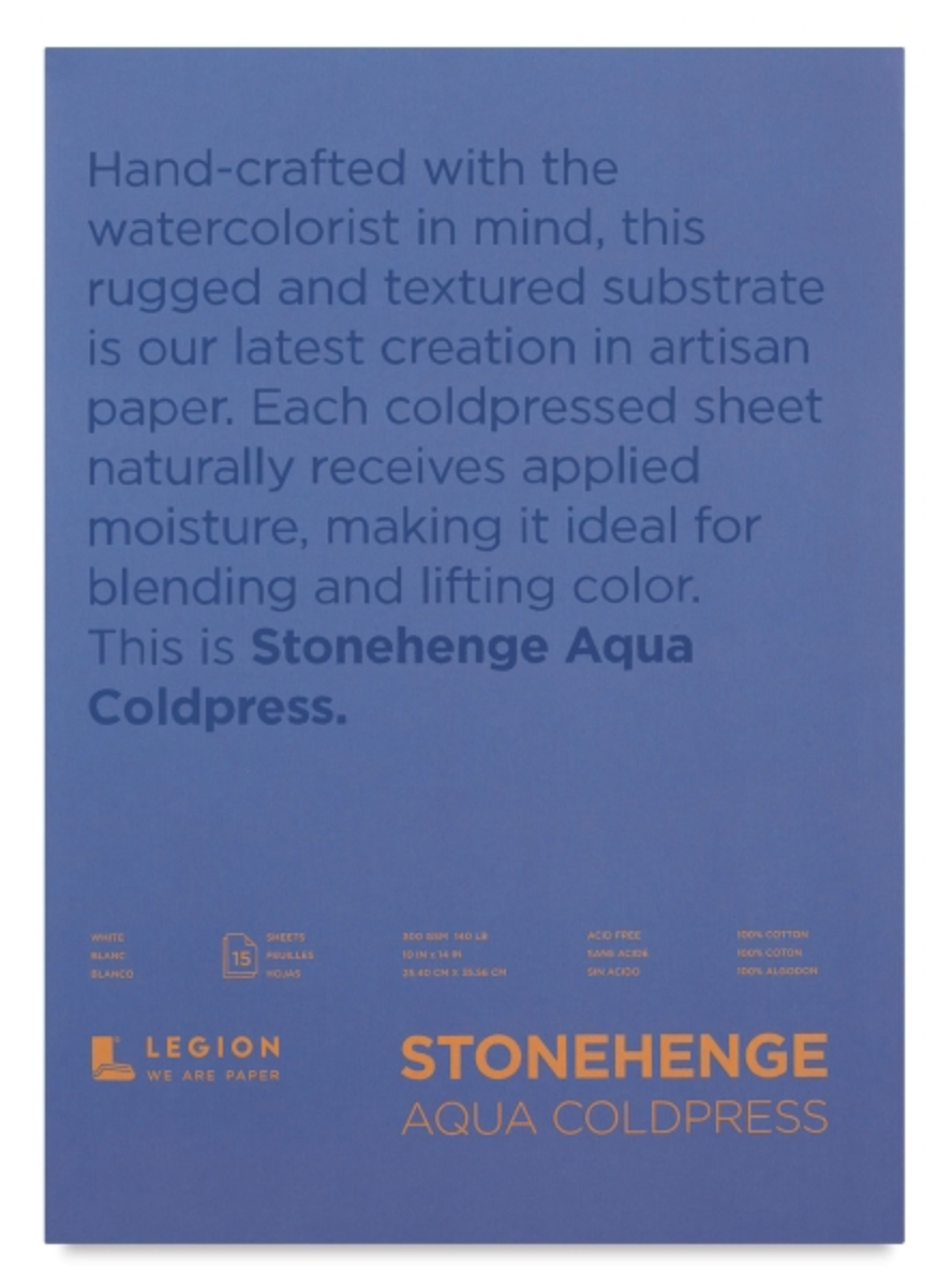
Stonehenge Cold Press Watercolor Paper
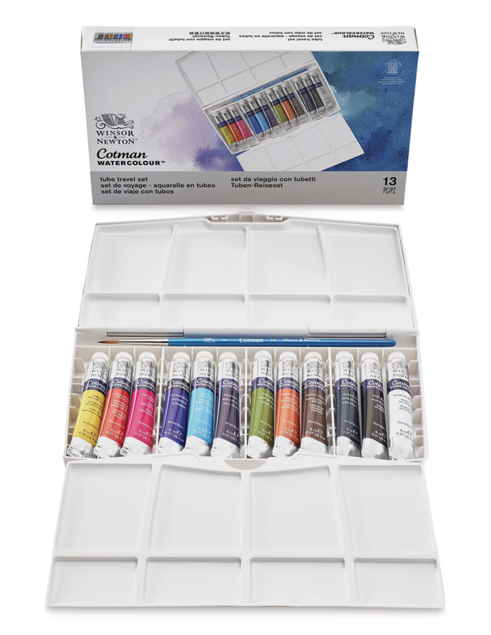
Winsor & Newton Cotman Watercolor Set
|
Reference Images Used
For these studies, I found a couple of high quality photographs online that included the specific elements I wanted to study (flowers, grass and rocks). As always, I went for my trusted online free image sources Pixabay and Pexels.
I highly recommend these websites if you're looking for beautiful reference pictures to work from!
*Note: I used these pictures loosely and wasn't trying to copy them exactly.
You can find my other favorite free image sources in my blog post titled My Favorite Free Image Sites & Two Examples of References with Finished Illustrations.
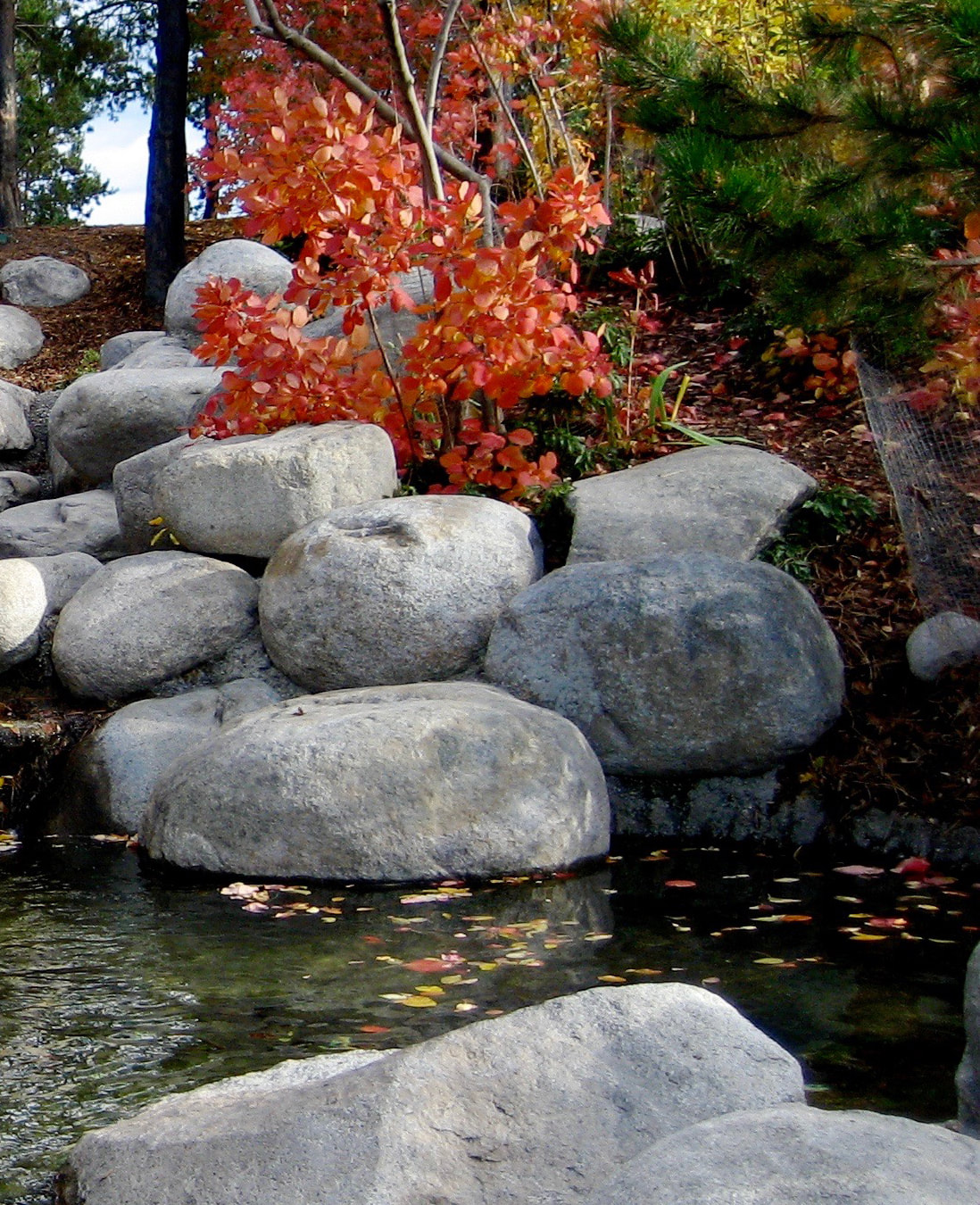
Focusing on only this area of the picture.
|
Because I'm mainly using this image to practice rocks, I decided to open it in Photoshop and crop out a section that I thought would make for a nice little painting. This allowed me to focus on the subjects I wanted to practice. |
Painting Process
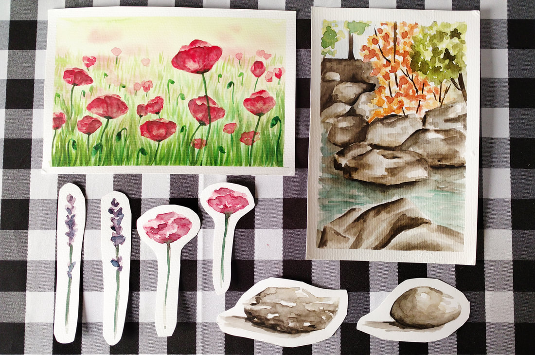
Watercolor Poppy Field
1. Before actually starting with my complete painting, I created individual studies of two of my favorite landscape flowers.
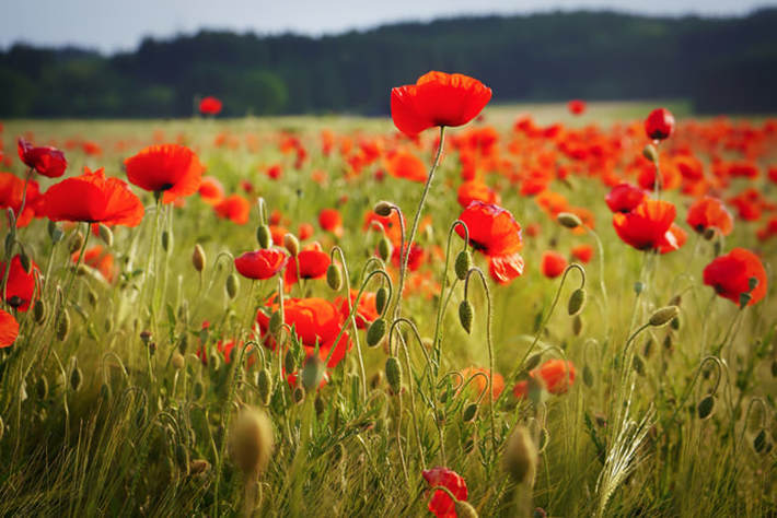
2. After deciding I wanted to create a field of Poppies, I looked for a high quality picture online that included a good amount of them in it. It's important to develop an eye for what images could possibly lead to nice looking paintings.
3. I taped my watercolor paper onto a thick piece of cardboard and, using the wet-on-wet technique described in the first video of this series, I created a blurry background effect using yellow and light green.
While wet, I dropped in a few dots of my red Poppy flower mixture because I wanted my furthest flowers to appear blurred out. I allowed my first layer to dry completely.
4. I started adding in very loose and irregular red shapes that would later be turned into the tops (or petals) of the Poppy flowers. At this point, I started using deeper red color mixtures with a less amount of water in them, but I still didn't go too dark, taking it one step at a time.
I made sure to add just enough shapes for it to look like a field of Poppies, but not too many that it would look too crowded. It's SO important to know when to stop!
5. I jumped around from flower to flower, adding in deeper red values carefully. I created the illusion of separate petals by placing few curved lines here and there. The darkest hue used within the petal area was created by adding in blue to my red mixture.
As always, my darkest values were placed very deliberately and only where needed (see reference image at all times).
6. I started adding in individual blades of grass using a medium green paint mixture and clean upward motions (using my thin round brush). I created the effect of realistic depth by making the blades of grass smaller as they got closer to the horizon line (further from the viewer).
7. Once I had added the first layer of grass, I allowed it to dry and went back to work on my Poppies. To soften some of the noticeable darker shapes left within the petal areas, I wet my brush with clean water and did gentle scrubbing. I did this only here and there.
8. I created a deeper green value and painted the flower stems, more grass, as well as flower buds scattered throughout. To create a sense of depth, I made sure to leave the most crisp-looking and vibrant green blades of grass closest to the viewer and the most translucent ones closest to the horizon line.
I also made sure to add at least a bit of a darker green to my flower buds in order to transmit a more believable sense of form.
Specific colors I used for this study:
- Lemon Yellow
- Permanent Green Olive
- Cadmium Red Light
- Permanent Carmine
- Ultramarine Blue

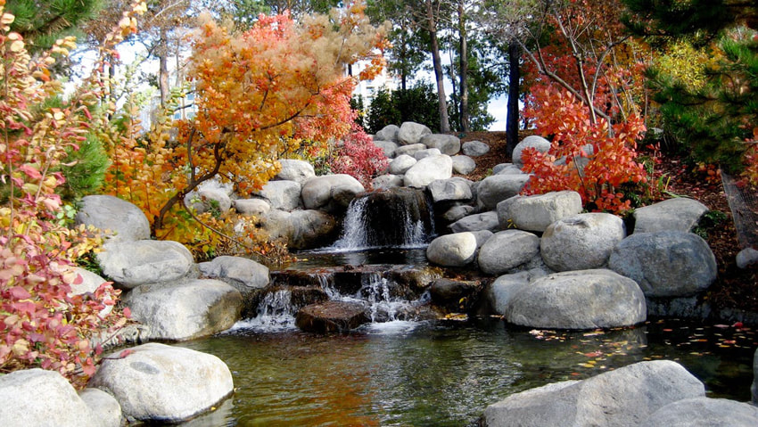
Watercolor Rocky Creek
1. I opened my reference photograph in a photo-editing software and cropped an area that would allow me to focus on painting rocks. Using a pencil, I created a very light sketch on my watercolor paper, getting inspired by the image but not fussing to much about drawing it exactly the same.
2. I wet the entire rock area and started laying down my first and most translucent paint mixture, making sure to leave small areas free of pigment. Saving small white areas is very important when creating believable stones and rocks.
3. I jumped from one rock to the other deepening values and then allowed them to dry while I continued with the other areas of my painting. *Please refer to the first two blog posts/videos of this series if you'd like to know more about how I paint skies, water and trees.
4. I went back to my rocks, deepening values and creating a sense of shadow behind and between the rocks. At this point I also softened some of the transitions between my values by doing my scrubbing technique with a clean brush.
Specific colors I used for this study:
- Sepia Brown
- Ivory Black
- Yellow Ochre
- Cadmium Yellow Light
- Permanent Green Olive
- Cadmium Red Light
- Permanent Carmine
- Ultramarine Blue


Hi Leah,
I'm glad you found it helpful! Painting landscapes can definitely be a challenge due to the large amount of elements within them and the sense of perspective, form and depth that have to be created!
I really hope these posts have helped demystify them a bit!
Thanks for coming by and taking time to comment! :)
You are really great. Like really really amazing. I love the voiceover on your video. You provided a lot of useful information and tips. Almost makes me want to visit Michael's and buy some supplies. Hahah
Hi Andrea,
YOU'RE amazing and you can TOTALLY do this! :)
I really hope that you buy those supplies and give it a go! Creating art is simply one of the best experiences that you can have and it makes me happy to know that my posts/videos are inspiring you!
Go for it, my friend! And let me know how it goes!
Have a wonderful weekend!
Hi Irena,
I'm sure you can get to the level of painting you'd like to be at if you practice a bit! Thank you for your lovely comments and for taking time to visit!
Do let me know if you try out some of these studies and how they go for you. :)
Have a wonderful day!
I love this! I think watercolors are absolutely beautiful, but I always get nervous that my art doesn't look right. I truly believe it's the detail that make something beautiful and I just don't have that. This is inspiring, I will have to try some of your tips!
Hi Erin,
I truly hope that I've inspired and motivated you to get those watercolors out! You can do it! I really believe that part of the "trick" of becoming an artist is not being afraid of mistakes and challenges!
It's all in the exploration and experimentation and believing that even though maybe you don't end up with the result that you were initially intending, you've learned something about yourself and the medium and this will improve your work in the future!
Go for it and let me know how it goes for you! :)
Leave a Reply.


is a participant in the Amazon Services LLC Associates Program, an affiliate advertising program designed to provide a means for sites
to earn advertising fees by advertising and linking to amazon.com.
www.erikalancaster.com
is a participant in the Shareasale.com Affiliate Program, an affiliate advertising program designed to provide a means for sites to earn advertising fees by advertising and linking to Shareasale.com partner companies.
 RSS Feed
