*This post contains affiliate links. I receive small commissions for purchases made through these links at no extra cost to you. These commissions help me keep this site up and running, in order for me to keep providing helpful and inspiring art content. :)
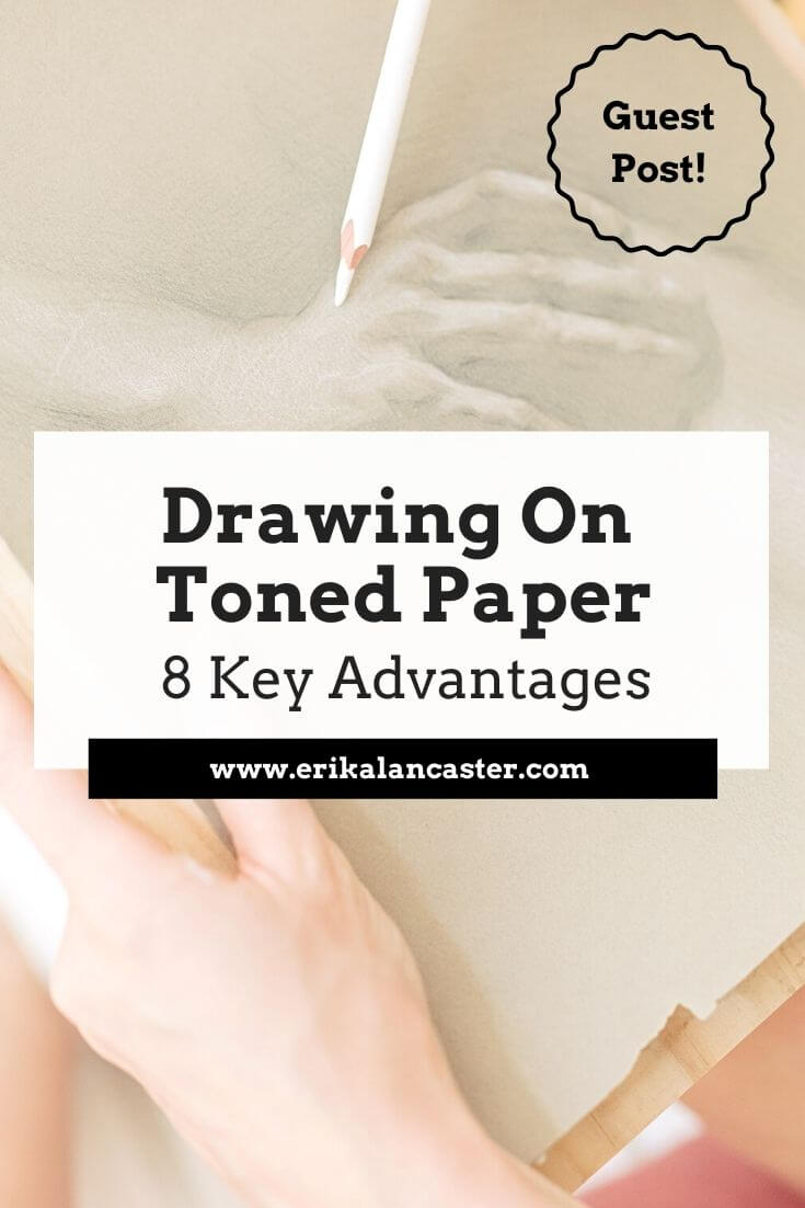
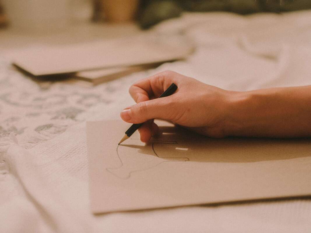
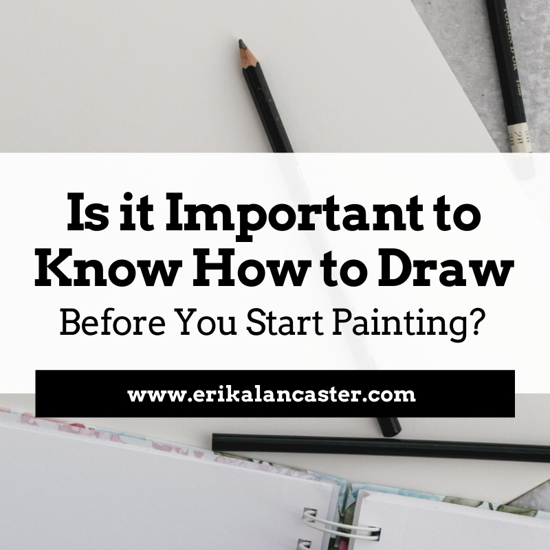
What's the difference between drawing on white paper vs. drawing on toned paper? Will drawing on toned paper help you improve your art skills faster? What advantages does this type of drawing/sketching substrate have? As I've explained in past blog posts and YouTube videos, I 100% believe that drawing is the basis for all kinds of art. Through drawing, we're not only able to increase our knowledge and skills with essential art fundamentals such as perspective, 3D form and value, but we're also able to develop basic skills such as our observation and our hand-eye coordination. To read more about how drawing will improve your painting skills, check out this blog post. As a painter, I make time for my sketching practice routinely, as I know this will positively impact my painting, and it is incredibly fun and enriching to explore new tools and substrates. Today, I'm excited to share another great guest blog post that sheds light on why drawing on toned paper can help us continue developing our art skills. Emily Clare is the artist and author behind the Fine Art Tutorials website, which is a great educational resource for art enthusiasts looking to improve their skills with drawing and painting. Over at her website, you can find step-by-step guides, beginner-friendly tutorials, and interviews with professional artists. Clare is primarily a painter working with oils, but just like me, she loves working with a range of drawing and painting mediums. Her interest in art began at a young age, when she started drawing portraits. Today, her subjects of choice are landscapes and seascapes. Let's jump into her article! 8 Advantages of Drawing on Toned Paper
by Emily Clare
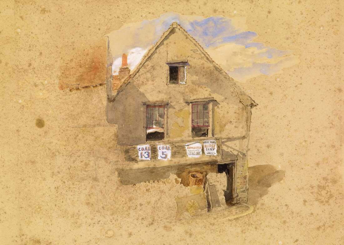
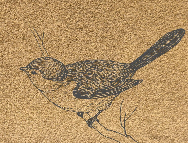
When it comes to choosing the right paper for drawing, there are a lot of options to consider. The color of the paper you choose can greatly impact the finished look of the drawing. Toned paper is a great substrate for artists to work on and if you've not tried it before, it's worth experimenting with. Toned drawing paper usually comes in cool gray tones and warm brown tones, so pick the one you think will work best for your kind of artwork. In this blog post, we will explore 8 advantages of drawing on toned paper. Keep reading to learn more! 1. You can work much faster
|
|
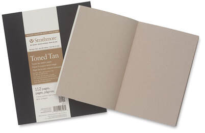
Strathmore Softcover 400 Series Toned Sketch Artist Journal
|
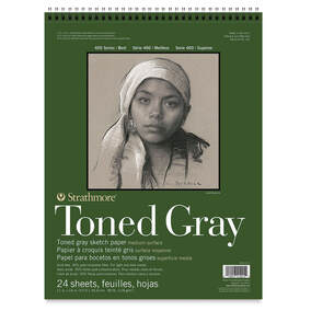
Strathmore 400 Series Recycled Toned Sketch Wirebound Pads
|
You can use a variety of different drawing tools on toned paper including chalk, conté crayons, pastels, charcoal sticks or pencils, and regular colored pencils.
You can protect your artwork and keep it from smearing, with a fixative.
I hope this post was helpful and inspiring!
Thanks so much to Emily Clare for so generously sharing all of this useful information with us.
Thank you for reading and I wish you tons of progress and enjoyment in your art journey.
I hope this post was helpful and inspiring!
Thanks so much to Emily Clare for so generously sharing all of this useful information with us.
Thank you for reading and I wish you tons of progress and enjoyment in your art journey.
6 Comments
*This post contains affiliate links. I receive small commissions for purchases made through these links at no extra cost to you. These commissions help me keep this site up and running, in order for me to keep providing helpful and inspiring art content. :)
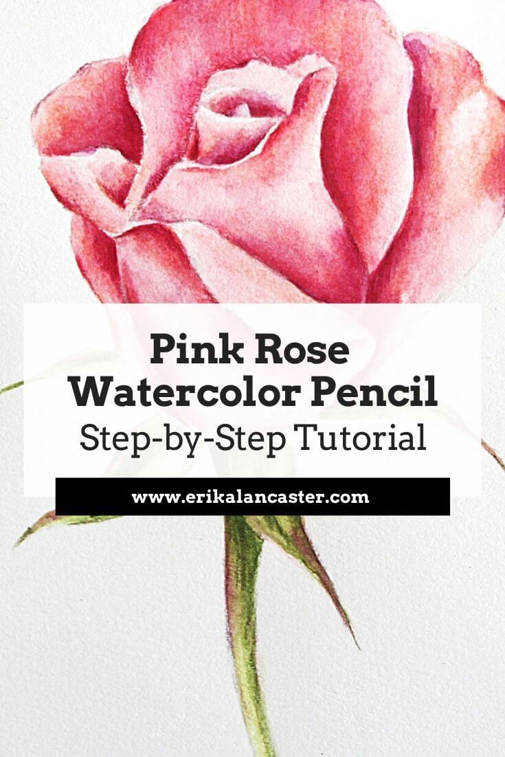
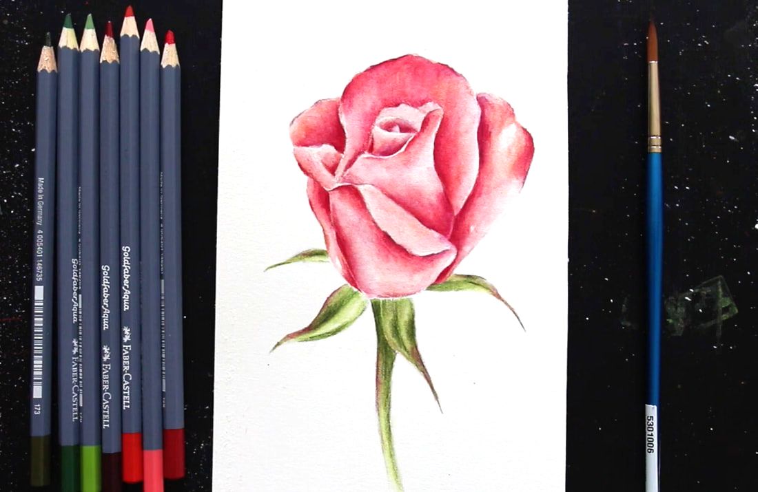
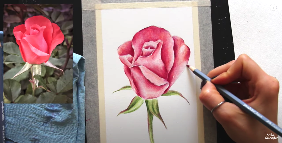
Interested in developing your skills with watercolor pencils? Wondering how to paint realistic flowers that show depth and dimension with this versatile medium?
In this step-by-step tutorial for beginners, I take you through my entire process for developing botanical paintings using watercolor pencils.
I share everything, from how I choose my colors for a smoother painting process, how to activate pigment with water for a painterly effect, and how I do my layering to develop higher levels of realism without overworking my paper and maintaining the glow that's so unique to watercolor.
Along the way, I share tons of must-know tips and tricks that help me arrive at great results, every time.
Before jumping into the Pink Rose tutorial, if you're just getting started with Watercolor Pencils, I would highly recommend checking out this very thorough video where I share tons of must-know information on this medium that'll help you make much faster progress:
If you enjoyed this video and found it helpful, make sure to subscribe to my YouTube channel. I share a brand new video every week with art tips, drawing and painting tutorials and mindset/productivity tips for artists. *Subscribe HERE*
Ready? Let's jump in!
Ready? Let's jump in!
*Download pink rose reference photo from Unsplash.com here.
Recommended watercolor pencil sets:
Student-grade
Faber-Castell Goldfaber Aqua
Derwent Academy Watercolor Pencils
Professional
Faber-Castell Albrecht Dürer Studio Watercolour Pencils
Derwent Watercolor Pencils
Caran D'ache Museum Aquarelle Pencil Sets
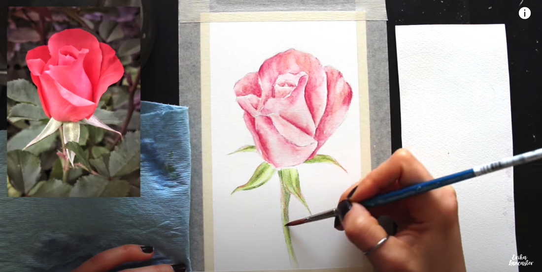
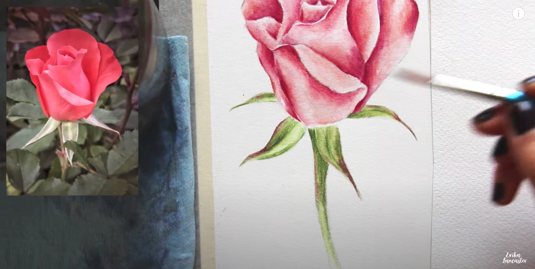
Watercolor Pencil Pink Rose Steps
1. Choose your colors wisely before starting
Observing my reference photo, I chose a few different pinks, reds and greens from my watercolor pencil set that I thought looked similar to the hues I saw.
When we're going for higher levels of realism, it's essential to take time choosing our colors and testing them out on a scrap piece of paper to ensure they will help us arrive at the results we're after.
This will help us stay away from undesired effects and muddy colors.
It's also important to decide how you'll be developing different values in each area (lighter areas, midtone areas and darkest areas), as developing a wide range of values (or tones) is key for any level of realism.
In the video above, you'll see how I prepared myself with light, midtone and darker colors I'd be using to develop color and value in the pink petals, as well as light, midtone and darker colors I'd be using for the green stem and leaves.
Consider testing out the colors you'll be layering together in the darkest areas on your scrap piece of paper to make sure they create colors you like before doing this layering in your final piece.
Also, if you'd like to play with color temperature in different areas, pay attention to whether the colors you're choosing from your set are warm or cool-biased.
I'd recommend limiting the amount of colors you'll be bringing in to avoid overwhelm or confusion throughout the process.
Simple is often best, and you don't need a large variety of colors to arrive at great results or high levels of realism.
Once I've tested my colors and have chosen the ones I'll be working with, I stick to using only those.
2. First layering of pigment in the petals
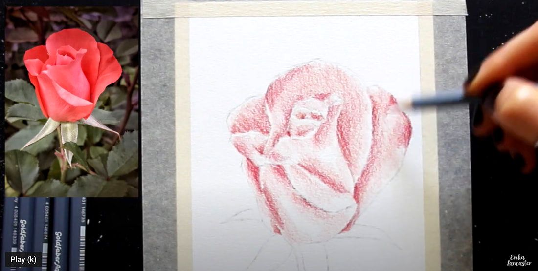
Whether I'm working with traditional watercolor paint or watercolor pencils, I always work from lights to darks in each area.
Before starting, I always observe where the lightest areas and darkest areas are in the reference photo.
The lightest sections (highlights) are areas/shapes that I'm going to do my best to keep protected throughout the process, with little-to-no color in them. This way, the whiteness of the paper can shine through and stand in place for my highlights.
Because the white paper is standing in place for the highlights and is helping us develop lighter values, no white color is needed. This is the same when we're working with traditional watercolor paint.
The darkest shadow areas are where the color will be layered on more and where the white paper will be covered up more.
Starting with the petal portion, I begin layering my first/lightest color (my pink) all throughout, excluding only the lightest areas I see in the reference photo. These lightest highlight areas (highlights) I leave free of color and are areas I want to keep protected thought the process.
Once the pink is in, I switch to my first red (the lightest one), and I layer this first red in the midtone and darkest areas I'm able to see in the reference photo. I leave sections of lightest values free of this second color.
Even though I don't really press down hard at any point throughout this process because I don't want to scratch or damage my paper, I make sure to release any pressure I'm exerting gradually as I move out from the darkest areas and into the light areas.
This helps me create gradients and soft transitions.
With the second color layered on, I switch to my next, darker red, and continue with the layering process, making sure to only place this darker red in deep shadow areas I'm able to see in the reference photo.
As you're developing these different values, bring to mind the three-dimensional structure of the rose, as well as overlapping petals creating shadows on each other and curving/curling petal sections that may be catching more or less light.
Ask yourself where the light source is in relation to the subject, and how this light source can have an impact on the values/tones you see throughout it.
3. First color activation in the petals
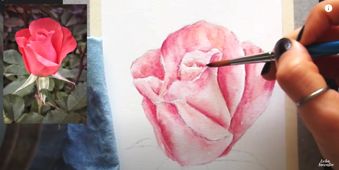
Using my size 6 round brush, I take a little bit of water at a time from my container and start activating my color, section by section.
When activating watercolor pencil pigment, it's essential to stay on top of water control or you risk messing up the values you've already developed.
Use your absorbent towel to help you stay on top of water control.
Throughout the process, I'm constantly blotting the tip of my paintbrush on my towel to remove excess water and paint, and I use it to do any lifting/absorbing of too much water I've accidentally placed on my paper, or to lift too much color if I feel I've flattened a section out too much.
As you're activating your color, start with your lightest areas and make your way towards darker areas. This way, you can keep your darker colors where you need them and you'll avoid pushing/pulling these darker colors into lighter areas.
Darker colors will very easily "eat up" your lighter colors. Plus, it's always going to be easier to go in and darken, than it is to go in and lighten.
So take it slow.
Keep an eye on how much pigment is collecting in your paintbrush bristles as you're activating your color.
As soon as you see you're pushing way too much pigment around, remove that color from your bristles by swiveling your paintbrush in your water, blot your bristles gently on your towel, and pick up where you left off.
It's also essential to continue observing your reference photo as you're activating your color in order to continue differentiating between values/tones present throughout the sections you're activating.
You want the lights to stay light, the midtones to stay as midtones, and the darks to stay as darks.
Remember, it's all about developing those values you're able to see in the reference photo.
If you stop looking at the reference photo, you stop thinking of the structure of what it is your painting, and you start ignoring values, it's very likely you'll accidentally flatten everything out and things will look overworked and heavy.
*Allow to dry completely.*
4. First layering of pigment in the stem and leaves
Same as with the initial layering of color in the petal area, we're starting with the lightest green and are making our way towards the darkest green, making sure to keep lightest areas protected, with little-to-no-color in them.
First, go in with the lightest green and fill in the entire leaf and stem shapes, excluding any highlight shapes you're looking to keep protected (with no color in them).
After the lightest green has been placed, switch to your medium green and layer this color over your lightest green in midtone and darkest shadow areas.
After the medium green has been placed, switch to your darkest green and layer this one only in darkest shadow areas.
Remember not to press down too much so that you avoid scratching or damaging your paper, and release any pressure you're exerting as you make your way out from darker areas and into lighter value areas to create gradual transitions.
I see a hint of pink/red in the leaves and stem, so after layering the greens, I switch to my pink and layer a bit over the greens where I see this color in the reference photo.
5. First color activation in the stem and leaves
After working on my layering in the stem and leaves, I go in with my paintbrush and a bit of water to do my color activation in these areas.
In all of the activation phases in this process, I make sure to do everything I talked about in step 3 of this process.
*Allow to dry completely.*
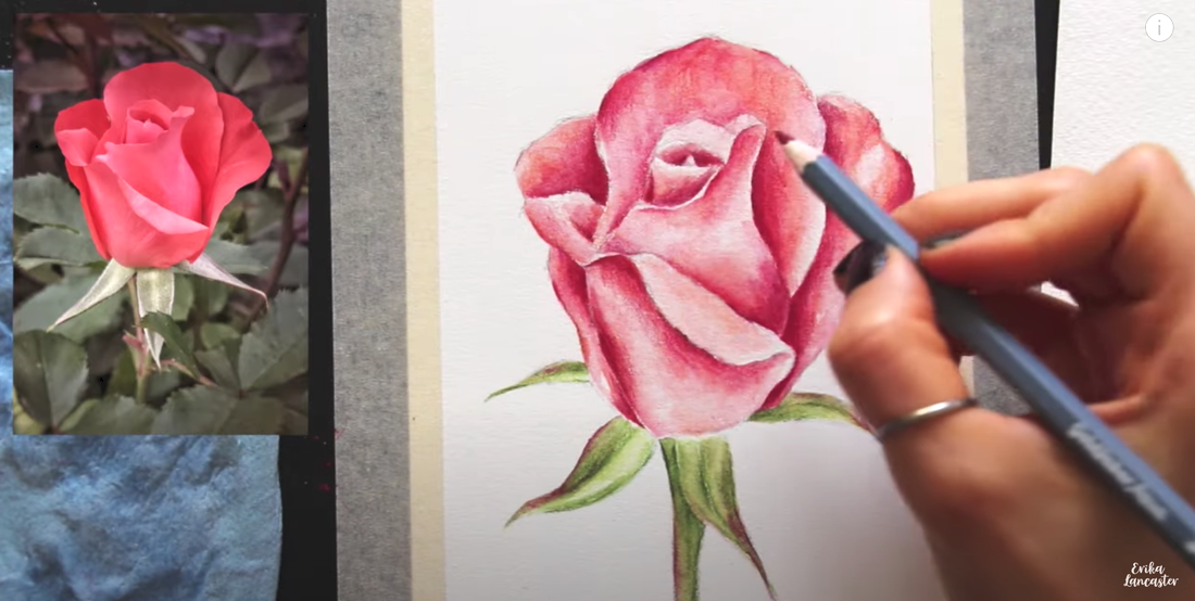
6. Second layering of pigment in the petals
In all of the activation phases in this process, I make sure to do everything I talked about in step 3 of this process.
*Allow to dry completely.*
6. Second layering of pigment in the petals
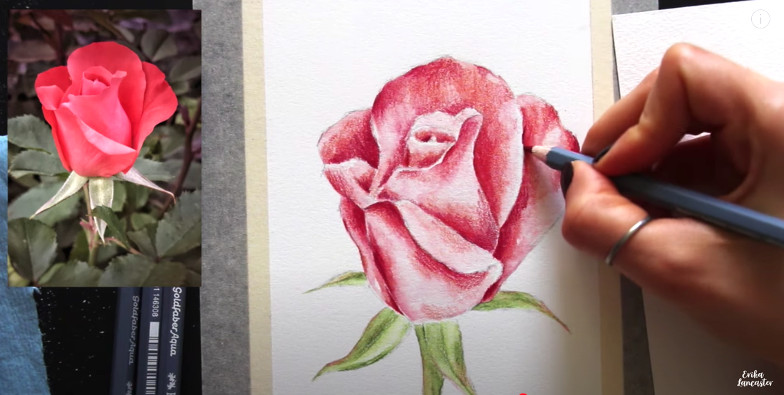
With everything completely dry, it's time to work on our second layering of pigment in the petal area.
At this point, we're working on only layering on more pigment in darker midtone areas and darkest dark areas. This means we're no longer working with the lightest color (the pink).
I start with my first red and layer this color in darker midtone areas, really avoiding any unnecessary layering in lighter value sections.
I make sure to release any pressure I'm exerting on my pencil as I make my way into lighter value areas, and keep lighter value sections (and brightest highlights) protected.
It's important to not apply any more pigment in light value areas and to keep the highlights with no color in them. If lighter value areas are darkened, this will flatten the piece out and will make it heavy.
This will take away from the realism we're trying to develop, as we need a wide range of values for something to look realistic, from lightest highlights, to a wide range of midtones, to darkest darks.
Once I've layered on more of my first red, I switch to my second (darker) red, and do more layering only in darkest shadow areas.
Finally, in this part of the process, I also bring in my darkest, purplish red, but I only layer this one in deepest areas that I want to push contrast in more.
7. Second color activation in the petals
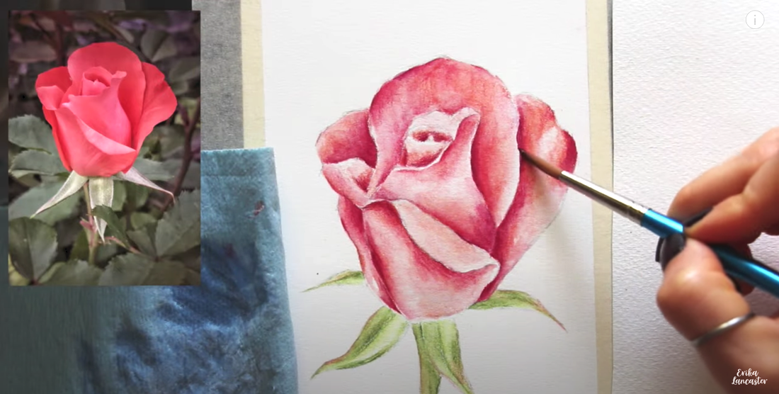
With my second layering of color done, it was time to activate the pigment with my paintbrush and water, once again.
I only run my paintbrush bristles over areas where I've layered more color on, in the previous step.
All of the color activation tips provided in step 3 still apply.
*Allow to dry completely.*
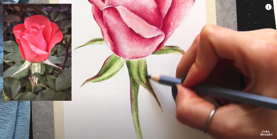
8. Second layering of pigment in the stem and leaves
I only run my paintbrush bristles over areas where I've layered more color on, in the previous step.
All of the color activation tips provided in step 3 still apply.
*Allow to dry completely.*
8. Second layering of pigment in the stem and leaves
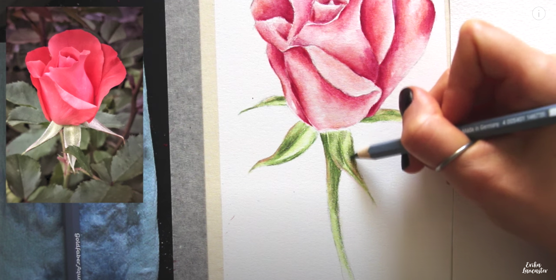
Using the medium green and then the darkest green, I do more layering to push darker midtones and darkest shadow areas, just like I did with my second layering in the petal area.
I make sure not to layer or darken lighter value areas, and continue doing my best to protect any highlights.
After layering on more pigment in midtone and darkest green areas, I intensify the red in the leaf and stem sections where I see this color in the reference photo by layering on some of my darkest red (where I had already layered on some pink previously).
9. Second color activation in the stem and leaves
Once again, it's time to do activation with a paintbrush and water.
I only go over smaller sections in the stem and leaves where I've just placed more pigment in the previous step, making sure to keep lighter value sections protected.
These shapes are much smaller than the petals, so I'm even more careful to not go in with too much water and really pay attention to how I'm pushing/pulling color around.
This will help me not mess up the values I've already developed.
*Allow to dry completely.*
10. Third layering of pigment all throughout
This is the final layering of color I'll be doing and I'm only looking to push darkest shadow areas to develop greater contrast and define certain edges.
In this phase, I do layering in both the petal section, as well as the leaf/stem section.
I'm only using my two darkest reds at this point (in the petals) and the darkest green (in the leaves/stem), and I'm focusing on doing more layering only in the very darkest areas I see in the reference photo.
Even at this point, I'm not burnishing or pressing down too hard on my paper in order to avoid scratching it.
Continue releasing any pressure you're exerting as you make your way out of darker value areas to create gradual transitions between values.
11. Third color activation all throughout
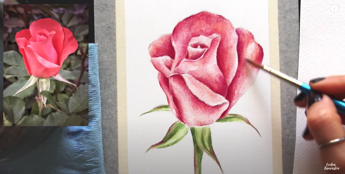
This is the final color activation I'll be doing with my paintbrush and water.
I only run my paintbrush bristles over the areas I've layered more pigment on in the previous step, and avoid pushing/pulling color into lighter value areas.
I continue to observe the reference photo in order to keep light areas light, midtone areas as midtones, and darkest areas dark.
*Allow to dry completely.*
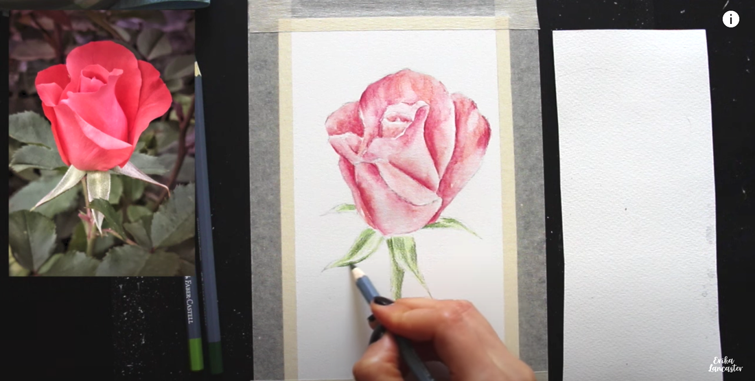
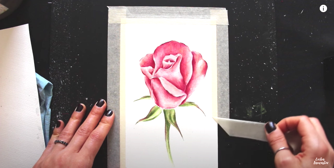
12. Fourth layering of pigment all throughout
I do my final application of pigment to increase contrast and define edges here and there, using only the darkest red in petal areas and the darkest green in the leaves/stem.
I allow myself to push down a little bit more.
I do not activate this final layering of pigment as I like incorporating some of the texture watercolor pencils allow.
By this point, you can see how highlight and light value areas have little-to-no pigment in them, which means that the paper is shining through more.
Darkest areas have a more generous application of color in them, which covers up more paper.
Midtone areas are somewhere in between.
It's through incorporating the brightness of the paper as part of the piece, that the final result looks more realistic and also has that glow that is so particular to watercolor.
And we're done!

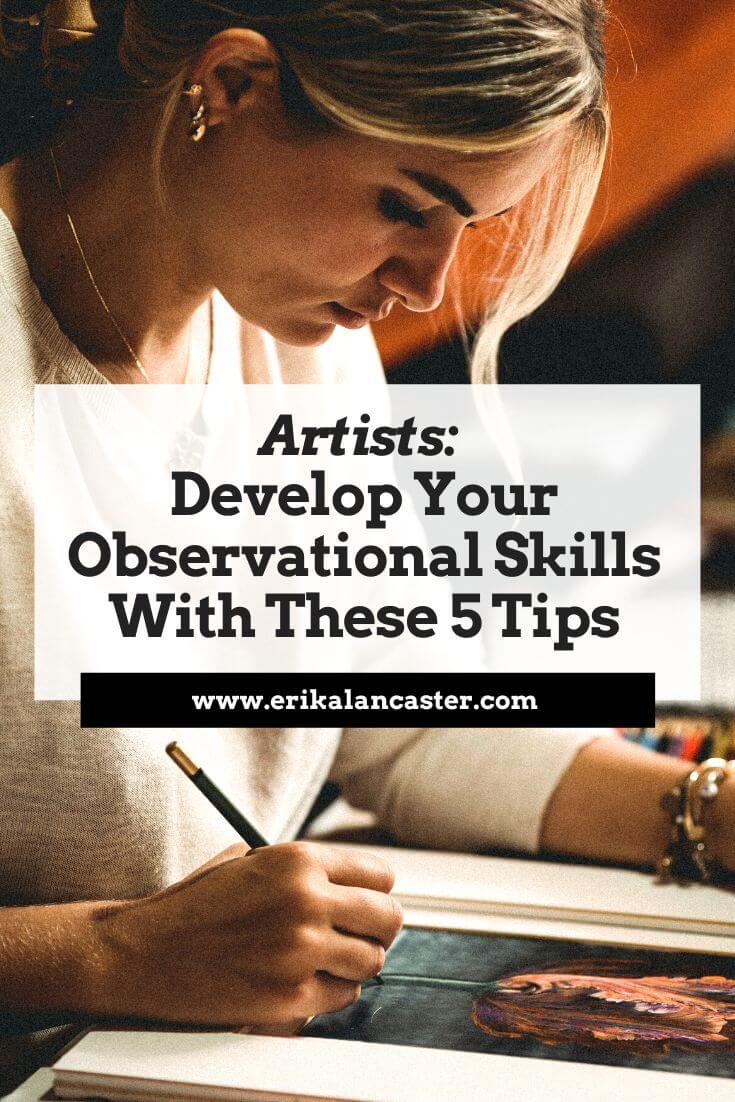
Seeing artistically does not happen automatically. We must constantly develop our powers of observation.
-Eugene Delacroix
I often receive messages from beginner artists asking me how or where to start for faster, more effective progress.
The one skill I'd advise beginners to strategically work on developing right away is their observation.
This may sound obvious, but there's so much misinformation out there that creates confusion among aspiring artists to the point that, lots of them, don't truly get started at all.
Not to mention, there's such a desire to move forward at lightning speed, they skip over the basics (which only leads to hitting walls and plateaus).
This is why I wanted to share today's message and tips with you.
Why is building up your observational skills so important as a beginner artist?
Being able to draw or paint doesn’t only involve knowing how to use your medium effectively.
It's also about taking in visual information on a deeper level and thinking about it critically in order to replicate (and even improve) what you're seeing on paper/canvas.
Without good observation, you simply won’t be able to draw or paint a subject accurately.
*Unless you've already built up this skill in the past, you know your subject on a deep level, and have perhaps lost sight over the years. If a skilled, knowledgeable artist looses a percentage of her/his sight, in many cases she/he will be able to make up for the information she/he is lacking.
Even abstract artists who’re working more intuitively and/or don’t use any type of reference photo or life subject, still need to make use of their observation as more colors, shapes, lines, and textures get added to the paper/canvas.
By using their observation and critical thinking, they make choices as to what to add, subtract or alter to improve their visual compositions.
This is why, as we move on in our art journeys, it’s essential to continue developing our observational skills alongside mastery over our medium(s).
What is observation, exactly?
Observation is a process that involves our eyes and our brains/conscious thought.
Most non-artists tend to see things only at surface level.
Great observation is about being conscious and aware of what’s in front of you, taking it in via all senses possible, and making connections.
As artists, this practice allows us to better inform our work and more information gets stored in our brains long-term.
Not to mention, it results in more expressive, unique artwork that has ourselves in it.
5 Practical Tips for Developing Your Observational Skills
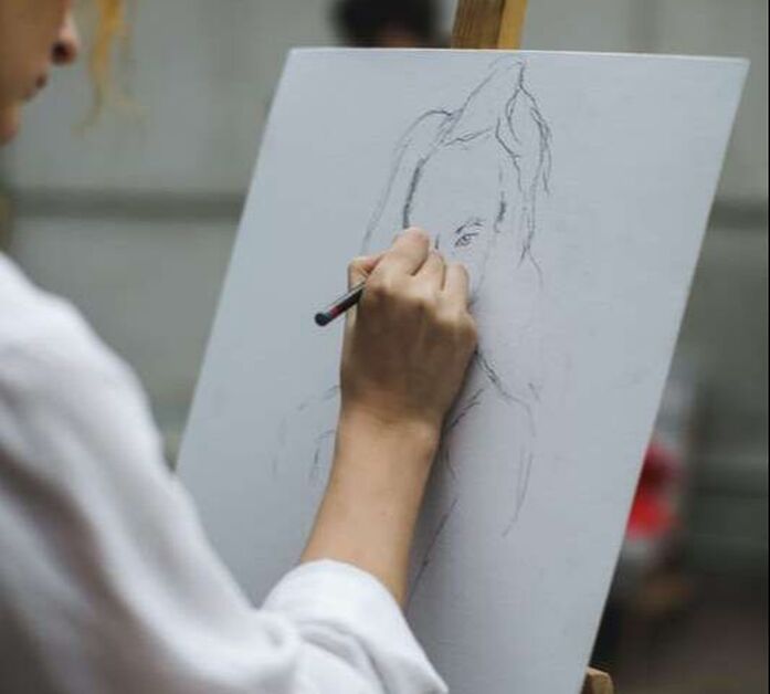
1. Use references or draw/paint from direct observation
If you're a beginner artist and you still believe things like: "real artists don't use references" or "real artists work solely from imagination", it's time to realize these are total myths and not how the creative process works (at least not for most of us).
Continuing to believe this will only hinder your progress.
In this blog post, I provide three examples of famous artists who used reference photos as inspiration for their work. Artists use all kinds of references, in all kinds of ways.
*Think about it: If you don’t have anything to look at and study, how can you possibly build up your observational skills?
It’s also through using references and drawing/painting from direct observation that we learn about essential Art Fundamentals such as Color, Light Behavior, Perspective and Anatomy.
Also, remember: The way we think things look like is often not what they actually look like in real life.
2. Observe before putting pencil/paintbrush to paper
Before jumping into the drawing or painting process, take a few minutes to observe your reference or whatever you have in front of you.
Ask yourself questions such as:
Once you start with your drawing or painting, make sure you continue looking and analyzing.
You can ask any professional artist that makes use of references or direct observation, and they’ll tell you that over 50% of their working time is spent observing!
1. Use references or draw/paint from direct observation
If you're a beginner artist and you still believe things like: "real artists don't use references" or "real artists work solely from imagination", it's time to realize these are total myths and not how the creative process works (at least not for most of us).
Continuing to believe this will only hinder your progress.
In this blog post, I provide three examples of famous artists who used reference photos as inspiration for their work. Artists use all kinds of references, in all kinds of ways.
*Think about it: If you don’t have anything to look at and study, how can you possibly build up your observational skills?
It’s also through using references and drawing/painting from direct observation that we learn about essential Art Fundamentals such as Color, Light Behavior, Perspective and Anatomy.
Also, remember: The way we think things look like is often not what they actually look like in real life.
2. Observe before putting pencil/paintbrush to paper
Before jumping into the drawing or painting process, take a few minutes to observe your reference or whatever you have in front of you.
Ask yourself questions such as:
- What interesting relationships do I see in terms of color, value, shape, size and texture?
- Is there contrast present? How is this contrast being created?
- What techniques can I use to render the different sections of my drawing/painting to best describe each area?
Once you start with your drawing or painting, make sure you continue looking and analyzing.
You can ask any professional artist that makes use of references or direct observation, and they’ll tell you that over 50% of their working time is spent observing!
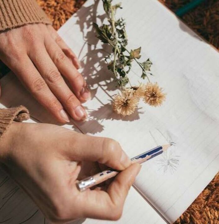

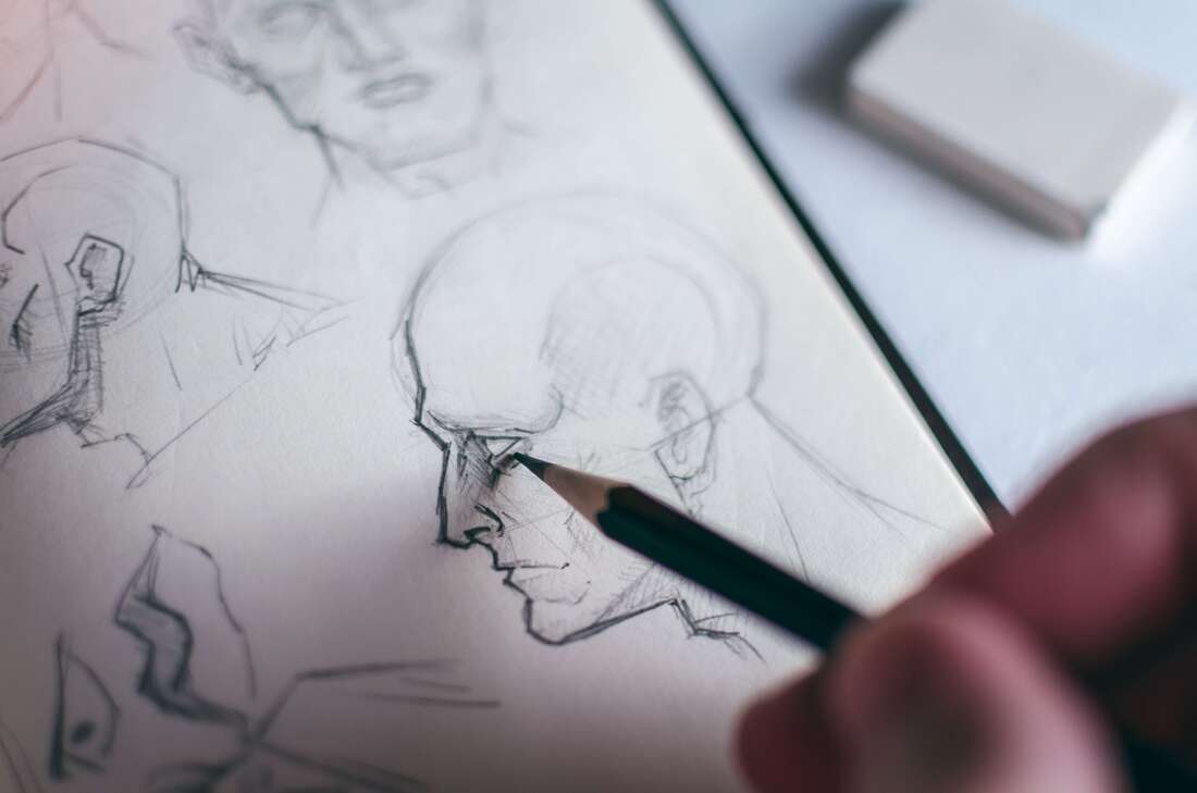
3. Get to know your subject
The more you know about your subject, the more you’ll notice.
This is why it's so important, especially if you’re drawing/painting a subject that's new to you and/or is more complex, to inform yourself about it.
Go beyond using just one single reference.
Compile photos, watch videos, read about the characteristics that make it different from other subjects of its kind. Take notes.
For example, if it's your first time drawing a portrait, you're likely going to arrive at much better results if you learn about the structure and proportions of the human head, as well as individual facial features, before jumping into the final piece.
4. Cut out distractions
In order to truly observe, we need to stay in the present and focus.
The ability to focus deeply is uncommon in this fast-paced, constantly multitasking world.
However, as artists, it’s important to develop this ability and also to protect our working time by minimizing distractions in order to “get in flow”.
We must allow ourselves the time to immerse ourselves in our subjects.
*A few things I do that help me stay focused are: I have my phone on Airplane Mode or in another room, I don’t have social media or any tabs open on my computer that I don’t absolutely need, and I let other people know I’ll be working to minimize interruptions.
This may sound hard, but I promise it gets easier the more you do it!
5. Bring in all your senses
Skilled observers will take in, analyze and remember their surroundings using every sense possible.
Try engaging not only your sight, but also smell, touch, sound and taste.
This will inform your work more fully and there will be much more of yourself in it because we all experience things differently.
Try practicing this in your everyday life, even when you’re not preparing to create a new piece. It will help you turn this into a habit.
Extra points if you actually record your observations in writing!
*Bonus Tip
Play memory games on your own or with a friend.
Observe a scene or a photograph for a full minute, then write a descriptive paragraph about it without looking.
Try recalling as many details as you can. It often helps to go from general towards specifics.
I hope these tips were helpful!

*This post contains affiliate links. I receive small commissions for purchases made through these links at no extra cost to you. These commissions help me keep this site up and running, in order for me to keep providing helpful and inspiring art content. :)
Wondering how to use watercolor pencils for best results? How are watercolor pencils different from regular colored pencils and traditional watercolor paint? Where to start when learning about this versatile medium?
Watercolor pencils are an incredibly fun, beginner-friendly, versatile medium that continues gaining popularity among art enthusiasts all around the globe.
What makes watercolor pencils so different from other art mediums is the fact that they're a drawing and painting tool all wrapped up in one. They're a blend of characteristics offered by traditional colored pencils and particularities of watercolor paint.
Because of this, watercolor pencils bring an infinite amount of possibilities in terms of both strategies to go about creating art, but also in overall outcome/style.
However, this also makes them a bit confusing in terms of what basic skills and techniques we should cover as beginners, which are the best supplies to use alongside them, etc.
There are a few key things that I’ve learned as I’ve continued exploring and pushing myself with this medium throughout the last few years.
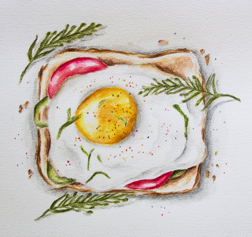
Egg on Toast. Watercolor pencils on paper. Erika Lancaster.
My Top 5 Watercolor Pencil Tips
1. Use quality watercolor pencils
Truth be told, when I first started using watercolor pencils, I didn’t like them at all.
I struggled to get the vibrant colors I wanted, there was way too much texture left behind, and I had trouble blending colors, as well as creating gradients.
It wasn’t until I invested in better quality watercolor pencils that I started actually enjoying the process and liking my end results.
I first invested in a smaller (but better quality) set with 12 colors from Derwent. Once I understood the medium a bit better, and was confident in the fact that I wanted to go long-term with it, I invested in a larger set from Faber-Castell.
A couple of the best watercolor pencils in the market are: Faber Castell's Albrecht Durer and Caran D'ache Museum Aquarelle. Both offer smaller and larger sets.
*Always remember, larger sets are not necessarily better than smaller sets.*
2. Give thought to your paper
With watercolor pencils, we usually bring in at least some amount of water into the process. Because of this, it’s essential to work on paper that’s intended for water-soluble mediums such as watercolor paper.
I enjoy working on hot press watercolor paper, which is the least textured of all. The more textured your paper is, the more visual texture and “sketchiness” will be left at the end. This is because the tip of your pencils will skip against the tooth of the paper as the pigment is being applied. In other words, the pigment is not applied evenly.
Two brands that offer great hot press watercolor paper are Canson and Winsor & Newton.
Another thing to consider is the thickness of your paper. Whenever you’re bringing water in, you’ll likely want medium-to-heavier weight paper (140 lbs. in weight or more).
Thinner papers will easily buckle or even tear, making the process more frustrating than it needs to be.
Another option is illustration board! It's smooth and very sturdy.
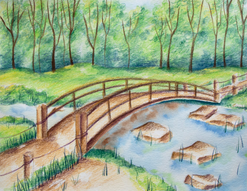
Nature Scene with Bridge. Watercolor pencils on paper. Erika Lancaster.
3. Pre-select your colors
I’m a huge believer in giving thought to your colors before jumping in, as well as in limiting the amount you'll be using for the piece on hand.
By swatching out and choosing the specific watercolor pencils you'll be using, there’s much less of a chance you’ll accidentally create undesired colors as your painting.
Also, by keeping your amount of colors limited and thinking about repeating colors throughout your piece, you’ll arrive at more harmonious results.
Five minutes of prep work can make a huge difference in how smoothly your process goes, as well as in the quality of your end results.
4. Protect your highlights and lightest value areas
Just like when working with traditional watercolor paint, I like incorporating the brightness and beauty of the paper as part of the piece.
We're working with transparent paint after all and there's no need to bring in white!
Before getting started with the painting process, I plan for highlight areas and light value sections where I want to make use of very translucent color.
I make sure to apply little-to-no color in these areas so that, at the end, I have plenty of my paper shining through them.
Heavier applications of color are reserved for darker midtone areas and darkest darks.
This creates that dimension, lightness and glow that watercolor allows.
5. Embrace the sketchy look!
Unless you’re applying your colors on a separate paper that you're using as a palette, activating them with water there, and only applying color on your painting with a paintbrush *I share about this technique in the video below (34:43)*, you’ll likely always be left with some amount of texture.
This is the case, even when you’re working with higher quality pencils and the smoothest of papers.
You can certainly go in and try to get rid of every-single-little textured section, but this often leads to an overworked, flat look.
Now-a-days I embrace the texture left behind by the pencils and actively think of ways to combine painterly effects with some amount of sketchiness.
This creates a balance that's visually pleasing and interesting to look at.
If you enjoyed this video and found it helpful, make sure to subscribe to my YouTube channel. I share a brand new video every week with art tips, drawing and painting tutorials and mindset/productivity tips for artists. *Subscribe HERE*
Check out some of my Watercolor Pencil
Step-by-Step Tutorials:
I hope these tips and tutorials were helpful if you're getting started on your journey with watercolor pencils, and wish you tons of enjoyment with them.
*This post contains affiliate links. I receive small commissions for purchases made through these links at no extra cost to you. These commissions help me keep this site up and running, in order for me to keep providing helpful and inspiring art content. :)
Struggling with an art block or creative rut? Looking for ideas to get the most out of Inktober this year? Eager to take your art further, whether in terms of skill development or expanding your audience?
Participating in online art challenges can be an amazing way to get back into creating art consistently after a break, as well as to improve your drawing/painting skills in a short period of time.
Not to mention, because so many people will be participating and sharing consistently, it's also a great way to get your art out there and start growing your name as an artist.
I've personally participated in Inktober a few times in the past and have gotten a lot from pushing myself to complete them. You can check out video timelapses I've shared of past sketching processes, things I learned from the challenge and more in past posts.
I also recently shared a video over at my YouTube channel in which I explain the main reasons why participating in daily art challenges like Inktober can be so powerful for artists, as well as my main tips to help you reach the finish line while enjoying every step of the way. You can check it out here.
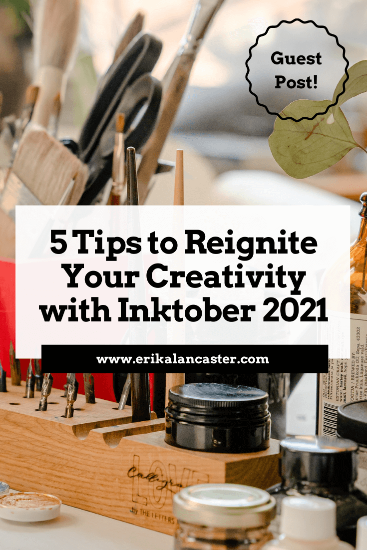
To add to the Inktober/Fall art challenge goodness and helpful tips, I'd love to share an article today which was kindly contributed by Debbie Woodliffe. Debbie's not only been working in the creative industry for nine years, but has always had a deep love for art and it's been her hobby her entire life.
As a creative, Debbie knows what it's like to struggle with blocks. Inktober and similar challenges have helped her move past them and get back into the flow of consistent art creation.
Below, she'll be sharing her top tips that'll help reignite your creativity and take your art to a new level with Inktober 2021.
Without further ado, let's get into her article!
Struggling with an art block or creative rut? Looking for ideas to get the most out of Inktober this year? Eager to take your art further, whether in terms of skill development or expanding your audience?
Participating in online art challenges can be an amazing way to get back into creating art consistently after a break, as well as to improve your drawing/painting skills in a short period of time.
Not to mention, because so many people will be participating and sharing consistently, it's also a great way to get your art out there and start growing your name as an artist.
I've personally participated in Inktober a few times in the past and have gotten a lot from pushing myself to complete them. You can check out video timelapses I've shared of past sketching processes, things I learned from the challenge and more in past posts.
I also recently shared a video over at my YouTube channel in which I explain the main reasons why participating in daily art challenges like Inktober can be so powerful for artists, as well as my main tips to help you reach the finish line while enjoying every step of the way. You can check it out here.
To add to the Inktober/Fall art challenge goodness and helpful tips, I'd love to share an article today which was kindly contributed by Debbie Woodliffe. Debbie's not only been working in the creative industry for nine years, but has always had a deep love for art and it's been her hobby her entire life.
As a creative, Debbie knows what it's like to struggle with blocks. Inktober and similar challenges have helped her move past them and get back into the flow of consistent art creation.
Below, she'll be sharing her top tips that'll help reignite your creativity and take your art to a new level with Inktober 2021.
Without further ado, let's get into her article!
Reignite your Creativity and Take Your Art Farther with Inktober 2021
by Debbie Woodliffe
As days get shorter and the weather gets cooler, it can become difficult to find inspiration and it can be easy for our creativity levels to drop.
Luckily, there are lots of drawing and art challenges during the Fall season that we can take part in, which can help reignite our passion for art and get our creative juices flowing again.
One of these challenges is Inktober, which is an incredibly popular daily drawing challenge that lots of people participate in every year.
Whether you prefer traditional art mediums or are a digital artist, keep reading for my top tips to get the most out of Inktober, and advice to keep you inspired and creative this season.
What's Inktober?
Inktober is a worldwide event where tens of thousands of creatives, artists and art enthusiasts share their unique take on specific drawing prompts. It was made popular by ink artist Jake Parker, who created the challenge because he wanted to hone his ink drawing skills and exchange artistic inspiration with others.
These types of challenges are common within the artistic community as they not only have the power to help people overcome art blocks, but also remain consistent with their practice and make tons of progress in a short period of time.
Also, because thousands of people participate in the same challenge, it’s super easy to get motivated because everyone’s constantly sharing their unique takes on the prompts.
All you have to do to get your daily inspiration is follow the #Inktober hashtag on social media during October, and use this same hashtag to share your own artwork with the community!
It’s that simple.
Are there any rules for Inktober?
While there’s nothing to stop you from creating your own art and using the aforementioned hashtag, there are a few things you should do to ensure you get the most from the challenge:
1. Create a drawing using any type of ink (you can sketch it out in pencil first)
2. Post the picture to social media and use the hashtags: #inktober and #inktober2021
3. You can post daily, every other day, or each week – it’s totally up to you.
Just remember, you’ll get the most out of the challenge if you remain consistent and complete all the prompts. For tips on making it through the challenge, check out Erika's recent video on Inktober tips.
*Top Tip:
You don’t need to share your work online if you don’t want to. However, it can be a real learning experience when others provide you with constructive criticism or praise, as well as when you do it for others.
What's the prompt list for Inktober 2021?
Since 2016, the Inktober team has been releasing the official prompt list via their website for everyone to see. They also share it on their social media profiles.
5 Tips to Get the Most Out of Inktober 2021
This art challenge is a fun one as it encourages you to try a specific medium you may not be very familiar with, or to hone your skills with ink if it's a medium that you've always been drawn to, but perhaps haven't been very consistent with.
Ink can certainly be tricky to work with, given its fluidity and permanence. However, it’s an incredibly versatile medium, and with a little practice, it can be used to create impactful and very unique artwork.
1. Push your boundaries
The key to boosting your creativity is to expand your boundaries and take steps into new artistic realms. This is why the challenge works so well – it provides specific (yet general) criteria points that are open to interpretation and it has an easy-to-follow structure.
Because the prompts are pre-selected, you might be forced out of your comfort zone, which will always lead to growth.
When it comes to working with ink, it might be worthwhile to learn about alternative shading and mark-making techniques like hatching and crosshatching, or to look for inspiration in Pop Art or silkscreening artwork for ideas on how to use flat/solid shapes instead of trying to go for the usual gradient shading.
Remember that your comfort zone is just that – comfy and what you're used to. You won’t be learning new things if you aren’t trying them, so Inktober is the perfect excuse to get started with something new.
2. Share your art like a pro and start making money
Why not sell your works of art online on marketplaces like Redbubble, Society6 or Etsy?
To showcase your artwork effectively, take high quality, clear photos. Experiment with stylized, personalized backgrounds or white backgrounds - figure out what makes your artwork shine at its best, and start noticing what your audience responds to most.
Here’s a top tip when taking photos of art – natural light is best, so take photos next to a window at the right time of the day or try doing it outside during the day. Morning or later in the evening when the sun is not high up in the sky often is best. Overcast days can also be great, as the light is not very stark.
Alternatively, place your work against a blank white laptop screen for a professional back-lighting effect!
3. Make it personal
Remember that the key to selling your art is creating an outstanding experience for your customer and personalizing your products.
When people purchase work from an artist, they buy into an experience. Think of different ways you can make the buying process a positive one, and of how you can set apart your products from others in a way that won't break the bank.
These make a huge difference and it won't only help your customers remember you, but will entice them to keep coming back.
A very cool idea is to package your inky creations with some equally impressive packaging. Use some protective sheets and backing boards, nice looking Washi tape, a custom branded stamp, and a thank you card with your social media profiles so they can stay in touch.
If and when you set up shop online, don’t forget to make use of keywords and categories, on whichever site or platform you choose to sell from. Inktober will see far more searches within the ink or monochromatic art categories.
4. Pick your tools
Drawing and painting with ink can be a little tricky, but with a few tips and a little practice, you’ll be creating masterpieces in no time at all.
You can use any kind of ink pen or tool – from fountain pens to fillable brushes, or standard brushes and Indian ink tubs. If you want less mess and a more portable way of inking, go for technical liner pens in a range of different sizes. Smaller sizes like 0.1, 0.3 and 0.5 are excellent for those fine lines.
Check out some awesome recommendations for pens and inks in this article!
Don’t be afraid of regular ballpoints either!
Setting yourself constraints such as using specific colors or adding a specific background design like Erika mentions in her last Inktober tips video, is a great way to encourage creative thinking and unusual approaches.
5. Choose the right paper
It's always important to give thought to the paper or sketchbook you'll be using for the challenge, and to consider the type of inking tool you'll be using on it.
For ink drawing, medium weight and thicker papers work best. It's also important to consider the papers' texture, as your pens' nibs can feel like they have to fight against heavily textured papers and can even be damaged by them.
Personally, when I use technical pens or nibs, I prefer smoother paper and medium weight does the trick. When I use ink tubs and brushes, a bit of texture is great and thicker paper is required.
It ultimately depends on what you like to draw/paint, the style you're going for, and what you personally enjoy.
Watercolor or mixed media sheets or sketchbooks are popular options among many artists participating in Inktober.
So are you feeling ready to step up your creative game with Inktober 2021 and smash through any creative blocks?
Remember to be consistent, bold and experimental. After all, practice makes perfect and working on something completely different can do wonders for your creative mind.
I hope this post was helpful and inspiring!
Thanks so much to Debbie Woodliffe for so generously sharing all of this useful information with us. It has certainly gotten me excited for Inktober and all the amazing work I'm sure I'll get to see next month.
Thank you for reading and I wish you tons of progress and enjoyment in your art journey.
For a list of my favorite art supplies, go here.


www.erikalancaster.com
is a participant in the Amazon Services LLC Associates Program, an affiliate advertising program designed to provide a means for sites
to earn advertising fees by advertising and linking to amazon.com.
www.erikalancaster.com
is a participant in the Shareasale.com Affiliate Program, an affiliate advertising program designed to provide a means for sites to earn advertising fees by advertising and linking to Shareasale.com partner companies.
 RSS Feed
