Erika Lancaster- Artist + Online Art Teacher
  • HOME
  • BLOG + FREEBIES
  • YOUTUBE
  • PATREON
  • COURSES
  • MY ART TOOLS
  • GALLERY
  • Online Art Mentorship

Watercolor Pencil Pink Rose Tutorial for Beginners

4/17/2022

4 Comments

 
Picture
Follow
*This post contains affiliate links. I receive small commissions for purchases made through these links at no extra cost to you. These commissions help me keep this site up and running, in order for me to keep providing helpful and inspiring art content. :)


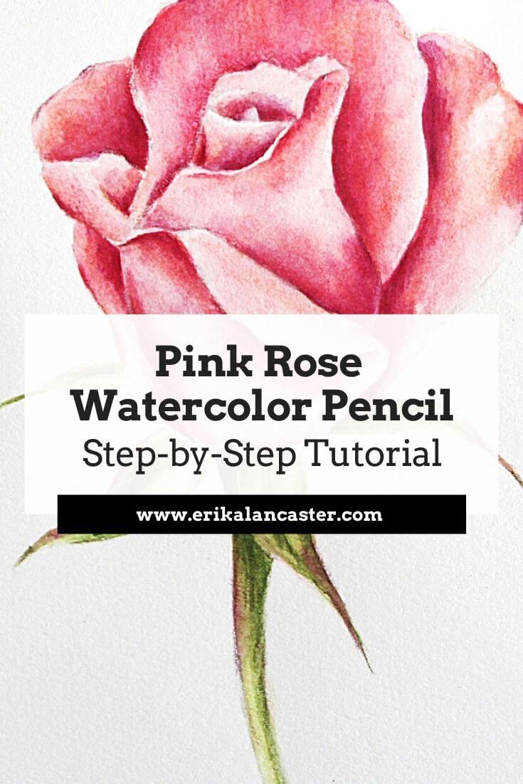
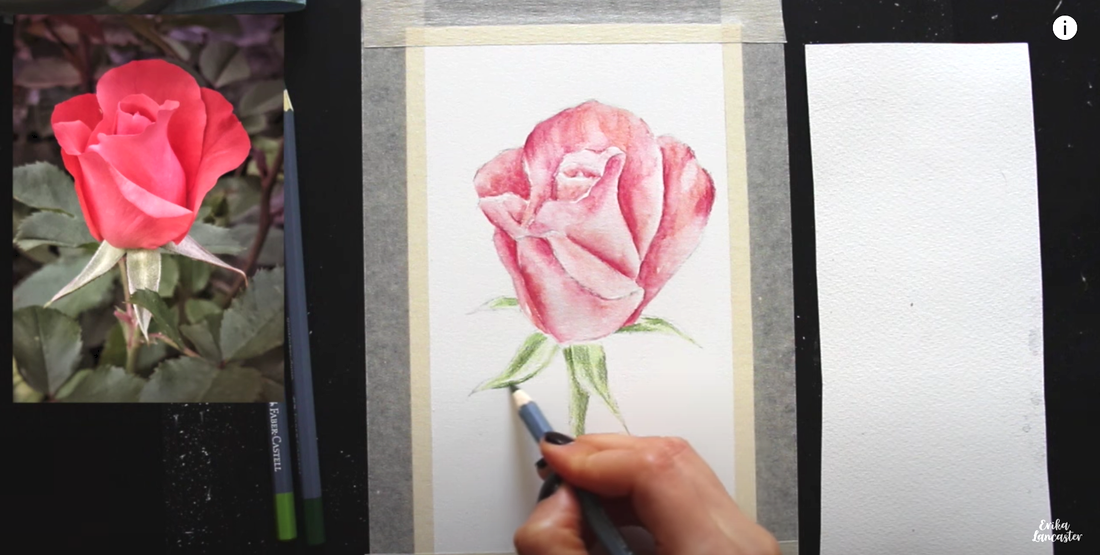
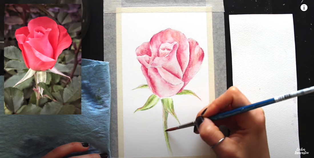
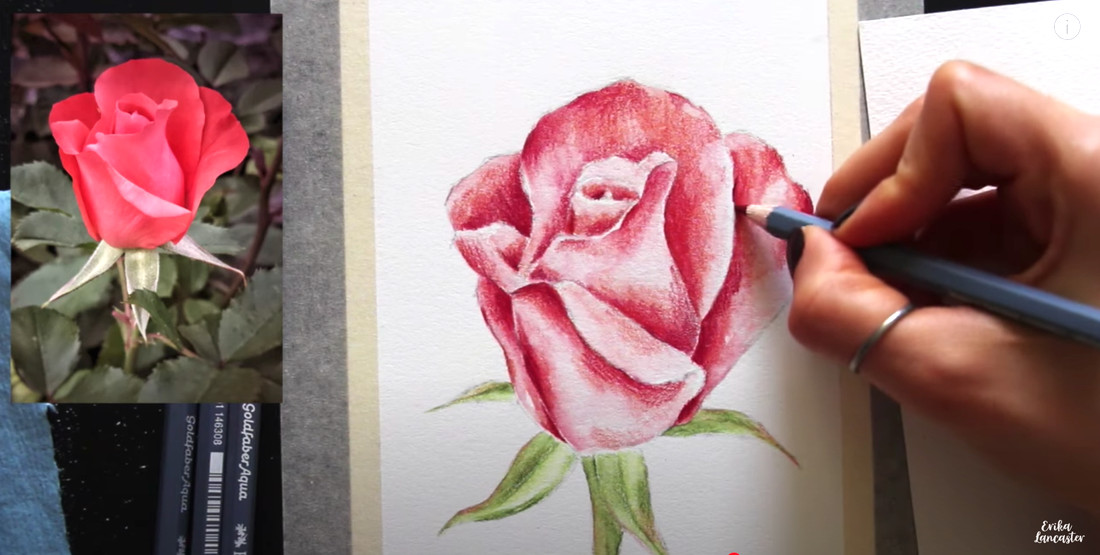
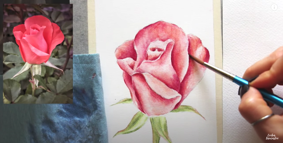
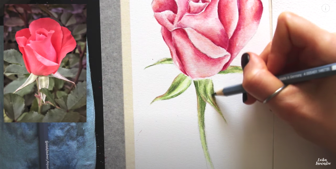
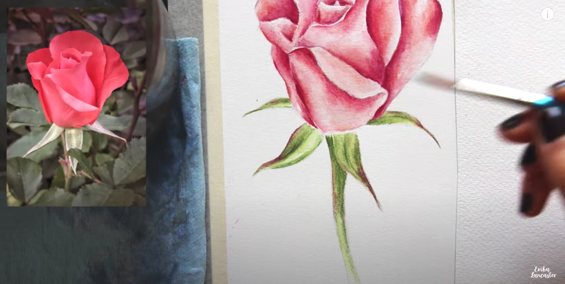
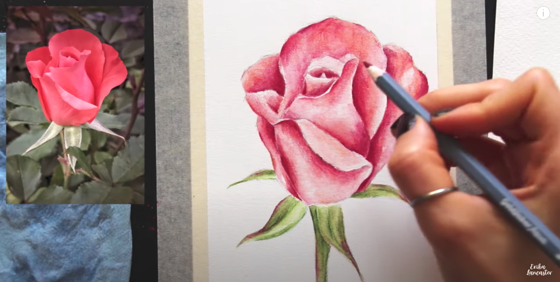
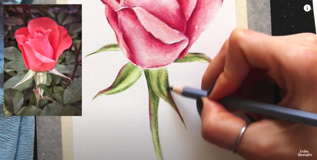
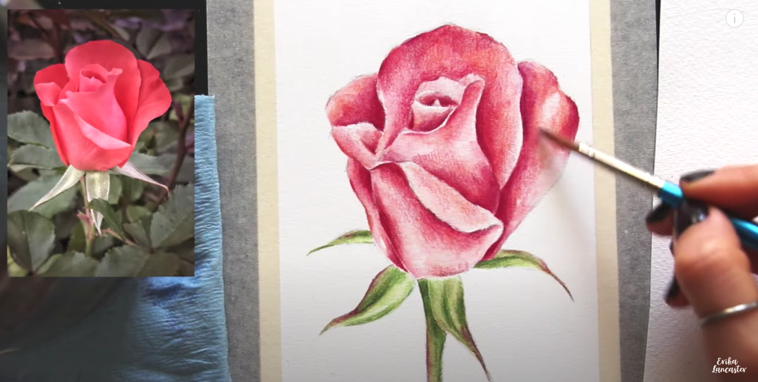
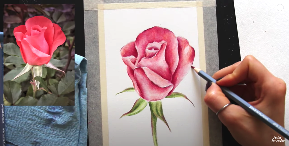
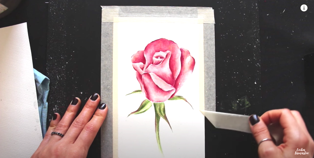
Interested in developing your skills with watercolor pencils? Wondering how to paint realistic flowers that show depth and dimension with this versatile medium? 


In this step-by-step tutorial for beginners, I take you through my entire process for developing botanical paintings using watercolor pencils. 

I share everything, from how I choose my colors for a smoother painting process, how to activate pigment with water for a painterly effect, and how I do my layering to develop higher levels of realism without overworking my paper and maintaining the glow that's so unique to watercolor.
​
Along the way, I share tons of must-know tips and tricks that help me arrive at great results, every time. 


​
Watercolor Pencil Pink Rose by Erika Lancaster


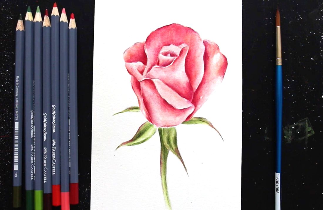
​Before jumping into the Pink Rose tutorial, if you're just getting started with Watercolor Pencils, I would highly recommend checking out this very thorough video where I share tons of must-know information on this medium that'll help you make much faster progress:
If you enjoyed this video and found it helpful, make sure to subscribe to my YouTube channel. I share a brand new video every week with art tips, drawing and painting tutorials and mindset/productivity tips for artists. *Subscribe HERE*
​

​
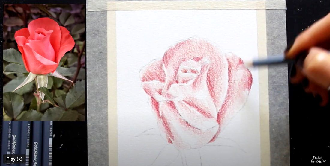
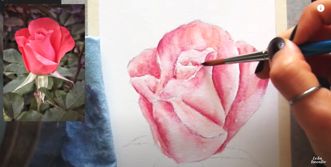
Ready? Let's jump in! 


*Download pink rose reference photo from Unsplash.com here. 


Recommended watercolor pencil sets:

Student-grade
Faber-Castell Goldfaber Aqua
Derwent Academy Watercolor Pencils

Professional

Faber-Castell Albrecht Dürer Studio Watercolour Pencils
Derwent Watercolor Pencils 

Caran D'ache Museum Aquarelle Pencil Sets


Watercolor Pencil Pink Rose Steps
​

1. Choose your colors wisely before starting 

Observing my reference photo, I chose a few different pinks, reds and greens from my watercolor pencil set that I thought looked similar to the hues I saw.

When we're going for higher levels of realism, it's essential to take time choosing our colors and testing them out on a scrap piece of paper to ensure they will help us arrive at the results we're after. 

This will help us stay away from undesired effects and muddy colors. 

It's also important to decide how you'll be developing different values in each area (lighter areas, midtone areas and darkest areas), as developing a wide range of values (or tones) is key for any level of realism. 

In the video above, you'll see how I prepared myself with light, midtone and darker colors I'd be using to develop color and value in the pink petals, as well as light, midtone and darker colors I'd be using for the green stem and leaves. 

Consider testing out the colors you'll be layering together in the darkest areas on your scrap piece of paper to make sure they create colors you like before doing this layering in your final piece. 

Also, if you'd like to play with color temperature in different areas, pay attention to whether the colors you're choosing from your set are warm or cool-biased.

I'd recommend limiting the amount of colors you'll be bringing in to avoid overwhelm or confusion throughout the process. 

Simple is often best, and you don't need a large variety of colors to arrive at great results or high levels of realism. 
​
Once I've tested my colors and have chosen the ones I'll be working with, I stick to using only those. 


​

2. First layering of pigment in the petals
Watercolor Pencil Realistic Rose Tutorial 1

​

Whether I'm working with traditional watercolor paint or watercolor pencils, I always work from lights to darks in each area. 

Before starting, I always observe where the lightest areas and darkest areas are in the reference photo.


The lightest sections (highlights) are areas/shapes that I'm going to do my best to keep protected throughout the process, with little-to-no color in them. This way, the whiteness of the paper can shine through and stand in place for my highlights.

Because the white paper is standing in place for the highlights and is helping us develop lighter values, no white color is needed. This is the same when we're working with traditional watercolor paint. 

The darkest shadow areas are where the color will be layered on more and where the white paper will be covered up more. 

Starting with the petal portion, I begin layering my first/lightest color (my pink) all throughout, excluding only the lightest areas I see in the reference photo. These lightest highlight areas (highlights) I leave free of color and are areas I want to keep protected thought the process. 

Once the pink is in, I switch to my first red (the lightest one), and I layer this first red in the midtone and darkest areas I'm able to see in the reference photo. I leave sections of lightest values free of this second color. 

Even though I don't really press down hard at any point throughout this process because I don't want to scratch or damage my paper, I make sure to release any pressure I'm exerting gradually as I move out from the darkest areas and into the light areas.

This helps me create gradients and soft transitions. 

With the second color layered on, I switch to my next, darker red, and continue with the layering process, making sure to only place this darker red in deep shadow areas I'm able to see in the reference photo. 

As you're developing these different values, bring to mind the three-dimensional structure of the rose, as well as overlapping petals creating shadows on each other and curving/curling petal sections that may be catching more or less light.

Ask yourself where the light source is in relation to the subject, and how this light source can have an impact on the values/tones you see throughout it. 


​3. First color activation in the petals
Watercolor Pencil Realistic Rose Tutorial 2
Using my size 6 round brush, I take a little bit of water at a time from my container and start activating my color, section by section. 

When activating watercolor pencil pigment, it's essential to stay on top of water control or you risk messing up the values you've already developed. 


Use your absorbent towel to help you stay on top of water control.

Throughout the process, I'm constantly blotting the tip of my paintbrush on my towel to remove excess water and paint, and I use it to do any lifting/absorbing of too much water I've accidentally placed on my paper, or to lift too much color if I feel I've flattened a section out too much. 


As you're activating your color, start with your lightest areas and make your way towards darker areas. This way, you can keep your darker colors where you need them and you'll avoid pushing/pulling these darker colors into lighter areas. 

Darker colors will very easily "eat up" your lighter colors. Plus, it's always going to be easier to go in and darken, than it is to go in and lighten.

So take it slow.

Keep an eye on how much pigment is collecting in your paintbrush bristles as you're activating your color.

As soon as you see you're pushing way too much pigment around, remove that color from your bristles by swiveling your paintbrush in your water, blot your bristles gently on your towel, and pick up where you left off. 

It's also essential to continue observing your reference photo as you're activating your color in order to continue differentiating between values/tones present throughout the sections you're activating. 

​You want the lights to stay light, the midtones to stay as midtones, and the darks to stay as darks. 


Remember, it's all about developing those values you're able to see in the reference photo.

If you stop looking at the reference photo, you stop thinking of the structure of what it is your painting, and you start ignoring values, it's very likely you'll accidentally flatten everything out and things will look overworked and heavy. 


*Allow to dry completely.*

​

​4. 
First layering of pigment in the stem and leaves
Watercolor Pencil Realistic Rose Tutorial 3
Same as with the initial layering of color in the petal area, we're starting with the lightest green and are making our way towards the darkest green, making sure to keep lightest areas protected, with little-to-no-color in them. 

First, go in with the lightest green and fill in the entire leaf and stem shapes, excluding any highlight shapes you're looking to keep protected (with no color in them).

After the lightest green has been placed, switch to your medium green and layer this color over your lightest green in midtone and darkest shadow areas. 

After the medium green has been placed, switch to your darkest green and layer this one only in darkest shadow areas. 

Remember not to press down too much so that you avoid scratching or damaging your paper, and release any pressure you're exerting as you make your way out from darker areas and into lighter value areas to create gradual transitions. 


I see a hint of pink/red in the leaves and stem, so after layering the greens, I switch to my pink and layer a bit over the greens where I see this color in the reference photo. 


​
5. First color activation in the stem and leaves
Watercolor Pencil Realistic Rose Tutorial 4
After working on my layering in the stem and leaves, I go in with my paintbrush and a bit of water to do my color activation in these areas. 

In all of the activation phases in this process, I make sure to do everything I talked about in step 3 of this process.


​*Allow to dry completely.*


​

6. Second layering of pigment in the petals
Watercolor Pencil Realistic Rose Tutorial 5


With everything completely dry, it's time to work on our second layering of pigment in the petal area. 

At this point, we're working on only layering on more pigment in darker midtone areas and darkest dark areas. This means we're no longer working with the lightest color (the pink). 

I start with my first red and layer this color in darker midtone areas, really avoiding any unnecessary layering in lighter value sections.

I make sure to release any pressure I'm exerting on my pencil as I make my way into lighter value areas, and keep lighter value sections (and brightest highlights) protected. 

It's important to not apply any more pigment in light value areas and to keep the highlights with no color in them. If lighter value areas are darkened, this will flatten the piece out and will make it heavy. 

This will take away from the realism we're trying to develop, as we need a wide range of values for something to look realistic, from lightest highlights, to a wide range of midtones, to darkest darks. 


Once I've layered on more of my first red, I switch to my second (darker) red, and do more layering only in darkest shadow areas. 

Finally, in this part of the process, I also bring in my darkest, purplish red, but I only layer this one in deepest areas that I want to push contrast in more. 
​

​

​
7. Second color activation in the petals
Watercolor Pencil Realistic Rose Tutorial 6
With my second layering of color done, it was time to activate the pigment with my paintbrush and water, once again. 

I only run my paintbrush bristles over areas where I've layered more color on, in the previous step. 

All of the color activation tips provided in step 3 still apply. 


​*Allow to dry completely.*


8. Second layering of pigment in the stem and leaves
Watercolor Pencil Realistic Rose Tutorial 7
Using the medium green and then the darkest green, I do more layering to push darker midtones and darkest shadow areas, just like I did with my second layering in the petal area. 

I make sure not to layer or darken lighter value areas, and continue doing my best to protect any highlights. 

​After layering on more pigment in midtone and darkest green areas, I intensify the red in the leaf and stem sections where I see this color in the reference photo by layering on some of my darkest red (where I had already layered on some pink previously). 


​​

9. Second color activation in the stem and leaves​
Watercolor Pencil Realistic Rose Tutorial 8
Once again, it's time to do activation with a paintbrush and water.

I only go over smaller sections in the stem and leaves where I've just placed more pigment in the previous step, making sure to keep lighter value sections protected. 

These shapes are much smaller than the petals, so I'm even more careful to not go in with too much water and really pay attention to how I'm pushing/pulling color around.

This will help me not mess up the values I've already developed. 


​*Allow to dry completely.*

​


10. Third layering of pigment all throughout​
Watercolor Pencil Realistic Rose Tutorial 9
This is the final layering of color I'll be doing and I'm only looking to push darkest shadow areas to develop greater contrast and define certain edges. 

In this phase, I do layering in both the petal section, as well as the leaf/stem section. 

I'm only using my two darkest reds at this point (in the petals) and the darkest green (in the leaves/stem), and I'm focusing on doing more layering
only in the very darkest areas I see in the reference photo. 

Even at this point, I'm not burnishing or pressing down too hard on my paper in order to avoid scratching it. 

Continue releasing any pressure you're exerting as you make your way out of darker value areas to create gradual transitions between values. 


Watercolor Pencil Realistic Rose Tutorial 11


​11. Third color activation all throughout
Watercolor Pencil Realistic Rose Tutorial 10
This is the final color activation I'll be doing with my paintbrush and water.

I only run my paintbrush bristles over the areas I've layered more pigment on in the previous step, and avoid pushing/pulling color into lighter value areas. 

I continue to observe the reference photo in order to keep light areas light, midtone areas as midtones, and darkest areas dark. 

​*Allow to dry completely.*


12. Fourth layering of pigment all throughout​
Watercolor Pencil Realistic Rose Tutorial 11
I do my final application of pigment to increase contrast and define edges here and there, using only the darkest red in petal areas and the darkest green in the leaves/stem. 

I allow myself to push down a little bit more. 

I do not activate this final layering of pigment as I like incorporating some of the texture watercolor pencils allow.

By this point, you can see how highlight and light value areas have little-to-no pigment in them, which means that the paper is shining through more.

Darkest areas have a more generous application of color in them, which covers up more paper.

​Midtone areas are somewhere in between. 

It's through incorporating the brightness of the paper as part of the piece, that the final result looks more realistic and also has that glow that is so particular to watercolor. 


​
Picture


​And we're done!
Watercolor Pencil Realistic Rose Tutorial Final

Hope you enjoyed this tutorial!


For a list of my favorite art supplies, go here. 

​
​​

Tips for Self Taught Artists
Is it Important to Know How to Draw Before You Start Painting
Self-Care Tips for Artists and Creatives
4 Comments
dessin de cheval facile link
9/5/2023 01:55:32 am

Beautiful tutorial! I really enjoyed the step-by-step instructions for creating this stunning pink rose with watercolor pencils. As a beginner, it's incredibly helpful to have such clear guidance. Thank you for sharing your expertise, Erika! 🌹Tristian

Reply
Erika Lancaster link
9/5/2023 11:53:43 am

Hello Tristian,
I'm glad to hear you enjoyed this tutorial.
Thanks so much for checking it out and enjoy your art practice!

Reply
dessin cheval link
9/5/2023 02:00:28 am

Beautiful tutorial! I'm so impressed by your talent and the clear, step-by-step instructions you provide. This pink rose looks stunning, and your blog is a fantastic resource for beginners like me. Thank you for sharing your expertise, Erika! 😊
-Tristian

Reply
Erika Lancaster link
9/5/2023 11:54:45 am

Hello, again!
Thanks so much for taking time to leave your valuable comments.
It means the world. Wish you tons of progress and enjoyment moving forward in your art journey.

Reply


Leave a Reply.

    Picture
    ​
    Learn Drawing and Watercolor Step by Step Tutorials

    ​
    Picture

    ​
    www.dickblick.com

    ​

    ​
    www.erikalancaster.com
    is a participant in the Amazon Services LLC Associates Program, an affiliate advertising program designed to provide a means for sites
    ​to earn advertising fees by advertising and linking to amazon.com.


    www.erikalancaster.com
    is a participant in the 
    Shareasale.com Affiliate Program, an affiliate advertising program designed to provide a means for sites to earn advertising fees by advertising and linking to Shareasale.com partner companies.
    ​

    RSS Feed

    ​

    Become an art email insider to receive:

    ​

    • My full Watercolor Blueberries tutorial (with downloadable outline sketch, reference photo and supply list)
    • Helpful tips and tutorials on sketching and watercolor painting
    • Artist mindset advice that I don't share anywhere else
    • News about my latest offerings designed to help you reach your full artistic potential
    • Access to the Art in Harmony Facebook group, which is full of over 2,000 amazing, positive artists from all over the world who're looking to grow together

    ​

      I'm committed to only providing valuable and inspiring content. You can easily unsubscribe at any time.

      *To subscribe you must be 18+ years of age.

      Built with ConvertKit
    Picture
    Picture
           
    ​  
    Website Disclaimer              Privacy Policy              ​Terms and Conditions
    ©  2025  Erika Lancaster.  All rights reserved.
    • HOME
    • BLOG + FREEBIES
    • YOUTUBE
    • PATREON
    • COURSES
    • MY ART TOOLS
    • GALLERY
    • Online Art Mentorship