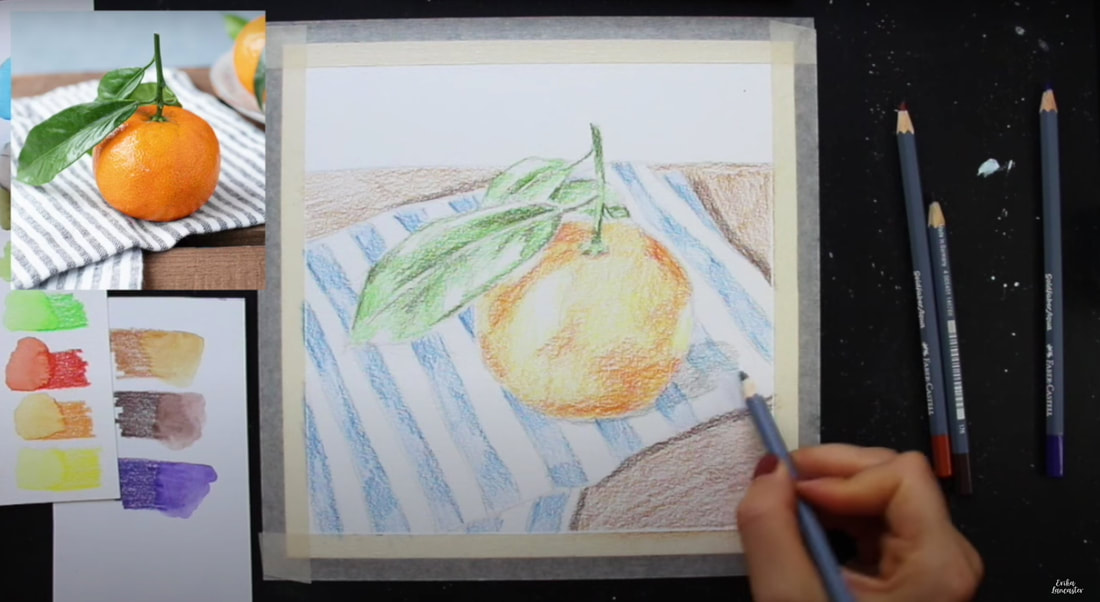
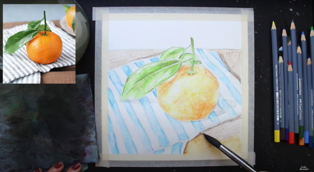
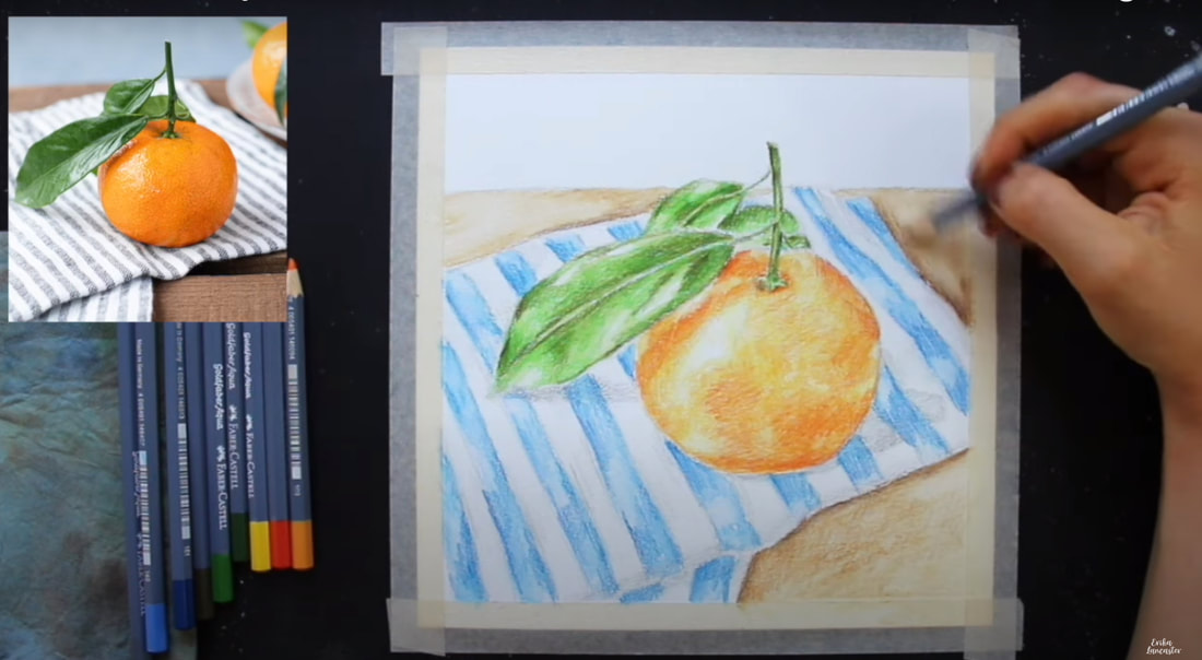
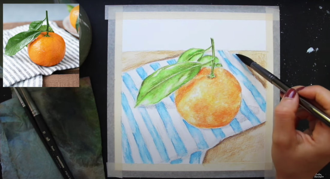
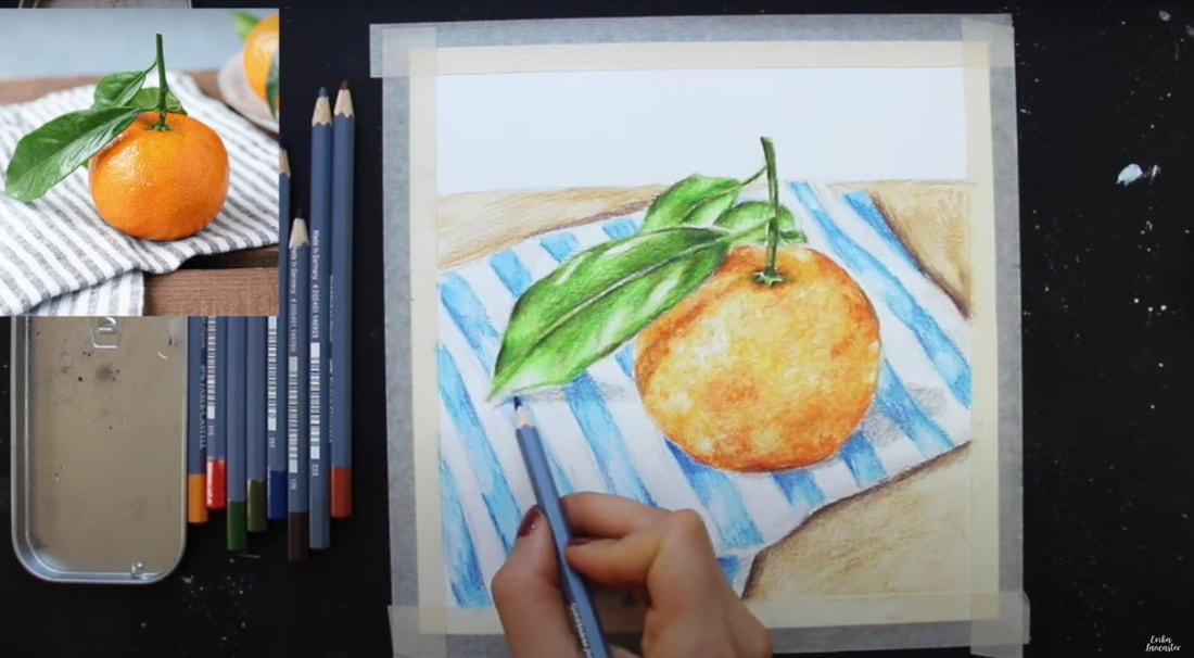
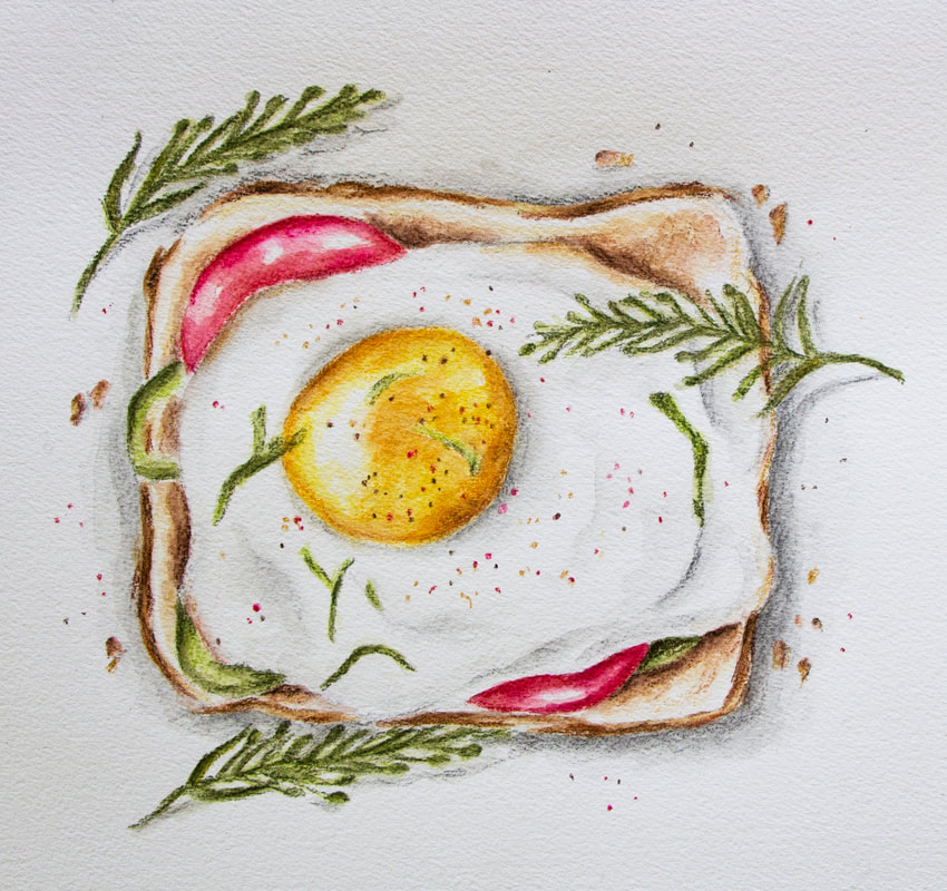
Can watercolor pencils be used to create higher levels of realism? How do you prepare for a successful watercolor pencil painting? How can I choose my colors in order to arrive at cohesive, harmonious results? Can watercolor pencils be layered? Watercolor pencils are such an exciting art medium! However, it can be tricky to learn to use them because they are both a drawing and a painting medium, all wrapped up in one. They can be used in a variety of different ways, depending on the outcome you wish to create. Do you enjoy drawing mediums and the "sketchy" texture they create? Consider using less water throughout the process. Do you enjoy more of a painterly effect? Bring in more water throughout the process to "activate" your pigment. Looking for a combo of pencil texture and painterly effects? Use both techniques! After years of honing my skills with watercolor pencils, I'm happy to say that I've found a process, and specific supplies, that lead to the results I love, every time. In the full tutorial below, as well as others I've shared over at my YouTube channel (I have a full watercolor pencil playlist!), I spill the tea on my favorite techniques and main tips that have helped me create better work. The tutorial below includes: -My 5-Phase process for painting with watercolor pencils -How I create my preliminary sketch using pencil -How I pick the specific colors I'll be needing for higher levels of realism -How I layer watercolor pencils to develop believable depth -How I activate watercolor pencils with water -How I avoid overworking my watercolor pencil pieces -How I bring in a "wildcard color" to push contrast as well as develop greater color integration and harmony -How to create subtle textures -Must-know tips for success 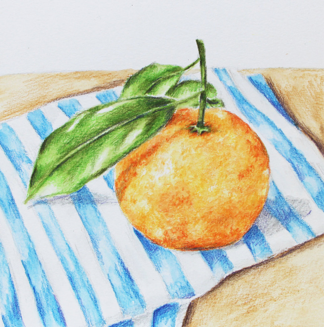
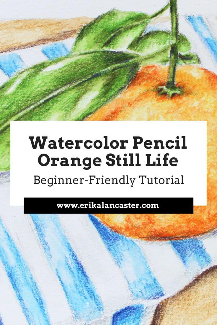
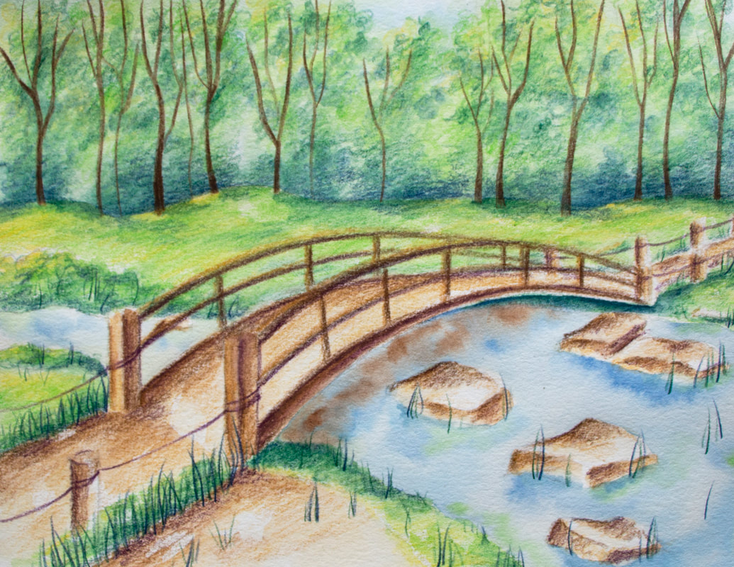
Watercolor Pencil Orange Still Life by Erika Lancaster
If you enjoyed this video and found it helpful, make sure to subscribe to my YouTube channel. I share a brand new video every week with art tips, drawing and painting tutorials and mindset/productivity tips for artists. *Subscribe HERE*
Original Reference photo can be found here. My 5-Phase Watercolor Painting Process
|

Tired of having to depend on tracing and/or using grids when drawing or preparing for a painting? Do you want to be able to confidently sketch while out and about, in a coffee shop, at a park, while on vacation, etc.? Confused as to how artists are able to recreate shapes and proportions effectively when drawing freehand?
Most of my students and community members know that, even though I enjoy using references when drawing or painting (I use both photos as well as draw/paint from direct observation), I'm not a very big believer in tracing and using grids.
Why?
Because, after we've gotten to a certain level with our drawing, sticking to those methods for long periods of time and never challenging oneself with freehand drawing or sketching, tends to hinder our progress in a variety of ways.
For one, tracing and using grids doesn't do much for our development when it comes to our visual measuring skills or our ability to lay down lines confidently.
Not to mention, these methods primarily teach budding artists to create carbon copies of the reference. This may very well be what certain types of artists are seeking, but for artists like myself who are looking to bring expression, personality and even certain amounts of imperfection into our representational pieces, progress would just come much more slowly.
Finally, because these methods focus primarily on copying, there's no reason for artists to further their knowledge of the subject on hand when it comes to proportion, 3D form and even perspective, which are all very important Art Fundamentals to wrap our heads around.
If we don't understand important Art Fundamentals such as perspective and 3D form (and others such as anatomy if we're drawing human figures or portraits), there's just no way that we're going to be able to draw freehand with confidence and ease.
For me, if my drawing practice is not somehow preparing me to draw from direct observation (otherwise known as drawing from life), it's holding me back.
This is just me, though. And I'm aware we all have different goals, styles and ways of working as artists.
But it's also important to be honest with ourselves regarding the types of practice that will help us get to our goals.
Even though I like using references in order to have something to jump off from, I'm not going for 100% replicating or creating a carbon copy of what I'm looking at.
I'm always taking away elements, bringing in elements, manipulating color, looking for ways to bring myself into my work and thinking of ways to improve the overall composition.
And yes, I do believe that using tracing is a great option for beginners just getting started on their drawing/sketching journeys. It could also very well be a great jumping off point, even when the artist has already developed his/her drawing skills and is getting into a new type of subject.
For example, when I was getting started with figure drawing, tracing over full-body poses helped me understand shapes throughout the body and develop that mind-muscle memory to a certain extent before drawing freehand.
I also believe that there is a time and place for tracing and using grids, even when the artist is already highly skilled. Namely, when he/she is short on time, the composition is very complex or large, he/she is teaching classes, working on studies that focus primarily on the painting process, etc.
You'll be able to find a list of my favorite drawing supplies here.
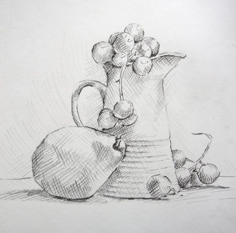
Still life arrangement in graphite by Erika Lancaster.
It's one thing to trace and use grids when one already knows how to draw and quite another to continue tracing and using grids forever, and ignoring the importance of learning to draw because you want to skip straight to the painting process or whatever it may be.
If you're creating art for the fun of it, then it's perfectly ok.
But if you're really looking to improve your art skills at a deeper level, it'll hinder you.
I've said this once and I'll continue saying it:
Drawing is the basis for all kinds of art.
Even though I sell my paintings and consider myself to be primarily a painter, I'll always continue practicing my drawing/sketching alongside my painting, because I know how much this practice enhances and simplifies my process with everything else.
And, if you're asking yourself if knowing how to draw is necessary if you're looking to develop a highly abstract style, I would say yes.
The only scenario in which I'd consider learning how to draw as not necessary, would be if an artist is looking to do pouring type paintings or Jackson Pollock-type paintings, in which the paint in itself organically creates shapes and the composition is more erratic/less planned.
But, if you're looking to ever leave that, it's essential to know how to draw and learn about Art Fundamentals.
If you know these two at least on a basic level, not only will moving on to painting be much easier, but you'll be able to create higher quality work much faster.
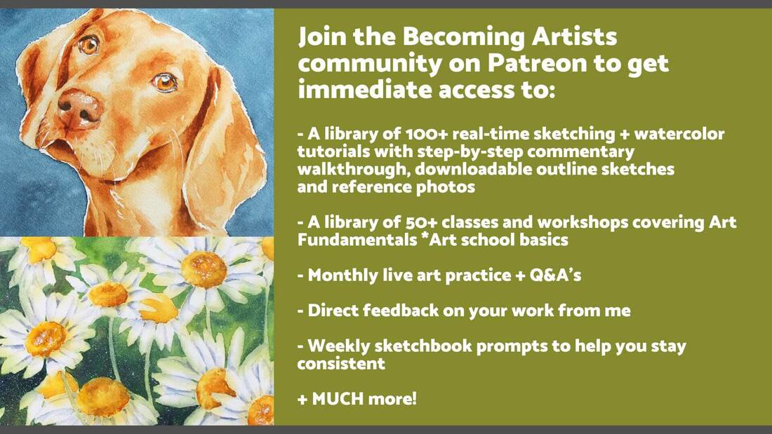
This is why,over on the Becoming Artists membership site, I share both watercolor and drawing/sketching tutorials, as well as full classes and assignments on Art Fundamentals.
In the following video, I share my preliminary sketching (outline sketching) process for recreating effective shapes and proportions freehand.
This is what I do every time I'm working on a new drawing, as well as before getting started with a new watercolor piece.
I also provide lots of tips along the way that'll help beginners move forward faster with their freehand drawing.
After finishing with the preliminary sketching process using regular graphite pencils, I use alternative shading/mark-making techniques (hatching and crosshatching in this case) to develop a wide range of values and create interest/depth.
If you enjoyed this video and found it helpful, make sure to subscribe to my YouTube channel. I share a brand new video every week with art tips, drawing and painting tutorials and mindset/productivity tips for artists. *Subscribe HERE*
Freehand Sketching Tips for Beginners
1. Take time to find a great reference photo and observe it before getting started
In this past blog post, I talk about the main characteristics that a reference photo should have if we're intending to use it for drawing or painting purposes.
Choosing your reference photo wisely is a must. Otherwise, you might be making the drawing or painting process much harder for yourself than it needs to be.
A few of the things we have to look for are: great lighting, good resolution, and that no important parts of the subject are cropped out.
Once you've found a great art reference photo, or have prepared something to draw from life/direct observation, make time to observe it before putting pencil to paper.
Conclude where the light source is located in relation to the subject(s), take note of the perspective you're viewing the subject(s) from, notice any textures you may have to practice before jumping in, and take note of the different sizes and shapes.
2. Make sure you're drawing lightly (I like using my HB pencil)
Drawing is a refinement process. It's not like when we're writing our name or a sentence, in which we're expected to write everything perfectly right-off-the-bat.
And when we're drawing freehand, we're going to make mistakes along the way that we need to be able to easily fix.
We want to draw lightly for a variety of different reasons: this will help us easily erase mistakes, it'll help us avoid damaging/scratching our paper, and if we're looking to create higher levels of realism, our outline sketch won't show through at the end (in realism there are no outlines).
I always move from harder pencil grades to softer pencil grades in my drawing process.
I explain all about pencil grades and their use throughout the drawing process in the first class of my Drawing for the Total Beginner Mini-Course, which you can access for free.
3. Simplify your subject and use "envelopes" to lay down largest/general shapes
It's essential to be able to simplify what you're looking at and visualize it as simple shapes or forms (or combinations of simple shapes or forms).
*Shapes are flat and 2-dimensional and forms are 3-dimensional and have volume.
I don't worry about recreating curves and shapes perfectly when I'm getting started with a sketch, but simply lay down oversimplified shapes that are blocky and more angular. This helps me, first and foremost, make sense of proportions and locations of different elements in regards to each other.
By starting with largest/general shapes and making our way towards smaller shapes and details, we're able to use our drawing area much more effectively and this also helps our brains compare sizes and widths of different elements more easily. *You can see this entire process in the video above.
As you continue adding in more shapes, constantly relate and compare different elements with each other in terms of their lengths, widths, locations within space, the angles they create upon each other, etc.
Visually break elements down into halves, thirds, fourths, etc. and compare them to each other in this way. There's no shame in using a ruler in the beginning!
As you continue adding more and more elements, you'll likely notice that there are things that need fixing. This is normal, as the more elements you add in, the more points of comparison you'll have.
Continue comparing constantly and refining along the way.
Remember that it's important to take the entire composition (the whole) into account and that achieving effective proportions is all about getting the relationships between different elements right.
4. Whenever you're drawing smaller groupings of elements, take note of overlapping and edges
Whenever a reference has groupings of similar or small overlapping elements, such as the grapes in the one I'm working with above, take note of their edges.
Make sure you're noticing which elements are overlapping which, and how they are sitting on each other, in order to avoid a "floating" look.
5. Lay down horizontal or vertical lines as guides
Our brains tend to and understand straight horizontal or vertical lines a lot more easily than slated or irregular lines.
We can decipher angles, alignments and distances between subjects with greater ease by drawing horizontal or vertical lines (you can use a ruler for this) alongside elements or wherever you feel a line would serve as guidance.
Lots of skilled artists use plumb lines, which are vertical lines that enable them to more easily achieve proper distance, alignment, etc. among different elements.
6. Take your time with the preliminary sketching process
The preliminary sketching process is, quite simply, the foundation for everything else.
You'd never start adding in the windows or painting the walls of a house without making sure that the foundation is solid, right?
Especially when we're looking for higher levels of realism, it's essential to take our time with our preliminary sketch before moving on later parts of the drawing process such as smaller details and shading.
I know it can be exciting to move on to shading, but remember that no amount of shading, texture or detail is going to fix errors in proportion, shapes and perspective.
7. Learn about Art Fundamentals such as 3D form and Perspective
When our objective is to become skilled at drawing or sketching freehand, knowing at least the basics on Art Fundamentals is essential.
Learning how to use your medium (whether graphite, pen and ink, pastel, watercolor, gouache, etc.) and developing your observational skills, is one thing, but learning the fundamentals is quite another.
These go hand in hand.
The list of Art Fundamentals will vary a bit depending on where you look, but the basics include: Elements and Principles of Art, Composition Design, Light Behavior, Anatomy, etc.
I always recommend students learn at least the basics of all of them so that they aren't limited, but once the artist knows the specific subject he/she'll be working with for a long period of time, it's important to delve deeper into the fundamentals that'll help us increase the quality of our work (ex. Anatomy is an important fundamental for portrait/figurative artists, Perspective is important for urban sketchers and landscape artists, etc.).
8. Practice with the 4-Quadrant Method
There is one method that I practiced with a lot when I was just getting started, which helped me develop much needed skills for freehand sketching a lot faster.
I still use it to the day when I'm working with specific subjects and/or want to make sure I'm using my drawing space as effectively as possible.
This is a method I always introduce to my students when I'm just getting started with them and they've seen great success through consistent practice with it.
I explain this method here.

As overwhelming and challenging freehand sketching may seem in the beginning, it's important to remember that we're making forwards progress with every piece we work on.
The more you practice, the more you'll be building up your observational skills, visual measuring skills, and ability to recreate shapes and proportions effectively.
By staying consistent with your freehand sketching practice and applying the aforementioned tips, you'll be making tons of progress in no time!
You'll be able to find a list of my favorite drawing supplies here.

*This post contains affiliate links. I receive small commissions for purchases made through these links at no extra cost to you. These commissions help me keep this site up and running, in order for me to keep providing helpful and inspiring art content. :)
What are the main things I need to know in order to achieve realistic results when drawing hair? How can I break drawing hair down into simple steps to follow?
There's no denying it.
Achieving realistic results when drawing (or painting) takes great skill and patience.
And for those of us who love drawing portraits and animals, knowing how to add hair texture in a believable way is important!
I'm very excited to share a super helpful, step-by-step tutorial with you that the extremely talented Austrian artist/illustrator Sabrina Hassler prepared for us.
Today, she'll be spilling the beans on her method for adding beautiful (and very realistic) hair to her graphite portraits!
It takes only a quick look into Sabrina's website and social media to know that she's the real-deal when it comes to realistic drawing.
She loves drawing portraits, animals and botanicals and, just like me, she has a passion for sharing her knowledge with other creatives who are looking to progress their skills.
Without any further ado, let's get into her tutorial!
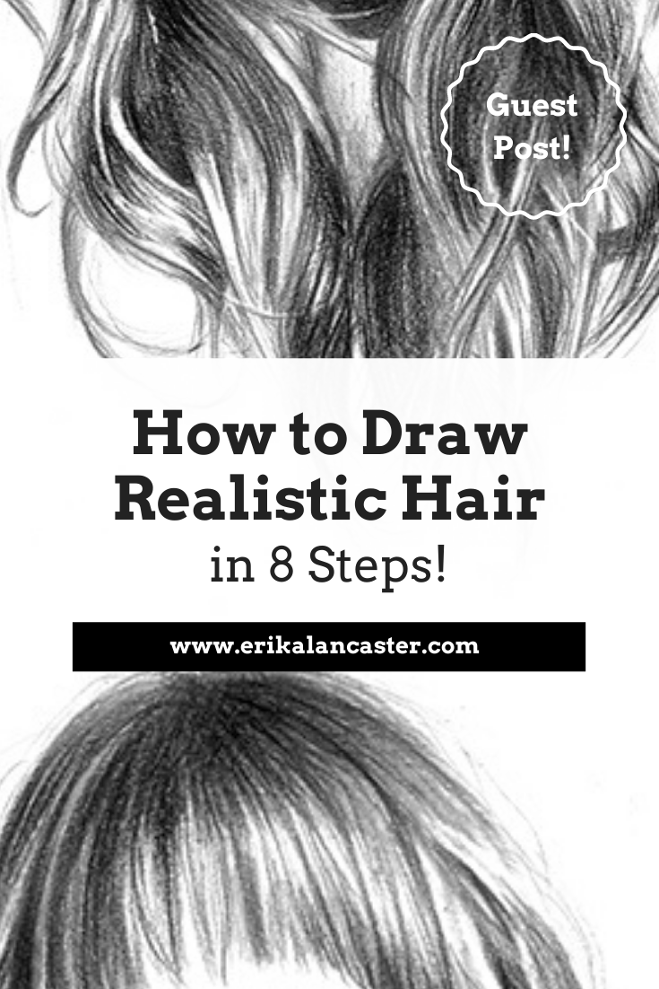
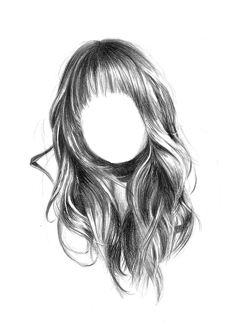
How to Draw Realistic Hair in 8 Steps
by Sabrina Hassler
Many artists find it difficult to draw interesting and natural hairstyles. I've been asked many times: "How do you make hair look so realistic?”
Some complain: "Drawing hair is so complex!"
But it doesn't have to be that way.
In this tutorial you will learn how to draw hair in 8 simple steps, using the example of a long wavy hair.
Curious? Here we go!
Supplies you'll need:
• Pencils (H-4B)
• Black colored pencil
• Eraser and pen style/barrel eraser
• Blending stump
• Drawing paper
Find a list of Erika's favorite drawing supplies here.
How to prepare:
Print out your reference photo several times.
Print out the original photo on regular printing paper once (preferably in grayscale/black and white if you draw with pencils).
Other copies should ideally be a little lighter and a little darker than the original. You can make small brightness adjustments using any photo editing software.
Why do you need lighter and darker copies?
In the lighter copy you'll be able to see dark areas in more detail and in the darker copy the highlights will stand out even more. This will help you to create a high level of contrast between lights and darks later on, which is important for realism.
You’ll also need an extra copy to draw in some helpful guidelines.
Link to my reference photo.
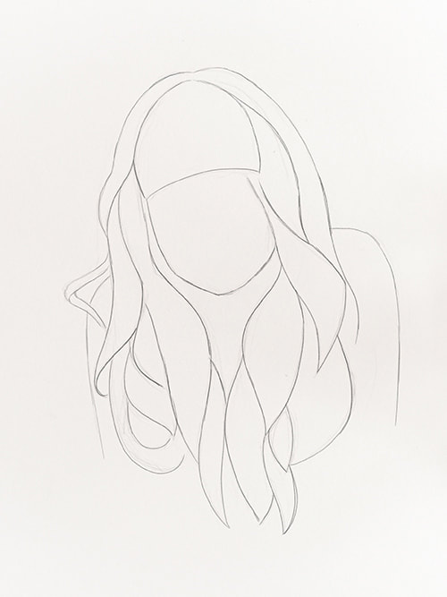
1. Draw basic outlines
To begin, carefully draw the outlines of the head, neck and hair on your drawing paper. Use a harder pencil grade (for example H or HB) and make sure not to press down too hard on your paper as you're creating your sketch.
In the beginning it’s completely normal to make mistakes and you’ll often have to fix something. That’s why your strokes shouldn’t be too dark, so they're easily erasable.
If you have trouble getting the proportions right, try breaking down your subject/reference into simple shapes (such as circles and rectangles). It also helps me to draw guidelines, for example along the central axis of the face (from forehead to nose to chin).
In this example you can draw a circle for the head (chin to top of the head) and then draw an identical circle beneath it, to get an idea where the hair
ends.
2. Analyze shapes
It's time to analyze the separate strands of hair. To do this, take your extra copies of the reference photo and try to recognize abstract shapes throughout the hair.
Draw these abstract shapes with a pen or drawing tool that you'll be able to see clearly on your photo. I used a yellow acrylic pen in the example below.
Once you have divided the hair into shapes, transfer these shapes onto your sketch, once again, without pressing too hard.
Reference photo with shapes:
Outline sketch:
3. Start shading
The next step is very basic shading.
I'd recommend using a softer pencil grade such as B or 2B, and shade the darkest areas on your sketch where least amount of light reaches the hair.
Mostly the areas around the neck and on the parting are very dark. Start there.
Take a look at your lighter copy of the reference photo and detect the areas where the image is darkest.
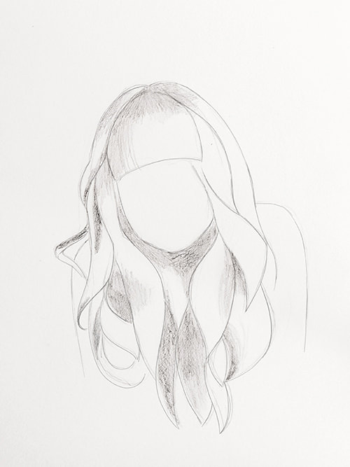
4. Sculpting
Next, give your hair more volume and three-dimensional form by adding individual hair strands inside of those basic shapes you created.
By dividing the strands into shapes (step 2), this process is much easier for you and you can work your way over the head one strand at a time.
Make sure that your strokes flow in the same direction as the hair naturally grows. Constantly observe your reference photo for clues.
Try to leave the bright spots (highlights) free of graphite and concentrate on the dark tones and midtones.
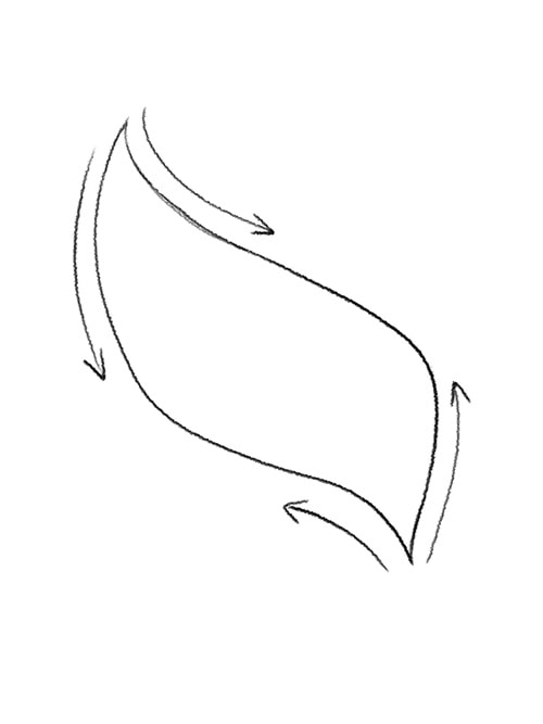
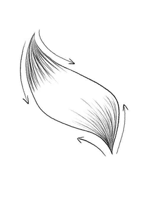
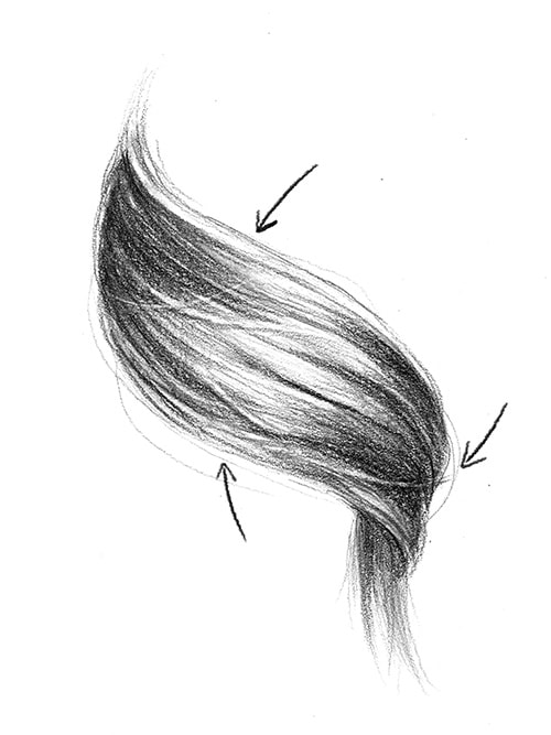
*Tips and techniques to give hair a 3D look
In the sketch below, you can see how you can shade in a single lock of hair.
Always draw your lines from the ends of that strand, going in (see arrow direction) so that your strokes end gradually in the widest area in the center. In other words, those pencil strokes are going towards the direction of the highlight in that strand of hair.
The hair usually shines most in the middle of the strand because this part protrudes outwards most and thus captures the most light.
Therefore, it's helpful to work from the ends towards the middle section, and not fill in the area in the middle with as much graphite, as this will be the lightest part.
Your focus should be more on the overall shape of the strand, and not on the individual hairs.
The more lines you draw, the darker everything will look. This creates more contrast with the lighter (empty) areas in the middle and this will make your stand look three-dimensional and shiny.
One lock of hair:
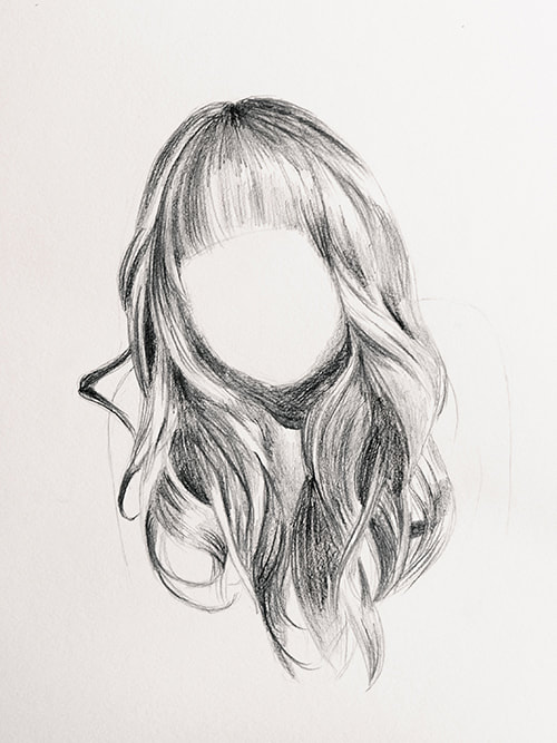
5. Smooth things out
The next step is a suggestion and not a requirement. It mostly depends on the overall look or result you'd like to achieve.
I think it makes a big difference to smooth out the transitions between values (lights, midtones and darks), and to soften out individual lines. I like using a paper bending stump for this part of the process, but you can also use a cotton swab.
Carefully (and gently) trace over your previous pencil strokes and let the flow of the hair guide you.
Try your best to not go over areas of lighter values/highlights. It often happens that I accidentally smear something or bring graphite into areas that I wanted to leave very light.
But don't worry, if this happens! We will correct this in the next step.
6. Pull out highlights
Next, take your pen-style/barrel eraser (or a pointed-shaped kneaded eraser) and erase the highlights (i.e. the shiny spots that reflect the light the most).
Most of the time I accidentally smudge these shiny spots with my blending stump in the previous step, so I have to pull them back out by erasing the graphite.
Observe your darker copy. There, you'll be able to notice lighter areas even more distinctly.
A pen-style eraser is perfect for this because it provides a lot of precision and you can even erase individual hairs.
7. Add contrast
By this point, your drawing will probably already look pretty good, but you shouldn’t stop there!
Using a black colored pencil, darken the darkest areas of your drawing again, using the same strokes/direction/overall motion that you were previously using with your pencil.
Colored pencils provide a more opaque/less shiny finish than regular pencils and will help add more depth and contrast, making your drawing look even more realistic.
8. Final details
The last step will really make your drawing stand out. If you want your drawing to look natural, you should also invest some time adding the final details.
By that I mean details such as smaller hairs that don’t follow the general flow of the hair, such as flyaways, stray hairs, and all the small imperfections that make hair look "real". These can be added around the head or even over the face.
You can draw a few flyaways on the outside of the head with a hard pencil grade. Flyaways are usually very thin and hardly recognizable from a distance. The pen-style eraser is suitable for drawing individual hairs over the main hair areas. Use it to erase small lines over larger, dark areas to add in a flyaway hair.
Take a close look at your reference photo and decide for yourself which details you would like to draw in and which make the hairstyle unique.
You can also add some details from your imagination, if you want to achieve a messy look for instance.
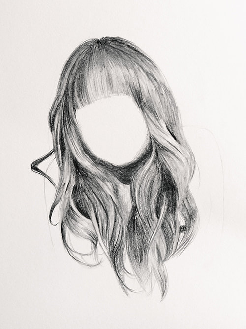
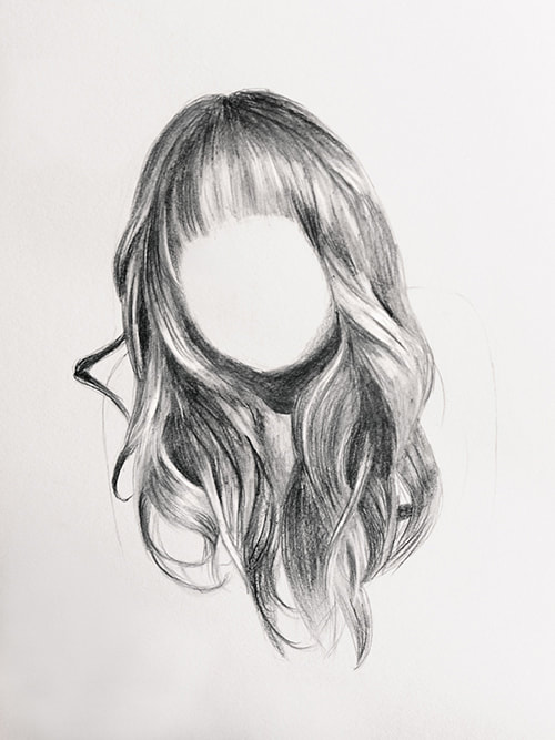
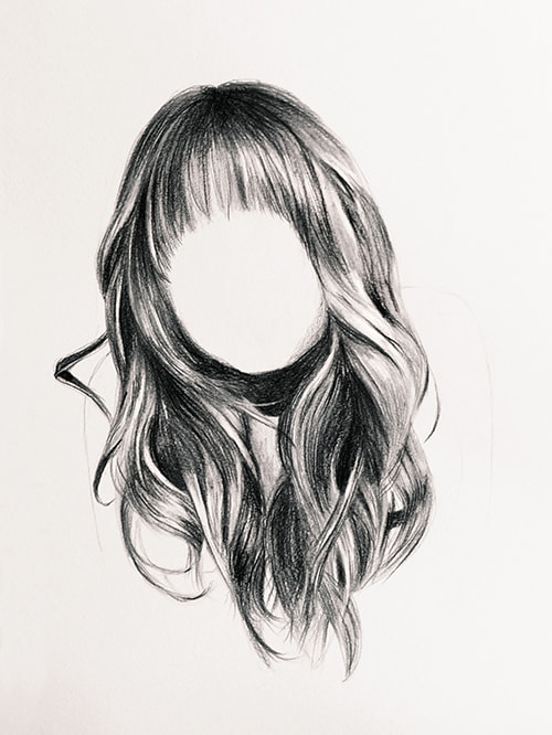
Finished drawing:
*Final tip: Adding details
In the image above, you can see examples of “imperfections” such as flyaways and stray hairs in greater detail. Some single hairs also cast their own shadow on the hair underneath.
Avoid dark ends in hairs by releasing the pressure on the pencil at the end of your stroke. Try to get your hairs darker at the roots and remember to create a line weight variation within your lines (from thick to thin/dark to light), instead of having one continuous line weight from one end to the other.
Never forget to draw your lines in a dynamic motion so they don’t end up being wobbly. If you move your hand in a fast and confident way, you will achieve a great look!
I hope that these tips will help you to draw complex and believable hairstyles and that from now on drawing hair will be much more enjoyable for you.
Drawing hair is a great way to practice our shading skills and advance out ability to draw different textures. Not to mention, we're also able to progress out observational skills via analyzing complex references.
Once you understand the basic principle, you can let your imagination go wild and draw interesting hairstyles or fur.
I would be happy to hear from your experiences - you can contact me here.

|
Sabrina Hassler is an Austrian artist and illustrator specializing in portraits, animals and botanicals. Follow her on social media: And visit her website here. |
Was this an amazing tutorial or what?
I certainly learned a lot of things that I'll be putting into practice when drawing hair realistically, and I hope you did too.
For more helpful tips and tutorials from Sabrina, check out her blog.
Sending out a huge thank you to Sabrina for this incredibly helpful tutorial!
Cheers!


www.erikalancaster.com
is a participant in the Amazon Services LLC Associates Program, an affiliate advertising program designed to provide a means for sites
to earn advertising fees by advertising and linking to amazon.com.
www.erikalancaster.com
is a participant in the Shareasale.com Affiliate Program, an affiliate advertising program designed to provide a means for sites to earn advertising fees by advertising and linking to Shareasale.com partner companies.
 RSS Feed
