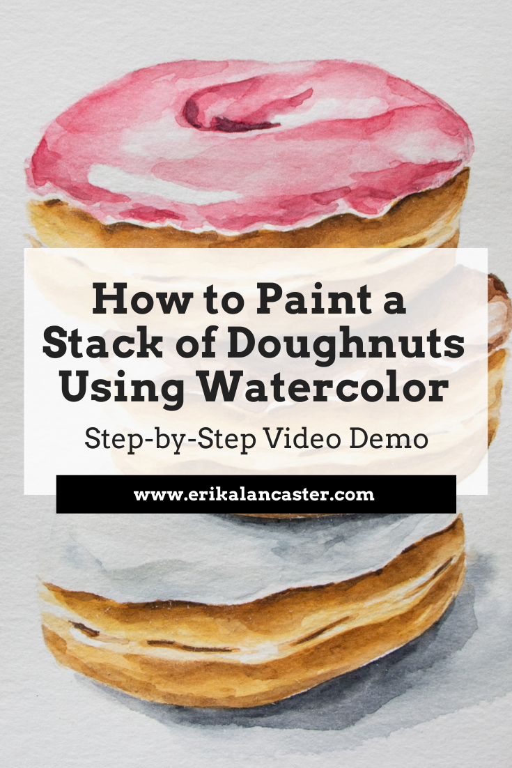
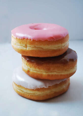
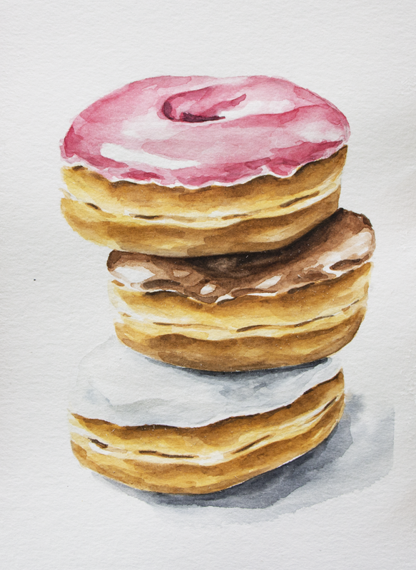
*This post contains affiliate links. I receive small commissions for purchases made through these links at no extra cost to you. These commissions help me keep this site up and running, in order for me to keep providing helpful and inspiring art content. :) Interested in watercolor food illustration, but don't know where do start? How can higher levels of realism be developed using watercolor? Why is layering so important and how does it work when using this tricky painting medium? In today's blog post/YouTube video, I'm taking you through my full watercolor painting process for a stack of doughnuts. Throughout the video included in this post, I share everything about my technique, no holds barred, as well as provide tons of tips on water control and much more. I absolutely love painting food! Food illustration is one of the first kinds of work I started doing when my journey with watercolor began a few years ago, and this is still my go-to subject when I feel blocked or frustrated creatively. For the painting process I'll be sharing in this post, I used a photo that I took in my own home studio. Here's the photo and the final painting.
Check out my blog post titled How to Take Your Own Art Reference Photos Quickly and Easily to find essential tips on taking pictures to work from for future pieces. Forming your own art reference photo library is so powerful! Or, if you're short on time and are looking to find great art reference photos online that you can use without getting into trouble, check out this blog post. Below the video, I'll be providing the key takeaways for you.
If you enjoyed this video and found it helpful, make sure to subscribe to my YouTube channel. I share a brand new video every week with art tips, drawing and painting tutorials and mindset/productivity tips for artists. *Subscribe HERE*
For a list of my favorite watercolor painting supplies, go here. Key Takeaways from Today's Watercolor Tutorial
|


0 Comments
*This post contains affiliate links. I receive small commissions for purchases made through these links at no extra cost to you. These commissions help me keep this site up and running, in order for me to keep providing helpful and inspiring art content. :)
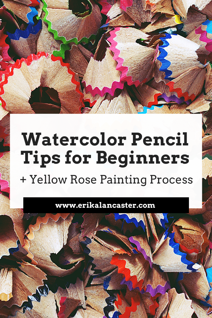
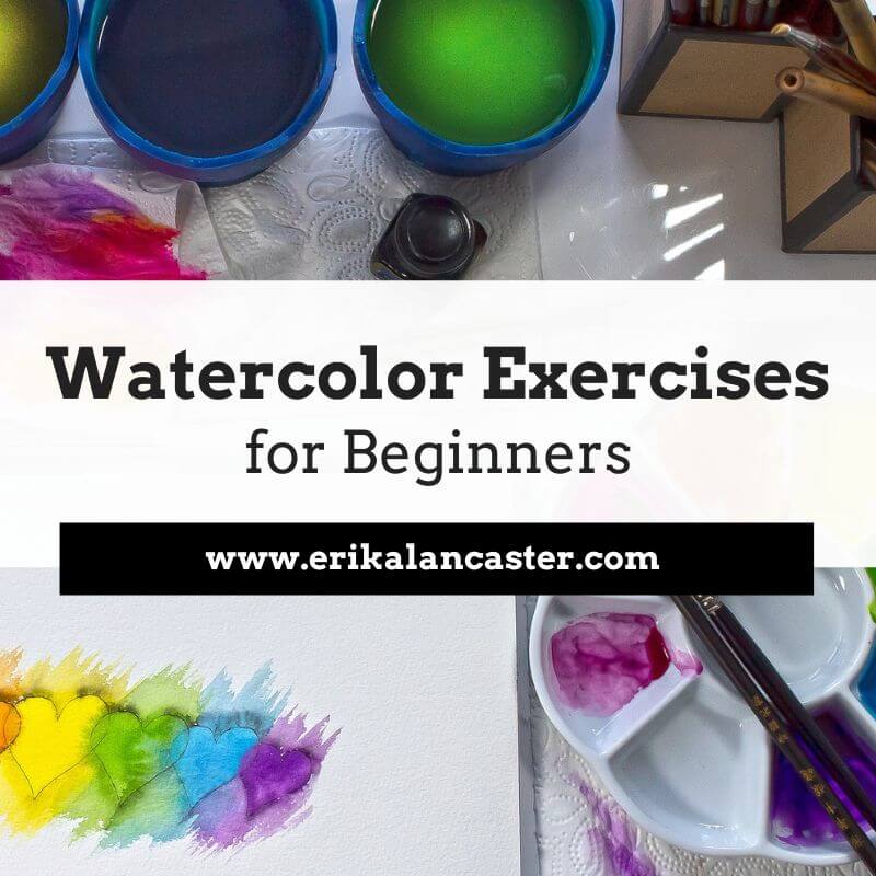
Is there a specific process to follow when using watercolor pencils? What things should I do to ensure a better outcome when using this medium? What are some good watercolor pencil options for beginners just getting started?
In this blog post, I'll be providing five key tips that will help make the learning process less frustrating and enable you to create amazing artwork as soon as possible. In the video included here, I'll also be sharing how I personally use watercolor pencils by painting a yellow rose.
Watercolor pencils are not only an extremely versatile art medium, as they are simultaneously a drawing and a painting tool, but their practicality makes them ideal for many beginners that are short on time and space.
They also allow for much more control when compared to regular watercolor paint and can help us start getting a feel for what it's like to work with watercolors without having to master water control.
Watercolor pencils are basically watercolor pigment that has been encased in wood, in the form of a pencil.
They can and can be used either with or without water to create different effects, which can range from a heavily-textured colored pencil look, to a smooth and painterly watercolor paint look.
To create marks and colored pencil textures, we simply use them right on our paper, which can be completely bone dry or pre-wetted with clean water.
Of course, the type of paper used has a great impact on the amount of texture created. Smoother paper will lead to smoother effects, while rougher paper will create more texturized effects, as the pigment isn't evenly distributed throughout the tooth of the paper.
On the other hand, to create painterly effects, we lay down our color on our paper just as if we were using regular colored pencils and then smooth it out by going in with a dampened paintbrush. There's no need to use heaps of water for this. *You can also use the paper paint mixing palette method I demonstrate in the video included below.
When using quality watercolor pencils, water really activates the pigment and makes the color look a lot brighter and bolder.
These techniques can be used alone or in combination. For example, if you were painting a landscape, you could use more painterly techniques for your background, and more textured/detailing techniques for layers in your foreground.
There is no specific process to follow when using this medium. It's use is going to depend on the specific style and effects you are personally going for with the piece on hand, which is why it's important to give thought to the overall look you want to create before starting.
All this said, many of the regular watercolor "rules" (if they can even be called rules) apply.
In the following video you'll see how, even though my general method is different to what I would do when I paint with regular watercolor paint, I still protect my highlights throughout the process, work from light and translucent to dark and saturated, and allow my paper to dry in between layers.
In this past blog post/YouTube video, I do a comparison between regular watercolor paint and watercolor pencils, and share a complete demo in which I paint the same apple using both mediums. They are very similar, but very different at the same time.
If you enjoyed this video and found it helpful, make sure to subscribe to my YouTube channel. I share a brand new video every week with art tips, drawing and painting tutorials and mindset/productivity tips for artists. *Subscribe HERE*
Find a list of my favorite watercolor pencil supplies here.
Find a list of my favorite watercolor pencil supplies here.
Watercolor Pencil Tips for Beginners
1. Use paper that is intended for water-soluble mediums
Using regular printer paper for watercolor or watercolor pencil work will most likely lead to frustration during the process, as well as undesired results. Not to mention, the learning phase will last longer, as the beginner artist isn't actually able to get a sense for what the medium is like.
This said, I don't believe in necessarily going for the highest quality watercolor paper right-off-the-bat (if you have the budget- then by all means go for it).
I'd much rather you practice consistently on decent quality (and accessibly priced) student-grade paper, as opposed to not creating art because you're afraid of wasting your supplies.
Check out my blog post/YouTube video titled Watercolor Supplies for Beginners and Things You Must Know to learn more about my opinions and suggestions on specific watercolor painting supplies.
I always recommend working with watercolor paper that is at least 140 lbs. or thicker/heavier in weight, so that it's able to take a bit of a beating. Thinner paper not only warps a lot more easily, but it doesn't allow for layering and scrubbing techniques and is very easy to damage.
And when we're just getting started (with any medium), most of us tend to overwork things, often damaging our substrate and/or tools.
Stay mindful throughout your painting process in order to ensure that you're not scratching your paper with your sharp watercolor pencils and that you're allowing layers of paint to dry in between if you're using a dampened paintbrush to smooth out your color.
Lay down your colors gently and patiently, without pressing down to hard (this will create scratches and burnish the paper-creating an uneven sheen/finish).
2. Create your preliminary sketch lightly
One of the main characteristics that sets watercolors apart from other painting mediums such as acrylics, oils and gouache, is its translucency.
Because of this, if we create a preliminary sketch prior to starting with our painting process that's not very light, it will likely show through our paint.
There are lots of watercolor artists out there who like their line work to show through their paint, but if you don't want this to happen, it's important to make sure that you're outline sketch is created lightly. I usually use an HB pencil for this phase of the process and make sure I'm not exerting much pressure at all.
Being light-handed when creating your preliminary sketch will also help ensure that the graphite left behind on your watercolor paper won't dirty up the colors you start placing on top. You want your colors vibrant and fresh.
Something you can also do, is use a light colored watercolor pencil to create your preliminary sketch. This way, once you start using water, your line work will disappear completely as you go!
3. Plan the colors you'll be using before starting to paint
It's incredibly important for people starting on their painting journeys, to look into the color wheel and Color Theory.
Color is an Element of Art that not only plays a huge role in making an artwork look harmonious and cohesive, but knowledge about the color wheel enables us to create color mixtures effectively throughout the art-making process.
Instead of randomly picking colors throughout the painting process, take five minutes to observe your reference picture and pick out the specific watercolor pencil colors you'll be using. Take them out of your package and place them beside you as you prepare for your new piece.
Don't only think about the colors of the subject in and of itself (ex. if I'm painting a gray cat I'm not only looking for different grays), but also think about what colors you'll be adding in to create your darkest values, cast shadows and background colors.
Take time to swatch your colors on a scrap piece of watercolor paper, as they really tend to look different once they are applied vs. the color shown on the pencil. Test any color mixtures you're planning on using.
Keep things limited and as simple as possible.
I promise, it'll make a huge difference in terms of both your organization during the process, as well as the outcome.
4. Use a good reference photo
If you're looking to create higher levels of realism, make sure you're stemming from a good reference photo (or have your subject in front of you in good lighting).
Not only will a good reference photo enable you to see details and the tiny nuances that will make your drawing or painting more realistic, but it will also provide you much needed information in terms of light behavior and locations of highlights, midtones and darks.
Remember, it's these different values (highlights, midtones and darks), that make drawings and paintings look three-dimensional. If you're unable to locate them in a photo reference, you'll have lots of trouble trying to recreate them.
Always make sure your reference photos have a great resolution that will enable you to see details and zoom in (if necessary), and that they show good lighting.
You'll know a photo has good lighting if it shows a good play between lights and darks. *Photos taken with flash are usually washed out and make everything look very flat, which makes the drawing and painting process a lot harder.
If you don't have a good reference to work from, you're basically guessing at what things look like and have to make your own conclusions in regards to where highlights, midtones and darks are located.
Unless you've been drawing or painting a specific subject for years, you're drawing or painting it the way you think that subject looks like, and not what it actually looks like in real life.
Learning to observe and learn all we can about the subjects we're interested in improving at by actually taking in all sorts of references (photos, life subjects, videos, etc.), is so important, as artists!
And, remember, just because you're using a reference, it doesn't mean you can't bring in your own creativity into your work.
5. Give thought to what kinds of effects you want to use in each area of your painting
Because watercolor pencils allow for so many different types of techniques, it can be very easy to get lost during the process and end up with effects we weren't intending to create.
Give thought to the specific techniques you'll be using, as well as when and where you'll be using each, throughout the painting process. This will make it much more likely that you'll end up with an outcome you'll love.
Think of how you can combine different techniques to create impactful and contrasting effects in your different layers (foreground, middleground, background), as well as how you can use them to bring more attention to your focal point.
There are so many ways you can go with watercolor pencils!
Explore, have fun and don't forget to bring in a bit of yourself into everything that you create. :)
Find a list of my favorite watercolor pencil supplies here.
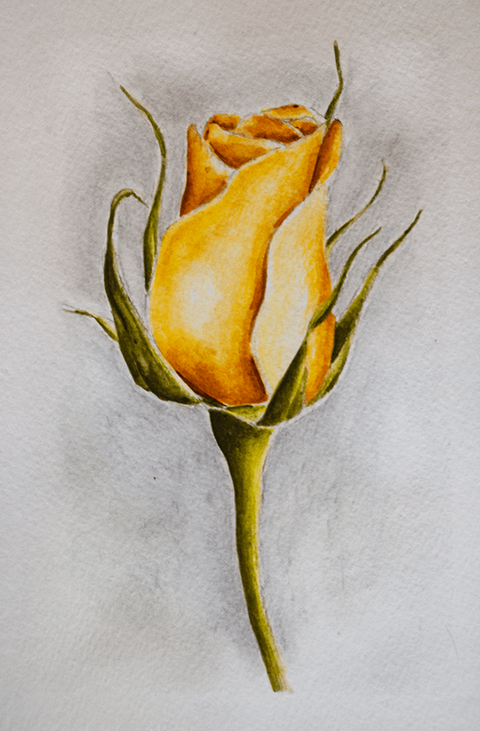
Watercolor Pencil Rose by Erika Lancaster
|
|
|
*This post contains affiliate links. I receive small commissions for purchases made through these links at no extra cost to you. These commissions help me keep this site up and running, in order for me to keep providing helpful and inspiring art content. :)
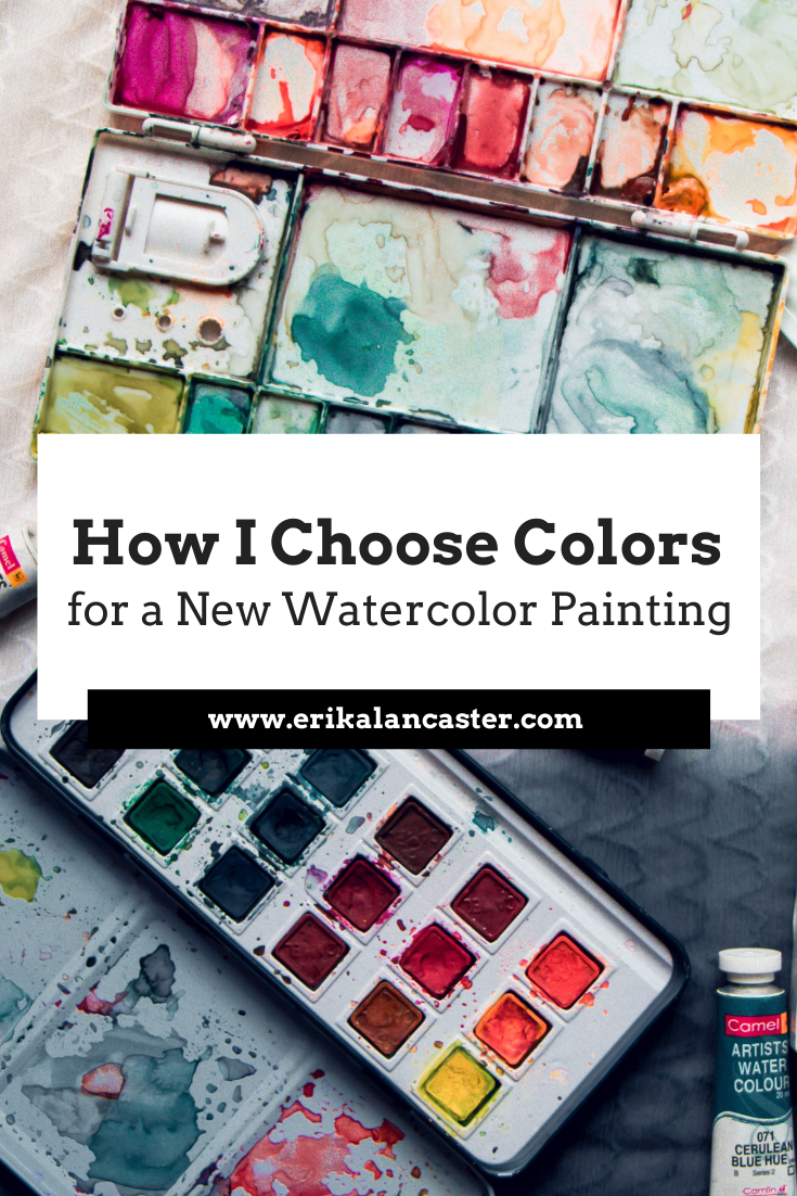
Why is it important to plan colors before starting a painting? How is a limited color palette useful? How will learning about the Color Wheel help us create more successful and professional-looking artwork?
In the video included within this blog post, I'll be sharing how I go about selecting my colors prior to starting a new piece. I'll share my thinking process as I go through this method and will be offering lots of tips pertaining to color.
In past blog posts and YouTube videos, I have mentioned how color is an essential Element of Art to learn about as a beginner artist.
The reason?
When we're looking to create a visual composition, we have to think about how different parts fit together into a whole.
And color plays a huge role in making a visual composition look harmonious and cohesive.
When it comes to a visual composition, all individual elements are connected. Each one has an effect over how we perceive the elements around it.
And just like how you wouldn't throw on an outfit with a ton of different colors and textures that don't mesh well together, you have to think about how things will look like in a painting when appreciated as a whole.
It's not about one element in the piece, but how the different elements included intermix to effectively transmit the idea or message we're trying to get across.
It's incredibly important that any beginner artist who is serious about improving their painting makes time to learn about the Color Wheel.
This is an incredibly important tool that allows us to understand relationships between colors so that we're not only able to create effective color mixtures during the painting process, but also prepare color schemes that work well.
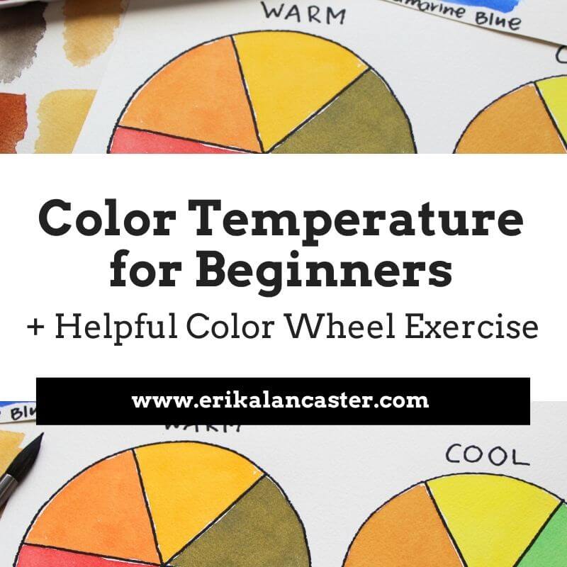
Here's a free class on Color Temperature in which I share a powerful exercise for beginners.
Limiting the amount of colors that you use in a painting is also very useful because the more colors you use, the more disorganized your palette will be, the more likely color mixtures will lead to mud, and the more incoherent the end-results.
Whatever you do, stay away from randomly selecting colors during the painting process and dedicate at least a bit of time to plan for your painting. I promise you, there's much more of a chance that you'll end up with great results.
Why is it important to plan colors before starting a painting? How is a limited color palette useful? How will learning about the Color Wheel help us create more successful and professional-looking artwork?
In the video included within this blog post, I'll be sharing how I go about selecting my colors prior to starting a new piece. I'll share my thinking process as I go through this method and will be offering lots of tips pertaining to color.
In past blog posts and YouTube videos, I have mentioned how color is an essential Element of Art to learn about as a beginner artist.
The reason?
When we're looking to create a visual composition, we have to think about how different parts fit together into a whole.
And color plays a huge role in making a visual composition look harmonious and cohesive.
When it comes to a visual composition, all individual elements are connected. Each one has an effect over how we perceive the elements around it.
And just like how you wouldn't throw on an outfit with a ton of different colors and textures that don't mesh well together, you have to think about how things will look like in a painting when appreciated as a whole.
It's not about one element in the piece, but how the different elements included intermix to effectively transmit the idea or message we're trying to get across.
It's incredibly important that any beginner artist who is serious about improving their painting makes time to learn about the Color Wheel.
This is an incredibly important tool that allows us to understand relationships between colors so that we're not only able to create effective color mixtures during the painting process, but also prepare color schemes that work well.
Here's a free class on Color Temperature in which I share a powerful exercise for beginners.
Limiting the amount of colors that you use in a painting is also very useful because the more colors you use, the more disorganized your palette will be, the more likely color mixtures will lead to mud, and the more incoherent the end-results.
Whatever you do, stay away from randomly selecting colors during the painting process and dedicate at least a bit of time to plan for your painting. I promise you, there's much more of a chance that you'll end up with great results.
If you enjoyed this video and found it helpful, make sure to subscribe to my YouTube channel. I share a brand new video every week with art tips, drawing and painting tutorials and mindset/productivity tips for artists. *Subscribe HERE*
You'll be able to find a list of my favorite watercolor supplies here.
You'll be able to find a list of my favorite watercolor supplies here.

|
|
*This post contains affiliate links. I receive small commissions for purchases made through these links at no extra cost to you. These commissions help me keep this site up and running, in order for me to keep providing helpful and inspiring art content. :)
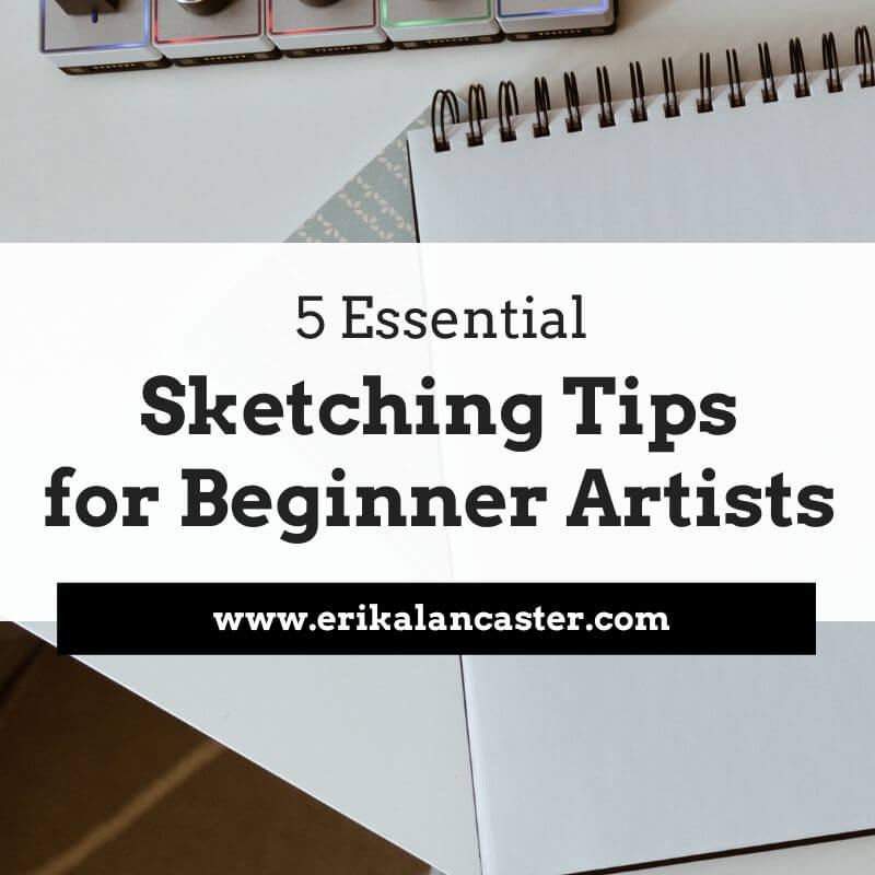
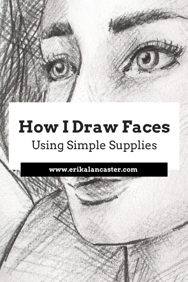
Do you need fancy supplies to progress your drawing skills and create the artwork you'd like to share with the world? How does one go about drawing a believable face? Why is keeping a sketching habit important for artists of all kinds?
In the time lapse video included within this blog post I share my entire face drawing process, starting with creating the head shape, moving onto laying down guidelines to help with the effective placement of facial features, sketching in individual elements and finishing up by adding quick shading using a combination of hatching and crosshatching.
Drawing believable portraits (and any part of the human figure) is challenging, as it requires us to not only have decent drawing skills to be able to render form/three-dimensionality as well as different textures like hair and skin, but it also entails having a good amount of knowledge on proportion.
You see, faces are probably what we see most as human beings. Due to this, even non-artists are usually able to tell when something looks off, even though they may not know exactly where the error is.
In this YouTube video, I take you step-by-step, through drawing a simple, forwards-facing portrait and explain basic facial proportions. *This is, in my opinion, an essential place for beginners to start.
In my blog post, How to Draw Faces at a 3/4's Angle-My 4 Step Process, I get into starting to understand the head shape as a three-dimensional form, why it's useful to understand the underlying structure of the face (the human skull), and take you through drawing a portrait at an angle.
Though I primarily sell my paintings, I'm a huge sketching fan. I consider drawing to be the basis for all kinds of art and really believe in keeping a sketchbook habit. Even quicker sketches created consistently will help keep your observation sharp and continue progressing your artistic skills.
Not to mention, sketching is also incredibly practical as we don't really need much besides drawing paper, a few different pencil grades and an eraser. There's no need to take out your painting supplies and go through your whole set-up if you're short on time.
If you enjoyed this video and found it helpful, make sure to subscribe to my YouTube channel. I share a brand new video every week with art tips, drawing and painting tutorials and mindset/productivity tips for artists. *Subscribe HERE*
If you're not new to my blog posts or videos, you're probably already aware that I'm a huge fan of keeping it simple when it comes to art supplies. I'm a big fan of artists who are able to create amazing work using basic, and even limited, tools.
There's no need for anything fancy in order to make immense progress in your drawing skills.
The supplies below are what I usually have on hand when I'm drawing or sketching. *I'm not a big fan of kneaded erasers and have replaced them entirely with my Mono Zero eraser that I acquire via Amazon. I use blending stumps only when I'm creating more realistic drawings such as the one in this video.
I hope you enjoyed this post and learned something new, or got inspired to go and create a sketch for yourself.
I wish you tons of progress and enjoyment in your artistic journey! :)
I wish you tons of progress and enjoyment in your artistic journey! :)

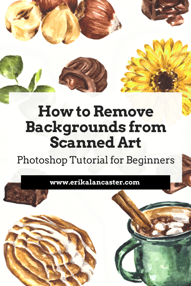
Are you interested in starting to sell your artwork online but are lost as to how to start digitalizing and editing your work using photo-editing software? Have you started learning Photoshop and want to know which tools to use in order to remove the background from your scanned work as efficiently as possible?
It's essential for traditional media artists to familiarize themselves with some kind of photo-editing software at least on a very basic level.
Whether you're looking to sell prints of your work through your own website, create products with drawings or paintings via print-on-demand platforms, create mock-ups using pictures you've taken of your work, or you're simply looking to share your art on social media, it's essential to make it shine and transmit a sense of quality to the viewer if you intend to make any sales.
Today, I'll be sharing a video that is perfect for artists just getting started with Photoshop and digital editing. I'll be explaining three different selection tools commonly used by artists/illustrators to separate their artwork from its background, and I'll also be sharing which my personal favorite is and why.
Throughout the video, I also give important tips that you should definitely be aware of when digitalizing art made with traditional mediums. These apply to whatever photo-editing software you choose to use.
Check out my blog post How to Sell Artwork on Society6 + Pros and Cons to find out more about my entire process, from finishing a watercolor illustration, to scanning it, editing it, and finally uploading it onto Society6 to design products.
In this past post, I also share the positives and negatives I've learned in regards to print-on-demand platforms like Redbubble and Society6 throughout the time I've been using them.
If you enjoyed this video and found it helpful, make sure to subscribe to my YouTube channel. I share a brand new video every week with art tips, drawing and painting tutorials and mindset/productivity tips for artists. *Subscribe HERE*
I hope you enjoyed this post and learned something new, or got inspired to go and create a sketch for yourself.
I wish you tons of progress and enjoyment in your artistic journey! :)
For a list of my favorite watercolor supplies, go here.
I hope you enjoyed this post and learned something new, or got inspired to go and create a sketch for yourself.
I wish you tons of progress and enjoyment in your artistic journey! :)
For a list of my favorite watercolor supplies, go here.


www.erikalancaster.com
is a participant in the Amazon Services LLC Associates Program, an affiliate advertising program designed to provide a means for sites
to earn advertising fees by advertising and linking to amazon.com.
www.erikalancaster.com
is a participant in the Shareasale.com Affiliate Program, an affiliate advertising program designed to provide a means for sites to earn advertising fees by advertising and linking to Shareasale.com partner companies.
 RSS Feed
