*This post contains affiliate links. I receive small commissions for purchases made through these links at no extra cost to you. These commissions help me keep this site up and running, in order for me to keep providing helpful and inspiring art content. :)
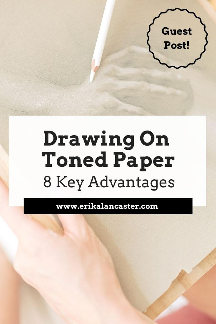
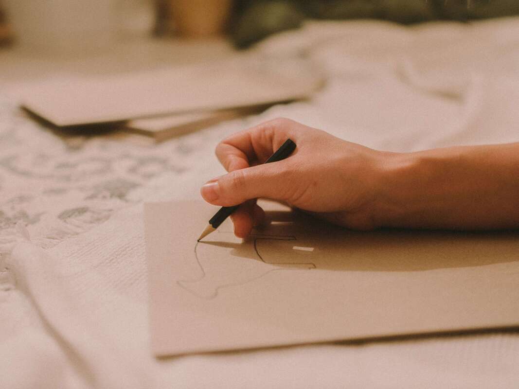
What's the difference between drawing on white paper vs. drawing on toned paper? Will drawing on toned paper help you improve your art skills faster? What advantages does this type of drawing/sketching substrate have? As I've explained in past blog posts and YouTube videos, I 100% believe that drawing is the basis for all kinds of art. Through drawing, we're not only able to increase our knowledge and skills with essential art fundamentals such as perspective, 3D form and value, but we're also able to develop basic skills such as our observation and our hand-eye coordination. To read more about how drawing will improve your painting skills, check out this blog post. As a painter, I make time for my sketching practice routinely, as I know this will positively impact my painting, and it is incredibly fun and enriching to explore new tools and substrates. Today, I'm excited to share another great guest blog post that sheds light on why drawing on toned paper can help us continue developing our art skills. Emily Clare is the artist and author behind the Fine Art Tutorials website, which is a great educational resource for art enthusiasts looking to improve their skills with drawing and painting. Over at her website, you can find step-by-step guides, beginner-friendly tutorials, and interviews with professional artists. Clare is primarily a painter working with oils, but just like me, she loves working with a range of drawing and painting mediums. Her interest in art began at a young age, when she started drawing portraits. Today, her subjects of choice are landscapes and seascapes. Let's jump into her article! 8 Advantages of Drawing on Toned Paper
by Emily Clare
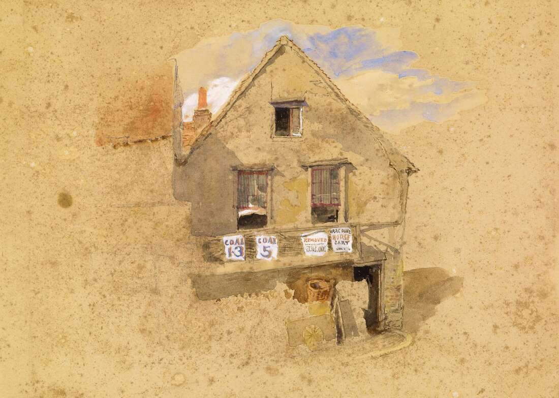
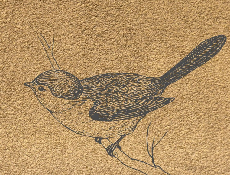
When it comes to choosing the right paper for drawing, there are a lot of options to consider. The color of the paper you choose can greatly impact the finished look of the drawing. Toned paper is a great substrate for artists to work on and if you've not tried it before, it's worth experimenting with. Toned drawing paper usually comes in cool gray tones and warm brown tones, so pick the one you think will work best for your kind of artwork. In this blog post, we will explore 8 advantages of drawing on toned paper. Keep reading to learn more! 1. You can work much faster
|
|
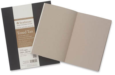
Strathmore Softcover 400 Series Toned Sketch Artist Journal
|
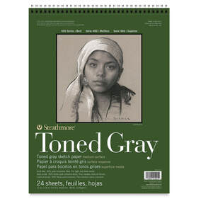
Strathmore 400 Series Recycled Toned Sketch Wirebound Pads
|
You can use a variety of different drawing tools on toned paper including chalk, conté crayons, pastels, charcoal sticks or pencils, and regular colored pencils.
You can protect your artwork and keep it from smearing, with a fixative.
I hope this post was helpful and inspiring!
Thanks so much to Emily Clare for so generously sharing all of this useful information with us.
Thank you for reading and I wish you tons of progress and enjoyment in your art journey.
I hope this post was helpful and inspiring!
Thanks so much to Emily Clare for so generously sharing all of this useful information with us.
Thank you for reading and I wish you tons of progress and enjoyment in your art journey.

6 Comments
*This post contains affiliate links. I receive small commissions for purchases made through these links at no extra cost to you. These commissions help me keep this site up and running, in order for me to keep providing helpful and inspiring art content. :)
Wondering how to use watercolor pencils for best results? How are watercolor pencils different from regular colored pencils and traditional watercolor paint? Where to start when learning about this versatile medium?
Watercolor pencils are an incredibly fun, beginner-friendly, versatile medium that continues gaining popularity among art enthusiasts all around the globe.
What makes watercolor pencils so different from other art mediums is the fact that they're a drawing and painting tool all wrapped up in one. They're a blend of characteristics offered by traditional colored pencils and particularities of watercolor paint.
Because of this, watercolor pencils bring an infinite amount of possibilities in terms of both strategies to go about creating art, but also in overall outcome/style.
However, this also makes them a bit confusing in terms of what basic skills and techniques we should cover as beginners, which are the best supplies to use alongside them, etc.
There are a few key things that I’ve learned as I’ve continued exploring and pushing myself with this medium throughout the last few years.
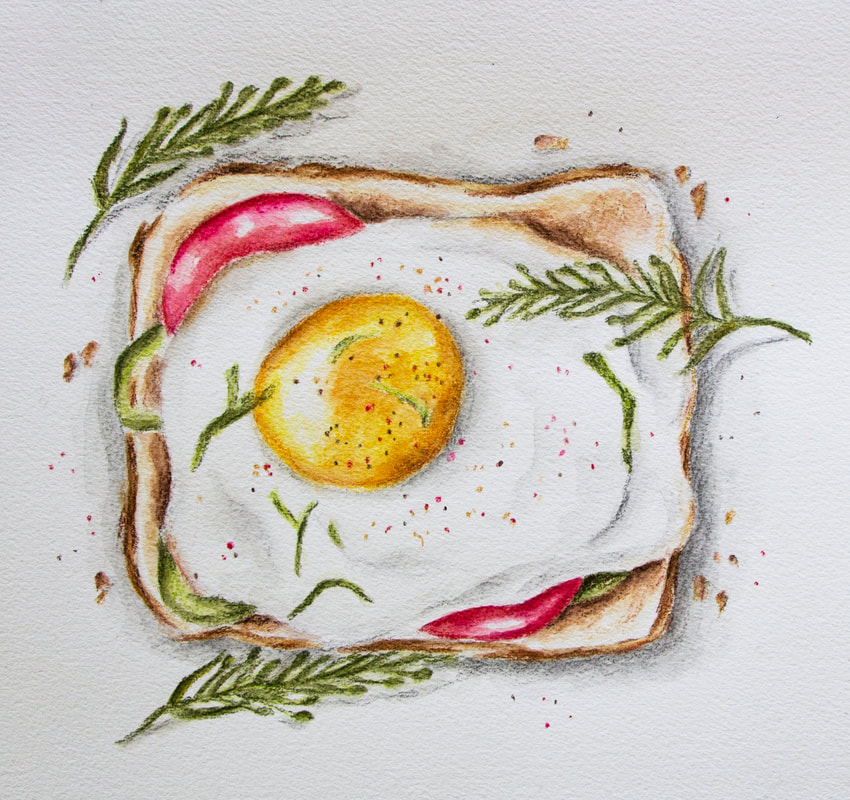
Egg on Toast. Watercolor pencils on paper. Erika Lancaster.
My Top 5 Watercolor Pencil Tips
1. Use quality watercolor pencils
Truth be told, when I first started using watercolor pencils, I didn’t like them at all.
I struggled to get the vibrant colors I wanted, there was way too much texture left behind, and I had trouble blending colors, as well as creating gradients.
It wasn’t until I invested in better quality watercolor pencils that I started actually enjoying the process and liking my end results.
I first invested in a smaller (but better quality) set with 12 colors from Derwent. Once I understood the medium a bit better, and was confident in the fact that I wanted to go long-term with it, I invested in a larger set from Faber-Castell.
A couple of the best watercolor pencils in the market are: Faber Castell's Albrecht Durer and Caran D'ache Museum Aquarelle. Both offer smaller and larger sets.
*Always remember, larger sets are not necessarily better than smaller sets.*
2. Give thought to your paper
With watercolor pencils, we usually bring in at least some amount of water into the process. Because of this, it’s essential to work on paper that’s intended for water-soluble mediums such as watercolor paper.
I enjoy working on hot press watercolor paper, which is the least textured of all. The more textured your paper is, the more visual texture and “sketchiness” will be left at the end. This is because the tip of your pencils will skip against the tooth of the paper as the pigment is being applied. In other words, the pigment is not applied evenly.
Two brands that offer great hot press watercolor paper are Canson and Winsor & Newton.
Another thing to consider is the thickness of your paper. Whenever you’re bringing water in, you’ll likely want medium-to-heavier weight paper (140 lbs. in weight or more).
Thinner papers will easily buckle or even tear, making the process more frustrating than it needs to be.
Another option is illustration board! It's smooth and very sturdy.
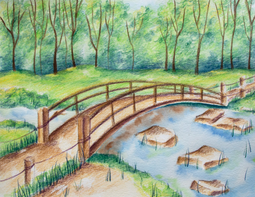
Nature Scene with Bridge. Watercolor pencils on paper. Erika Lancaster.

3. Pre-select your colors
I’m a huge believer in giving thought to your colors before jumping in, as well as in limiting the amount you'll be using for the piece on hand.
By swatching out and choosing the specific watercolor pencils you'll be using, there’s much less of a chance you’ll accidentally create undesired colors as your painting.
Also, by keeping your amount of colors limited and thinking about repeating colors throughout your piece, you’ll arrive at more harmonious results.
Five minutes of prep work can make a huge difference in how smoothly your process goes, as well as in the quality of your end results.
4. Protect your highlights and lightest value areas
Just like when working with traditional watercolor paint, I like incorporating the brightness and beauty of the paper as part of the piece.
We're working with transparent paint after all and there's no need to bring in white!
Before getting started with the painting process, I plan for highlight areas and light value sections where I want to make use of very translucent color.
I make sure to apply little-to-no color in these areas so that, at the end, I have plenty of my paper shining through them.
Heavier applications of color are reserved for darker midtone areas and darkest darks.
This creates that dimension, lightness and glow that watercolor allows.
5. Embrace the sketchy look!
Unless you’re applying your colors on a separate paper that you're using as a palette, activating them with water there, and only applying color on your painting with a paintbrush *I share about this technique in the video below (34:43)*, you’ll likely always be left with some amount of texture.
This is the case, even when you’re working with higher quality pencils and the smoothest of papers.
You can certainly go in and try to get rid of every-single-little textured section, but this often leads to an overworked, flat look.
Now-a-days I embrace the texture left behind by the pencils and actively think of ways to combine painterly effects with some amount of sketchiness.
This creates a balance that's visually pleasing and interesting to look at.
If you enjoyed this video and found it helpful, make sure to subscribe to my YouTube channel. I share a brand new video every week with art tips, drawing and painting tutorials and mindset/productivity tips for artists. *Subscribe HERE*
Check out some of my Watercolor Pencil
Step-by-Step Tutorials:
I hope these tips and tutorials were helpful if you're getting started on your journey with watercolor pencils, and wish you tons of enjoyment with them.
*This post contains affiliate links. I receive small commissions for purchases made through these links at no extra cost to you. These commissions help me keep this site up and running, in order for me to keep providing helpful and inspiring art content. :)
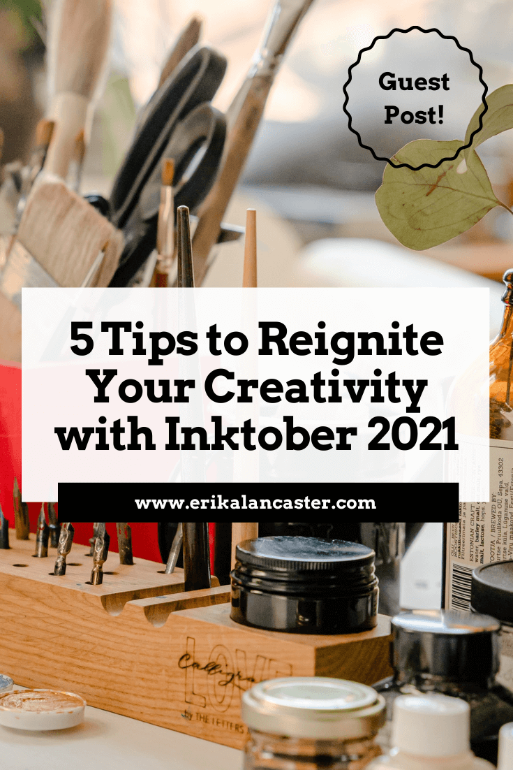
Struggling with an art block or creative rut? Looking for ideas to get the most out of Inktober this year? Eager to take your art further, whether in terms of skill development or expanding your audience?
Participating in online art challenges can be an amazing way to get back into creating art consistently after a break, as well as to improve your drawing/painting skills in a short period of time.
Not to mention, because so many people will be participating and sharing consistently, it's also a great way to get your art out there and start growing your name as an artist.
I've personally participated in Inktober a few times in the past and have gotten a lot from pushing myself to complete them. You can check out video timelapses I've shared of past sketching processes, things I learned from the challenge and more in past posts.
I also recently shared a video over at my YouTube channel in which I explain the main reasons why participating in daily art challenges like Inktober can be so powerful for artists, as well as my main tips to help you reach the finish line while enjoying every step of the way. You can check it out here.
To add to the Inktober/Fall art challenge goodness and helpful tips, I'd love to share an article today which was kindly contributed by Debbie Woodliffe. Debbie's not only been working in the creative industry for nine years, but has always had a deep love for art and it's been her hobby her entire life.
As a creative, Debbie knows what it's like to struggle with blocks. Inktober and similar challenges have helped her move past them and get back into the flow of consistent art creation.
Below, she'll be sharing her top tips that'll help reignite your creativity and take your art to a new level with Inktober 2021.
Without further ado, let's get into her article!
Reignite your Creativity and Take Your Art Farther with Inktober 2021
by Debbie Woodliffe
As days get shorter and the weather gets cooler, it can become difficult to find inspiration and it can be easy for our creativity levels to drop.
Luckily, there are lots of drawing and art challenges during the Fall season that we can take part in, which can help reignite our passion for art and get our creative juices flowing again.
One of these challenges is Inktober, which is an incredibly popular daily drawing challenge that lots of people participate in every year.
Whether you prefer traditional art mediums or are a digital artist, keep reading for my top tips to get the most out of Inktober, and advice to keep you inspired and creative this season.
What's Inktober?
Inktober is a worldwide event where tens of thousands of creatives, artists and art enthusiasts share their unique take on specific drawing prompts. It was made popular by ink artist Jake Parker, who created the challenge because he wanted to hone his ink drawing skills and exchange artistic inspiration with others.
These types of challenges are common within the artistic community as they not only have the power to help people overcome art blocks, but also remain consistent with their practice and make tons of progress in a short period of time.
Also, because thousands of people participate in the same challenge, it’s super easy to get motivated because everyone’s constantly sharing their unique takes on the prompts.
All you have to do to get your daily inspiration is follow the #Inktober hashtag on social media during October, and use this same hashtag to share your own artwork with the community!
It’s that simple.
Are there any rules for Inktober?
While there’s nothing to stop you from creating your own art and using the aforementioned hashtag, there are a few things you should do to ensure you get the most from the challenge:
1. Create a drawing using any type of ink (you can sketch it out in pencil first)
2. Post the picture to social media and use the hashtags: #inktober and #inktober2021
3. You can post daily, every other day, or each week – it’s totally up to you.
Just remember, you’ll get the most out of the challenge if you remain consistent and complete all the prompts. For tips on making it through the challenge, check out Erika's recent video on Inktober tips.
*Top Tip:
You don’t need to share your work online if you don’t want to. However, it can be a real learning experience when others provide you with constructive criticism or praise, as well as when you do it for others.
What's the prompt list for Inktober 2021?
Since 2016, the Inktober team has been releasing the official prompt list via their website for everyone to see. They also share it on their social media profiles.
5 Tips to Get the Most Out of Inktober 2021
This art challenge is a fun one as it encourages you to try a specific medium you may not be very familiar with, or to hone your skills with ink if it's a medium that you've always been drawn to, but perhaps haven't been very consistent with.
Ink can certainly be tricky to work with, given its fluidity and permanence. However, it’s an incredibly versatile medium, and with a little practice, it can be used to create impactful and very unique artwork.
1. Push your boundaries
The key to boosting your creativity is to expand your boundaries and take steps into new artistic realms. This is why the challenge works so well – it provides specific (yet general) criteria points that are open to interpretation and it has an easy-to-follow structure.
Because the prompts are pre-selected, you might be forced out of your comfort zone, which will always lead to growth.
When it comes to working with ink, it might be worthwhile to learn about alternative shading and mark-making techniques like hatching and crosshatching, or to look for inspiration in Pop Art or silkscreening artwork for ideas on how to use flat/solid shapes instead of trying to go for the usual gradient shading.
Remember that your comfort zone is just that – comfy and what you're used to. You won’t be learning new things if you aren’t trying them, so Inktober is the perfect excuse to get started with something new.
2. Share your art like a pro and start making money
Why not sell your works of art online on marketplaces like Redbubble, Society6 or Etsy?
To showcase your artwork effectively, take high quality, clear photos. Experiment with stylized, personalized backgrounds or white backgrounds - figure out what makes your artwork shine at its best, and start noticing what your audience responds to most.
Here’s a top tip when taking photos of art – natural light is best, so take photos next to a window at the right time of the day or try doing it outside during the day. Morning or later in the evening when the sun is not high up in the sky often is best. Overcast days can also be great, as the light is not very stark.
Alternatively, place your work against a blank white laptop screen for a professional back-lighting effect!
3. Make it personal
Remember that the key to selling your art is creating an outstanding experience for your customer and personalizing your products.
When people purchase work from an artist, they buy into an experience. Think of different ways you can make the buying process a positive one, and of how you can set apart your products from others in a way that won't break the bank.
These make a huge difference and it won't only help your customers remember you, but will entice them to keep coming back.
A very cool idea is to package your inky creations with some equally impressive packaging. Use some protective sheets and backing boards, nice looking Washi tape, a custom branded stamp, and a thank you card with your social media profiles so they can stay in touch.
If and when you set up shop online, don’t forget to make use of keywords and categories, on whichever site or platform you choose to sell from. Inktober will see far more searches within the ink or monochromatic art categories.
4. Pick your tools
Drawing and painting with ink can be a little tricky, but with a few tips and a little practice, you’ll be creating masterpieces in no time at all.
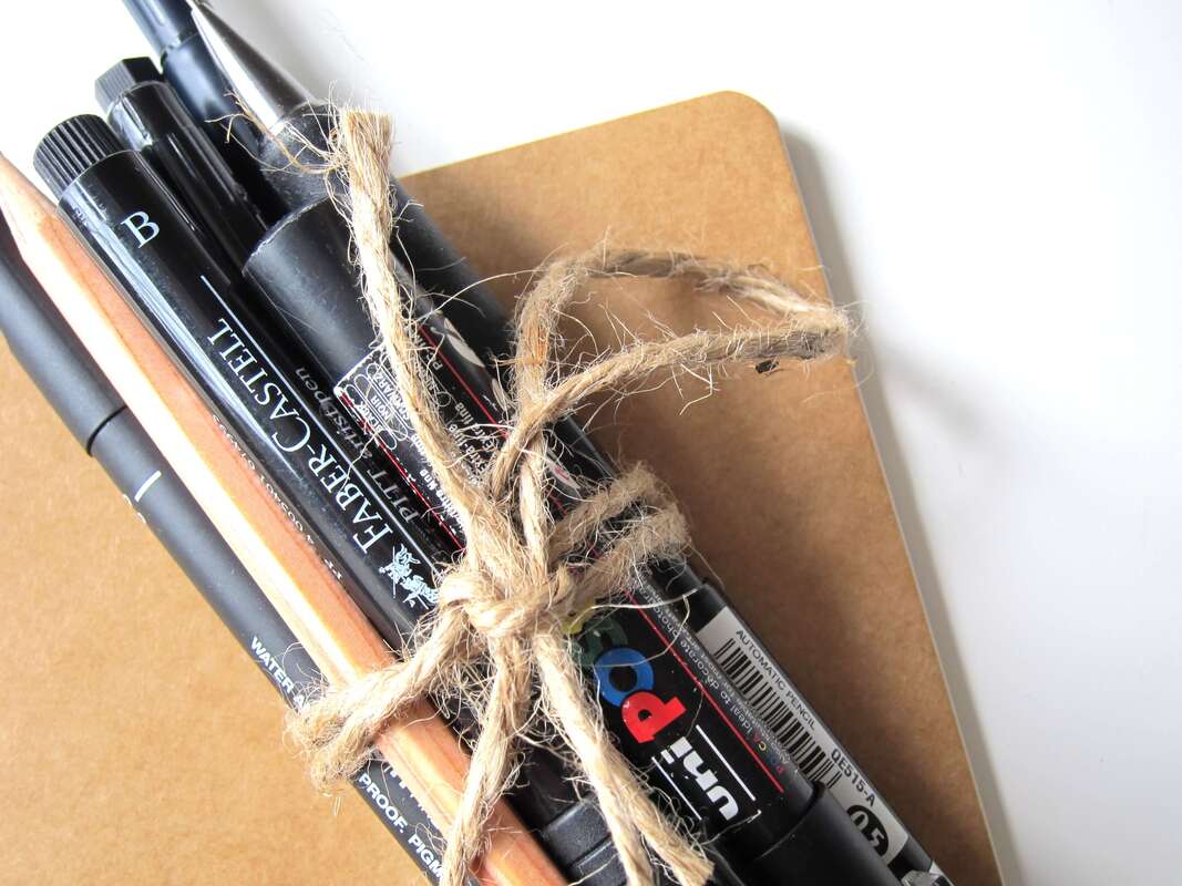
You can use any kind of ink pen or tool – from fountain pens to fillable brushes, or standard brushes and Indian ink tubs. If you want less mess and a more portable way of inking, go for technical liner pens in a range of different sizes. Smaller sizes like 0.1, 0.3 and 0.5 are excellent for those fine lines.
Check out some awesome recommendations for pens and inks in this article!
Don’t be afraid of regular ballpoints either!
Setting yourself constraints such as using specific colors or adding a specific background design like Erika mentions in her last Inktober tips video, is a great way to encourage creative thinking and unusual approaches.
5. Choose the right paper
It's always important to give thought to the paper or sketchbook you'll be using for the challenge, and to consider the type of inking tool you'll be using on it.
For ink drawing, medium weight and thicker papers work best. It's also important to consider the papers' texture, as your pens' nibs can feel like they have to fight against heavily textured papers and can even be damaged by them.
Personally, when I use technical pens or nibs, I prefer smoother paper and medium weight does the trick. When I use ink tubs and brushes, a bit of texture is great and thicker paper is required.
It ultimately depends on what you like to draw/paint, the style you're going for, and what you personally enjoy.
Watercolor or mixed media sheets or sketchbooks are popular options among many artists participating in Inktober.
So are you feeling ready to step up your creative game with Inktober 2021 and smash through any creative blocks?
Remember to be consistent, bold and experimental. After all, practice makes perfect and working on something completely different can do wonders for your creative mind.
This art challenge is a fun one as it encourages you to try a specific medium you may not be very familiar with, or to hone your skills with ink if it's a medium that you've always been drawn to, but perhaps haven't been very consistent with.
Ink can certainly be tricky to work with, given its fluidity and permanence. However, it’s an incredibly versatile medium, and with a little practice, it can be used to create impactful and very unique artwork.
1. Push your boundaries
The key to boosting your creativity is to expand your boundaries and take steps into new artistic realms. This is why the challenge works so well – it provides specific (yet general) criteria points that are open to interpretation and it has an easy-to-follow structure.
Because the prompts are pre-selected, you might be forced out of your comfort zone, which will always lead to growth.
When it comes to working with ink, it might be worthwhile to learn about alternative shading and mark-making techniques like hatching and crosshatching, or to look for inspiration in Pop Art or silkscreening artwork for ideas on how to use flat/solid shapes instead of trying to go for the usual gradient shading.
Remember that your comfort zone is just that – comfy and what you're used to. You won’t be learning new things if you aren’t trying them, so Inktober is the perfect excuse to get started with something new.
2. Share your art like a pro and start making money
Why not sell your works of art online on marketplaces like Redbubble, Society6 or Etsy?
To showcase your artwork effectively, take high quality, clear photos. Experiment with stylized, personalized backgrounds or white backgrounds - figure out what makes your artwork shine at its best, and start noticing what your audience responds to most.
Here’s a top tip when taking photos of art – natural light is best, so take photos next to a window at the right time of the day or try doing it outside during the day. Morning or later in the evening when the sun is not high up in the sky often is best. Overcast days can also be great, as the light is not very stark.
Alternatively, place your work against a blank white laptop screen for a professional back-lighting effect!
3. Make it personal
Remember that the key to selling your art is creating an outstanding experience for your customer and personalizing your products.
When people purchase work from an artist, they buy into an experience. Think of different ways you can make the buying process a positive one, and of how you can set apart your products from others in a way that won't break the bank.
These make a huge difference and it won't only help your customers remember you, but will entice them to keep coming back.
A very cool idea is to package your inky creations with some equally impressive packaging. Use some protective sheets and backing boards, nice looking Washi tape, a custom branded stamp, and a thank you card with your social media profiles so they can stay in touch.
If and when you set up shop online, don’t forget to make use of keywords and categories, on whichever site or platform you choose to sell from. Inktober will see far more searches within the ink or monochromatic art categories.
4. Pick your tools
Drawing and painting with ink can be a little tricky, but with a few tips and a little practice, you’ll be creating masterpieces in no time at all.
You can use any kind of ink pen or tool – from fountain pens to fillable brushes, or standard brushes and Indian ink tubs. If you want less mess and a more portable way of inking, go for technical liner pens in a range of different sizes. Smaller sizes like 0.1, 0.3 and 0.5 are excellent for those fine lines.
Check out some awesome recommendations for pens and inks in this article!
Don’t be afraid of regular ballpoints either!
Setting yourself constraints such as using specific colors or adding a specific background design like Erika mentions in her last Inktober tips video, is a great way to encourage creative thinking and unusual approaches.
5. Choose the right paper
It's always important to give thought to the paper or sketchbook you'll be using for the challenge, and to consider the type of inking tool you'll be using on it.
For ink drawing, medium weight and thicker papers work best. It's also important to consider the papers' texture, as your pens' nibs can feel like they have to fight against heavily textured papers and can even be damaged by them.
Personally, when I use technical pens or nibs, I prefer smoother paper and medium weight does the trick. When I use ink tubs and brushes, a bit of texture is great and thicker paper is required.
It ultimately depends on what you like to draw/paint, the style you're going for, and what you personally enjoy.
Watercolor or mixed media sheets or sketchbooks are popular options among many artists participating in Inktober.
So are you feeling ready to step up your creative game with Inktober 2021 and smash through any creative blocks?
Remember to be consistent, bold and experimental. After all, practice makes perfect and working on something completely different can do wonders for your creative mind.
I hope this post was helpful and inspiring!
Thanks so much to Debbie Woodliffe for so generously sharing all of this useful information with us. It has certainly gotten me excited for Inktober and all the amazing work I'm sure I'll get to see next month.
Thank you for reading and I wish you tons of progress and enjoyment in your art journey.
For a list of my favorite art supplies, go here.
*This post contains affiliate links. I receive small commissions for purchases made through these links at no extra cost to you. These commissions help me keep this site up and running, in order for me to keep providing helpful and inspiring art content. :)
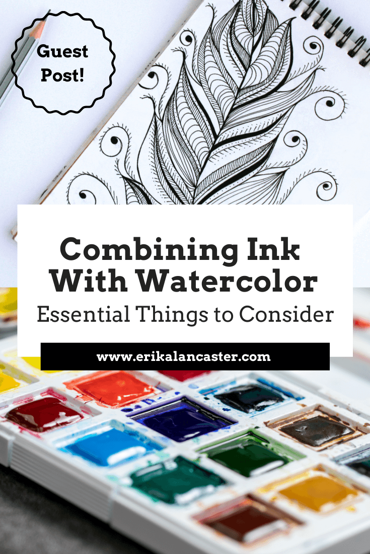
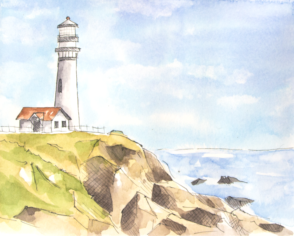
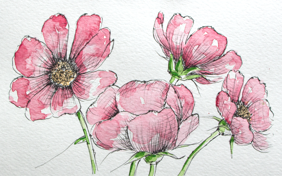
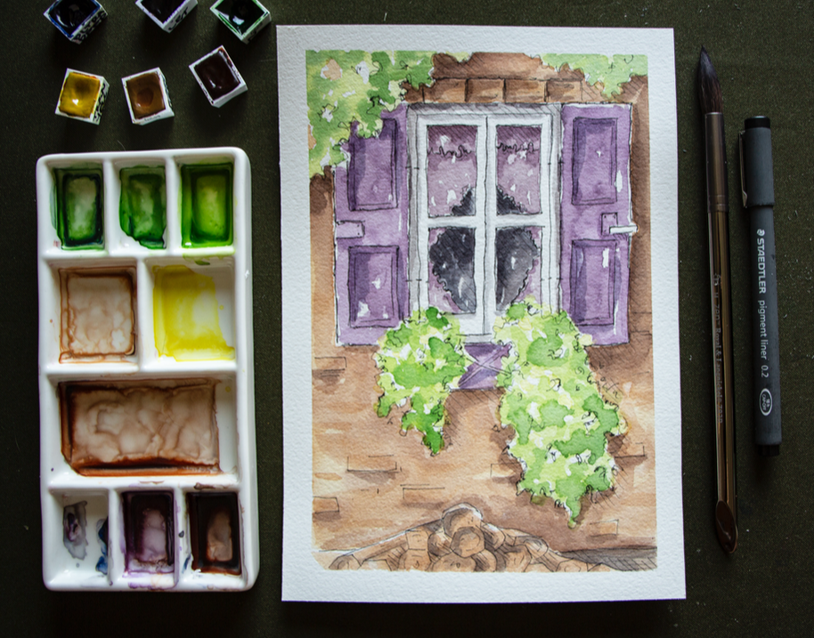
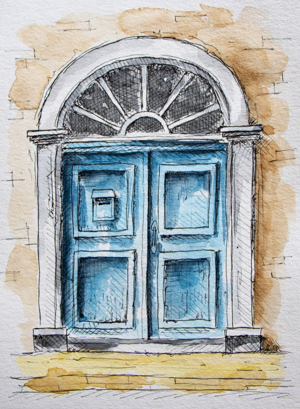
Love the look of pen and watercolor artwork and want some tips to get started on the right foot? What are the must-know things to have in mind when combining ink and watercolor in order to avoid undesired accidents? What are some good options for supplies when it comes to ink pens and bottled inks?
Watercolor and ink go together like bread and butter.
As an artist with experience working with a vast array of traditional drawing and painting mediums, I've found very few combos that can so easily create such striking and professional-looking results.
I'm a huge fan of both painting with watercolor as well as of pen and ink sketching, and have released helpful blog posts and videos to help beginners improve their skills with both.
In today's blog post, we're covering the must-know basics to know about when looking to use these two mediums in combination, which brings up a whole new set of questions in terms of process and supplies.
A variety of step-by-step pen and watercolor wash tutorials for beginners can be found over at my membership site on Patreon.
As with all mixed-media art creation, it's incredibly important to consider how the mediums we're going to be using will be interacting and affecting each other throughout the art-making process, but also how the piece will hold up over time after the artwork has been completed.
By doing a bit of research, choosing the right art supplies, visualizing what results we're after, and planning the techniques/general strategy we'll be using before getting started with a new piece, we can ensure a smoother process and it'll be much more likely that we'll arrive at results we'll love.
Today, I'm incredibly pleased to share an article written for us by pen and ink expert K.T. Mehra. She is the founder of Goldspot Pens, a store based in New Jersey that is dedicated to selling not only beautiful, high-quality fountain pens, but also incredible inks, writing instruments and paper.
Alongside the hard work she does in her company, she's incredibly passionate about literature, history and, you guessed it...art!
Without much further ado, let's get into her helpful tips and recommendations for supplies.
Combining Ink With Watercolor:
Essential Things to Consider
by K.T. Mehra
Watercolor and ink work together beautifully, and this combination of mediums can certainly lead to a variety of amazing effects and styles.
Line work created with dark inks can be colored in with bright watercolor washes for very impactful, modern-looking pieces, but there's also so much room for exploration, creativity, and for artists to bring in their own personalities into the process.
To make it easier for artists just getting started with ink and watercolor, I’ve written a short list of must-know aspects to consider when choosing pens and inks to combine with watercolor. Afterwards, I'll be sharing my favorite options for both ink pens and bottled inks.
Before getting into anything else, when buying inks to combine with watercolor (whether in pen or bottled format), it's important always ask yourself the following four questions:
1. Is it waterproof?
The first and most important factor you want to consider is whether your ink is waterproof. This will determine whether it'll bleed or smudge when water is applied on top of the ink.
When working with watercolor, you'll need quality waterproof ink. This will allow your line work to stay clean and sharp as you apply paint over it. Most pens and inks will be labelled as 'waterproof', whether in pen form or bottled format.
2. Is it water-soluble?
You may come across inks and pens that state they are 'water-soluble'. You want to avoid these inks, as they are made with water and will run when combined with watercolor.
These can be used to create particular styles, but are not ideal for most cases when you're looking for a good ink or pen to use in combination with watercolor, as the ink will run and smudge, and very possible affect the vibrancy of your washes of color.
It's best to assume that any ink pen contains water-soluble ink and will not be ideal for use with watercolor unless its specifically states that it is waterproof. You also usually want to avoid any pen or ink that says it’s 'water-based'.
3. Is the ink pigmented?
Oftentimes it's not 100% clear whether the pen contains waterproof ink or not. One sign that the pen is most likely waterproof and usable with watercolor is if it includes the words 'pigment' or 'pigmented ink' on the pen or bottle.
Pigments are tiny particles of colored material that do not dissolve in water. In other words, they are rarely water-soluble or water-based, which makes them good for use with watercolor.
4. How long does it take to dry?
Another factor you want to consider is the ink’s drying time. If you apply watercolor too soon after drawing with ink, it's likely that some smudging will occur.
Most inks will dry after an hour or two, but to avoid this completely, you’ll want to wait 12 to 24 hours for the ink to fully dry and set into the paper.
If you don't want to wait this long for the ink to dry, make sure that to purchase a fast-drying ink. I'll recommend my favorite below, so keep on reading!
Are you supposed to do your ink line work before or after your watercolor washes?
This is a great question, and the answer is even better.
The truth is... either way works!
There are pros and cons to both methods, but it's ultimately up to you to experiment and determine what'll work best for you, making sure, of course, that you're taking precautions and allowing layers the necessary time to dry in between.
It depends on the artist's personal way of working and the outcome that he/she is going for.
A reason you might want to do your ink work before watercolor is that it allows you to focus on your line work and/or outlines first, establishing a type of preliminary sketch to work with. You're then able to begin applying watercolor washes and it's easier to stay inside the lines and have more control over where the color is applied.
Also, you'll likely find that the pen glides across your paper more smoothly when there's no paint on your paper yet, which can be a pro for many artists.
A reason you might want to do your ink work after your watercolor painting process is if you're looking for your line work to be very clear and visible.
Doing your line work after your washes also allows you to first freely paint with watercolor, creating abstract shapes and organic effects which can then serve as a guide or a type of underpainting for the line work that'll come later.
This technique is great for artists who love the looseness and interesting effects watercolor allows, and want the paint to be the primary creative force structuring the artwork.
It's also important to note that, when doing your ink work after your watercolor painting, you're also able to use water-soluble inks, as long as you've allowed your painting to dry for 24 hours.
Have fun, explore and get creative with your process!
Ink and watercolor can and should be used in new ways that give your pieces a unique personality and character. I'd recommend exploring both sequences and analyzing which results you like best.
A variety of step-by-step pen and watercolor wash tutorials for beginners can be found over at my membership site on Patreon.
Best Waterproof Pens For Use With Watercolor
Now that we’ve covered the basic things to consider when searching for an ink pen or bottled ink to use in combination with watercolor paint, let’s look at the best waterproof pens available (in no particular order).
Uni-Ball Signo Gelstick Pen
The Uni-Ball Signo is a great beginner-friendly option. It's affordable and one of the best ink pens for use with watercolor. It's waterproof, fade-proof, and is able to create smooth, thin lines. It also doesn’t leave stop and start marks at the end of long lines and marks like most gel pens do.
*Most Affordable *Best Gel Pen
Sakura Pigma Micron Series
If you’re looking for a slightly more professional fineliner pen, the Sakura Pigma Micron is a great option, and it's one our favorite fineliner pens for use with watercolor. The Sakura Pigma Micron draws smooth, thin, and very consistent lines that can really help bring together watercolor pieces.
Artists around the world swear by the Pigma Micron for its precise and professional line work.
*Best Fineliner Pen
Lamy Safari Fountain Pen
Using disposable pens can definitely become expensive because they have to be replaced after a relatively short period of time, especially when using them for drawing/sketching purposes.
We recommend, as an alternative, using a fountain pen and filling it with your own ink. This allow us to use our own choice of ink at an affordable price and we can continue filling up the pen when the ink runs out. As long as we take care of the pen, it'll last for years.
If you are looking to invest in a fountain pen, Lamy Safari is the best option for beginners and is relatively affordable for a quality, reusable fountain pen.
*Best Beginner-Friendly Fountain Pen *Most Affordable
Uni-Ball Impact Gel Pen
The Impact Uni-ball pen is a slightly more expensive gel pen option that works wonderfully with watercolors. Go with this waterproof pen if you're looking to incorporate thicker, bolder outlines or marks into your watercolor paintings.
This pen draws fairly wide lines. So if you are looking to do very detailed work, you will need a large canvas or paper, which may be a drawback of the impact gel pen for some artists.
Fudenosuke Brush Pen
Another interesting option is using a brush pen alongside watercolors! The Fudenosuke pen by Tombow is perfect for use with watercolor, as it is waterproof, and produces beautiful drawings with a lot of line-weight variation.
Brush pens allow for varying thicknesses of lines/marks via changing the pressure and angle we're using. If you aren’t looking for a this kind of variation in your line work, as well as organic transitions between thin and thick lines, a brush pen may not be for you.
This pen also requires practice and a certain level of control, which may be a drawback for some artists.
*Best Brush Pen
Kaweco Pen
If the thought of a fountain pen caught your attention, the Kaweco brand is famous for their superior quality fountain pens.
Winsor and Newton Fineliner
This is another beautiful and unique option for a high-quality fineliner that works great with watercolor. Winsor and Newton provide a great lineup of fineliners that are waterproof and come in many sizes and colors. I can’t recommend them enough!
The Unipin Fine Line
The Unipin Fine Line is a great and fun-to-use waterproof pen, but it does have some drawbacks. I love this pen and it’s definitely worth a buy. Unfortunately, when using an eraser on the Unipin Fine Line, the ink fades and blurs a bit.
This is a fantastic option if you do not plan on using any pencil markings that you’re thinking of erasing later in the process.
Pentel Pocket Brush Pen
If you are looking for something a little different, the Pentel Pocket Pen is a really neat option. This pen was created for writing expressive Japanese calligraphy. It has a very sensitive felt-tip that's able to create plenty of variation when it comes to line width.
This may be a negative for new artists, but it does allow more control for experienced artists that are used to brush pens.
Faber-Castell Assorted Pens
Faber-Castell has an awesome pack of eight waterproof pens which offers and assortment of different types and sizes. They call these their Pitt Artist Pens, and the cool thing about this pack is that you get four fineliners and four brush pens in almost every size.
There are better ink pens to use with watercolor on this list, but the Faber-Castell Artist Pens are waterproof and do work well with watercolor. The main benefit of buying this pen set is primarily the variety offered, which allows the artist to explore amongst them.
*Most Variety
A variety of step-by-step pen and watercolor wash tutorials for beginners can be found over at my membership site on Patreon.
Best Bottled Ink For Use With Watercolor
If you’re looking for the absolute best supplies to use for your ink and watercolor pieces, buying your own ink bottle along with a fountain pen or dip pen is going to provide you a custom experience and might just be the way to go.
Next, I’ll reveal my top ten picks in terms of the best bottled inks out there.
Platinum Carbon Ink
Probably my favorite ink to use with watercolor is the Platinum Carbon ink. It's a beautiful natural black textured ink that comes in a lovely little glass bottle. This permanent, waterproof ink is great for use with watercolors.
This ink takes about an hour to dry. Once dried, it’s resistant to water, erasing, smudging and anything else.
This Japanese ink is highly sought-after, which makes it slightly pricey, but it's worth every penny!
*Best Overall Ink
De Atramentis Archive Ink
This is an incredible waterproof ink. The color is less textured and not as pretty than the Platinum Carbon Ink and less of a 'true black' than the Speedball India Ink, but the De Atramentis Archive Ink may just be the most waterproof ink on this list.
I've experienced absolutely no smearing or even a drop of ink smudged after working on my watercolor washes. The ink was also dry after only a few minutes! This is a great and really safe option for use for your watercolor projects.
*Most Waterproof Ink *Best Fast-Drying Ink
Speedball Super Black India Ink
India ink is the best, deepest, truest black ink you can get. Speedball's India Ink is an amazing waterproof option. Some artists mention occasional smearing, but I've personally never had this happen.
The Speedball Super Black India Ink is the best ink bottle you can purchase for a pure, true black outline with your fountain pen and dip pen. If you use this with your Lamy Safari fountain pen or the Kaweco, you’ll want to clean out the pen often, as this ink is thick and can clog the pen if not cleaned routinely.
*Best Pure Black Ink
Winsor and Newton Ink
Winsor and Newton’s ink is also great for watercolor projects. It offers a matte black finish that would be perfect for more modern or cartoony styles and line work. This ink does take a while to dry, but if you're looking for this kind of color and style, it’s definitely worth it.
Sailor Kiwa-Guro
Sailor is a company that's known for their fountain pens, but they're also one of the top ink manufacturers in the world. This is another high-end Japanese ink that performs beautifully for both writing and drawing. You cannot go wrong with the Sailor Kiwa-Guro.
The ink is a solid matte black and dries very quickly. The big negative is that there have been reports of it losing its waterproof properties after several months of being left in the bottle.
So far, this hasn’t happened in my personal experience, but it would make this option riskier if our aim is to combine it with watercolor.
|
|
How To Find The Right Pen And Ink For You
Like with all art supplies, it’s important to explore for yourself in order to find the right pen (and ink) for you. Art is such a personal experience, and we all have different styles, quirks, and processes.
Try different pens and inks to find the ones that work best for you, starting at accessible options if you have a limited budget. Finding your personal favorites will make all the difference when working on a new art piece.
Whether you decide on a gel pen, a fountain pen and ink, or a professional fineliner, we are excited to see what you come up with!
A variety of step-by-step pen and watercolor wash tutorials for beginners can be found over at my membership site on Patreon.
Sending out a huge thank you to K.T. Mehra for her enlightening tips and recommendations!
To find out more about Goldspot Pens and the products they have available, visit their website here.
Also be sure to follow their Facebook page and Instagram account for the latest news.
Thanks for reading!
Find a list of my favorite art supplies here.

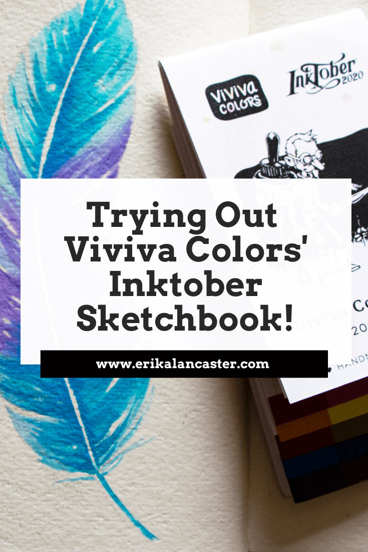
Love #Inktober? Looking for new art supplies to make this popular drawing challenge different and perhaps, more special, this year? Do you enjoy trying out unique art supplies to share with your creative friends?
If so, you'll definitely want to check out Viviva Colors' new sketchbook line that's been launched especially in time for Inktober 2020, but will continue being sold worldwide even after this popular yearly drawing challenge concludes at the end of October.
That's right!
Viviva's crowdfunding campaign for these sketchbooks has gone so well, that the company will continue making them available for artists (without the Inktober logo) for an undefined amount of time.
Inktober is one of the most popular drawing challenges going on in the online space since 2009.
Each year, Inktober creator and renowned illustrator Jack Parker, publishes a new daily prompt list for artists to use as inspiration to create a new drawing/painting/mixed-media piece each day throughout the month of October.
Every October, thousands of artists and creatives all around the world participate in this challenge, pushing themselves to work on a new piece, every day, for 31 days.
It's no secret that Jake Parker has been involved in a couple of different controversial incidents as of late, which have caused a good amount of people to look for alternative art challenges to work on this October.
However, lots of die-hard followers of this challenge are still eager to participate and are excited to begin, many of whom aren't necessarily fans of Jake Parker himself, but have found the experience of Inktober a valuable part of their art journeys.
Many artists believe that the challenge has grown to become more than the person who initially created it.
Inktober has become a way for artists to push their skills, creativity and build the discipline to stay consistent with their art practice.
It has become an event that allows lesser-known emerging artists, to gain traction online and start growing their name known amongst a larger audience.
It's also become an event that brings artists from all over the world together, helping us create meaningful connections that'll last a lifetime.
Inktober, in my opinion, is about artistic growth, about community, and about sharing the importance of art with the world.
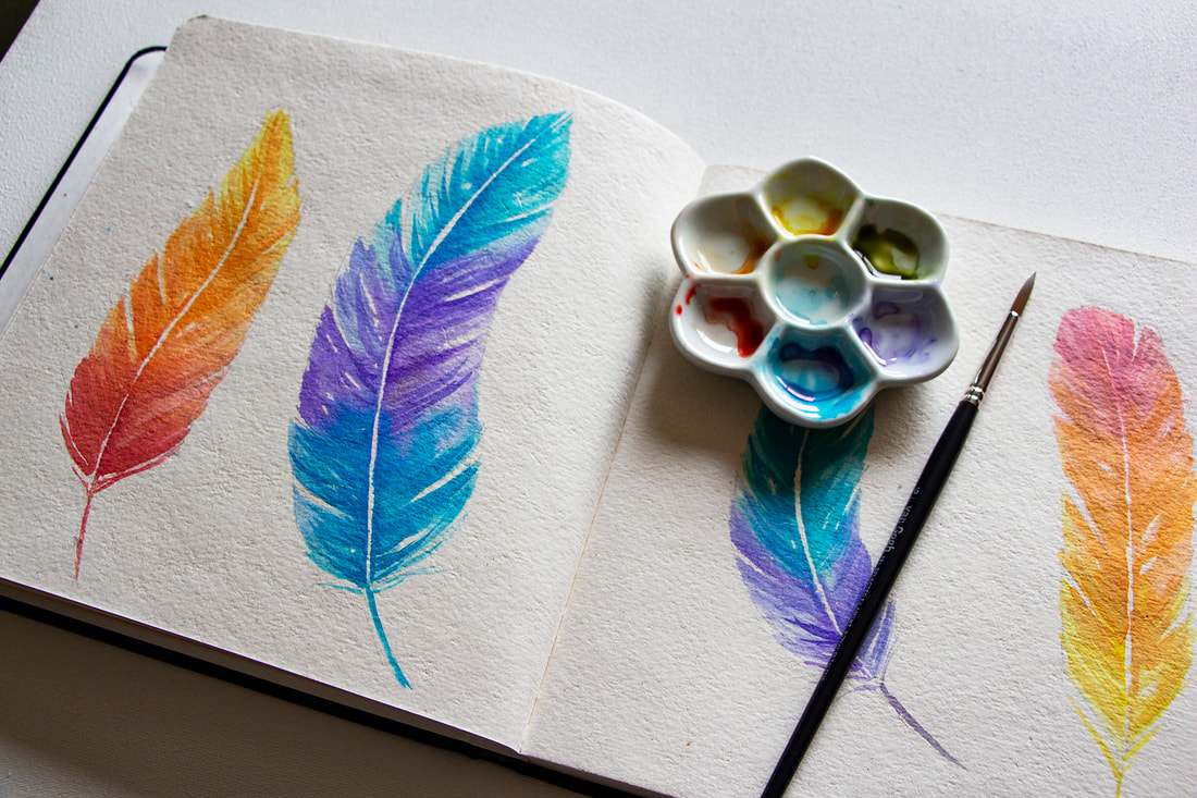
Image 1. Colorful feathers painted on 7.5 x 7.5 in / Rough / Off-white sketchbook using special edition colorsheets.
In this past blog post I talk about Viviva Colors' history and also share my swatching process, as well as my review, for their original colorsheets. Make sure to check it out to read more about their compact and insanely vibrant watercolors.
Viviva Colors' mission has always been to inspire artists to continue on their creative journeys and to never set their art aside, no matter how busy or how stressful life becomes.
The company is not only constantly improving their products and offerings, but is always looking for new ways to encourage and motivate artists to stay on their paths.
Viviva knows that, through art, people are able to cope with anxiety and depression, which are rampant this year due to the current pandemic, its economic repercussions, and all of the uncertainty its creating worldwide.
And knowing how challenging 2020 has been, Viviva teamed up with Jake Parker to release an officially licensed set of supplies that'll make this year's Inktober even more special.
These items were designed to make Inktober 2020 #AnInktoberToRemember.
Just like Viviva's original colorsheets, which were officially launched in 2017, these new supplies were crowdfunded via Indiegogo.
With the huge success of the first campaign, Viviva Colorsheets was able to start mass manufacturing their original product and have shipped them out to more than 30,000 artists in over than 100 countries.
They are currently working on doing the same for the backers of these Inktober sketchbooks and colorsheets!
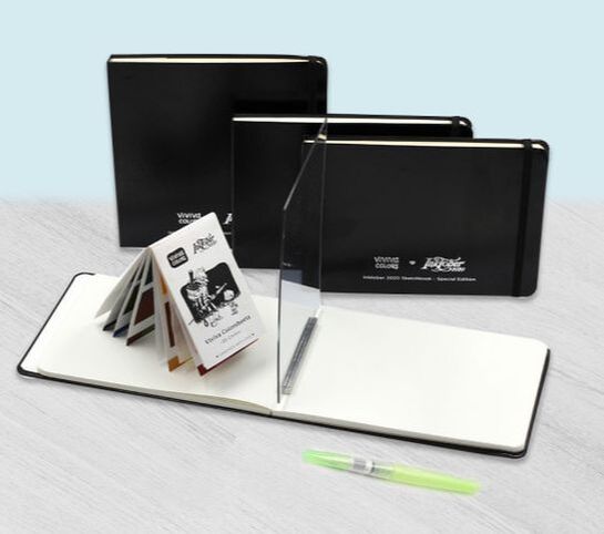
Viviva's Inktober sketchbook line.
You can find out more about the products they have available at their website.
Let's talk about the new items!
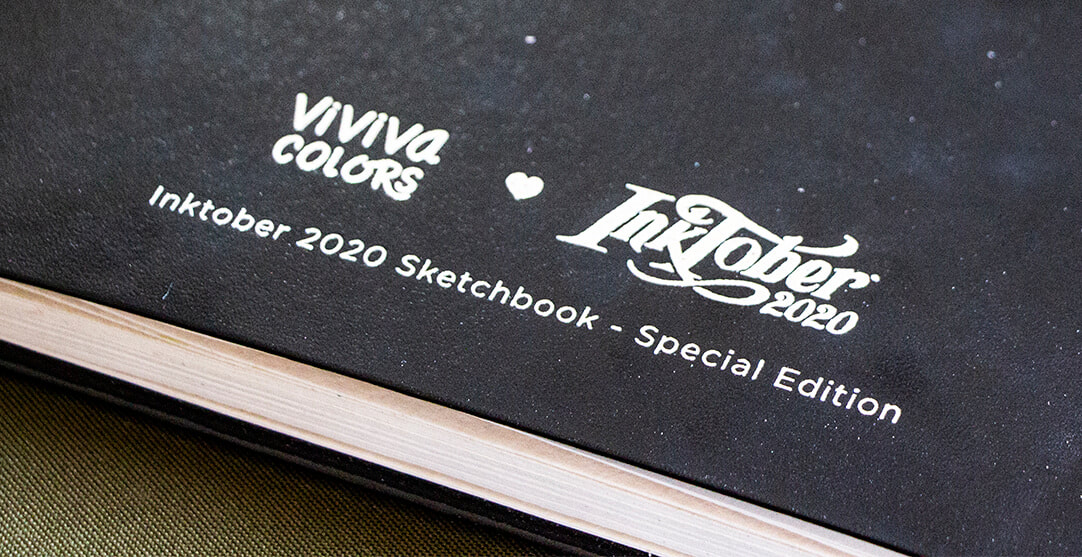
For Inktober 2020, Viviva launched 4 sketchbook variants, as well as a special edition of their colorsheets.
Sketchbooks
All of these sketchbooks are hardbound with a quality faux-leather cover and (during the Inktober season) also include a silver foil stamp with the Inktober 2020 and Viviva Colors logos on the front cover.
a) A5 format (5.8 x 8.3 in) / 240 gsm / Ivory white / Smooth Lessebo paper
/ 64 pages
b) A5 format (5.8 x 8.3 in) / 300 gsm / Off-white color / Rough watercolor paper
/ 40 pages / 100% Cotton
c) Square format (7.5 x 7.5 in) / 300 gsm / Off-white color /
Rough watercolor paper / 40 pages / 100% Cotton
d) *The Easy Sketchbook* A5 format (5.8 x 8.3 in) / 240 gsm / Ivory white
/ Smooth Lessebo paper / 64 pages
*The Easy Sketchbook was created especially for beginner artists who have trouble with their preliminary sketching process. It includes a sketching mirror and an aluminum slot stand to hold it as you're drawing, which helps you transfer the reference's outlines onto paper in an easier and faster way.
See the Easy Sketchbook in action here!
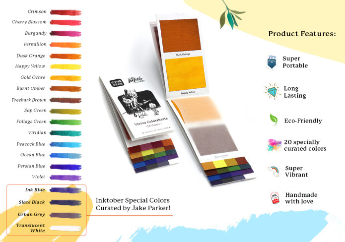
Colorsheets
Aside from the four sketchbooks, Viviva also released a special edition of their colorsheets set which contains an extra 4 colors (their original sets have 16 and this one has 20).
The 20 colors offered in this edition have been curated by Viviva and Jake Parker especially for Inktober.
Check out my color swatching process for their original colorsheets in this blog post. You'll be able to see the colors' vibrancy and learn about my thoughts as to how they compare with regular watercolors in that post.
Just like their original colorsheets, the Inktober edition also has the portable booklet format with protective paper in between each page.
Viviva Colors' special edition Inktober colorsheets.
Here are a couple of pieces I've created in my Viviva/Inktober sketchbook, which is the square format with rough watercolor paper.
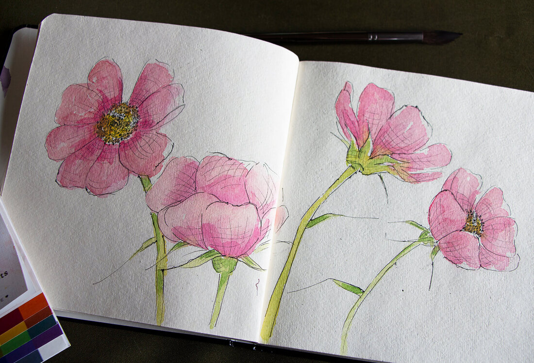
Image 2. Pen and watercolor wash pink flowers painted on 7.5 x 7.5 in / Rough / Off-white sketchbook using Micron drawing pens and Viviva's original colorsheets.
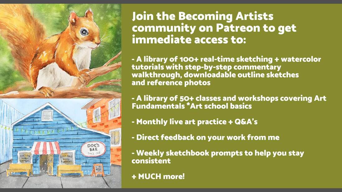
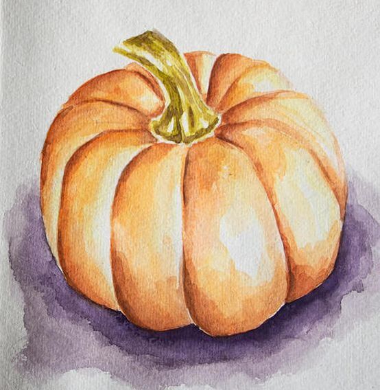
Image 3. Fall pumpkin painted on 7.5 x 7.5 in / Rough / Off-white sketchbook using professional quality Van Gogh watercolors.
A few interesting characteristics I noticed about the sketchbooks:
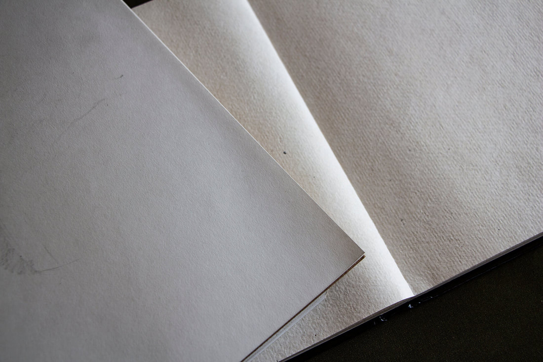
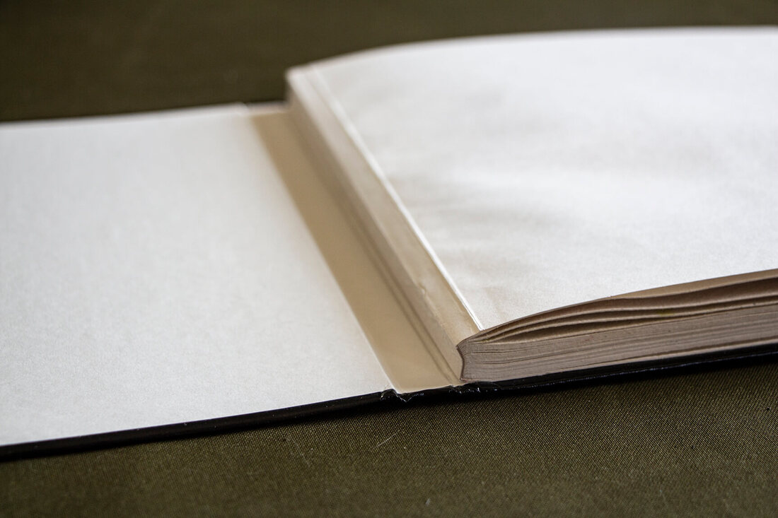
- The sketchbooks have been designed to be opened flat so that they don't close on you when your drawing or painting and you're able to use the sheets fully. The spine where the pages come together is not glued onto the spine of the cover intentionally, for this purpose (see images below). This said, the first few pages are difficult to open completely without having to press down hard at the spine/base. I was a little worried that I'd damage the spine when I did this, but everything was okay.
- Sketchbooks have rounded corners, which I love, as they are more difficult to damage.
- I love the elastic included on the covers, as it keeps the sketchbook closed when you're not working in it, protecting your artwork.
- I like the pocket included at the back, as I can place loose sketches and notes in there. I wish it had a bit more space.
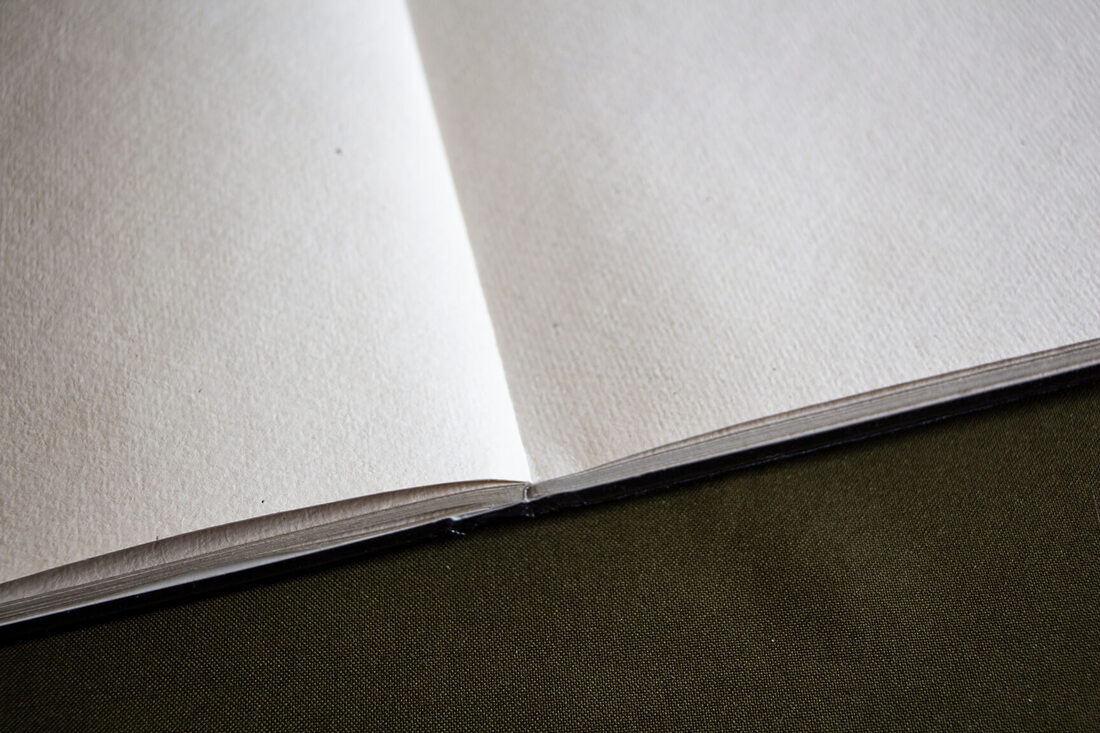
- The watercolor paper included in the watercolor sketchbooks is very different from the commercial paper I'm used to (Arches, Fabriano, Strathmore, etc.). It is a lot more flexible to the touch when dry, has little imperfections in it because it's handmade (which isn't necessarily a bad thing), and I found that the paint gets absorbed in a very different way. Both the paint from Viviva's colorsheets, as well as regular watercolor paint sinks into the paper very quickly and the paint cannot be moved around. Washes of color react differently when overlapped and the off-white, almost cream color of this paper has an effect on the vibrancy of the colors. I also noticed that the paper is fragile. It doesn't tolerate scrubbing techniques and even erasing can damage it easily.
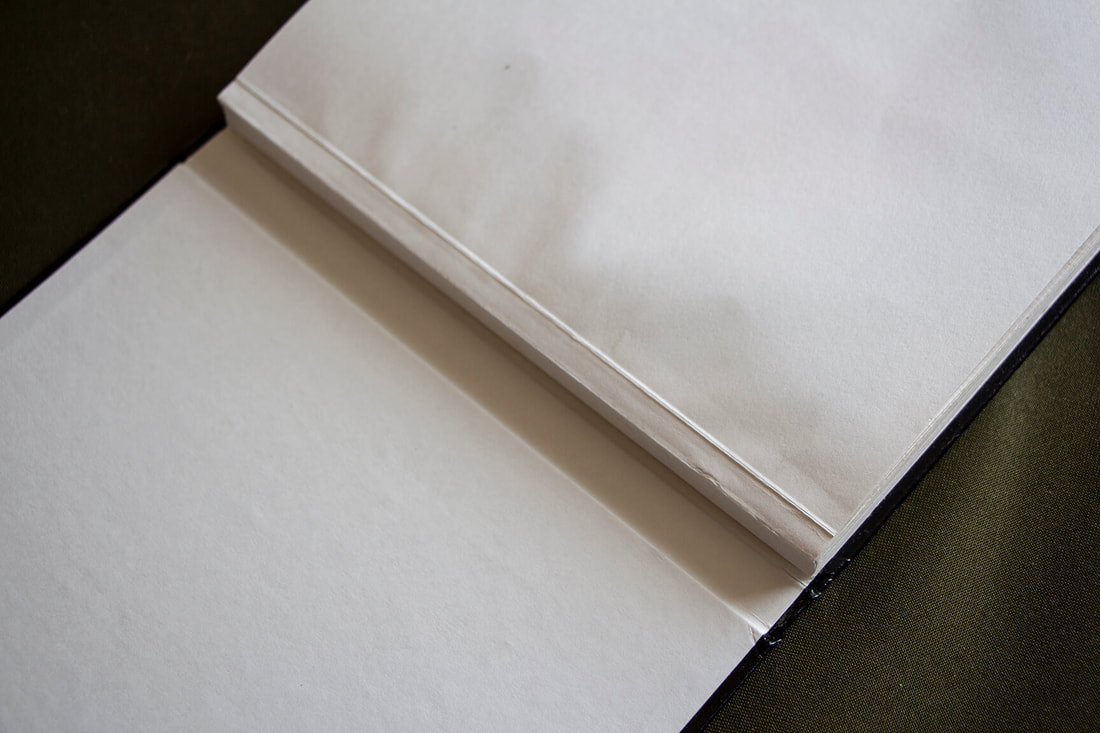
Viviva Inktober Sketchbook spine (made to allow the pages to open flat).
Viviva Inktober Sketchbook open flat.
Viviva Inktober watercolor paper sketchbook next to smooth, white drawing paper sketchbook. Notice differences in texture, as well as color.
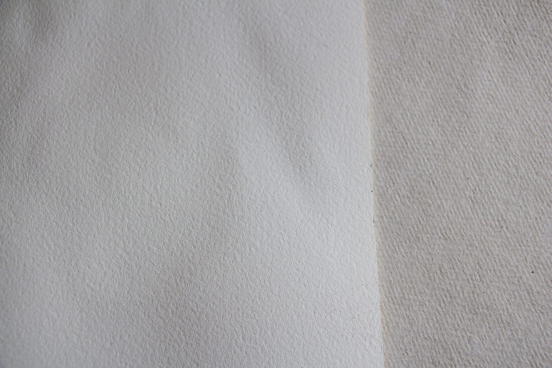
Viviva Inktober watercolor paper sketchbook next to a sheet of Arches, cold-press watercolor paper. Notice differences in texture and color. Viviva's paper is a lot more textured and is cream-colored.
Finally, here are a few pros and cons I've found in relation to the items I've had the opportunity to try out, in bullet form.
Pros and Cons of Viviva Colors'
and Inktober's Sketchbooks and Colorsheets
Pros
*For more pros and cons about Viviva's color sheets, go here.
|
Cons
|
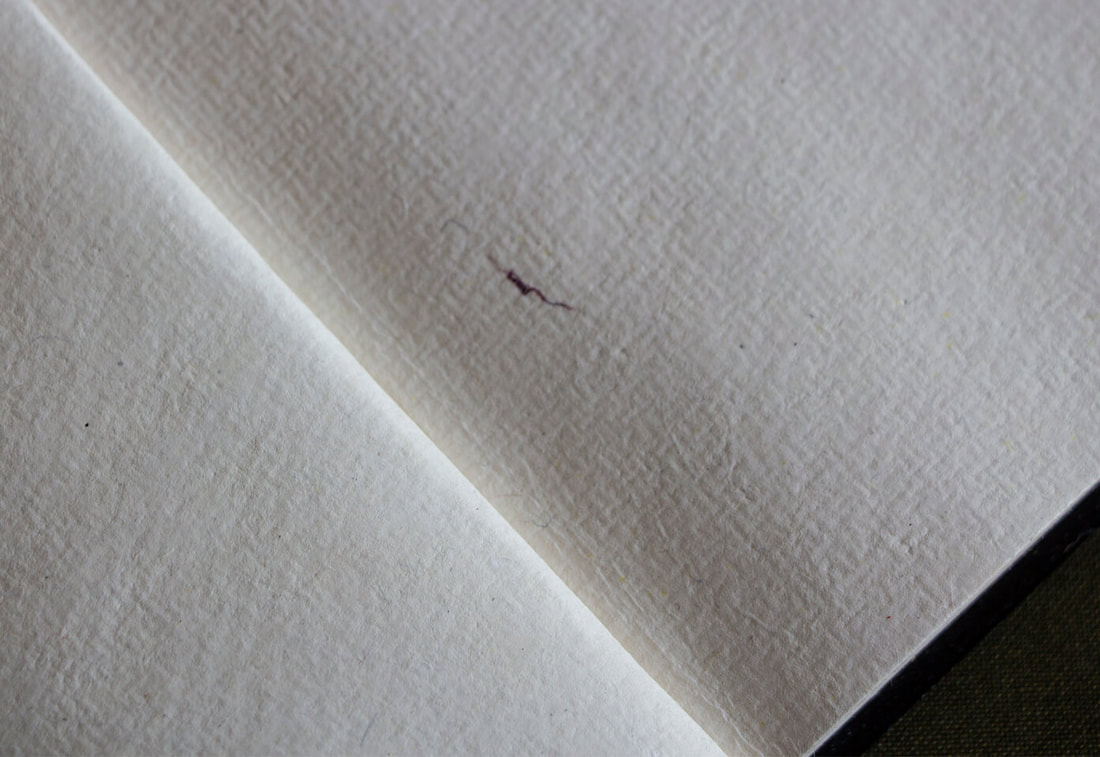
Close-up of Viviva's Inktober Sketchbook (watercolor paper). Blemishes can be found here and there because this is hand-made paper. I personally liked these little blemishes, but am not so convinced with the color of the paper.
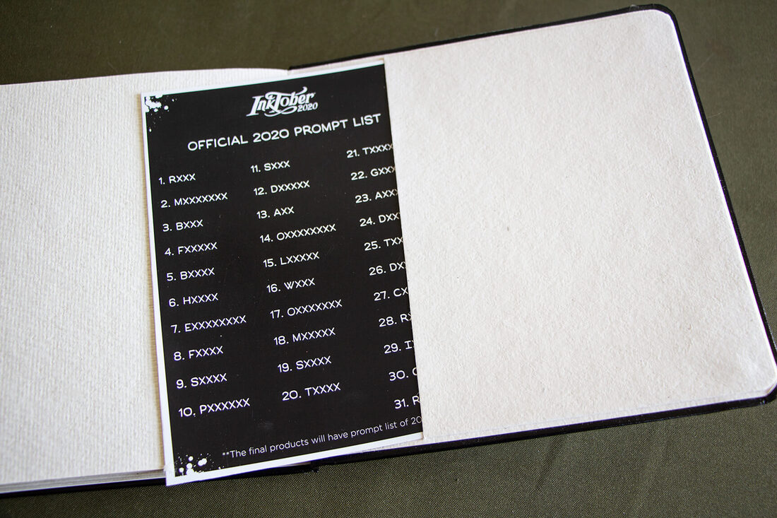
Viviva Inktober Sketchbook back folder with prompt list (because my sketchbook was a prototype created prior to mass production, the words appear with "X").
Viviva Inktober Sketchbook spine (made to allow the pages to open flat).
Beautiful silver foil logos on the faux leather cover.
These items are all beautiful and high-quality, and I want to send a huge thank you to Viviva Colors for providing me these items to explore and review!
Personally, I won't be participating in Inktober this year due to a lack of time and more important projects I'm working for my online art communities, but I look forward to creating more pieces in this great sketchbook.
*Visit Viviva Colors' website and follow them on social media to see inspiring artwork created with their colorsheets, as well as the latest news from them:
Viviva Colors Website
Viviva Colors on Instagram
Viviva Colors on Facebook


www.erikalancaster.com
is a participant in the Amazon Services LLC Associates Program, an affiliate advertising program designed to provide a means for sites
to earn advertising fees by advertising and linking to amazon.com.
www.erikalancaster.com
is a participant in the Shareasale.com Affiliate Program, an affiliate advertising program designed to provide a means for sites to earn advertising fees by advertising and linking to Shareasale.com partner companies.
 RSS Feed
