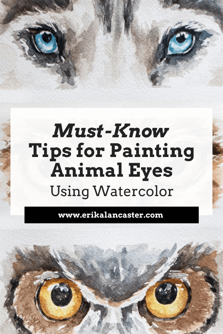
Would you love to paint animals using watercolor, but find it a bit intimidating? Have you tried painting animals in the past, just to end up disappointed and frustrated with your results? Would you like to be able to create animal paintings that are impactful and full of life? For animal-loving artists like myself, it can be incredibly rewarding to paint one successfully, in a way that communicates its beauty. One of the pieces of advice I most frequently give to my students and art community members over on Patreon, is to make time to break up complex compositions (or subjects) into elements, techniques and/or layers that can be practiced in isolation. This way, when we sit down to work on the complete piece, we're not only much more likely to be successful, but we'll also enjoy the process a lot more due to the understanding and confidence we've built through this previous practice and prep work. And this is exactly what I did in the video below in order to push my ability to paint animals using watercolor. I found three (quality) reference images of very different sets of animal eyes so that I could challenge myself and dove right into these studies. You can check out the three painting processes below.
If you enjoyed this video and found it helpful, make sure to subscribe to my YouTube channel. I share a brand new video every week with art tips, drawing and painting tutorials and mindset/productivity tips for artists. *Subscribe HERE*
This goes without saying, but eyes are one of, if not the, most important parts of any portrait, whether we're drawing/painting a person or an animal. Why? Eyes are able to transmit the person's or animal's essence and personality and, if drawn or painted well, they can make the entire piece come to life. Which means, they can also break the piece, if drawn or painted poorly. Oftentimes, artists decide to make eyes the focal point and draw more attention to them by making use of techniques such as: - Bringing in higher levels of detail in the eye area - Creating higher tonal contrast in this area Find a list of my favorite watercolor painting supplies here. Tips for Painting Beautiful Animal Eyes with Watercolor 1. Make time for isolated studies It's super smart to practice different elements and techniques in isolation or via smaller studies, as opposed to jumping right into complete paintings without having done any previous practice or preparation. When I was first getting started on my own painting journey, I used to go right into a brand new drawing or painting expecting a masterpiece, only to end up frustrated with my results. I used to have very high expectations of myself, even when I was getting started with a brand new medium or a subject I had never drawn or painted before. Then I had an awakening. Every-single-type of subject, whether it's a portrait, a landscape, a still life arrangement, etc., can be broken down into things that can be practiced separately. Taking time to practice things that we feel might be challenging for us before jumping in can make all the difference in the world. As mentioned before, this kind of prep work makes it much more likely that we'll not only end up with a final piece we love, but that we'll actually enjoy the process much more. For example, if you love drawing or painting portraits, learning about the anatomy of different facial features and and practicing each in isolation without the overwhelm of drawing/painting an entire face, is going to inform your final piece immensely. If you love drawing or painting landscapes, creating studies of different types of skies, trees and things like water or flowers, will make it much more likely that you'll succeed at that final piece. When it comes to painting animal eyes, understanding their structure, as well as their different parts is incredibly powerful. If we don't take time to study them, it can be easy to leave out little elements that are important in order for them to look believable. 2. Use high-quality reference photos When we're trying to achieve higher levels of realism, it's essential to work with references, at least in the beginning. In fact, I'd recommend both using photos, as well as drawing/painting from direct observation (otherwise known as drawing/painting from life). Why? Because without references and material to inform your work, you'll most likely be making up information and drawing/painting subjects the way you think they look like, and not what they actually look like. Unless you have a photographic memory or are a genius of some kind, of course. Plus, realism is all about those subtleties and details, which are super easy to forget if we don't have the subject in front of us in one way or another. Even if your goal is to later be able to draw things from imagination, using references is going to help you develop your observational skills and understand about Art Fundamentals such as light behavior, form and perspective, all of which are key and impossible to understand if you don't study what things look like in real life. Having said all this, learning to select the right reference photos for drawing or painting is essential, as we can make the process way harder for ourselves if we're trying to create a drawing or painting using a low quality image. Here are a few things to make sure your reference photo shows if you'll be using it as a reference for your artwork:
3. Choose your paintbrush sizes and switch between them mindfully along the way Before getting started with your painting, choose the specific paintbrushes you'll be using for both outside of the eyes, as well as for the detail inside of the eyeballs. The fur around the eyes can be described in a much more abstract/looser way and, at least for those first layers, medium sized paintbrushes work best (I like using round brushes in sizes 14-16). For the detail inside the eyes, we usually want much more control. Inside those eyeballs, we have very small (yet super important) elements to add in, such as the tear duct, the pupil, tear lines, etc., many of which we want sharp and defined. We also have to be able to work around those little highlights in the eyeballs, as these are essential in making the eyes look lifelike. For complete animal paintings or things like eyelashes, etc., it's also important to choose a very thin detailing paintbrush. I'd recommend practicing drawing thin lines with whatever paintbrush you choose before adding them in. 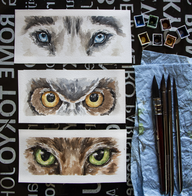
Watercolor animal eyes by Erika Lancaster (Husky, owl, cat)
4. Plan when/where you're going to be using wet-on-wet techniques vs. wet-on-dry techniques *Wet-on-wet: Applying/dropping in paint onto paper that has been pre-wetted with clean water or has a layer of paint that's still wet- Great for organic color gradients, soft transitions from more saturated color to more translucent color and blurred edges. *Wet-on-dry: Applying paint on paper that is completely dry - Great for sharp, defined edges. Before starting with any watercolor painting, it's advisable to think of a strategy that'll help you arrive at the effects/outcome that you're looking for. As opposed to opaque painting mediums such as acrylics or oils, we're not able to cover up our mistakes with a layer of paint. Not to mention, saving our highlights is essential and, once paint touches paper, there's no going back to the whiteness the paper once had. And, yes, you can decide to add in your highlights at the end with white gouache or another medium, but it's important to understand that when we're working with watercolor, we're playing with the medium's translucency and the whiteness of the paper underneath to create a variety of different values. Usually, we want the whiteness of our paper to stand in place for our highlights and no white paint is actually necessary when working with watercolor, if we save those whites. I'd highly recommend not getting started until you have at least a general idea of how many layers of paint you're thinking of going in with, as well as which areas you want to use wet-on-wet techniques in, which areas you want to use wet-on-dry in, and which will require a layering of both. Also, along the painting process, continue asking yourself whether it's important to allow a layer of paint to dry before going in with the next. For example, when painting many of the details inside of the eyeball (highlights, pupil, etc.), you're probably going to want to go in wet-on-dry in order to achieve sharp outlines, but for the fur and elements around the eyes, wet-on-wet can come it very handy. Transitions between colors within the pupil can oftentimes also be created wet-in-wet. Five minutes of planning before getting started can go a long way in having a smoother painting process, and arriving at way more successful results! 5. Remember the spherical nature of the eyeball If you've never tried painting a sphere using watercolor before, it's extremely helpful, as eyeballs have a spherical form. *There are animals such as owls that don't have spherical eyes. Aside from the eyeball being a sphere, we need to remember that eyeballs are set deep within the skull and are covered/wrapped by an upper and lower eyelid with creates outwards/convex volume in the head shape. The sphere in itself is going to have different values throughout it, and the eyelids create shadows on the sphere, too! When we're drawing or painting human eyes, we're able to see much more of the sclera (the whites of the eyes), and it's easier to tell different values throughout it. Just like when drawing or painting teeth, even though the sclera is essentially white/off-white they are never one flat white value. If we leave them with only one flat value, and don't try to understand their 3D form, we risk our outcome looking quite cartoony and it will retract from the level of realism in the piece, even if the rest of the piece is realistically rendered. 6. Plan your highlights and keep them protected throughout the painting process Notice the highlights and lighter values in the reference photo both inside of the eyes as well as around them, and think of the strategy you'll be using to keep them protected throughout the painting process. Are you going to be using masking fluid to keep lightest lights protected, or will you be painting around them carefully? Whatever you decide to do, make sure that you plan for them, as once you cover up that paper with paint, there's no going back to the whiteness the paper once had. Those highlights are incredibly important to make those eyes come alive and look moist and realistic. Also, the more we can do to understand the structure of the animals head (brow ridge, snout size, rounded areas around the eyes, etc.) the more 3D and realistic our painting will tend to look. This is why doing skull studies is so valuable! 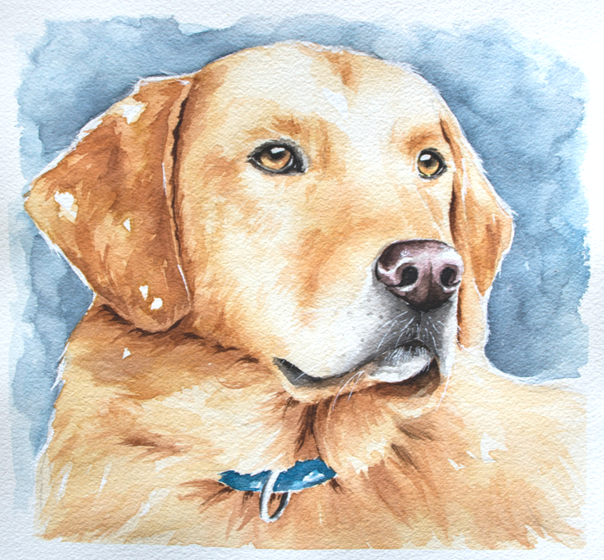
Watercolor Labrador by Erika Lancaster. Whiskers were added in at the end with white gouache and a fine detailing brush.
7. Start with a bright yellow layer in the eyeball when appropriate Whenever it makes sense, I like starting with a semi-translucent layer of bright yellow in the iris/pupil (avoiding the highlights), as this provides a glow to the eyes. Usually I like doing this with a color such as Gamboge or Permanent Yellow Medium. This works very well when the animal's eyes are amber colored and even green. However, I didn't use this strategy for the husky eyes I share above, because these eyes are blue and I would risk turning them green (yellow + blue= green). 8. Mindfully use soft/blurred transitions vs. defined edges When painting eyes, we're usually going to need a combo of shapes with soft/blurred out edges and hard/defined edges. Notice where these blurred out effects happen and where sharper edges are located in your reference. Usually, we have lots of soft transitions within the pupil, where one color turns gradually into another color. But when it comes to painting elements like little shapes along the tear lines, eyelashes, and pupils in some cases, we want the edges of our shapes to be defined. By giving thought to these things, you'll have a better idea of whether you should be painting on paper that's still wet, or whether you should allow the previous layer to dry completely before adding more detail. It's essential to stay patient! Aside from all this, if we're looking for higher levels of realism, it's important to stay away from the look of obvious/stark outlines around different elements. A lot of animals, such as cats, tend to have a darker (eyeliner type look) around their eyes. This may instinctively make us want to go in and create a hard outline around the entire eye and this will ultimately retract from the level of realism of the piece. In realism, there are no outlines and it's important to notice the subtle changes in values even in these areas that we may initially perceive as dark lines. Usually there's a line weight variation within the elements we initially perceive as lines, such as the tear lines, and even whiskers. Meaning, certain segments of those "lines" are thicker while others are thinner, some are darker while others are lighter. Capturing this leads to a more natural look. Notice moisture and any highlights along the tear lines, too! 
9. Pay attention to the length and direction of hair growth around the eyes Whenever we're painting animals that have fur or feathers, it's important to acknowledge their length and the direction they're growing out towards. Not only this, but how this length and growth direction changes throughout its head and body (it's not the same all throughout!). If we mindlessly start laying down marks and lines without paying attention to our reference, we're most likely going to end up with an outcome that doesn't look very realistic, which is why it's so important to keep observing our reference photo. Whether you decide to paint the areas around the eyeballs before or after the eyeballs themselves, switch on over to the paintbrushes that you've selected for this and stay focused when laying down those brushstrokes that are meant to describe fur or feathers. The way you use your paintbrush should reflect the direction and length of that growth. This doesn't meant that you have to paint every-single-hair that you see in the photo (in fact I would never recommend trying to paint each individual hair), but noticing these characteristics and taking them into account as you're laying down those abstract shapes representing those groupings of hair or feathers, is essential. 10. Leave eyelashes and whiskers until the end (or keep them protected with masking fluid) Make sure you don't get ahead of yourself and leave eyelashes and/or whiskers until after the areas beneath and around them have been finalized. Sometimes, though, I do mask out the animal's whiskers using liquid frisket before getting started with the painting process. Generally speaking though, details like whiskers and eyelashes are created with lines or marks that are overlapping the other elements, which is why the layers underneath have to be finished. You don't want to have to go in a fix layers underneath after the whiskers or eyelashes have been added! Be patient and always keep thinking critically in terms of what should come first and what should come later. Also, make sure you're using very small paintbrushes that come to a thin tip for these final details and, if needed, always practice painting thin lines on a scrap piece of paper before going into your painting. This is something I almost always do myself, to the day. In the eye studies I share in this video, I approach the animal's eyelashes in a very abstracted way, using irregular shapes as opposed to trying to draw in every single eyelash in. Whiskers I do either mask out since the beginning or add until the end using white gouache. *Refer to Yellow Labrador watercolor painting above. Find a list of my favorite watercolor painting supplies here.
6 Comments
*This post contains affiliate links. I receive small commissions for purchases made through these links at no extra cost to you. These commissions help me keep this site up and running, in order for me to keep providing helpful and inspiring art content. :)
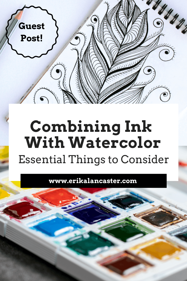
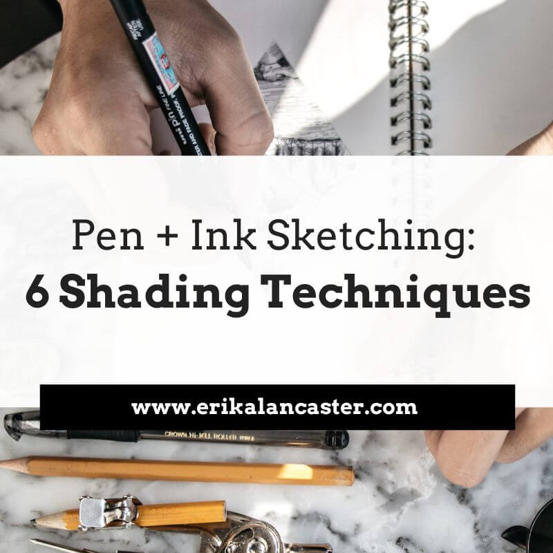
Love the look of pen and watercolor artwork and want some tips to get started on the right foot? What are the must-know things to have in mind when combining ink and watercolor in order to avoid undesired accidents? What are some good options for supplies when it comes to ink pens and bottled inks? Watercolor and ink go together like bread and butter. As an artist with experience working with a vast array of traditional drawing and painting mediums, I've found very few combos that can so easily create such striking and professional-looking results. I'm a huge fan of both painting with watercolor as well as of pen and ink sketching, and have released helpful blog posts and videos to help beginners improve their skills with both. In today's blog post, we're covering the must-know basics to know about when looking to use these two mediums in combination, which brings up a whole new set of questions in terms of process and supplies. 
A variety of step-by-step pen and watercolor wash tutorials for beginners can be found over at my membership site on Patreon.
As with all mixed-media art creation, it's incredibly important to consider how the mediums we're going to be using will be interacting and affecting each other throughout the art-making process, but also how the piece will hold up over time after the artwork has been completed. By doing a bit of research, choosing the right art supplies, visualizing what results we're after, and planning the techniques/general strategy we'll be using before getting started with a new piece, we can ensure a smoother process and it'll be much more likely that we'll arrive at results we'll love. Today, I'm incredibly pleased to share an article written for us by pen and ink expert K.T. Mehra. She is the founder of Goldspot Pens, a store based in New Jersey that is dedicated to selling not only beautiful, high-quality fountain pens, but also incredible inks, writing instruments and paper. Alongside the hard work she does in her company, she's incredibly passionate about literature, history and, you guessed it...art! Without much further ado, let's get into her helpful tips and recommendations for supplies. Combining Ink With Watercolor:
|
Lamy Safari Fountain Pen
Using disposable pens can definitely become expensive because they have to be replaced after a relatively short period of time, especially when using them for drawing/sketching purposes.
We recommend, as an alternative, using a fountain pen and filling it with your own ink. This allow us to use our own choice of ink at an affordable price and we can continue filling up the pen when the ink runs out. As long as we take care of the pen, it'll last for years.
If you are looking to invest in a fountain pen, Lamy Safari is the best option for beginners and is relatively affordable for a quality, reusable fountain pen.
*Best Beginner-Friendly Fountain Pen *Most Affordable
Uni-Ball Impact Gel Pen
The Impact Uni-ball pen is a slightly more expensive gel pen option that works wonderfully with watercolors. Go with this waterproof pen if you're looking to incorporate thicker, bolder outlines or marks into your watercolor paintings.
This pen draws fairly wide lines. So if you are looking to do very detailed work, you will need a large canvas or paper, which may be a drawback of the impact gel pen for some artists.
Fudenosuke Brush Pen
Another interesting option is using a brush pen alongside watercolors! The Fudenosuke pen by Tombow is perfect for use with watercolor, as it is waterproof, and produces beautiful drawings with a lot of line-weight variation.
Brush pens allow for varying thicknesses of lines/marks via changing the pressure and angle we're using. If you aren’t looking for a this kind of variation in your line work, as well as organic transitions between thin and thick lines, a brush pen may not be for you.
This pen also requires practice and a certain level of control, which may be a drawback for some artists.
*Best Brush Pen
Kaweco Pen
If the thought of a fountain pen caught your attention, the Kaweco brand is famous for their superior quality fountain pens.
Winsor and Newton Fineliner
This is another beautiful and unique option for a high-quality fineliner that works great with watercolor. Winsor and Newton provide a great lineup of fineliners that are waterproof and come in many sizes and colors. I can’t recommend them enough!
The Unipin Fine Line
The Unipin Fine Line is a great and fun-to-use waterproof pen, but it does have some drawbacks. I love this pen and it’s definitely worth a buy. Unfortunately, when using an eraser on the Unipin Fine Line, the ink fades and blurs a bit.
This is a fantastic option if you do not plan on using any pencil markings that you’re thinking of erasing later in the process.
Pentel Pocket Brush Pen
If you are looking for something a little different, the Pentel Pocket Pen is a really neat option. This pen was created for writing expressive Japanese calligraphy. It has a very sensitive felt-tip that's able to create plenty of variation when it comes to line width.
This may be a negative for new artists, but it does allow more control for experienced artists that are used to brush pens.
Faber-Castell Assorted Pens
Faber-Castell has an awesome pack of eight waterproof pens which offers and assortment of different types and sizes. They call these their Pitt Artist Pens, and the cool thing about this pack is that you get four fineliners and four brush pens in almost every size.
There are better ink pens to use with watercolor on this list, but the Faber-Castell Artist Pens are waterproof and do work well with watercolor. The main benefit of buying this pen set is primarily the variety offered, which allows the artist to explore amongst them.
*Most Variety
A variety of step-by-step pen and watercolor wash tutorials for beginners can be found over at my membership site on Patreon.
Best Bottled Ink For Use With Watercolor
If you’re looking for the absolute best supplies to use for your ink and watercolor pieces, buying your own ink bottle along with a fountain pen or dip pen is going to provide you a custom experience and might just be the way to go.
Next, I’ll reveal my top ten picks in terms of the best bottled inks out there.
Platinum Carbon Ink
Probably my favorite ink to use with watercolor is the Platinum Carbon ink. It's a beautiful natural black textured ink that comes in a lovely little glass bottle. This permanent, waterproof ink is great for use with watercolors.
This ink takes about an hour to dry. Once dried, it’s resistant to water, erasing, smudging and anything else.
This Japanese ink is highly sought-after, which makes it slightly pricey, but it's worth every penny!
*Best Overall Ink
De Atramentis Archive Ink
This is an incredible waterproof ink. The color is less textured and not as pretty than the Platinum Carbon Ink and less of a 'true black' than the Speedball India Ink, but the De Atramentis Archive Ink may just be the most waterproof ink on this list.
I've experienced absolutely no smearing or even a drop of ink smudged after working on my watercolor washes. The ink was also dry after only a few minutes! This is a great and really safe option for use for your watercolor projects.
*Most Waterproof Ink *Best Fast-Drying Ink

Speedball Super Black India Ink
India ink is the best, deepest, truest black ink you can get. Speedball's India Ink is an amazing waterproof option. Some artists mention occasional smearing, but I've personally never had this happen.
The Speedball Super Black India Ink is the best ink bottle you can purchase for a pure, true black outline with your fountain pen and dip pen. If you use this with your Lamy Safari fountain pen or the Kaweco, you’ll want to clean out the pen often, as this ink is thick and can clog the pen if not cleaned routinely.
*Best Pure Black Ink
Winsor and Newton Ink
Winsor and Newton’s ink is also great for watercolor projects. It offers a matte black finish that would be perfect for more modern or cartoony styles and line work. This ink does take a while to dry, but if you're looking for this kind of color and style, it’s definitely worth it.
Sailor Kiwa-Guro
Sailor is a company that's known for their fountain pens, but they're also one of the top ink manufacturers in the world. This is another high-end Japanese ink that performs beautifully for both writing and drawing. You cannot go wrong with the Sailor Kiwa-Guro.
The ink is a solid matte black and dries very quickly. The big negative is that there have been reports of it losing its waterproof properties after several months of being left in the bottle.
So far, this hasn’t happened in my personal experience, but it would make this option riskier if our aim is to combine it with watercolor.
|
|
How To Find The Right Pen And Ink For You
Like with all art supplies, it’s important to explore for yourself in order to find the right pen (and ink) for you. Art is such a personal experience, and we all have different styles, quirks, and processes.
Try different pens and inks to find the ones that work best for you, starting at accessible options if you have a limited budget. Finding your personal favorites will make all the difference when working on a new art piece.
Whether you decide on a gel pen, a fountain pen and ink, or a professional fineliner, we are excited to see what you come up with!
A variety of step-by-step pen and watercolor wash tutorials for beginners can be found over at my membership site on Patreon.
Sending out a huge thank you to K.T. Mehra for her enlightening tips and recommendations!
To find out more about Goldspot Pens and the products they have available, visit their website here.
Also be sure to follow their Facebook page and Instagram account for the latest news.
Thanks for reading!
Find a list of my favorite art supplies here.

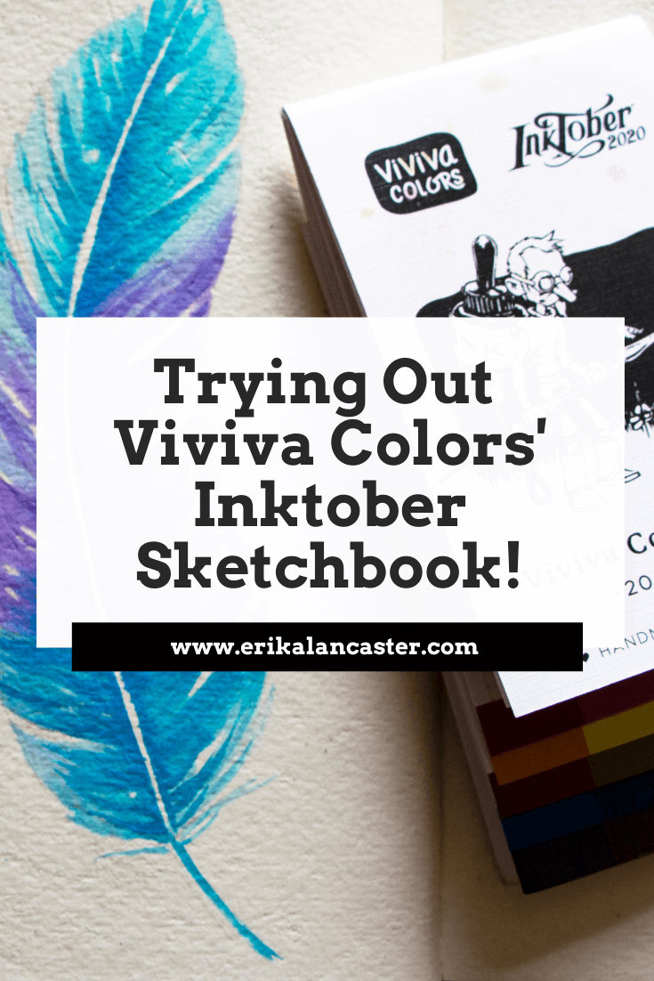
Love #Inktober? Looking for new art supplies to make this popular drawing challenge different and perhaps, more special, this year? Do you enjoy trying out unique art supplies to share with your creative friends?
If so, you'll definitely want to check out Viviva Colors' new sketchbook line that's been launched especially in time for Inktober 2020, but will continue being sold worldwide even after this popular yearly drawing challenge concludes at the end of October.
That's right!
Viviva's crowdfunding campaign for these sketchbooks has gone so well, that the company will continue making them available for artists (without the Inktober logo) for an undefined amount of time.
Inktober is one of the most popular drawing challenges going on in the online space since 2009.
Each year, Inktober creator and renowned illustrator Jack Parker, publishes a new daily prompt list for artists to use as inspiration to create a new drawing/painting/mixed-media piece each day throughout the month of October.
Every October, thousands of artists and creatives all around the world participate in this challenge, pushing themselves to work on a new piece, every day, for 31 days.
It's no secret that Jake Parker has been involved in a couple of different controversial incidents as of late, which have caused a good amount of people to look for alternative art challenges to work on this October.
However, lots of die-hard followers of this challenge are still eager to participate and are excited to begin, many of whom aren't necessarily fans of Jake Parker himself, but have found the experience of Inktober a valuable part of their art journeys.
Many artists believe that the challenge has grown to become more than the person who initially created it.
Inktober has become a way for artists to push their skills, creativity and build the discipline to stay consistent with their art practice.
It has become an event that allows lesser-known emerging artists, to gain traction online and start growing their name known amongst a larger audience.
It's also become an event that brings artists from all over the world together, helping us create meaningful connections that'll last a lifetime.
Inktober, in my opinion, is about artistic growth, about community, and about sharing the importance of art with the world.
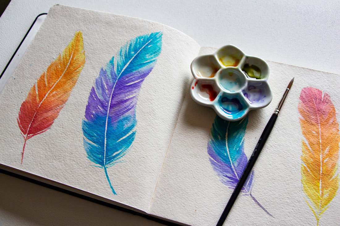
Image 1. Colorful feathers painted on 7.5 x 7.5 in / Rough / Off-white sketchbook using special edition colorsheets.
In this past blog post I talk about Viviva Colors' history and also share my swatching process, as well as my review, for their original colorsheets. Make sure to check it out to read more about their compact and insanely vibrant watercolors.
Viviva Colors' mission has always been to inspire artists to continue on their creative journeys and to never set their art aside, no matter how busy or how stressful life becomes.
The company is not only constantly improving their products and offerings, but is always looking for new ways to encourage and motivate artists to stay on their paths.
Viviva knows that, through art, people are able to cope with anxiety and depression, which are rampant this year due to the current pandemic, its economic repercussions, and all of the uncertainty its creating worldwide.
And knowing how challenging 2020 has been, Viviva teamed up with Jake Parker to release an officially licensed set of supplies that'll make this year's Inktober even more special.
These items were designed to make Inktober 2020 #AnInktoberToRemember.
Just like Viviva's original colorsheets, which were officially launched in 2017, these new supplies were crowdfunded via Indiegogo.
With the huge success of the first campaign, Viviva Colorsheets was able to start mass manufacturing their original product and have shipped them out to more than 30,000 artists in over than 100 countries.
They are currently working on doing the same for the backers of these Inktober sketchbooks and colorsheets!
Viviva's Inktober sketchbook line.
You can find out more about the products they have available at their website.
Let's talk about the new items!
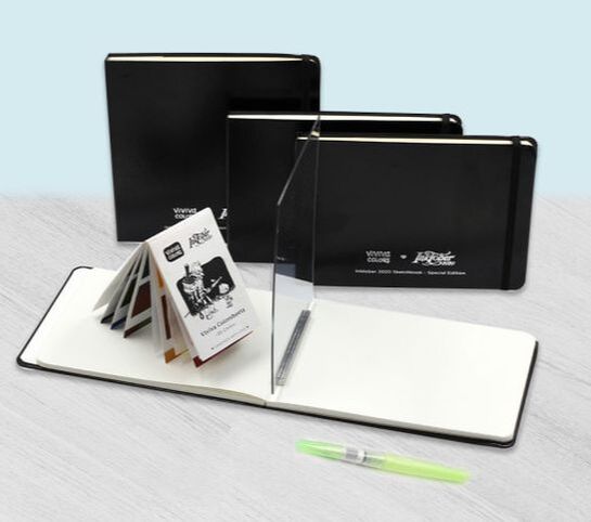
For Inktober 2020, Viviva launched 4 sketchbook variants, as well as a special edition of their colorsheets.
Sketchbooks
All of these sketchbooks are hardbound with a quality faux-leather cover and (during the Inktober season) also include a silver foil stamp with the Inktober 2020 and Viviva Colors logos on the front cover.
a) A5 format (5.8 x 8.3 in) / 240 gsm / Ivory white / Smooth Lessebo paper
/ 64 pages
b) A5 format (5.8 x 8.3 in) / 300 gsm / Off-white color / Rough watercolor paper
/ 40 pages / 100% Cotton
c) Square format (7.5 x 7.5 in) / 300 gsm / Off-white color /
Rough watercolor paper / 40 pages / 100% Cotton
d) *The Easy Sketchbook* A5 format (5.8 x 8.3 in) / 240 gsm / Ivory white
/ Smooth Lessebo paper / 64 pages
*The Easy Sketchbook was created especially for beginner artists who have trouble with their preliminary sketching process. It includes a sketching mirror and an aluminum slot stand to hold it as you're drawing, which helps you transfer the reference's outlines onto paper in an easier and faster way.
See the Easy Sketchbook in action here!
Colorsheets
Aside from the four sketchbooks, Viviva also released a special edition of their colorsheets set which contains an extra 4 colors (their original sets have 16 and this one has 20).
The 20 colors offered in this edition have been curated by Viviva and Jake Parker especially for Inktober.
Check out my color swatching process for their original colorsheets in this blog post. You'll be able to see the colors' vibrancy and learn about my thoughts as to how they compare with regular watercolors in that post.
Just like their original colorsheets, the Inktober edition also has the portable booklet format with protective paper in between each page.
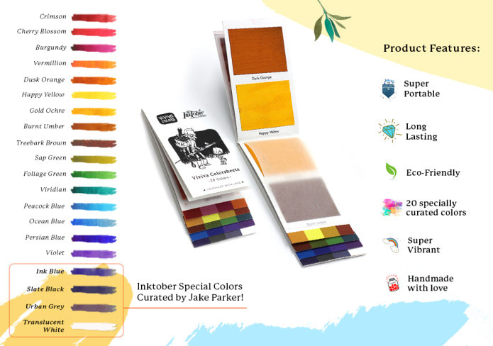
Viviva Colors' special edition Inktober colorsheets.
Here are a couple of pieces I've created in my Viviva/Inktober sketchbook, which is the square format with rough watercolor paper.
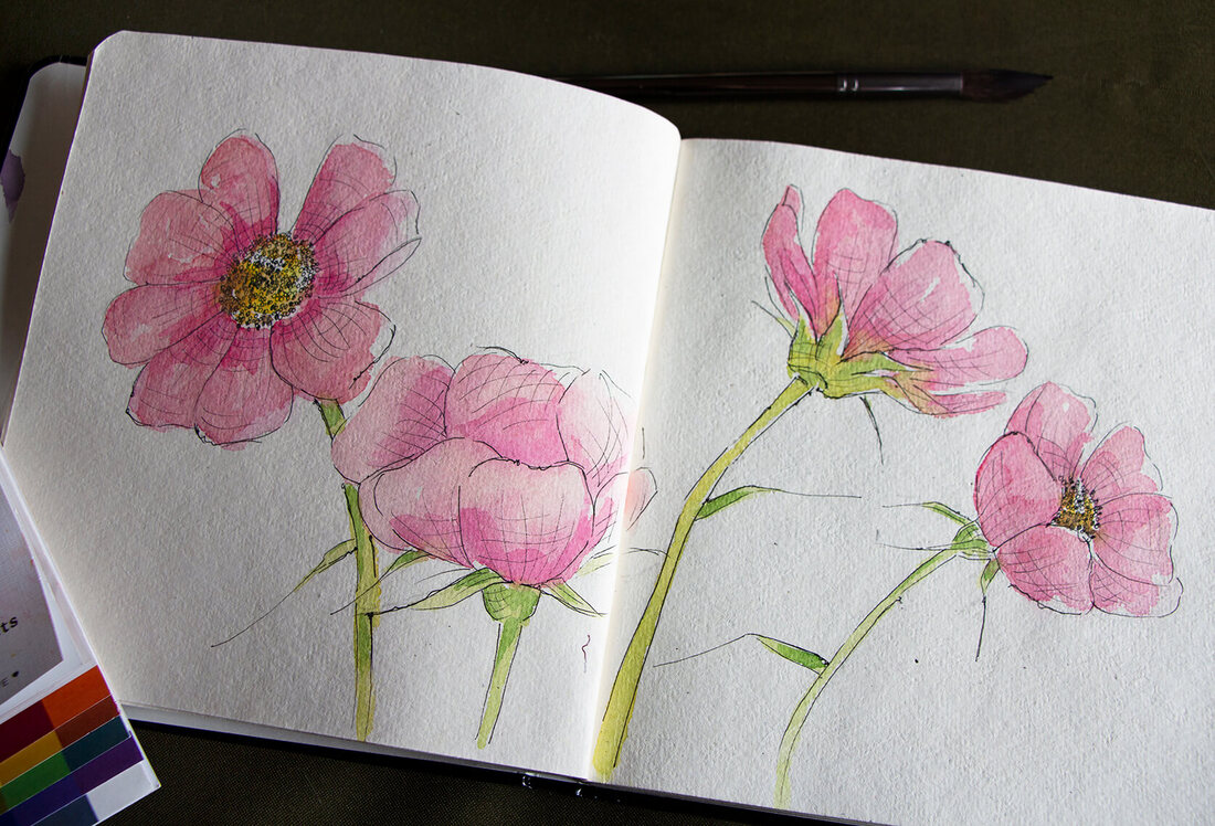
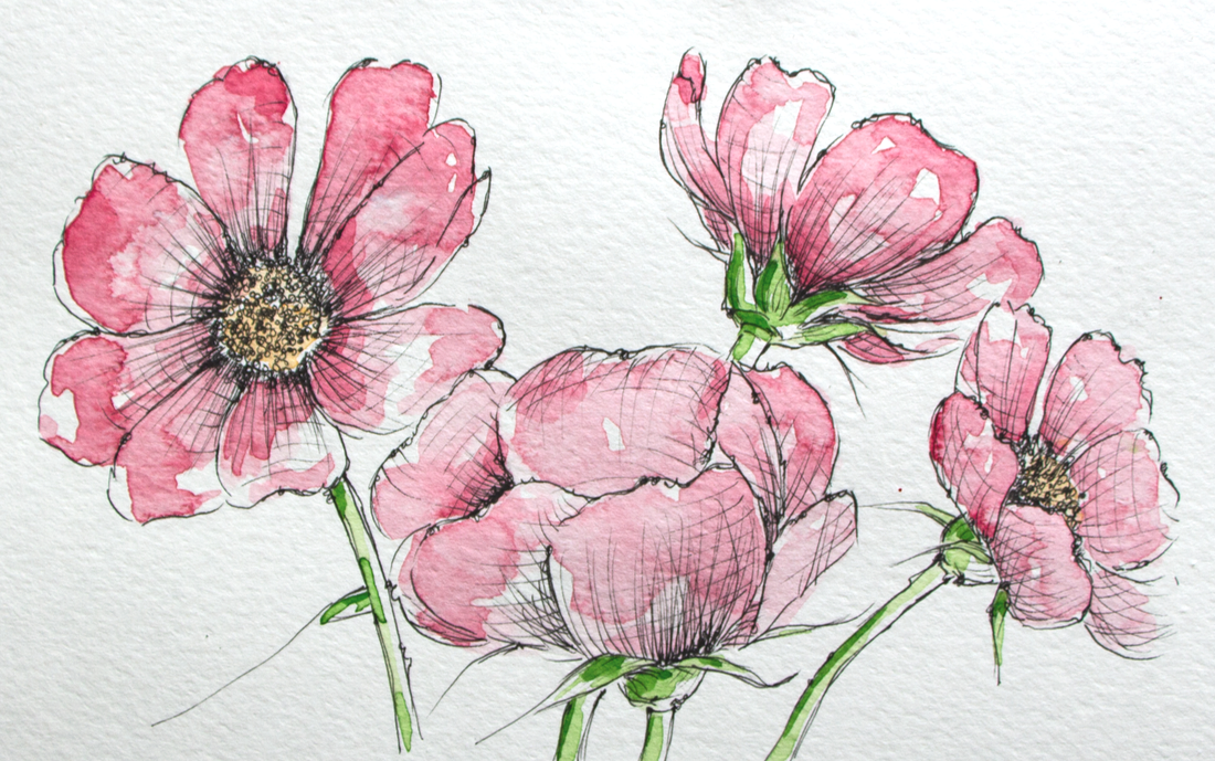
Image 2. Pen and watercolor wash pink flowers painted on 7.5 x 7.5 in / Rough / Off-white sketchbook using Micron drawing pens and Viviva's original colorsheets.
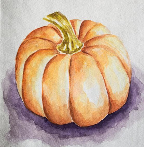
Image 3. Fall pumpkin painted on 7.5 x 7.5 in / Rough / Off-white sketchbook using professional quality Van Gogh watercolors.
A few interesting characteristics I noticed about the sketchbooks:
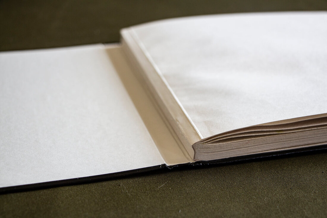
- The sketchbooks have been designed to be opened flat so that they don't close on you when your drawing or painting and you're able to use the sheets fully. The spine where the pages come together is not glued onto the spine of the cover intentionally, for this purpose (see images below). This said, the first few pages are difficult to open completely without having to press down hard at the spine/base. I was a little worried that I'd damage the spine when I did this, but everything was okay.
- Sketchbooks have rounded corners, which I love, as they are more difficult to damage.
- I love the elastic included on the covers, as it keeps the sketchbook closed when you're not working in it, protecting your artwork.
- I like the pocket included at the back, as I can place loose sketches and notes in there. I wish it had a bit more space.
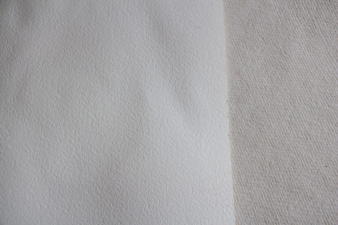
- The watercolor paper included in the watercolor sketchbooks is very different from the commercial paper I'm used to (Arches, Fabriano, Strathmore, etc.). It is a lot more flexible to the touch when dry, has little imperfections in it because it's handmade (which isn't necessarily a bad thing), and I found that the paint gets absorbed in a very different way. Both the paint from Viviva's colorsheets, as well as regular watercolor paint sinks into the paper very quickly and the paint cannot be moved around. Washes of color react differently when overlapped and the off-white, almost cream color of this paper has an effect on the vibrancy of the colors. I also noticed that the paper is fragile. It doesn't tolerate scrubbing techniques and even erasing can damage it easily.
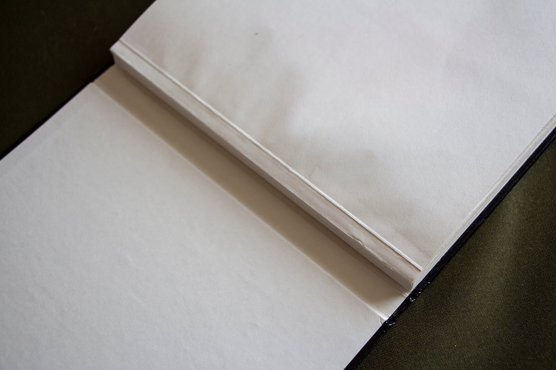
Viviva Inktober Sketchbook spine (made to allow the pages to open flat).
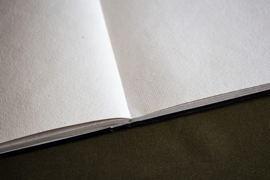
Viviva Inktober Sketchbook open flat.
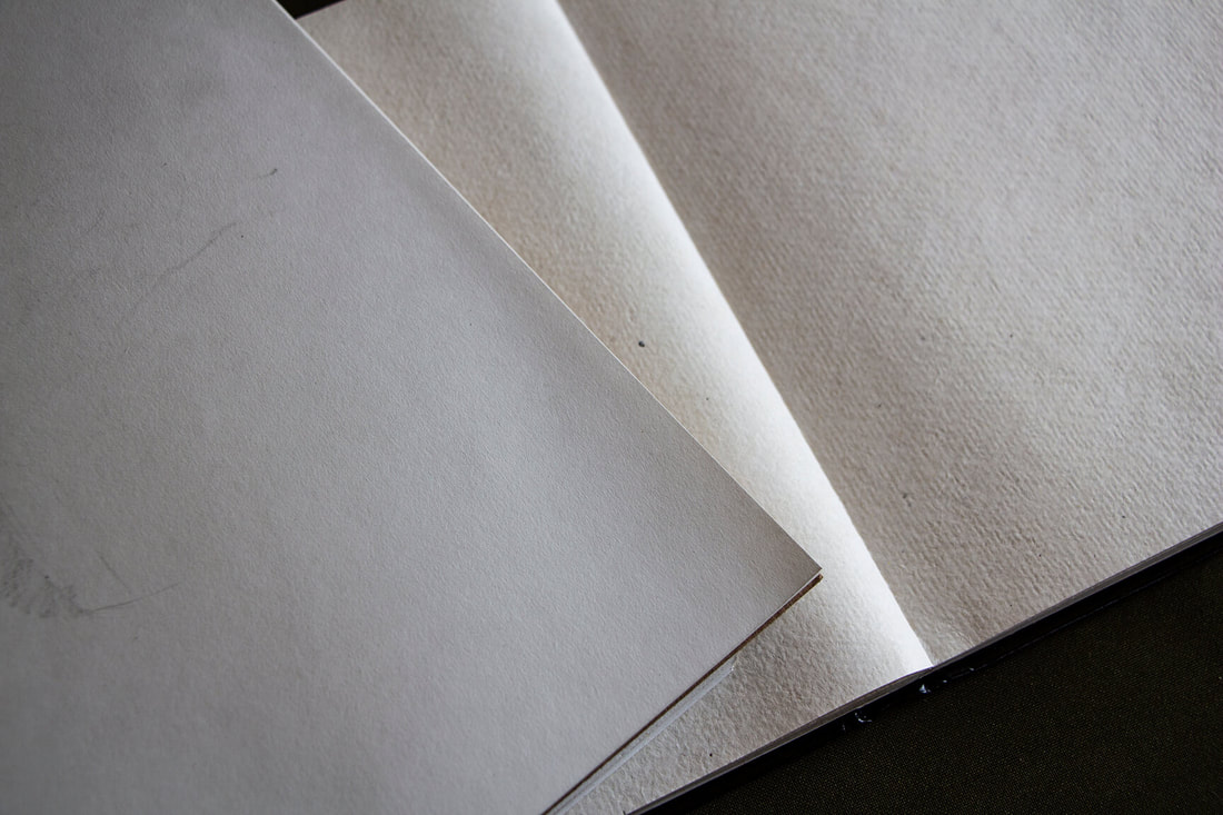
Viviva Inktober watercolor paper sketchbook next to smooth, white drawing paper sketchbook. Notice differences in texture, as well as color.
Viviva Inktober watercolor paper sketchbook next to a sheet of Arches, cold-press watercolor paper. Notice differences in texture and color. Viviva's paper is a lot more textured and is cream-colored.
Finally, here are a few pros and cons I've found in relation to the items I've had the opportunity to try out, in bullet form.
Pros and Cons of Viviva Colors'
and Inktober's Sketchbooks and Colorsheets
Pros
*For more pros and cons about Viviva's color sheets, go here.
|
Cons
|
Close-up of Viviva's Inktober Sketchbook (watercolor paper). Blemishes can be found here and there because this is hand-made paper. I personally liked these little blemishes, but am not so convinced with the color of the paper.
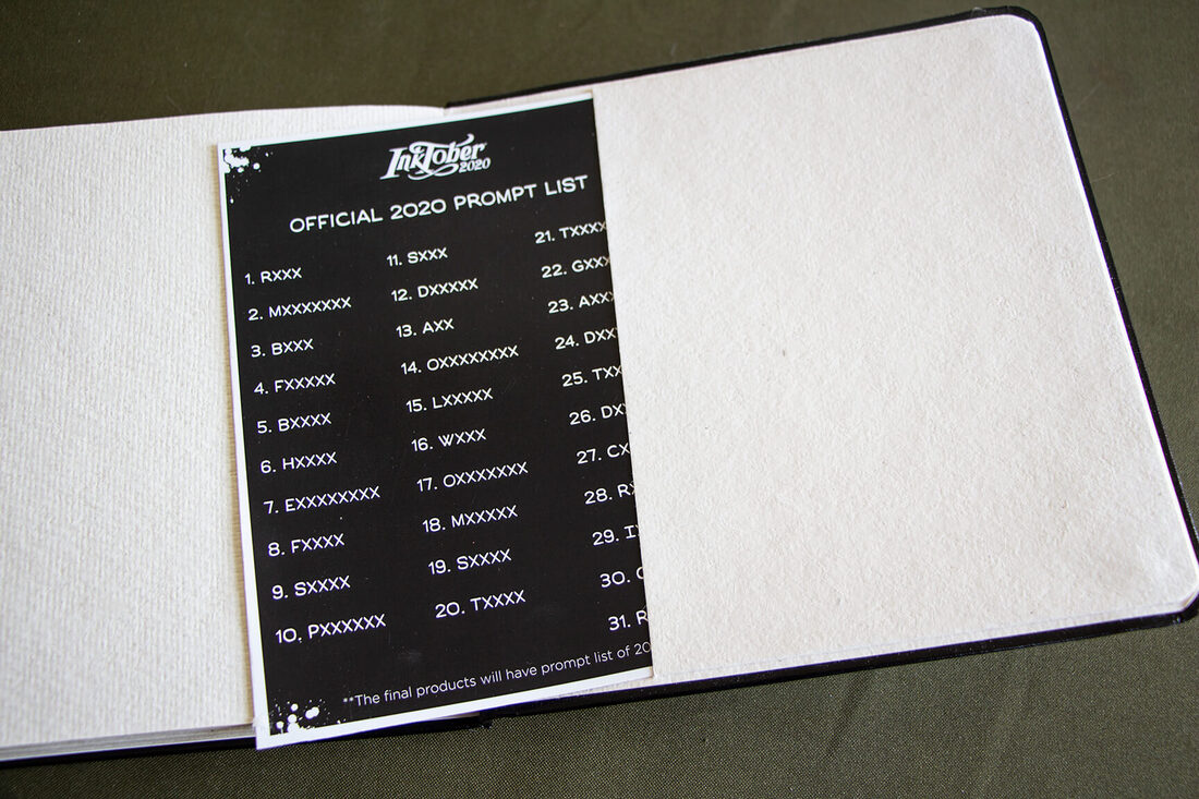
Viviva Inktober Sketchbook back folder with prompt list (because my sketchbook was a prototype created prior to mass production, the words appear with "X").
Viviva Inktober Sketchbook spine (made to allow the pages to open flat).
Beautiful silver foil logos on the faux leather cover.
These items are all beautiful and high-quality, and I want to send a huge thank you to Viviva Colors for providing me these items to explore and review!
Personally, I won't be participating in Inktober this year due to a lack of time and more important projects I'm working for my online art communities, but I look forward to creating more pieces in this great sketchbook.
*Visit Viviva Colors' website and follow them on social media to see inspiring artwork created with their colorsheets, as well as the latest news from them:
Viviva Colors Website
Viviva Colors on Instagram
Viviva Colors on Facebook
How, exactly, can creating art help someone deal with negative emotions such as anxiety and stress? What happens in an art therapy session? Why are holistic, comprehensive approaches for managing inner turmoil more effective than treatments that only revolve around talking or taking medication?
As an artist sharing content online, I've made it a priority to not only share helpful tips and tutorials that help others progress their technical skills, but also articles and videos providing insights and habits I've set in place that have allowed me to improve my mindset and wellbeing.
Our physical and mental health permeate, quite literally, into all areas of our lives (personal, professional, interpersonal).
Plus, being an artist can not only be incredibly challenging in a variety of ways, but lonely too.
In the past, I've shared how I've struggled with Generalized Anxiety Disorder since my teenage years and how, since making my mental/physical wellbeing a priority and started embracing more positive practices and routines, I've become way happier, as well as more focused and energized.
This, of course, has helped me be a lot more productive, which has led to much greater success with my art creation and business overall.
Alongside my art creation and everything I do revolving around my business, I'm constantly reading, researching and putting to use new information that I feel could help me improve my life, as a working artist and educator, even more.
And I'll keep sharing with you guys, in hopes that some of you may find it helpful too.
Because of the current worldwide pandemic, its negative effects on our economies and the social injustices/inequalities that are becoming more and more evident, a lot of us are struggling with negative emotions such as worry and overwhelm at a deeper level than we normally would.
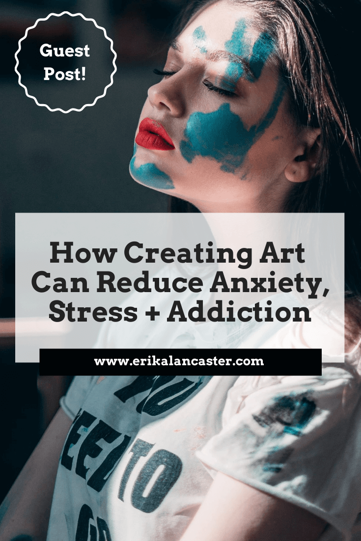
This is why I'm incredibly happy to be sharing an article written for us by professional writer, Patrick Bailey, who has studied the fields of mental health and addiction for years.
Patrick's article helps clarify what happens during an art therapy session and why creative activities are such a great way to cope with negative emotions.
This information is enlightening even for those of us who don't struggle with severe mental illnesses.
Without much further ado, let's get into his article!
How Creating Art Can Reduce Conditions Such as Anxiety, Stress, and Addiction
by Patrick Bailey
Chronic stress and anxiety are leading underlying causes of substance use disorders (SUDs) or addiction. These conditions can make it more difficult for you or your loved one to quit.
In the context of addiction treatment, creating art can help you relax and be more willing to address drug or alcohol use disorder. Art therapy provides a healthy, alternative way to cope with stress, anxiety, and other conditions that often co-occur with substance abuse.
What is Creative Art Therapy?
Art therapy is a form of experiential therapy that has been used to treat substance abuse since the 1950's. There is scientific evidence that backs up the efficacy of using creative expression to confront past trauma that triggers stress or anxiety, or leads to self-destructive behaviors.
Substance abuse is often caused or exacerbated by co-occurring conditions such as depression and post-traumatic stress disorder. Alcohol and drug rehab centers are still using art therapy as part of a multidisciplinary and holistic approach to substance abuse treatment.
Treatment specialists initially focused on using evidence-based treatments such as medication therapy, behavioral therapy, and contingency management as recovery tools.
Today, holistic therapies such as art, poetry, music, and dance help individuals in rehab to connect with their emotions and express them in various ways.
Other forms of creative expressions are:
These and other creative activities also provide a way for people to process
negative emotions and anxieties that may show up during their treatment.
Chronic stress and anxiety are leading underlying causes of substance use disorders (SUDs) or addiction. These conditions can make it more difficult for you or your loved one to quit.
In the context of addiction treatment, creating art can help you relax and be more willing to address drug or alcohol use disorder. Art therapy provides a healthy, alternative way to cope with stress, anxiety, and other conditions that often co-occur with substance abuse.
What is Creative Art Therapy?
Art therapy is a form of experiential therapy that has been used to treat substance abuse since the 1950's. There is scientific evidence that backs up the efficacy of using creative expression to confront past trauma that triggers stress or anxiety, or leads to self-destructive behaviors.
Substance abuse is often caused or exacerbated by co-occurring conditions such as depression and post-traumatic stress disorder. Alcohol and drug rehab centers are still using art therapy as part of a multidisciplinary and holistic approach to substance abuse treatment.
Treatment specialists initially focused on using evidence-based treatments such as medication therapy, behavioral therapy, and contingency management as recovery tools.
Today, holistic therapies such as art, poetry, music, and dance help individuals in rehab to connect with their emotions and express them in various ways.
Other forms of creative expressions are:
- Crafting
- Art journaling
- Creating collages or mosaics
- Drawing, painting, or sculpting emotions
These and other creative activities also provide a way for people to process
negative emotions and anxieties that may show up during their treatment.
The Role of Art Therapy in Substance Abuse Treatment
Psychotherapy is also known as talk therapy, but talking is not always the most effective way to express the emotions that emerge in the recovery process.
Artistic creations give you a less stressful way to describe your emotions and help your therapist better understand your recovery needs. Your therapist may also encourage you to discuss them during individual talk therapy and group therapy.
The ultimate goal of using arts-based methods for rehabilitation is to improve the mental, physical, and emotional well-being of the person.
The creative processes also are a good addiction management technique that can make recovery easier by:
- Providing a safe, non-addictive way of emotional release
- Helping the client admit the addiction
- Motivating change in behaviors
- Stimulating a desire to sober up
- Reducing the shame and guilt of addiction
Artistic activities help by acting as a door that opens up to a place or part of themselves from which patients are running.
There is a type of art therapy called incident drawing that lets you illustrate your feelings and experiences of feeling out of control or self-destructive via drawing.
Seeing the images on paper is a powerful way to help you connect the dots and see the role stress and anxiety play in substance abuse.
Finally recognizing that addiction is a problem makes you more willing to stay in treatment and commit to long-term sobriety.
What Happens During Art Therapy Sessions?
Art therapy is facilitated by a professional art therapist, someone who is trained in using art as a medium for healing and recovery. Therapy takes place at an inpatient or outpatient treatment center in a structured and supportive environment.
Interestingly, you don't need to have a special talent or a background in the arts to get involved. The purpose of art therapy isn’t to produce quality artwork but to help clients become healthy.
You only need to be open to the idea of speaking your truth using art-based methods when words alone cannot explain it all. The art therapist needs to be ready for all the mixed emotions that may emerge from the process.
Expect your therapist to provide a variety of art supplies such as paper, canvas, cloth, paint, crayons, and clay. Don't worry. There is no need to create anything that looks perfect; the focus will be on the creative process rather than the finished product.
Some programs allow you to create your art pieces independently or work on a group project with others. The program structure and your schedule will help determine the approach.
After you're finished, your therapist may interpret your creation or encourage you to focus on the healing the process brings. You may be asked to explain how you feel the art—painting, drawing, or crafting, for example—helps you.
Enrolling in an Art Therapy Program
Art therapy helps clients in rehab overcome addiction and live a healthy life.
It allows you to release stress, anger, and frustration, regain confidence, build self-acceptance, and improve self-esteem.
Many addiction treatment centers offer a creative arts program as a part of a comprehensive treatment program that addresses the "whole person."
Other modalities include individual therapy, group therapy, 12-Step meetings, family counseling, fitness, nutritional counseling, and recreational outings.
When looking for a treatment facility, it's important to consider one that uses an integrative approach to recovery.
Sources:
- https://www.tandfonline.com/doi/full/10.1080/07421656.2016.1166832?journalCode=uart20 - Reduction of Cortisol Levels and Participants' Responses Following Art Making
- https://www.drugabuse.gov/publications/principles-drug-addiction-treatment-research-based-guide-third-edition/evidence-based-approaches-to-drug-addiction-treatment - Evidence-Based Approaches to Drug Addiction Treatment
- https://www.ncbi.nlm.nih.gov/pmc/articles/PMC4268880/#R2 - The Use of Art and Music Therapy in Substance Abuse Treatment Programs
Sending out a huge thank you to Patrick for this enlightening article.
To find more of his helpful wellness articles, visit his website here.
Cheers!
*This post contains affiliate links. I receive small commissions for purchases made through these links at no extra cost to you. These commissions help me keep this site up and running, in order for me to keep providing helpful and inspiring art content. :)
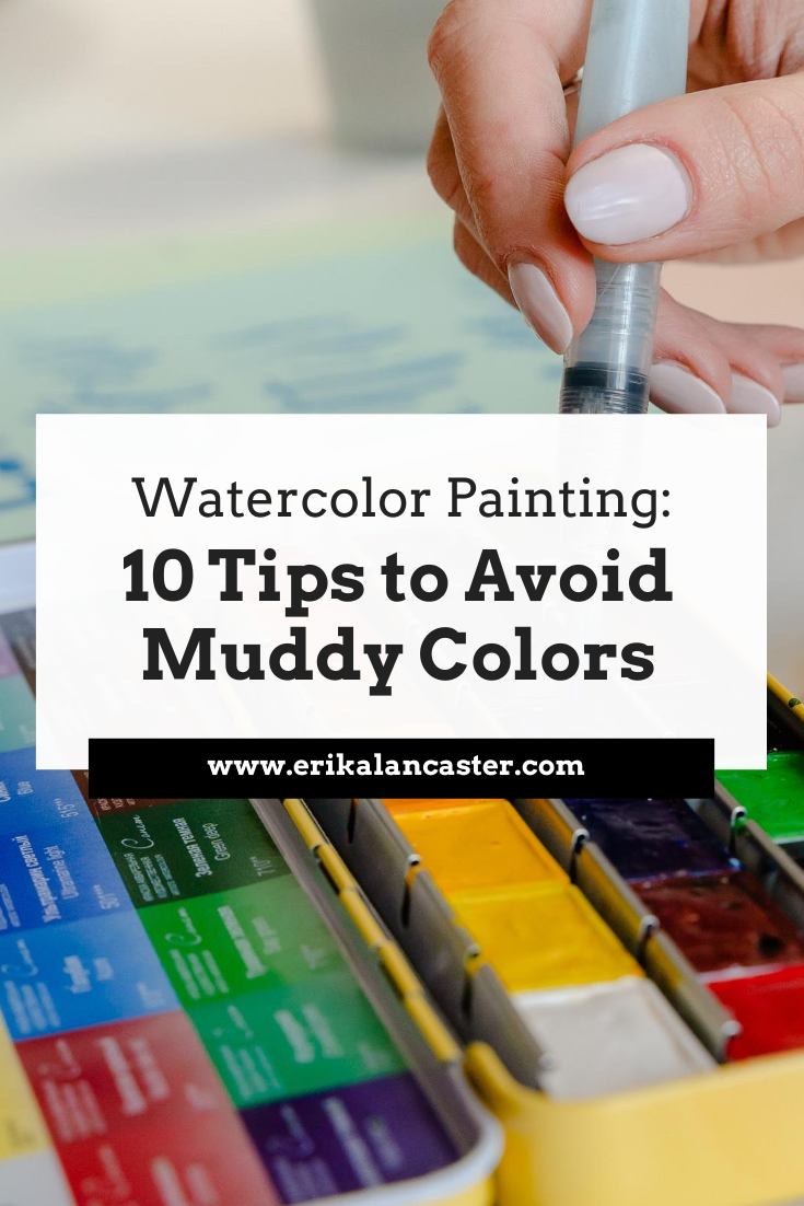
What, exactly does the term muddy color refer to when painting with watercolor? What are the common culprits for muddy colors and which actions should we take in order to avoid them?
Watercolor!
So vibrant, so fresh, so... tricky!
Muddy colors are one of the most common struggles for people starting out with this painting medium and in today's blog post (and YouTube video!), I'm covering what they are exactly, so that you know what to keep an eye out for. I'll also be providing my best tips that'll help you keep your colors fresh and vibrant.
There's no doubt that watercolor is an amazing painting medium that can be a lot more practical to use when compared to mediums like acrylics or oils, which require a larger space to set up, a well-ventilated area, much more clean up and, most often than not, a larger investment in supplies.
This said, it doesn't take much time using watercolors to realize that they are truly a challenge.
Not only are there so many variables involved when it comes to painting with watercolor that affect both the painting experience, as well as the final outcome (such as the humidity and temperature of the room we're in, the quality of our paint, each specific pigment's characteristics, the type of paper that we're using, etc.), but there's also no way to simply cover up our mistakes or swipe them off like we can when we're painting with opaque mediums.
Learn more about different types of paint, paintbrushes and watercolor paper and what you truly need as a beginner just getting started in my blog post titled Watercolor Supplies for Beginners and Things You Must Know.
Not to mention, we're working on a substrate that's inherently fragile. Even when we're working with paper that's intended for water-soluble mediums, it can only take so much scrubbing, lifting and layering. It's paper!
It's essential to stay patient, work mindfully, practice our water control and allow the paper to dry/regain its strength whenever needed throughout the process.
As loose, expressive and even quick, more experienced artists make painting with watercolor seem, as I'll be talking about in the video, creating a successful piece requires not only mastering water control, but also knowledge of color, and going in with some sort of strategy.
We need to visualize the overall effects we're going for so that we know what techniques (wet-on-wet, wet-on-dry, etc.) to use where and also, when.
It's also essential to have some sort of general plan when it comes to the colors we'll be using.
Then we can allow ourselves to let go and embrace the beautiful, organic effects that only watercolors allow.
So... what are muddy colors, exactly?
The term 'muddy color' refers to a color mixture or a section of our painting has turned dull, flat, matte and, overall, lifeless.
Muddy colors lack the vibrancy (and most of the time also the translucency) that watercolor allows and don't look like they belong within the context of the piece, when one takes into consideration the rest of the colors used around that area.
Watercolor allows for a light, interesting, vibrant use of color that's unique to this medium and flat, lifeless colors are often proof that something has gone wrong.
This said, it's important to note that a muddy color is very different from a desaturated or muted-out color.
Desaturated colors are grays, browns or neutralized colors and these are often used intentionally by artists who are looking to tone down highly-saturated colors straight out of the pan or tube to make them look more realistic/natural or simply to make use of a color scheme that suits their style best.
You'll notice that lots of colors (except for browns and neutrals) are very saturated and vibrant right out of the pan or tube, and these kinds of colors don't happen very much in real life when you look at the settings or living things around you.
Other watercolor artists simply like the look of more muted out colors and create they own color mixtures, adding a second or even third color to desaturate them or create the color they need.
This doesn't make these colors mud, as long as the artist knows what he/she is mixing together, has at least somewhat of a plan, is staying in control, is playing to the medium's translucent nature and interesting use of color, and the colors fit within the context of the piece.
Take this still life watercolor of mine below as an example. I've created my own gray and brown color mixtures using Ultramarine Blue and Raw Umber and there's still a vibrancy/life to them.
There's a variety in values, translucencies and even color temperature throughout these areas, and these more desaturated color mixtures harmonize and look like they've been planned. They allow the bright, vivid colors in the apples to shine.
*Learn more about Art Fundamentals and what it takes to plan for successful, harmonious and balanced compositions with my classes over on Patreon.
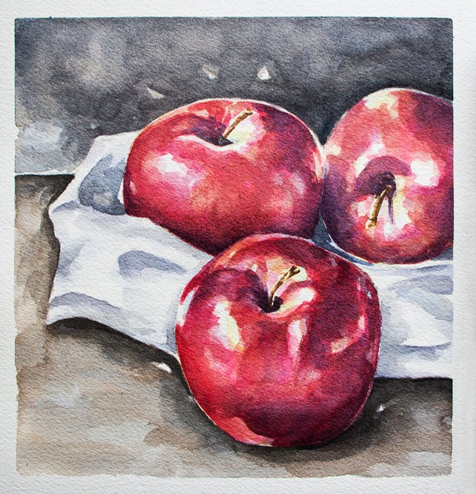
Watercolor Apples Still Life by Erika Lancaster
Desaturated, muted out colors and even grays and browns can, indeed, have a life and vibrancy to them, as long as we plan for them intentionally and make sure not to overwork our paintings.
What's essential, in my opinion, is making use of this medium's translucency and dynamic nature to create light looking paintings with a vibrant use of color so that, whether the colors we're using are pure/highly-saturated or toned-down, our paintings still seem to glow from within.
Matte and opaque are opposite to translucent and vibrant.
And flatness/heaviness is basically where the problem is.
Not darkness, not level of saturation.
When we're just getting started with this medium and are still lacking water control, it's incredibly easy to overwork our paintings.
Add to this the fact that most beginnersdon't invest enough time to learn about the Color Wheel/Color Theory and this is a recipe for lots of frustration and disappointment.
If you enjoyed this video and found it helpful, make sure to subscribe to my YouTube channel. I share a brand new video every week with art tips, drawing and painting tutorials and mindset/productivity tips for artists. *Subscribe HERE*
Why do muddy colors happen?
Usually, they happen because of one (or a combination) of the following:
a) Because we lose control of our different colors on our paint mixing palette or on our paper (colors can intermix in both areas).
b) We don't know much about the Color Wheel/Color Theory and don't pre-select our colors before starting a new piece (testing out color mixtures is very important).
c) We don't clean out our paintbrush bristles well in-between colors and/or we're not changing our water throughout the painting process.
d) We're not staying patient and are getting anxious to finish, going over the same spot again and again, while our paper is still wet, in attempts to fix mistakes but damaging our paper in the process.
Find a list of my favorite watercolor supplies here.
10 Tips to Avoid Muddy Colors When Painting with Watercolor
1. Learn about the Color Wheel and color temperature
The Color Wheel is an invaluable tool that helps us understand color relationships.
Not only does it allow us to create color mixtures effectively while working, but it also enables us to plan color schemes prior to starting with the painting process that work beautifully and help us communicate the message we're looking to communicate.
Experiment with creating your own color mixtures. See what happens first-hand when you combine cool colors, warm colors and a warm plus a cool. Learn about color and work on color mixing exercises outside of a painting process via color studies and explorations.
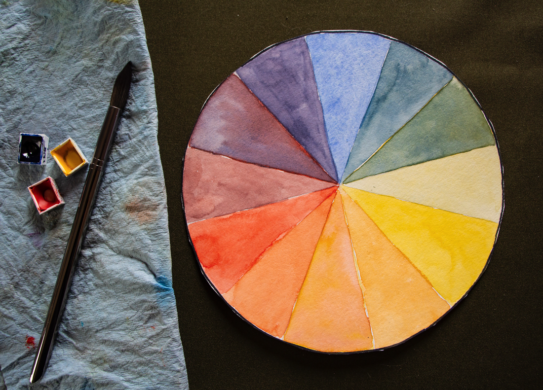
12- Part Color Wheel in Watercolor including Primary, Secondary and Tertiary colors.
2. Pre-select the colors you'll be using for the painting on hand before getting started
Randomly picking colors throughout the painting process is a surefire way of arriving at muddy colors.
Keeping things limited to only a certain amount of necessary colors, especially in the beginning, is a great idea. This not only allows the beginner to keep colors more organized throughout the process, but will mostly likely lead to an outcome that is much more harmonious and cohesive.
In this video, I share my entire process for painting a still life with watercolor using only 4 colors and why I love working with a limited color palette.
Before getting started with a new piece, give thought to how you're going to be creating the different colors you'll be needing, how you're going to be creating shadows and darker values of different colors, etc.
Most often than not, working with a limited amount of colors is going to help you get comfortable with color mixing a lot faster!
3. Change your water throughout the painting process (or use 2 or 3 containers)
As soon as you notice your water becoming murky, change it! You can also consider using 2 or even 3 containers as you're painting.
This way, you're able to use one of them to rinse out your bristles and another to take clean water from as needed throughout the process whenever you need to pre-wet areas of your paper, add more water to paint mixtures, soften out edges, etc.
4. Make sure you're cleaning out your paintbrush bristles thoroughly in-between colors
If you just finished using one color and you're planning on going into a color that's very different from it, make extra sure that your bristles are well rinsed, especially if you're not looking to desaturate your colors.
As a rule of thumb, if I'm not going into an Analogous color (a color that is next to to the one I was just using the Color Wheel), or just finished using a brown/neutral color, or even a color that might be more opaque than the one I want to use next (watercolors can be opaque, semi-opaque, translucent and semi-translucent), I make extra sure that all of the previous color has been washed out.
Unless I actually want to desaturate or mute-out a color.
If you're using grays, browns or neutrals, or Complementary Colors (opposites in the Color Wheel) in your painting, make sure to stay mindful throughout the process, as it's very easy for colors to mix together on your paper (especially if you're using lots of wet-on-wet), in your paint-mixing palette, and even in the bristles of your paintbrush!
5. Be careful when using Complementary Colors
Complementary Colors are opposites in the Color Wheel and, when mixed together, they neutralize or mute each other out. You can use this to your advantage if this is what you want to do, but if your aim is to keep your colors super saturated, then you need to approach these color combos with some sort of strategy.
Ask yourself: Depending on the effects that I'm going for, what area should I paint first, next and last? What techniques should I be using (wet-on-wet, wet-on-dry, etc.)? What areas should I stay extra mindful to allow to dry before adding more color on top or around it? Should I be placing these two colors next to each other at this point in the process?
Remember that watercolor is always going to expand and bleed into paper that is wet. So if you don't want colors to intermix, you must allow them to dry completely.
If it makes sense for the subject on hand and the style you're going for, consider darkening colors with an Analogous Color, if you want colors to remain very vivid. Remember, Analogous Colors are next to each other in the Color Wheel.
6. Avoid using ready-made blacks
Though color ingredients vary from brand to brand, most ready-made blacks such as Lamp Black, Ivory Black, Mars Black, etc., tend to be very flat and usually dull-out colors. This is one of the reasons why so many traditionally trained watercolor artists don't use them and, instead, create their own dark color mixtures that have liveliness and a color temperature to them.
It's also important to have in mind that blacks can really lead to stark, heavy looking marks or shapes that can be very distracting, and that there's actually very little pure black in nature. Even shadows have color and a temperature to them.
There are tons of ways to create your own darks when using watercolor.
I share many different dark color mixtures in this video over at my YouTube channel.
If you do use a ready-made black, consider adding another color into it.
You can also use Neutral Tint, Payne's Gray or Analogous Cours to darken a certain color.
7. Hold yourself back from overworking your paintings
This is a tough one and something I'm working on as I continue on my journey with watercolor. Especially because I started painting with oils and acrylics, which usually require layering and going over the same area many times.
When it comes to working with watercolor, I've realized that the less moving around of paint we do after its been placed and even the less amount of layers we have to develop, the better and the fresher the outcome tends to be.
I've realized that visualizing the outcome we're after and approaching a new watercolor painting process with at least some sort of general plan is essential. This helps us lay down our washes and brush strokes more confidently and leave things be.
Because, if we don't know what we're after or what we're doing, we're going to be hesitating and making lots of mistakes that we'll want to go in and fix.
Mistakes and accidents always happen, but they're usually a lot smaller and can be made less noticeable more easily if we go in with a strategy and are staying mindful/patient.
If you feel you need to practice a specific technique or do isolated studies of something before getting started with a more complete piece, do it! It'll help you attack a new painting a lot more confidently and with much more success.
If you make a mistake, don't fret. Simply absorb excess water and paint with your absorbent towel or semi-dry paintbrush bristles and allow it to dry. Come back after the paper has regained its strength to see how you can make it less noticeable.
*A small amount of moving around of our paint is okay, but avoid going over the same spot again, and again, and again!*
8. Allow your layers of paint to dry completely before applying another wash on top
Like I said before, watercolor is always going to expand into paper that is wet. If the paper is very wet, the paint you place on top is going to expand more rapidly. If the paper is starting to dry, it'll expand more slowly.
But it'll always feather out at least a bit depending on the level of moisture.
There are varying degrees of wetness a paper can have when we're working with watercolor and, as we continue practicing, it'll become easier to tell when we should be dropping in our paint in order to achieve a certain level of gradating or blurring out.
If we want our marks or the edges of our shapes to be clean and sharp, or if we don't want the previous colors we've placed to intermix with the ones we want to place on top, it's important to be patient and allow our painting (or at least that specific area) to dry completely.
Always remember that, wet paper is fragile paper and we must allow it to regain its strength before attempting to add further detail or darken certain areas.
9. Avoid using opaque colors
Watercolor paint can be opaque, semi-opaque, transparent and semi-transparent. Each individual color's characteristics vary, even within the same paint set, and this is one of the reasons why swatching out a new paint set is important.
It's important to know that opaque colors tend to create color mixtures that get thicker and thicker, and murkier and murkier, which can lead to mud much more easily than using transparent colors.
This doesn't mean that we can't use them (I use them all the time!), but it does mean that we have to use them carefully or, in many cases, on their own.
Colors such as Cadmium Yellow, Cadmium Red, Cerulean Blue, Raw Umber and Yellow Ochre tend to have opaque qualities to them.
You can never go wrong with testing out the different color mixtures you're planning on using on a scrap piece of watercolor paper before actually using them in your painting.
10. Make sure that you're cleaning out your paint mixing palette thoroughly and keep colors organized throughout the process
This one's related to keeping your water and paintbrushes clean, and I just thought I'd add it in because it can be especially helpful for beginners.
When we're watching videos in which expert watercolor artists are using a huge watercolor palette with a bunch of different colors that seem to be intermixing and they are freely taking their colors as they're painting, it's important to realize that they:
a) Know the Color Wheel like the back of their hand
b) Have mastered water control and know what to do to fix mistakes
and
c) Most likely than not, they've pre-selected and organized the specific colors they know and love using to create their very own color palette
When we're just getting started it can seem like we should be approaching our painting process in that same way, with a large amount of colors and with a palette that *seems to be* out of control.
It can be very frustrating when a beginner sees that, tries to replicate that, continues ending up with paintings that don't seem right, and has no idea what he/she is doing wrong.
My advice?
Learn about Color Theory, keep things practical and limited, and stay as organized as possible in the beginning so that you can continue practicing mindfully and, I promise, you'll get to that point a lot sooner!
*Bonus Tip:
Higher quality watercolor paint is going to lead to better results (better color payoff/more vibrancy/easier mixing of colors/etc.) and generally offers more information about each color such as its level of translucency, granulation, etc. Cheaper watercolors tend to be chalky and opaque, which lead to muddy colors.
Find a list of my favorite watercolor supplies here.


www.erikalancaster.com
is a participant in the Amazon Services LLC Associates Program, an affiliate advertising program designed to provide a means for sites
to earn advertising fees by advertising and linking to amazon.com.
www.erikalancaster.com
is a participant in the Shareasale.com Affiliate Program, an affiliate advertising program designed to provide a means for sites to earn advertising fees by advertising and linking to Shareasale.com partner companies.
 RSS Feed
