
*This post contains affiliate links. I receive small commissions for purchases made through these links at no extra cost to you. These commissions help me keep this site up and running, in order for me to keep providing helpful and inspiring art content. :)
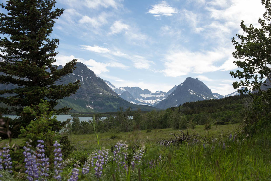
Ever wondered how to go about painting a watercolor landscape? Do you find complex, layered watercolor compositions too hard or intimidating to create? Are you curious about how to paint a unique landscape using a photograph as reference? Painting a watercolor landscape can definitely be daunting when an artist is just starting out with this medium, especially due to its fluidity and transparency. We often hear that watercolors are "difficult to control" and "unforgiving", which may cause beginners to stay away from painting certain types of compositions. This, if you ask me, is a complete shame. I'm here today to encourage you to give watercolor landscapes a try! If you have a basic understanding of this painting medium, as well as Art Fundamentals like perspective and proportion, it's not as difficult as you may think. In this post and the video included here, I will be taking you through my complete process, one-step-at-a-time. I will also be sharing some of my personal tips and tricks that allow me to create specific textures, depth and dimension. Water control is one of the first skills we have to master when starting out with watercolor. Check out my video about this topic over at my YouTube channel. Welcome to the fourth (and final) part of the Watercolor Landscapes for Beginners Series!In this series, I have broken watercolor landscape compositions apart into commonly used elements and/or layers in order to help you gain a better understanding of the painting process. By making time to study individual elements before jumping into a complete composition, you gain confidence in your painting skills and increase the chances of producing a finished piece you'll actually be proud of! A landscape composition is usually made up of different layers (foreground, middleground, background), as well as a large variety of colors and textures. The artist has to have a good sense of compositional arrangement, depth and perspective. All of these items are very important when attempting to recreate any kind of believable scenery that is visually appealing and balanced. 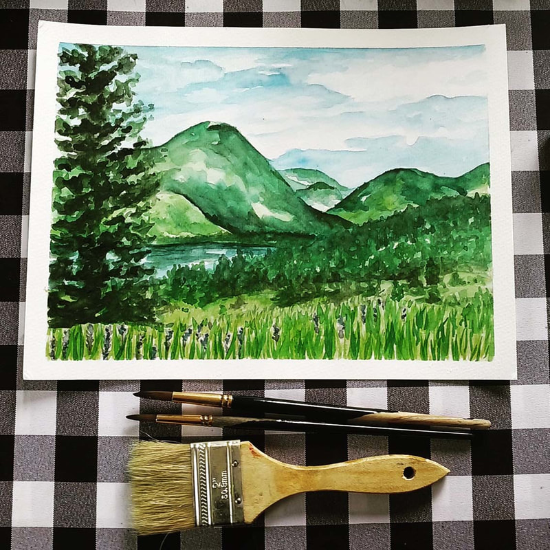
Watercolor landscape painting by Erika Lancaster
|
|
|
|
|
Painting Process
Watercolor Mountain Landscape
All of the "base" layers of paint were created using the wet-on-wet technique. I used less and less water in my paint mixtures as I moved on with subsequent layers, which allowed me to create deeper values, textures and details.
1. I created my initial pencil sketch lightly using my reference photograph as inspiration, but not stressing out about making it exactly the same.
Personally, I don't like my pencil lines to show through my paint, so I do my best to draw as lightly as possible using an HB pencil and even go back to erase what I can before starting to add my color in.
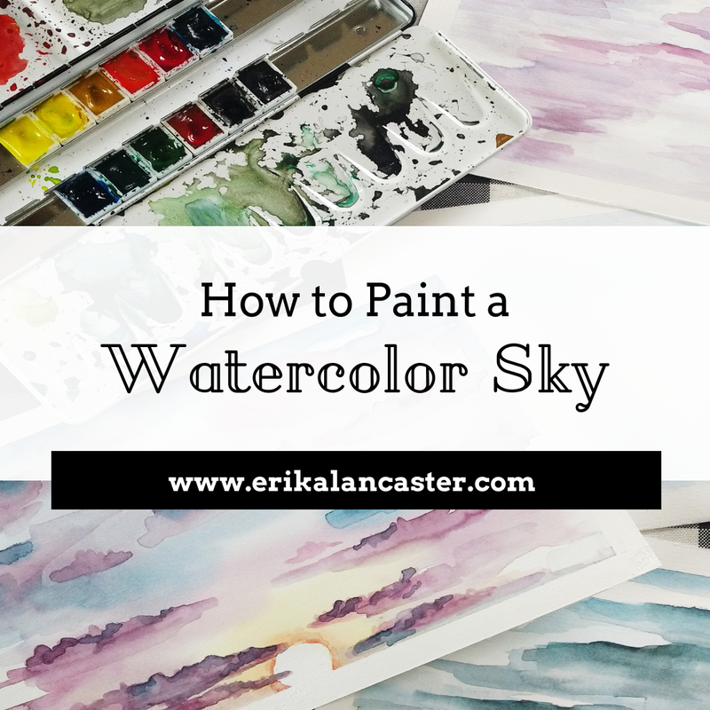
2. I painted the first layer of my sky using the wet-on-wet technique.
Using my two inch paintbrush, I wet my entire sky area using clean water and started adding in my first layer of blues, making sure to create a variety in values since the very beginning (I used my rag to do lifting wherever I wanted to create the illusion of clouds).
I then decided to allow my first layer of paint to dry, jumping to the opposite side of my painting. *Refer to the How to Paint a Watercolor Sky blog post/video.
3. I wet the entire grass section of my sketch using clean water. I then dropped in and played around with a few yellows/light greens until I had to allow that section to dry.
4. I wet the entire mountain area and started dropping in and playing around with greens in this section, making sure to observe my reference picture in order to have a general idea of where darker values would be created later on (this is very important especially when there are overlapping elements present).
5. At this point, I went back to finish my sky area by adding darker blues and a bit more definition in specific areas of my clouds.
I was very careful not to go overboard! Add some definition here and there, and leave other areas blurrier.
6. I decided to jump to the lake area of my picture because the sections around it were already dry.
Again, I wet this area with clean water and started dropping in my blue paint mixtures, making sure to create a tonal variety since the beginning. I allowed this area to dry.
7. Jumping back to the dry mountain area, I started adding in deeper, darker values.
I made sure to observe my reference picture constantly for this, but wasn't attempting to make everything exactly the same. It's important to be very careful when placing darker values of color because you risk flattening out your painting!
8. I jumped back to the middleground/foreground area, adding in deeper, darker greens where I saw them in the picture, allowing the lighter greens already there to show through.
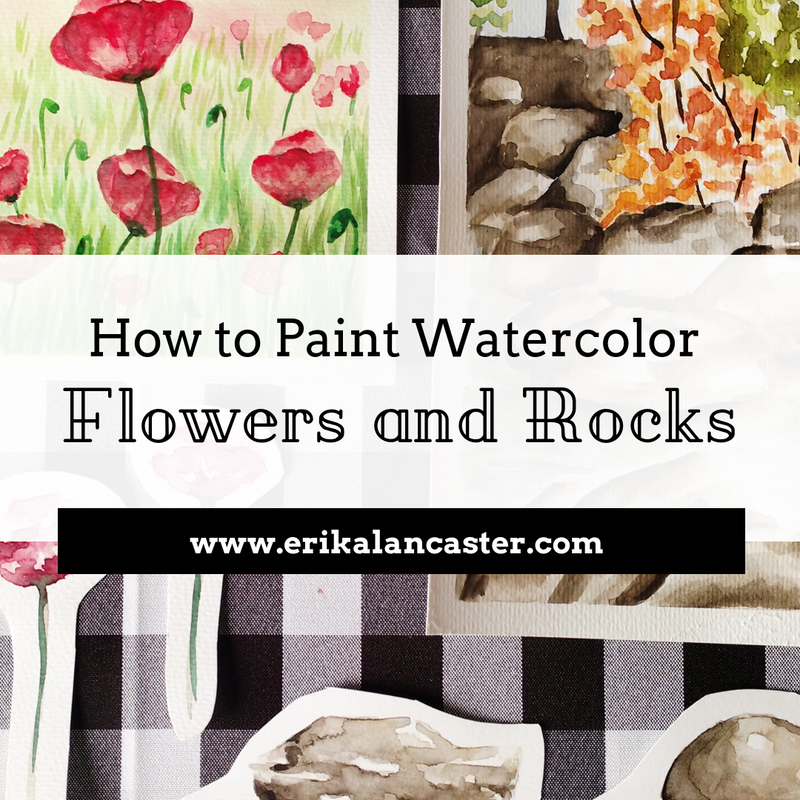
9. I created a purple paint mixture and quickly practiced my lavender flowers before adding them into my painting. I added a few here and there, but made sure not to go overboard.
I also made sure to place them in irregular patterns and to make some smaller than others.
Remember, when painting anything natural, go for asymmetrical and irregular patterns and shapes! *Refer to the Watercolor Flowers and Rocks blog post/video.
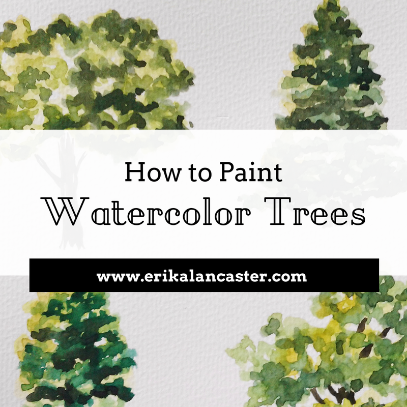
10. At this point, I wanted to start adding in trees/plants and started with the ones located in the middleground.
I used gentle scribbling motions in irregular triangular shapes to give the impression of pine trees in the distance, and made sure to keep them quite small, as they are quite far away from the viewer.
It's very important to give thought to the size of each element you'll be adding in, as this helps give off the impression of depth and perspective. *Refer to the Watercolor Tree Tutorial blog post/video.
11. I could tell that my mountains (which had already dried) required a bit more contrast and darker values in certain areas, so I went back to work on them.
12. Jumping back to the foreground, I used a darker green to add in the effect of short shrubs/plants in some areas. I used a scribbling motion to create these textures.
Remember, you're creating the illusion of plants, and not trying to paint every single detail! I recommend keeping it loose and expressive!
13. At this point, it was time to add the large tree in the foreground!
I created my lightest and most translucent green and started adding in the illusion of the layered leaves I could see in the picture using light scribbling motions. Once I was done laying down the general shape of the tree, I started adding in deeper greens in certain areas, making sure to not go overboard.
14. I created a light and translucent green paint mixture and started adding in individual blades of grass using upwards strokes with my smaller round brush.
I knew I was going to go back in later with a variety of greens to make this area look more believable.
Remember that the blades of grass that are farther away (closer to the horizon line) have to be a lot smaller than the ones closest to the viewer. Once my initial layers of green grass had dried, I start adding in my mid-to-darker values.
15. Finally, I stepped away from my painting and compared it to the reference image in order to pinpoint where darker values have to be added in.
Because watercolor paint dries lighter than it looks when wet, usually deeper contrast has to be created later on.
Don't be afraid to add darker values! Just make sure to add them deliberately and carefully (only where necessary and never covering up large areas of your previous layers entirely).
Personally, I don't like my pencil lines to show through my paint, so I do my best to draw as lightly as possible using an HB pencil and even go back to erase what I can before starting to add my color in.
2. I painted the first layer of my sky using the wet-on-wet technique.
Using my two inch paintbrush, I wet my entire sky area using clean water and started adding in my first layer of blues, making sure to create a variety in values since the very beginning (I used my rag to do lifting wherever I wanted to create the illusion of clouds).
I then decided to allow my first layer of paint to dry, jumping to the opposite side of my painting. *Refer to the How to Paint a Watercolor Sky blog post/video.
3. I wet the entire grass section of my sketch using clean water. I then dropped in and played around with a few yellows/light greens until I had to allow that section to dry.
4. I wet the entire mountain area and started dropping in and playing around with greens in this section, making sure to observe my reference picture in order to have a general idea of where darker values would be created later on (this is very important especially when there are overlapping elements present).
5. At this point, I went back to finish my sky area by adding darker blues and a bit more definition in specific areas of my clouds.
I was very careful not to go overboard! Add some definition here and there, and leave other areas blurrier.
6. I decided to jump to the lake area of my picture because the sections around it were already dry.
Again, I wet this area with clean water and started dropping in my blue paint mixtures, making sure to create a tonal variety since the beginning. I allowed this area to dry.
7. Jumping back to the dry mountain area, I started adding in deeper, darker values.
I made sure to observe my reference picture constantly for this, but wasn't attempting to make everything exactly the same. It's important to be very careful when placing darker values of color because you risk flattening out your painting!
8. I jumped back to the middleground/foreground area, adding in deeper, darker greens where I saw them in the picture, allowing the lighter greens already there to show through.
9. I created a purple paint mixture and quickly practiced my lavender flowers before adding them into my painting. I added a few here and there, but made sure not to go overboard.
I also made sure to place them in irregular patterns and to make some smaller than others.
Remember, when painting anything natural, go for asymmetrical and irregular patterns and shapes! *Refer to the Watercolor Flowers and Rocks blog post/video.
10. At this point, I wanted to start adding in trees/plants and started with the ones located in the middleground.
I used gentle scribbling motions in irregular triangular shapes to give the impression of pine trees in the distance, and made sure to keep them quite small, as they are quite far away from the viewer.
It's very important to give thought to the size of each element you'll be adding in, as this helps give off the impression of depth and perspective. *Refer to the Watercolor Tree Tutorial blog post/video.
11. I could tell that my mountains (which had already dried) required a bit more contrast and darker values in certain areas, so I went back to work on them.
12. Jumping back to the foreground, I used a darker green to add in the effect of short shrubs/plants in some areas. I used a scribbling motion to create these textures.
Remember, you're creating the illusion of plants, and not trying to paint every single detail! I recommend keeping it loose and expressive!
13. At this point, it was time to add the large tree in the foreground!
I created my lightest and most translucent green and started adding in the illusion of the layered leaves I could see in the picture using light scribbling motions. Once I was done laying down the general shape of the tree, I started adding in deeper greens in certain areas, making sure to not go overboard.
14. I created a light and translucent green paint mixture and started adding in individual blades of grass using upwards strokes with my smaller round brush.
I knew I was going to go back in later with a variety of greens to make this area look more believable.
Remember that the blades of grass that are farther away (closer to the horizon line) have to be a lot smaller than the ones closest to the viewer. Once my initial layers of green grass had dried, I start adding in my mid-to-darker values.
15. Finally, I stepped away from my painting and compared it to the reference image in order to pinpoint where darker values have to be added in.
Because watercolor paint dries lighter than it looks when wet, usually deeper contrast has to be created later on.
Don't be afraid to add darker values! Just make sure to add them deliberately and carefully (only where necessary and never covering up large areas of your previous layers entirely).
Colors I used for this landscape study:
Sky area
Ultramarine Blue
Prussian Blue
Grass area
Permanent Green Olive
Lemon Yellow
Mountain area
Permanent Green Olive
Lemon Yellow
Ultramarine Blue
Water area
Ultramarine Blue
Prussian Blue
Permanent Green Olive
Plants and Trees
Ultramarine Blue
Permanent Green Olive
Sepia Brown
Lavender Flowers
Permanent Carmine
Ultramarine Blue
Ultramarine Blue
Prussian Blue
Grass area
Permanent Green Olive
Lemon Yellow
Mountain area
Permanent Green Olive
Lemon Yellow
Ultramarine Blue
Water area
Ultramarine Blue
Prussian Blue
Permanent Green Olive
Plants and Trees
Ultramarine Blue
Permanent Green Olive
Sepia Brown
Lavender Flowers
Permanent Carmine
Ultramarine Blue

What areas do you find most difficult when painting landscapes? Are there any elements that you avoid adding in because they've been too difficult to render in the past? I'd love to hear from you in the comments section below!


10 Comments
Hey there!
This weekly collection includes the five pencil face studies I did this week. This was my second week practicing faces in different angles, which means I have another two to go, at least. I was also able to finish two oil paintings this week and a fun watercolor painting of a little red-eyed frog.
This week was exciting for me because I finally opened my first online shop on Redbubble. Click here to check out the cool stuff that I have created with my artwork and make sure to visit it later because I am still working on scanning more artwork to place on products. Next week I will also be opening a Society6 store and within the next few months, I'm starting on Etsy!
Hope you enjoy!
Daily face pencil sketches. Canson Mixed-Media sketchbook. Woman looking over shoulder.
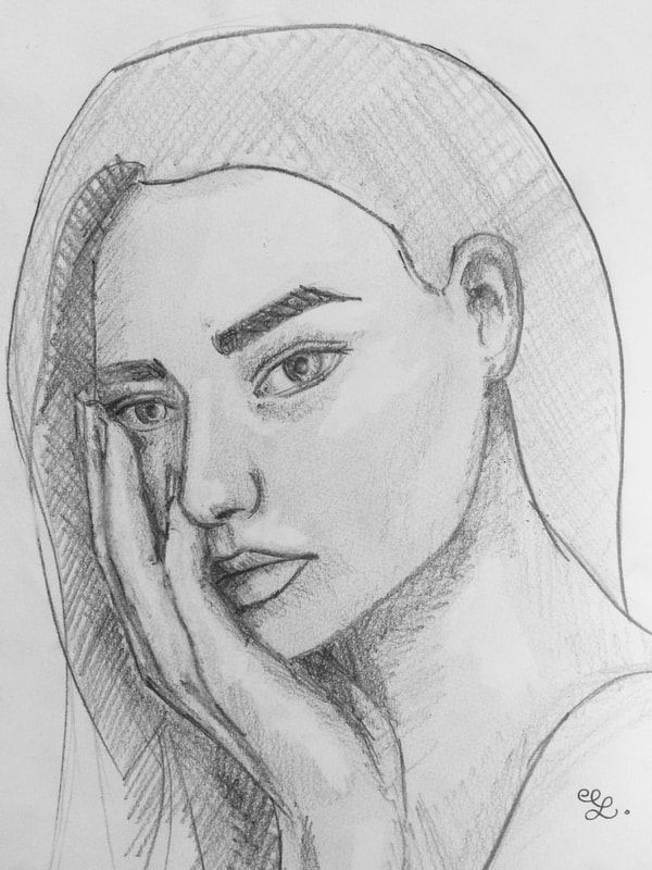
Daily face pencil sketches. Canson Mixed-Media sketchbook. Face resting on hand.
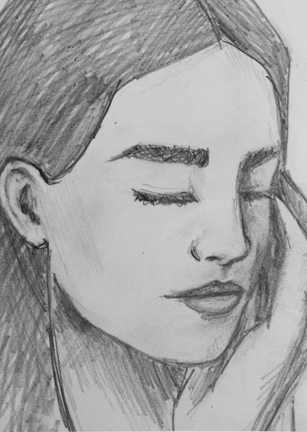
Daily face pencil sketches. Canson Mixed-Media sketchbook. Woman 3/4 head angle with closed eyes.
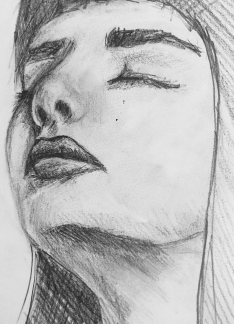
Daily face pencil sketches. Canson Mixed-Media sketchbook. Woman looking up with eyes closed.
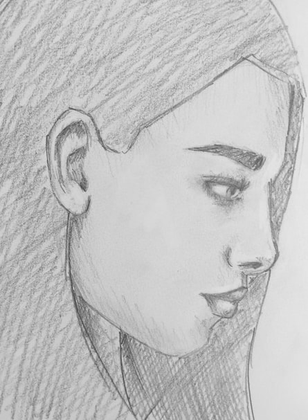
Daily face pencil sketches. Canson Mixed-Media sketchbook. Woman's face in profile looking down.
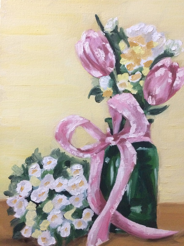
Oil painting on canvas. Pink tulips in green vase with smaller white flowers.
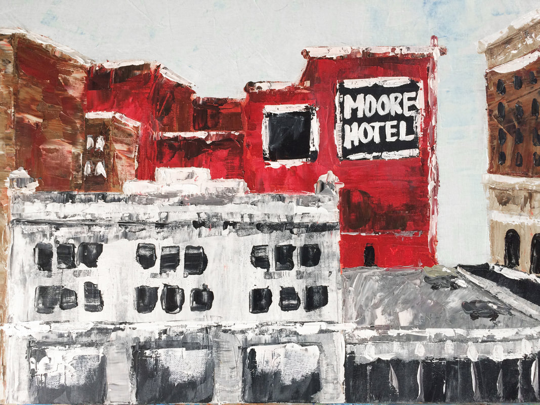
Oil painting on canvas. Experimental palette knife city painting. Red building.
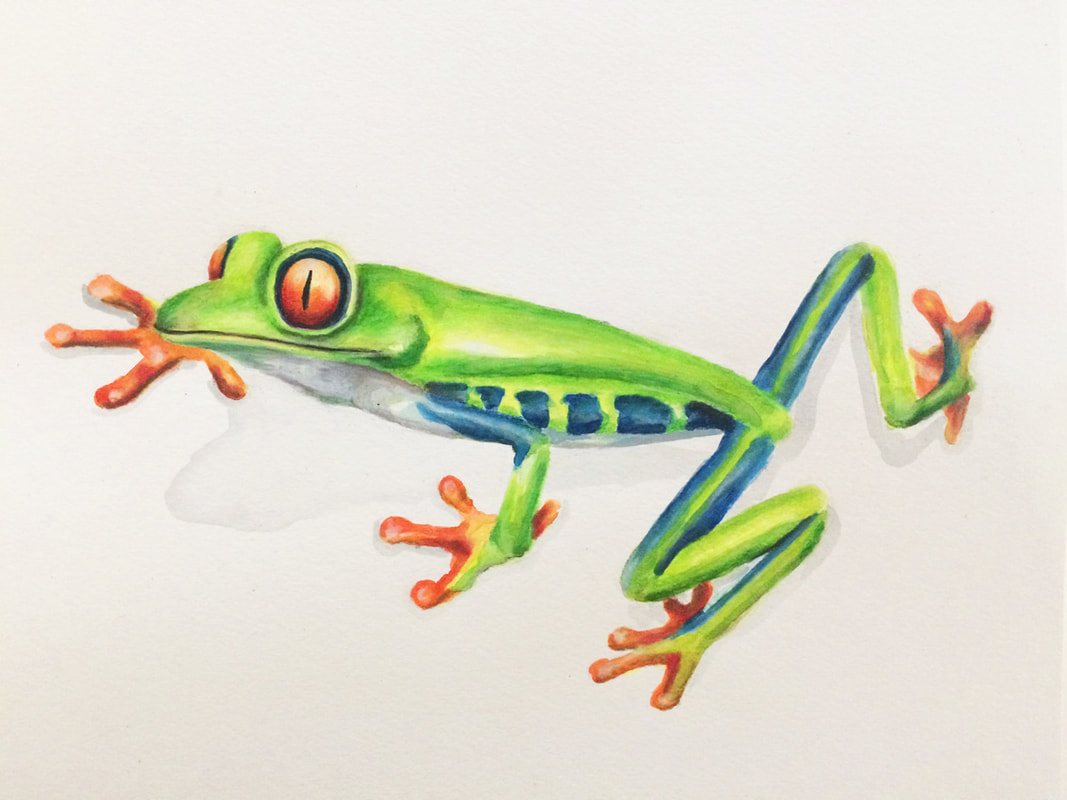
Mixed-media painting. Watercolor and Prismacolor pencils on Canson watercolor paper. Red-eyed frog.


Hello, there!
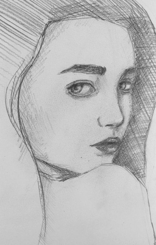
This was my third week starting my work days with hand sketches. That means that next week will be the last week I will be doing studies of this subject as frequently as I currently am. I will do my best to close this hand month by creating some paintings that include hands. I also did a watercolor wine glass study and, for the first time, I pushed myself to paint a portrait of a specific person using oils. I needed to find a quality picture of somebody's face that not only I knew well, but others around me knew well, in order to get feedback. Because of this, I decided to go for a picture of a well-known celebrity that I found online.
Thank you for coming by and make sure to visit next week to read more about art tips I have learned as well as my personal progress!
Cheers!
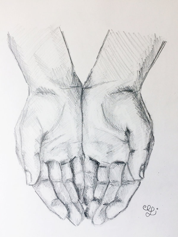
Daily hand pencil sketches. Canson Mixed-Media sketchbook.
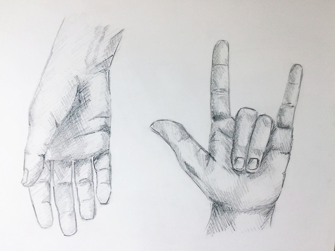
Daily hand pencil sketches. Canson Mixed-Media sketchbook.
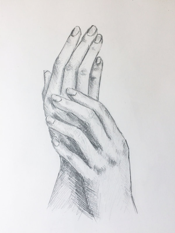
Daily hand pencil sketches. Canson Mixed-Media sketchbook.
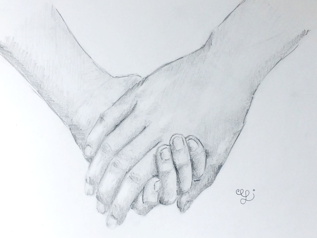
Daily hand pencil sketches. Canson Mixed-Media sketchbook.
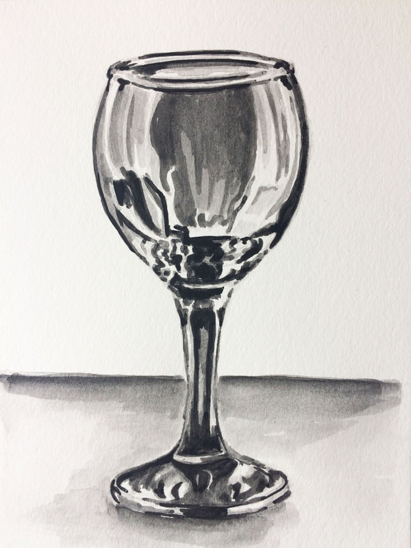
Watercolor wine glass painting. Sakura Koi watercolors on Canson watercolor paper.
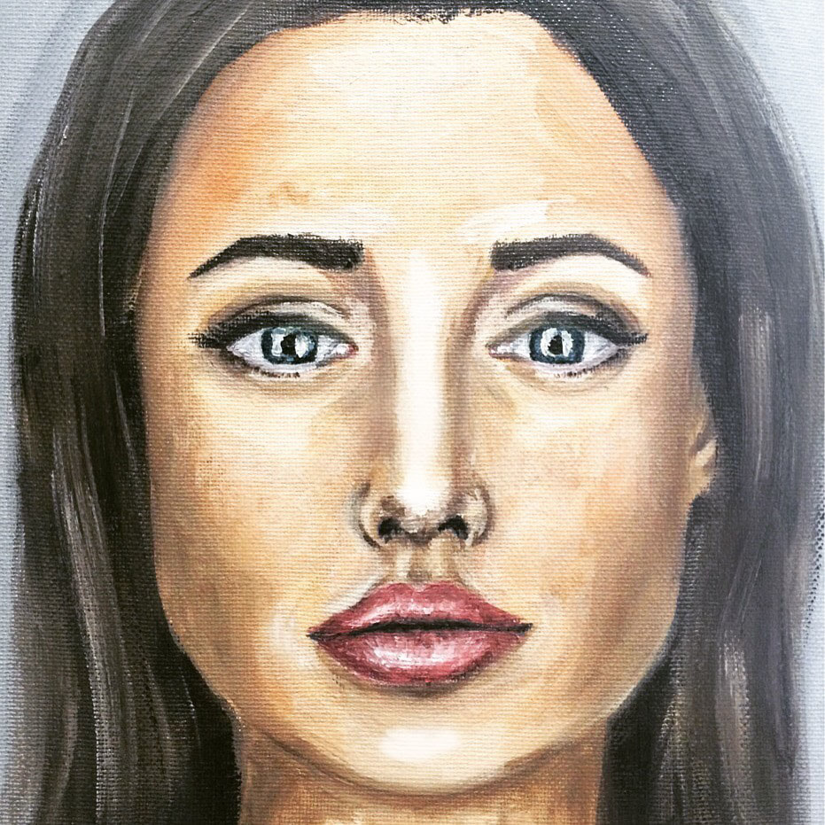
Angelina Jolie portrait in oils. Oil paint on canvas board.
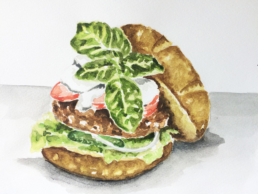
Watercolor hamburger painting. Sakura Koi watercolors on Fabriano paper.


Hello!
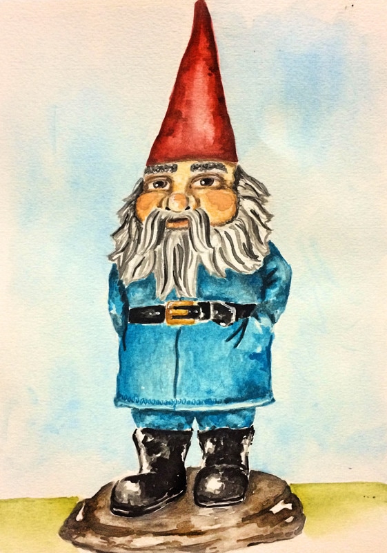
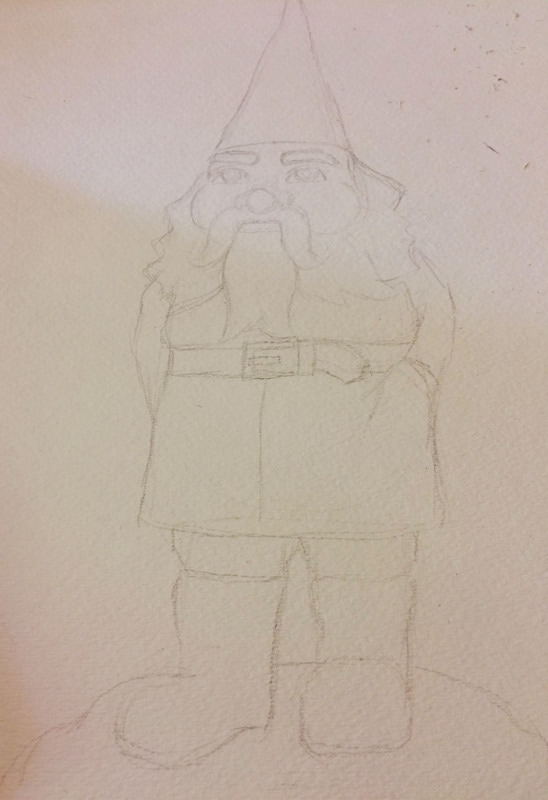
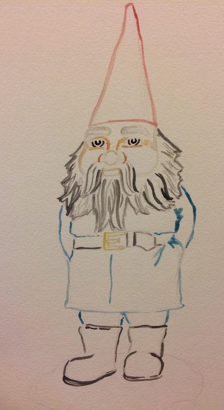
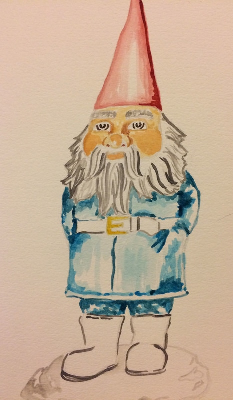
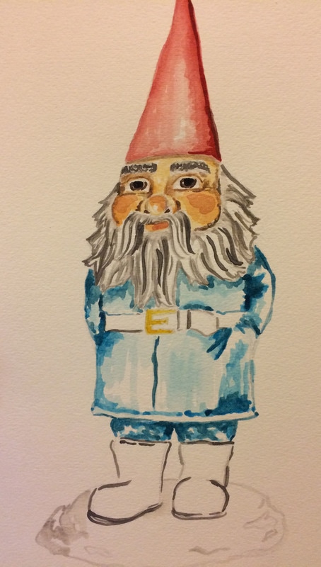
Here is a little something I worked on yesterday. I felt like painting something fun and thought of a garden gnome (they've always brought a smile to my face). For this painting, I started by making the drawing with gray watercolor pencil in order for the sketch to disappear completely once the painting process begins. Then I did an initial tracing with watercolors in the color of the area I would be painting inside. I don't always start my paintings by tracing my sketch but I thought that I would like some visible outlines at the end because this was going to be more of a ¨cartoony¨ style, so I just went for it. After that was just adding different layers of values. I made sure to jump around throughout the painting process in order to allow the layers to dry. This turned out pretty kitschy! I kind of like it!
Have a nice day!


www.erikalancaster.com
is a participant in the Amazon Services LLC Associates Program, an affiliate advertising program designed to provide a means for sites
to earn advertising fees by advertising and linking to amazon.com.
www.erikalancaster.com
is a participant in the Shareasale.com Affiliate Program, an affiliate advertising program designed to provide a means for sites to earn advertising fees by advertising and linking to Shareasale.com partner companies.
 RSS Feed
