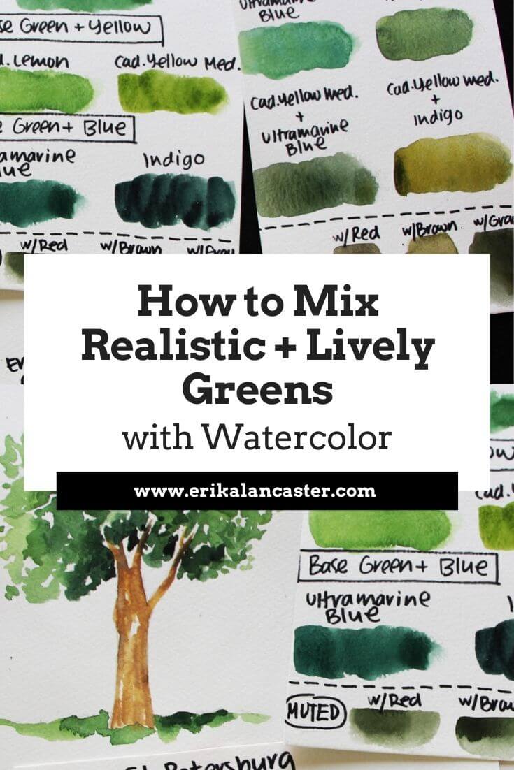
Confused as to why your watercolor landscapes are looking unrealistic and flat?Looking for best ways to create realistic greens for your watercolor botanical pieces? How can you make unnatural looking greens in your watercolor sets look more realistic? Lots of beginners getting started on their journey with watercolor struggle with creating lively, interesting greens. This is not surprising, as many greens included in commercial watercolor sets are very unnatural straight out of the pan/tube, and they usually haven't taken time to learn about the Color Wheel and color relationships, or how to mix colors in order to modify their saturation and value. Add to this the fact that, when working with watercolor, having good water control and understanding that we're working with a translucent medium is a must. Without this skill and understanding, you'll likely create heavy, flat-looking paintings even with great green mixtures! My advice? Start by understanding the characteristics that set watercolor apart from other painting mediums, such as: -Watercolor is transparent (not opaque like acrylics, oils or gouache). We're meant to use this translucency to develop depth, but also arrive at an end result that is light and seems to glow from within. -We paint on paper, which is inherently more delicate and easier to overwork than, say, canvas or wood. Because of this, it's essential to learn when we have to allow the paper to dry. -We're using thin layers of paint and are not looking to cover up our entire painting area with thick layers of paint as we would when working with opaque mediums. -We're planning/saving our highlights throughout the painting process, as it's the whiteness of the paper that'll stand in place for our lightest areas, as well as other light value sections in which we're looking to incorporate the brightness and beauty of the paper as part of the piece. -Because the white of the paper stands in place for our lightest value areas, and we're using translucent paint, no white paint is necessary. -We use plenty of water along the way and are constantly modifying the water- to-paint ratios in our mixtures depending on whether we want lighter/paler color or darker/more saturated color. After familiarizing yourself with the basics of the medium on hand, start learning about the Color Wheel, as this will help you to understand relationships between different colors, as well as essential Color Theory-related topics such as Color Temperature, Value and Saturation. By developing these basic skills and knowledge on these key topics, mixing believable and lively greens will be a breeze! In the thorough video below, I share my two main strategies for creating realistic green color mixtures, how to further desaturate/mute out greens by adding different colors, and also how I paint a tree that shows a variety of green values for depth.
If you enjoyed this video and found it helpful, make sure to subscribe to my YouTube channel. I share a brand new video every week with art tips, drawing and painting tutorials and mindset/productivity tips for artists. *Subscribe HERE*
For a list of my favorite art supplies, go here. Two Strategies for Creating Natural, Lively Greens with Watercolor Strategy #1: Using a Base/Ready-Made Green Choose a "base" green to work with, making sure to notice how warm (yellow-biased) or cool (blue-biased) it is. You can use any green, but depending on whether it's very warm or cool biased (or somewhere in-between), you're probably going to have to add more or less of your other colors. Choose a yellow and a blue to add into your "base" green. To create your lighter green, mix yellow into it. To create a dark green, mix blue into it. In the video above, you can see me explore adding two different yellows and two different blues into my base green so that you can see how the addition of different colors leads to different lighter and darker greens. For this strategy, you can see your "base" green as your "midtone" or "medium" green. Continue modifying the ratios of the colors in your color mixtures until you arrive at a lighter green, a medium green and a darker green. With these color mixtures created on your palette, you'll be ready to paint greenery that has depth and dimension to it. I'd highly recommend trying out the exercises shared in the video to start getting comfortable with color mixing and to get to know the colors you're able to create with the set you have. 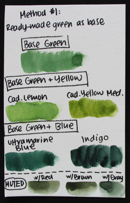
Swatches for Strategy#1: Using a Ready-Made "Base" Green
Strategy #2: Using Yellow and Blue to Create Green Choose a blue and a yellow, then mix them together to create your green. Blue and yellow are Primary Colors that create green (a Secondary color). Take your time modifying your color mixture, adding more blue or yellow, until you mixture looks green on your palette. I'd recommend exploring different blue and yellow combinations you have available, as the temperature of the blue and yellow you use, as well as how dark or light it is, will have a great impact on your end green result. These variables will also have an impact on how muted/desaturated your end result is. In the video above you can see me exploring both warm and cool yellow and blue color combos, and you can see the immense difference in those green results. Some greens look way more natural than others and there's no need to bring in a third color to desaturate it further. To create your lighter greens, simply add more yellow into your mixture. For your darker greens, simply add more blue into your mixture. And, once again, with your light, midtone/medium, and darker green color mixtures ready on your palette, you're set to start painting! 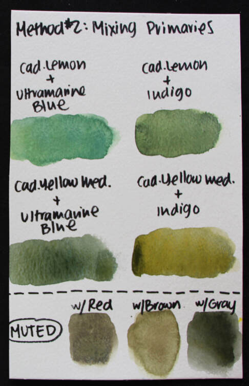
Swatches for Strategy#2: Using Yellow and Blue to Create Green
Want to mute out a green? Whether you're using a ready-made green or have created your own green mix using either of the aforementioned strategies, here are three ways to make them look a bit more natural: -Add in a bit of green's Complementary Color (opposite to green in the Color Wheel), which is red -Add in a brown/neutral color such as Burnt Sienna, Burnt Umber, Sepia or Van Dyke Brown -Add in Payne's Gray or Neutral Tint 
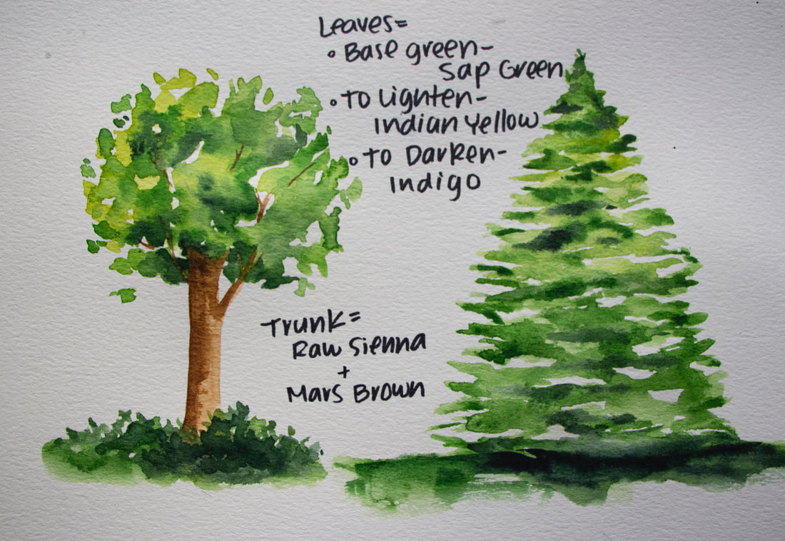
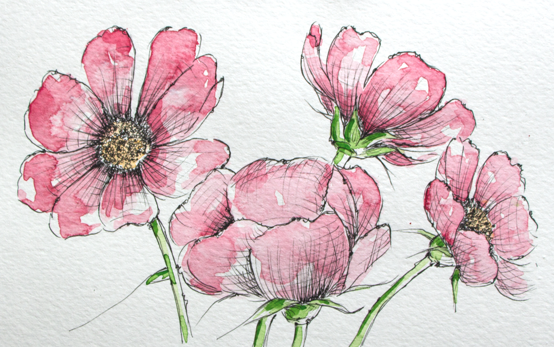
Tree studies created using the "base" green strategy. Sap Green was used as the "base" green. Indian Yellow was added to create lighter green. Indigo was used to create darker green.
4 Comments
*This post contains affiliate links. I receive small commissions for purchases made through these links at no extra cost to you. These commissions help me keep this site up and running, in order for me to keep providing helpful and inspiring art content. :)
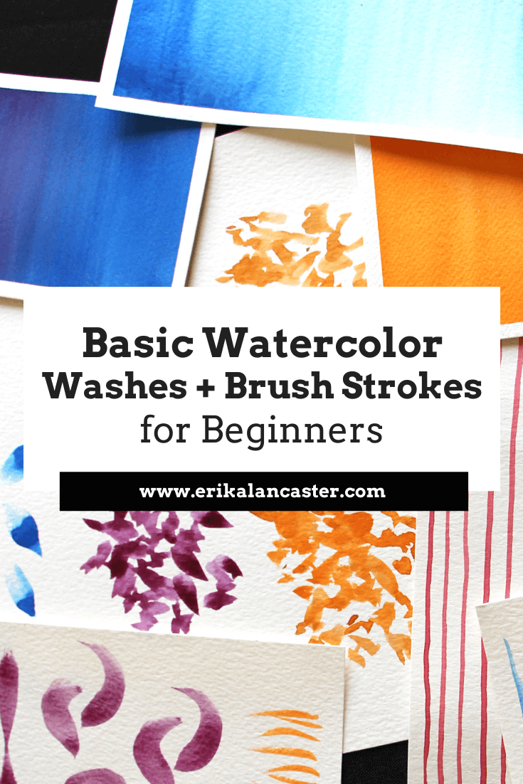
Eager to learn watercolor painting but confused as to where to start? Have you started on your journey with watercolor, but always experience frustration during your painting processes and/or end up disappointed with your results? Water and brush control are two basic skills that anyone looking to learn watercolor should focus on in the beginning. Why? Because without these two skills, it's going to be very difficult to succeed with pretty much any kind of painting you set out to work on, whether it's a completely abstract piece or something more realistic. My advice for beginners getting started with any new drawing or painting medium is to devote time to explore it without pressuring themselves to complete a full piece or to achieve perfection in any way. Get to know your medium. Do some research to understand what sets it apart from other drawing or painting mediums, and what the main things are that one should know about in order to create a piece that allows it to perform/"shine" to its full capabilities. In this video, I share the top things I wish I knew about watercolor when I was getting started, in which I share these main characteristics. Compare and contrast watercolor paintings with pieces created with opaque painting mediums such as acrylics or oils. Take notes. For example, when it comes to watercolor, we're meant to use the medium's translucency, in combination with the whiteness of the paper under the paint, to create depth and volume. *We don't even need white paint! Another thing that distinguishes watercolor from other painting mediums is the fact that we're working on paper as opposed to canvas, wood or other tougher substrates. And, while we're using paper that's intended for water-soluble mediums, it's still paper. Paper is much more fragile (especially in its wet state) and, thus, it's much more easily overworked/damaged. As opposed to the heaviness that opaque painting mediums can have, when we're working with watercolor, we're trying to achieve a lighter-looking outcome...a piece that seems to glow from within. When the medium's characteristics are taken into account as we're painting, and the basic "rules" are understood (which we can decide to break later), it's much more likely that we'll arrive at the results we're looking for. Aside from doing research and continuing to learn about these things, basic drills and exercises on brush strokes, as well as washes are essential in the beginning. This hands-on practice will help us tackle complete paintings with greater confidence and ease. This said, the following drills and exercises are very helpful, even for artists who're more advanced, as we have to get to know our brushes every time we invest in a new one. In the following watercolor tutorial video, I walk you step-by-step through the main brush strokes to practice as a beginner, as well as the three must-know washes. I'd recommend practicing these in a sketchbook that's intended for watercolor, or on accessibly priced (but quality) watercolor paper. Find a list of my favorite watercolor supplies here.
If you enjoyed this video and found it helpful, make sure to subscribe to my YouTube channel. I share a brand new video every week with art tips, drawing and painting tutorials and mindset/productivity tips for artists. *Subscribe HERE*
Basic Watercolor Brush Strokes*For these brush stroke exercises, I'd recommend using a medium-sized brush, whether it's a flat or a round (or both!). Something around a size 8-14 would do perfectly. Another suggestion that'll increase your practice is creating your strokes in different directions (horizontally, vertically, diagonally, etc.). 1. Thin Lines To create thin lines, touch just the tip of your paintbrush to your paper and drag from one edge of your paper to the other with one consistent, flowing brush stroke. Do your best to keep the thickness of your line as consistent as possible from start to finish. This means that only the tip of your paintbrush should be coming into contact with your paper from beginning to end. 2. Thick Lines To create thick lines, you'll have to press down the belly of your paintbrush to your paper. Just like with the thin lines, try to keep that pressure and the thickness of your lines consistent from start to finish. You'll likely notice dry brushing effects near the ends of your lines, as paint and water start running out from your bristles. Dry brushing is shown near the end (right) of my thick lines in the image below. You can see specks of white paper showing through, where my paint/water started running out and the color wasn't covering the paper as smoothly. 3. Thin-to-Thick Lines For thin-to-thick lines, the pressure you're exerting on your paintbrush changes as you move from one edge to the other. In other words, your arm is moving laterally, but you're simultaneously lifting and pressing, over and over. This creates variations in thickness throughout that line. The challenge is to always have at least a bit of contact with the paper from start to finish. 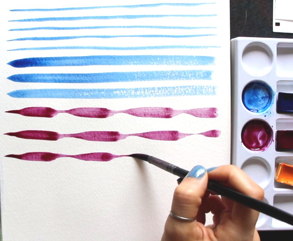
4. C-Strokes These are short, curved strokes that start out wider and taper at their tail ends. Essentially, you press down the belly of your brush at the top, and release that pressure as you move towards the end of that stroke, all the while drawing a curve or "c" shape. 5. Flicking For this one, you flick your wrist upwards (or in whichever direction you'd like) in one quick, short stroke. There's no need to press down your paintbrush bristles onto your paper very much at all, but at the end of the flicking motion, you do want to lift your bristles from your paper in order to have that tapered look at the end. You want the "base" or "root" of your stroke to have a slightly thicker look than the end. This brush stroke is very handy when adding grass to landscapes. 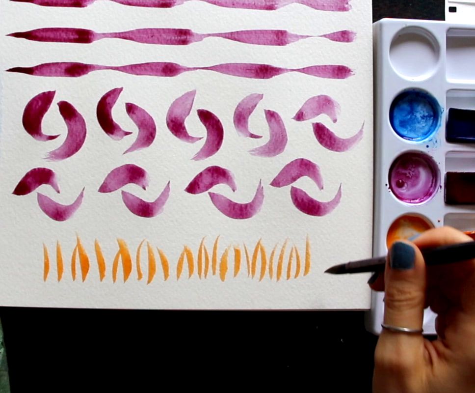
6. Bouncing I think of bouncing as a form of stamping. All you have to do after you've loaded up your paintbrush, is press down its bristles so that their entirety comes into contact with your paper, and lift. On and on. There is no dragging or lateral movement of any kind. Just press and lift, and press and lift. You can imagine how much of a difference it would make if I had used a flat brush instead of a round, as the "stamped" shapes would not look like water drops or leaves, but would be more boxy/angular. This one is great to create the illusion of leaves when painting nearby trees and plants. 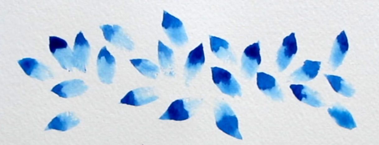
7. Scribbling To do scribbling (shown in orange in the image below), loosen up your wrist and really practice using your paintbrush in a variety of different ways. You're looking for irregularity all throughout (no organized patterns or perfect shapes) and this is created via shifting and changing the pressure you're exerting on your paintbrush, but also the angle you're using your paintbrush at (90°/45°/30° from your paper, etc.), and the direction you're painting towards. You're moving your paintbrush up and down, but also laterally in different ways. Curves and loops are also great. Just let your wrist go and embrace irregularity! 8. Scribbling + Bouncing This is a combination of both techniques which can be seen in the image below at the top (the magenta/purplish color). You'll notice some visible "stamped" leaf/drop shapes, while other shapes are more irregular in terms of their shape and size. This technique is also great for leaves of plants and trees. 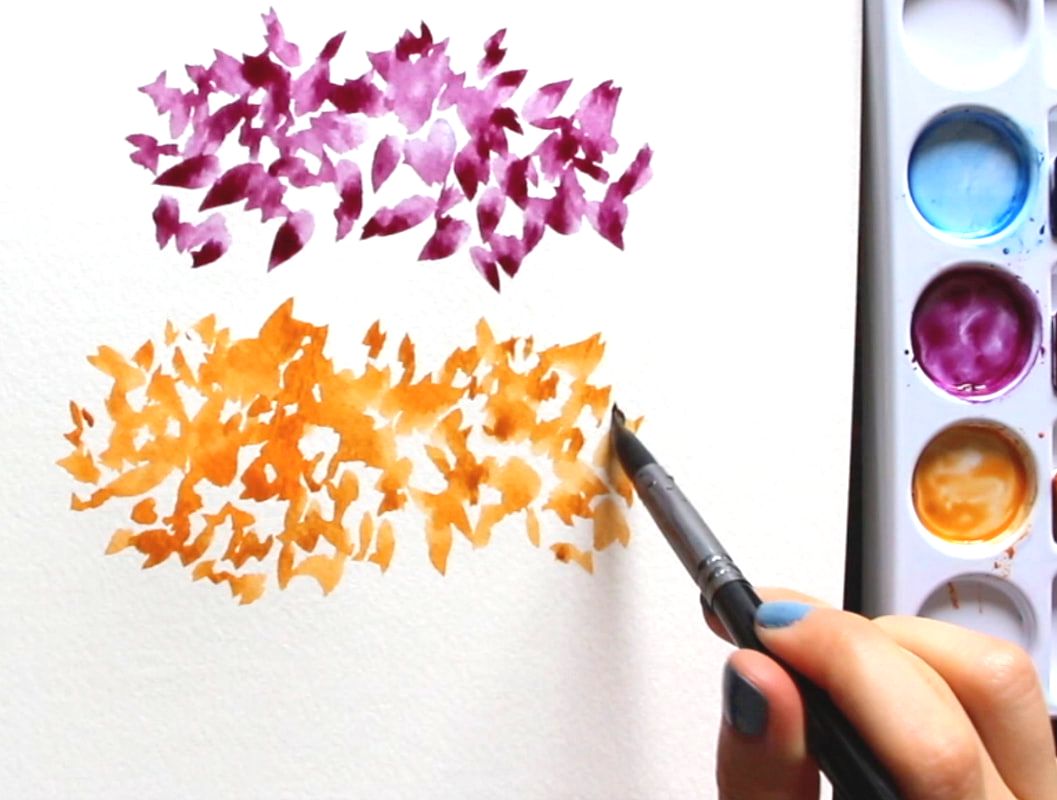
9. Dark-to-Light Lines With one same load of your paintbrush, you start at the top by painting a line using the color at its most saturated (darkest) state. In between each line, you dip your paintbrush in your container of water 1-2 times, remove the excess water, and paint the next line. Then you dip your paintbrush in your container of water again, remove the excess water, paint the next line, and so on and so forth until you reach the bottom. This is a great exercise for water control and understanding translucency, as well as the wide range of values you can create with only one color. 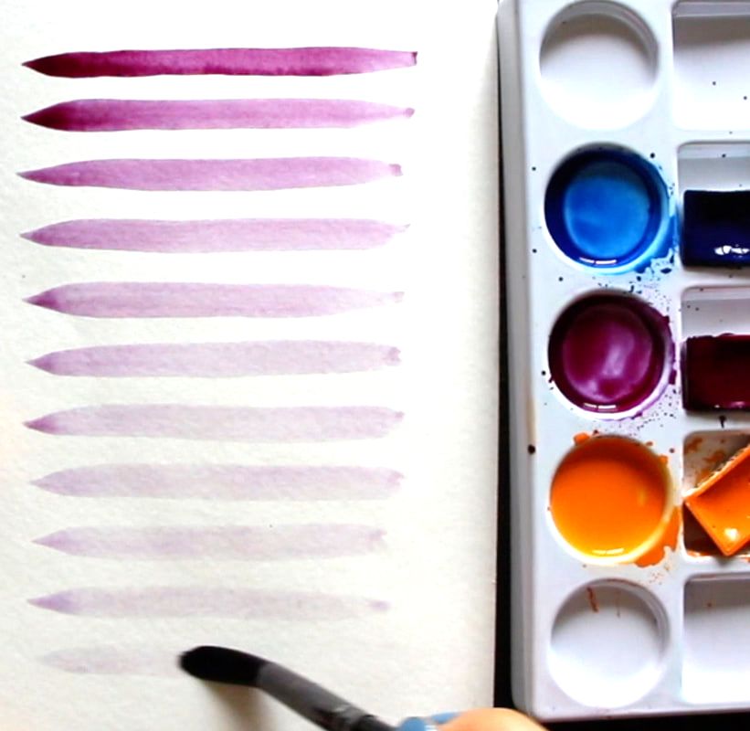
3 Must-Know Watercolor Washes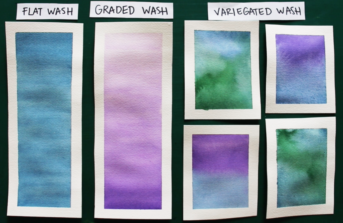
*For these watercolor wash exercises, I'd recommend larger sized brushes, whether a large round/mop or a flat brush. The larger the painting area, the larger the brush you'll want to use. These strips I prepared for myself were around 3 inches in width and 6 inches in height. I used a 3/4" flat brush. It's important to create enough juicy/saturated color mixtures for yourself on your color mixing palette and to work quickly as you're laying down that color. The less moving around of paint that you do after it's been placed on paper, the better. 1. Flat Wash 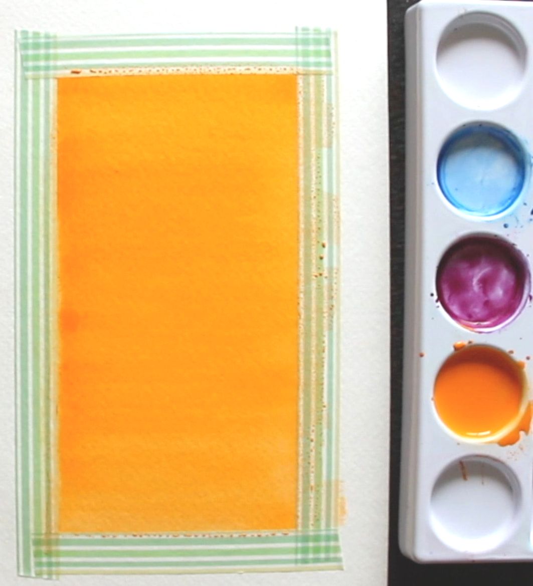
The objective with the flat wash is to paint consistent/uniform color all throughout the shape. What's important to take into account with this one is that, as you're making your way down (or upwards or sideways), your color will start running out from your paintbrush bristles and it'll become lighter and lighter. How quickly this happens depends on the size of the space you're painting in, as well as the size of the paintbrush you're using. If the shape you're filling up with color is relatively small, and you're using a large brush, perhaps you'll make it through with just one load. On the other hand, if you're trying to fill a larger space, and are using a smaller brush, you're going to have to reload way more often. Keep your eye on the paper as you're filling that shape in and notice if/when the color is becoming weaker and, when it does, quickly load up your paintbrush with more paint and pick up where you left off before the paint that's on your paper starts to dry. 2. Graded Wash 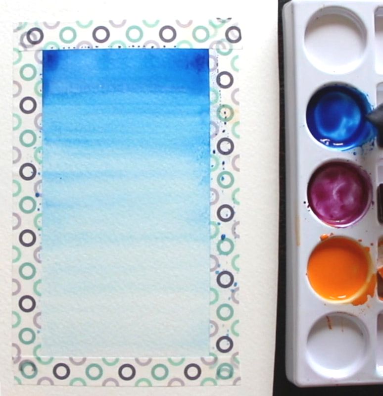
For the graded wash, you're looking for your color to become lighter (or darker) as you move up/down. You're looking for a gradual change in value/translucency of the color you're laying down. As opposed to the flat wash, you want your color to start running out from your paintbrush bristles so that it becomes weaker and weaker as you go. Keep your eye on your paper and, as your making your way down filling in that shape, make sure your color is becoming more translucent. If it's not, quickly dip your paintbrush in your container of water a couple of times, remove the excess water, and come back to pick up the edge of your shape where you left off. I usually have to dip my paintbrush in my container of water to weaken that color at least a couple of times throughout the process to ensure that, when I reach the end of that wash, my color will be at its most translucent. 3. Variegated Wash 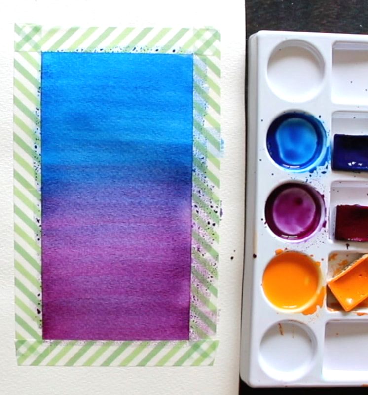
In a variegated wash, one color gradually turns into another color, which means we'll need at least a couple of different colors. I'd recommend getting started with colors that are Analogous (right next to each other) in the color wheel. By choosing Analogous colors, you'll ensure vibrant transition colors throughout the gradient you create. 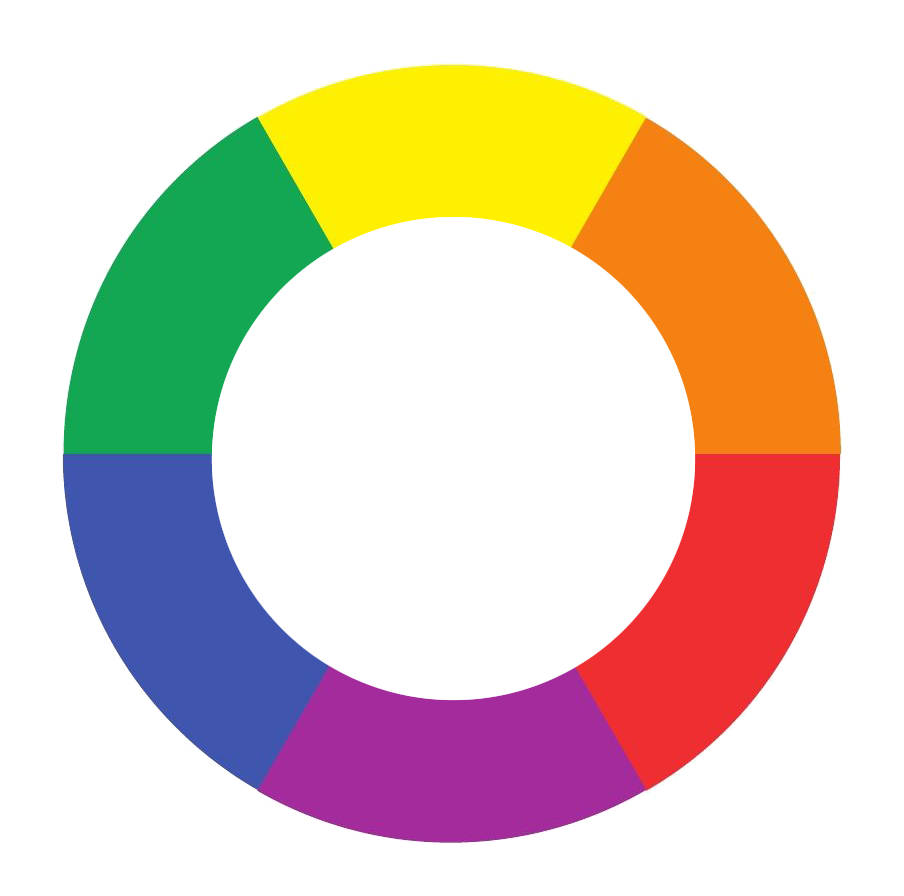
Complementary colors (opposites in the color wheel) mute each other out, and you can accidentally create muddiness or grays/browns in between, where your two colors merge together. To create a variegated wash, paint in a section of your shape with one of your colors and then remove all of that color from your paintbrush bristles, remove the excess water, load up your paintbrush with the next color and paint in the rest of the shape. In the video, I painted in the blue until I got around halfway down, I removed the blue from my paintbrush bristles, loaded up my paintbrush with purple and worked on the transitional gradient by overlapping this purple on top of the blue in the middle section. I then removed the blue-purple from my paintbrush bristles, reloaded with just purple, and finished that last third so that I would only have purple as I made my way towards the bottom. 
I hope this post was helpful and wish you lots of progress and enjoyment as you move forward in your journey with watercolor. 
*This post contains affiliate links. I receive small commissions for purchases made through these links at no extra cost to you. These commissions help me keep this site up and running, in order for me to keep providing helpful and inspiring art content. :)
Love the look of pen and watercolor artwork and want some tips to get started on the right foot? What are the must-know things to have in mind when combining ink and watercolor in order to avoid undesired accidents? What are some good options for supplies when it comes to ink pens and bottled inks? Watercolor and ink go together like bread and butter. As an artist with experience working with a vast array of traditional drawing and painting mediums, I've found very few combos that can so easily create such striking and professional-looking results. I'm a huge fan of both painting with watercolor as well as of pen and ink sketching, and have released helpful blog posts and videos to help beginners improve their skills with both. In today's blog post, we're covering the must-know basics to know about when looking to use these two mediums in combination, which brings up a whole new set of questions in terms of process and supplies. 
A variety of step-by-step pen and watercolor wash tutorials for beginners can be found over at my membership site on Patreon.
As with all mixed-media art creation, it's incredibly important to consider how the mediums we're going to be using will be interacting and affecting each other throughout the art-making process, but also how the piece will hold up over time after the artwork has been completed. By doing a bit of research, choosing the right art supplies, visualizing what results we're after, and planning the techniques/general strategy we'll be using before getting started with a new piece, we can ensure a smoother process and it'll be much more likely that we'll arrive at results we'll love. Today, I'm incredibly pleased to share an article written for us by pen and ink expert K.T. Mehra. She is the founder of Goldspot Pens, a store based in New Jersey that is dedicated to selling not only beautiful, high-quality fountain pens, but also incredible inks, writing instruments and paper. Alongside the hard work she does in her company, she's incredibly passionate about literature, history and, you guessed it...art! Without much further ado, let's get into her helpful tips and recommendations for supplies. Combining Ink With Watercolor:
|
Lamy Safari Fountain Pen
Using disposable pens can definitely become expensive because they have to be replaced after a relatively short period of time, especially when using them for drawing/sketching purposes.
We recommend, as an alternative, using a fountain pen and filling it with your own ink. This allow us to use our own choice of ink at an affordable price and we can continue filling up the pen when the ink runs out. As long as we take care of the pen, it'll last for years.
If you are looking to invest in a fountain pen, Lamy Safari is the best option for beginners and is relatively affordable for a quality, reusable fountain pen.
*Best Beginner-Friendly Fountain Pen *Most Affordable
Uni-Ball Impact Gel Pen
The Impact Uni-ball pen is a slightly more expensive gel pen option that works wonderfully with watercolors. Go with this waterproof pen if you're looking to incorporate thicker, bolder outlines or marks into your watercolor paintings.
This pen draws fairly wide lines. So if you are looking to do very detailed work, you will need a large canvas or paper, which may be a drawback of the impact gel pen for some artists.
Fudenosuke Brush Pen
Another interesting option is using a brush pen alongside watercolors! The Fudenosuke pen by Tombow is perfect for use with watercolor, as it is waterproof, and produces beautiful drawings with a lot of line-weight variation.
Brush pens allow for varying thicknesses of lines/marks via changing the pressure and angle we're using. If you aren’t looking for a this kind of variation in your line work, as well as organic transitions between thin and thick lines, a brush pen may not be for you.
This pen also requires practice and a certain level of control, which may be a drawback for some artists.
*Best Brush Pen
Kaweco Pen
If the thought of a fountain pen caught your attention, the Kaweco brand is famous for their superior quality fountain pens.
Winsor and Newton Fineliner
This is another beautiful and unique option for a high-quality fineliner that works great with watercolor. Winsor and Newton provide a great lineup of fineliners that are waterproof and come in many sizes and colors. I can’t recommend them enough!
The Unipin Fine Line
The Unipin Fine Line is a great and fun-to-use waterproof pen, but it does have some drawbacks. I love this pen and it’s definitely worth a buy. Unfortunately, when using an eraser on the Unipin Fine Line, the ink fades and blurs a bit.
This is a fantastic option if you do not plan on using any pencil markings that you’re thinking of erasing later in the process.
Pentel Pocket Brush Pen
If you are looking for something a little different, the Pentel Pocket Pen is a really neat option. This pen was created for writing expressive Japanese calligraphy. It has a very sensitive felt-tip that's able to create plenty of variation when it comes to line width.
This may be a negative for new artists, but it does allow more control for experienced artists that are used to brush pens.
Faber-Castell Assorted Pens
Faber-Castell has an awesome pack of eight waterproof pens which offers and assortment of different types and sizes. They call these their Pitt Artist Pens, and the cool thing about this pack is that you get four fineliners and four brush pens in almost every size.
There are better ink pens to use with watercolor on this list, but the Faber-Castell Artist Pens are waterproof and do work well with watercolor. The main benefit of buying this pen set is primarily the variety offered, which allows the artist to explore amongst them.
*Most Variety
A variety of step-by-step pen and watercolor wash tutorials for beginners can be found over at my membership site on Patreon.
Best Bottled Ink For Use With Watercolor
If you’re looking for the absolute best supplies to use for your ink and watercolor pieces, buying your own ink bottle along with a fountain pen or dip pen is going to provide you a custom experience and might just be the way to go.
Next, I’ll reveal my top ten picks in terms of the best bottled inks out there.
Platinum Carbon Ink
Probably my favorite ink to use with watercolor is the Platinum Carbon ink. It's a beautiful natural black textured ink that comes in a lovely little glass bottle. This permanent, waterproof ink is great for use with watercolors.
This ink takes about an hour to dry. Once dried, it’s resistant to water, erasing, smudging and anything else.
This Japanese ink is highly sought-after, which makes it slightly pricey, but it's worth every penny!
*Best Overall Ink
De Atramentis Archive Ink
This is an incredible waterproof ink. The color is less textured and not as pretty than the Platinum Carbon Ink and less of a 'true black' than the Speedball India Ink, but the De Atramentis Archive Ink may just be the most waterproof ink on this list.
I've experienced absolutely no smearing or even a drop of ink smudged after working on my watercolor washes. The ink was also dry after only a few minutes! This is a great and really safe option for use for your watercolor projects.
*Most Waterproof Ink *Best Fast-Drying Ink
Speedball Super Black India Ink
India ink is the best, deepest, truest black ink you can get. Speedball's India Ink is an amazing waterproof option. Some artists mention occasional smearing, but I've personally never had this happen.
The Speedball Super Black India Ink is the best ink bottle you can purchase for a pure, true black outline with your fountain pen and dip pen. If you use this with your Lamy Safari fountain pen or the Kaweco, you’ll want to clean out the pen often, as this ink is thick and can clog the pen if not cleaned routinely.
*Best Pure Black Ink
Winsor and Newton Ink
Winsor and Newton’s ink is also great for watercolor projects. It offers a matte black finish that would be perfect for more modern or cartoony styles and line work. This ink does take a while to dry, but if you're looking for this kind of color and style, it’s definitely worth it.
Sailor Kiwa-Guro
Sailor is a company that's known for their fountain pens, but they're also one of the top ink manufacturers in the world. This is another high-end Japanese ink that performs beautifully for both writing and drawing. You cannot go wrong with the Sailor Kiwa-Guro.
The ink is a solid matte black and dries very quickly. The big negative is that there have been reports of it losing its waterproof properties after several months of being left in the bottle.
So far, this hasn’t happened in my personal experience, but it would make this option riskier if our aim is to combine it with watercolor.
|
|
How To Find The Right Pen And Ink For You
Like with all art supplies, it’s important to explore for yourself in order to find the right pen (and ink) for you. Art is such a personal experience, and we all have different styles, quirks, and processes.
Try different pens and inks to find the ones that work best for you, starting at accessible options if you have a limited budget. Finding your personal favorites will make all the difference when working on a new art piece.
Whether you decide on a gel pen, a fountain pen and ink, or a professional fineliner, we are excited to see what you come up with!
A variety of step-by-step pen and watercolor wash tutorials for beginners can be found over at my membership site on Patreon.
Sending out a huge thank you to K.T. Mehra for her enlightening tips and recommendations!
To find out more about Goldspot Pens and the products they have available, visit their website here.
Also be sure to follow their Facebook page and Instagram account for the latest news.
Thanks for reading!
Find a list of my favorite art supplies here.

Do you enjoy taking your watercolors with you while traveling or to different local settings to create unique, artistic renditions of your experiences? Love exploring new art supplies and sharing them with your creative friends? Do you like bold, bright, expressive color?
It's been a month since I first received my Viviva Colorsheets and I'm excited to report that, after having created a little series of paintings with them (some of which I'm including in this post), I'm ready to share my thoughts!
In this blog post, I'll not only be including my swatching video for the 16 colors offered in Viviva's watercolor sheets, but I'll also share some information about this amazing brand, the products they currently offer and my observations after having explored them for a bit.
This way, you can decide whether to order yourself a set a.s.a.p., or stick to regular watercolor tubes or pans.
Viviva's watercolor sheets take the form of a booklet and each sheet contains 2 (6 x 4.5 cms.) highly saturated "plaques" of pigment. To use them, one has to simply touch the color with a slightly wet paintbrush and the color will be immediately activated.
This is an idea pioneered by Peerless Watercolors in 1885 and Viviva has succeeded at creating their own modernized, all-around visually appealing version that they're constantly working on improving and providing different iterations of for their audience.
Viviva Colorsheets was founded in 2015 by med student Aditya Vadgaonkar, who loved watercolor, but found it hard to make time to paint ever since starting with his university studies. Even when he did have a bit of free time, the set-up process, taking care of required supplies and clean up involved, made things very impractical for him.
He longed to continue with his art practice and knew that there probably were lots of people around the world who loved art and felt that eagerness to sit down to create, yet found it too challenging to make time for it in their busy schedules.
While working on a med school assignment involving a diagnostic technique that required picking up color from a paper substrate, the idea of creating watercolor sheets that contained color in dried form occurred to him.
He thought this would be a great way to make watercolor painting more practical for busy people and for those enjoy sketching/painting outside of the studio, as these sheets would be easy to carry around and required minimal preparation/clean up.
Passionate about making his idea come to life, Aditya then worked with an expert on colorants and, after 2 years and lots of different iterations, they arrived at a product that was ready to be offered to the world.
They came up with a method to create watercolor sheets using a minimal amount of binder (when compared to regular watercolor pan sets), which gives them their vividness and great color payoff.
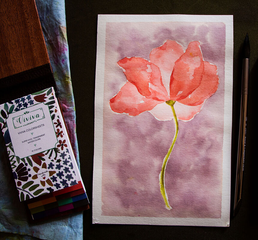
Watercolor flower by Erika Lancaster- Viviva Colorsheets on Hahnemühle watercolor paper.
In May 2017, Viviva launched a crowdfunding campaign on Indiegogo in order to begin producing their colorsheets in small volumes and start selling worldwide. It was a huge success.
Viviva has been working on their product design nonstop, and now offer a wide range of vibrant colors that are not only super bright and easily activated, but portable, durable and eco-friendly.
They've added more colors, tabs on the bottom of each sheet so that colors can be easily found, protective water-repellent paper in between each sheet, a small foldable paper palette, and they've even added beautiful and customizable wood covers as an option for your colorsheets (an amazing addition if you want to give these colorsheets away as a gift).
They've also been working hard on getting their innovative product into art-enthusiasts' hands worldwide, as they continue spreading their mission to share the joy of being able to paint anytime and without the mess.
Today, Viviva is selling their colorsheets to artists and art-lovers all over the world via their website, as well as through art stores in the U.S., Canada, UK, Germany, France, Netherlands, Singapore, Honk Kong, Australia and more.
Viviva currently offers four different sets:
Find out more about their products by visiting their website.
- Single set: One set of colorsheets with 16 different colors
- Sketcher's set: One set of colorsheets with 16 different colors + a refillable watercolor brush
- Gift set: One set of colorsheets with its wood/customizable cover and a refillable watercolor brush
- Deluxe set: Two sets of colorsheets, each with its wood/customizable cover and a refillable watercolor brush
Find out more about their products by visiting their website.
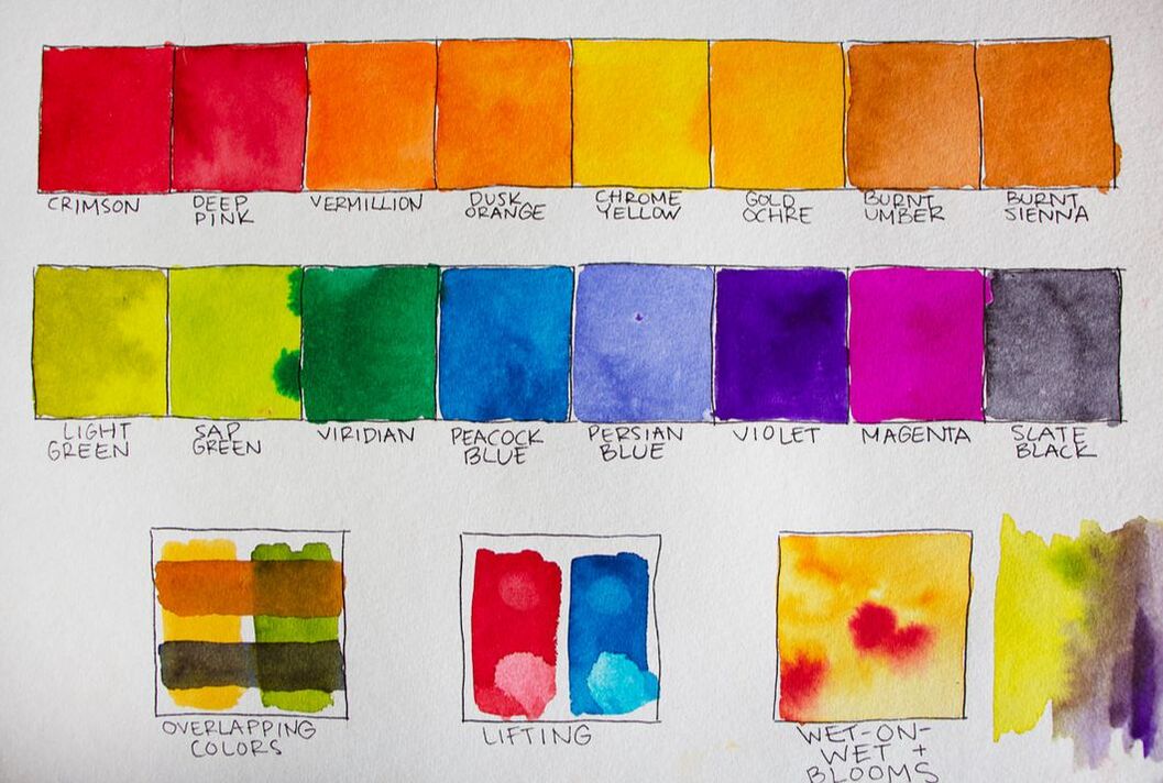
Viviva Watercolor Swatches
The very first thing I did after receiving my colorsheets, was work on swatches for their 16 colors. As you'll see in the video, I also made sure to test out some techniques that I frequently use in my watercolor painting.
As I explain in my blog post/YouTube video titled How to Swatch Watercolor and Why It's Important, making time to test out colors before using them in an actual painting will not only give us a feel for the usability of the new set on hand, but will also help us avoid surprises when we're laying down our colors and creating our different color mixtures.
Many colors in regular watercolor sets often look very different while in the pan/tube when compared to how they look when they're placed on paper and Viviva's colorsheets are no different (specific colors like Violet, Peacock Blue and Viridian are especially surprising!).
Swatching colors out also allows us to have a better understanding of the color range offered.
If you enjoyed this video and found it helpful, make sure to subscribe to my YouTube channel. I share a brand new video every week with art tips, drawing and painting tutorials and mindset/productivity tips for artists. *Subscribe HERE*
The 16 colors included in Viviva's Colorsheets are:
Crimson
Deep Pink
Vermillion
Dusk Orange
Chrome Yellow
Gold Ochre
Burnt Umber
Burnt Sienna
Light Green
Sap Green
Viridian
Peacock Blue
Persian Blue
Violet
Magenta
Slate Black
You'll notice that, in this video included above, I also share my initial thoughts on how these paints compare to regular watercolor pans and tubes.
In many ways, these paints act more like dyes than regular watercolors and it's important to take this into account when you start painting with them.
This said, I've come across pieces created by different artists using these colorsheets that look like they were painted with regular watercolors.
Because of this, I refused to change the way I work and just simplified my method. I came up with something that works similarly to my usual techniques and that I like the look of.
As with many art supplies, there's a learning curve involved, for sure. Especially if you already have a specific way of working as well as a style you're trying to achieve.
As you'll see in the pieces I share here, I've have managed to use these colorsheets to successfully create beautiful wet-on-wet effects, muted out color mixtures and even a variety of values using layering to provide a bit more realism.
Dry Color Swatches and Tests
Viviva watercolor sheets swatches
Pros and Cons of Viviva's Colorsheets
Pros
|
Cons
|
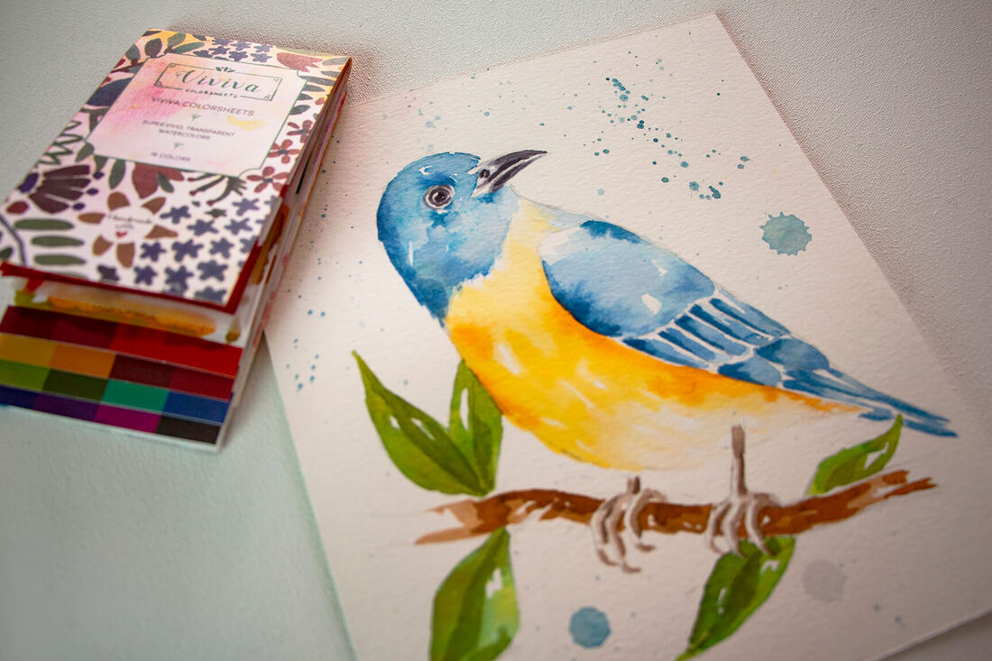
Watercolor bird by Erika Lancaster- Viviva Colorsheets on Hahnemühle watercolor paper.
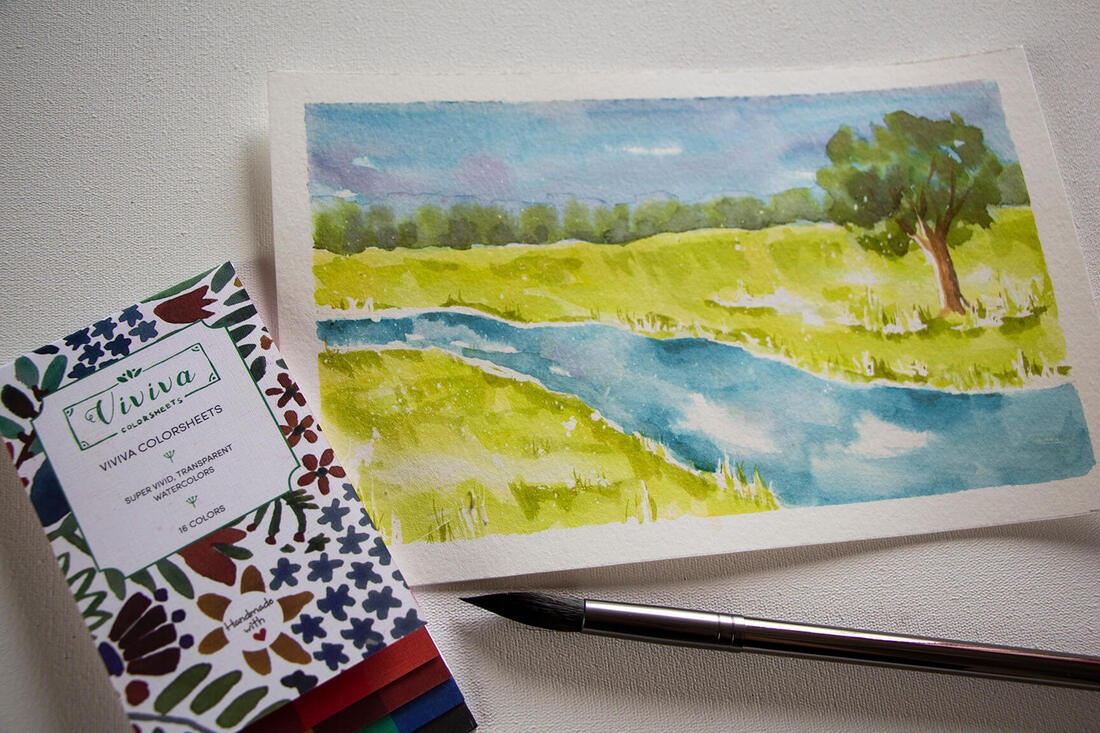
Watercolor landscape by Erika Lancaster- Viviva Colorsheets on Hahnemühle watercolor paper
Final Thoughts
Trying out these colorsheets has been a great experience and the product didn't disappoint. I'd recommend it to artists who are looking for convenience/portability and love creating quick paintings or sketches using watercolor, especially those who love bright color and do minimal color mixing.
Viviva's colorsheets are the smallest, most lightweight, portable set that I've ever used, which make them perfect for art on-the-go. Any artist who enjoys creating quick sketches outdoors, in different settings or while traveling, should definitely give these a go!
Though it definitely took me a bit to get used to them in order to produce the results I was after, I think the challenge has expanded my horizons and has made me a better artist.
Thank you for reading!
*Follow Viviva Colors on social media to see inspiring artwork created with their colorsheets, as well as the latest news from them:
Viviva Colors on Instagram
Viviva Colors on Facebook
For a list of Erika's favorite watercolor painting supplies, go here.
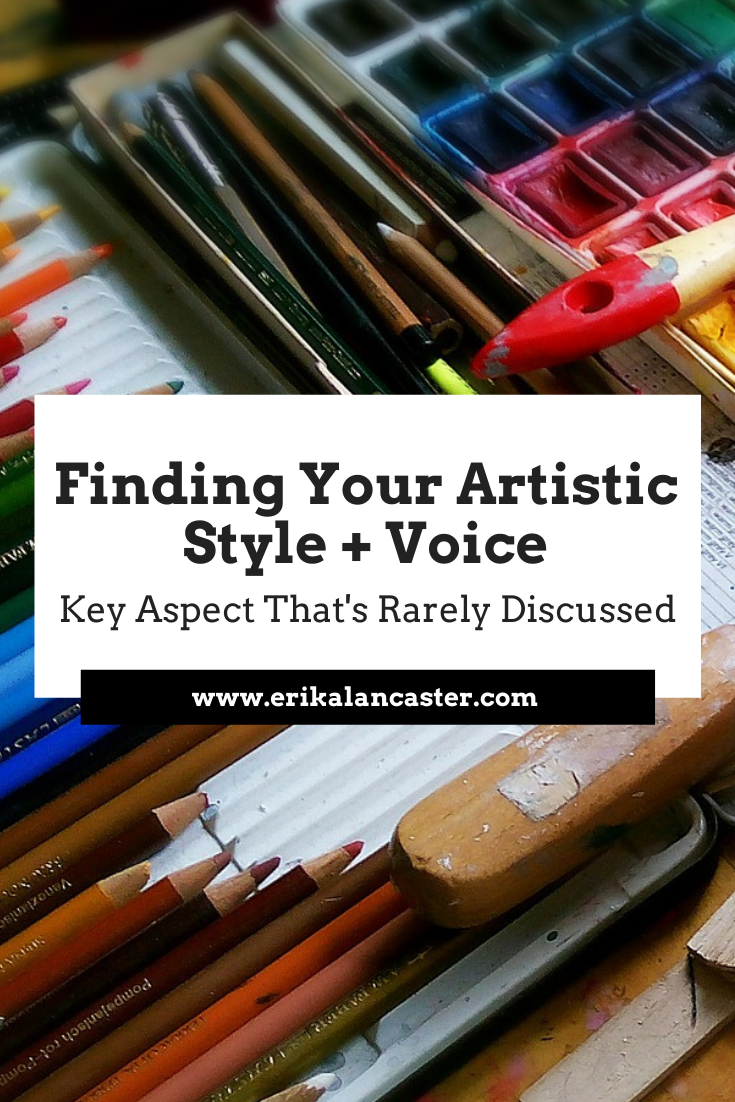
What does it really take to develop one's own artistic style and voice? How do professional artists get to a point at which their artwork is unique and seems to be an extension of themselves? Is there anything that artists just getting started can do to get there sooner?
In today's blog post/YouTube video I'll be sharing a fundamental aspect behind finding one's own artistic style and voice that's rarely, if ever, discussed. I'll also be sharing some key tips that have helped me make a ton of progress with this in my own journey.
So, let's just cut to the chase.
The fact is that becoming an artist that creates unique, quality artwork is just as much about doing the internal work as it is about continuing to develop our cold drawing/painting skills.
Why?
Because it's through the introspection, self-analysis and even self-discovery that takes place as you continue honing your art skills that you'll be able to start peeling back the layers and learn who you are as a human being, as well as how this relates to your very own creative process.
You must find out who you are, the message you want to share with the world and how you want to share it.
Without comparing yourself to anybody else.
If we don't practice listening to ourselves throughout the creative process and we constantly depend on external inspiration in the form of other artists' work to get started, we risk never finding out enough.
We risk not connecting the necessary dots so that we're able to create something from scratch that's truly ours.
Think about it.
If there's one thing that all kinds of artists who manage to constantly create unique, meaningful work have in common...one thing that makes a person stand out from the crowd, it's the fact that they know who they are.
They know what's important to them and are unapologetically themselves.
Don't get me wrong.
Developing our cold artistic skills and knowledge on Art Fundamentals is essential when we're just getting started.
In my blog post titled 5 Tips for the (Serious) Self-Taught Artist, I get into the importance of learning about Art Fundamentals, as well as why its vital for serious artists to adopt a learning mentality and to embrace exploration.
It's through knowledge about Art Fundamentals that you'll be able to make use of Elements and Principles of Art effectively, in a way that's visually impactful, harmonious, balanced and that transmits your message.
This knowledge also provides you the confidence you need to trust in yourself artistically, which is so important.
And yes, we're always going to be inspired and influenced by other people's work (visual artists and otherwise) that has impacted us directly or indirectly throughout our lives.
Our art is an extension of ourselves after all.
But there are effective ways to do it and others which aren't so helpful if we're already at a certain skill level.
In this blog post, I explain how to get inspired by other artists' work in a way that isn't copying and that will actually get you closer to discovering your own art style.
Even though there's nothing "new" under the sun, no one else in the world has that exact combination of influences and experiences you have.
And you better believe that you have the ability to create an original mishmash of all those things.
Here are the objective/tangible aspects that we often consider when looking at our own or someone else's artwork:
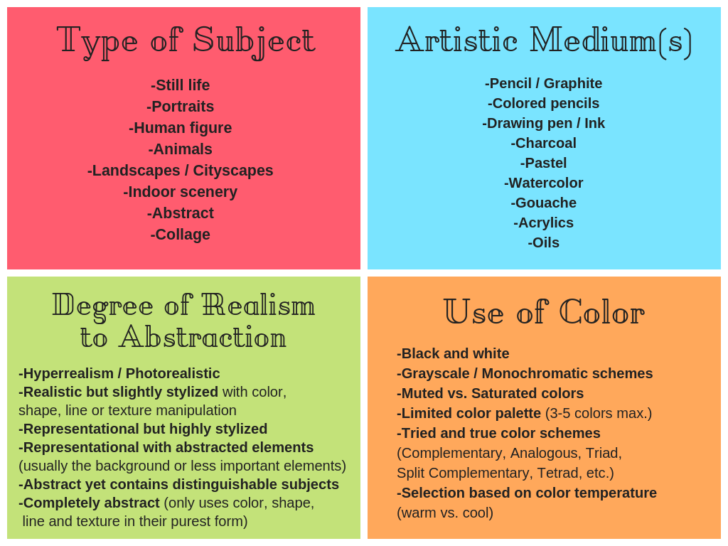
What makes an art style?
But, what about the more subjective aspects? What about those things that cannot be readily described, but felt and understood at a deeper level?
What about the artwork's overall mood, message or story?
Artists who've developed a unique style and voice, find their own way of making use of their medium(s) and the aforementioned objective/tangible aspects in order to transmit a particular feeling or message that connects to who they are.
And while this message doesn't have to be anything complex or grandiose, it does have to come from you.
If you enjoyed this video and found it helpful, make sure to subscribe to my YouTube channel. I share a brand new video every week with art tips, drawing and painting tutorials and mindset/productivity tips for artists. *Subscribe HERE*
Creating quality original artwork comes down to two things:
a) Having an original vision and a message that's meaningful to you
b) Having the skills and tools necessary to see it come to life
As you continue honing your skills and mastering your medium, start reflecting on your creative process, what you're enjoying and not enjoying, the commonalities that you're finding in the pieces you've created, your personal strengths and weaknesses, what strengths you'd like to enhance and what weaknesses you want to work on, etc.
Also ask yourself what's most important to you, what life/world issues deeply affect you, what change you'd like to see in the world, what life lessons have marked you or made you different from others, etc.
Remember that, even though a lot of us are total introverts and work in isolation, we create art to ultimately share it with others.
We create art to communicate important issues, bring light and/or build bridges.
What is it that you want to communicate with yours?
Then, work intentionally, based on your findings and the goals you set for yourself.
Here are a few specific tips that'll help.
Tips to Find Your Own Art Style and Voice
1. Prioritize and stay consistent
Consistency is number one whenever we're trying to achieve anything big in our lives. Even if you're only taking baby steps, if you continue, a year from now you'll be absolutely amazed with the progress you've made.
It's important to embrace the fact that art is a large part of who you are, and to truly commit to improving your work and finding yourself artistically.
Make it a priority and don't be afraid to set those goals!
In this blog post, I share my method for setting goals and breaking them down into tasks you can do monthly, weekly and daily, so that you can make sure that you're moving forward consistently.
Move past those limiting beliefs because quite often, we're holding our own selves back from making significant progress.
2. Inspiration can come from anywhere
When we're looking to get inspired to start a new piece or project, a lot of us immediately turn to other visual artists' work for inspiration.
However, as an artist, you have stronger sensibilities than non-artists. If you want to, you can get inspired with practically anything.
By breaking away from Instagram and Pinterest, and practicing with finding beauty or interest in day-to-day objects, thoughts, feelings or circumstances, you'll be opening the floodgates to new, original ideas.
Also, it's important to realize that we're not always going to be inspired.
If we're serious about reaching artistic success, we need to find motivation in achieving our long-term goals (they're different for all of us and you need to find what these are for you).
Oftentimes, inspiration will come to you as your working or will come to you as you continue busting through those milestones!
3. Create an inspiration board
Create a collection of things that inspire and appeal to you.
Yes, other artists' work can be part of this collection but, add bits and pieces of all kinds of things/subject-matter including colors, textures, words, music bands, random elements and whatever comes to mind.
What's absolutely amazing, is looking back at these collections you've created and discovering patterns or threads in the items you've picked (often subconsciously).
It allows you to discover specific things that appeal to you in a visual and tangible form.
Analyze the collections you come up with and internalize the threads you find. Ask yourself questions like: How do these visual patterns connect with who I am and my personal tastes? Can I find a message here?
I love doing these digitally, as the Internet makes it very easy to find all sorts of images and we can even create collections via Pinterest boards or in any sort of photo-editing software.
4. Put yourself through periods of "incubation"
As visual people, it can be very hard not to get influenced by art and design that we have right in front of us.
And this can be very hard because with the Internet and social media, we're constantly bombarded with all kinds of visual stimuli.
The fact of the matter is, that the influences that have already impacted you and make you who you are, are already inside of you.
You don't need to take anything new in, in order to create.
*This doesn't include using reference photos or subjects you have in front of you in real life, if this is the way you work. But try creating your own references based on your original ideas/concepts.
I put myself through periods of what I like to call incubation, in which I limit the new influences I'm taking in and make time to sift through what's already inside of me.
It's important to turn off unnecessary external influences from time to time, trust that we have what we need already within us and listen.
This tip goes hand-in-hand with another suggestion I've provided in other YouTube videos and blog posts:
"Limit consumption and increase creation."
Do your best to create your own concepts and see those visions through from start to finish. Take your own art reference photos, draw that preliminary sketch from the imagination, whatever it may be for you.
And there's no need to be a master at your medium to allow yourself to do this!
And the more you put yourself through this process independently, the easier it will get.
5. Get writing!
I cannot even begin to describe how much writing has helped me, not only in getting to know myself, but also in becoming a happier and more productive artist.
Writing things down or doing what I like to refer to as "brain-dumps", is so helpful in getting rid of unnecessary mind-clutter that's making you slower or may even be blocking you.
I talk about it in my blog post: 5 Essential Self-Care Tips for Artists and Creatives.
It doesn't matter if you don't consider yourself a good enough writer, because it's not about getting perfect grammar and spelling. What matters is getting out what's in your mind and heart at the present moment.
Similarly to tip #3, you're going to start seeing threads in your journal entries in terms of personal thoughts and even expression styles which continue popping up. These can give you clues on ideas that are important to you and that perhaps you can integrate into your artistic message in some way, shape or form.
For me, my writing takes form of morning pages, but getting out that journal and doing free-form, unstructured writing is something you can do whenever you have time during the day.
That's it for today's blog post!
I really wanted to share these ideas with you today because I know how frustrating it can be as a beginner artist who wants to desperately move past the awkward phase and get to creating original and meaningful artwork, to come across advice such as:
"Keep doing the work and it will come to you eventually."
or
"Don't try to rush it or pressure yourself, just keep on creating and it will come naturally, at the right time."
While these suggestions are all well and good, they are too vague and often leave beginners spinning their wheels, continuing to do exactly what they were doing before and making the self-discovery process a lot longer than it needs to be.
So, after you reach a certain skill level with your medium, you need to start trusting that you have everything you need to create original work from scratch already within you.


www.erikalancaster.com
is a participant in the Amazon Services LLC Associates Program, an affiliate advertising program designed to provide a means for sites
to earn advertising fees by advertising and linking to amazon.com.
www.erikalancaster.com
is a participant in the Shareasale.com Affiliate Program, an affiliate advertising program designed to provide a means for sites to earn advertising fees by advertising and linking to Shareasale.com partner companies.
 RSS Feed
