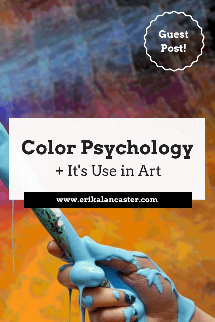
Have you ever stopped yourself from adding color to a drawing because you were afraid of ruining it and/or just couldn't decide which combination to go with? How have famous artists used color to give their work impact and the ability to efficiently transmit a particular mood or emotion to their viewers? Have you ever wondered how colors around you affect you in your day-to-day life? It's no secret that artists need to have vast knowledge about the different Elements of Art and how to use them in order to create compositions that are both visually pleasing and effective at transmitting ideas or emotions to their public. Color is one of these elements! When I'm explaining the different Elements of Art (Color, Shape, Line, Texture, etc.), I like segmenting each into its more objective aspects (pertaining to cold technical drawing/painting skills) and its more subjective aspects (relating to how they can affect a viewer's emotions/mood). For me, a great art piece demonstrates both technical knowledge on part of the artist and is able to transmit a message or feeling. This is why I like to get aspiring artists thinking about both of these aspects simultaneously as their journey progresses.
Today I'll be sharing an amazing Color infographic created, and very kindly shared, by Invaluable! Invaluable.com is a renowned online marketplace that sells fine art, as well as antiques and collectibles (links to their website and social media channels can be found at the end of this post).
Their infographic helps us understand the different emotions that each color can transmit, and shares specific examples of famous paintings that effectively used each. Let's get into the guest post! Color Psychology and It's Use in Art
by Invaluable
You may not realize it, but colors have a large impact on your emotions and actions. Color psychology is the study of how different pigments can cause different behaviors. Dating back to the 15th century, color theory is still implemented in a variety of ways. Individuals, institutions, and businesses carefully pick which colors to incorporate into their brand. Because colors symbolize different feelings, you may be able to understand a lot about a brand simply from analyzing its hues. Marketers also take advantage of human reactions to color by packaging products to draw attention and even evoke emotion. If you’re interested in the psychological science behind color, Invaluable put together the infographic below using art to explain it. 
How Artists Use Color to Evoke Emotion. Infographic by Invaluable. Click on the image above to read their complete blog post!
Visit the blog section Invaluable's website for more great art-related posts! Follow them on social media at: facebook.com/InvaluableOfficial twitter.com/invaluablelive instagram.com/invaluableofficial pinterest.com.mx/invaluable 
Sending out a huge thanks to Invaluable for sharing this great infographic with us and thank you for reading! I hope you found this blog post inspiring and helpful.
6 Comments
Erika Lancaster
1/25/2019 08:45:04 am
Hey there Awanto, 3/21/2019 07:14:22 am
It's really interesting to think about all the different things you can portray with color. I especially liked how white can mean clarity or grief. It would be interesting to see someone use both of these meanings with this one color in one piece.
Erika Lancaster
3/27/2019 09:30:44 am
Hi Gerty,
julia bryson
8/4/2020 05:27:04 pm
Hi Erika 8/5/2020 03:03:23 pm
Hi, Julia! Leave a Reply. |


 www.erikalancaster.com
is a participant in the Amazon Services LLC Associates Program, an affiliate advertising program designed to provide a means for sites to earn advertising fees by advertising and linking to amazon.com. www.erikalancaster.com is a participant in the Shareasale.com Affiliate Program, an affiliate advertising program designed to provide a means for sites to earn advertising fees by advertising and linking to Shareasale.com partner companies. |

 RSS Feed
