*This post contains affiliate links. I receive small commissions for purchases made through these links at no extra cost to you. These commissions help me keep this site up and running, in order for me to keep providing helpful and inspiring art content. :)
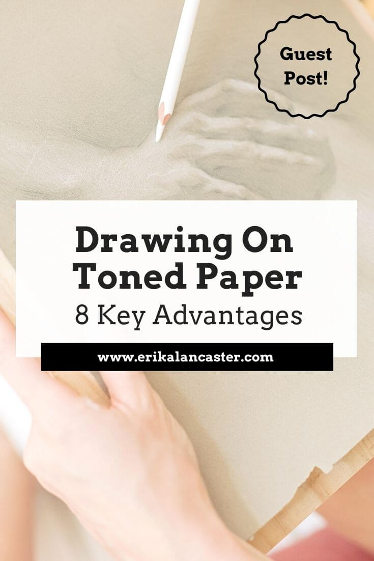
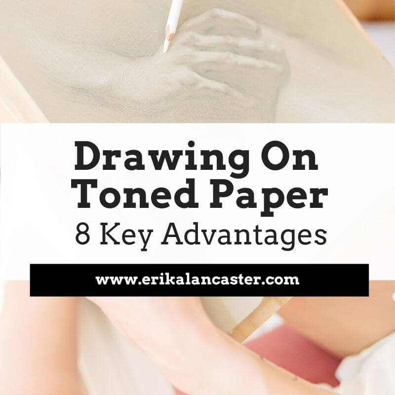
What's the difference between drawing on white paper vs. drawing on toned paper? Will drawing on toned paper help you improve your art skills faster? What advantages does this type of drawing/sketching substrate have? As I've explained in past blog posts and YouTube videos, I 100% believe that drawing is the basis for all kinds of art. Through drawing, we're not only able to increase our knowledge and skills with essential art fundamentals such as perspective, 3D form and value, but we're also able to develop basic skills such as our observation and our hand-eye coordination. To read more about how drawing will improve your painting skills, check out this blog post. As a painter, I make time for my sketching practice routinely, as I know this will positively impact my painting, and it is incredibly fun and enriching to explore new tools and substrates. Today, I'm excited to share another great guest blog post that sheds light on why drawing on toned paper can help us continue developing our art skills. Emily Clare is the artist and author behind the Fine Art Tutorials website, which is a great educational resource for art enthusiasts looking to improve their skills with drawing and painting. Over at her website, you can find step-by-step guides, beginner-friendly tutorials, and interviews with professional artists. Clare is primarily a painter working with oils, but just like me, she loves working with a range of drawing and painting mediums. Her interest in art began at a young age, when she started drawing portraits. Today, her subjects of choice are landscapes and seascapes. Let's jump into her article! 8 Advantages of Drawing on Toned Paper
by Emily Clare
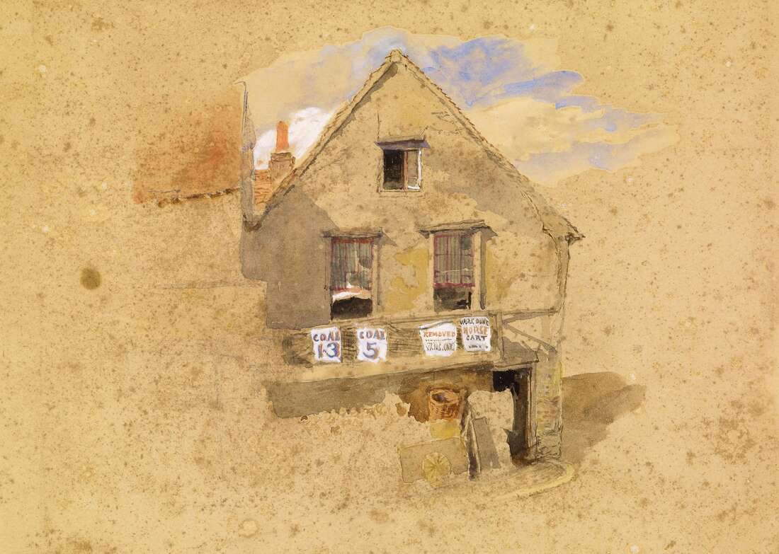
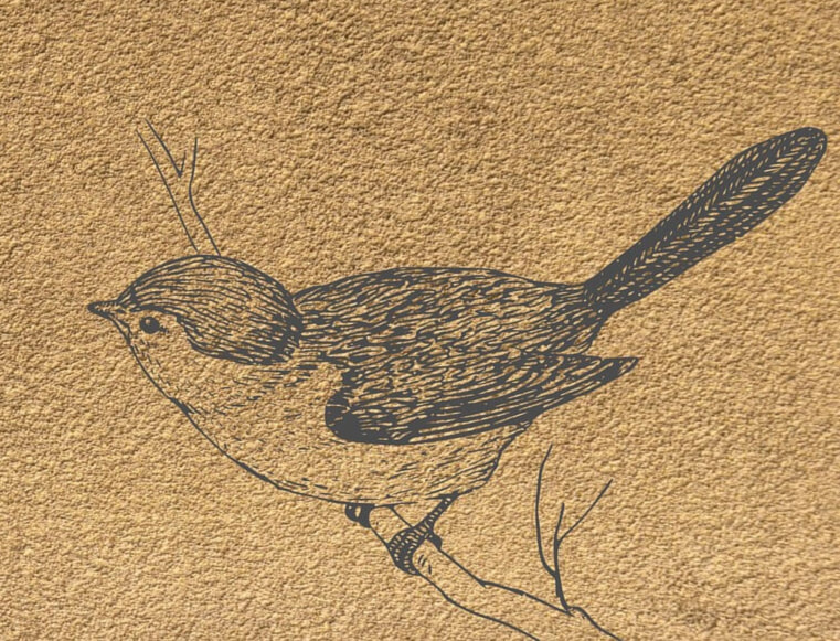
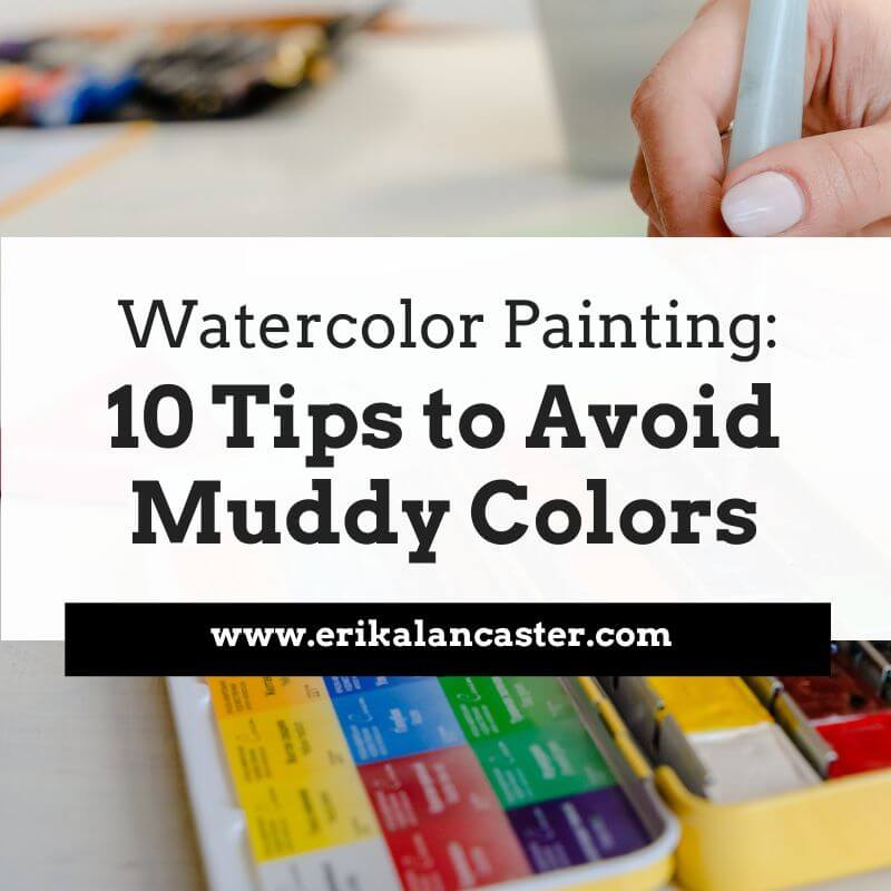
When it comes to choosing the right paper for drawing, there are a lot of options to consider. The color of the paper you choose can greatly impact the finished look of the drawing. Toned paper is a great substrate for artists to work on and if you've not tried it before, it's worth experimenting with. Toned drawing paper usually comes in cool gray tones and warm brown tones, so pick the one you think will work best for your kind of artwork. In this blog post, we will explore 8 advantages of drawing on toned paper. Keep reading to learn more! 1. You can work much faster
|
|
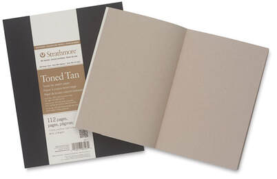
Strathmore Softcover 400 Series Toned Sketch Artist Journal
|
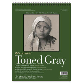
Strathmore 400 Series Recycled Toned Sketch Wirebound Pads
|
You can use a variety of different drawing tools on toned paper including chalk, conté crayons, pastels, charcoal sticks or pencils, and regular colored pencils.
You can protect your artwork and keep it from smearing, with a fixative.
I hope this post was helpful and inspiring!
Thanks so much to Emily Clare for so generously sharing all of this useful information with us.
Thank you for reading and I wish you tons of progress and enjoyment in your art journey.
I hope this post was helpful and inspiring!
Thanks so much to Emily Clare for so generously sharing all of this useful information with us.
Thank you for reading and I wish you tons of progress and enjoyment in your art journey.
6 Comments
Drawing includes three and a half quarters of the content of painting…Drawing contains everything, except the hue.
-Jean-Auguste-Dominique Ingres
A question I’m often asked by beginners getting started on their art journeys is:
“Is it necessary to know how to draw before jumping into painting?”
My instinct is always to respond with a resounding
“Yes!”, followed by a, “Learn them simultaneously if you’re eager to start painting.”
However, I hold myself back because I know we all have different goals, things we enjoy doing (and things we don't), as well as styles we aspire to develop.
Plus, just to be clear, I respect each-and-every type of artwork and artist out there.
As I’ve shared in the past, I don’t consider any type of art style or way of working “better” than another.
So I always answer, “It depends.”
In my opinion, there are two circumstances in which spending time learning how to draw wouldn’t benefit an artist very much.
1) If she/he is interested in only working on completely abstract paintings that require little-to-no planning, in which the painting is created 100% intuitively and the medium itself is doing most of the talking/decision-making organically.
*Think of acrylic pouring or Jackson Pollock-type drip paintings.
Even in these cases, though, I’d highly recommend learning about Art Fundamentals such as Color and other Elements of Art such as Line, Texture and Shape, as well as Composition.
This will greatly improve the quality of your work.
2) If she/he is only interested in learning about Color and is okay with tracing over photographs or other people’s work for the foreseeable future.
Tracing is okay in the beginning and there is a time/place for it even later on, but if we only trace for long periods of time, we'll hit a wall with our drawing skills.
This method does not prepare us to draw freehand confidently or from direct observation (otherwise known as drawing from life).
*If you see a professional representational artist tracing, she/he most likely already knows how to draw and is using tracing to speed up the working process.
You can find a list of my favorite drawing supplies here.
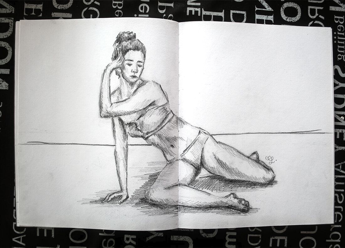
Female figure sketch by Erika Lancaster
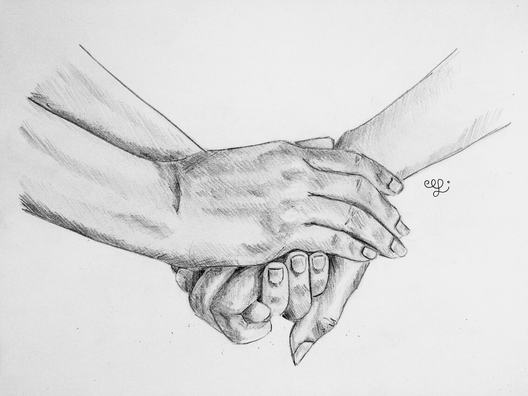
Hands sketch by Erika Lancaster
When it comes to any other kind of artwork or artistic goal - yes! even those which revolve around high levels of abstraction or stylization- it's my belief that the artist would greatly benefit from learning to draw. ️
Lots of well-known abstract artists throughout history started by learning the ins and outs of their mediums, as well as understanding the fundamentals, and then they veered away to develop their own thing.
And even then, they continued sketching and practicing line work consistently in between larger projects.
Whether their drawing was highly minimalistic or abstract is besides the point.
This knowledge and practice equipped them to not only create highly distinctive art styles, but also to not be limited by their lack of skills.
It’s important to realize that drawing doesn’t only equate to rendering subjects realistically.
It’s far beyond that.
Knowing how to draw means we understand perspective and 3D form, that we're able to recreate proportions we see effectively, that we're aware of light behavior and value, and that we're able to get original ideas down on paper with the simplest (and cheapest) of tools.
It's being able to lay down the "bones" for our paintings from scratch, with a minimal amount of tools and with imperfections that are particular to us, which enables us to develop styles that are highly unique.
We're also able to make sense of our visual compositions via thumbnail sketches before moving on to the painting process.
Our understanding of all of these impacts our painting tremendously, even when we’re not looking for the highest levels of realism.
So… in my opinion, drawing and painting are 100% intertwined.
And honestly, I’m not sure why anyone looking to make deep progress artistically would want to jump over drawing.
What I’ve seen in my many years of developing my own skills and also teaching lots of different people, is that those who know how to draw are able to move on to painting successfully a lot faster than those who don’t.
Anyone can learn how to draw and your paintings will be better for it.
So why not do it?
Learning how to draw doesn't have to be hard if you approach your journey in a smart, step-by-step way.
I cover all of the must-know basics to get you started in my Drawing for the Total Beginner Mini-Course, which you can access for free here.
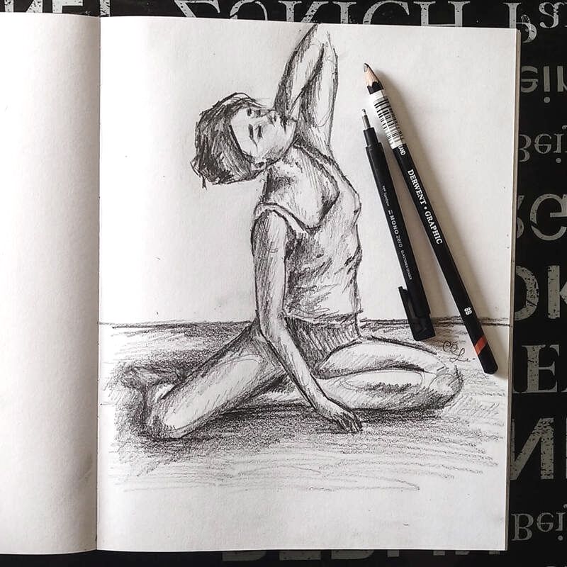
Female figure sketch by Erika Lancaster
Botanical pen and ink sketch by Erika Lancaster
Here are 5 reasons why learning to draw will positively affect your artistic development:
1. Through drawing we start developing our observational skills, our fine motor skills and our hand-eye coordination with tools that are similar to what we've been using since we were kids (pencils and pens) before jumping into paintbrushes and paint. ️
2. Aside from Color, lots of essential Art Fundamentals such as 3D Form, Perspective, initial phases of Value, etc., are learned through drawing and sketching.
We're also able to understand what makes something look realistic via practicing drawing in grayscale before starting in with the monster of a topic which is Color. This makes our learning much less overwhelming.
Not sure what Art Fundamentals are? Check out this video.
3. You’re not limited by what you can and can’t do, and can create artwork from scratch (no need to trace or use intricate grids).
*Grids, just like tracing, are also ok to use when you already know how to draw and understand the importance of seeing the global picture, as well as the fundamentals.

4. Most representational paintings get developed on some sort of preliminary sketch or start with a preliminary sketch, which is the foundation for everything else.
No amount of color, texture or even shading will fix a faulty foundation. ️
5. You can draw anywhere, at any time, and with a minimum amount of supplies.
This makes it much more easy for us to stay consistent with our art practice, and consistency is absolutely key.
Because of all these reasons, though I consider myself to be primarily a painter (I sell my paintings and teach people all around the world how to paint), I plan on continuing with my drawing practice throughout my journey.
This is also why I teach the way I teach, as well as why ever since I started my blog and YouTube channel, I thread drawing and sketching into the content I share.
To me, drawing is 100% the basis for all kinds of art.
You can find a list of my favorite drawing supplies here.

Tired of having to depend on tracing and/or using grids when drawing or preparing for a painting? Do you want to be able to confidently sketch while out and about, in a coffee shop, at a park, while on vacation, etc.? Confused as to how artists are able to recreate shapes and proportions effectively when drawing freehand?
Most of my students and community members know that, even though I enjoy using references when drawing or painting (I use both photos as well as draw/paint from direct observation), I'm not a very big believer in tracing and using grids.
Why?
Because, after we've gotten to a certain level with our drawing, sticking to those methods for long periods of time and never challenging oneself with freehand drawing or sketching, tends to hinder our progress in a variety of ways.
For one, tracing and using grids doesn't do much for our development when it comes to our visual measuring skills or our ability to lay down lines confidently.
Not to mention, these methods primarily teach budding artists to create carbon copies of the reference. This may very well be what certain types of artists are seeking, but for artists like myself who are looking to bring expression, personality and even certain amounts of imperfection into our representational pieces, progress would just come much more slowly.
Finally, because these methods focus primarily on copying, there's no reason for artists to further their knowledge of the subject on hand when it comes to proportion, 3D form and even perspective, which are all very important Art Fundamentals to wrap our heads around.
If we don't understand important Art Fundamentals such as perspective and 3D form (and others such as anatomy if we're drawing human figures or portraits), there's just no way that we're going to be able to draw freehand with confidence and ease.
For me, if my drawing practice is not somehow preparing me to draw from direct observation (otherwise known as drawing from life), it's holding me back.
This is just me, though. And I'm aware we all have different goals, styles and ways of working as artists.
But it's also important to be honest with ourselves regarding the types of practice that will help us get to our goals.
Even though I like using references in order to have something to jump off from, I'm not going for 100% replicating or creating a carbon copy of what I'm looking at.
I'm always taking away elements, bringing in elements, manipulating color, looking for ways to bring myself into my work and thinking of ways to improve the overall composition.
And yes, I do believe that using tracing is a great option for beginners just getting started on their drawing/sketching journeys. It could also very well be a great jumping off point, even when the artist has already developed his/her drawing skills and is getting into a new type of subject.
For example, when I was getting started with figure drawing, tracing over full-body poses helped me understand shapes throughout the body and develop that mind-muscle memory to a certain extent before drawing freehand.
I also believe that there is a time and place for tracing and using grids, even when the artist is already highly skilled. Namely, when he/she is short on time, the composition is very complex or large, he/she is teaching classes, working on studies that focus primarily on the painting process, etc.
You'll be able to find a list of my favorite drawing supplies here.
Still life arrangement in graphite by Erika Lancaster.
It's one thing to trace and use grids when one already knows how to draw and quite another to continue tracing and using grids forever, and ignoring the importance of learning to draw because you want to skip straight to the painting process or whatever it may be.
If you're creating art for the fun of it, then it's perfectly ok.
But if you're really looking to improve your art skills at a deeper level, it'll hinder you.
I've said this once and I'll continue saying it:
Drawing is the basis for all kinds of art.
Even though I sell my paintings and consider myself to be primarily a painter, I'll always continue practicing my drawing/sketching alongside my painting, because I know how much this practice enhances and simplifies my process with everything else.
And, if you're asking yourself if knowing how to draw is necessary if you're looking to develop a highly abstract style, I would say yes.
The only scenario in which I'd consider learning how to draw as not necessary, would be if an artist is looking to do pouring type paintings or Jackson Pollock-type paintings, in which the paint in itself organically creates shapes and the composition is more erratic/less planned.
But, if you're looking to ever leave that, it's essential to know how to draw and learn about Art Fundamentals.
If you know these two at least on a basic level, not only will moving on to painting be much easier, but you'll be able to create higher quality work much faster.
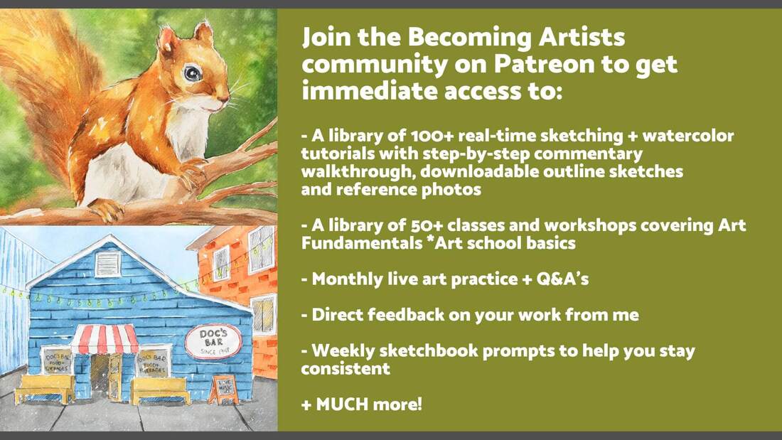
This is why,over on the Becoming Artists membership site, I share both watercolor and drawing/sketching tutorials, as well as full classes and assignments on Art Fundamentals.
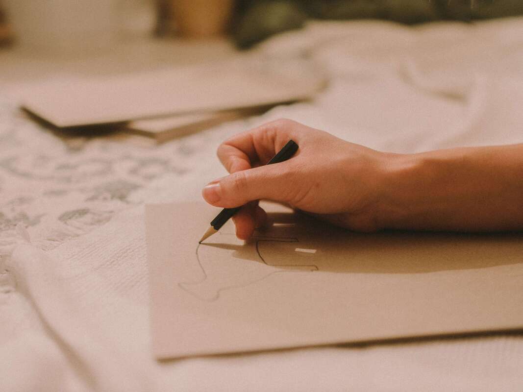
In the following video, I share my preliminary sketching (outline sketching) process for recreating effective shapes and proportions freehand.
This is what I do every time I'm working on a new drawing, as well as before getting started with a new watercolor piece.
I also provide lots of tips along the way that'll help beginners move forward faster with their freehand drawing.
After finishing with the preliminary sketching process using regular graphite pencils, I use alternative shading/mark-making techniques (hatching and crosshatching in this case) to develop a wide range of values and create interest/depth.
If you enjoyed this video and found it helpful, make sure to subscribe to my YouTube channel. I share a brand new video every week with art tips, drawing and painting tutorials and mindset/productivity tips for artists. *Subscribe HERE*
Freehand Sketching Tips for Beginners
1. Take time to find a great reference photo and observe it before getting started
In this past blog post, I talk about the main characteristics that a reference photo should have if we're intending to use it for drawing or painting purposes.
Choosing your reference photo wisely is a must. Otherwise, you might be making the drawing or painting process much harder for yourself than it needs to be.
A few of the things we have to look for are: great lighting, good resolution, and that no important parts of the subject are cropped out.
Once you've found a great art reference photo, or have prepared something to draw from life/direct observation, make time to observe it before putting pencil to paper.
Conclude where the light source is located in relation to the subject(s), take note of the perspective you're viewing the subject(s) from, notice any textures you may have to practice before jumping in, and take note of the different sizes and shapes.
2. Make sure you're drawing lightly (I like using my HB pencil)
Drawing is a refinement process. It's not like when we're writing our name or a sentence, in which we're expected to write everything perfectly right-off-the-bat.
And when we're drawing freehand, we're going to make mistakes along the way that we need to be able to easily fix.
We want to draw lightly for a variety of different reasons: this will help us easily erase mistakes, it'll help us avoid damaging/scratching our paper, and if we're looking to create higher levels of realism, our outline sketch won't show through at the end (in realism there are no outlines).
I always move from harder pencil grades to softer pencil grades in my drawing process.
I explain all about pencil grades and their use throughout the drawing process in the first class of my Drawing for the Total Beginner Mini-Course, which you can access for free.
3. Simplify your subject and use "envelopes" to lay down largest/general shapes
It's essential to be able to simplify what you're looking at and visualize it as simple shapes or forms (or combinations of simple shapes or forms).
*Shapes are flat and 2-dimensional and forms are 3-dimensional and have volume.
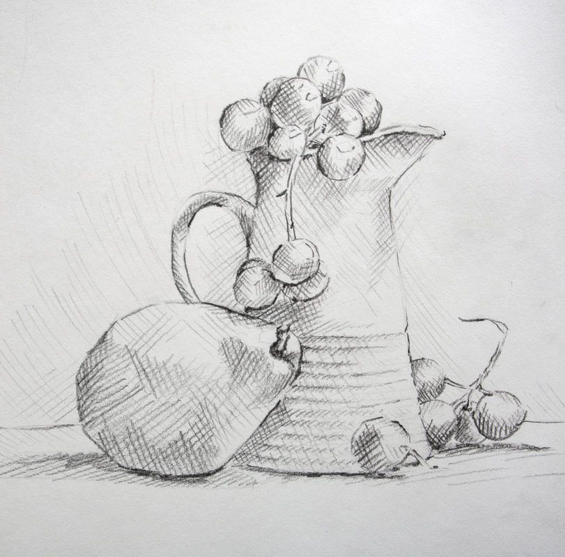
I don't worry about recreating curves and shapes perfectly when I'm getting started with a sketch, but simply lay down oversimplified shapes that are blocky and more angular. This helps me, first and foremost, make sense of proportions and locations of different elements in regards to each other.
By starting with largest/general shapes and making our way towards smaller shapes and details, we're able to use our drawing area much more effectively and this also helps our brains compare sizes and widths of different elements more easily. *You can see this entire process in the video above.
As you continue adding in more shapes, constantly relate and compare different elements with each other in terms of their lengths, widths, locations within space, the angles they create upon each other, etc.
Visually break elements down into halves, thirds, fourths, etc. and compare them to each other in this way. There's no shame in using a ruler in the beginning!
As you continue adding more and more elements, you'll likely notice that there are things that need fixing. This is normal, as the more elements you add in, the more points of comparison you'll have.
Continue comparing constantly and refining along the way.
Remember that it's important to take the entire composition (the whole) into account and that achieving effective proportions is all about getting the relationships between different elements right.
4. Whenever you're drawing smaller groupings of elements, take note of overlapping and edges
Whenever a reference has groupings of similar or small overlapping elements, such as the grapes in the one I'm working with above, take note of their edges.
Make sure you're noticing which elements are overlapping which, and how they are sitting on each other, in order to avoid a "floating" look.
5. Lay down horizontal or vertical lines as guides
Our brains tend to and understand straight horizontal or vertical lines a lot more easily than slated or irregular lines.
We can decipher angles, alignments and distances between subjects with greater ease by drawing horizontal or vertical lines (you can use a ruler for this) alongside elements or wherever you feel a line would serve as guidance.
Lots of skilled artists use plumb lines, which are vertical lines that enable them to more easily achieve proper distance, alignment, etc. among different elements.
6. Take your time with the preliminary sketching process
The preliminary sketching process is, quite simply, the foundation for everything else.
You'd never start adding in the windows or painting the walls of a house without making sure that the foundation is solid, right?
Especially when we're looking for higher levels of realism, it's essential to take our time with our preliminary sketch before moving on later parts of the drawing process such as smaller details and shading.
I know it can be exciting to move on to shading, but remember that no amount of shading, texture or detail is going to fix errors in proportion, shapes and perspective.
7. Learn about Art Fundamentals such as 3D form and Perspective
When our objective is to become skilled at drawing or sketching freehand, knowing at least the basics on Art Fundamentals is essential.
Learning how to use your medium (whether graphite, pen and ink, pastel, watercolor, gouache, etc.) and developing your observational skills, is one thing, but learning the fundamentals is quite another.
These go hand in hand.
The list of Art Fundamentals will vary a bit depending on where you look, but the basics include: Elements and Principles of Art, Composition Design, Light Behavior, Anatomy, etc.
I always recommend students learn at least the basics of all of them so that they aren't limited, but once the artist knows the specific subject he/she'll be working with for a long period of time, it's important to delve deeper into the fundamentals that'll help us increase the quality of our work (ex. Anatomy is an important fundamental for portrait/figurative artists, Perspective is important for urban sketchers and landscape artists, etc.).
8. Practice with the 4-Quadrant Method
There is one method that I practiced with a lot when I was just getting started, which helped me develop much needed skills for freehand sketching a lot faster.
I still use it to the day when I'm working with specific subjects and/or want to make sure I'm using my drawing space as effectively as possible.
This is a method I always introduce to my students when I'm just getting started with them and they've seen great success through consistent practice with it.
I explain this method here.
In this past blog post, I talk about the main characteristics that a reference photo should have if we're intending to use it for drawing or painting purposes.
Choosing your reference photo wisely is a must. Otherwise, you might be making the drawing or painting process much harder for yourself than it needs to be.
A few of the things we have to look for are: great lighting, good resolution, and that no important parts of the subject are cropped out.
Once you've found a great art reference photo, or have prepared something to draw from life/direct observation, make time to observe it before putting pencil to paper.
Conclude where the light source is located in relation to the subject(s), take note of the perspective you're viewing the subject(s) from, notice any textures you may have to practice before jumping in, and take note of the different sizes and shapes.
2. Make sure you're drawing lightly (I like using my HB pencil)
Drawing is a refinement process. It's not like when we're writing our name or a sentence, in which we're expected to write everything perfectly right-off-the-bat.
And when we're drawing freehand, we're going to make mistakes along the way that we need to be able to easily fix.
We want to draw lightly for a variety of different reasons: this will help us easily erase mistakes, it'll help us avoid damaging/scratching our paper, and if we're looking to create higher levels of realism, our outline sketch won't show through at the end (in realism there are no outlines).
I always move from harder pencil grades to softer pencil grades in my drawing process.
I explain all about pencil grades and their use throughout the drawing process in the first class of my Drawing for the Total Beginner Mini-Course, which you can access for free.
3. Simplify your subject and use "envelopes" to lay down largest/general shapes
It's essential to be able to simplify what you're looking at and visualize it as simple shapes or forms (or combinations of simple shapes or forms).
*Shapes are flat and 2-dimensional and forms are 3-dimensional and have volume.
I don't worry about recreating curves and shapes perfectly when I'm getting started with a sketch, but simply lay down oversimplified shapes that are blocky and more angular. This helps me, first and foremost, make sense of proportions and locations of different elements in regards to each other.
By starting with largest/general shapes and making our way towards smaller shapes and details, we're able to use our drawing area much more effectively and this also helps our brains compare sizes and widths of different elements more easily. *You can see this entire process in the video above.
As you continue adding in more shapes, constantly relate and compare different elements with each other in terms of their lengths, widths, locations within space, the angles they create upon each other, etc.
Visually break elements down into halves, thirds, fourths, etc. and compare them to each other in this way. There's no shame in using a ruler in the beginning!
As you continue adding more and more elements, you'll likely notice that there are things that need fixing. This is normal, as the more elements you add in, the more points of comparison you'll have.
Continue comparing constantly and refining along the way.
Remember that it's important to take the entire composition (the whole) into account and that achieving effective proportions is all about getting the relationships between different elements right.
4. Whenever you're drawing smaller groupings of elements, take note of overlapping and edges
Whenever a reference has groupings of similar or small overlapping elements, such as the grapes in the one I'm working with above, take note of their edges.
Make sure you're noticing which elements are overlapping which, and how they are sitting on each other, in order to avoid a "floating" look.
5. Lay down horizontal or vertical lines as guides
Our brains tend to and understand straight horizontal or vertical lines a lot more easily than slated or irregular lines.
We can decipher angles, alignments and distances between subjects with greater ease by drawing horizontal or vertical lines (you can use a ruler for this) alongside elements or wherever you feel a line would serve as guidance.
Lots of skilled artists use plumb lines, which are vertical lines that enable them to more easily achieve proper distance, alignment, etc. among different elements.
6. Take your time with the preliminary sketching process
The preliminary sketching process is, quite simply, the foundation for everything else.
You'd never start adding in the windows or painting the walls of a house without making sure that the foundation is solid, right?
Especially when we're looking for higher levels of realism, it's essential to take our time with our preliminary sketch before moving on later parts of the drawing process such as smaller details and shading.
I know it can be exciting to move on to shading, but remember that no amount of shading, texture or detail is going to fix errors in proportion, shapes and perspective.
7. Learn about Art Fundamentals such as 3D form and Perspective
When our objective is to become skilled at drawing or sketching freehand, knowing at least the basics on Art Fundamentals is essential.
Learning how to use your medium (whether graphite, pen and ink, pastel, watercolor, gouache, etc.) and developing your observational skills, is one thing, but learning the fundamentals is quite another.
These go hand in hand.
The list of Art Fundamentals will vary a bit depending on where you look, but the basics include: Elements and Principles of Art, Composition Design, Light Behavior, Anatomy, etc.
I always recommend students learn at least the basics of all of them so that they aren't limited, but once the artist knows the specific subject he/she'll be working with for a long period of time, it's important to delve deeper into the fundamentals that'll help us increase the quality of our work (ex. Anatomy is an important fundamental for portrait/figurative artists, Perspective is important for urban sketchers and landscape artists, etc.).
8. Practice with the 4-Quadrant Method
There is one method that I practiced with a lot when I was just getting started, which helped me develop much needed skills for freehand sketching a lot faster.
I still use it to the day when I'm working with specific subjects and/or want to make sure I'm using my drawing space as effectively as possible.
This is a method I always introduce to my students when I'm just getting started with them and they've seen great success through consistent practice with it.
I explain this method here.
As overwhelming and challenging freehand sketching may seem in the beginning, it's important to remember that we're making forwards progress with every piece we work on.
The more you practice, the more you'll be building up your observational skills, visual measuring skills, and ability to recreate shapes and proportions effectively.
By staying consistent with your freehand sketching practice and applying the aforementioned tips, you'll be making tons of progress in no time!
You'll be able to find a list of my favorite drawing supplies here.

*This post contains affiliate links. I receive small commissions for purchases made through these links at no extra cost to you. These commissions help me keep this site up and running, in order for me to keep providing helpful and inspiring art content. :)
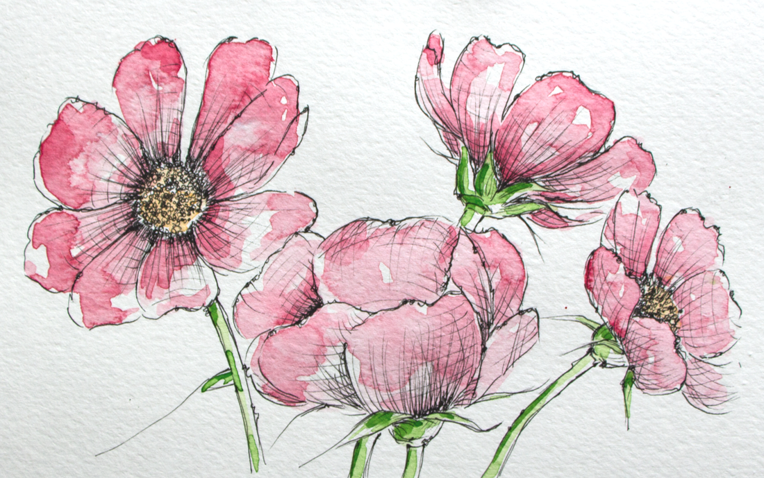
Love the look of pen and watercolor artwork and want some tips to get started on the right foot? What are the must-know things to have in mind when combining ink and watercolor in order to avoid undesired accidents? What are some good options for supplies when it comes to ink pens and bottled inks?
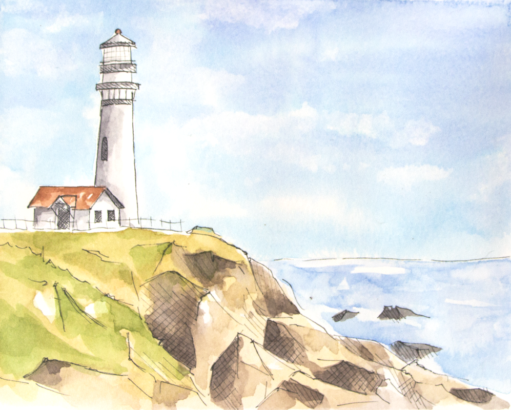
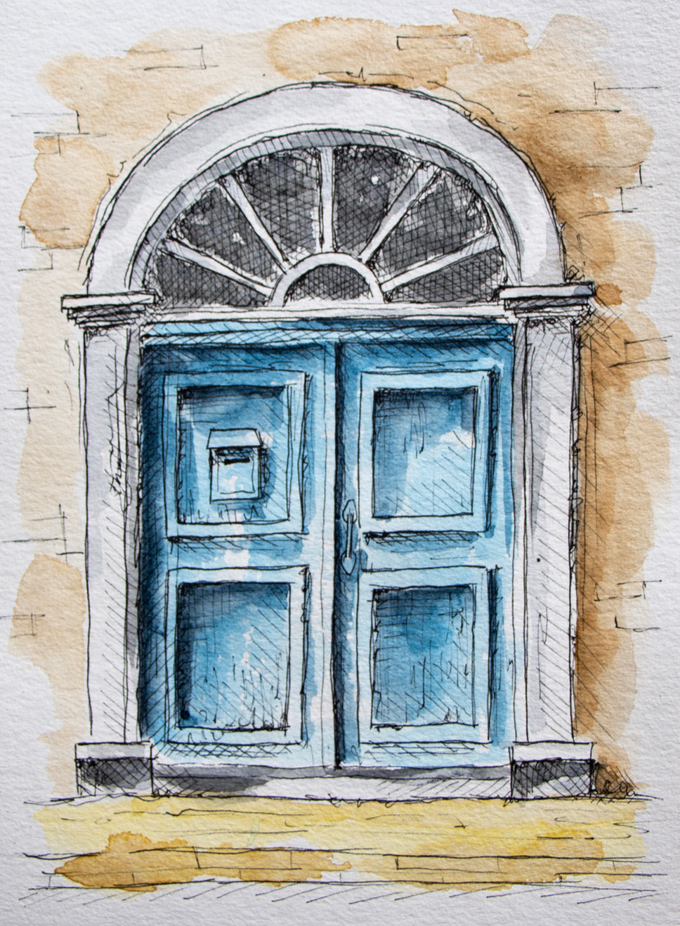
Watercolor and ink go together like bread and butter.
As an artist with experience working with a vast array of traditional drawing and painting mediums, I've found very few combos that can so easily create such striking and professional-looking results.
I'm a huge fan of both painting with watercolor as well as of pen and ink sketching, and have released helpful blog posts and videos to help beginners improve their skills with both.
In today's blog post, we're covering the must-know basics to know about when looking to use these two mediums in combination, which brings up a whole new set of questions in terms of process and supplies.
Love the look of pen and watercolor artwork and want some tips to get started on the right foot? What are the must-know things to have in mind when combining ink and watercolor in order to avoid undesired accidents? What are some good options for supplies when it comes to ink pens and bottled inks?
Watercolor and ink go together like bread and butter.
As an artist with experience working with a vast array of traditional drawing and painting mediums, I've found very few combos that can so easily create such striking and professional-looking results.
I'm a huge fan of both painting with watercolor as well as of pen and ink sketching, and have released helpful blog posts and videos to help beginners improve their skills with both.
In today's blog post, we're covering the must-know basics to know about when looking to use these two mediums in combination, which brings up a whole new set of questions in terms of process and supplies.
A variety of step-by-step pen and watercolor wash tutorials for beginners can be found over at my membership site on Patreon.
As with all mixed-media art creation, it's incredibly important to consider how the mediums we're going to be using will be interacting and affecting each other throughout the art-making process, but also how the piece will hold up over time after the artwork has been completed.
By doing a bit of research, choosing the right art supplies, visualizing what results we're after, and planning the techniques/general strategy we'll be using before getting started with a new piece, we can ensure a smoother process and it'll be much more likely that we'll arrive at results we'll love.
Today, I'm incredibly pleased to share an article written for us by pen and ink expert K.T. Mehra. She is the founder of Goldspot Pens, a store based in New Jersey that is dedicated to selling not only beautiful, high-quality fountain pens, but also incredible inks, writing instruments and paper.
Alongside the hard work she does in her company, she's incredibly passionate about literature, history and, you guessed it...art!
Without much further ado, let's get into her helpful tips and recommendations for supplies.
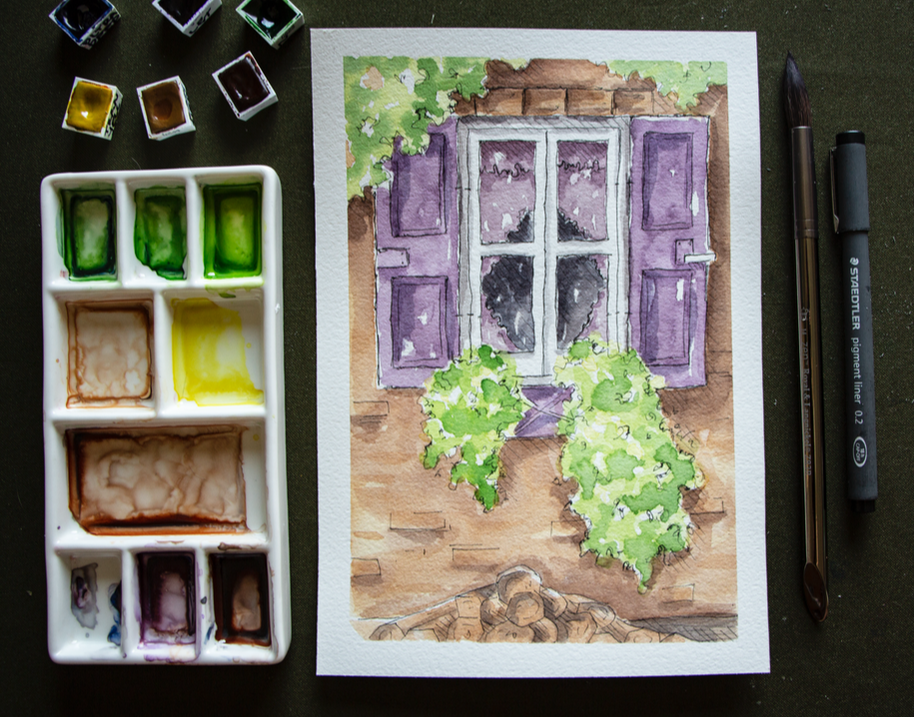
Combining Ink With Watercolor:
Essential Things to Consider
by K.T. Mehra
Watercolor and ink work together beautifully, and this combination of mediums can certainly lead to a variety of amazing effects and styles.
Line work created with dark inks can be colored in with bright watercolor washes for very impactful, modern-looking pieces, but there's also so much room for exploration, creativity, and for artists to bring in their own personalities into the process.
To make it easier for artists just getting started with ink and watercolor, I’ve written a short list of must-know aspects to consider when choosing pens and inks to combine with watercolor. Afterwards, I'll be sharing my favorite options for both ink pens and bottled inks.
Before getting into anything else, when buying inks to combine with watercolor (whether in pen or bottled format), it's important always ask yourself the following four questions:
1. Is it waterproof?
The first and most important factor you want to consider is whether your ink is waterproof. This will determine whether it'll bleed or smudge when water is applied on top of the ink.
When working with watercolor, you'll need quality waterproof ink. This will allow your line work to stay clean and sharp as you apply paint over it. Most pens and inks will be labelled as 'waterproof', whether in pen form or bottled format.
2. Is it water-soluble?
You may come across inks and pens that state they are 'water-soluble'. You want to avoid these inks, as they are made with water and will run when combined with watercolor.
These can be used to create particular styles, but are not ideal for most cases when you're looking for a good ink or pen to use in combination with watercolor, as the ink will run and smudge, and very possible affect the vibrancy of your washes of color.
It's best to assume that any ink pen contains water-soluble ink and will not be ideal for use with watercolor unless its specifically states that it is waterproof. You also usually want to avoid any pen or ink that says it’s 'water-based'.
3. Is the ink pigmented?
Oftentimes it's not 100% clear whether the pen contains waterproof ink or not. One sign that the pen is most likely waterproof and usable with watercolor is if it includes the words 'pigment' or 'pigmented ink' on the pen or bottle.
Pigments are tiny particles of colored material that do not dissolve in water. In other words, they are rarely water-soluble or water-based, which makes them good for use with watercolor.
4. How long does it take to dry?
Another factor you want to consider is the ink’s drying time. If you apply watercolor too soon after drawing with ink, it's likely that some smudging will occur.
Most inks will dry after an hour or two, but to avoid this completely, you’ll want to wait 12 to 24 hours for the ink to fully dry and set into the paper.
If you don't want to wait this long for the ink to dry, make sure that to purchase a fast-drying ink. I'll recommend my favorite below, so keep on reading!
Are you supposed to do your ink line work before or after your watercolor washes?
This is a great question, and the answer is even better.
The truth is... either way works!
There are pros and cons to both methods, but it's ultimately up to you to experiment and determine what'll work best for you, making sure, of course, that you're taking precautions and allowing layers the necessary time to dry in between.
It depends on the artist's personal way of working and the outcome that he/she is going for.
A reason you might want to do your ink work before watercolor is that it allows you to focus on your line work and/or outlines first, establishing a type of preliminary sketch to work with. You're then able to begin applying watercolor washes and it's easier to stay inside the lines and have more control over where the color is applied.
Also, you'll likely find that the pen glides across your paper more smoothly when there's no paint on your paper yet, which can be a pro for many artists.
A reason you might want to do your ink work after your watercolor painting process is if you're looking for your line work to be very clear and visible.
Doing your line work after your washes also allows you to first freely paint with watercolor, creating abstract shapes and organic effects which can then serve as a guide or a type of underpainting for the line work that'll come later.
This technique is great for artists who love the looseness and interesting effects watercolor allows, and want the paint to be the primary creative force structuring the artwork.
It's also important to note that, when doing your ink work after your watercolor painting, you're also able to use water-soluble inks, as long as you've allowed your painting to dry for 24 hours.
Have fun, explore and get creative with your process!
Ink and watercolor can and should be used in new ways that give your pieces a unique personality and character. I'd recommend exploring both sequences and analyzing which results you like best.
A variety of step-by-step pen and watercolor wash tutorials for beginners can be found over at my membership site on Patreon.
Best Waterproof Pens For Use With Watercolor
Now that we’ve covered the basic things to consider when searching for an ink pen or bottled ink to use in combination with watercolor paint, let’s look at the best waterproof pens available (in no particular order).
Uni-Ball Signo Gelstick Pen
The Uni-Ball Signo is a great beginner-friendly option. It's affordable and one of the best ink pens for use with watercolor. It's waterproof, fade-proof, and is able to create smooth, thin lines. It also doesn’t leave stop and start marks at the end of long lines and marks like most gel pens do.
*Most Affordable *Best Gel Pen
Sakura Pigma Micron Series
If you’re looking for a slightly more professional fineliner pen, the Sakura Pigma Micron is a great option, and it's one our favorite fineliner pens for use with watercolor. The Sakura Pigma Micron draws smooth, thin, and very consistent lines that can really help bring together watercolor pieces.
Artists around the world swear by the Pigma Micron for its precise and professional line work.
*Best Fineliner Pen
Lamy Safari Fountain Pen
Using disposable pens can definitely become expensive because they have to be replaced after a relatively short period of time, especially when using them for drawing/sketching purposes.
We recommend, as an alternative, using a fountain pen and filling it with your own ink. This allow us to use our own choice of ink at an affordable price and we can continue filling up the pen when the ink runs out. As long as we take care of the pen, it'll last for years.
If you are looking to invest in a fountain pen, Lamy Safari is the best option for beginners and is relatively affordable for a quality, reusable fountain pen.
*Best Beginner-Friendly Fountain Pen *Most Affordable
Uni-Ball Impact Gel Pen
The Impact Uni-ball pen is a slightly more expensive gel pen option that works wonderfully with watercolors. Go with this waterproof pen if you're looking to incorporate thicker, bolder outlines or marks into your watercolor paintings.
This pen draws fairly wide lines. So if you are looking to do very detailed work, you will need a large canvas or paper, which may be a drawback of the impact gel pen for some artists.
Fudenosuke Brush Pen
Another interesting option is using a brush pen alongside watercolors! The Fudenosuke pen by Tombow is perfect for use with watercolor, as it is waterproof, and produces beautiful drawings with a lot of line-weight variation.
Brush pens allow for varying thicknesses of lines/marks via changing the pressure and angle we're using. If you aren’t looking for a this kind of variation in your line work, as well as organic transitions between thin and thick lines, a brush pen may not be for you.
This pen also requires practice and a certain level of control, which may be a drawback for some artists.
*Best Brush Pen
Kaweco Pen
If the thought of a fountain pen caught your attention, the Kaweco brand is famous for their superior quality fountain pens.
Winsor and Newton Fineliner
This is another beautiful and unique option for a high-quality fineliner that works great with watercolor. Winsor and Newton provide a great lineup of fineliners that are waterproof and come in many sizes and colors. I can’t recommend them enough!
The Unipin Fine Line
The Unipin Fine Line is a great and fun-to-use waterproof pen, but it does have some drawbacks. I love this pen and it’s definitely worth a buy. Unfortunately, when using an eraser on the Unipin Fine Line, the ink fades and blurs a bit.
This is a fantastic option if you do not plan on using any pencil markings that you’re thinking of erasing later in the process.
Pentel Pocket Brush Pen
If you are looking for something a little different, the Pentel Pocket Pen is a really neat option. This pen was created for writing expressive Japanese calligraphy. It has a very sensitive felt-tip that's able to create plenty of variation when it comes to line width.
This may be a negative for new artists, but it does allow more control for experienced artists that are used to brush pens.
Faber-Castell Assorted Pens
Faber-Castell has an awesome pack of eight waterproof pens which offers and assortment of different types and sizes. They call these their Pitt Artist Pens, and the cool thing about this pack is that you get four fineliners and four brush pens in almost every size.
There are better ink pens to use with watercolor on this list, but the Faber-Castell Artist Pens are waterproof and do work well with watercolor. The main benefit of buying this pen set is primarily the variety offered, which allows the artist to explore amongst them.
*Most Variety
A variety of step-by-step pen and watercolor wash tutorials for beginners can be found over at my membership site on Patreon.
Best Bottled Ink For Use With Watercolor
If you’re looking for the absolute best supplies to use for your ink and watercolor pieces, buying your own ink bottle along with a fountain pen or dip pen is going to provide you a custom experience and might just be the way to go.
Next, I’ll reveal my top ten picks in terms of the best bottled inks out there.
Platinum Carbon Ink
Probably my favorite ink to use with watercolor is the Platinum Carbon ink. It's a beautiful natural black textured ink that comes in a lovely little glass bottle. This permanent, waterproof ink is great for use with watercolors.
This ink takes about an hour to dry. Once dried, it’s resistant to water, erasing, smudging and anything else.
This Japanese ink is highly sought-after, which makes it slightly pricey, but it's worth every penny!
*Best Overall Ink
De Atramentis Archive Ink
This is an incredible waterproof ink. The color is less textured and not as pretty than the Platinum Carbon Ink and less of a 'true black' than the Speedball India Ink, but the De Atramentis Archive Ink may just be the most waterproof ink on this list.
I've experienced absolutely no smearing or even a drop of ink smudged after working on my watercolor washes. The ink was also dry after only a few minutes! This is a great and really safe option for use for your watercolor projects.
*Most Waterproof Ink *Best Fast-Drying Ink
Speedball Super Black India Ink
India ink is the best, deepest, truest black ink you can get. Speedball's India Ink is an amazing waterproof option. Some artists mention occasional smearing, but I've personally never had this happen.
The Speedball Super Black India Ink is the best ink bottle you can purchase for a pure, true black outline with your fountain pen and dip pen. If you use this with your Lamy Safari fountain pen or the Kaweco, you’ll want to clean out the pen often, as this ink is thick and can clog the pen if not cleaned routinely.
*Best Pure Black Ink
Winsor and Newton Ink
Winsor and Newton’s ink is also great for watercolor projects. It offers a matte black finish that would be perfect for more modern or cartoony styles and line work. This ink does take a while to dry, but if you're looking for this kind of color and style, it’s definitely worth it.
Sailor Kiwa-Guro
Sailor is a company that's known for their fountain pens, but they're also one of the top ink manufacturers in the world. This is another high-end Japanese ink that performs beautifully for both writing and drawing. You cannot go wrong with the Sailor Kiwa-Guro.
The ink is a solid matte black and dries very quickly. The big negative is that there have been reports of it losing its waterproof properties after several months of being left in the bottle.
So far, this hasn’t happened in my personal experience, but it would make this option riskier if our aim is to combine it with watercolor.
|
|
How To Find The Right Pen And Ink For You
Like with all art supplies, it’s important to explore for yourself in order to find the right pen (and ink) for you. Art is such a personal experience, and we all have different styles, quirks, and processes.
Try different pens and inks to find the ones that work best for you, starting at accessible options if you have a limited budget. Finding your personal favorites will make all the difference when working on a new art piece.
Whether you decide on a gel pen, a fountain pen and ink, or a professional fineliner, we are excited to see what you come up with!
A variety of step-by-step pen and watercolor wash tutorials for beginners can be found over at my membership site on Patreon.
Sending out a huge thank you to K.T. Mehra for her enlightening tips and recommendations!
To find out more about Goldspot Pens and the products they have available, visit their website here.
Also be sure to follow their Facebook page and Instagram account for the latest news.
Thanks for reading!
Find a list of my favorite art supplies here.
*This post contains affiliate links. I receive small commissions for purchases made through these links at no extra cost to you. These commissions help me keep this site up and running, in order for me to keep providing helpful and inspiring art content. :)
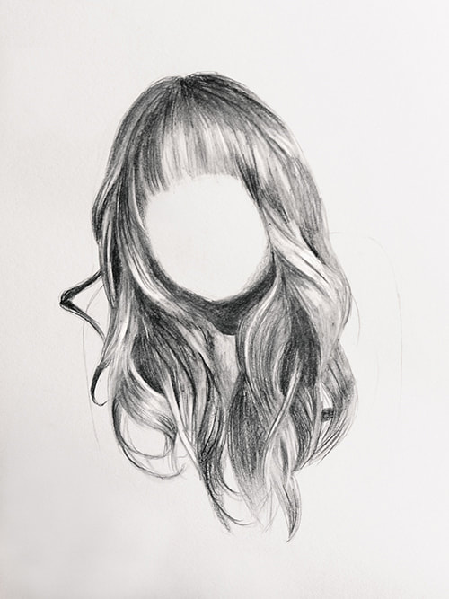
What are the main things I need to know in order to achieve realistic results when drawing hair? How can I break drawing hair down into simple steps to follow?
There's no denying it.
Achieving realistic results when drawing (or painting) takes great skill and patience.
And for those of us who love drawing portraits and animals, knowing how to add hair texture in a believable way is important!
I'm very excited to share a super helpful, step-by-step tutorial with you that the extremely talented Austrian artist/illustrator Sabrina Hassler prepared for us.
Today, she'll be spilling the beans on her method for adding beautiful (and very realistic) hair to her graphite portraits!
It takes only a quick look into Sabrina's website and social media to know that she's the real-deal when it comes to realistic drawing.
She loves drawing portraits, animals and botanicals and, just like me, she has a passion for sharing her knowledge with other creatives who are looking to progress their skills.
Without any further ado, let's get into her tutorial!
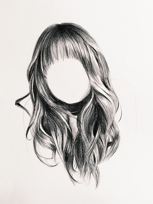
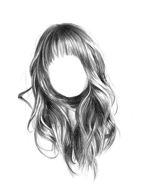
How to Draw Realistic Hair in 8 Steps
by Sabrina Hassler
Many artists find it difficult to draw interesting and natural hairstyles. I've been asked many times: "How do you make hair look so realistic?”
Some complain: "Drawing hair is so complex!"
But it doesn't have to be that way.
In this tutorial you will learn how to draw hair in 8 simple steps, using the example of a long wavy hair.
Curious? Here we go!
Supplies you'll need:
• Pencils (H-4B)
• Black colored pencil
• Eraser and pen style/barrel eraser
• Blending stump
• Drawing paper
Find a list of Erika's favorite drawing supplies here.
How to prepare:
Print out your reference photo several times.
Print out the original photo on regular printing paper once (preferably in grayscale/black and white if you draw with pencils).
Other copies should ideally be a little lighter and a little darker than the original. You can make small brightness adjustments using any photo editing software.
Why do you need lighter and darker copies?
In the lighter copy you'll be able to see dark areas in more detail and in the darker copy the highlights will stand out even more. This will help you to create a high level of contrast between lights and darks later on, which is important for realism.
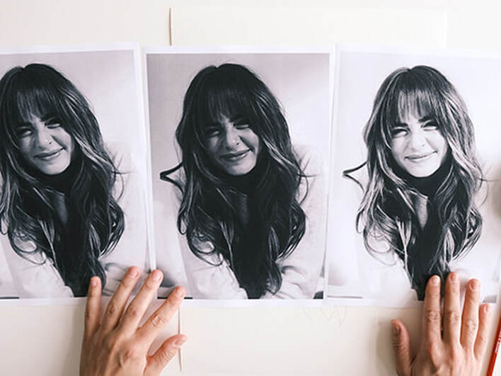
You’ll also need an extra copy to draw in some helpful guidelines.
Link to my reference photo.
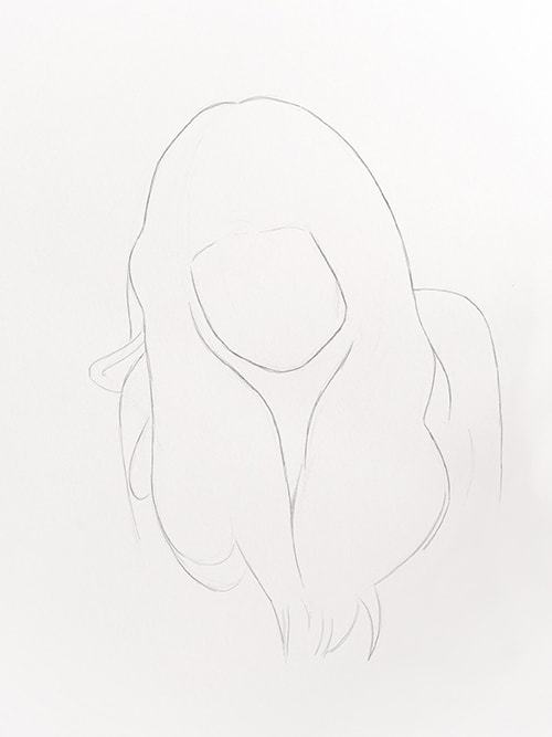
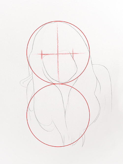
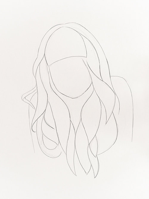
1. Draw basic outlines
To begin, carefully draw the outlines of the head, neck and hair on your drawing paper. Use a harder pencil grade (for example H or HB) and make sure not to press down too hard on your paper as you're creating your sketch.
In the beginning it’s completely normal to make mistakes and you’ll often have to fix something. That’s why your strokes shouldn’t be too dark, so they're easily erasable.
If you have trouble getting the proportions right, try breaking down your subject/reference into simple shapes (such as circles and rectangles). It also helps me to draw guidelines, for example along the central axis of the face (from forehead to nose to chin).
In this example you can draw a circle for the head (chin to top of the head) and then draw an identical circle beneath it, to get an idea where the hair
ends.
2. Analyze shapes
It's time to analyze the separate strands of hair. To do this, take your extra copies of the reference photo and try to recognize abstract shapes throughout the hair.
Draw these abstract shapes with a pen or drawing tool that you'll be able to see clearly on your photo. I used a yellow acrylic pen in the example below.
Once you have divided the hair into shapes, transfer these shapes onto your sketch, once again, without pressing too hard.
Reference photo with shapes:
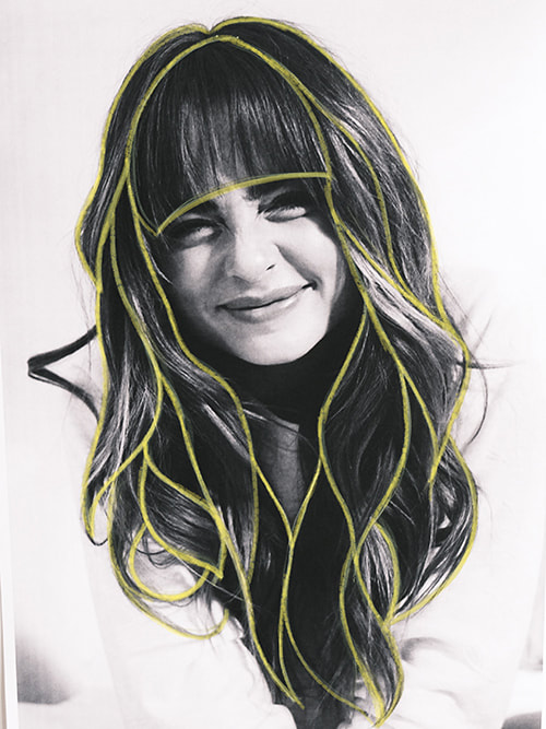
Outline sketch:
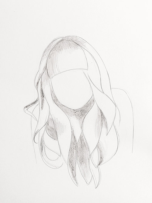
3. Start shading
The next step is very basic shading.
I'd recommend using a softer pencil grade such as B or 2B, and shade the darkest areas on your sketch where least amount of light reaches the hair.
Mostly the areas around the neck and on the parting are very dark. Start there.
Take a look at your lighter copy of the reference photo and detect the areas where the image is darkest.
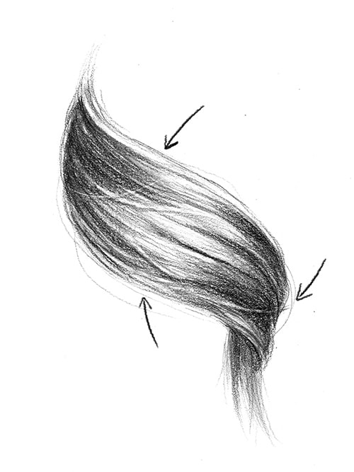
4. Sculpting
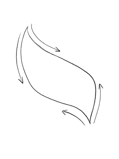
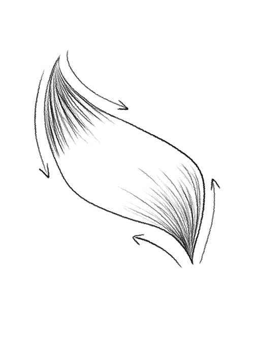
Next, give your hair more volume and three-dimensional form by adding individual hair strands inside of those basic shapes you created.
By dividing the strands into shapes (step 2), this process is much easier for you and you can work your way over the head one strand at a time.
Make sure that your strokes flow in the same direction as the hair naturally grows. Constantly observe your reference photo for clues.
Try to leave the bright spots (highlights) free of graphite and concentrate on the dark tones and midtones.
*Tips and techniques to give hair a 3D look
In the sketch below, you can see how you can shade in a single lock of hair.
Always draw your lines from the ends of that strand, going in (see arrow direction) so that your strokes end gradually in the widest area in the center. In other words, those pencil strokes are going towards the direction of the highlight in that strand of hair.
The hair usually shines most in the middle of the strand because this part protrudes outwards most and thus captures the most light.
Therefore, it's helpful to work from the ends towards the middle section, and not fill in the area in the middle with as much graphite, as this will be the lightest part.
Your focus should be more on the overall shape of the strand, and not on the individual hairs.
The more lines you draw, the darker everything will look. This creates more contrast with the lighter (empty) areas in the middle and this will make your stand look three-dimensional and shiny.
One lock of hair:
5. Smooth things out
The next step is a suggestion and not a requirement. It mostly depends on the overall look or result you'd like to achieve.
I think it makes a big difference to smooth out the transitions between values (lights, midtones and darks), and to soften out individual lines. I like using a paper bending stump for this part of the process, but you can also use a cotton swab.
Carefully (and gently) trace over your previous pencil strokes and let the flow of the hair guide you.
Try your best to not go over areas of lighter values/highlights. It often happens that I accidentally smear something or bring graphite into areas that I wanted to leave very light.
But don't worry, if this happens! We will correct this in the next step.
6. Pull out highlights
Next, take your pen-style/barrel eraser (or a pointed-shaped kneaded eraser) and erase the highlights (i.e. the shiny spots that reflect the light the most).
Most of the time I accidentally smudge these shiny spots with my blending stump in the previous step, so I have to pull them back out by erasing the graphite.
Observe your darker copy. There, you'll be able to notice lighter areas even more distinctly.
A pen-style eraser is perfect for this because it provides a lot of precision and you can even erase individual hairs.
7. Add contrast
By this point, your drawing will probably already look pretty good, but you shouldn’t stop there!
Using a black colored pencil, darken the darkest areas of your drawing again, using the same strokes/direction/overall motion that you were previously using with your pencil.
Colored pencils provide a more opaque/less shiny finish than regular pencils and will help add more depth and contrast, making your drawing look even more realistic.
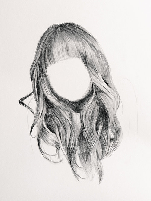
8. Final details
The last step will really make your drawing stand out. If you want your drawing to look natural, you should also invest some time adding the final details.
By that I mean details such as smaller hairs that don’t follow the general flow of the hair, such as flyaways, stray hairs, and all the small imperfections that make hair look "real". These can be added around the head or even over the face.
You can draw a few flyaways on the outside of the head with a hard pencil grade. Flyaways are usually very thin and hardly recognizable from a distance. The pen-style eraser is suitable for drawing individual hairs over the main hair areas. Use it to erase small lines over larger, dark areas to add in a flyaway hair.
Take a close look at your reference photo and decide for yourself which details you would like to draw in and which make the hairstyle unique.
You can also add some details from your imagination, if you want to achieve a messy look for instance.
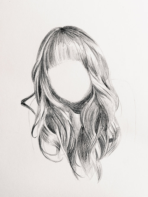
Finished drawing:
*Final tip: Adding details
In the image above, you can see examples of “imperfections” such as flyaways and stray hairs in greater detail. Some single hairs also cast their own shadow on the hair underneath.
Avoid dark ends in hairs by releasing the pressure on the pencil at the end of your stroke. Try to get your hairs darker at the roots and remember to create a line weight variation within your lines (from thick to thin/dark to light), instead of having one continuous line weight from one end to the other.
Never forget to draw your lines in a dynamic motion so they don’t end up being wobbly. If you move your hand in a fast and confident way, you will achieve a great look!
I hope that these tips will help you to draw complex and believable hairstyles and that from now on drawing hair will be much more enjoyable for you.
Drawing hair is a great way to practice our shading skills and advance out ability to draw different textures. Not to mention, we're also able to progress out observational skills via analyzing complex references.
Once you understand the basic principle, you can let your imagination go wild and draw interesting hairstyles or fur.
I would be happy to hear from your experiences - you can contact me here.

|
Sabrina Hassler is an Austrian artist and illustrator specializing in portraits, animals and botanicals. Follow her on social media: And visit her website here. |
Was this an amazing tutorial or what?
I certainly learned a lot of things that I'll be putting into practice when drawing hair realistically, and I hope you did too.
For more helpful tips and tutorials from Sabrina, check out her blog.
Sending out a huge thank you to Sabrina for this incredibly helpful tutorial!
Cheers!


www.erikalancaster.com
is a participant in the Amazon Services LLC Associates Program, an affiliate advertising program designed to provide a means for sites
to earn advertising fees by advertising and linking to amazon.com.
www.erikalancaster.com
is a participant in the Shareasale.com Affiliate Program, an affiliate advertising program designed to provide a means for sites to earn advertising fees by advertising and linking to Shareasale.com partner companies.
 RSS Feed
