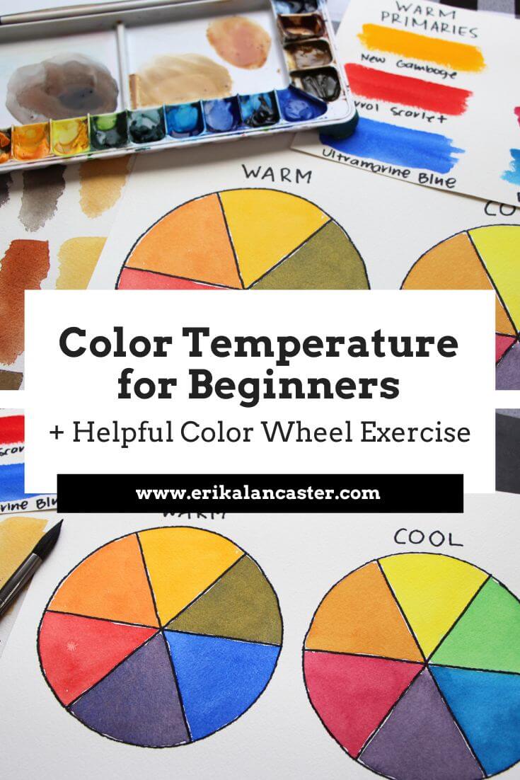
What does the term "Color Temperature" refer to, exactly? How can you tell if colors are warm or cool and why is this important? How can you change a color's temperature? What happens with grays and browns? Color Theory can seem like a daunting art fundamental to start learning about, especially because it encompasses so much. This said, it is essential for any artist who makes use of color in drawings or paintings to expand their knowledge about color and color mixing as this will greatly increase the quality of their work. In the following video, I share must know information for beginners getting started, as well as for more advanced artists who find Color Temperature confusing. I also provide a very powerful exercise that I'd highly recommend working on, as it'll help you build a solid foundation so that you can advance your skills faster. After finishing the exercise, I also explain how to tell if grays and browns are warm or cool, as well as how to create darker or lighter versions of these "neutrals".
If you enjoyed this video and found it helpful, make sure to subscribe to my YouTube channel. I share a brand new video every week with art tips, drawing and painting tutorials and mindset/productivity tips for artists. *Subscribe HERE*
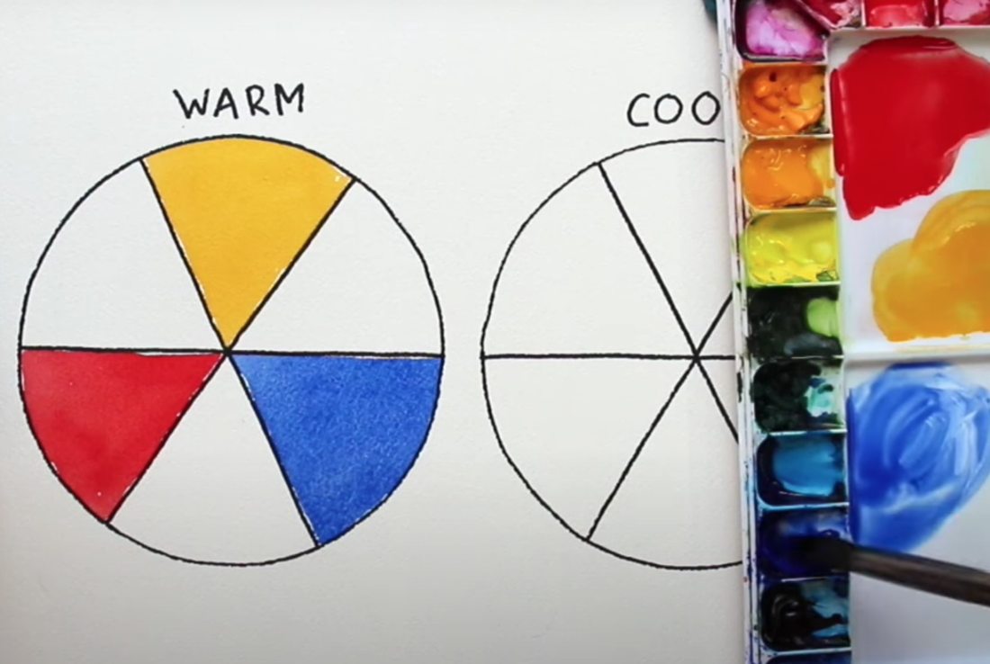
For a list of my favorite art supplies, go here. Step 1. Create two 6-part color wheel templates Find a circular object to trace around that isn't too big or too small, and fits in your watercolor sheet twice. Using a pencil, trace around it twice, to create two circles. Use a ruler to divide the circle into 6 triangular "pie pieces". Use a black pen or marker to trace over your pencil work and label your color wheels as "warm" and "cool". Step 2. Choose your warm and cool primary paint colors Swatch out different reds, blues and yellows you have available. Using the information below, decide which will be your three warm primaries and your three cool primaries. *Feel free to combine watercolor brands for this exercise if necessary. Blues:
Make sure to write down the names of the colors you'll be using for each wheel. You don't want to start using another blue, red or yellow as you're filling in your wheels. 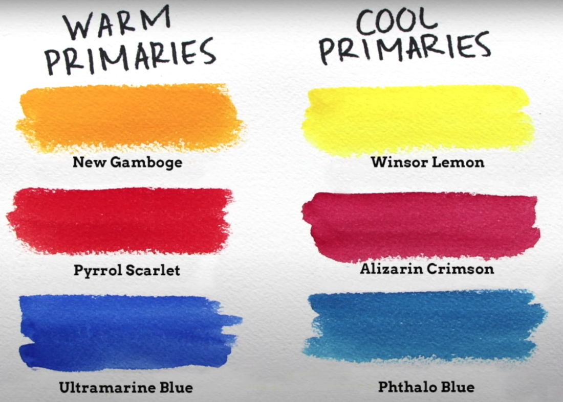
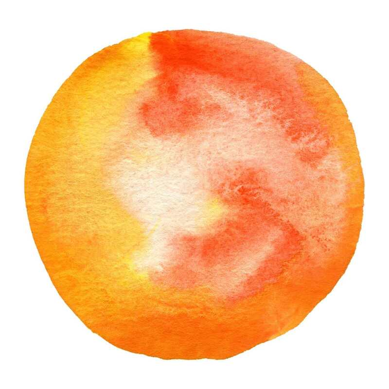
Warm and Cool color swatches
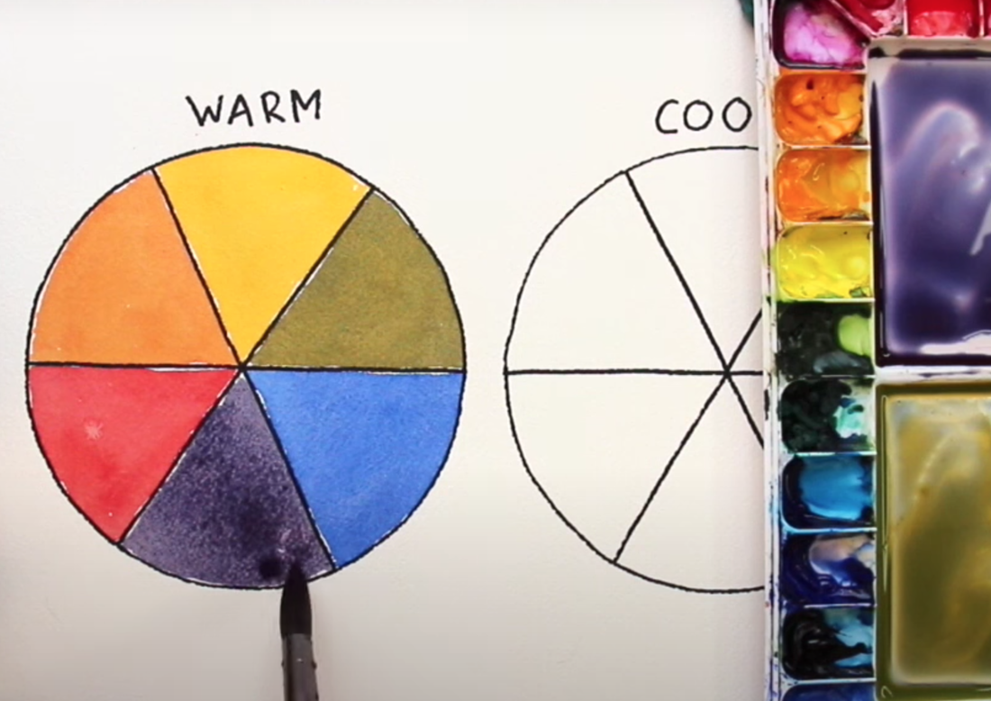
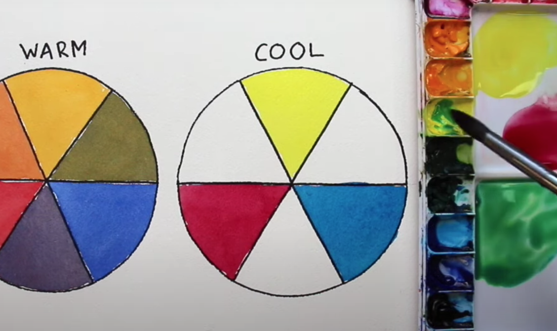
Step 3. First fill in your primaries and then your secondaries
Whether you decide to start with your warm or cool wheel, begin by filling in your primaries and then fill in the secondaries in-between.
Think of your secondary colors as the "babies" that sit in-between the two primary colors that create them.
*Pro Tip: When working on Color Wheel exercises, it is important to keep paint puddles well organized on your palette so that they don't seep into each other. Also, make sure you rinse out your paintbrush bristles in-between each color, so that you don't contaminate the next. 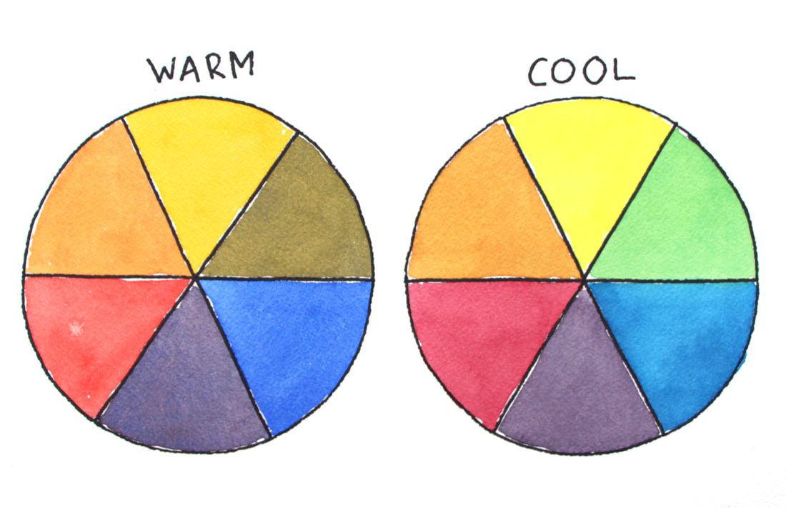
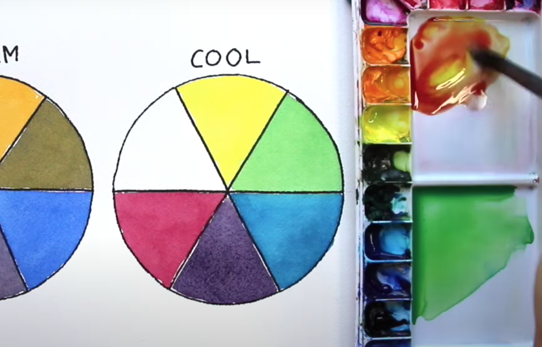
Final Warm and Cool Color Wheels

Once you're done, take time to analyze your color wheels. What differences do you notice between them? Are there brighter or more saturated colors in one of them? What primaries and secondaries do you personally prefer? Extra practice: Try mixing browns and grays using your primary colors. Hint: If you mix enough of two complementary colors (opposites in the color wheel), you'll get a gray or brown. Also, test the neutrals you have available in your watercolor sets (grays, blacks, browns), and compare them with each other. Which look warmer and which look cooler to you? What primary colors can you add to these ready-made neutrals to shift their temperature?
2 Comments

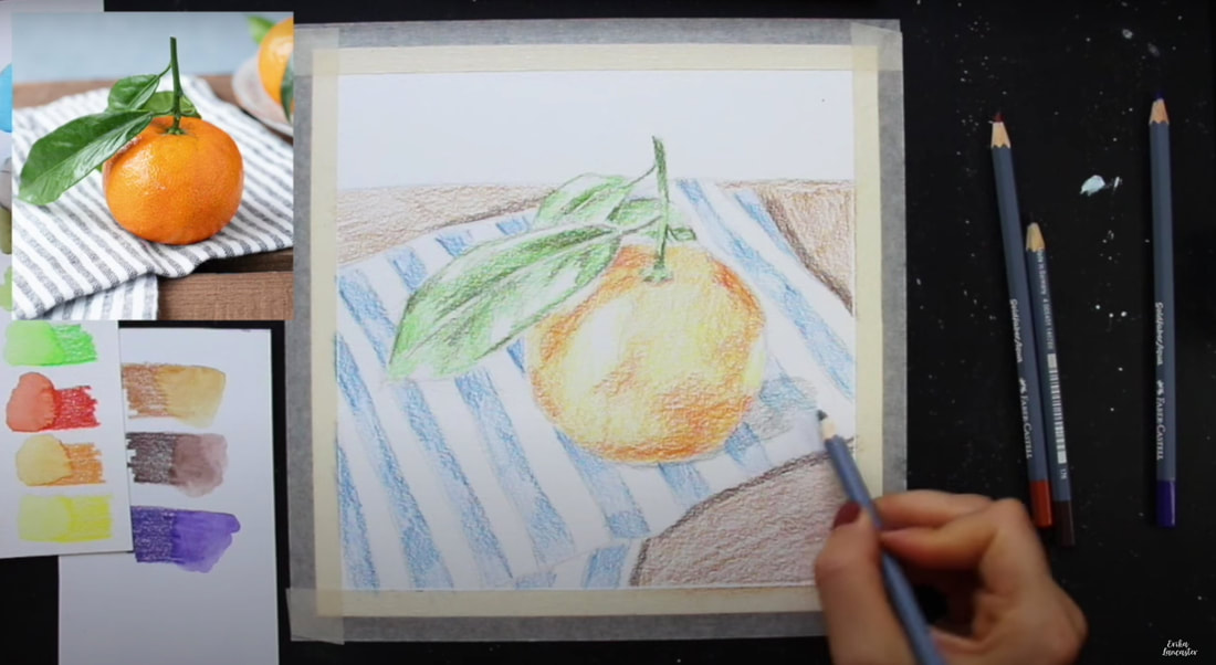
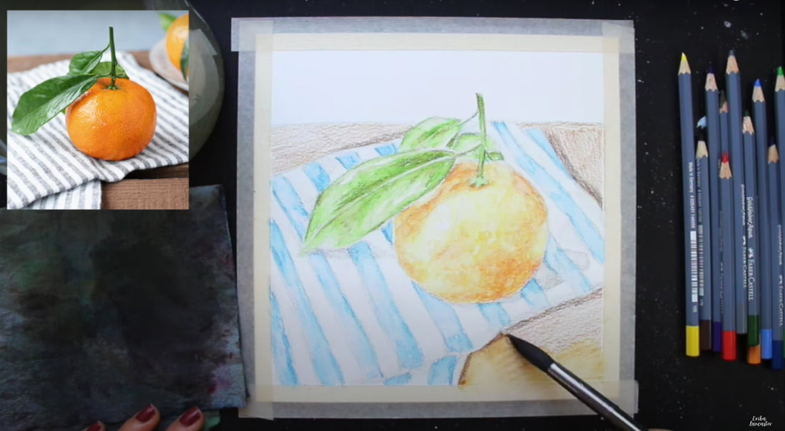
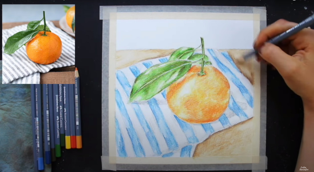
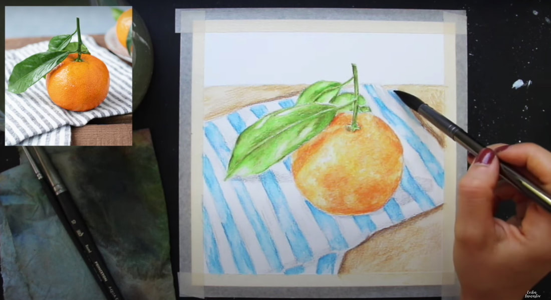
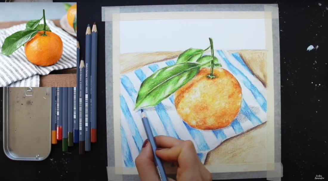
Can watercolor pencils be used to create higher levels of realism? How do you prepare for a successful watercolor pencil painting? How can I choose my colors in order to arrive at cohesive, harmonious results? Can watercolor pencils be layered? Watercolor pencils are such an exciting art medium! However, it can be tricky to learn to use them because they are both a drawing and a painting medium, all wrapped up in one. They can be used in a variety of different ways, depending on the outcome you wish to create. Do you enjoy drawing mediums and the "sketchy" texture they create? Consider using less water throughout the process. Do you enjoy more of a painterly effect? Bring in more water throughout the process to "activate" your pigment. Looking for a combo of pencil texture and painterly effects? Use both techniques! After years of honing my skills with watercolor pencils, I'm happy to say that I've found a process, and specific supplies, that lead to the results I love, every time. In the full tutorial below, as well as others I've shared over at my YouTube channel (I have a full watercolor pencil playlist!), I spill the tea on my favorite techniques and main tips that have helped me create better work. The tutorial below includes: -My 5-Phase process for painting with watercolor pencils -How I create my preliminary sketch using pencil -How I pick the specific colors I'll be needing for higher levels of realism -How I layer watercolor pencils to develop believable depth -How I activate watercolor pencils with water -How I avoid overworking my watercolor pencil pieces -How I bring in a "wildcard color" to push contrast as well as develop greater color integration and harmony -How to create subtle textures -Must-know tips for success 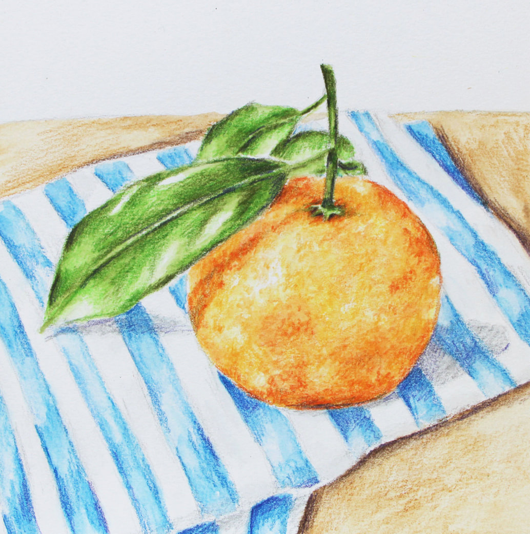
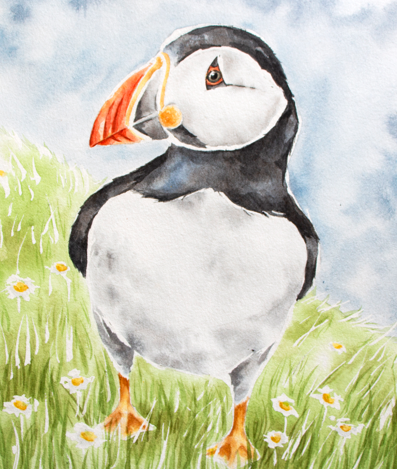
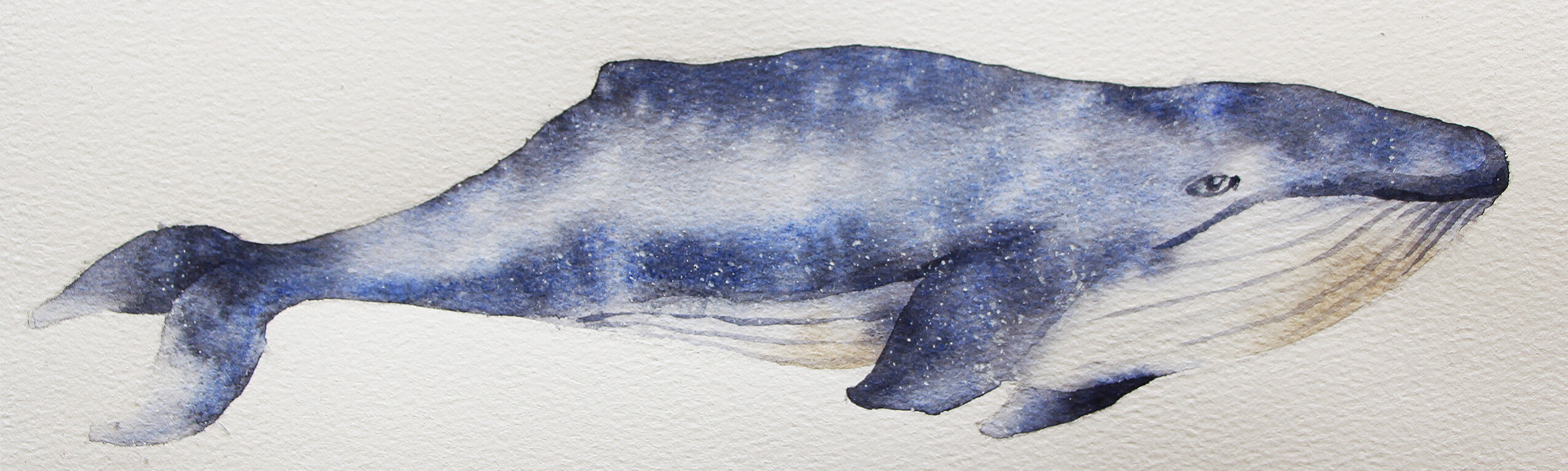
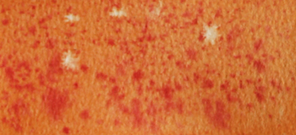
Watercolor Pencil Orange Still Life by Erika Lancaster
If you enjoyed this video and found it helpful, make sure to subscribe to my YouTube channel. I share a brand new video every week with art tips, drawing and painting tutorials and mindset/productivity tips for artists. *Subscribe HERE*
Original Reference photo can be found here. My 5-Phase Watercolor Painting Process
|


 www.erikalancaster.com
is a participant in the Amazon Services LLC Associates Program, an affiliate advertising program designed to provide a means for sites to earn advertising fees by advertising and linking to amazon.com. www.erikalancaster.com is a participant in the Shareasale.com Affiliate Program, an affiliate advertising program designed to provide a means for sites to earn advertising fees by advertising and linking to Shareasale.com partner companies. |


 RSS Feed
