*This post contains affiliate links. I receive small commissions for purchases made through these links at no extra cost to you. These commissions help me keep this site up and running, in order for me to keep providing helpful and inspiring art content. :) Would you like to start giving your sketches a sense of believable form and three-dimensionality but are unsure about how/where to start? Do you have trouble pinpointing different values (highlights, mid-tones, shadows) in reference photographs in order to translate this information into pen and ink drawings using different marks? What are the best exercises to start off with? In today's post I will be explaining a few techniques that are very useful to know when you are ready to start giving drawings a sense of realistic volume and depth. Once you can create basic outline drawings, the next step is to start practicing further observational skills which will allow you to pinpoint light and shadow areas as well as other details in subjects. This is an essential skill to develop as you work your way towards creating more realistic artwork. I will be including seven different shading techniques commonly used by pen and ink artists. However, I use many of these myself when drawing with pencil and they can be used when drawing with charcoal, chalk, and many other kinds of drawing media. I will not be going into the graphite blending technique that is commonly used to create hyperrealistic drawings because what I want to get across with this lesson is the importance of value placement, more than creating realistic texture. 
Value is an incredibly important Art Fundamental to understand if we're looking to start developing any sense of realistic three-dimensionality and depth in our drawings. It is a wide range of values, starting from lightest lights, to a wide range of midtones, to darkest darks, that give a subject a sense of three-dimensional form. Many artists argue that value is even more important than color. It's common for artists to create sketches prior to starting paintings and, in these sketches one of the most important things to decipher (besides proportion and placement of elements within the composition) is where the darkest and lightest areas will be. Let's begin with the topic! Hatching, crosshatching, stippling, etc. are traditional drawing techniques that have been used by artists for centuries. All of these are nothing but patterns and groups of lines (or dots) placed in well thought-out ways in order to transmit a sense of volume, three dimensionality, depth and texture. Some artists style is more controlled and precise, which lead to cleaner and more organized lines, while others have a more free and expressive style. I greatly recommend looking for drawings by Van Gogh, Durer and Da Vinci to be able to see different results. First off, I want you to take a moment to observe the following etchings created by Giorgio Morandi. 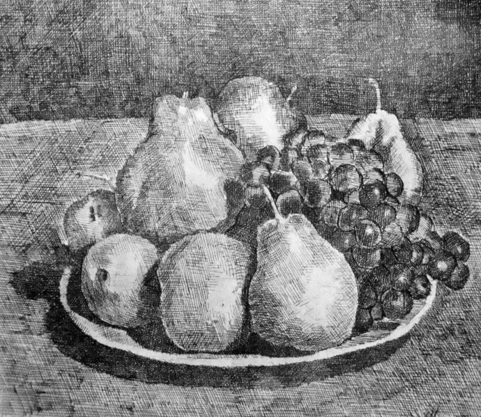
Giorgio Morandi etching. Still Life with Pears and Grapes, 1927.
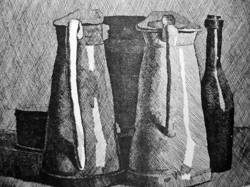
Giorgio Morandi etching. Still Life with Five Objects, 1954.
These etchings were created by using a combination of hatching and crosshatching. I want you to notice the lightest areas in the artworks, as well as the darkest. Notice how the lightest areas have nearly no lines in them, so they look almost entirely (or entirely) white. Now notice how the darkest areas are full of lines to the point at which they look close to (or entirely) black. Try pinpointing the different values in between the lightest and darkest throughout the drawings. How many can you count? How many variations in value do you think you can create using only one pen or pencil? Practice creating value strips showing gradual tonal changes using the downloadable PDF at the end of the post (VALUE_STRIPS.PDF). This will help A LOT! 
Value strip exercise
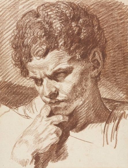 Jean-Baptiste Greuze red chalk sketch. Head of Caracalla, 1768. Jean-Baptiste Greuze red chalk sketch. Head of Caracalla, 1768.
Now take a moment to observe this piece by Jean-Baptiste Greuze created with only red chalk. Notice how this drawing is more complex due to the nature of the subject. Notice the whitest areas and the darkest areas and the values in between. In this drawing, the artist used a mixture of shading techniques. I can find both straight lines, contour lines and even some scribbles which create the texture of curly hair. Understand that different shading techniques can be used together in one same piece. Ok! Moving on! Different Shading Techniques Here are seven different shading techniques that you can use in your drawings and sketches. When using all of these techniques, it's important to keep in mind that, even though lines do not have to be super perfect, you do have to take your time and think about what your doing. It is essential to keep a sense of consistency in terms of the marks you create throughout your piece and to stay mindful of how your mark-making is going to affect its outcome. Keep line thickness, direction, and overall size in mind throughout your drawing process! What's even MORE important, is that the lines you create accentuate the form of the object you are drawing. Increase the density of your lines by placing them closer together or creating a second (or even third) layer overlapping the first in areas that you want to appear darker. If you need practice drawing sets of parallel lines, I recommend practicing until your hand becomes steady enough. Practice each of the following techniques using the downloadable PDF at the end of the post titled SHADING_TECHNIQUES. 1. Hatching/Parallel Hatching This can be considered the most basic of all of the shading techniques included here. It involves creating groups or patterns of parallel lines. These lines don't have to be completely vertical or horizontal. They can also be slanted or follow any angle you'd like, as long as this direction is uniform throughout the area you are shading. 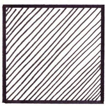
Hatching
Check out my FREE Patreon-exclusive tutorial and class samples here.
2. Cross Hatching Cross Hatching is like taking parallel hatching to the next level. You create a first layer of parallel lines (in any direction) and a second layer of lines is drawn on top in a perpendicular or nearly perpendicular manner. This technique is probably the quickest of all due to the fact that you are able to create darker values faster than with the other techniques. I tend to go for this method most of the time myself. 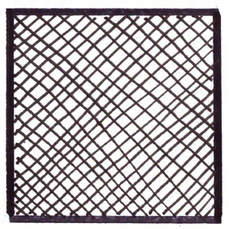
Cross-hatching
3. Contour Hatching This technique involves using lines that follow the curves or lines of the initial contour/outline drawing. When used correctly, contour hatching enhances volume and three-dimensionality in a very striking manner. With this method, it is important to be able to visualize the three-dimensionality and planes of whatever it is your drawing. 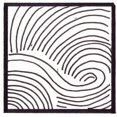
Contour Hatching
4. Stippling When stippling, tone and texture is built up by applying dots in different densities. This technique takes time and you have to make sure that you don't start creating lines instead of dots. 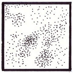
Stippling
5. Tick Hatching This method is similar to stippling but instead of making dots, you make short lines. In darker areas, lines are placed in an overlapped manner. I personally don't use this method very much because I find the texture it creates looks like hair! However, it is very useful when using oil pastels or similar media to create Impressionist-style art. 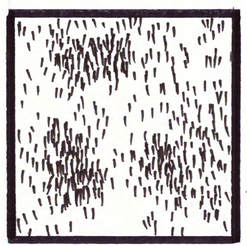
Tick Hatching
6. Woven Hatching Woven Hatching leads to a very interesting outcome when done correctly. This technique involves creating sets of short(er) parallel lines in one direction and then placing another group of parallel lines next to it in perpendicular or near-perpendicular directions. Crosshatching can be later added to add density in areas that require darker values. 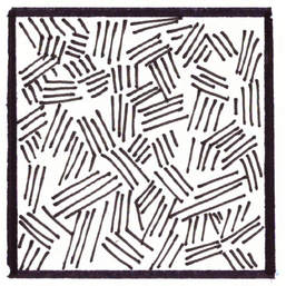
Woven Hatching
7. Scribbling Scribbling is an excellent technique to use when drawing specific subjects like trees or hair because it not only creates values, but also transmits a sense of texture. In the drawing below I used scribbling to create the leaves of the tree and the effect of grass below it. I love scribbling! 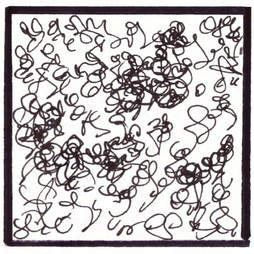
Scribbling
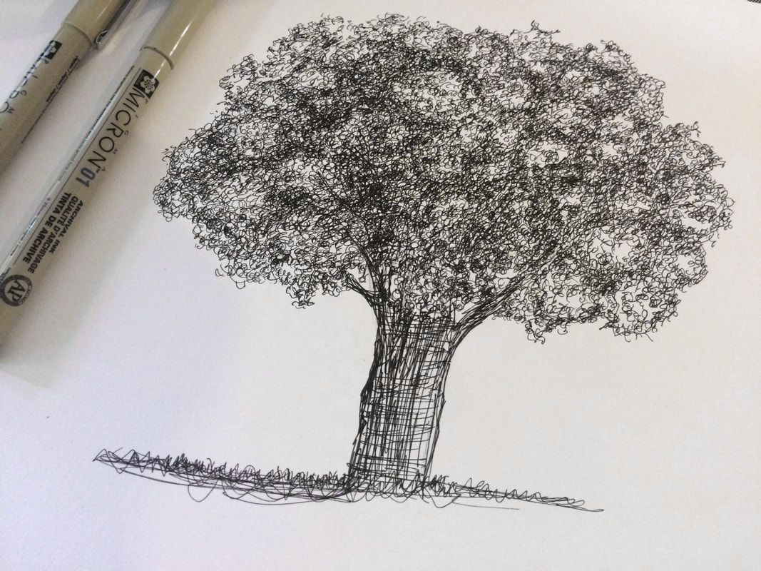
Tree pen sketch by Erika Lancaster. Micron pens on Canson Mixed-Media sketchbook.
Practice the different shading techniques described using the PDF titled SHADING_TECHNIQUES attached at the end of the post. Then, before starting with more complex figures, practice shading simple geometric shapes (use PDF titled GEOMETRIC_SHAPES). 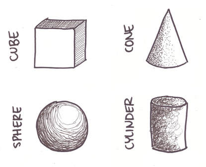
Various shading techniques used to shade simple, geometric shapes.
Essential Steps to Achieving Successful Shading 1. Make sure you select a good photographic reference What makes an effective photograph? Firstly, make sure it is large enough to allow you to view details. Do not select blurry photos. Secondly, make sure the photo is not over or underexposed and has a good balance of light and dark areas. I recommend selecting a photo that has only one visible light source hitting the subject so that you can easily distinguish where the lightest parts and darkest parts will be. Try going for a simple object first. Perhaps a simple still life photograph with only one or two objects in it? Start out with something like this. You can download this image for free use here or find other great pictures to practice from at www.pexels.com. 
Photograph by Lisa Fotios. Find her photos at www.pexels.com or visit her website here.
2. Create a light pencil sketch including only outlines of shapes Practice your observational/drawing skills to create a simple, outline drawing of your subject. Focus only on the general shapes, proportions and locations of the subject(s) in relation with one another and within the composition. 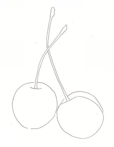
Outline drawing of cherries created using the previously mentioned reference picture.
I strongly encourage you to keep practicing your drawing skills and not resort to tracing, but I have included my outline drawing in PDF form for you to download if you wish to only focus on shading techniques today (CHERRY_OUTLINES.PDF).
3. Take a moment to observe the reference picture and answer the following questions: -Where is the light source located in relation to my object(s)? Is the light in front, behind, below, above or to the side of the subject? -Where are lightest/whitest parts of the subject? -Where are the darkest/blackest parts of the subject? -If there are different colors included in the photograph (in this case we have red and green), how do they relate to one another in terms of their value? Is the red included here LIGHTER or DARKER than the green? This is very important! It may be easy to notice different values within one same color, but once more colors are added in, it is important to notice how they compare to one another in terms of lightness or darkness. For example, in this picture, the values of reds in the cherries are darker (for the most part) than the green in the stems. The green in the stems is pretty light when compared to the reds of the cherries and this is something that has to be translated within a one-color drawing. *If you still feel unsure, I recommend you take your time when preparing your initial sketch. Create a map for yourself using LIGHT pencil strokes within your outline drawing. I do something similar when painting with watercolors in order to remind myself what areas will be left completely white and which areas are darkest. 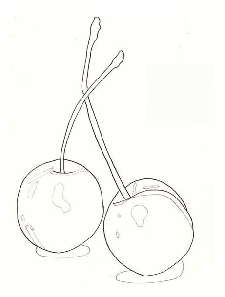
In this "map" I have created shapes that should be left nearly white and also where my cast shadows will be below the cherries.
4. Start developing those values! I recommend starting your drawings with pencil if you haven't practiced these techniques much and move on to pen and ink once you feel more confident. Pen and ink drawings are wonderful and super fun but each and every line you create is permanent and it is easy to get discouraged if your drawing doesn't turn out the way you want it to. Experiment with different techniques and go for the one you feel comes most natural to you. You can move on to exploring combinations of techniques and more complex subjects as time goes by. The way I usually start this type of drawing is by placing my hatching in darkest areas and go back and forth adjusting values as I see fit. 5. Consistency is key It is essential to keep in mind that the lines you are creating are meant to ENHANCE and not DISTRACT the viewer when the piece is finished. So, again, remember that line length, thickness, and direction should show some kind of consistency. Take your time! These kinds of drawings are very much a mental exercise as much as they are a drawing exercise. 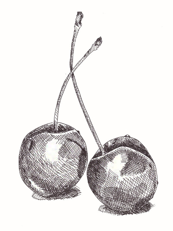
Pen/Ink drawing of two cherries showing the crosshatching shading technique by Erika Lancaster.

Old country church pen sketch showing a variety of shading techniques by Erika Lancaster.
What kind of shading technique do you like most and why? Do you switch shading techniques depending on the artistic medium you're using? I'd love to hear from you! Comment below.
67 Comments
*This post contains affiliate links. I receive small commissions for purchases made through these links at no extra cost to you. These commissions help me keep this site up and running, in order for me to keep providing helpful and inspiring art content. :) Have you ever finished a drawing of a face just to notice that something is off, but you can't tell exactly what it is? Why is it important to start with forwards-facing portraits before moving on to different angles? In this post/YouTube video, I'll be explaining how I create my quick and simple face sketches. It's essential for the beginner artist looking to start with portraits to learn about basic facial proportions and the effective placement of facial elements within the head shape before moving on to adding any sort of realistic shading or texture. Why? Because that preliminary outline sketch is the foundation for everything else and, if proportions/shapes/etc. are not achieved effectively, then the entire drawing is going to be off no matter how long we spend on creating beautiful shading and detail. And, most often than not, it's going to be best for the beginner to get started with forwards-facing portraits, as they are the easiest way to learn about facial proportions. Once we start getting into drawing heads at different angles, foreshortening and knowledge on perspective comes into play to varying degrees, shapes are distorted or hidden, etc., which takes the challenge up a notch. In this post, I've included a section briefly explaining how I draw each individual facial element (eyes, nose, lips, ears and hair) and have also included some notes about how features can be modified when drawing either male or female characters. Before we start, it's important to keep in mind that facial elements come in all shapes and sizes. So long as you stay within these general guidelines I'll be providing, you can and I actually encourage you to experiment by making face shapes, noses, lips, and all the rest in slightly different shapes and sizes. For this tutorial, you'll need: -A pencil (I recommend an HB) -Sketchbook or paper of any kind -Eraser -Ruler I've used all of these products below and highly recommend them! Click on the images to find out more about them at www.consumercrafts.com.
If you enjoyed this video and found it helpful, make sure to subscribe to my YouTube channel. I share a brand new video every week with art tips, drawing and painting tutorials and mindset/productivity tips for artists. *Subscribe HERE*
1. Drawing the head shape The way I draw the initial head shape is by starting with a large circle (1). I then make a vertical line dividing the face in half (2) and add a centered, small horizontal line a bit below the circle, which will be the chin (3). *The shorter you make this horizontal line, the narrower/pointer your chin will be. The wider you draw this horizontal line, the wider your chin will be. The further down from the circle you draw it, the longer the face will be. The closer to the circle, the rounder the face. Once that is ready, draw two vertical lines down the left and right sides of the large circle (4). At the point at which these vertical lines touch the circle, I draw two curved lines downwards, connecting them to each side of the chin line (5). At this point, you can erase the vertical lines running down the sides of the head, as well as the bottom half of the circle. Leave the vertical line dividing the face where it is. 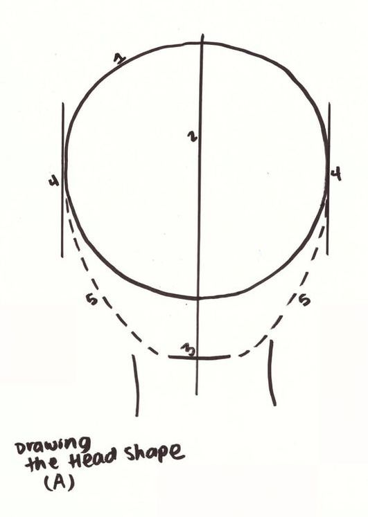
How to draw the head shape.
2. Adding your guidelines As I had mentioned before, when drawing faces, it's essential to be aware of placement and size of facial features within the head shape. In order to achieve this, we will add guidelines that will help us along the way. Make sure to add in these guidelines as lightly as possible, so that you're able to erase them when you no longer need them! Aside from the vertical line we already have dividing our face width in half (which will help us place the nose in the appropriate place), we will add a horizontal line dividing our face length in half. This will be the line that tells us where to place our eyes. This line will then be divided into five parts. The width of five eyes should fit along this line. Eyes should be drawn in the ¨2nd¨ and ¨4th¨ sections of this line. The nose line will be placed halfway down the eye line and the chin. Finally, the mouth line will be placed halfway down the nose line and the chin. *Some artists divide this lower section (between the nose line and the chin line) into three equal parts once again. The first new guideline is where the opening of the mouth will be, in this case. If you'd like to place a few guidelines for your ears, they start a bit above the eye line and end at the nose line. 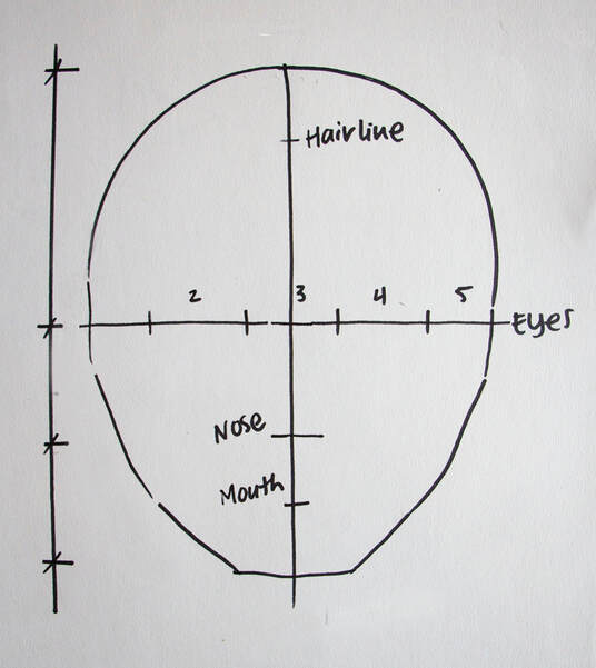
Facial proportions. Placing your guidelines.

2. Drawing the different facial elements We are all good so far, but many of us (myself included) have trouble drawing at least one of the facial elements, whether it's the eyes, eyebrows, nose, lips, ears or hair. Do not attempt to leave something out simply because you think you're not going to be able to draw it properly. Remember, practice makes perfect and if you want to ever be able to create a realistic drawing, you have to start at some point. Here's a brief description of how I go about drawing simple versions of all of these necessary facial elements, as well as some tips to distinguish female features from male features. 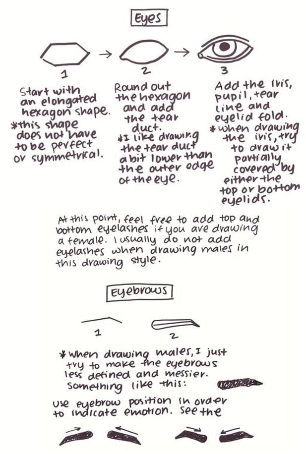
How do draw simple eyes and eyebrows.
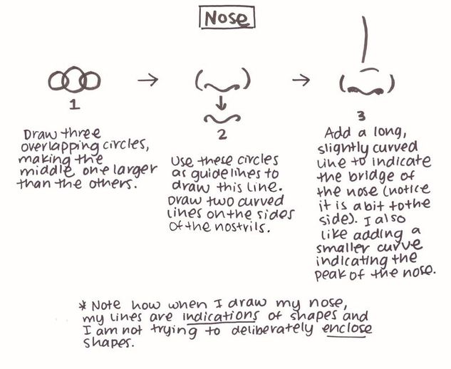
How to draw a simple nose.
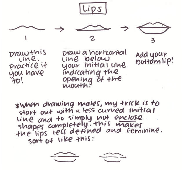
How to draw simple lips.
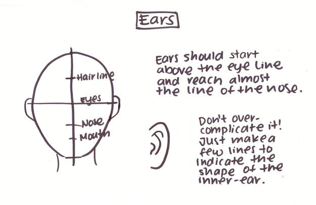
How to draw simple ears.
Once you have finished drawing your facial elements, erase all your guidelines. 3. Adding in the hair
There are many different ways to draw hair, depending on the hair style you'd like your character to have. It can be long, short, straight, curly, wavy, etc.
Remember, though, that hair has volume. Because of this, it should be drawn slightly above the head shape. I cannot go into all the different hair styles here, but I strongly encourage you to experiment with different types of line (curved, straight, wavy, etc.) in order to transmit the characteristics you'd like. 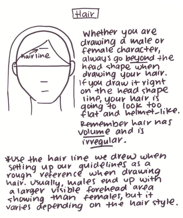
How to draw simple hair.
4. Bringing it all together
By this point, your face should be completed. Here are two examples I have drawn for you showing the differences between male and female characteristics.

Complete male and female faces by Erika Lancaster. Soft graphite in Canson paper sketchbook.
5. Final Details
Add as many details (textures, shading, etc.) as you'd like. I personally don't add many details to this type of face drawing and prefer the sketchy look.
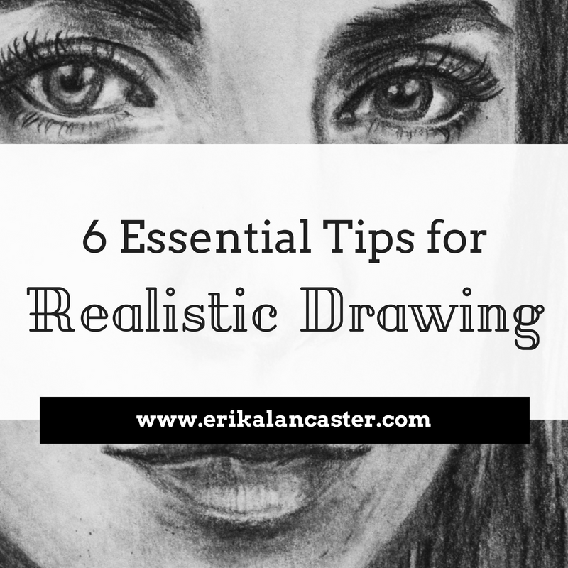
For tips on how to make a drawing look realistic, visit my blog post titled 6 Essential Tips for Realistic Drawing. There are only 2 weeks left before teacher preparation for next school year begins (OMG!). I am still working on my final portfolio for my Master program (which ended last month), but since I am done with all my classes I finally had a bit of time to dedicate to personal projects. I used this small break to set many goals for myself, in both personal and professional areas of my life. Because of this, I decided to create my own personalized planner to keep track of my progress throughout the year. I saw/read SOOO many of videos and blog posts from others in order to get ideas for my planner. The whole thing was pretty fun to make and it will be super useful for me. I enjoyed it so much, I will probably be making more in the future. There are many websites from which you can buy monthly calendars and weekly templates, but I decided to make my own. If anyone is interested, the PDFs are below the pictures, which can be downloaded and printed out. I decided to make the design very simple because I plan on doing at least a certain amount of doodling and collaging in this planner.  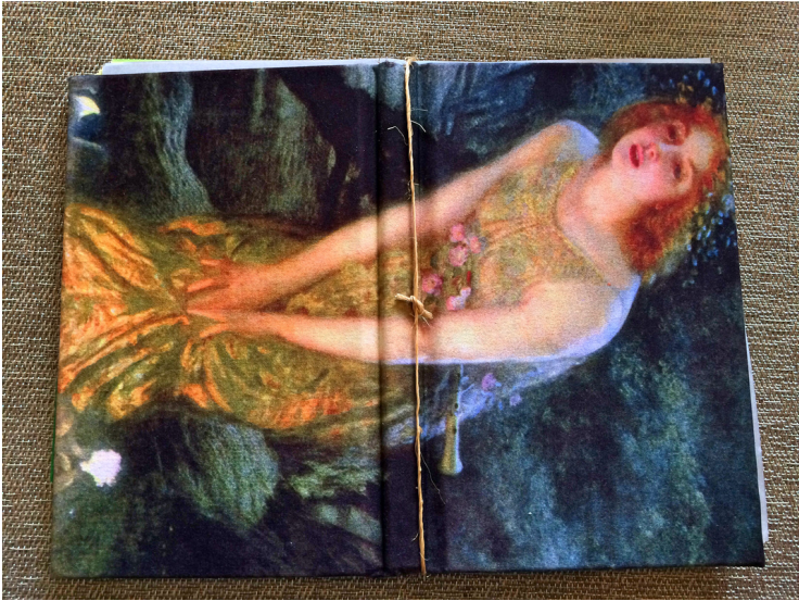 To start off I found an old hardcover book and used an X-ACTO knife to carefully separate the pages from the cover. You have to run the blade down vertically, as straight as possible, and making sure not to damage the spine. Next I found an old blouse with a nice graphic that I was never going to use anymore. I cut out a large rectangle (the book cover has to have at least 1 inch of extra fabric all around it), ironed it, and used spray adhesive to glue it onto the book cover. I then planned the sections I would be creating in my planner. This will vary from person to person, since we all have different organizing needs. I left only 3: Monthly Calendars, Weekly Plans and Important Notes. After deciding on my sections I got to work designing my monthly calendars, and my weekly spreads. I made sure to add areas to jot down monthly goals or notes about important events, as well as daily meals and exercising in my weekly planning section. 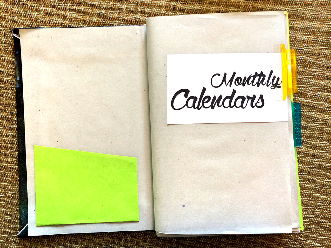 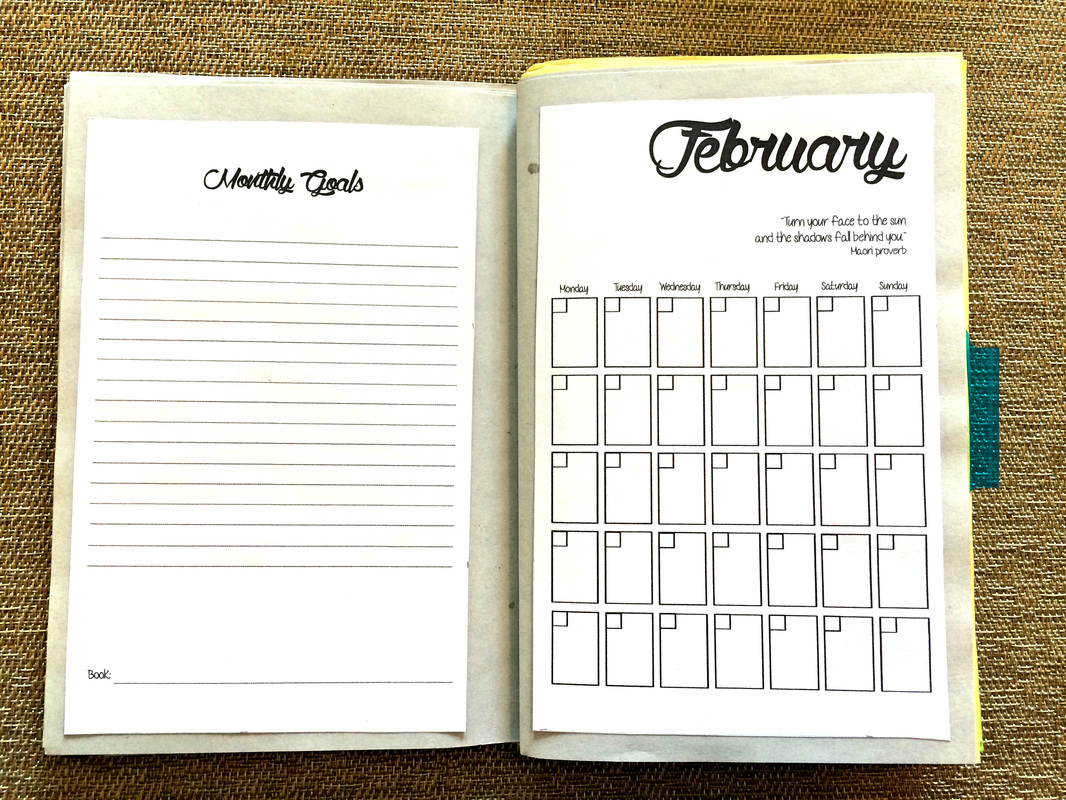 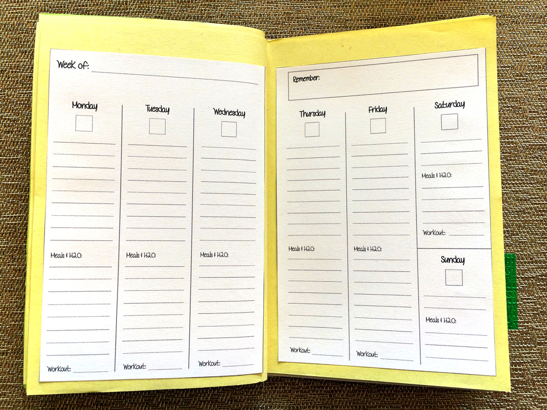 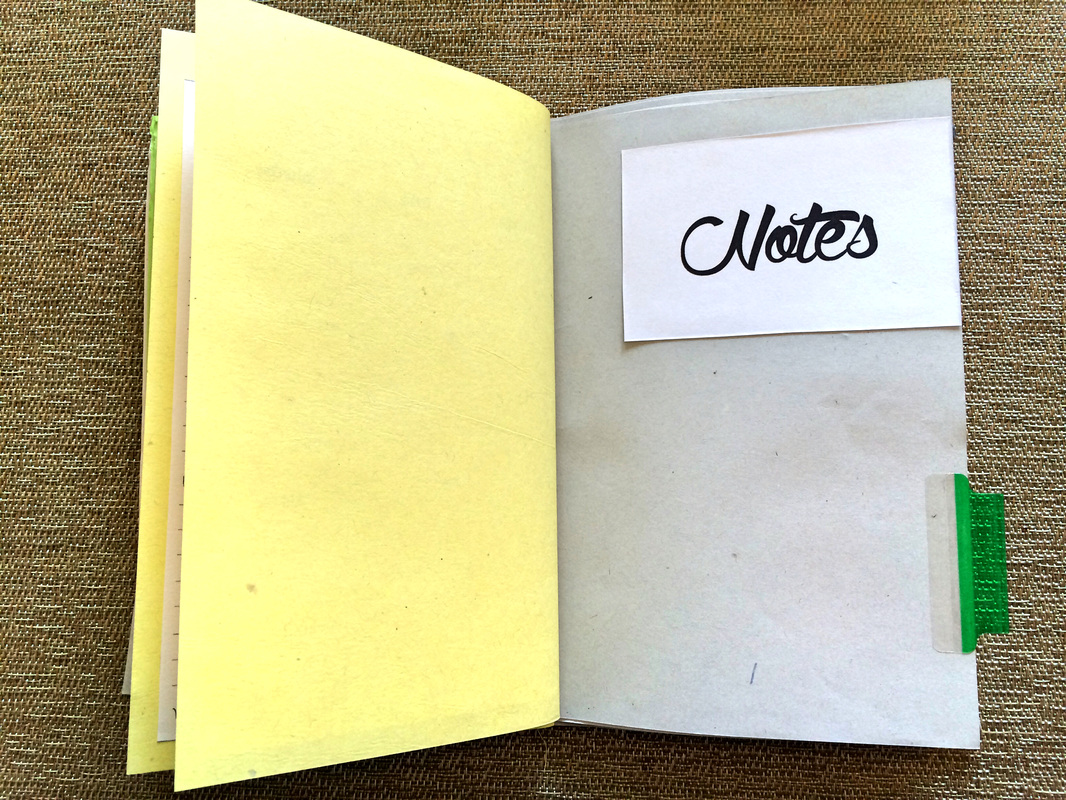 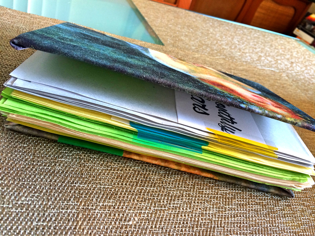 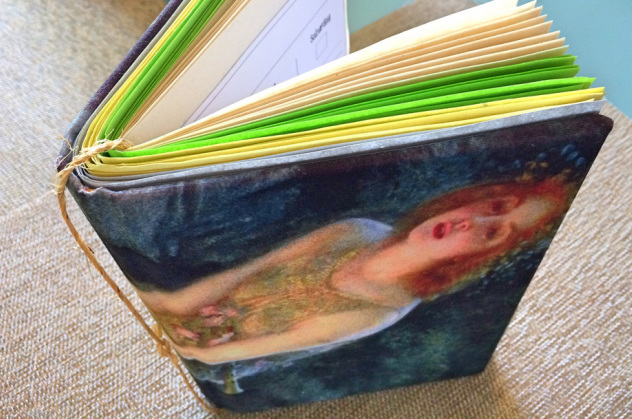 As you can see, I went for the easiest book binding method. I had a roll of thin rope in my basement which I thought would go well with the cover. I was a little worried at first that it wouldn't hold the pages properly, but the hard cover helps keep everything in place perfectly. :)
|


 www.erikalancaster.com
is a participant in the Amazon Services LLC Associates Program, an affiliate advertising program designed to provide a means for sites to earn advertising fees by advertising and linking to amazon.com. www.erikalancaster.com is a participant in the Shareasale.com Affiliate Program, an affiliate advertising program designed to provide a means for sites to earn advertising fees by advertising and linking to Shareasale.com partner companies. |
|||||||||||||||||||||||


 RSS Feed
