*This post contains affiliate links. I receive small commissions for purchases made through these links at no extra cost to you. These commissions help me keep this site up and running, in order for me to keep providing helpful and inspiring art content. :)
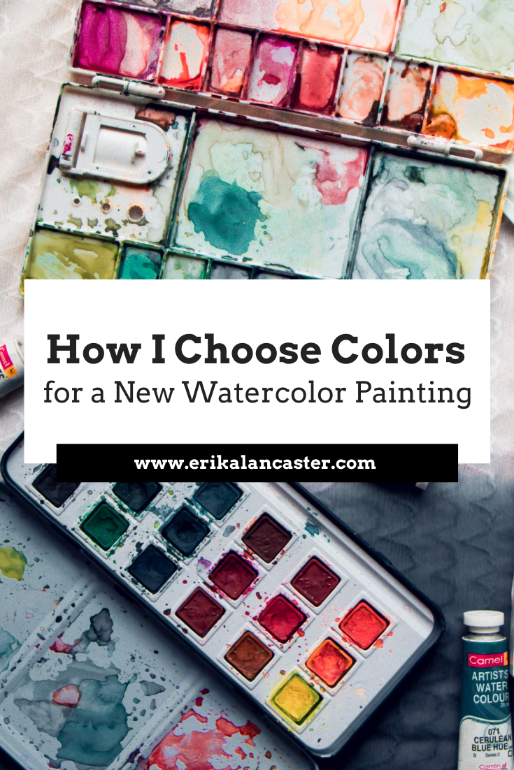
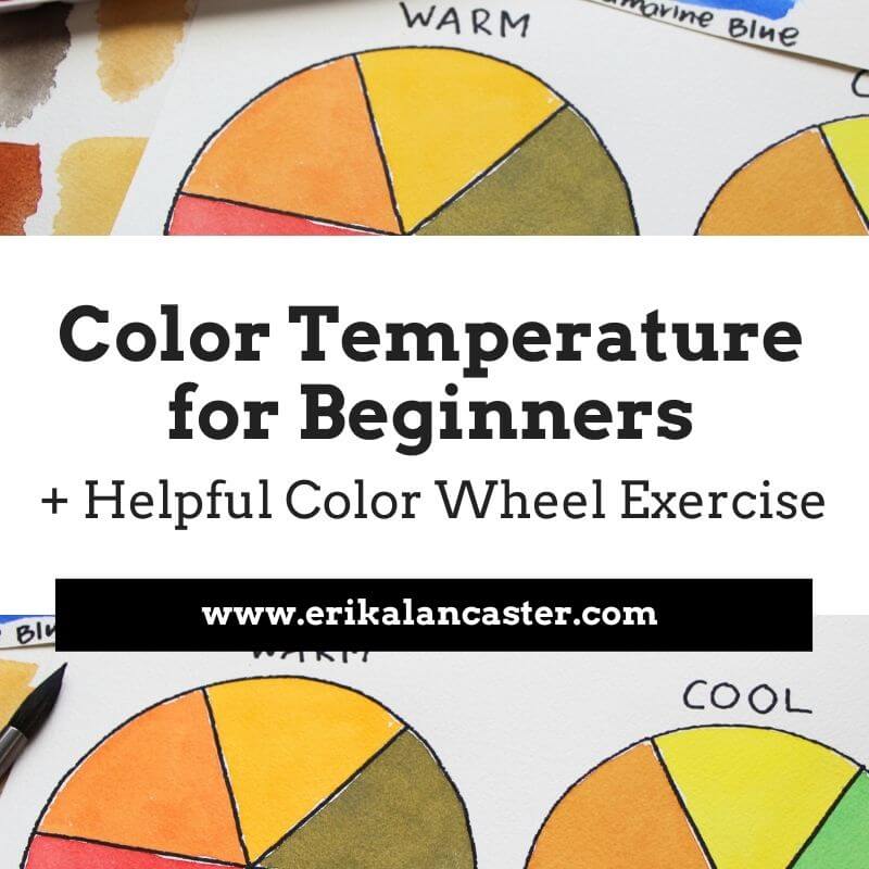
Why is it important to plan colors before starting a painting? How is a limited color palette useful? How will learning about the Color Wheel help us create more successful and professional-looking artwork? In the video included within this blog post, I'll be sharing how I go about selecting my colors prior to starting a new piece. I'll share my thinking process as I go through this method and will be offering lots of tips pertaining to color. In past blog posts and YouTube videos, I have mentioned how color is an essential Element of Art to learn about as a beginner artist. The reason? When we're looking to create a visual composition, we have to think about how different parts fit together into a whole. And color plays a huge role in making a visual composition look harmonious and cohesive. When it comes to a visual composition, all individual elements are connected. Each one has an effect over how we perceive the elements around it. And just like how you wouldn't throw on an outfit with a ton of different colors and textures that don't mesh well together, you have to think about how things will look like in a painting when appreciated as a whole. It's not about one element in the piece, but how the different elements included intermix to effectively transmit the idea or message we're trying to get across. It's incredibly important that any beginner artist who is serious about improving their painting makes time to learn about the Color Wheel. This is an incredibly important tool that allows us to understand relationships between colors so that we're not only able to create effective color mixtures during the painting process, but also prepare color schemes that work well. Here's a free class on Color Temperature in which I share a powerful exercise for beginners. Limiting the amount of colors that you use in a painting is also very useful because the more colors you use, the more disorganized your palette will be, the more likely color mixtures will lead to mud, and the more incoherent the end-results. Whatever you do, stay away from randomly selecting colors during the painting process and dedicate at least a bit of time to plan for your painting. I promise you, there's much more of a chance that you'll end up with great results.
If you enjoyed this video and found it helpful, make sure to subscribe to my YouTube channel. I share a brand new video every week with art tips, drawing and painting tutorials and mindset/productivity tips for artists. *Subscribe HERE*
You'll be able to find a list of my favorite watercolor supplies here. 
4 Comments
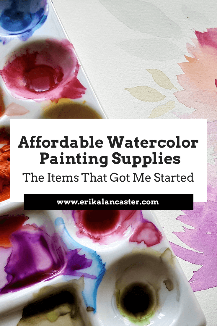
*This post contains affiliate links. I receive small commissions for purchases made through these links at no extra cost to you. These commissions help me keep this site up and running, in order for me to keep providing helpful and inspiring art content. :) Are expensive, super-high quality supplies really necessary to progress your watercolor painting skills? What can you do as a beginner just starting out to ensure that you're spending your money wisely and not on cheap materials that are going to make the learning process more difficult than it needs to be? In my Watercolor Supplies 101 class I explain about the common types of watercolor paint, paper and paintbrushes that you'll be able to find in art supply stores, a well as what I'd recommend for beginners. Today, I'll be sharing the exact products that I finally came across at the beginning of my watercolor painting journey that really allowed me to make substantial progress without breaking the bank. In the video included within this post, I'll be talking about these items. I'll also be sharing a time lapse of an illustration I created using a combination of these. When I was first getting started, I didn't have money to spend on the high-end paper, paintbrushes and paint sets that I saw professional artists using and recommending on Instagram and/or YouTube. As I tried to learn what I could from the pros, I heard them saying time and time again, that the higher the quality of the supplies, the better results will be. Especially, it seemed, when painting with this very volatile medium. Though you should definitely avoid the super-cheap watercolor paint/paper varieties because they will not really help you understand the medium's characteristics and will probably make the learning process much more frustrating, there are brands that offer excellent quality products at affordable prices that are perfect for those starting out. Rest assured that you can progress your skills far with accessibly priced products. I also think there's a lot to say for artists who're able to create amazing looking artwork with what they have on hand and that don't rely on only the best-of-the-best supplies. I still use several of these items, to-the-day. Not only for teaching and filming tutorials, but also whenever I'm not creating a painting or illustration I'm intending to sell or when the art will be scanned for prints or uploading onto shops online. Let's get to the video!
If you enjoyed this video and found it helpful, make sure to subscribe to my YouTube channel. I share a brand new video every week with art tips, drawing and painting tutorials and mindset/productivity tips for artists. *Subscribe HERE*
After almost four years of painting with watercolors I can honestly say that, while it's true that artists selling their work must be able to offer high-quality, durable artwork to their customers, beginners shouldn't feel the pressure to spend $40 dollars on sable brushes or $50 dollars on watercolor paper. Beginners should be exploring, trying different techniques, learning the do's and don'ts of the medium on hand, and thinking about what subjects and styles they'd love to become better at. They shouldn't stop themselves from creating because they're afraid of wasting expensive supplies. 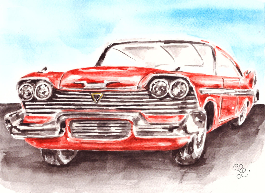
Watercolor Plymouth Fury by Erika Lancaster. Winsor & Newton 12-pan set on Fabriano watercolor paper.
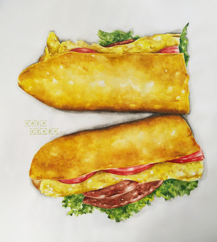
Watercolor Sandwich by Erika Lancaster. Sakura Koi Watercolors on Canson Watercolor Paper.

Awesome Watercolor Paint Sets for Beginners
|
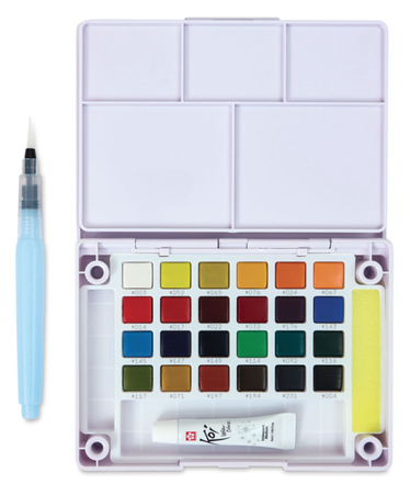
|
|
|
|
|
Watercolor Paintbrushes
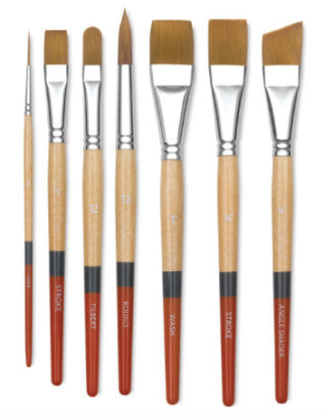
Princeton SNAP! Golden Synthetic Brushes $3.09 - $10.01
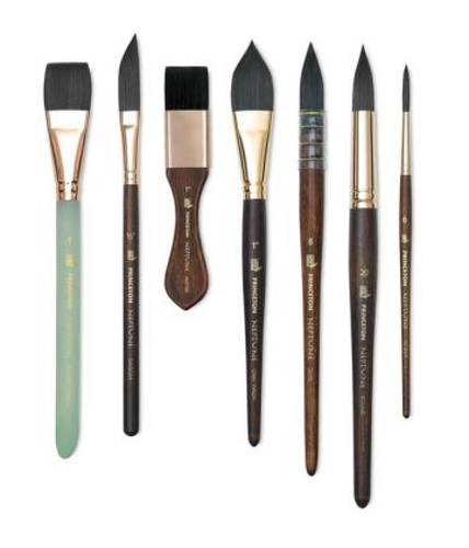
Princeton Neptune Series 4750 Synthetic Squirrel Brushes $4.18 - $51.15
Royal Langnickel Zen Watercolor Brushes $2.99 - $5.99
I hope you enjoyed this post and learned something new, or got inspired to go and create a sketch for yourself. I wish you tons of progress and enjoyment in your artistic journey! :)
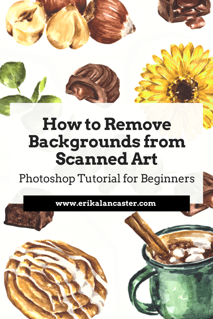
Are you interested in starting to sell your artwork online but are lost as to how to start digitalizing and editing your work using photo-editing software? Have you started learning Photoshop and want to know which tools to use in order to remove the background from your scanned work as efficiently as possible?
It's essential for traditional media artists to familiarize themselves with some kind of photo-editing software at least on a very basic level.
Whether you're looking to sell prints of your work through your own website, create products with drawings or paintings via print-on-demand platforms, create mock-ups using pictures you've taken of your work, or you're simply looking to share your art on social media, it's essential to make it shine and transmit a sense of quality to the viewer if you intend to make any sales.
Today, I'll be sharing a video that is perfect for artists just getting started with Photoshop and digital editing. I'll be explaining three different selection tools commonly used by artists/illustrators to separate their artwork from its background, and I'll also be sharing which my personal favorite is and why.
Throughout the video, I also give important tips that you should definitely be aware of when digitalizing art made with traditional mediums. These apply to whatever photo-editing software you choose to use.
Check out my blog post How to Sell Artwork on Society6 + Pros and Cons to find out more about my entire process, from finishing a watercolor illustration, to scanning it, editing it, and finally uploading it onto Society6 to design products.
In this past post, I also share the positives and negatives I've learned in regards to print-on-demand platforms like Redbubble and Society6 throughout the time I've been using them.
If you enjoyed this video and found it helpful, make sure to subscribe to my YouTube channel. I share a brand new video every week with art tips, drawing and painting tutorials and mindset/productivity tips for artists. *Subscribe HERE*
I hope you enjoyed this post and learned something new, or got inspired to go and create a sketch for yourself.
I wish you tons of progress and enjoyment in your artistic journey! :)
For a list of my favorite watercolor supplies, go here.
I hope you enjoyed this post and learned something new, or got inspired to go and create a sketch for yourself.
I wish you tons of progress and enjoyment in your artistic journey! :)
For a list of my favorite watercolor supplies, go here.
*This post contains affiliate links. I receive small commissions for purchases made through these links at no extra cost to you. These commissions help me keep this site up and running, in order for me to keep providing helpful and inspiring art content. :)
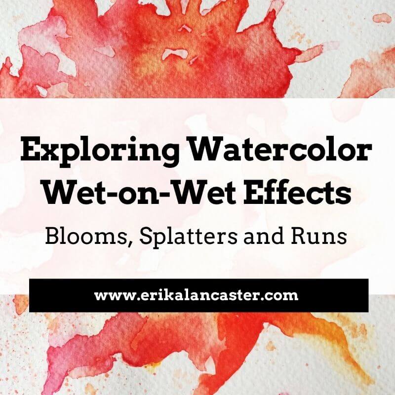
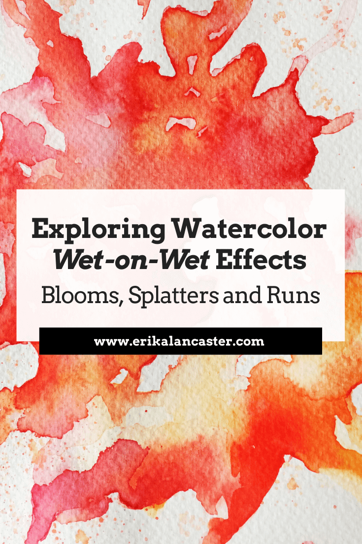
What, exactly, does the term wet-on-wet refer to and how can we use these techniques to create beautiful paintings with watercolor? Do you love watching artists create those awesome washy watercolor effects, but find that things don't end up as expected when you're trying them yourself?
In today's blog post I'll explain what wet-on-wet effects are, how they can be combined with wet-on-dry effects to create awesome paintings, and a few essential tips to apply when using these techniques. I'll also explain how to do different effects like blooms, splatters and runs.
Make sure to check out the video included in this post to see me in action!
Wet-on-wet refers to the act of applying fresh paint onto a wet surface or on paint that is still wet rather than onto a dry surface or a layer of paint that has already dried. When using these kinds of techniques, we get colors that blend or intermix with each other.
It's important to understand that this painting technique isn't exclusive to watercolors, but can be used with all traditional painting mediums (watercolor, gouache, acrylic, oils) and it can be used in a variety of ways.
First and foremost, when working with watercolors, it's essential to understand that when a paint mixture is placed on paper that is wet (either because it has been pre-wetted with clean water or because a previous layer of paint hasn't dried), the paint mixture will expand, creating a blurred out/fuzzy effect.
Opposite to this, when we place a paint mixture on paper that is dry (either because it's a fresh sheet of watercolor paper or because the previous layer has completely dried), the newly placed paint will not expand, leading to sharp looking lines and defined shapes.
This principle is essential to grasp and it's important for beginners starting out with watercolors to know that wet-on-wet and wet-on-dry effects complement each other to create beautiful paintings.
By combining them, we're able to create a visually pleasing contrast, bring attention to focal points by adding sharper detail to certain elements, add depth to a piece, and many other things.
It's important for beginners to practice both kinds of techniques, and start giving thought to how they can be used in a particular piece before actually starting the painting process.
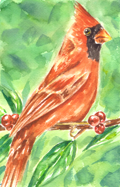
Watercolor Cardinal painting by Erika Lancaster. Wet-on-wet techniques in combination with wet-on-dry techniques.
How and when you use wet-on-wet and wet-on-dry techniques in your painting process will depend on what subject you're painting and what effects you're personally going for.
Generally speaking though, the first layers of paint should be translucent and paint mixtures should contain more water than pigment.
As the painting process moves forward and subsequent layers start being placed, paint mixtures contain less water and more pigment.
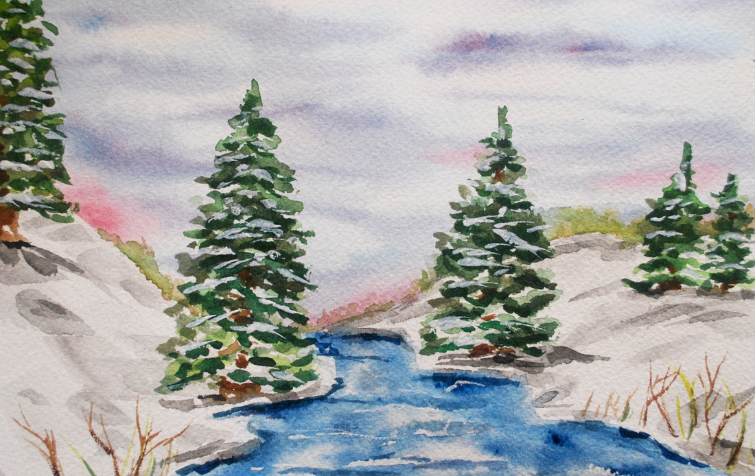
Watercolor Winter Landscape painting by Erika Lancaster. Wet-on-wet techniques in combination with wet-on-dry techniques.
If you enjoyed this video and found it helpful, make sure to subscribe to my YouTube channel. I share a brand new video every week with art tips, drawing and painting tutorials and mindset/productivity tips for artists. *Subscribe HERE*
5 Essential Tips to Have in Mind When Using Wet-on-Wet Techniques
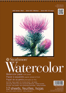
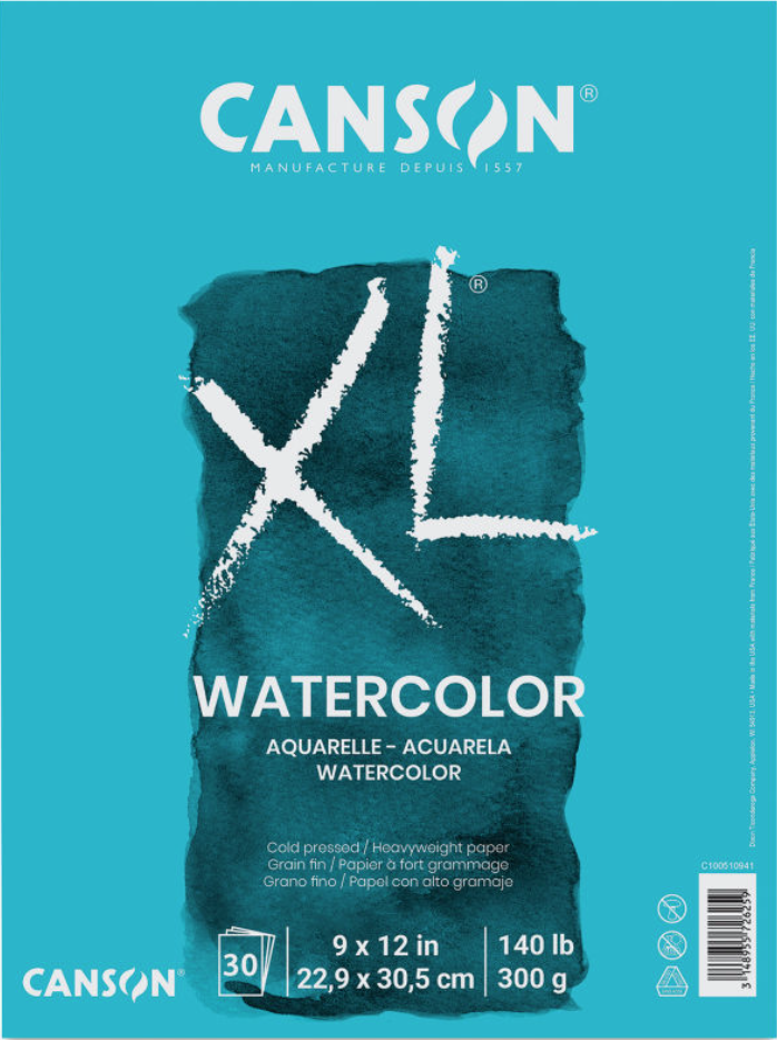
1. Use medium to heavier-weight paper with enough tooth/absorbency
Paper makes a huge difference when painting with watercolor and can often be the reason why our wet-on-wet effects don't turn out as expected.
No matter what kind of painting medium we're using, it's absolutely essential to give thought to what paper or support we'll be painting on before starting a piece as this will directly affect both our painting process, as well as its overall outcome. When painting with a water-soluble medium like watercolor, we should use a paper that is intended for this purpose.
This said, when we're planning on using lots of wet-on-wet effects like the ones described in this post, it's best to use a medium (140 lb.) to heavier weight (300 lb.) watercolor paper, as anything thinner will warp and possibly even shred throughout the process.
You also want it to have some degree of tooth or texture to it, as this will help ensure that water/paint mixtures will be absorbed when placed upon it.
Watercolor paper can certainly be difficult to grasp, as there are so many different types and formats available. In my blog post/YouTube video Watercolor Supplies for Beginners and Things You Must Know, I go much more in depth into watercolor paper and explain a few other important aspects in regards to watercolor painting supplies.
2. Give thought to the colors you'll be using
Because colors will be intermixing a ton when using wet-on-wet techniques, it's essential to do a bit of planning to ensure that we won't create unwanted hues accidentally.
Though one of the beauties of watercolor is the fact that it has a mind of its own, skilled artists are able to have at least some level of control over the 'chaos'. They have practiced water control and have a good idea of what's going to happen when a certain paint mixture is placed in a specific area, using effects to their advantage.
Skilled watercolor artists have not only become masters at managing the combination of paint and water, but they also know the importance of planning color. This Element of Art is an important aspect behind making a painting look harmonious and balanced.
We're also able to create very striking visual effects when planning our color palettes and giving thought to how we'll actually be using it throughout the painting process.
Color shouldn't be an afterthought or something that happens accidentally.
In the video included in this post, you'll see how I create my warm and cool color studies separately. The reason I do this is because I know that when Complimentary Colors mix together, they create grayed out/dull tones. Complementary Colors mute each other out and, in these studies, I wanted my colors vibrant and saturated.
3. Keep your water clean
Using murky water when painting with watercolor is a huge no-no, no matter what kinds of techniques you're using. Dirty water will affect your paint colors and may even make your piece appear dirty.
When working wet-on-wet we're not only using a lot of water, but we're also usually working at a faster pace because we're using the freshness/dampness of an area to create beautiful effects.
It's important to ensure that we're not accidentally dipping our paintbrush into dirty water and placing this water on our paper!
I've known of artists that use two or even three cups of water as they are painting. One idea could be to use one glass of water to rinse color off your brush and a second one to dampen it with clean water.
Whatever it is you decide to do, make sure you're constantly checking on your water throughout the painting process.

For a list of my favorite art supplies and books, go here.
4. Constantly give thought to how much water is already on your paper and how much water is in your brush
The outcome of our wet-on-wet techniques will greatly depend on how wet/damp the specific area of paper is, as well as how thick or watery the paint mixture that we're placing upon it is.
I would recommend beginners to practice creating a wide range of paint mixtures, from watery/translucent to thicker/heavily pigmented mixtures, and see what happens when they are placed on slightly dampened paper vs. puddles of water.
In the video included in this blog post, you can see me play around with large puddles of water/paint mixtures. While puddles allow for a lot of exciting movement, they are certainly difficult to control and can lead to unwanted effects like backruns and splotchiness if we're not careful!
Generally speaking, if your paper is already very wet, it would be best to stay away from laying down a very watery paint mixture on it. In principle, for backruns not to happen, you have to make sure that there is less water in your brush than there is on your paper.
Another option to avoid backruns and undesired splotchiness would be to allow your paint layer to dry completely before going back in with another color.
If you've wetted your paper too much accidentally, you can always absorb some excess water with a paper towel or with a clean (dry or slightly dampened) brush.
5. Know when to stop
When I was first starting out with watercolor, I didn't understand that watercolor paper can only take a certain amount of 'beating' before it has to be left alone to regain its strength.
Even if paper is specially intended for use with water, it's essential to understand that wet paper is fragile paper.
With watercolors, we must stay mindful of when we should stop, as continuing to work over and over on one same area will definitely lead to overworking our paper (even when using the heavier weight variety).
Beginners starting out with this medium tend to lay down paint mixture over paint mixture and try to fix mistakes or make changes in one same area, damaging the paper.
When we've made a mistake, it's best to do a bit of gentle lifting when the paint is still wet and then allow it to dry completely. What I like doing, is ignoring my accident for a bit and working on other areas of my painting while that one dries.
Other times, I work on two pieces at once and jump back and forth from one to the other, allowing paint layers to dry.
Often, we can make mistakes less noticeable by doing a bit of work in the area once the initial layer has dried. We can add more washes of color, lift some more, or even to a bit of gentle scrubbing at this point.
Check out my blog post titled 5 Common Watercolor Painting Mistakes and How to Fix them for ideas on fixing accidents and avoiding them altogether.
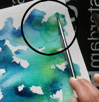
Watercolor Wet-on-Wet Effects and Techniques
|
Watercolor Wet-on-Wet Effects and Techniques
|
Watercolor Wet-on-Wet Techniques
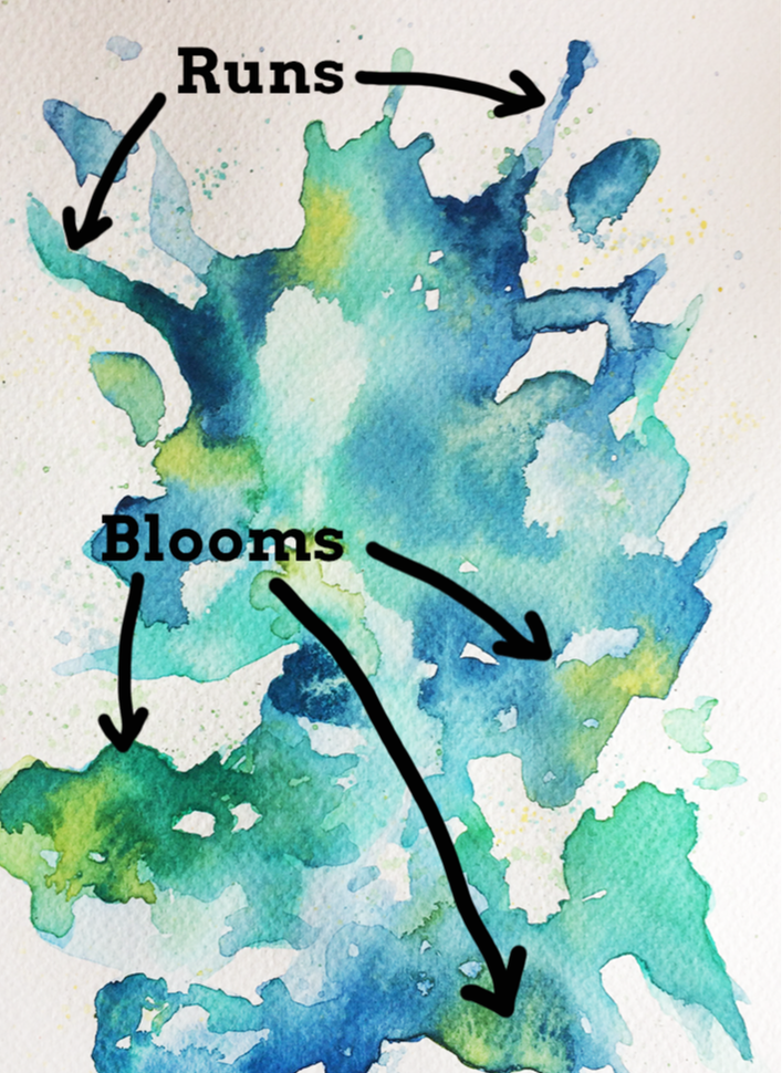
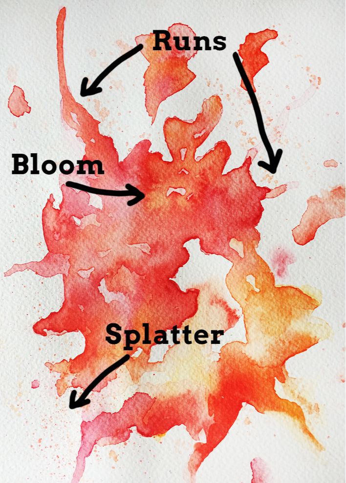
1. Blooms
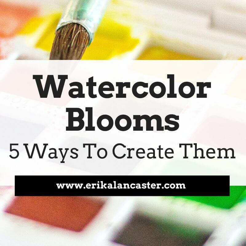
Watercolor blooms are mesmerizing to watch and are the first thing that comes into many of our minds when we first think of watercolors. These are beautiful gradients in which one color turns gradually into another that has been previously placed.
It can also be a gradient of color turning more and more transparent until all we can see is the whiteness of the paper.
To create a bloom effect, wet your paper with clean water or lay down a wash watery paint mixture, and drop a new color right on top of it. To retain the "bloom" effect, you want to lay it down gently and allow the paint to do its thing without going back and attempting to smooth or shift it.
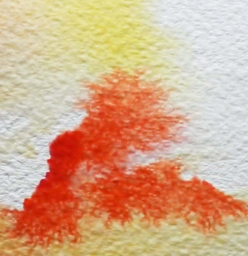
Watercolor orange and yellow bloom
|
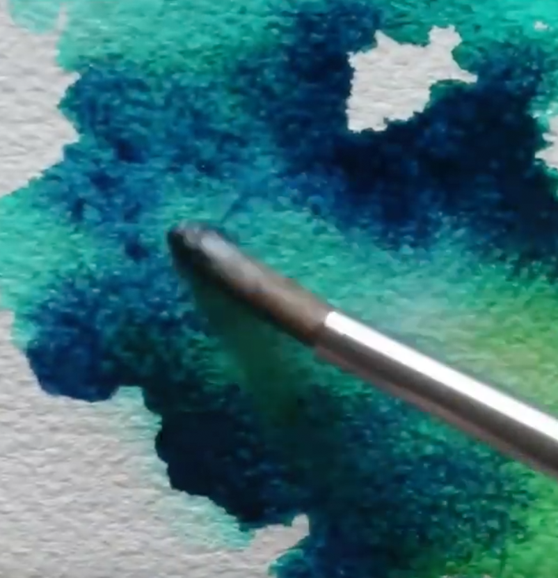
Watercolor blue and green bloom
|
2. Runs (Controlled + Organic)
Runs are interesting effects that can be used when we're creating an abstract painting, or even when adding abstract elements to figurative painting. They are, quite simply, a stream of paint running off the main area or subject in our piece.
We can create runs completely organically by shifting our paper to a slanted or sideways position while it has a large amount of water on it. Sooner or later, gravity will make the water naturally travel down your paper.
If it doesn't happen, consider placing a bit more water in the puddle using your paintbrush, and/or gently tap the paper on your desk in this vertical position.
We can also create controlled runs quite easily by drawing a line of clean water in a specific shape/direction, placing a watery paint mixture at the start of it (the place where our main shape ends and our clean line of water starts), and shifting our paper sideways until the paint mixture starts moving down on its own.
Remember, when using watercolor paper, the paint mixture will naturally expand or move towards the wetness and stay away from dry areas. This is why the paint will naturally travel down the path we've created for it!
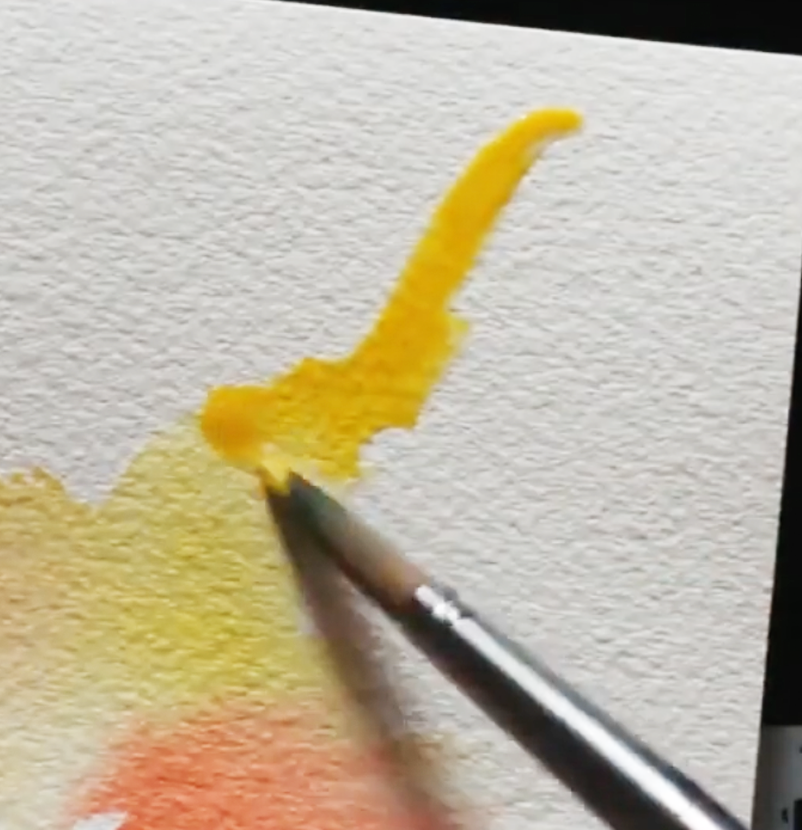
Watercolor run in yellow
|
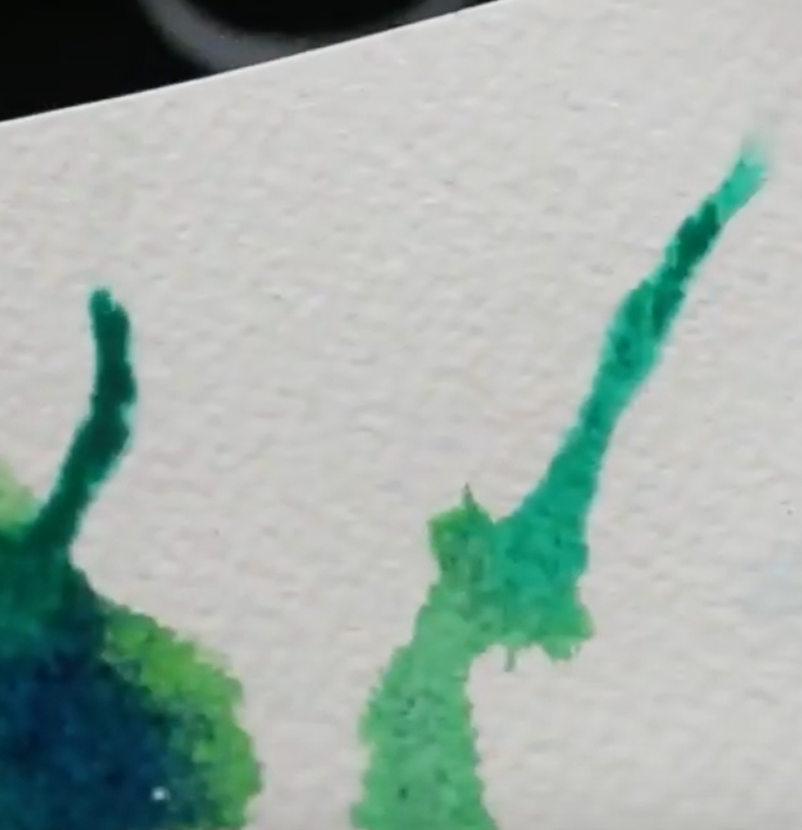
Watercolor run in blue/green
|
3. Splatters
Splatters can have very striking results and can be used in a variety of ways. If heavily-pigmented paint drops fall on areas of paper that are wet, you can create mini-blooms! On the other hand, if splatters fall on dry paper, these drops will retain their sharp, circular shape.
It's easy to go overboard with it, though, mostly because it's quite fun to do! So work incrementally and stay mindful throughout the process.
To do this technique, create a watery but pigmented paint mixture, wet your paintbrush (I use a round in size 8 in the video) and gently tap it on another paintbrush in a cross position.
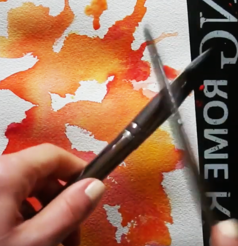
Watercolor splattering technique in warm color exploration
|
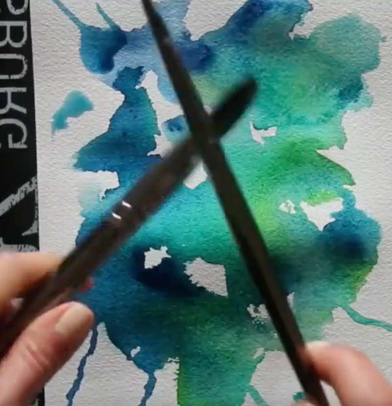
Watercolor splattering technique in cool color exploration
|
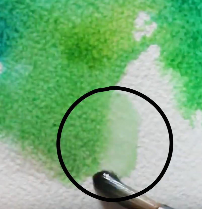
4. Bleeds
Many beginners starting out with watercolors aren't aware of this, but it's easy to soften out stark- looking lines and shapes both while our paint is still wet and after our paint has already dried.
One of the techniques we can use to soften lines or create feathering effects is bleeding, which can be easily done whilst our paint is still wet or is in the drying process.
To do bleeding, simply rinse your paintbrush thoroughly and draw a line of clean water right along the outer edge of the shape or line you want to soften out. Because paint will expand in wet areas, the color will feather out into the recently wetted line of clean water you've drawn, creating a softened effect.
This said, one of watercolors characteristics is the fact that they can be reactivated once they've dried! This means that we'll always have the option to go back into an area to soften it out by doing some gentle scrubbing using a clean, damp paintbrush.
Of course, certain pigments will be easier to lift and move around than others and it will be almost impossible to go back to the whiteness of our paper, but we'll be able to do at least some level of softening.
It's very useful to swatch out our colors when buying a new watercolor paint set, as this allows us to test out paint characteristics before actually using them in a painting.
In my blog post/YouTube video titled How to Swatch Watercolors and Why it's Important, I describe important characteristics and terminology related to this painting medium and take you through my own swatching process.
Watercolor bleeding/feathering effect in red
|
Watercolor bleeding/feathering in green
|
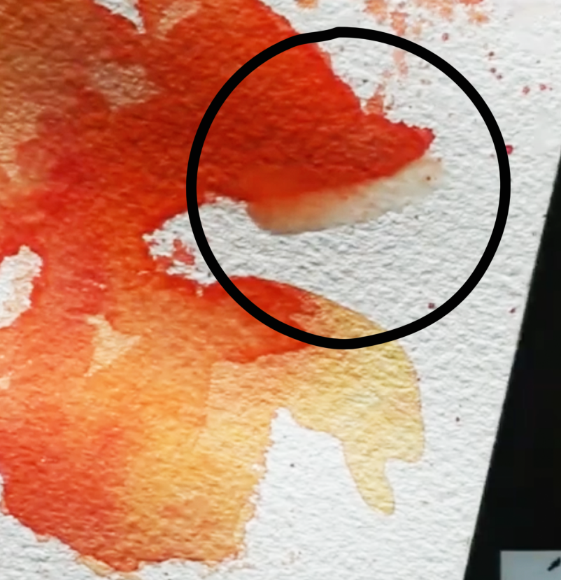
*Bonus Effect: The Backrun
When we're just starting out with using wet-on-wet effects, are working too fast and/or are not staying mindful of what's going on, backruns happen. We can avoid backruns by practicing water control, staying mindful of how wet our paper is and how much water our paintbrush has in its bristles.
In essence, backruns can be avoided by making sure the amount of water in our bristles is less that the amount of water that is already on our paper. They can also be avoided by allowing the previous layer to dry completely before going back in with another wash of color.
This said, backruns are one of those things that some artists consider to be absolutely wrong, while others actually create them intentionally to give the impression of specific things in their paintings like foliage in a landscape, etc.
What do you think?
Watercolor back run
Watercolor supplies used in the video:
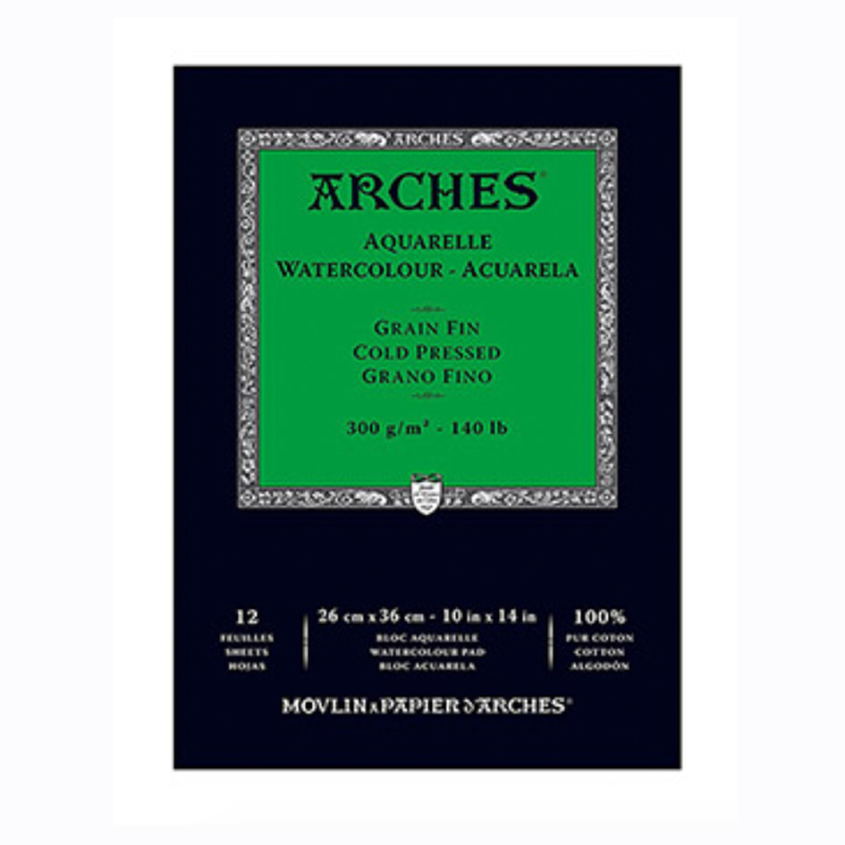 Arches Watercolor Paper Pad: 10 X 14 inches Arches Watercolor Paper Pad: 10 X 14 inches
|
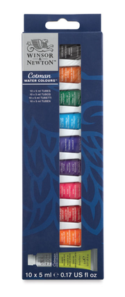
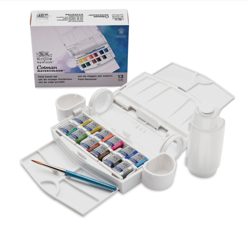
Winsor & Newton Cotman Watercolor Set of 10 Tubes
|

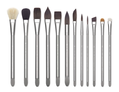
Royal & Langnickel Zen Line Watercolor Brushes
|
I hope you enjoyed this post and learned something new, or got inspired to go and create for yourself.
I wish you tons of progress and enjoyment in your artistic journey! :)

*This post contains affiliate links. I receive small commissions for purchases made through these links at no extra cost to you. These commissions help me keep this site up and running, in order for me to keep providing helpful and inspiring art content. :)
Confused as to what the similarities and differences are between watercolor and gouache? What are the main things to have in mind when combining these two painting mediums in one same piece in order to achieve the best outcome?
It's no secret that watercolor and gouache can work amazingly well together. This said, it can be difficult to get the most out of their combination if we're unaware of the differences between them, as well as how we can combine their distinctive characteristics to create balanced pieces that allow both of them to shine simultaneously.
Learning tips and tricks from experienced artists can definitely open up our horizons to make our ideas come to life more successfully, and this is why I've asked the amazingly talented Haydn Symons to write a post for us!
In today’s blog post, U.K.-based artist Haydn Symons helps us understand the similarities and differences between watercolor and gouache, and why they are so compatible. He'll also be sharing some of his expert tips that will help us successfully integrate both mediums into one great-looking piece.
Haydn is a skilled freelance illustrator and designer with a vast experience working with watercolor and gouache. Throughout the years, he has developed a very striking art style and currently works with clients worldwide within the editorial, publishing and advertising spaces.
Though watercolor and gouache are his favorite painting mediums, Haydn is a multi-passionate artist that constantly explores different drawing and painting techniques, which is something I really believe in myself.
Without any further ado, let’s get into Haydn’s blog post!
Make sure to visit his website to check out more of his amazing work and follow him on social media. Links will be provided at the end.
3 Tips to Create Amazing Artwork Combining Watercolor and Gouache
by Haydn Symons
Combining watercolor and gouache can be a hard nut to crack, especially if you’re new to either of these painting mediums or to the world of art. In this post, I'll be sharing the main similarities and differences between them, as well as why they are perfect for each other. I'll also be providing three pro tips to keep in mind when using both of these painting mediums in one same piece.
If you want to level up your use of gouache and watercolor, look no further than this blog post!
Similarities and Differences Between Watercolor and Gouache
The main similarity between watercolor and gouache is that they are both water-soluble. Both of these painting mediums can be reactivated with water once they've dried. On the other hand, when we work with acrylics or oils, we can certainly lay down subsequent layers of paint to add to or further enhance the look of previous layers, but it will be impossible to modify the layers in and of themselves once they've dried.
In terms of differences, watercolor is transparent, while gouache is opaque. Most of the time (depending on the thickness of the paint layer), when watercolor is placed on paper, we're able to see the underlying paper through the paint. Conversely, when gouache is placed on paper, its thickness and opaqueness covers up the surface fully unless it's been heavily diluted with water.
Check out Erika's Watercolor vs. Gouache blog post to see examples of the same subject painted with both mediums.
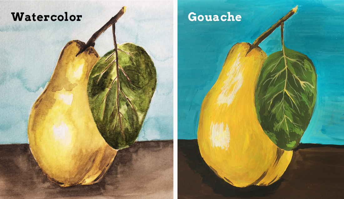
Same pear painted with both watercolor and gouache. Illustrations by Erika Lancaster.
Many famous artists have used gouache to produce ground-breaking work, from Edward Hopper and Henri Matisse to Paul Klee. Famous watercolor artists include J. M. W. Turner, John Singer Sargent to Vincent Van Gogh, just to name a few.
Matisse’s famous paper cut outs were created using gouache!
I love painting all kinds of subjects (portraits, landscapes, etc.) integrating both of these mediums, as they mesh together so well. I’ve become quite addicted to combining them!
Check out this book cover illustration of mine, as an example.
Combine These Two Painting Mediums Effectively By Doing the Following
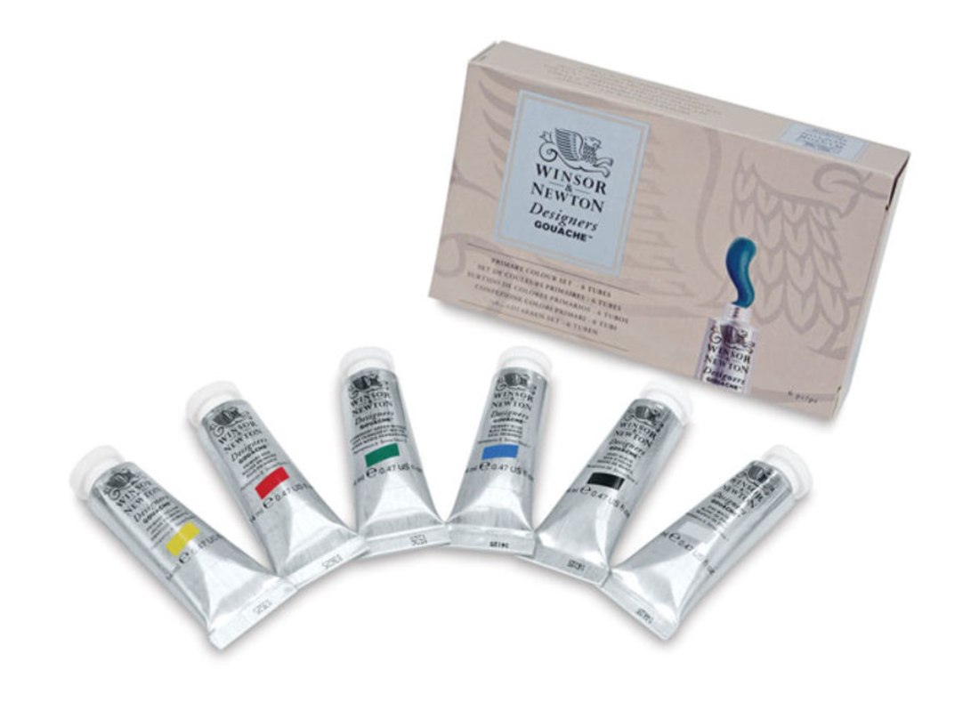
Winsor & Newton's Designer's Gouache Set of 6 Colors
|
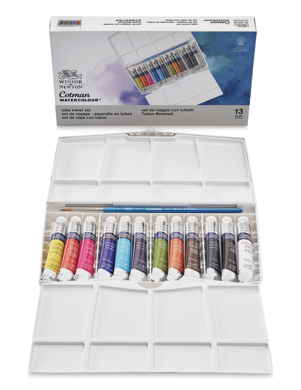
Winsor & Newton's Cotman 12 Tube Set
|
Even though watercolor and gouache can work very well together, to create balanced and visually striking artworks, it's essential to have in mind a few things that will ensure we're playing to each of their strengths.
We want the two mediums to complement and enhance the other harmoniously, and develop a sense of contrast that will create visual interest.
Tip 1. Use watercolor first and gouache second
As previously explained, gouache is the opaque sister of watercolor. Because gouache will easily cover up watercolor, but not the other way around, it's essential to plan out which areas to paint in with each medium. Gouache is the most dominant of the two and you want to make sure that it doesn't overtake the areas painted with watercolor.
Watercolor is delicate and provides a transparent glow, while gouache is punchy and solid. By giving thought to how you'll combine them, you'll allow each to shine in its own way and create a more interesting, balanced piece.
Give thought to how you can complement them, depending on the subject you'll be painting.
It’s a good idea to start your painting with a watercolor base, which is particularly helpful if you've created a preliminary sketch underneath as you'll still be able to see it through the watercolor layer(s).
Another idea is to use watercolor to create a warm or cool underpainting for your gouache to build upon. You can also create a background using watercolors that will then be added to with gouache. Finally, you can start with a wash of watercolor to simply break up the dreaded white space.
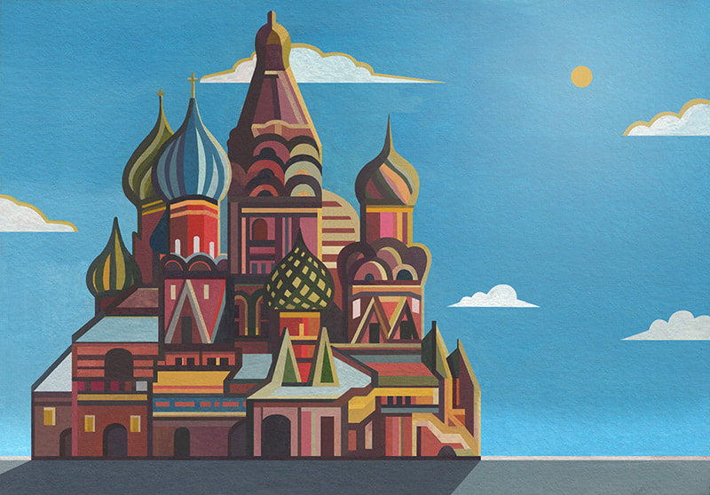
St. Basil Cathedral. Illustration by Haydn Symons. Click on image to check out more of his work!
Tip 2. Create depth by using a higher color saturation and level of detail in the foreground
The characteristics of these painting mediums can be combined to create an amazing sense of depth in a piece!
If you’re painting a landscape, for example, you can create depth by painting the sky using watercolor and your foreground elements in gouache. Because gouache is thicker and more opaque than watercolor, it will add a bold, sharp punch to closer elements, creating the illusion of these being closer to the viewer.
Because elements further away from us are usually blurry and less saturated in color, adding further details to our foreground elements using gouache can really enhance the sense of depth in a piece.
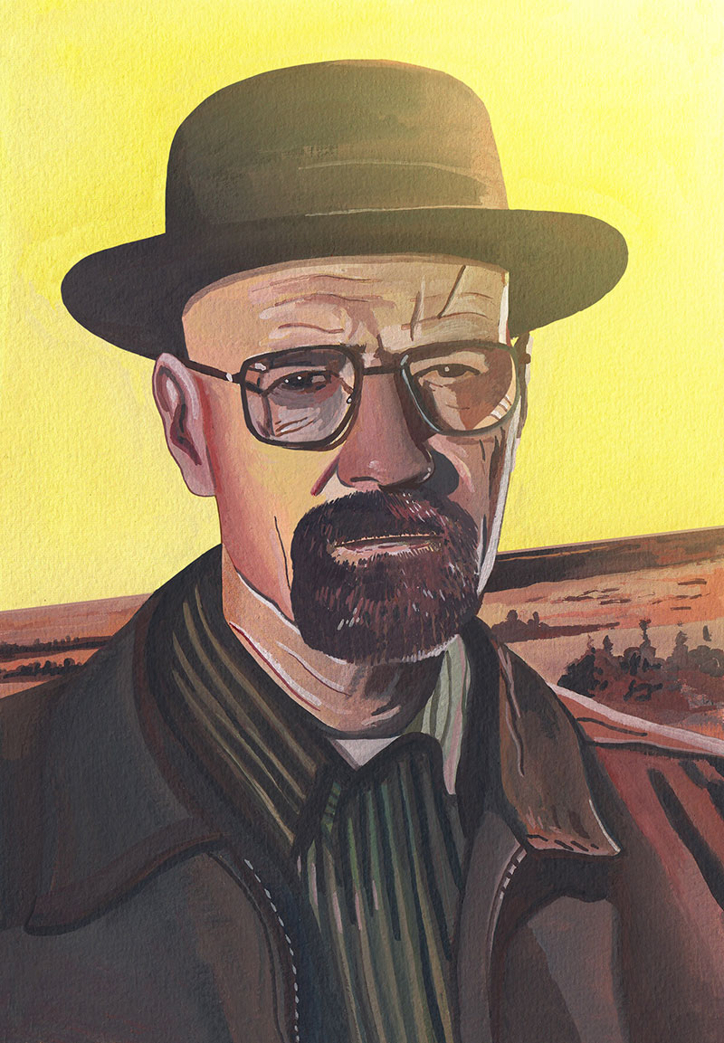
Walter White. Illustration by Haydn Symons. Click on image to check out more of his work!
Tip 3. Use thick watercolor paper or canvas
Because you’ll be using water throughout the painting process, working on thick watercolor paper or watercolor canvas is essential. Using thin, non-suitable paper will make the painting process difficult, as it will warp easily.
I enjoy using Seawhite’s Watercolor Paper in 350 gsm to create my illustrations, whether that be for commissioned work or personal work. Whether you choose to go for this brand or others, I highly recommend using paper that is at least 300 gsm in thickness.
Another alternative is painting directly onto watercolor canvas, as this paper is already pre-stretched and will not result in warping and buckling.
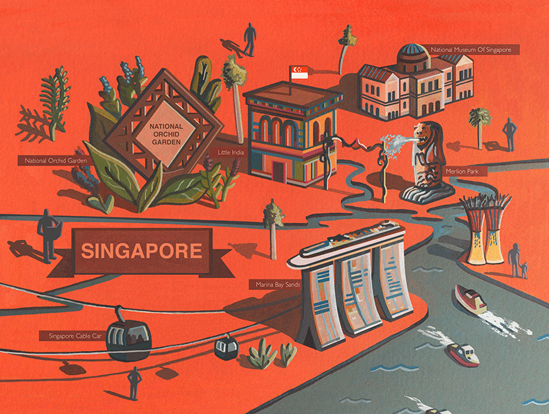
Singapore Map. Illustration by Haydn Symons. Click on image to check out more of his work!
*Bonus Tip: Use plenty of water when creating watercolor paint mixtures, but leave gouache mixtures thick and undiluted
One of the major errors that I have come across when combining these two mediums is making them fight against each other by adding too much water to both.
To ensure we're creating a balanced outcome (and to make the painting process go much smoothly), use plenty of water within the watercolor mixtures and only a bit in the gouache mixtures. This will allow the two mediums' contrasting characteristics of translucency vs. opaqueness to really stand out and contrast with each other, creating a ton of visual interest.
Finally, make sure to have fun!
I hope you've enjoyed this blog post to help you create stunning artworks combining watercolor and gouache, and encourage you to give it a go!
Remember to have fun! When creating art we can get bogged down with advice and technicalities, and loose the whole essence of what makes art so enjoyable.
Keep practicing and you'll be onto a winner!
Cheers!
For a list of my favorite art supplies and books, go here.
How have you tried combining these two painting mediums yourself? Are there any tips you’d like to share?
Haydn and I would love to hear from you in the comments section below.
A huge thanks to Haydn, for being so generous and sharing all of this useful information with us! He’s definitely inspired me to combine these two painting mediums more in my own work!
To find out more about more about Haydn and his work, visit his website/portfolio at www.haydnsymons.com
Also, follow Haydn on social media:
Instagram: https://www.instagram.com/haydnsymons/
Twitter: https://twitter.com/haydnsym
Facebook: https://www.facebook.com/haydnsymonsillustration


www.erikalancaster.com
is a participant in the Amazon Services LLC Associates Program, an affiliate advertising program designed to provide a means for sites
to earn advertising fees by advertising and linking to amazon.com.
www.erikalancaster.com
is a participant in the Shareasale.com Affiliate Program, an affiliate advertising program designed to provide a means for sites to earn advertising fees by advertising and linking to Shareasale.com partner companies.
 RSS Feed
