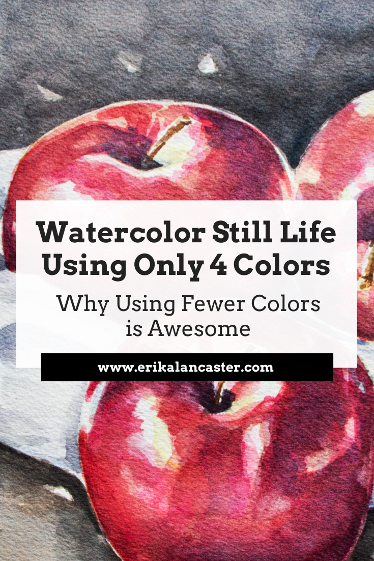
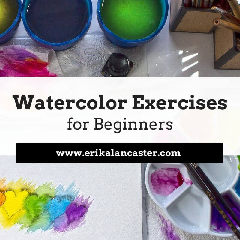
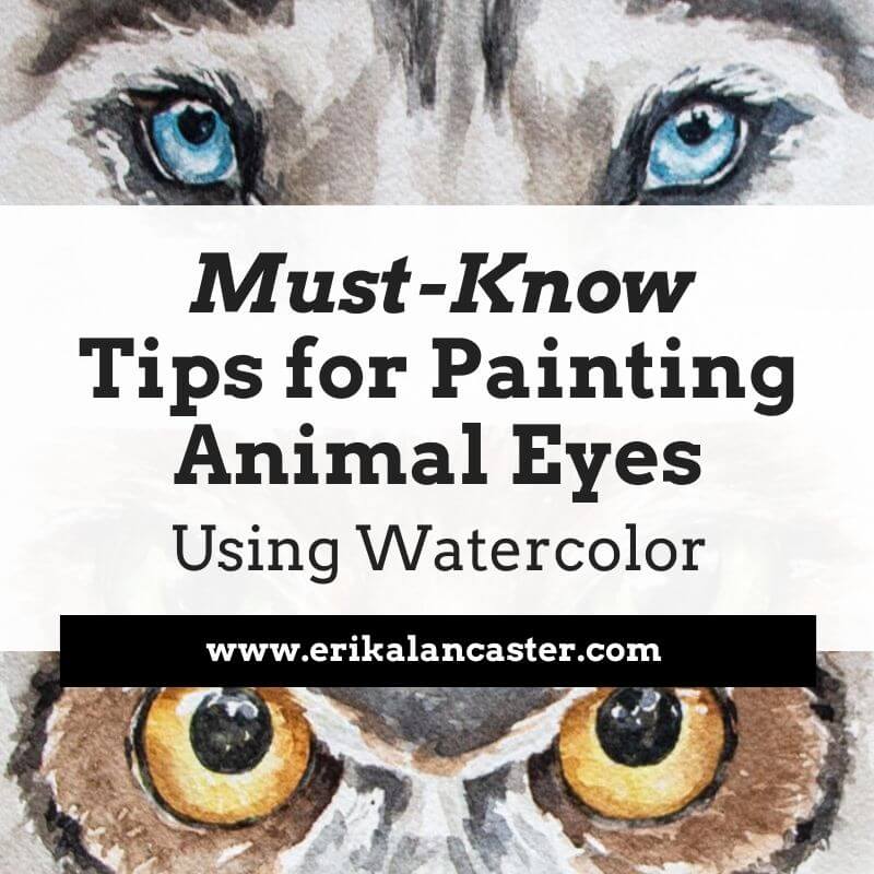
*This post contains affiliate links. I receive small commissions for purchases made through these links at no extra cost to you. These commissions help me keep this site up and running, in order for me to keep providing helpful and inspiring art content. :) How do artists choose the colors they'll be using for a new watercolor painting? What can I do to keep my color mixtures better organized on my mixing palette throughout the painting process and steer clear of accidentally creating mud? Why is it important to invest time in planning the colors we'll be using before starting a new painting? In this blog post, I'll be sharing three reasons why I love using a limited amount of colors (usually 3-7) to create my watercolor paintings and how this practice has helped me make deeper, faster progress as a painter. Color is an Element of Art that plays a huge role in making a visual composition look harmonious and cohesive. As with all other Art Fundamentals, use of color is something that most skilled artists continue learning about and improving upon throughout their journeys. It's absolutely essential for the beginner starting with any kind of painting medium, to learn about Color Theory and the Color Wheel, as this knowledge enables us to not only create successful color mixtures throughout the painting process, but also to plan great color schemes that work for the piece on hand. Because skilled artists know how important color and value are, they take time to prepare for a new piece via the creation of thumbnails, swatching colors, and thinking of how they'll be creating the color mixtures needed for a new painting prior to actually starting. Either this, or they've already prepared a custom color palette to work from that has all of the colors they love and know they're going to need. They know exactly what's going to happen when two or three of those colors get mixed together. Artists know that making time to think about color before starting to paint will enable them to move forward more smoothly and will lead to an outcome that is impactful, harmonious, and also communicates their message more clearly. And how each artist goes about selecting his/her colors is completely dependent on the artist's personal creative process. Artists who are looking for very high-levels of realism often go by specific colors they see in their reference pictures or in the subjects they have in front of them when working from direct observation. They make time to observe and put in the work to ensure their colors/color mixtures match what they actually see. Others work from references loosely and manipulate color to bring a certain level of expression, contrast, etc. into the picture. Sometimes they change specific colors altogether or alter some of them to bring their style in. And others, such as abstract artists, at times start their paintings based on a specific color scheme they found inspiring, designing an entire visual composition around it. Or they create their own color schemes that are meant to transmit a specific message or emotion (putting Color Psychology to use). Of course, there are tried-and-true color schemes that have been used by artists throughout history that will always lead to very visually pleasing results. In lots of Van Gogh's work, you'll see use of Complementary Colors, in Monet's you'll see use of Analogous Colors, etc. Some artists take hours preparing the colors they'll be using for a new painting and others take minutes, but they always bring in their knowledge of the Color Wheel and Color Theory. It doesn't really matter how you do it. The more you paint, the more your own personal style and creative process will become clearer. The point here is to make it a habit to start thinking about color before starting to paint. Color is a huge, complex topic and I believe it's important for beginners to build upon a solid base of knowledge and take their learning a step-at-a-time, as this helps avoid overwhelm and keeps their art journey enjoyable. This will help them stay consistent, which is key in making significant artistic progress.
If you enjoyed this video and found it helpful, make sure to subscribe to my YouTube channel. I share a brand new video every week with art tips, drawing and painting tutorials and mindset/productivity tips for artists. *Subscribe HERE*
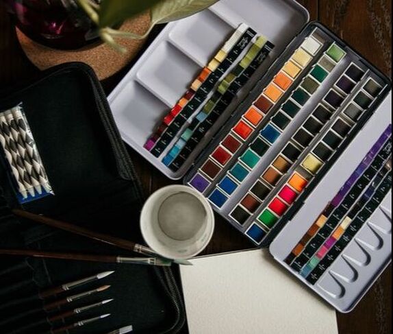
You'll find a list of my favorite watercolor supplies here. 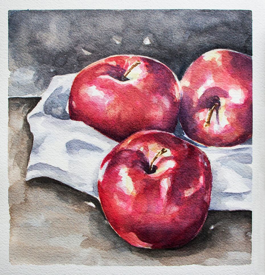
3 Reasons Why Limited Color Schemes Are AwesomeEven as a more experienced painter, I absolutely love using limited color schemes because of the points I'm going to be sharing next. This said, keeping things simple can do wonders for beginners and can help them make much faster progress than being drowned and overwhelmed with a wide array of different colors, and even paper and paintbrushes. *We're not getting into paper and paintbrushes today, but I highly recommend checking out my blog post titled Watercolor Supplies for Beginners and Things You Must Know if you'd like more in-depth information on watercolor painting supplies. 1. They help us get comfortable with color mixing By taking time to plan and prepare a limited amount of colors, we'll be putting our knowledge of color to the test, as this forces us to give thought to how we'll be creating our different color mixtures with the least amount of colors possible. A couple of quick examples of how to work with a less amount of colors: -If you've already selected a yellow and a red for a new painting, and all of the sudden realize you're going to need an orange color, why not use a mixture of your yellow and red instead of reaching for an orange? -If you've already selected your Ultramarine Blue and your Burnt Umber for certain areas of your painting, why not use a mixture of these two to create your dark gray, instead of reaching for another gray? In my many years teaching art, I've found lots of beginners are afraid to mix their own colors and are looking for instructors to provide very specific "recipes" and even color-to-color ratios for their mixtures. Also, lots of beginners feel they need the specific color that the artist in the tutorial they are following is using. By learning about the Color Wheel, Color Temperature, etc., and making time to play with color (intentionally of course), they'd be able to create any needed color without much guidance at all. Make time to learn the basics. Don't skip over them because they'll improve everything you choose to do in the future. Make time to explore and get comfortable with your medium, before attempting to create a polished masterpiece. As beginners, it's important to keep things simple. Most often than not, keeping things intentionally limited will help us make faster progress than jumping between a bunch of different things and overwhelming ourselves with lots of supplies. 2. They lead to harmonious paintings When we're just getting started, most of us are anxious to begin with the painting process. We tend to skip over any sort of preparation and move forward randomly picking colors. I did this when I was first getting started in my painting journey and was so confused as to why my paintings always ended up looking amateurish and incohesive. Unless we have a very colorful art style or are going for this look intentionally, randomly picking colors throughout the painting process is a surefire way of ending up with a painting that is very overwhelming to look at or that is "all-over-the-place" in terms of the message it's transmitting to the viewer. By limiting our colors and repeating colors as we're creating our different paint mixtures, we'll end up with much more harmonious results. Our color mixtures look like they belong together and are working in unison to transmit one same message. It's similar to the "Mother Color" method that some artists working with oils and acrylics use to unify and provide color harmony in their paintings. What they do is choose one color to be the "Mother", which is going to be added (in a small degree) to every color mixture. This makes the different colors look like they belong together. All part of one same "whole". And this is what we want when we're designing a visual composition. We want the different parts to work together as one "whole". The "Mother Color" method doesn't quite apply the same way when we're working with watercolor, as the color mixing process when using this medium is a lot more organic and free-flowing. We're constantly shifting color ratios, paint to water ratios, etc. as we move along, but the principle of re-using the same colors in our different color mixtures in order to unify the overall outcome still applies. Give thought to how you can use this idea in your own work to both make your paintings more cohesive and also to transmit your message/emotion/idea in a more powerful way. 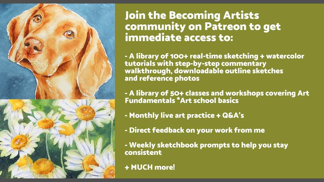
3. They help us stay organized throughout the painting process When working with watercolor, it can be very easy for our colors to start mixing together due to the amount of water we're using throughout the process, which can certainly be frustrating! *This paint mixing palette has certainly helped me in this department. Loosing control of our color mixtures on our paint mixing palettes can lead to creating mud (brownish/grayish/desaturated colors that we weren't actually going for). By having made the time to actually test out our color mixtures on scrap pieces of watercolor paper prior to starting with the painting process, we'll be avoiding undesired colors. Also, by limiting the amount of colors we're using and knowing exactly which colors we're using throughout our painting (at least in loose terms), we'll be making things a lot easier for ourselves along the way. It takes out all of the guesswork as we'll know exactly which color to reach for whenever we need to create more of any specific mixture. I don't know about you, but it's very easy for me to start accidentally dipping my paintbrush into a paint pan I wasn't intending to use during the painting process (especially when I'm using a larger paint set that includes several different blues, reds, browns, etc.). To make things easier for myself, I often love removing the paint pans I have selected from my watercolor set and only have those with me as I'm working. Over on Patreon, I share step-by-step watercolor painting tutorials in which I explain everything, starting from how I select my paint colors and create my color mixtures, to how I develop my color, values and details in layers.
I hope you found this post helpful, and wish you tons of progress and enjoyment in your artistic journey!
10 Comments
*This post contains affiliate links. I receive small commissions for purchases made through these links at no extra cost to you. These commissions help me keep this site up and running, in order for me to keep providing helpful and inspiring art content. :)
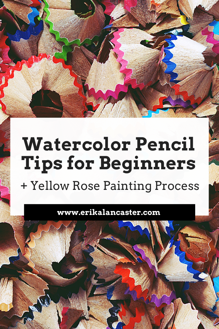
Is there a specific process to follow when using watercolor pencils? What things should I do to ensure a better outcome when using this medium? What are some good watercolor pencil options for beginners just getting started? In this blog post, I'll be providing five key tips that will help make the learning process less frustrating and enable you to create amazing artwork as soon as possible. In the video included here, I'll also be sharing how I personally use watercolor pencils by painting a yellow rose. Watercolor pencils are not only an extremely versatile art medium, as they are simultaneously a drawing and a painting tool, but their practicality makes them ideal for many beginners that are short on time and space. They also allow for much more control when compared to regular watercolor paint and can help us start getting a feel for what it's like to work with watercolors without having to master water control. Watercolor pencils are basically watercolor pigment that has been encased in wood, in the form of a pencil. They can and can be used either with or without water to create different effects, which can range from a heavily-textured colored pencil look, to a smooth and painterly watercolor paint look. To create marks and colored pencil textures, we simply use them right on our paper, which can be completely bone dry or pre-wetted with clean water. Of course, the type of paper used has a great impact on the amount of texture created. Smoother paper will lead to smoother effects, while rougher paper will create more texturized effects, as the pigment isn't evenly distributed throughout the tooth of the paper. On the other hand, to create painterly effects, we lay down our color on our paper just as if we were using regular colored pencils and then smooth it out by going in with a dampened paintbrush. There's no need to use heaps of water for this. *You can also use the paper paint mixing palette method I demonstrate in the video included below. When using quality watercolor pencils, water really activates the pigment and makes the color look a lot brighter and bolder. These techniques can be used alone or in combination. For example, if you were painting a landscape, you could use more painterly techniques for your background, and more textured/detailing techniques for layers in your foreground. There is no specific process to follow when using this medium. It's use is going to depend on the specific style and effects you are personally going for with the piece on hand, which is why it's important to give thought to the overall look you want to create before starting. All this said, many of the regular watercolor "rules" (if they can even be called rules) apply. In the following video you'll see how, even though my general method is different to what I would do when I paint with regular watercolor paint, I still protect my highlights throughout the process, work from light and translucent to dark and saturated, and allow my paper to dry in between layers. In this past blog post/YouTube video, I do a comparison between regular watercolor paint and watercolor pencils, and share a complete demo in which I paint the same apple using both mediums. They are very similar, but very different at the same time.
If you enjoyed this video and found it helpful, make sure to subscribe to my YouTube channel. I share a brand new video every week with art tips, drawing and painting tutorials and mindset/productivity tips for artists. *Subscribe HERE*
Find a list of my favorite watercolor pencil supplies here. Watercolor Pencil Tips for Beginners
|

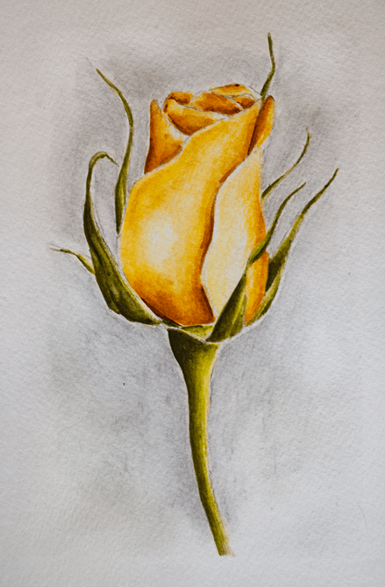
Watercolor Pencil Rose by Erika Lancaster
|
|
|
Why is it that abstract art looks so easy to do and when I try my hand at it, I always end up disappointed with my results? How can I become looser and more expressive when painting with watercolor? Does one have to prepare before starting a painting that's more on the abstract side of the art spectrum?
When I first saw abstract artists at work, back when I was very young, I remember thinking just how easy it must be to create that kind of painting (or drawing).
I saw how intuitively and spontaneously they moved along the process, and concluded there was no prep work involved or specific process to follow.
I wasn't entirely wrong.
However, the thing I failed to realize back then is, those artists that seemed to be creating magic on canvas in a matter of minutes and without any struggle at all, had a ton of knowledge about art and Art Fundamentals, and had full control over their preferred mediums.
They had already devoted lots of time to learning, exploring, messing up and finding their voice to the point that they could now easily express emotions and ideas via marks, colors, shapes and textures.
They had full knowledge of Elements and Principles of Art, and were masters at choosing color schemes, creating interesting and balanced compositions, harmony, contrast, and everything that makes an artwork look impactful, cohesive and have the ability to effectively communicate an idea or emotion.
Because they had already gained a certain level of mastery through their first-hand experience, they were able to move through the creative process with confidence and ease.
And confidence, in my opinion, is key to abstracts as it's what truly allows us to let go and be able to work more intuitively.
Not to mention, these artists had already gone through the long process of finding themselves artistically and preparing their specific tools (and colors) of choice. They know the message they want to transmit and how they want to transmit it.
So yes, they may be going along the creation of an abstract painting intuitively now, and they may or may not have prepared or practiced before starting a specific piece (this depends on each artist's creative process), but they have years of practice under their belts.
When we're just getting started (and we're serious about improving our skills), it's important to realize that there is a lot to learn and that we need to explore and practice first-handedly consistently and intentionally, in order to make the progress we're after.
As I shared in my past blog post, 5 Tips for the (Serious) Self-Taught Artist, learning about Art Fundamentals can make the biggest different in your artistic journey.
Not only in your ability to create original and impactful drawings or paintings, but also in your ability to analyze and talk about art. This knowledge helps you communicate your ideas about your work, and the work of others, which is so important when your goal is to become a professional artist.
By learning about Art Fundamentals and applying this knowledge consciously in the beginning, as well as taking a few minutes to do a bit of planning prior to starting a new piece (whether it's abstract or not), you'll develop your eye for composition and later be able to tell if something works or not, pretty darn fast.
Not to mention, knowledge of Art Fundamentals is what allows us to create original and visually pleasing artworks from scratch, all on our own, and without having to constantly rely on inspiration from other artists.
This means you won't have to spend hours scrolling Instagram or Pinterest until you arrive at something that you want to replicate, because you'll have the ability to take ideas you already have inside of you and turn them into an actual visual composition.
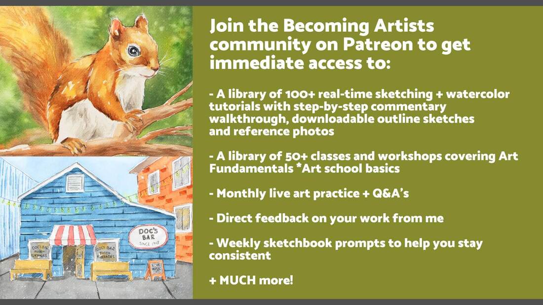
Join the Becoming Artists community on Patreon for live classes on Art Fundamentals, exclusive real-time drawing and watercolor tutorials that I don't share anywhere else (complete with downloadables), sketchbook prompts sent to you every week designed to help you stay consistent, feedback from me on your work and much more!
Next. I'll be sharing three key tips that will help ensure a much smoother process and a more effective outcome when creating looser watercolor paintings.
If you enjoyed this video and found it helpful, make sure to subscribe to my YouTube channel. I share a brand new video every week with art tips, drawing and painting tutorials and mindset/productivity tips for artists. *Subscribe HERE*
3 Tips for Beautiful Watercolor Abstracts
1. Plan your colors
Color is an essential part behind making a visual composition (whether simple or complex) look harmonious and cohesive. Because of this, giving thought to what specific colors you'll be using prior to starting with the painting process can be extremely helpful, especially when we're just getting started with painting.
When we're creating an artwork, we have to consider the whole, or the global picture. A composition is meant to be seen in its entirety, which is why artists have to become masters at making use of (and manipulating) the different Elements and Principles of Art so that everything included works together to transmit the message, emotion or mood that they are intending to transmit.
No element included in the piece is an island, as they all interact with each other to communicate the story, message or feeling to the viewer.
Therefore, it's smart to give thought to how the different parts we'll be including in our artwork will be working in conjunction, prior to starting with the painting process.
In relation to color, it's also helpful to remember that the way we see each hue is affected by the colors around it.
Randomly picking colors throughout the painting process is a huge no-no, especially when we're just starting on our painting journeys. This will often result in struggling with muddy colors throughout the process, as well as finished products that don't look cohesive.
Have in mind that, when we come across a video online where we're seeing a pro who knows color and has been painting for a long time, they've already most likely prepared specific colors on their palettes that they love and know will work well for the mixtures they'll be needing.
In other words, they've already prepared their colors and aren't working with a color set that has been pre-made for them.
They also know the color wheel like the back of their hand. This knowledge enables them to not only create color mixtures effectively, but also select color schemes that look integrated and impactful, and know exactly which colors to reach out for (or stay away from) when a new color mixture is needed.
Something I love doing when preparing for a new piece is to think about the overall mood I want it to transmit to the viewer and how I can play with color to enhance my focal points, as well as create a sense of contrast to really make my painting pop.
*Most of my viewers over on YouTube also know that I love keeping things simple and using a limited amount of colors when painting.
Keeping things as simple as possible, and limiting the amount of colors that I'll be using, allows me to stay better organized throughout the process, which keeps muddy colors at bay, and leads to my paintings looking a lot more unified at the end.
You can find a list of my favorite watercolor painting supplies here.
2. Give thought to your compositional arrangement
Though many abstract artists make this work seem easy, something important to understand as beginners is that an impactful, harmonious and balanced composition rarely happens by accident.
As an outsider looking in, it might look like what skilled abstract artists are doing is completely free-flowing and spontaneous.
However, as I mentioned before, they have the knowledge and skills they need to create impactful work almost unconsciously and have the confidence that allows them to trust in their tools and in their own decisions/movements.
It's incredibly helpful, for both beginners as well as more experienced artists, to sketch out a few quick thumbnails to roughly plan the location of focal point(s), as well as the balance that will be created between positive and negative spaces (areas which contain the subjects vs. empty areas), before getting started with the painting process.
If you're using a reference photo, give thought to cropping and manipulating the size of different elements included, as well as removing those which may be detracting from the focal point or the balance you're looking to create.
By learning about Art Fundamentals you'll become knowledgable on how to play with Elements of Art in order to manipulate their characteristics, as well as their placement within your space, to pull the viewers' attention towards your focal point(s) and keep their eyes moving throughout the piece.

Not to mention, you'll also be able to stay away from making your drawings or paintings too overwhelming, which can be a huge problem when creating abstract art.
Two "rules" or guides that I learned in art school which really helped me develop my eye for balanced yet interesting compositions, were the Rule of Thirds and the 60/40 (or 70/30) Rule (also referred to as the "Less is More" rule).
The Rule of Thirds is used by photographers and even cinematographers all the time, and it helps us create interesting, asymmetrically balanced artwork that transmits a story.
Using it is very simple. We basically divide our space into 9 equal squares or rectangles using horizontal and vertical lines and, using this grid, we decide the location of our focal point, as well as the placement of the secondary and tertiary elements.
The Rule of Thirds tells us to never place our focal point right in the center of our space, or within the center of any of the squares or rectangles. It tells us to pick one of the points where the horizontal or vertical lines intersect (see red dots in image below). We can also place our focal elements along one of the lines.
This guideline helps us create visual compositions that keep the viewer's eyes moving throughout the piece, instead of staying stagnant, which we definitely want to stay away from.
It's not completely black and white, and you'll be able to find many examples of masterpieces created throughout history in which the Rule of Thirds has been deliberately used, and other in which it's used a bit more loosely.
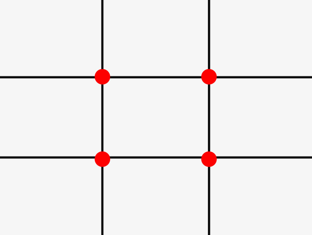
The Rule of Thirds Grid.
To learn more about Art Fundamentals directly from me in an easy and sequential way, join us on Patreon! You'll get immediate access to all of my exclusive drawing/watercolor painting tutorials (2 new ones get shared each month), as well as live Q&A's and tons of resources I don't share anywhere else.
Check out this beautiful painting created by Renoir in 1873. The viewer's attention immediately gets called towards the lady in the white dress.
The artist not only placed the focal point along one of the lines in the Rule of Thirds grid, but also emphasized the main subject by creating contrast using color and value, as well as rendering higher levels of detail within her when compared to the elements around her. We get a sense of this lady being directly hit by sunlight, while everything else in her proximity is in shadows.
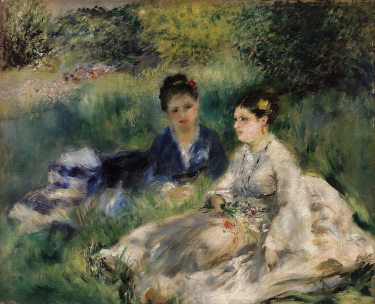
On the Grass by Pierre-Auguste Renoir (1873)
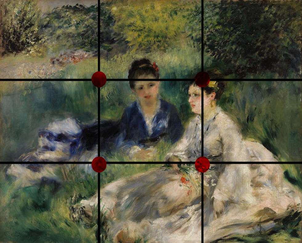
On the Grass by Pierre-Auguste Renoir (1873) with Rule of Thirds grid.
Now check out this painting created by Van Gogh in 1888. He's also made use of this same idea when he decided to place the group of boats off-center and closer to the left side.
The viewer's attention not only gets immediately pulled towards the red boat (which falls right in the intersection where one of the vertical and horizontal lines meet in the grid), but our eyes then keep traveling towards the boats behind it, and then to the boats that are heading out towards the horizon.
In this piece, though, the horizon line was placed almost halfway down the composition, which is what the Rule of Thirds tells us to stay away from. This nearly perfect central placement of the horizon line usually "cuts" landscapes right in half, when we're usually looking asymmetrical balance.
However, this piece has so much movement and depth created by the placement of elements in the foreground, middleground and background, and such an interesting overall use of Principles of Art, that the horizon line doesn't really take away from it.
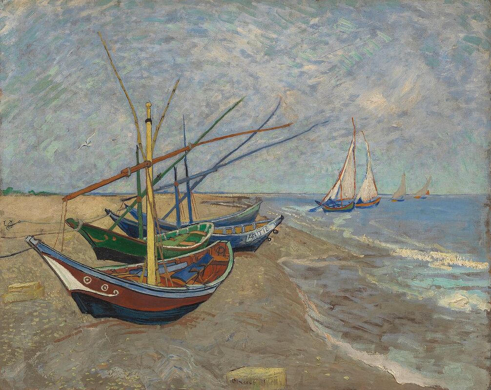
Fishing Boats on the Beach at Les Saintes-Maries-de-la-Mer by Vincent van Gogh (1888)
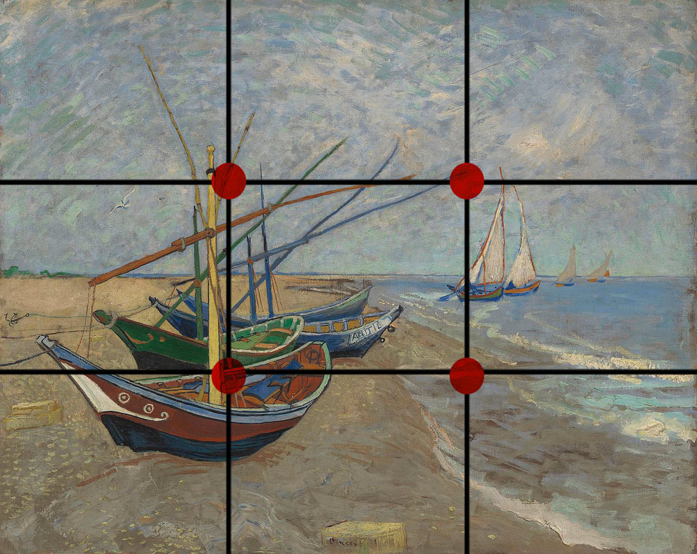
Fishing Boats on the Beach at Les Saintes-Maries-de-la-Mer by Vincent van Gogh (1888) with Rule of Thirds grid.
The 60/40 or 70/30 Rule basically tells us that the areas of interest (or our focal points) should take up a much smaller amount of space than areas of lower interest. It also propels us to think about how we're going to be making use of different Principles of Art inside our areas of interest when compared to outside of them, in order to create contrast, bring attention to our focal point, and transmit our message more clearly.
I don't know about you, but when I'm creating an abstract piece, I find it really easy to go overboard and start adding more and more (paint, marks, etc.) to the point that the focal point is lost and I end up with a painting that is overwhelming for the viewer.
This is a big no-no, unless of course, this is intentionally the style your going for.
I suggest taking breaks and stepping back from your work every few minutes and, once again, observing the global picture.
Think about whether more is truly necessary.
These two "rules" are by no means the only way to go about creating an artwork or the only helpful guidelines that exist out there, but they really helped me develop my eye for composition, as well as my knowledge on what goes behind creating a successful artwork when I was first getting started.
For more on Composition pertaining to abstract art, check out this awesome video shared by artist David M. Kessler over at his YouTube channel.
3. Think about how you'll be doing your layering (especially if you're using mixed media)
What makes so many abstract pieces so appealing is the richness artists are able to achieve via their layering processes, which I suggest giving thought to whether you're only using one medium to create your piece (the way I did with watercolor in the video included above), or are combining a variety of mediums.
This will not only ensure a better outcome, but will also help your piece last a lot longer in good condition.
Depending on the mediums that you're using, you'll want to do research and even do quick explorations to see if your initial layers will directly affect both the look and durability of the layers you place on top, and vice versa.
You'll want to look into factors such as drying times between layers and final varnishing, as well.
As opposed to representational art, in which a large part of the story or message is told via instantly recognizable subjects, abstract artists make use of the Elements of Art in their purest form (color, shape, line, texture, etc.).
Playing around with how to layer these different elements, as well as defining what tools, mediums and/or techniques will be used throughout different parts of the process, we'll be able to create a much more impactful piece.
Not to mention, we'll be able to keep some level of organization in our chaos. :)
Keep in mind that an interesting and impactful composition usually has some sort of play between less and more, dark and light, etc. There are many ways in which we can create contrast, including making use of light vs. dark values, cool vs. warm colors, small vs. large sizes, heavy vs. light visual or tactile textures, highly detailed vs. less detailed, etc.
*Bonus Tip: Just keep moving!
Once you've started with the painting process, don't allow yourself to stay stuck in one place. Move past small mistakes and embrace imperfection!
Trust in the plan and prep work you've done and keep moving forward. This quicker pace of working will lead to much more expressive results.
If you don't feel ready to start on the actual piece that's meant to be finalized, warm up with smaller explorations! This never fails to help me, no matter what I'm doing.
A while back I shared a blog post titled 5 Tips to Loosen Up and Create More Expressive Art which contains helpful tips that I apply myself.
I hope this blog post was helpful! If you have any questions or tips to share, make sure to leave a comment below.
Thanks so much for reading!
Thanks so much for reading!

*This post contains affiliate links. I receive small commissions for purchases made through these links at no extra cost to you. These commissions help me keep this site up and running, in order for me to keep providing helpful and inspiring art content. :)
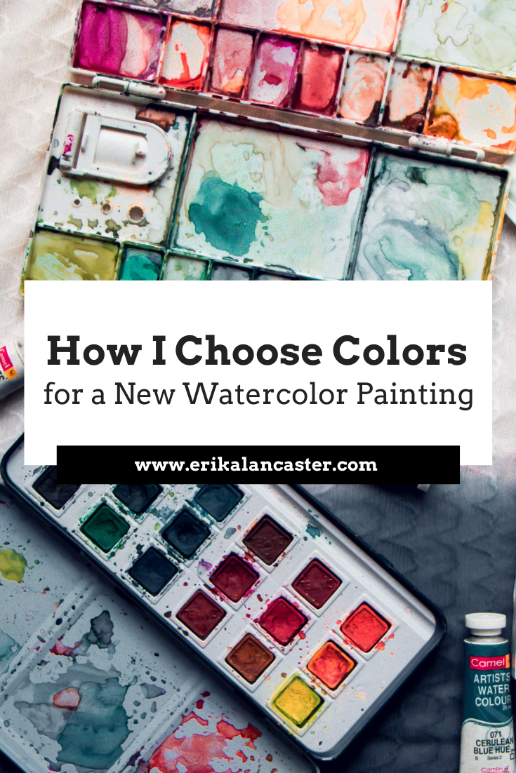
Why is it important to plan colors before starting a painting? How is a limited color palette useful? How will learning about the Color Wheel help us create more successful and professional-looking artwork?
In the video included within this blog post, I'll be sharing how I go about selecting my colors prior to starting a new piece. I'll share my thinking process as I go through this method and will be offering lots of tips pertaining to color.
In past blog posts and YouTube videos, I have mentioned how color is an essential Element of Art to learn about as a beginner artist.
The reason?
When we're looking to create a visual composition, we have to think about how different parts fit together into a whole.
And color plays a huge role in making a visual composition look harmonious and cohesive.
When it comes to a visual composition, all individual elements are connected. Each one has an effect over how we perceive the elements around it.
And just like how you wouldn't throw on an outfit with a ton of different colors and textures that don't mesh well together, you have to think about how things will look like in a painting when appreciated as a whole.
It's not about one element in the piece, but how the different elements included intermix to effectively transmit the idea or message we're trying to get across.
It's incredibly important that any beginner artist who is serious about improving their painting makes time to learn about the Color Wheel.
This is an incredibly important tool that allows us to understand relationships between colors so that we're not only able to create effective color mixtures during the painting process, but also prepare color schemes that work well.
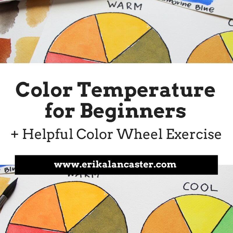
Here's a free class on Color Temperature in which I share a powerful exercise for beginners.
Limiting the amount of colors that you use in a painting is also very useful because the more colors you use, the more disorganized your palette will be, the more likely color mixtures will lead to mud, and the more incoherent the end-results.
Whatever you do, stay away from randomly selecting colors during the painting process and dedicate at least a bit of time to plan for your painting. I promise you, there's much more of a chance that you'll end up with great results.
Why is it important to plan colors before starting a painting? How is a limited color palette useful? How will learning about the Color Wheel help us create more successful and professional-looking artwork?
In the video included within this blog post, I'll be sharing how I go about selecting my colors prior to starting a new piece. I'll share my thinking process as I go through this method and will be offering lots of tips pertaining to color.
In past blog posts and YouTube videos, I have mentioned how color is an essential Element of Art to learn about as a beginner artist.
The reason?
When we're looking to create a visual composition, we have to think about how different parts fit together into a whole.
And color plays a huge role in making a visual composition look harmonious and cohesive.
When it comes to a visual composition, all individual elements are connected. Each one has an effect over how we perceive the elements around it.
And just like how you wouldn't throw on an outfit with a ton of different colors and textures that don't mesh well together, you have to think about how things will look like in a painting when appreciated as a whole.
It's not about one element in the piece, but how the different elements included intermix to effectively transmit the idea or message we're trying to get across.
It's incredibly important that any beginner artist who is serious about improving their painting makes time to learn about the Color Wheel.
This is an incredibly important tool that allows us to understand relationships between colors so that we're not only able to create effective color mixtures during the painting process, but also prepare color schemes that work well.
Here's a free class on Color Temperature in which I share a powerful exercise for beginners.
Limiting the amount of colors that you use in a painting is also very useful because the more colors you use, the more disorganized your palette will be, the more likely color mixtures will lead to mud, and the more incoherent the end-results.
Whatever you do, stay away from randomly selecting colors during the painting process and dedicate at least a bit of time to plan for your painting. I promise you, there's much more of a chance that you'll end up with great results.
If you enjoyed this video and found it helpful, make sure to subscribe to my YouTube channel. I share a brand new video every week with art tips, drawing and painting tutorials and mindset/productivity tips for artists. *Subscribe HERE*
You'll be able to find a list of my favorite watercolor supplies here.
You'll be able to find a list of my favorite watercolor supplies here.

|
|
*This post contains affiliate links. I receive small commissions for purchases made through these links at no extra cost to you. These commissions help me keep this site up and running, in order for me to keep providing helpful and inspiring art content. :)
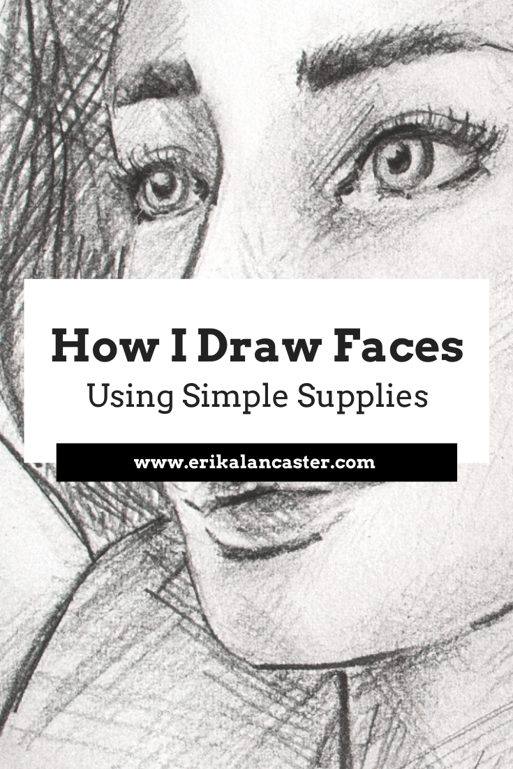
Do you need fancy supplies to progress your drawing skills and create the artwork you'd like to share with the world? How does one go about drawing a believable face? Why is keeping a sketching habit important for artists of all kinds?
In the time lapse video included within this blog post I share my entire face drawing process, starting with creating the head shape, moving onto laying down guidelines to help with the effective placement of facial features, sketching in individual elements and finishing up by adding quick shading using a combination of hatching and crosshatching.
Drawing believable portraits (and any part of the human figure) is challenging, as it requires us to not only have decent drawing skills to be able to render form/three-dimensionality as well as different textures like hair and skin, but it also entails having a good amount of knowledge on proportion.
You see, faces are probably what we see most as human beings. Due to this, even non-artists are usually able to tell when something looks off, even though they may not know exactly where the error is.
In this YouTube video, I take you step-by-step, through drawing a simple, forwards-facing portrait and explain basic facial proportions. *This is, in my opinion, an essential place for beginners to start.
In my blog post, How to Draw Faces at a 3/4's Angle-My 4 Step Process, I get into starting to understand the head shape as a three-dimensional form, why it's useful to understand the underlying structure of the face (the human skull), and take you through drawing a portrait at an angle.
Though I primarily sell my paintings, I'm a huge sketching fan. I consider drawing to be the basis for all kinds of art and really believe in keeping a sketchbook habit. Even quicker sketches created consistently will help keep your observation sharp and continue progressing your artistic skills.
Not to mention, sketching is also incredibly practical as we don't really need much besides drawing paper, a few different pencil grades and an eraser. There's no need to take out your painting supplies and go through your whole set-up if you're short on time.
If you enjoyed this video and found it helpful, make sure to subscribe to my YouTube channel. I share a brand new video every week with art tips, drawing and painting tutorials and mindset/productivity tips for artists. *Subscribe HERE*
If you're not new to my blog posts or videos, you're probably already aware that I'm a huge fan of keeping it simple when it comes to art supplies. I'm a big fan of artists who are able to create amazing work using basic, and even limited, tools.
There's no need for anything fancy in order to make immense progress in your drawing skills.
The supplies below are what I usually have on hand when I'm drawing or sketching. *I'm not a big fan of kneaded erasers and have replaced them entirely with my Mono Zero eraser that I acquire via Amazon. I use blending stumps only when I'm creating more realistic drawings such as the one in this video.
I hope you enjoyed this post and learned something new, or got inspired to go and create a sketch for yourself.
I wish you tons of progress and enjoyment in your artistic journey! :)
I wish you tons of progress and enjoyment in your artistic journey! :)


www.erikalancaster.com
is a participant in the Amazon Services LLC Associates Program, an affiliate advertising program designed to provide a means for sites
to earn advertising fees by advertising and linking to amazon.com.
www.erikalancaster.com
is a participant in the Shareasale.com Affiliate Program, an affiliate advertising program designed to provide a means for sites to earn advertising fees by advertising and linking to Shareasale.com partner companies.
 RSS Feed
