*This post contains affiliate links. I receive small commissions for purchases made through these links at no extra cost to you. These commissions help me keep this site up and running, in order for me to keep providing helpful and inspiring art content. :)
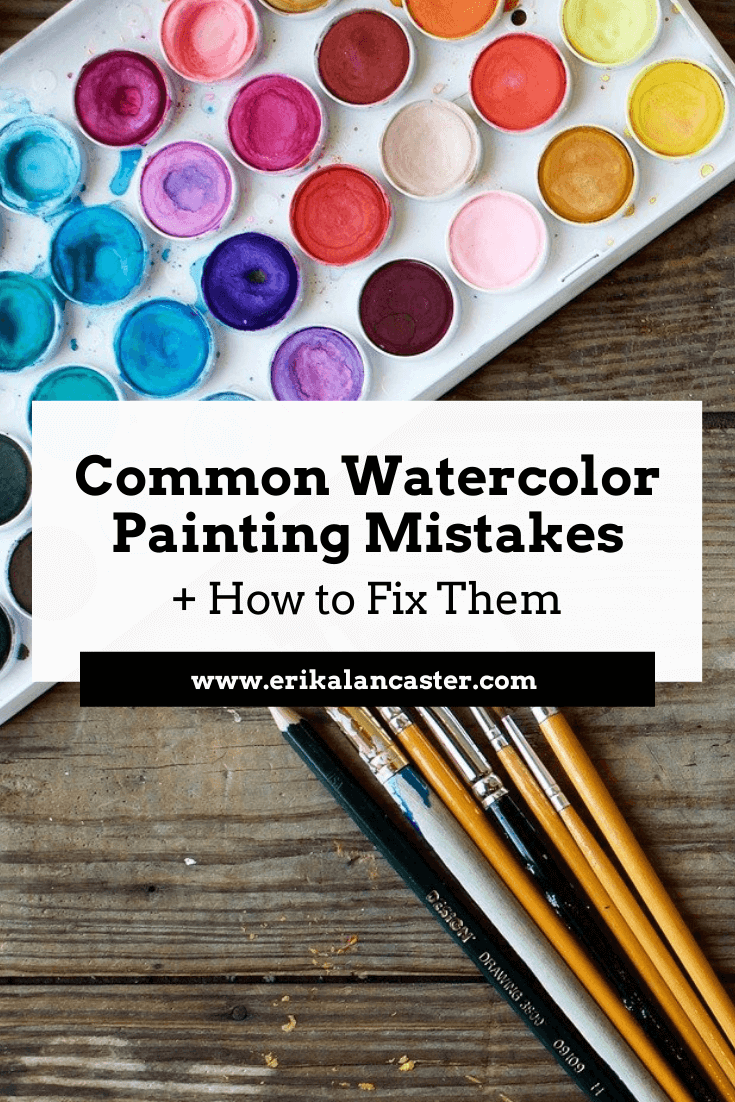
Do you feel like you're constantly fighting against your supplies when painting with watercolors? Feel like a failure after every single little mistake you make throughout your painting process? Do you frequently end up frustrated with yourself and throw away more paintings than you actually keep? In today's post, I'll be sharing five common watercolor painting mistakes and what I personally do to fix them or avoid them altogether. By making use of these tips and tricks, you'll end up with a painting that is going to have way more positives than negatives. When using watercolors, we cannot just simply cover up our mistakes with a new layer of paint. This artistic medium requires us to be much more mindful and delicate, even, right from the start of the painting process. I use several different kinds of paint for my own work and when I make the switch to watercolors, it helps me to remember that I'm using this medium's transparency, in combination with the whiteness of my paper, to produce a wide range of values. I am not covering up my substrate and layering paint, as I would with oils or acrylics, but using my paper in itself as my lightest value. This is what's going to help create watercolors' distinctive "glowing" effect. There's way more of a chance that you'll produce a great watercolor painting if you do, at least, a bit of planning before starting, and are able to remain patient throughout the process. It's also essential that you are aware of this medium's characteristics and have practiced basic exercises before jumping into a more complex subject. I highly recommend reading my blog post titled 10 Things I Wish I Knew Before Starting With Watercolors if you're just getting started. All this said, it's important to know that you don't have to get frustrated with yourself and throw away a painting every-single-time you've made a mistake. If you're mistake is small (which it should be if you're staying focused throughout the process), there most likely will be a way to make it less noticeable. There are also specific things you can do to avoid these mistakes in the first place! For the time-lapse video included in this post, I painted a subject that I knew would be extra challenging for me and would allow me to demonstrate how I approach my mistakes on a real project. Though I knew that my painting wasn't going to be "perfect" when that first mistake happened, I was determined to push through, and I'm happy I did. I learned a lot from it and will apply this knowledge in future paintings. 
Watercolor Cougar by Erika Lancaster. Schmincke watercolors on Fabriano 140 lb. watercolor paper.
|
||||||||||||||||||||||||||||||||||||||||||||||||||||||
|
|
|
|
Five Ways to Avoid or Fix Watercolor Mistakes
It's important to understand that no mistake will be completely erased with any of these techniques. What you're trying to do is make them less noticeable, so that they don't distract from the great areas of your painting.
Mistake #1: Accidentally covering up your lightest areas (highlights)
How to avoid this:
Make sure that you take time to plan and decide how you'll be protecting your lightest areas before starting with the painting process. You can do this by either creating a "map" for yourself (drawing small shapes around these areas using a pencil) and very carefully working around them as you're painting.
If you're painting a very complex subject with very small areas you want to protect, I recommend using masking fluid, as I did to protect the whiskers of this cougar.
To learn everything you need to know about using masking fluid with watercolors, visit my blog post titled Using Masking Fluid with Watercolors: Everything You Need to Know.
How to fix it:
Use the lifting technique to remove some of the pigment from your paper. If your paint is still wet, simply take your rag or paper towel and gently blot your paper with up and down motions (not sideways as this will damage the paper).
If your paint is already dry, no problem! As long as you're using decent quality watercolor paint, they can be reactivated by re-wetting them. All you have to do is rinse your brush well, remove excess water from its bristles and do gentle circular scrubbing motions in the area.
Don't go back in with too much water, though, and stay mindful about not damaging your paper.
Remember that the more wet your paper is, the more fragile it is. So once you've removed all you can, just let it go and allow the area to dry.
*It's important to know that different colors are going to have different staining qualities on your paper, and that the quality/type of paper you're using will affect the outcome of this technique.
*Also, the thicker the paper you're working on, the more scrubbing and lifting it will allow without you damaging it. These techniques won't work well if you're using lightweight paper. I love working on paper that's 140 lbs. and thicker.

Mistake #2: Laying down too much dark paint in the beginning stages or creating flat/stark looking shapes or lines
How to avoid this:
Remember that a good watercolor piece requires patience. Take your painting one-step-at-a-time and always start with light, translucent values and work your way towards darker darks incrementally.
Look at your reference and add your darkest values only where you actually see them (usually even these areas have somewhat of a variation in color and translucency in them in order to avoid flatness).
Generally speaking, you want to keep very dark/saturated colors only in the areas that really require them and make use of the medium's translucent qualities.
How to fix it:
Went a bit crazy laying down way too heavily pigmented paint mixture in a larger area (or sooner) than intended? Don't fret! Use the lifting technique described in the previous point using your rag to gently blot the area while it's still wet or use your clean, damp brush to do some scrubbing.
Be gentle while you remove as much pigment as possible and allow to dry before attempting to do anything else in that area.
You can also use the pulling/spreading technique in order to dissipate the concentrated pigment into a larger area. Of course, you don't want to spread that pigment into areas that are meant to be white or affect other colors you've already placed, so be careful.
I've found, dissipating that stark line or edge into a gradient really helps remove that flatness that we've mistakenly created. Do what you can and leave it. Move on to work on other areas of your painting.
Later on, when the area is completely dry, you can go back in and make any overworked areas less noticeable by adding more paint carefully and playing around with values/washes.
Mistake #3: Bleeding colors (when you didn't plan for them)
How to avoid this:
It's really essential for you to know the different effects that watercolors allow and when to use different techniques. I wouldn't recommend moving onto a complex piece if you haven't practiced simple exercises that will allow you to know your medium's characteristics.
Essentially, when you place a paint mixture on a previously wetted paper, it will expand/bleed/intermix. This is referred to as the wet-on-wet technique and will lead to a blurred-out effect that you, most likely, do not want in some areas of your painting.
Before starting with your painting process, give thought to what areas you want blurred out, and which you want more definition in. The more defined you want an area, the more important it is for you to wait for the previous layer of paint to dry before applying more paint on top.
How to fix this:
Gently blot your paper with your paper towel immediately when this intermixing starts happening in order to prevent it from expanding more. Allow it to dry completely.
If the mistake is small and the color left behind is faint, chances are you will be able to add more definition to the area with subsequent layers once it's dry.
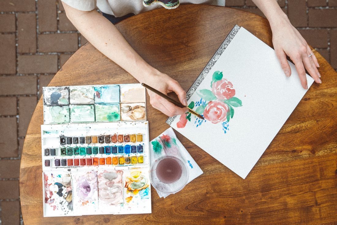
Photo courtesy of Unsplash.com. Click on image to visit original site.
Mistake #4: Creating muddy colors
Check out this blog post that I specifically created to help avoid this issue!
How to avoid this:
The very best thing you can do in order to avoid muddy colors to begin with, is to take time to test and experiment how the pigments you're planning to use mix together. Before starting to paint, give thought to the color palette needed for your composition. Plan the exact colors you'll be using, and keep your palette limited (5-6 colors usually works for me).
I cannot paint without my scrap piece of watercolor paper beside me that allows me to constantly test out color mixtures and transparencies throughout the process.
Know and understand the Color Wheel and the relationships between colors. Explore Analogous and Complementary colors, and decide how you want to approach deepening color values and creating shadow effects.
Take time to do exercises before even attempting to paint a complex subject or else you'll end up frustrating yourself more than you need to.
In the third class of my free Watercolor for the Total Beginner Mini-Course, I walk you through several color mixing exercises, which you'll find extremely useful!
*Don't mix more than 3 different colors together, unless you know what you're doing.
How to fix this:
If you've mistakenly laid down a muddy color on your paper, try to absorb what you can while it's still wet and allow the area to dry. There are some cases in which adding a light wash of a brighter color on top, will make the mistake less noticeable.
Mistake #5: Overworking or damaging your watercolor paper
How to avoid this:
If you're anything like me and you enjoy using techniques like scrubbing, lifting and layering, buy decent quality paper that's at least medium weight or thicker (140 lbs. and heavier). I personally cannot work on thin, flimsy paper.
However, even when using thick, quality paper, it's essential to learn when to stop and allow your paper to dry. The more experience you gain, the faster you'll be able to recognize when your paper needs time to recoup!
In the video included here, you'll notice I jump around a lot. If I do something I don't like, I absorb/lift what I can, and leave it. I work somewhere else and come back to that area to fix it later. I do not obsess over imperfections and move on with the process.
How to fix this:
Damaged paper simply cannot be fixed (unless you want to cut that part off). Of all the mistakes mentioned in this post, this is probably the deadliest, so stay mindful throughout the process so it never gets to this point.
Try not to get to obsessive over your mistakes, take a learning experience for what it is, and move on with the work you can do.
To finish up this post, I want to encourage you to not get frustrated over small mistakes. There is a certain beauty behind imperfection, and what you should be striving for with each piece is progress.
Trying to chase perfection with every single drawing or painting you create is probably going to end up hindering you and not allowing you to move forward as fast as you could.
Thanks so much for reading!

34 Comments
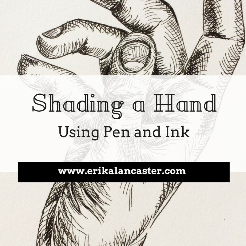
Shading Objects Using Hatching, Crosshatching, Scribbling, and Other Drawing Pen Techniques
7/11/2018
*This post contains affiliate links. I receive small commissions for purchases made through these links at no extra cost to you. These commissions help me keep this site up and running, in order for me to keep providing helpful and inspiring art content. :)
Do you love the look of pen and ink drawings that demonstrate hatching, crosshatching, and other mark-making techniques, and need a bit of guidance to start putting them to use in your own work? How does one go about using the visual information taken in from a reference photograph and translate it into a pen and ink sketch that demonstrates three-dimensionality?
In order to start adding a sense of believable form to a sketch, it's essential to understand how to create a variety in values using the art medium at hand. It's also very important that we practice taking in the visual information presented to us through either photographs or real-life subjects, so that we're able to describe form effectively through drawing.
Using pen and ink can be intimidating at first due to the fact that it's permanent and we need to use mark-making techniques to create different values. There is a large variety of mark-making methods and they all lead to very different results.
In today's post, I will be sharing the process that I go through when creating pen and ink sketches of objects using photographic references. I will be walking you through each step, from the selection of a great photograph, to preparing an initial pencil sketch, to actually filling that sketch in with ink marks.
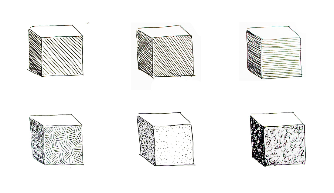
I will be exploring six different mark-making techniques so that you're able to see how the outcomes compare to each other.
In my previous blog post titled Pen and Ink Sketching: 6 Shading Techniques, I gave a thorough explanation of each of the six techniques I'll be using here today.
I focused on how to go about creating marks successfully using each, and provided essential exercises for beginners to start off with, including how to actually use them to start adding shading and form to an outline drawing of a cube.
If you're a beginner just starting out with pen and ink, I highly recommend checking my previous post out. Both that post and this one include free downloadable pdfs that you can print out at home and practice with.
*Find these free downloadables at the end!
If you enjoyed this video and found it helpful, make sure to subscribe to my YouTube channel. I share a brand new video every week with art tips, drawing and painting tutorials and mindset/productivity tips for artists. *Subscribe HERE*
My Process When Creating Pen and Ink Studies Using Photographic References
1. Preparing our supplies
To create the kind of pen and ink studies we're going to be exploring today, I usually like having the following supplies on hand:
-Pencil (preferably H or HB)
-Soft eraser
-Drawing/sketching paper or Bristol board
-Drawing pens (.3 and .5 points) *Two of my favorite brands are LePen and Micron!
|
|
|
|
|
|
|
2. Warming up
I enjoy warming up my hand by practicing the marks I will be using in my studies on a scrap piece of paper. If you're a beginner just starting with pen and ink and you're setting out to sketch an object in a way that actually transmits form, I suggest practicing value strips as well (there is a pdf at the end of the post that you can use to practice with).
It's absolutely essential that you understand how to create a variety in values using marks when it comes to sketching with a drawing pen, especially if you're looking to add believable structure and form to a drawing.
Practicing different types of marks to shade a simple geometric shape.
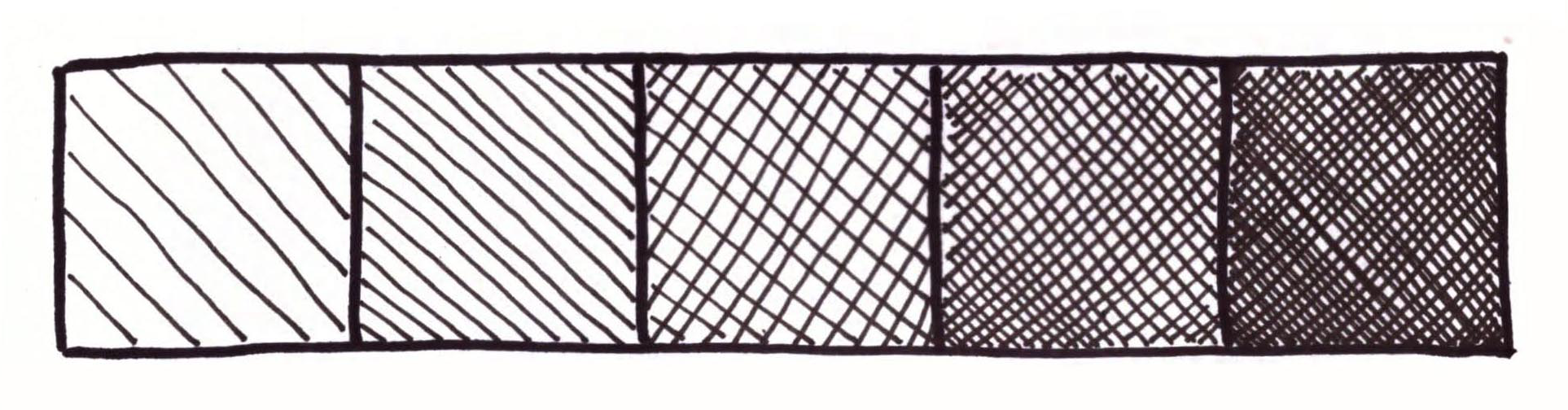
Value strip showing hatching and crosshatching.
3. Choosing a great reference photo
When searching for a photograph to use as reference for any kind of art study, there are a few things you have to keep in mind. First, make sure that its contents are suited for your current skill level, especially when you are exploring a new medium.
This way, you'll be able to focus more on the new medium or technique. Aside from this, you must select a photograph that is high quality.
When I am choosing a photograph to work from, I make sure that it has a great resolution that will allow me to zoom in to view details as needed.
Photographs should also have great lighting, which means that they are not over or underexposed, and that there is a good range of values/balance between lights and darks.
If you have trouble discerning between light, mid-tone and dark areas, I highly recommend looking for photographs with a single light source and possibly opening up your image in an image-editing software like Photoshop to desaturate it.
Keep practicing this, because it's imperative that you gain practice doing this so that you're able to render values and place them accordingly when you're trying to make your drawings more believable.
To find more free, quality photographs to practice with, visit my post titled My Favorite Free Image Sites and Two Examples of References with Finished Illustrations!
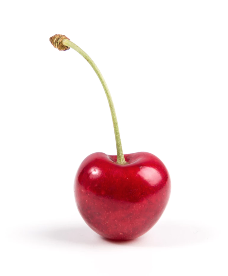
Photo by Thomas Quaritsch from unsplash.com. Click on link to visit site and download for your studies.
|
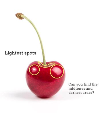
Photo showing lightest areas.
|
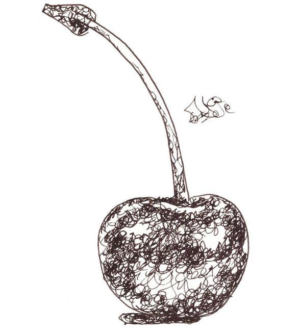
4. Creating an initial outline sketch (and lightest values map)
Once I have taken a moment to observe my reference picture and have pinpointed lightest and darkest areas, as well as mid-tones, it's time to create my initial pencil sketch!
This will entail creating a simple outline drawing of my object, paying attention to proportion and location of separate elements in regards to each other.
Also, at this point I also create a "map" for myself that will remind me where my lightest areas are located, so that I can protect them and leave them untouched by any marks. You can make this "map" as detailed as you'd like if you feel that creating more shapes with your pencil will help you throughout the mark-making process.
If you'd like to skip the outline drawing phase of this study and jump straight onto the ink mark-making, you can download either the large single cherry outline pdf or the six cherry outline pdf so you can practice all of the mentioned techniques!
Both of these free downloadable worksheets can be found at the end of this blog post.

5. Laying down initial layer of marks
First, I outline my initial pencil sketch (minus the smaller "map" shapes) using my drawing pen. Then, similarly to my watercolor painting process, I leave the lightest lights completely untouched by any ink and start adding in my first layer of ink.
What I like to do with these faster studies, is fill in all my mid-tone to darkest areas simultaneously using light pressure on my pen, making sure to work around my lightest areas.
In other words, by the end of this step, my entire mid-tone and darkest areas already are covered with that first "light" layer of marks.
6. Adding darker values
This is the part of the process that is the most time-consuming, as I work back and forth between mid-tone to darkest areas doing my best to create gradual shifts in value until the desired form is achieved.
Throughout this process, I constantly look at my reference picture.
It's essential to not go overboard by adding too many marks in mid-tone areas, but also to not be scared of going dark where needed (which is usually only in small areas).
Remember that there has there has to be a good range of values within your sketch or you risk "flattening" it out!
At the end, you can outline your sketch using your drawing pen once more if you wish! :)
Comparing Different Mark-Making/Shading Techniques
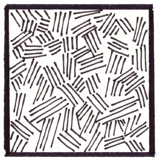
Hatching
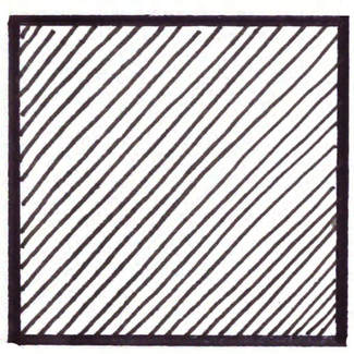
Hatching- Mark-making/ Shading technique
|
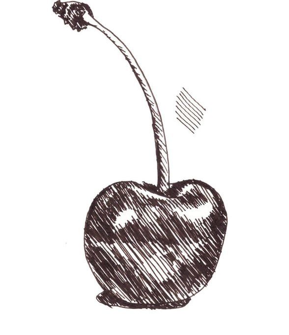
Cherry sketch showing hatching.
|
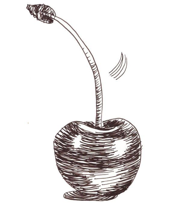
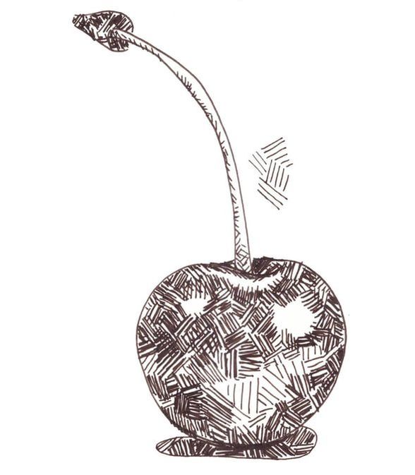
Crosshatching
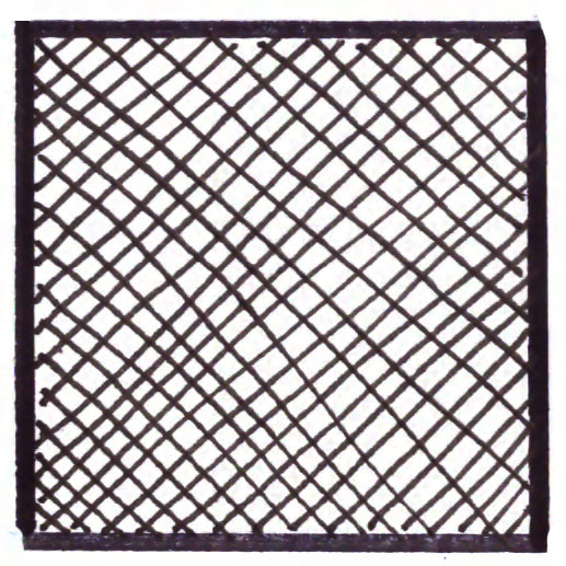
Crosshatching- Mark-making/ Shading technique
|
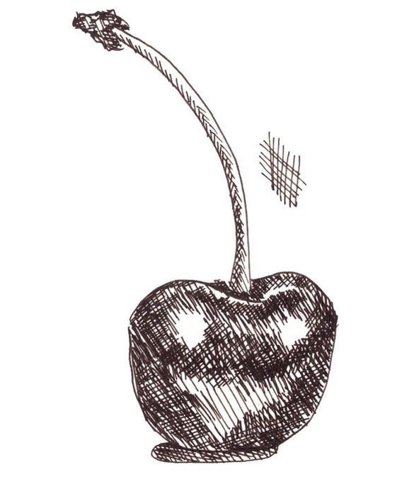
Cherry sketch showing crosshatching.
|
Contour Lines
Contour Lines- Mark-making/ Shading technique
|
Cherry sketch showing contour lines.
|
Weaving
Weaving- Mark-making/ Shading technique
|
Cherry sketch showing weaving.
|
Stippling
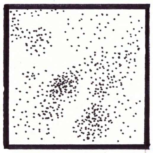
Stippling- Mark-making/ Shading technique
|
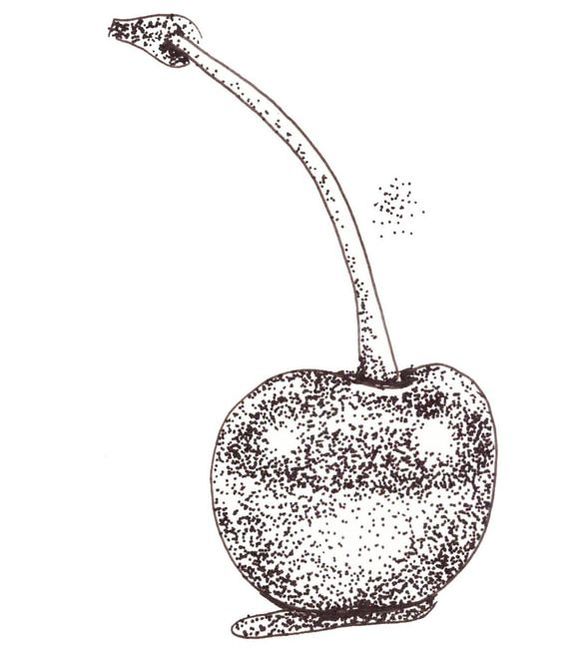
Cherry sketch showing stippling.
|
Scribbling
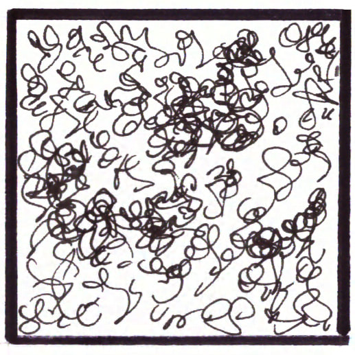
Scribbling- Mark-making/ Shading technique
|
Cherry sketch showing scribbling.
|
I would recommend practicing at least a few different pen and ink mark-making/shading techniques because it's the only way you'll be able to know which ones come more naturally to you, as well as which can best create the effects you're going for.
My personal favorites are hatching/crosshatching and contour lines. I'd love to know which you like best below!
*Free downloadables!
| drawing_marks_lines.pdf |
| value_transitions_shading.pdf |
| cherry_outline_drawing.pdf |
| 6_cherry_outline_drawings.pdf |
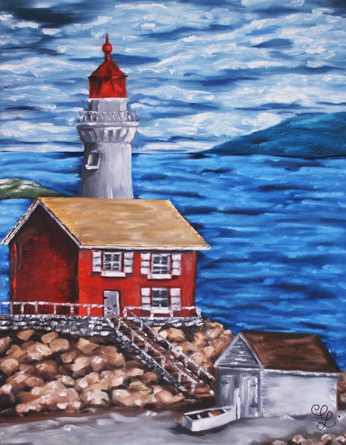
Lighthouse oil painting by Erika Lancaster
*This post contains affiliate links. I receive small commissions for purchases made through these links at no extra cost to you. These commissions help me keep this site up and running, in order for me to keep providing helpful and inspiring art content. :)
Hey, there!
In today's post I'll be sharing my most recent paintings and sketches. I've been working hard on, not only staying consistent with my blog and YouTube channel while teaching art classes locally, but also on producing the work I will be selling as soon as I'm able to open my online shop.
The two oil paintings included in this small compilation are the last two in the collection of five large (90 x 70 cms.) landscape oil paintings that I sought out to create about two months ago. It was a self-imposed challenge as I had never really created a "series" of larger paintings, and I really wanted to push myself to explore one single theme.
This weekend, I'll be starting on a collection of five still life oil paintings that will also be for sale and I'm very excited about that!
Through my online art shop, I'll be selling originals created with both oils and watercolors!
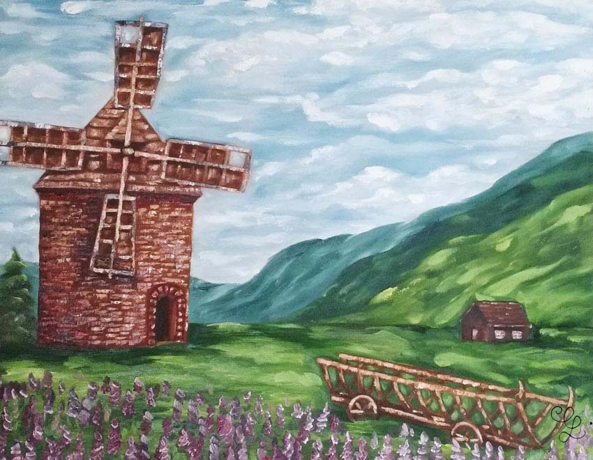
Windmill landscape oil painting by Erika Lancaster
Check out my FREE Patreon-exclusive tutorial and class samples here.
Aside from these two oil paintings, I'm sharing the watercolor illustrations I created for the July calendar I sent out to my e-mail subscribers this week (at the end of each month I send them a calendar for the following month). I really enjoy painting with watercolors and pushing myself to continue improving with this medium.
Aside from using these illustrations as part of the calendar design, I also create awesome products for my Society6 and Redbubble shops with them, which I'd love for you to check out! :)
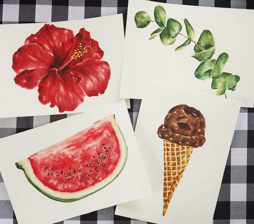
Watercolor illustrations of different objects by Erika Lancaster
And, finally, I'm also including some sketches. I'm always going on about how I find drawing so important, and how it's important for artists to keep drawing throughout their journeys, and I'm holding myself accountable!
I'm continuing to push myself to create human figure studies in more complex/dynamic poses (as opposed to the very stiff and uninteresting poses I drew when I first started). The human figure is a great challenge for me, but I've seen significant progress since I've started drawing it more consistently.
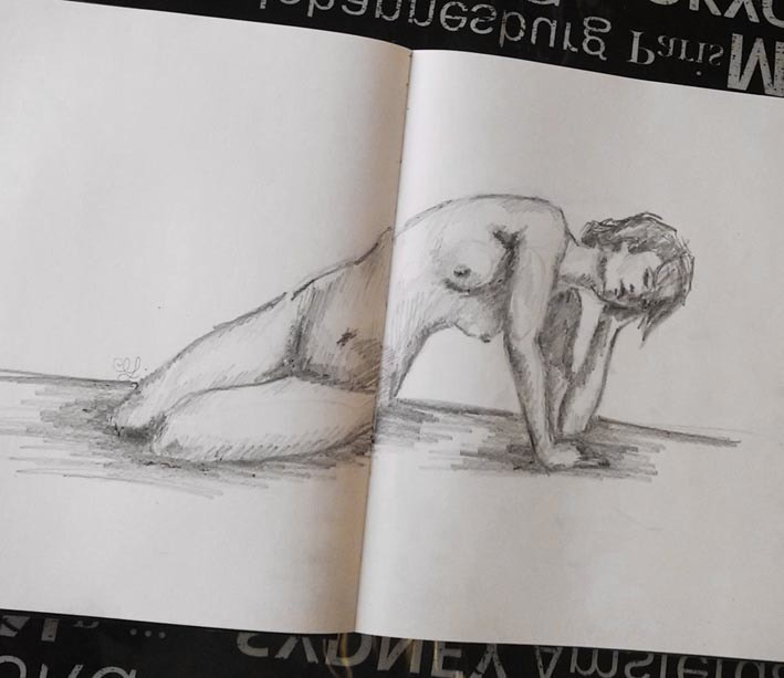
Sketch of female figure by Erika Lancaster
|
|
|
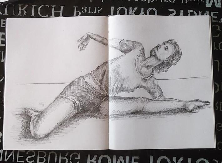
Sketch of female figure by Erika Lancaster

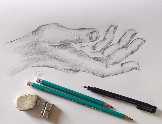
Outstretched hand sketch by Erika Lancaster
Thanks so much for dropping by and checking out my work. I really appreciate it!
And if you're a beginner/intermediate artist looking to improve your skills, make sure to visit my library of free resources. It's jam-packed with helpful tips and tutorials on a variety of different mediums and subjects.
Cheers!
*This post contains affiliate links. I receive small commissions for purchases made through these links at no extra cost to you. These commissions help me keep this site up and running, in order for me to keep providing helpful and inspiring art content. :)
Are you a beginner artist looking to start to sketch on a consistent basis? Do you have a sketchbook or two (or three) laying around, but find that you rarely use them either because you can't find the time or are scared of "ruining" them? Would you like to get past the initial stage of "awkwardness" as quickly as possible, so that you can actually start enjoying your sketching process?
In past blog posts and YouTube videos, I've talked about how I consider drawing to be the basis for all kinds of art. It doesn't really matter what kind of visual artist someone is setting out to become, or what level of skill has already been attained, artists must make sketching a habit and continue with this practice throughout their journeys.
In today's post, I will be sharing the top five tips I wish I knew when I first started sketching. By understanding and practicing these points, you'll be able to progress a lot faster, start enjoying your studies and explorations a lot more, and start filling out entire sketchbooks in no time.
Before moving forward, I want to get a very important message across. I believe that smaller sketches and studies are just as important as larger, more polished pieces that may take days (or even weeks) to complete.
Learning how to get ideas down on paper in a quicker, rougher way, is extremely valuable as an artist.
It was precisely these kinds of smaller, quicker studies that allowed me to progress artistically while holding on to demanding full-time jobs and going through major life changes.
Few of us are fortunate to know, since a very young age, that we want to dedicate our lives to art and become professional artists some day. And an even less percentage of those people who do know, are lucky enough to have the funds necessary to live, while solely working on developing their artistic skills.
If you're one of those lucky people and you have the money/time to explore both smaller and larger pieces simultaneously, by all means go for it!
However, if you have kids, full-time jobs, a house to keep clean, and many other responsibilities, rest assured that these smaller studies are moving you forward, as long as you're making it a point to stay consistent.
Five to six smaller sketches and/or studies a week are going to get you way farther than setting out to create one large masterpiece every five to six months, with no activity in between.
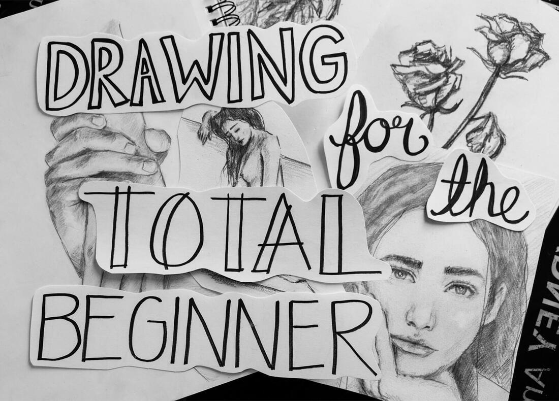
I highly recommend checking out my Drawing for the Total Beginner Mini-Course which you can get access to immediately after joining my art email insider group.
This mini-course is made up of three classes that are jam-packed with all of the information I wish I knew when I was getting started on my own drawing journey. It's contains must-know information about basic drawing supplies, specific exercises and lots more that will provide you direction as to how to move forward. Check it out here.
Are you a beginner artist looking to start to sketch on a consistent basis? Do you have a sketchbook or two (or three) laying around, but find that you rarely use them either because you can't find the time or are scared of "ruining" them? Would you like to get past the initial stage of "awkwardness" as quickly as possible, so that you can actually start enjoying your sketching process?
In past blog posts and YouTube videos, I've talked about how I consider drawing to be the basis for all kinds of art. It doesn't really matter what kind of visual artist someone is setting out to become, or what level of skill has already been attained, artists must make sketching a habit and continue with this practice throughout their journeys.
In today's post, I will be sharing the top five tips I wish I knew when I first started sketching. By understanding and practicing these points, you'll be able to progress a lot faster, start enjoying your studies and explorations a lot more, and start filling out entire sketchbooks in no time.
Before moving forward, I want to get a very important message across. I believe that smaller sketches and studies are just as important as larger, more polished pieces that may take days (or even weeks) to complete.
Learning how to get ideas down on paper in a quicker, rougher way, is extremely valuable as an artist.
It was precisely these kinds of smaller, quicker studies that allowed me to progress artistically while holding on to demanding full-time jobs and going through major life changes.
Few of us are fortunate to know, since a very young age, that we want to dedicate our lives to art and become professional artists some day. And an even less percentage of those people who do know, are lucky enough to have the funds necessary to live, while solely working on developing their artistic skills.
If you're one of those lucky people and you have the money/time to explore both smaller and larger pieces simultaneously, by all means go for it!
However, if you have kids, full-time jobs, a house to keep clean, and many other responsibilities, rest assured that these smaller studies are moving you forward, as long as you're making it a point to stay consistent.
Five to six smaller sketches and/or studies a week are going to get you way farther than setting out to create one large masterpiece every five to six months, with no activity in between.
I highly recommend checking out my Drawing for the Total Beginner Mini-Course which you can get access to immediately after joining my art email insider group.
This mini-course is made up of three classes that are jam-packed with all of the information I wish I knew when I was getting started on my own drawing journey. It's contains must-know information about basic drawing supplies, specific exercises and lots more that will provide you direction as to how to move forward. Check it out here.
If you enjoyed this video and found it helpful, make sure to subscribe to my YouTube channel. I share a brand new video every week with art tips, drawing and painting tutorials and mindset/productivity tips for artists. *Subscribe HERE*
5 Must-Know Sketching Tips
1. Know your tools
As with any other art-related practices, it's ultimately going to be up to you to explore different supplies/techniques so you can arrive at your personal favorites.
However, what you should know is that you can go far with limited and inexpensive supplies. So don't get overwhelmed with the large variety of papers, pencils, erasers, etc. out there, and go for the basics.
For my quicker sketches, I usually like to prepare the following:
a) Three different pencil grades (usually HB, 2B, and 6-8B) *I rarely use the H variety at all!
b) Drawing/sketching paper or sketchbook
c) Soft rubber graphite eraser
d) Basic metallic sharpener
e) Tombow Mono Zero eraser *This has been my favorite eraser to be able to get into smaller areas
These are optional, but useful if you want to start drawing more realistically:
f) Blending stumps or tortillions
g) Kneaded eraser
In terms of paper, it's useful to start noticing how different thicknesses and textures affect your process, as well as the outcome of your drawings.
|
|
|
|
|
|
|
|
2. Start with simplified large shapes and forget about details until later
This is huge! When we're just starting out drawing, we want to get into the details right away and spend hours working on a drawing just to find out that it looks off at the end.
It's absolutely imperative to learn to visualize your subjects (whether your drawing still life, the human figure, a landscape or anything else), as combinations of simple shapes like cubes, cylinders, rectangular prisms, cones, etc.
Learn to tune out all the smaller shapes and intricacies until after effective proportion and placement of individual elements in regards to each other, has been achieved.
I'm serious! Don't even start adding details, textures, shading, or anything of the sort, until your base outline sketch is solid.
I go a lot more in depth about this topic and provide you with several different exercises in my Drawing for the Total Beginner Mini-Course. To get immediate access to it, click on the image below to join my art insider group.
*Free Drawing for the Total Beginner Mini-Course
Once you've gained enough practice creating basic outline drawings, I highly recommend looking into shading techniques that will allow you to start creating a believable sense of three-dimensional form.
I have a very thorough blog post (complete with downloadable exercises) in which I explain hatching, crosshatching, scribbling, and other quick shading techniques that you can read here: Guide to Shading Techniques: Hatching, Crosshatching, Scribbling and Others.
This said, being able to create that preliminary outline sketch that shows effective proportion is first and foremost, in my opinion.
3. Learn how to hold your pencil for drawing purposes
It can take a bit of time for the beginner artist to get comfortable holding a pencil for drawing purposes. This is only natural, as we've been trained to hold pencils and pens a certain way since we started writing.
When we're writing, we need to be able to create neat, legible letters right-off-the bat. On the other hand, when we're drawing, we start by laying down imperfect lines and we refine them along the way (that's what our erasers are for!).
These are two very different activities and we have to make that mental switch necessary to change our approach depending on what it is we're doing.
There are many different ways of holding a pencil for sketching purposes and there isn't one that is necessarily "better" than the next. It's going to depend on what you find most comfortable at each point of the sketching process once you have a bit more drawing practice.
Have in mind you'll usually switch between different hand positions and grips throughout your drawing process. However, generally speaking, you want to position your hand further away from the tip of your pencil.
You also want to move your entire arm as you draw and not only your wrist (as you do when you're writing).
Try to relax and draw loosely! If you're too tense, warm up by drawing different types of lines and shapes. There's absolutely nothing to be nervous about, especially if you start out with light lines that you can easily erase (as you always should).
Always start lightly, and move on to darker values as you refine your sketch.
Have fun with it and throw perfection out the window! Fearing you'll make mistakes and striving for perfection will keep you from creating art, which will keep you from making progress.
Don't ever fear the blank page and, remember, with every sketch you make you'll get better and better.
Here are two different ways that I usually hold my pencil when I'm sketching:
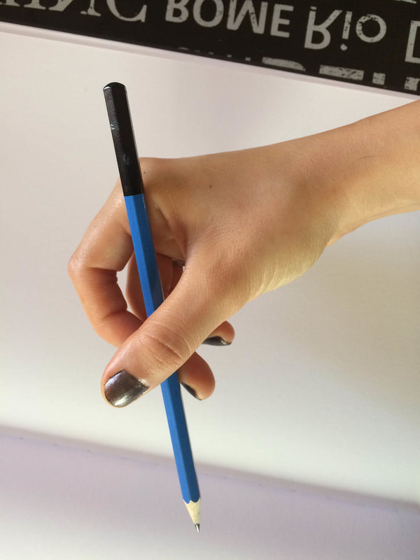
Underhand pencil grip for sketching.
|
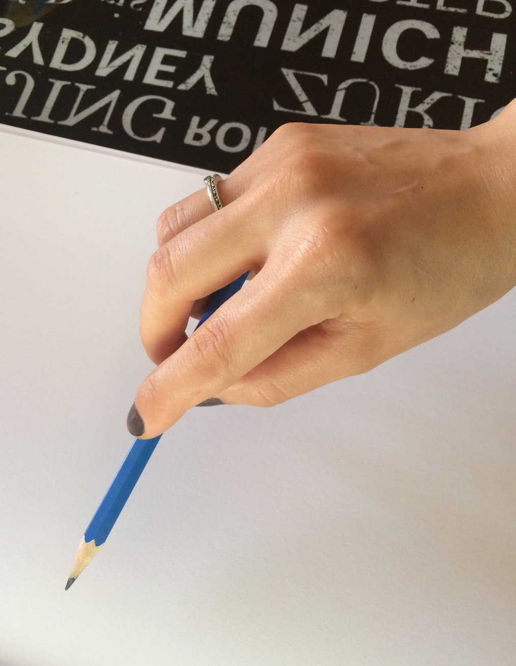
Overhand pencil grip for sketching.
|
4. Develop your observational skills and hand-eye coordination through using references
Drawing from both photographic references, as well as from life, is absolutely essential for progress to occur. Especially when we're looking to develop high levels of realism.
I've written about the use of references when creating art in blog posts before and I think it's absolutely hilarious when people think artists aren't supposed to use references and are supposed to draw or paint everything from imagination.
These types of comments show ignorance on the part of the commenter in terms of how art and creative processes work.
*Note: With "references" I mean either using photographs or drawing from life, not copying a previously made illustration or painting by another artist. Though there is a lot to gain from creating studies of other artists' work, I firmly believe that after having gained basic skills, we'll be making much more progress by creating original artwork from the ground up.
By this, I mean creating our own still life arrangements (or preparing compositions featuring whatever subjects we're interested in) to draw from direct observation, or taking our own photos to work from. We can also use other people's photos, if we have permission to use them of course!
Using references allows us to develop our observational skills and our hand-eye coordination. It's also impossible for the human brain to hold on to all the visual information that a photograph (or seeing something directly) can present to us.
Even if you're intending on developing a cartoonish style in the future, studying how things actually look like in real life, will help enhance your work and make it more effective.
I highly recommend all beginners out there to start working from photographs as soon as possible. We must learn to see.
There are many awesome free image sources online, so there's really no excuse. You can find a list of my favorite free image sites HERE.
Begin forming your own art reference library! Learn what makes a good photograph in terms of lighting and composition, and remind yourself to take photos whenever an opportunity presents itself. Soon enough, you'll have plenty of your own original photos to work from.
Once you've gained some confidence using photographs as references, start incorporating sketching from life into your weekly routines.
I explain why drawing/painting from life is an incredibly important part of an artist's journey and provide ten useful tips to make these exercises less intimidating in this blog post: Why Drawing From Direct Observation is Essential and 10 Tips to Improve
5. Make sketching a habit
Out of the five tips I'm mentioning in this post, getting into the habit of sketching regularly, is probably the most important of all. Oftentimes we make excuses, telling ourselves we don't have enough time to draw.
However, it's a matter of reminding ourselves what's important to us, getting our priorities straight, and setting aside the time.
If you want to get better at anything in life, you have to do it consistently.
As I was mentioning in the introduction of this post, taking even 15-20 minutes a day to sketch will get you far, as long as you make sure to continue.
I highly recommend buying a sketchbook that feels right for you and getting into the habit of taking it along with you throughout your day so that you can use any free pockets of time you may have available.
I hope these tips were useful for you and wish you much progress in your artistic journey!


*This post contains affiliate links. I receive small commissions for purchases made through these links at no extra cost to you. These commissions help me keep this site up and running, in order for me to keep providing helpful and inspiring art content. :)
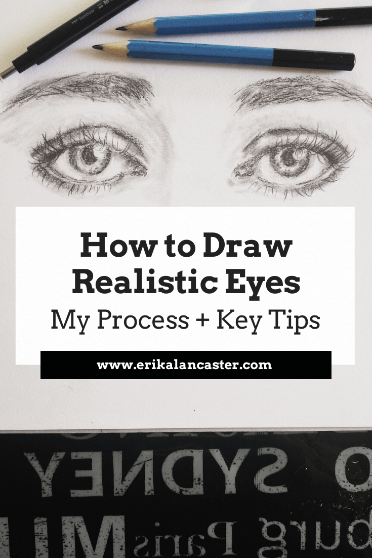
Do you find your eye drawings look slightly "off" and have trouble pinpointing areas of improvement? Have you wondered what you can do to make your drawings of facial elements look a bit more realistic? Would you like to take your portrait drawings a step further and give them more expression and life?
A lot of artists love drawing eyes (myself included) and this makes total sense! I really believe eyes are the windows to the soul. They play a huge role in portraiture because they have the ability of expressing emotion and the story behind the subject on hand.
In this blog post, I'll be sharing the method I go through when drawing realistic eyes, as well as the key components of eyes that should always be included in order to make them look believable. To finish up, I will also be sharing a few essential tips to have in mind whenever attempting to draw anything realistically.
Drawing portraits, or any individual facial element, is difficult and requires practice. We are used to seeing faces day-in-and-day-out, which makes us highly susceptive to noticing mistakes in a portrait drawing or painting.
Even if a non-artist wasn't able to decipher where the error is located specifically, he/she will most likely know that something doesn't look quite right.
This makes it essential for us, as artists, to study facial features in isolation and understand their structures and proportions, as well as their appropriate location within the head area.
This knowledge, together with an effective rendering of values, is what will make a portrait (or facial elements) look believable.
I highly recommend checking out this past blog post in which I explain why studying facial features individually will help you improve your portraits and what I personally do to study them:
Improve Your Portrait Artwork By Doing This One Thing
Also, learn about how and when it's okay to use other people's photographs as art references in this blog post:
When and How to Use Other People's Photographs to Create Art
Realistic eye drawings by Erika Lancaster. Sketchbook studies.
If you enjoyed this video and found it helpful, make sure to subscribe to my YouTube channel. I share a brand new video every week with art tips, drawing and painting tutorials and mindset/productivity tips for artists. *Subscribe HERE*

How to Draw Realistic Eyes
You will need:
-Pencils (HB, 2B, 6-8B)
-Eraser stick or kneaded eraser
-Regular rubber lead eraser
-Sharpener
-Blending stump
-Drawing paper (sketchbook or Bristol board)
*Optional: Ruler
|
|
|
|
|
|
|
|
Drawing Process:
1. Start with a great, high-quality photo reference
When attempting to draw anything realistically, it's extremely important to use a great photographic reference (unless you're drawing from life but we will not be getting into this at the moment as this is more of a beginner-oriented tutorial).
Why? Working with a reference allows us to develop our observational skills, which is absolutely key. As artists looking to improve the sense of realism in our work, me must learn to see.
Not to mention, a reference informs us about what the subject actually looks like and reminds us of details that we can easily forget if we didn't have it. These details can make or break our drawings/paintings!
It's important to draw our subject how it actually looks like in real life and not how we think it looks like.
What makes a high-quality photograph?
For the most part, you want to look for pictures that demonstrate good lighting and have a high resolution that allows you to zoom in to clearly see details as needed.
Find a list of my favorite free, quality image sites in my blog post titled:
My Favorite Free Image Sites and Two Examples of References With Finished Illustrations

Reference picture from Pixabay.com. Click on picture to go to original source.
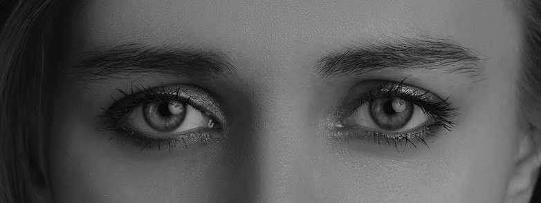
Reference picture cut at close-up of eyes and desaturated for studying purposes.
2. Create your preliminary outline sketch
You want to start out any drawing by creating a light sketch that integrates all necessary elements and demonstrates effective proportion and placement of each of these elements in regards to each other.
For this initial sketch, use your harder-lead pencil (H-HB).
Because achieving adequate proportion and location of individual facial elements is very important when drawing faces, I like creating guidelines for myself in the form of small ticks before actually starting my drawing.
I use a ruler or another tool to measure out sizes and distances as needed, as well as vertical and horizontal lines to keep things in alignment.
After having studied facial proportions, I know that there should be a certain symmetry to eyes and that the width of one eye should be able to fit between the two.
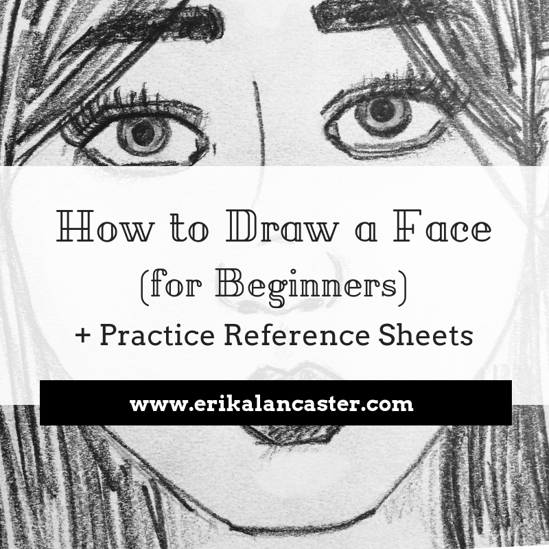
Learn about facial proportions and adequate locations of facial elements in this blog post:
How to Draw a Face (for Beginners)
Though there are many different eye shapes out there, there are certain key parts of eyes that are always at least partially visible and, therefore, you should make sure to integrate them into your drawing.
Though there isn't a set sequence that you must to draw these individual elements in, do make sure to leave your eyelashes until the end!
Always include the following:
a) The shape that represents the visible part of the eyeball
b) The pupil (darkest/blackest part in of the eye)
c) The iris (the part of the eye that contains color) *This part is almost NEVER visible in its entirety, unless you want your subject to look very surprised! It usually has darker edges and flecks of lighter color within it.
d) At least some reflection within the pupil and iris *These reflections give life to the eye and create the effect of eyes being moist.
e) The tear-duct in the inner corner of the eye
f) The tear-line along the bottom eyelid
g) The crease above the upper eyelid
h) The eyebrow
i) The eyelashes (which I highly recommend drawing until the very end)
*Notice how each of these are present in your selected picture before actually drawing them out.
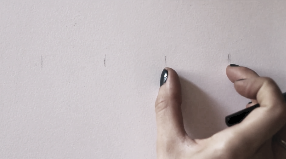
Establishing a few initial guidelines will help us ensure that our eyes will have effective proportion and location.
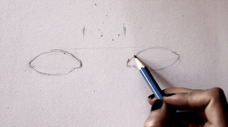
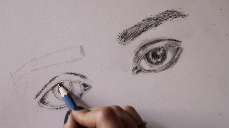
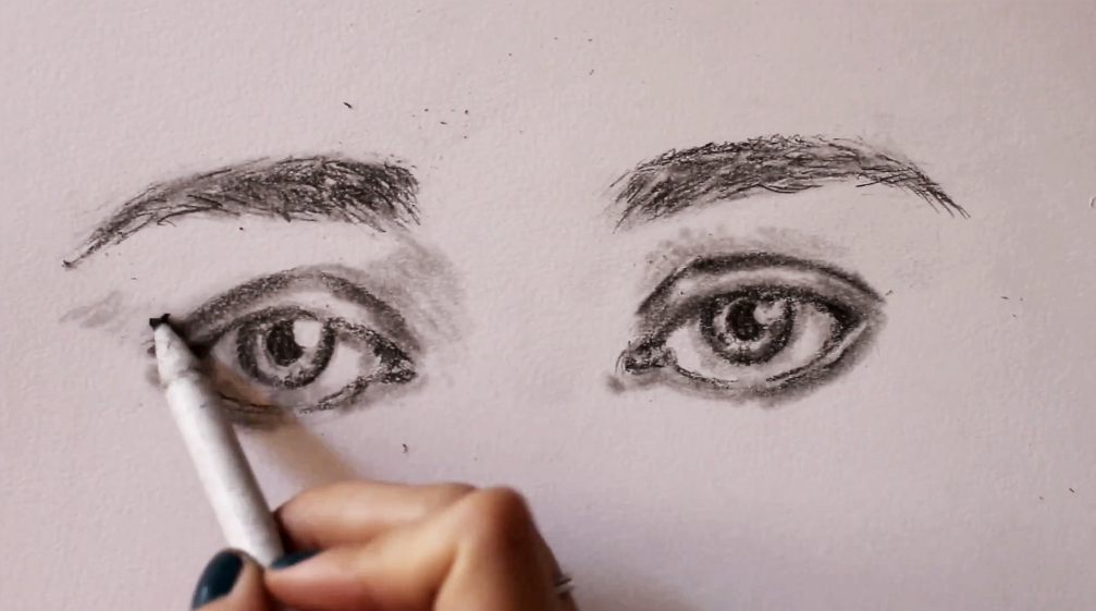
Drawing initial eye sketch (a).
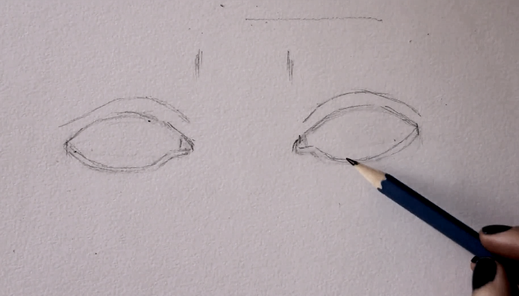
Drawing initial eye sketch (b).
Drawing initial eye sketch (c).
|
|
|
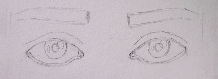
3. Start developing values and textures gradually
This is the part of the process that is probably going to take the longest, but take your time and observe your reference picture constantly.
Remember it's different values (highlights, midtones and darks) that give a drawing a sense of three-dimensional form. Therefore, you should observe where these different values are located within your subject so that you're able to recreate them.
Seriously! Around 50% of your time should be spent observing!
If you're having trouble with this, I recommend two things:
a) Choose a better picture with clearer lights/shadows, or
b) Desaturate your picture in Photoshop or another photo-editing software so you can see it in grayscale as opposed to full- color.*You can also do this in Gimp, which is a free photo-editing software you can download for free.
Using your softer-grade pencils (starting with 2B and progressing to 6B-8B as needed), take your time developing a wide range of values in layers, working from lights to darks as you go.
If you need help understanding different pencil grades, I highly recommend checking out my Drawing for the Total Beginner Mini-Course, which you can access for free after joining my art email insider list. I explain all about pencil grades in the first class of this course!
When it comes to shading, I always like starting in the darkest areas than I'm able to perceive in my reference picture, but I lay down my graphite lightly. I know that darkest darks are going to get developed incrementally, in layers.
Lay down your layers of graphite by exerting only a small amount of pressure on your paper and use your blending stump to create smooth transitions between your different values, as well as to get rid of any visible pencil lines.
Do your best not to cover up areas of highlights (lightest lights) with graphite. If you do cover them, no worries. You can pick up those highlights again later using a kneaded eraser or a Mono Zero eraser.
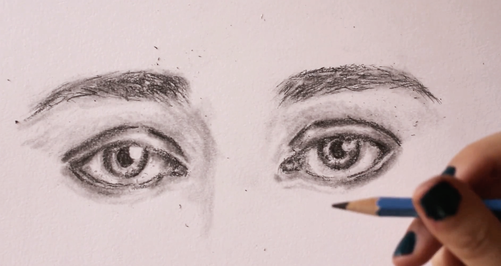
|
|
|
You should end up with parts that look almost entirely white, parts that look very dark, and an ample range of mid-tones in between.
Make sure that you create gradual transitions between your values and stay away from leaving visible outlines and harsh marks!
Remember, there are no visible outlines in realism!
Many beginners tend to believe that the sclera (the white part of the eyeball) should be left completely white, but it's not! There is shadow within the sclera created by the top eyelid and, usually, at the corners (which helps create the spherical shape of the eyeball).
Once again, don't guess. Observe your reference picture and make sure to develop your values as you see them.
When drawing the hair texture of the eyebrows, create a variety in values and draw them incrementally, starting from lights and making your way towards darks as you go.
Work back and forth as much as you need to, until you arrive at a good sense of three-dimensional form.
Resist the urge to add in your eyelashes until the end!
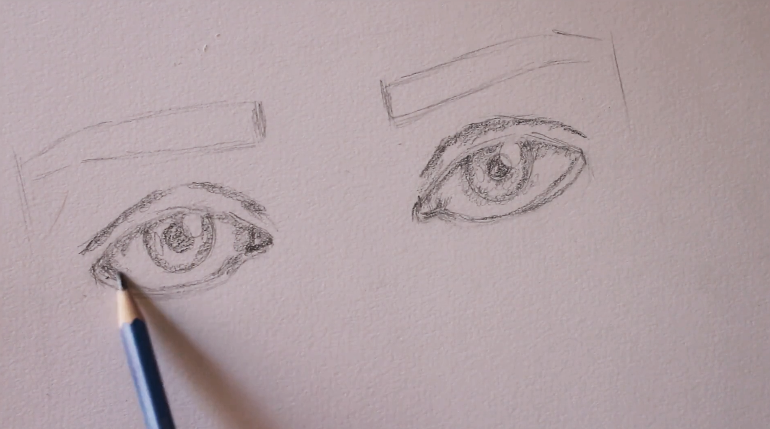
Developing values (a).
Developing values (b).
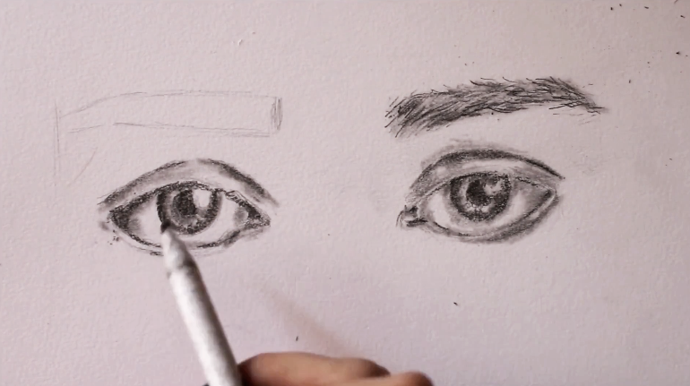
Developing values (c).
Developing values (d).
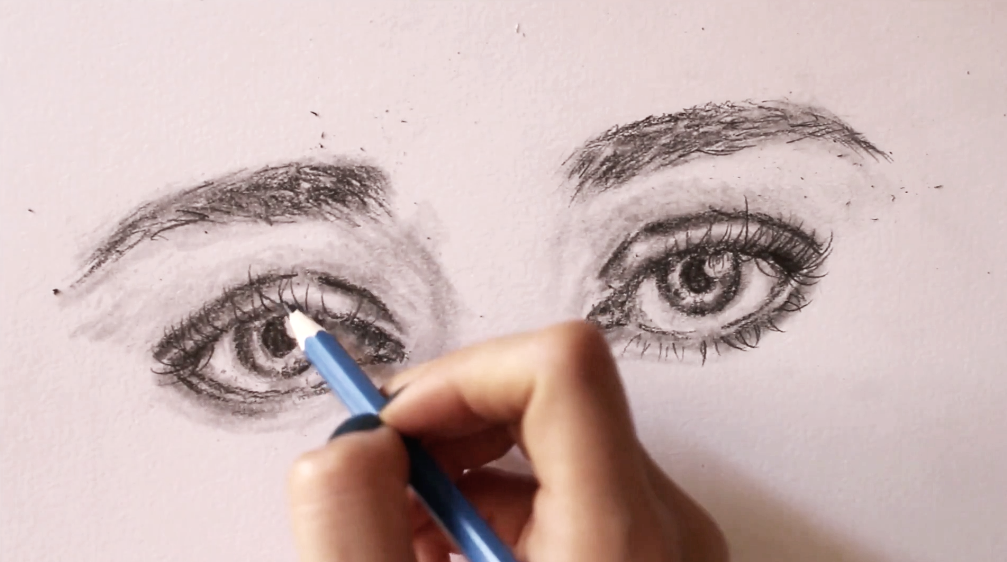
4. Establish a bit of form around the eyes to bring them together
Our eyes are spherical forms that are set in deep sockets in our skulls. They also have a large protruding form in between them (the nose) and a brow bone above them.
All of these things create nooks and crannies, and interesting shadows around our eyes. Take your drawing a bit further and bring your eyes together by adding in the shadows you see around them.
I like using my blending stump for this, gliding it gently in the areas where I need to create shadows. By this point in the drawing process it usually has plenty of graphite collected in its tip, but if yours doesn't, simply lay down more graphite where you see fit, making sure to start lightly.
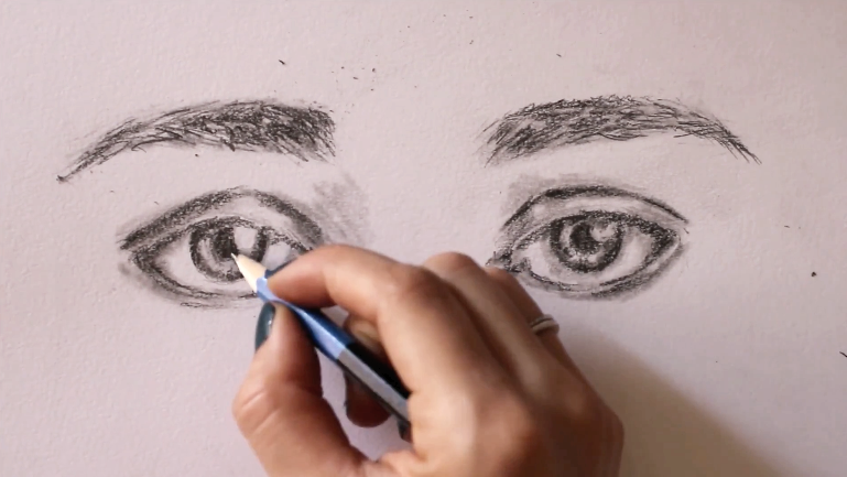
Creating form around the eyes (a).
Creating form around the eyes (b).
Creating form around the eyes (c).
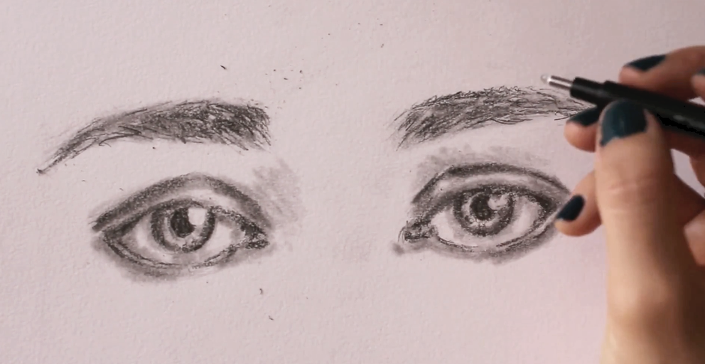
5. Draw the eyelashes
When you're done with the development of your values, it's time to draw in the eyelashes! For this part of the process, I like using my HB pencil, and I need to make sure that it's nice and sharp.
Natural eyelashes aren't perfect. Some of them are shorter than others, they are set at irregular distances from each other, and they go off in different directions depending on the angle and the direction the eye is looking towards. Also, many of them overlap!
Because the eyeball has a sphere-like structure, eyelashes located the inner-corner of the eye (close to the tear duct) tend to curl toward the nose, those in the middle section of the eyelid curl straight forward, and those in the outer corner of the eye curl away from the face.
Of course, the curl is generally emphasized more when drawing females than males and there are eyelashes that are completely straight.
Once again, draw what you see in the picture.
Another thing to note is that, usually, eyelashes located in the inner-corner of the eye and those along the lower eyelid are a lot shorter.
Be very careful not to oversaturate your eyelashes and create a variety amongst them in terms of value and thickness. This is easier said than done!
When drawing males, I've found that the less lashes I can get away with, the better!
Keep the aforementioned characteristics in mind and remember that natural things are imperfect.
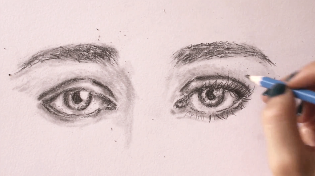
Drawing eyelashes (a).
Drawing eyelashes (b).
And we're done!
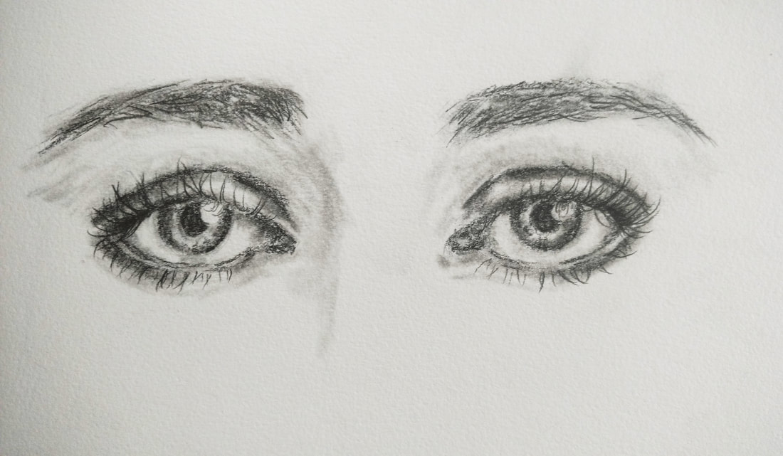
Realistic eye pencil drawing by Erika Lancaster.
Key tips to have in mind for realistic drawings:
1. Take your time choosing (or producing) a great reference picture.
2. Realize that value is more important than color and train yourself to discern highlights, mid-tones and shadows in your reference images.
3. Get used to observing your references constantly throughout the drawing process.
4. Draw what you see and not what you think things look like.
5. Steer clear of outlines and stark shapes (embrace subtleties).
6. Develop a wide variety in values and create gradual transitions between them.
I hope you found this post helpful! Which facial feature do you find most difficult to draw? Is it the eyes, nose, lips, ears....? Let me know in the comments section below! :)


www.erikalancaster.com
is a participant in the Amazon Services LLC Associates Program, an affiliate advertising program designed to provide a means for sites
to earn advertising fees by advertising and linking to amazon.com.
www.erikalancaster.com
is a participant in the Shareasale.com Affiliate Program, an affiliate advertising program designed to provide a means for sites to earn advertising fees by advertising and linking to Shareasale.com partner companies.
 RSS Feed
