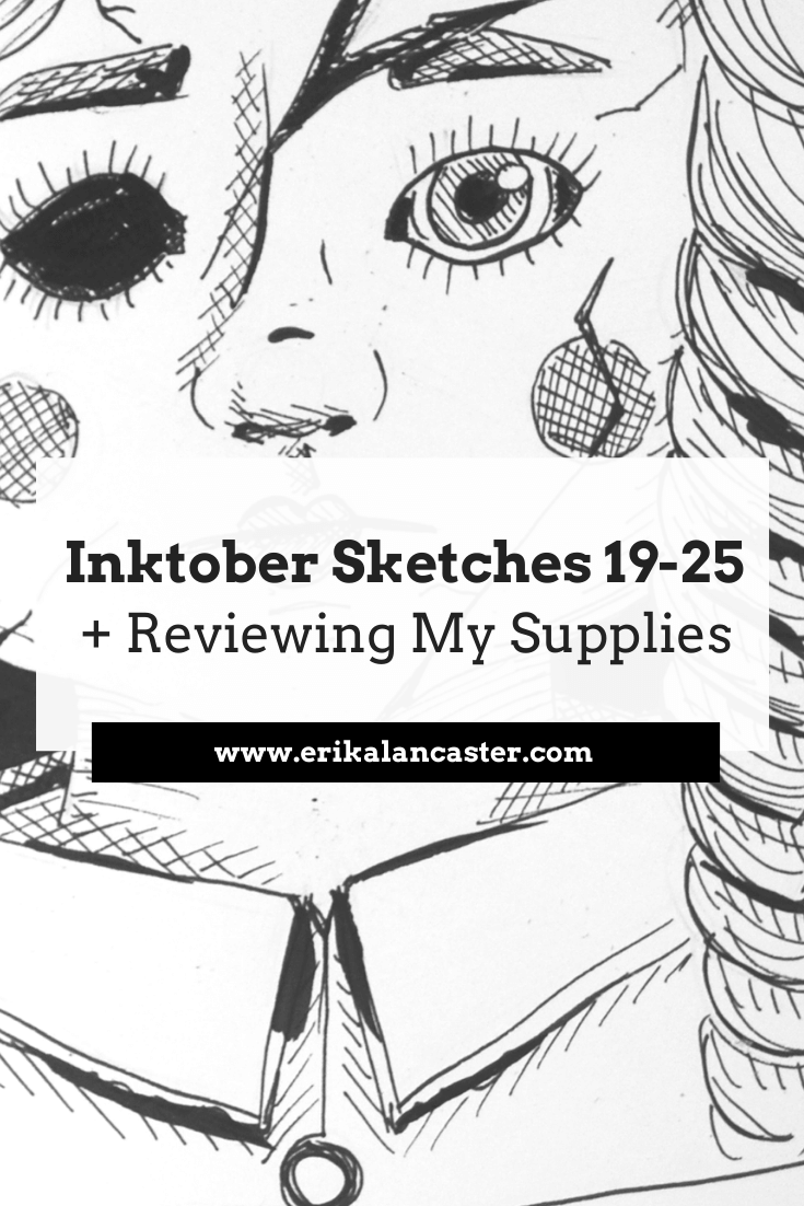
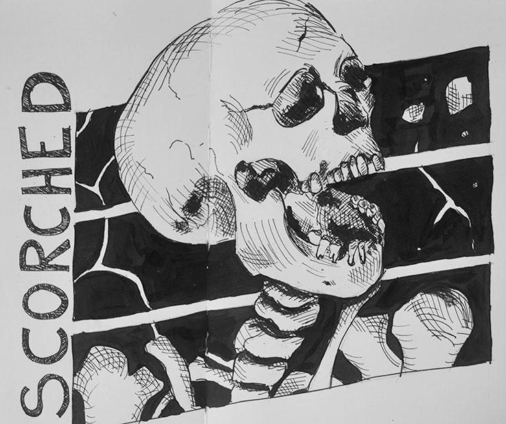
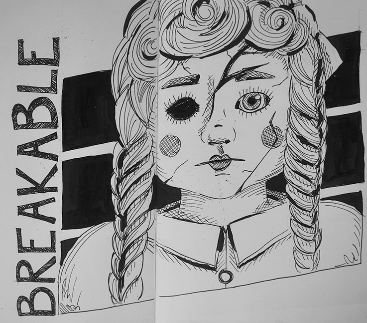
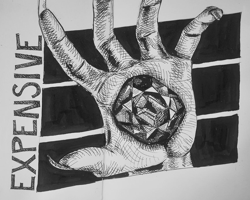
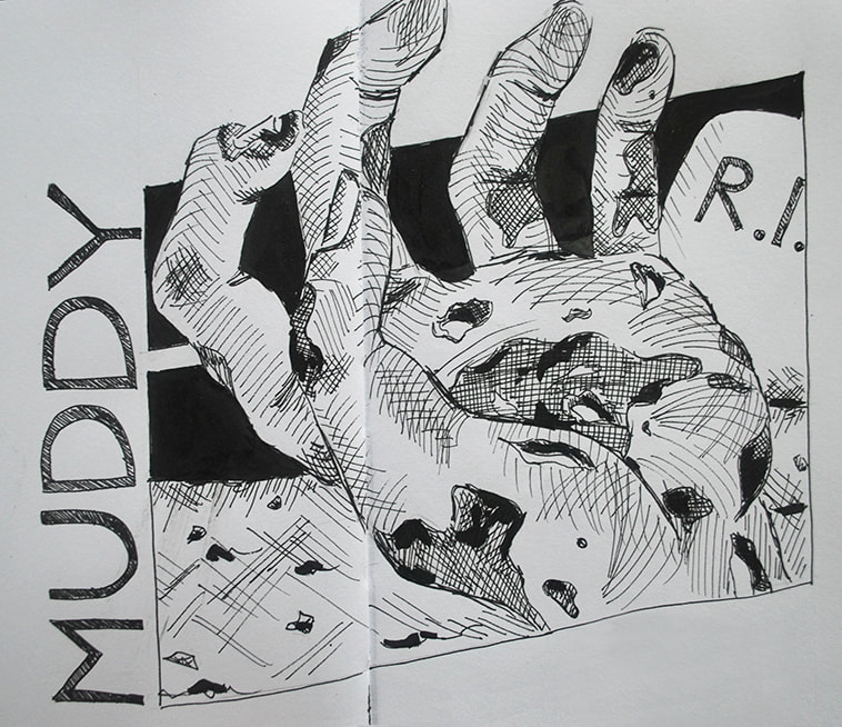
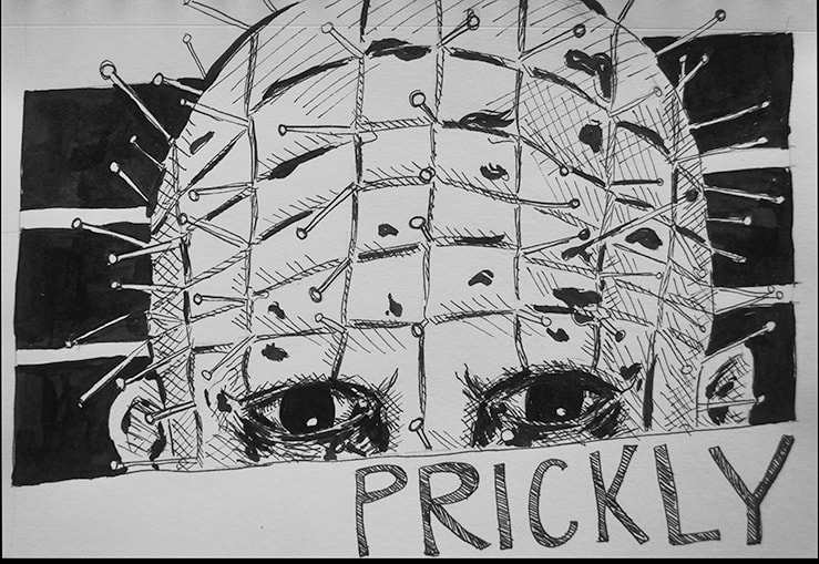
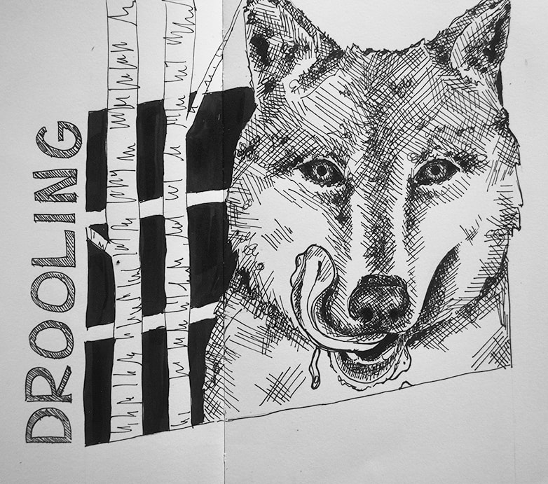
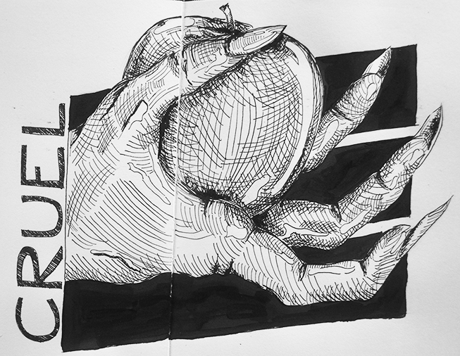
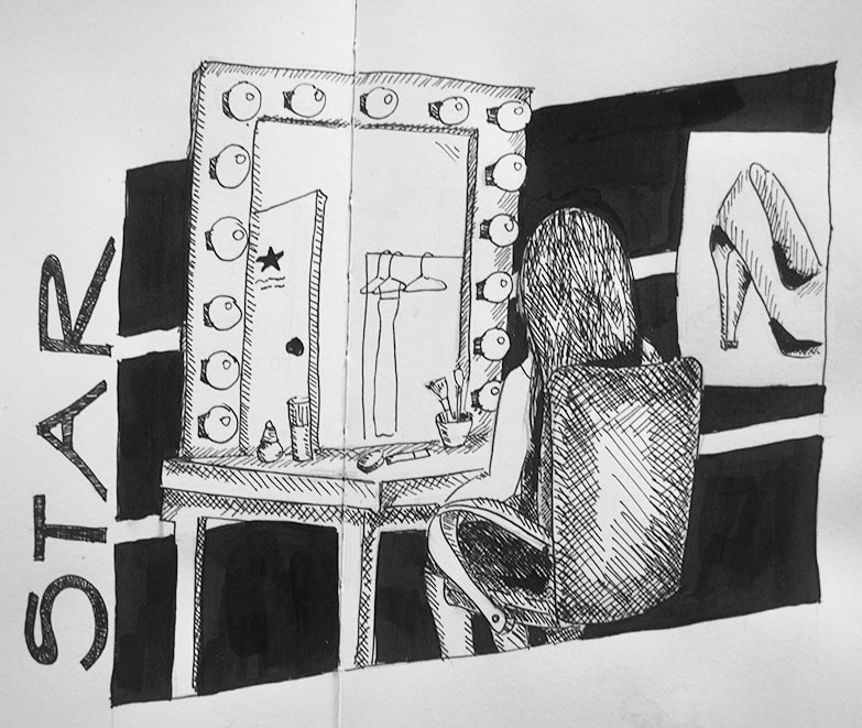
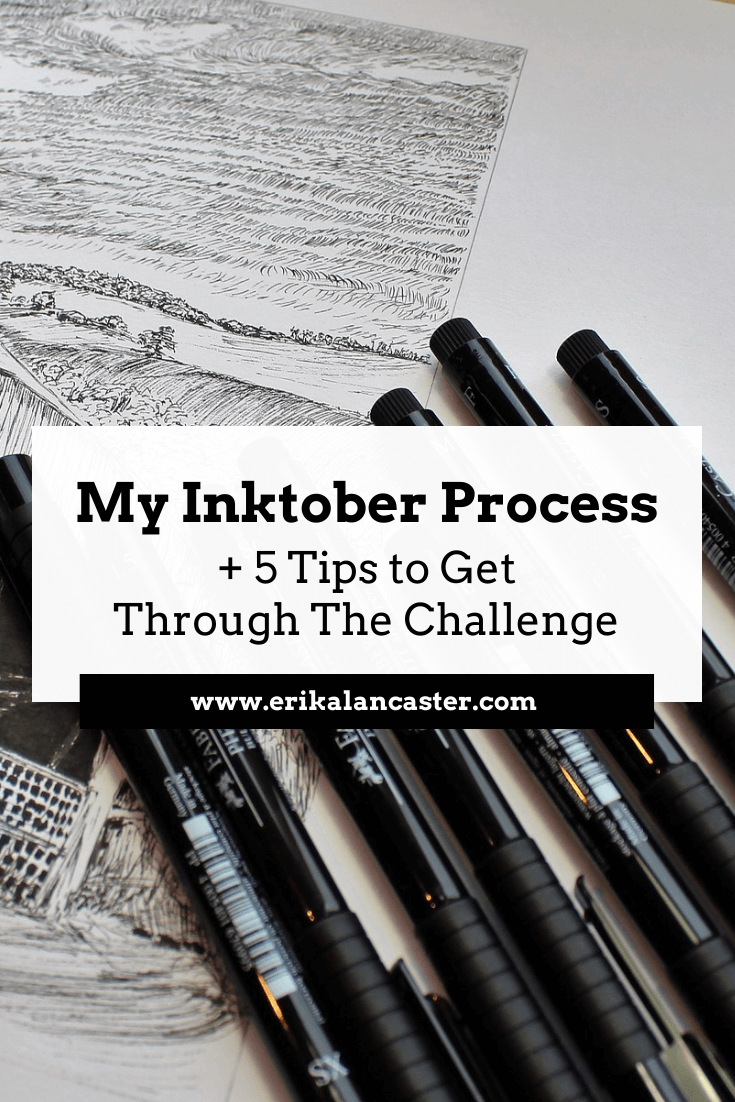
*This post contains affiliate links. I receive small commissions for purchases made through these links at no extra cost to you. These commissions help me keep this site up and running, in order for me to keep providing helpful and inspiring art content. :) In today's blog post/YouTube video, I'll be sharing Inktober sketches 19-25, as well as a review of the supplies I've been using throughout this challenge. I wanted to really put these products to the test and have a good amount of experience with them before I actually expressed any opinions. I have released several blog posts sharing tips and tutorials about pen and ink drawing that I highly recommend you check out if you haven't already (two very popular ones are this one and this one). In past YouTube videos, I've shared how much I enjoy using this drawing medium and why I think it's so effective at helping us progress our artistic skills. All this said, I had never used pen and ink as consistently as I have with this drawing challenge. I committed to participating in Inktober this year because I knew that creating a new piece every-single-day for an entire month would lead to amazing growth in a short period of time. The challenge would help me not only exercise my creativity continuously and gain confidence in my pen and ink technique, but would also test my time-management skills and even more mental/personal aspects. Over at my YouTube channel, I've shared all of my Inktober sketch time lapses so far: 1. Timelapses 1-5 + A Bit About My Thoughts and Process 2. Timelapses 6-11 + How I Come Up With the Ideas Behind My Sketches 3. Timelapses 12-18 + My Struggles So Far *The video included in this post is my fourth compilation of sketch time lapses and I'm closing this Inktober series with a last video including my final drawings, as well as a bit about what I've learned.
If you enjoyed this video and found it helpful, make sure to subscribe to my YouTube channel. I share a brand new video every week with art tips, drawing and painting tutorials and mindset/productivity tips for artists. *Subscribe HERE*
My Inktober SuppliesI knew I wanted to make a careful selection of supplies and stick with them throughout the entire month. This way, I would be able to come up with solid opinions about them. I bought all my supplies through Amazon and Blick Art Supplies this year. If you'd like to see a full list of my current favorite art supplies, go here. 1. Leuchtturm1917 Sketchbook
This was my first time using a Leuchtturm sketchbook and I really enjoyed it, especially in combination with drawing pens and ink. These sketchbooks are definitely on the more expensive side, but I'm really glad I invested in one and decided to use it for this drawing challenge!
The sketchbook is 15 x 21 cms. in size and is made up of 96 pure white 180 g/m drawing paper that is quite smooth. I love that the sketchbook includes two bookmarks and an elastic to keep it safely closed. These characteristics make the sketchbook perfect to take out for drawing in plein air or coffeeshops. I had a couple of different sketchbooks to pick from laying around that I could go for, but I went for this one for two main reasons: a) I knew that I wanted some areas of my Inktober sketches to have thick applications of ink and the thickness of its pages would allow for this. b) The pure/brilliant white of its pages would really allow my black ink lines/shapes to contrast and pop out! Though I find this sketchbook amazing for drawing purposes, I wouldn't recommend it for sketching with watercolors, as its paper is too smooth and I don't think it would hold/absorb water very well. I think it would, however, work pretty well for gouache and even acrylics. It's always a smart idea to give thought to what kinds of mediums you're planning on using in your sketchbooks before making a decision about which one to buy.
*This sketchbook is no longer available on Amazon, but you can find it on the brand's website here.

|
|||||||||||||||||||||||||||||||||||||||||


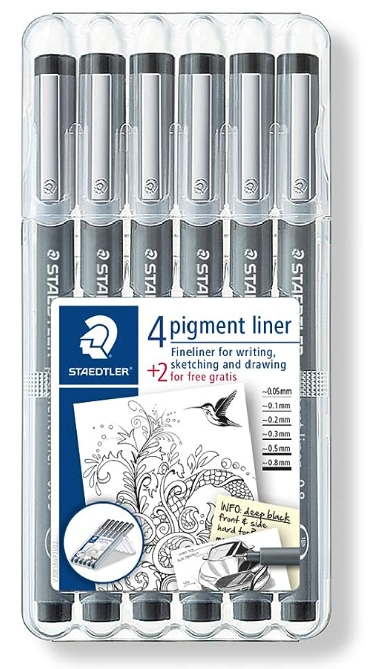
Staedtler Pigment Liners 6 Pack
|
|
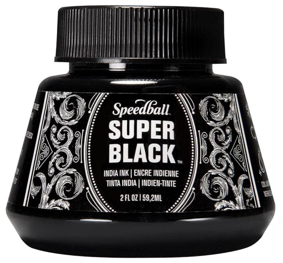
3. Speedball Drawing & Calligraphy India Ink
I acquired this little 2 ounce tub of black ink a while back for exploratory purposes and I'm very glad I had it on hand for this Inktober! It allowed me to create the flat black geometric background shapes that I decided would be the unifying aspect of my drawings prior to starting.
This Speedball drawing/calligraphy ink is a rich black and a bit on the thick side. However, it can be diluted to create a variety of values and a runnier texture. I used a small, angled, soft-bristled brush to apply it onto my paper and the wash always came out quite even. I never noticed any granulation, even in areas where I applied the ink thickly.
I also loved the fact that it washes off from skin pretty easily and that it has no overpowering odor to it. Lastly, the shape of its bottle is genius, as the bottom of it is wider than the top and makes it more stable. This avoids it from tipping over and creating a huge mess!
Speedball Super Black India Ink Tub
|
|
|
|
That's it in terms of my Inktober supplies for 2018!
I hope you enjoyed this post and learned something new, or got inspired to go and create a sketch for yourself. I wish you tons of progress and enjoyment in your artistic journey. :)
I hope you enjoyed this post and learned something new, or got inspired to go and create a sketch for yourself. I wish you tons of progress and enjoyment in your artistic journey. :)
0 Comments
*This post contains affiliate links. I receive small commissions for purchases made through these links at no extra cost to you. These commissions help me keep this site up and running, in order for me to keep providing helpful and inspiring art content. :)
Why, hello there! Thanks so much for visiting my little artistic corner of the Internet today!
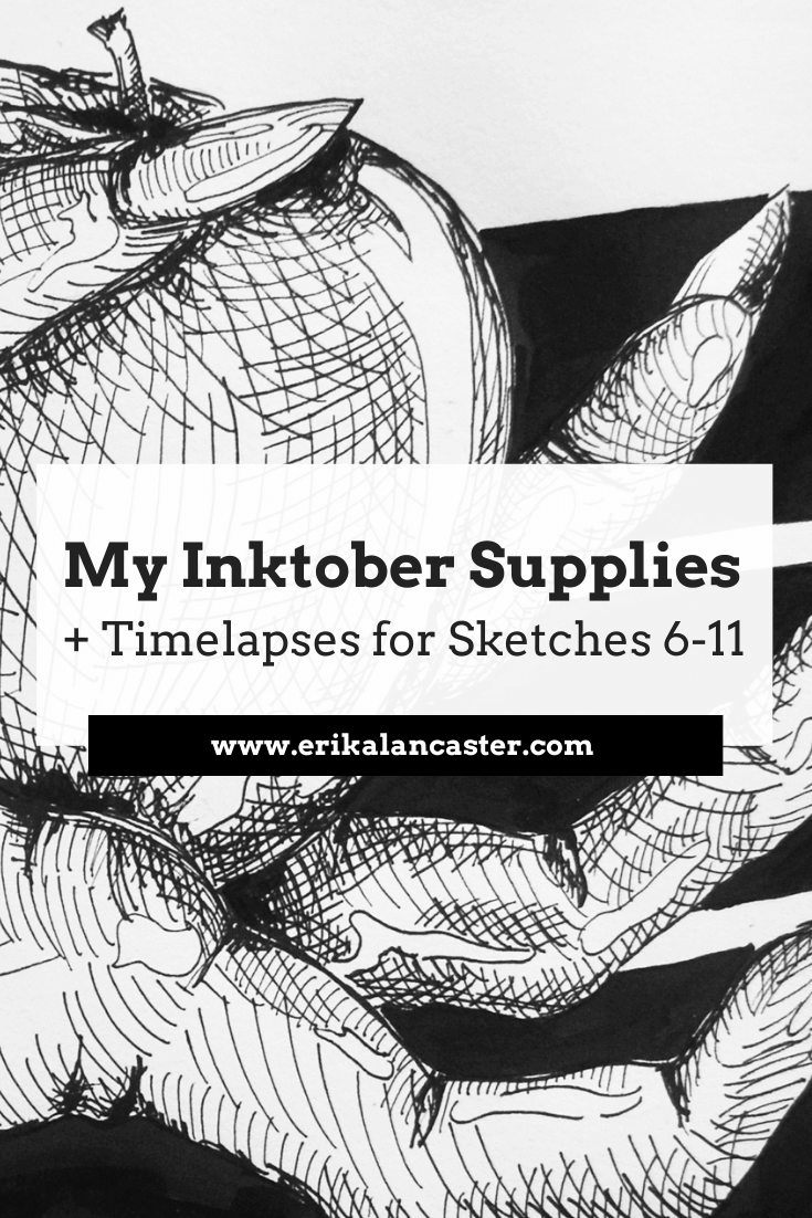
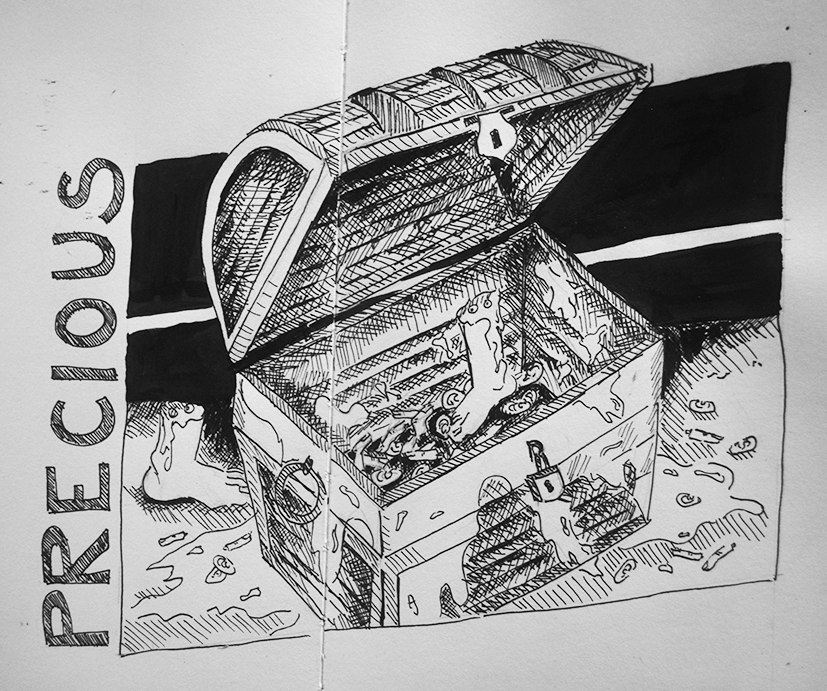
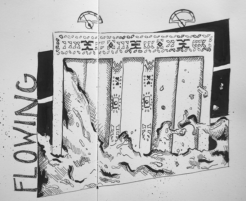
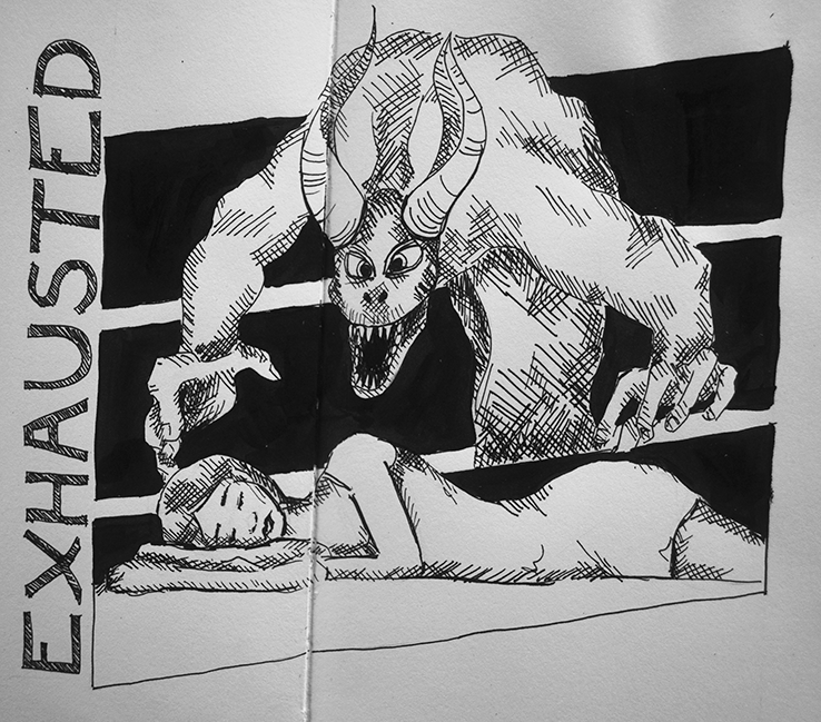
Today's post includes a video in which I'll be sharing the sketching time lapses for Inktober prompts 6-11, as well as how I came up with the ideas behind these quick pen and ink illustrations.
It's definitely a challenge to come up with a new original idea every-single-day, but I'm still going strong and am hoping to make it through!
I'm also sharing links to the exact sketchbook, drawing pens and ink that I'm using for this year's challenge, so make sure to find those at the end if you're interested in buying some new supplies for yourself.
Check out my previous Inktober-related blog post/video titled: 5 Tips to Make it Through Inktober and How I'm Going About it for specific tips to get the most out of this drawing challenge.
Also, here are a few past blog posts and YouTube videos in which I share a ton of helpful info about pen and ink drawing/shading.
They will definitely help you step up your game throughout the rest of this challenge!
Pen and Ink Alternative Shading Techniques (Shading a Sphere)
How to Shade a Hand Using Pen and Ink
Must-Know Pen and Ink Drawing Tips
If you enjoyed this video and found it helpful, make sure to subscribe to my YouTube channel. I share a brand new video every week with art tips, drawing and painting tutorials and mindset/productivity tips for artists. *Subscribe HERE*
My Inktober Supplies
Here are the supplies I'm using for all of my Inktober sketches this year. I buy most of my art supplies through Amazon and Blick Art Supplies.
|
|
|
|
|
|
*The Leuchtturm1917 sketchbook is no longer available on Amazon, but you can find it on the brand's website here.
For a complete list of my current favorite art supplies, go here.
For a complete list of my current favorite art supplies, go here.

I hope you enjoyed this post and learned something new, or got inspired to go and create a sketch for yourself. I wish you tons of progress and enjoyment in your artistic journey. :)
Thanks so much for popping by today!

*This post contains affiliate links. I receive small commissions for purchases made through these links at no extra cost to you. These commissions help me keep this site up and running, in order for me to keep providing helpful and inspiring art content. :)
Are you an artist looking for a foolproof way to improve your drawing/creative skills in a short period of time? Have you always wanted to participate in Inktober or other daily drawing challenges but find them a bit intimidating? Are you a beginner looking to make drawing and creativity a part of your daily life?
Month-long drawing challenges like Inktober are no joke.
Most of us have a lot going on in our lives and committing to producing one drawing a day (and actually sticking with it for the entire month) requires a huge amount of discipline.
Even if one starts with the project excited and has proper fun creating those first few sketches, that initial burst of inspiration is probably going to dwindle at some point mid-way.
And when that happens, it's going to take sheer determination to keep going!
This said, if we are able to stick with it, growth will come inevitably and fast. By the end of the month, our drawing skills will have progressed and our creative abilities will be heightened.
This type of experience is also incredibly valuable as it helps us make way towards finding our artistic style and voice. Committing to any sort of series like this one is a great way of pinpointing our strengths and weaknesses, which is essential.
In this blog post, I'll be sharing my top five tips to ensure that you are progressing your drawing/creative skills as much as possible with this drawing challenge, but also staying sane along the way.
These are all things I'm making sure to do myself throughout this month. I'm also including links to a few very helpful pen and ink drawing blog posts/YouTube videos that will help you step up your inking game.
The video included in this post is a compilation of time lapses for my first five Inktober sketches.
Make sure to follow me on Instagram to stay up-to-date with my progress throughout the month.
I'm sure I'll be missing a few days here and there, but I am planning to make up for them as soon as I'm able to.

Here are some other helpful blog posts and videos that will help you level up your pen and ink drawing:
1. Pen & Ink Sketching: 6 Shading Techniques
2. Guide to Shading Techniques: Hatching, Crosshatching, Scribbling and Others
3. Shading Simple Objects Using Hatching, Crosshatching and Other Drawing Pen Techniques
4. Shading a Hand Using Pen and Ink (Complex Subjects)
If you enjoyed this video and found it helpful, make sure to subscribe to my YouTube channel. I share a brand new video every week with art tips, drawing and painting tutorials and mindset/productivity tips for artists. *Subscribe HERE*
Inktober Tips
1. Be practical about it
As creatives, we have tons of different ideas popping up in our heads non-stop. This is great, but it can definitely hinder us from moving forward and actually finishing things. Think of an idea that you feel could work and that feels practical in terms of time, and just go for it.
If you look back constantly, there's a huge possibility that you won't finish drawings on time and they're going to start piling up, which can lead to overwhelm.
Remember that this is a marathon and not a sprint. I like keeping this sort of project practical by giving a bit of my energy each day instead of giving it all right at the beginning and burning out fast. I'm not striving for masterpieces, but for growth.
2. Avoid looking at others' work until after you have finished yours
It's important for me to keep my work as original as possible and I hope this is the case for you as well. I'm sure there will be other artists in the world creating work that is similar to mine in some (or many) aspects. But when this happens, I know that it's due to the fact that those other artists and I are somehow influenced by similar things and not because I'm copying their work.
For challenges like this one, I find it super helpful to stay away from social media until after I have finished my work (or at least my initial sketch). This way, I'm not allowing other artists' ideas to infiltrate my mind.
For challenges like this one, I find it super helpful to stay away from social media until after I have finished my work (or at least my initial sketch). This way, I'm not allowing other artists' ideas to infiltrate my mind.

3. Brainstorm ideas and create sketches
Before going to bed, I'm reading the prompt for the following day and allowing myself to start brainstorming. I start sifting through ideas in my head, setting aside those that might not be practical (no matter how amazing they might sound). I don't actually put pencil/pen to paper until the next day.
I recommend creating at least a couple of quick sketches prior to actually starting with your piece. Doing quick thumbnails is an excellent way of arriving at great compositional arrangements.
For several of the drawings above, I was unsure whether I wanted my main subject to be facing forwards or whether I'd be sketching him/her/it in profile or at an angle. It wasn't until I created those sketches and actually saw my ideas come to life that I could make a decision about what would be most appealing.
4. Incorporate some sort of element of coherency (or a theme)
When creating any sort of series like this one, it's useful to think about how you can bring an aspect of consistency to your work. A lot of artists like sticking to a specific theme for Inktober and I think this is very useful, as it limits the broad range of ideas that might lead to indecision and not doing anything at all.
I decided to incorporate coherency in the format/layout of my overall design. However, there are many ways that we can add a sense of consistency to our artwork.
Perhaps you want to make sure to incorporate human figures in all your drawings, stick with a specific color scheme (if you're using color), create some sort of frame around your drawing, integrate handwritten lettering, or think of a specific layout like I did.
5. Have fun and don't strive for perfection
Being a perfectionist and expecting too much from yourself with every single thing you do is a surefire way of burning out and not enjoying the creative process. It also keeps you from producing the amount of work you have to create in order to really improve artistically.
Not to mention, this challenge (in my opinion) is a way of improving our personal skills, not about showing off masterpieces and/or comparing them with other peoples'!
Stay in your lane and remember that the purpose of this project is to improve your drawing and creative skills, as well as to make art a daily habit.
My Inktober art supplies
|
Staedtler Pigment Liner Drawing Pens
|
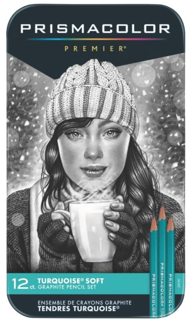
Prismacolor Drawing Pencil Set: Turquoise, 12 pack $13.99
|
|
Speedball Super Black India Ink Tub
|
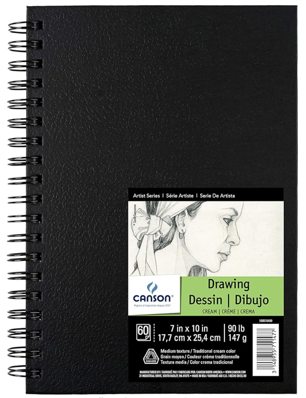
Canson Cream Colored Paper Sketchbook
|
|
*The Leuchtturm1917 sketchbook is no longer available on Amazon, but you can find it on the brand's website here.

I hope you enjoyed this post and learned something new, or got inspired to go and create a sketch for yourself. I wish you tons of progress and enjoyment in your artistic journey. :)
Thanks so much for popping by today!
*This post contains affiliate links. I receive small commissions for purchases made through these links at no extra cost to you. These commissions help me keep this site up and running, in order for me to keep providing helpful and inspiring art content. :)
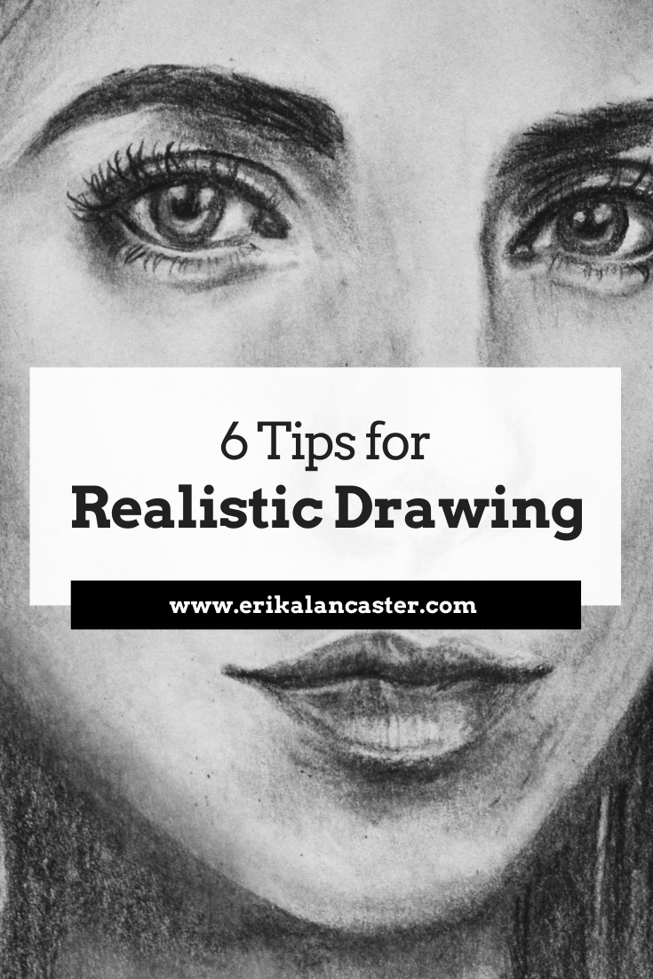
Are you impressed by artists who are able to achieve high levels of realism in their work and wish you could also get to that point, someday? Interested in bringing realistic form and three-dimensionality to your drawings so that they can really pop out? Have you gained some confidence creating line sketches, and are ready to start adding realistic light and shading effects?
Even though I consider myself much more of a sketcher and a painter than a realistic drawer per se, I think it's essential to make time for these kinds of studies. I also think that it's important for aspiring artists to devote time to achieving believable drawings/paintings because this is what's going to lead them to develop great observational skills and grasp fundamental art topics such as proportion, value, perspective, form, etc.
In today's blog post, I'll be sharing a video time-lapse of a portrait I drew using regular pencils, as well my top six tips to apply when attempting to create a realistic drawing of any type of subject (whether it be a face, animal, arrangement of objects, etc.).
By understanding and practicing the six key points I'll be sharing below, beginner artists will start making much faster progress and will soon be creating impressive, more professional-looking drawings.
I want to make something clear. To achieve realism, we need references. These references are going to allow us to observe what subjects actually look like in real life. If we don't use references, we are going to be working from what we think subjects look like.
References provide us details and remind us of tiny intricacies that we would have otherwise not thought about. And when attempting to achieve realism, it's ALL about observing the subtleties and being able to recreate them accordingly.
References can take the form of photographs or compositions we have arranged to draw from life (otherwise called working from direct observation).
Drawing from direct observation is essential for artists that have gained a certain level of skill using photographic references, as it provides a more challenging opportunity to further our artistic development.
As I've mentioned in other blog posts and YouTube videos, drawing is the basis for everything else in art. I believe all artists, no matter how skilled they've already become or what particular medium they've chosen to gain mastery in, should continue making time to sharpen their drawing/observational skills throughout their journeys.
Personally, I make sure to schedule in time for it on a weekly basis, even though what I sell are my paintings!
If you enjoyed this video and found it helpful, make sure to subscribe to my YouTube channel. I share a brand new video every week with art tips, drawing and painting tutorials and mindset/productivity tips for artists. *Subscribe HERE*
Tips to Improve Your Realistic Drawing
1. Make sure you're using a quality reference
Whether you're using a photograph or drawing from life, it's essential to put in time to search for a great picture or create a great composition.
If you're using a reference photograph, make sure it has a great resolution that is going to allow you to zoom in as needed, and that it shows a great play between lights and shadows. Do not use an overexposed or underexposed photograph as reference, as this will not lead to a good three-dimensional looking piece.
If you're a beginner just starting out, something that is going to be very helpful is opening up your photograph in a photo-editing software like Photoshop or Gimp and turning it into black and white/grayscale. This is going to allow you to pinpoint lights, darks and mid-tones a lot easier.
Being able to discern between different values in your reference is absolutely key to you being able to recreate them. Make to mistake, value is much more important than color when creating realism.
If you're a bit more experienced and are starting to draw from life, check out my blog post titled Why Drawing from Direct Observation is Essential and 10 Tips to Improve. In it, I explain why drawing from life is so important in order to progress our skills even further, and share a few tips to make the process less daunting.
2. Know and prepare your art supplies
When I first started drawing I used regular printing paper, my pencils from school, and had no idea about the different types of erasers that existed.
While this is perfectly fine when we're just starting out, and I actually am all for creating art with limited and basic tools, when you're ready to really improve your work, it's essential to invest in actual drawing supplies.
Using tools for the type of artwork you're intending to create is going to ensure that you're not making the process extra-difficult for yourself and you'll be able to progress much faster.
All of the following art supplies are products I myself use and would recommend for anyone getting started.

Prismacolor Turquoise Drawing Pencil Set
Mr. Pen Kneaded Erasers
|
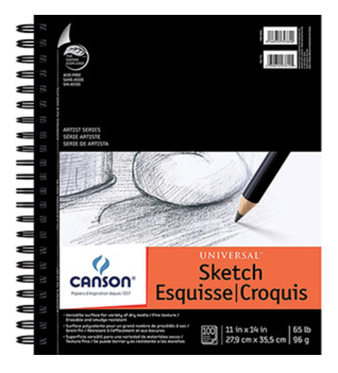
Canson Drawing Sketchbook 11x14"
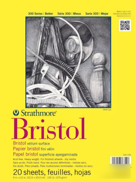
Strathmore Bristol Paper Vellum Surface 9x12"
|
|
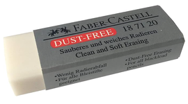
Faber-Castel Dust Free Soft Eraser
|
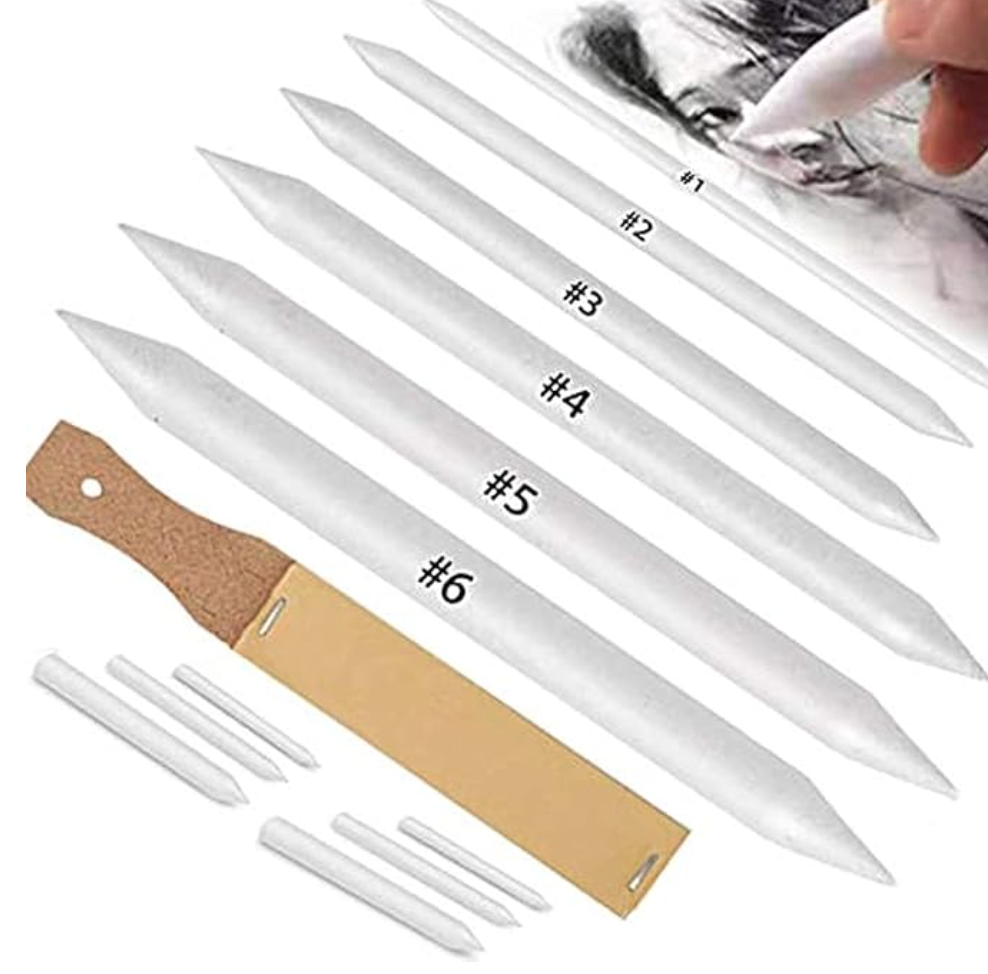
Blending Stump Set
|
When I set out to create a drawing that is more on the realistic side, I make sure to have the following supplies on hand:
-A few different pencil grades (2H or HB for the initial sketch, a couple of mid-grade a 2B or 4B to start creating darker values gradually, and a softer grade like an 8B for darkest areas)
-Drawing or sketching paper (smooth paper is going to ensure smooth blending)
-A kneaded eraser or eraser intended for smaller areas
-A regular soft rubber eraser for larger areas
-A blending stump or tortillon to blend smaller areas
-A tissue paper to blend larger areas
-A quality sharpener
-A scrap piece of regular paper or tracing paper to rest my hand on as I'm working
3. Always start with a light initial sketch, focusing on largest shapes first
When we're starting with any kind of drawing, it's absolutely essential to learn to visualize what we're looking at as a combination of simple shapes and to tune out details.
The proportion and location of these different elements in regards to each other has to be spot on, before even thinking about moving on to things like shading and texture.
It's the absolute worst to spend hours developing details and even creating beautiful, smooth shading just to step away from our drawings and realize that the proportions/locations of different elements are off.
Also, whether you're creating your initial sketch by tracing over a photograph or freehand, make sure those initial lines are created lightly so that they can be invisible at the end (we want no visible lines when creating realism).

4. Keep in mind that in realism, there are no visible lines
In real life, the shapes we see are created by subtle differences in values, which are influenced by light and shadow. These shapes are not outlined as they are in cartoons.
It's essential to stay away from creating any sort of stark-looking lines, whether it's around our different shapes/planes or in an area we're intending to create a smooth gradient in.
This said, we are required to draw lines when we are working on creating some kinds of texture (hair, eyebrows, eyelashes, etc.). However, even in these cases, the "lines" we are leaving behind are not uniform from one edge to the other, but have a variety even within them in terms of thickness or value.
They most likely go from thick to thin or from dark to light, etc., which leads to much less stark looking lines.
5. Create gradual, smooth transitions between your different values
Unless you're working with a photograph (or with a real-life composition) that shows very dramatic lighting, transitions between lights and darks must be gradual and smooth.
There should be no stark changes between one to the next and there shouldn't be any visible lines throughout these transitions either.
The exercises I share in this video will help you develop better pressure control.
There should be no stark changes between one to the next and there shouldn't be any visible lines throughout these transitions either.
The exercises I share in this video will help you develop better pressure control.
6. Make sure you are creating a very wide variety of values throughout your drawing
In order for your drawing to really pop out and transmit a sense of realistic three-dimensionality, you have to develop a huge range of values throughout your piece.
There have to be very light areas (which will appear almost white at the end), there have to be very dark areas (which will appear almost black at the end) and there have to be a ton of mid-values in between.
Practice creating a beautiful balance between lights and darks.
A lot of beginners make the mistake of not going dark enough where needed. Don't be afraid to go dark (as long as the values are really there in the reference). This said, make sure you're never pressing down too hard on your paper because this can damage it and cause visible scratches that will not be able to be fixed!
For the most part, I like working my way towards the darks gradually. Also, as you're working, you'll probably find that you're darkening some areas that you were intending to leave light.
This is where small, detailing erasers come in super handy because they allow you to go back in and lighten these areas. They also allow you to pull out highlights wherever needed, which is crucial for realistic looking hair.
*Bonus Tip: Make sure that you're looking at your reference, at least, 50% of the time you spend working!
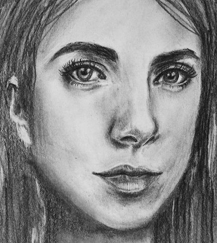
Portrait drawing by Erika Lancaster
*This post contains affiliate links. I receive small commissions for purchases made through these links at no extra cost to you. These commissions help me keep this site up and running, in order for me to keep providing helpful and inspiring art content. :)
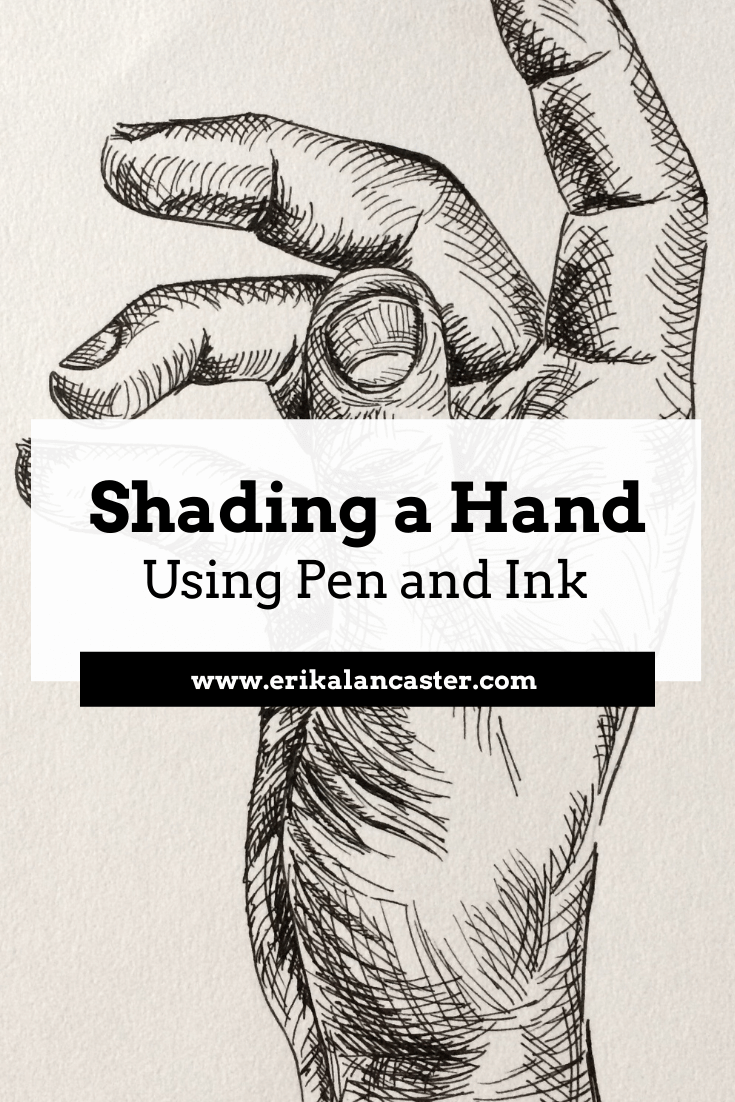
Have you gained confidence with your pen and ink mark-making, but need a bit of guidance when it comes to actually shading more complex subjects? Are you excited to step-up your pen and ink game so that you're able to create drawings that transmit more believable form and three-dimensionality?
When using pen and ink to create drawings that are more on the realistic side, it's essential to remember that we are both creating marks AND using said marks to render a wide range of values.
I've found that believable form is achieved with this art medium by staying mindful throughout the drawing process and placing marks as deliberately as possible.
Ink can be a bit intimidating due to the fact that it's permanent, but if you have enough practice with different mark-making techniques and you understand how to locate darkest areas, mid-tones and highlights in a reference image so that you can then create such values with marks, you'll be just fine!
For this blog post/YouTube video, I picked a subject I consider challenging (a hand) to explain my step-by-step process when adding form and three-dimensionality using the contour line/hatching technique.
This will help break the process up into more understandable chunks so that you can approach this kind of drawing more intentionally.
With practice, you'll gain confidence and you'll be able to enjoy creating more complex pen and ink drawings in no time!
This time, I wanted to jump right into the pen and ink explanation, and focus more on the creation of ink marks to render value/form than anything else. You'll see I start out with a previously created outline drawing of a hand.
To create this outline drawing, I did something I generally don't do, and traced a photo reference.
If you've been following me for a while, you're probably well-aware that I don't like tracing. However, I really wanted to jump right into the pen and ink techniques. Plus, I also wanted to provide both the exact photographic reference I used, as well as the initial outline drawing so we could start at the exact same point.
You can download both pdf's at the end of this post and follow along!
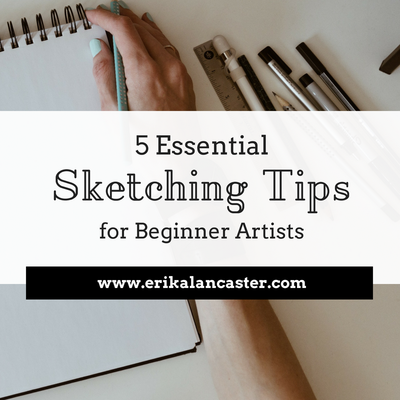
If you'd like to see how I would draw a hand in my usual freehand method, I highly recommend visiting my blog post titled 5 Essential Sketching Tips for Beginner Artists. I'm usually a huge believer in drawing subjects entirely freehand and not tracing.
If you're a beginner just starting out with pen and ink, I highly recommend checking out the blog posts/YouTube videos I released before this one. In those posts, I go much more in depth into different shading techniques and provide great exercises to start off with!
*Find them here:
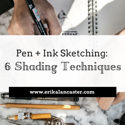
Pen and Ink Sketching: 6 Shading Techniques
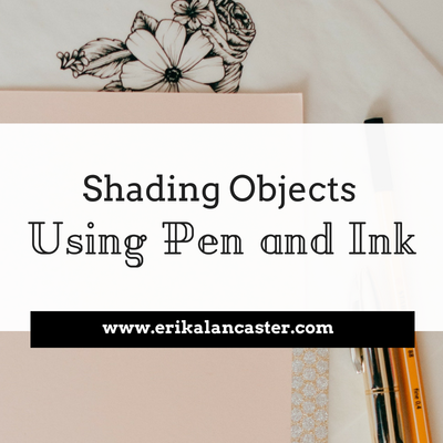
Shading Objects Using Hatching, Crosshatching, Scribbling, and Other Drawing Pen Techniques
Have you gained confidence with your pen and ink mark-making, but need a bit of guidance when it comes to actually shading more complex subjects? Are you excited to step-up your pen and ink game so that you're able to create drawings that transmit more believable form and three-dimensionality?
When using pen and ink to create drawings that are more on the realistic side, it's essential to remember that we are both creating marks AND using said marks to render a wide range of values.
I've found that believable form is achieved with this art medium by staying mindful throughout the drawing process and placing marks as deliberately as possible.
Ink can be a bit intimidating due to the fact that it's permanent, but if you have enough practice with different mark-making techniques and you understand how to locate darkest areas, mid-tones and highlights in a reference image so that you can then create such values with marks, you'll be just fine!
For this blog post/YouTube video, I picked a subject I consider challenging (a hand) to explain my step-by-step process when adding form and three-dimensionality using the contour line/hatching technique.
This will help break the process up into more understandable chunks so that you can approach this kind of drawing more intentionally.
With practice, you'll gain confidence and you'll be able to enjoy creating more complex pen and ink drawings in no time!
This time, I wanted to jump right into the pen and ink explanation, and focus more on the creation of ink marks to render value/form than anything else. You'll see I start out with a previously created outline drawing of a hand.
To create this outline drawing, I did something I generally don't do, and traced a photo reference.
If you've been following me for a while, you're probably well-aware that I don't like tracing. However, I really wanted to jump right into the pen and ink techniques. Plus, I also wanted to provide both the exact photographic reference I used, as well as the initial outline drawing so we could start at the exact same point.
You can download both pdf's at the end of this post and follow along!
If you'd like to see how I would draw a hand in my usual freehand method, I highly recommend visiting my blog post titled 5 Essential Sketching Tips for Beginner Artists. I'm usually a huge believer in drawing subjects entirely freehand and not tracing.
If you're a beginner just starting out with pen and ink, I highly recommend checking out the blog posts/YouTube videos I released before this one. In those posts, I go much more in depth into different shading techniques and provide great exercises to start off with!
*Find them here:
Pen and Ink Sketching: 6 Shading Techniques
Shading Objects Using Hatching, Crosshatching, Scribbling, and Other Drawing Pen Techniques
If you enjoyed this video and found it helpful, make sure to subscribe to my YouTube channel. I share a brand new video every week with art tips, drawing and painting tutorials and mindset/productivity tips for artists. *Subscribe HERE*
My method for adding believable form to complex subjects using pen and ink techniques
1. Study your reference/subject
I find it extremely useful to take time to study my subject, especially when it comes to drawing or painting something more complex, like a hand. If possible, I make time to learn about its underlying structure (which in this case is a combination of many small bones-muscles-tendons-etc.).
Having at least some knowledge about our subject's underlying structure will greatly improve our ability to render effective form and three-dimensionality!
Since we are drawing a hand, we can take a few minutes to study our own from different angles. Though our hands may look different from the next persons', their underlying structure is the same.
Take note of its convex vs. concave spots, the fleshy and bony areas, how the different elements within it compare with each other, its overall imperfections and the range of movement the different joints allow, etc.
All this said, it's essential to select an excellent photographic reference to work from (if you're not drawing from life).
I talk about the things I take into account when selecting this type of reference in my blog post titled Shading Objects Using Hatching, Crosshatching, Scribbling and Other Drawing Pen Techniques). Observe your photograph thoroughly.
I've included a letter-sized pdf of this hand photograph at the end of the post, in case you'd like to download and print it for practicing purposes.
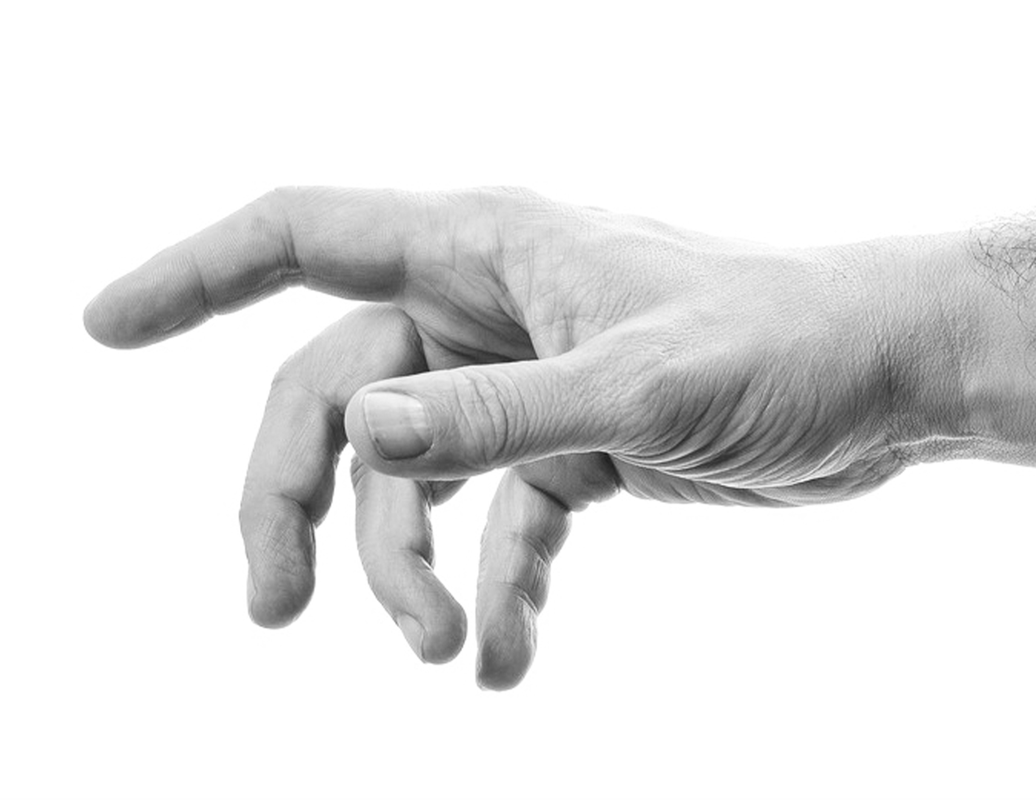
Reference hand photo after desaturating. Click on image to download original photograph from www.pixabay.com.
Once you've gained enough practice with reference photographs, I highly recommend incorporating at least some amount of drawing/sketching from direct observation (otherwise known as drawing/sketching from life) into your practice, as this will bring you much faster progress.
In my blog post titled Why Drawing from Direct Observation is Essential and 10 Tips to Improve, I explain why this method is so important for an artist's growth and provide a bunch of tips to make the process less daunting.
2. Start with a pencil outline drawing
Depending on your skill level and the objectives you have set for this study, you can decide whether you want to create your initial pencil sketch completely freehand, or if you'd like to focus on getting right into the pen and ink shading like I did for this tutorial.
I like using an HB or B pencil to create this preliminary drawing and keep it as light as possible because I want to be able to erase it completely later on.
If you'd like to download the free pdf that I've used to create this hand, you'll be able to find it at the end of this post.
I like using an HB or B pencil to create this preliminary drawing and keep it as light as possible because I want to be able to erase it completely later on.
If you'd like to download the free pdf that I've used to create this hand, you'll be able to find it at the end of this post.
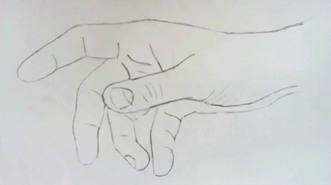
Hand outline pencil drawing
|
|
|
|
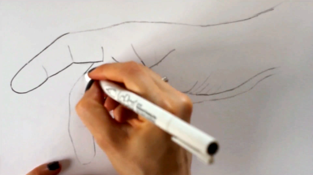
3. Outline your pencil drawing using ink
I used my LePen .5 point drawing pen to go over my pencil sketch carefully. Once the ink was set and dry, I erased all initial pencil lines.
At this point, you may also find it useful to create what I call a "value map" for yourself. You do not want to start adding marks without having a good idea of where your light source is located within the picture, as well as where darkest, mid-tones, and lightest areas are.
Draw shapes around these areas so that they can remind you throughout your drawing process where greatest value changes are located. You want to be especially mindful of where the lightest areas are within your reference image, so that those areas can be left untouched by ink.
Tracing outline pencil drawing using a drawing pen

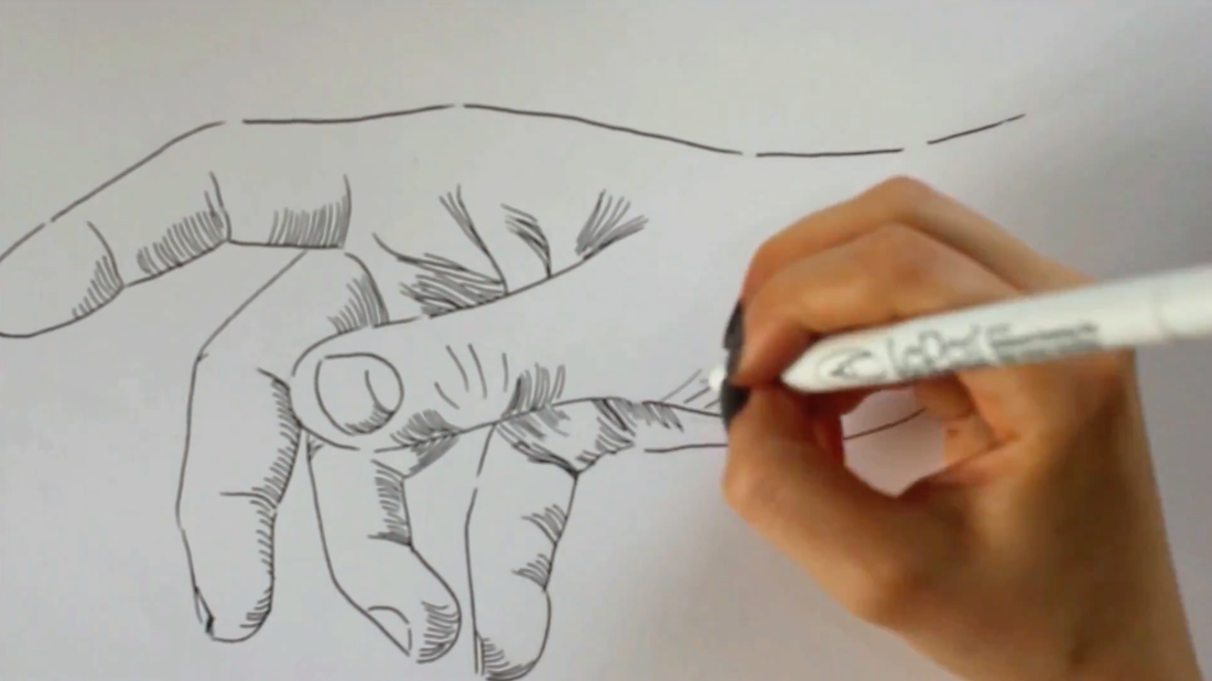
4. Start adding in initial layers of marks
Before starting this hand study, I decided that I would be using mostly contour lines/contour hatching for my shading. If used effectively, this mark-making technique allows us to very efficiently create three-dimensional form to more complex subjects that contain curves all throughout.
I usually like starting my pen and ink shading process with the very darkest areas, so I took a good look at where the deepest values of my picture were located and got ready to start laying down my initial sets of marks.
I switched to my .3 point LePen drawing pen and let the curves of my outline drawing to guide me, as well as my knowledge of the hand structure.
As I mentioned in the past pen and ink tutorials, it's very important to keep a sense of consistency within each group of marks you create.
These initial sets of lines are very important because they will be the foundation for everything else, so make sure to pay attention to what you're doing! Notice how curves start shifting in certain areas to best describe folds, fleshy bits, etc?
Adding in first groups of marks in the darkest areas within my reference photograph
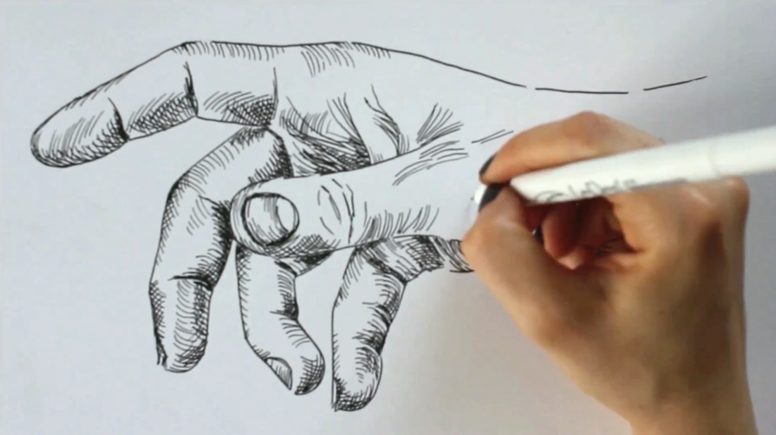
5. Work on mid-tone range and deepen darkest values
By this point, all of your darkest areas and perhaps even a bit of the mid-tone areas, should be covered with your first layer of marks. It's time to start developing more mid-tones!
Once you start laying down your mid-tones, you're probably going to want to go back to your darkest areas and deepen them because they're not going to seem dark enough anymore.
To do this with the contour line technique, all you have to do is add another set of curved lines on top of the first, similar to when you're doing crosshatching.
There is no set angle at which you have to draw this second group of curved lines, as long as they are intersecting with the first. Remember there has to be consistency within each group of lines you create.
Throughout the drawing process, keep in mind that, developing a wide range of values is essential when you're attempting to create a three-dimensional effect.
There have to be very light areas in your drawing (which will be represented by those areas of paper that are completely free of ink), a wide range of mid-tones, and extremely dark areas (those small areas almost entirely covered with ink).
Working on mid-tones and deepening darkest areas with cross-contour lines
6. Fine tuning
Still using my .3 LePen drawing pen, I smoothed out values that needed to transition a bit more gradually. Once I was happy with my drawing, I switched back to my .5 LePen drawing pen and traced my initial outline drawing only in certain areas.
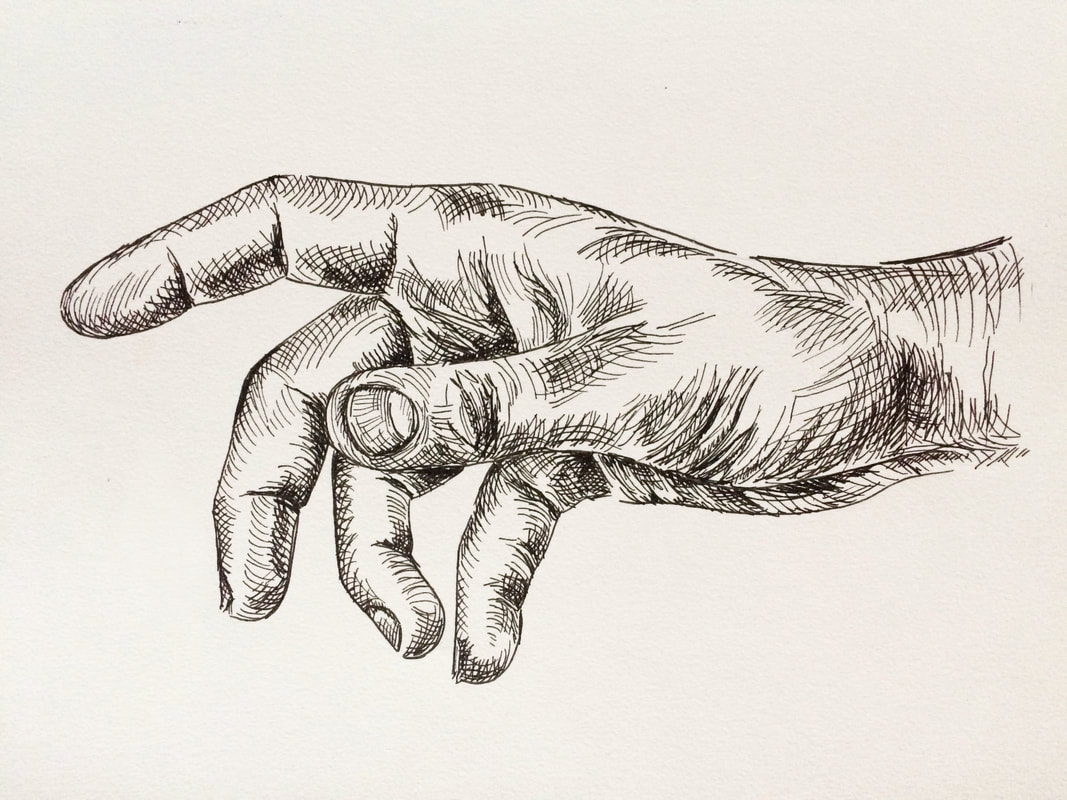
Final pen and ink hand drawing
*Free downloadables!
| hand_outline_drawing.pdf |
| grayscale_hand_reference.pdf |


www.erikalancaster.com
is a participant in the Amazon Services LLC Associates Program, an affiliate advertising program designed to provide a means for sites
to earn advertising fees by advertising and linking to amazon.com.
www.erikalancaster.com
is a participant in the Shareasale.com Affiliate Program, an affiliate advertising program designed to provide a means for sites to earn advertising fees by advertising and linking to Shareasale.com partner companies.
 RSS Feed
